Inside
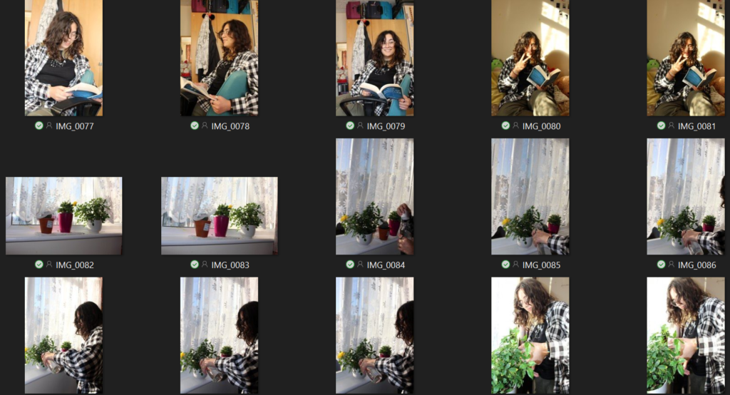
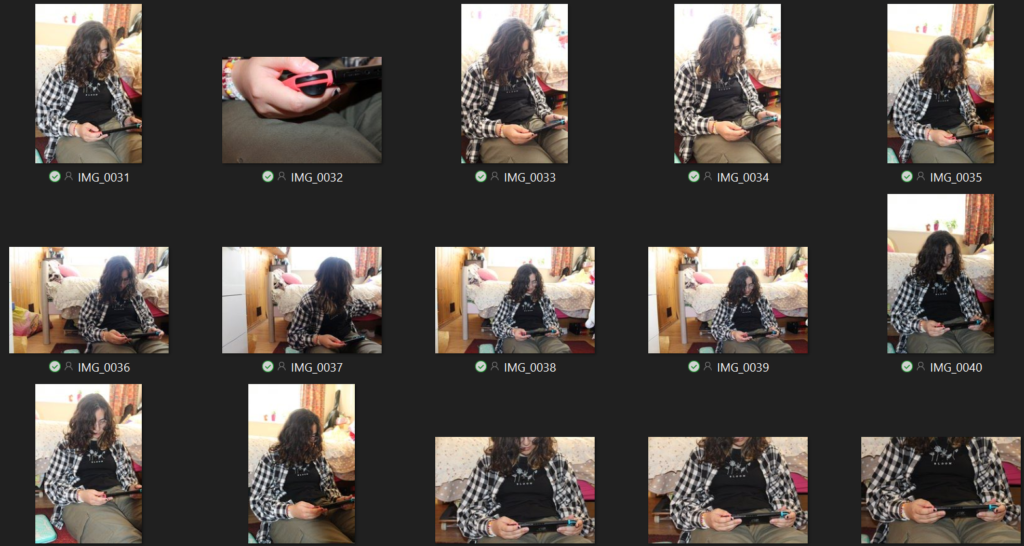
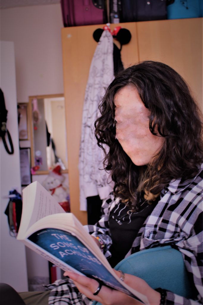
For this photoshoot, I asked my friend if I could go to their house and take pictures of them doing everyday things. I let them do whatever they wanted to make it seem more casual and realistic. I took pictures of them in their room while they played the guitar, read a book, played games on their switch and watered their plants. I used the window as my main light source as it was still sunny outside and there were interesting shadows on the walls.
I tried using low and high angles as well as different positions because I wanted my images to look unique and different from each other. I used some close-ups to focus on what my model was doing in order to get a better understanding of who they are as a person.
Contact Sheets





<3
Editing One Image
I really like this image because it shows my model’s interest and a bit of their personality. I think the way the lighting was hitting their face and the guitar looked interesting and I wanted to make the image livelier. I started by changing the tint to give it a softer and warmer look. I then turned the highlights down and exposure up in order to make the details stand out more.
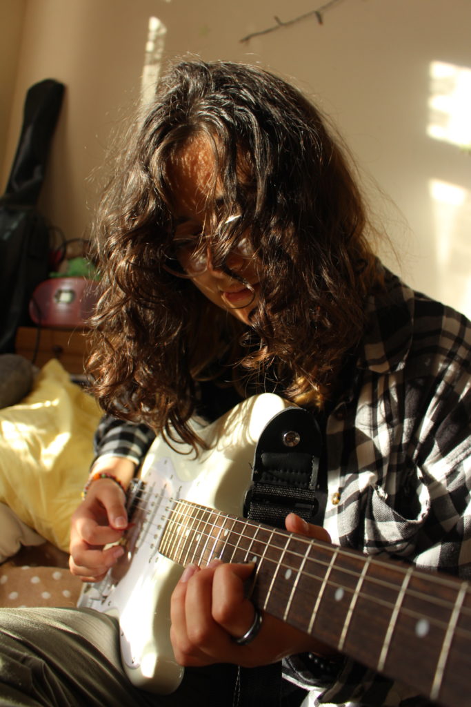
Before 
After
Final Edits


Outside
Photoshoot 1 + Contact Sheets
The weather was nice so I took some pictures of them on the roof listening to music, reading and then looking out of the window.


Photoshoot 2 + Contact Sheets
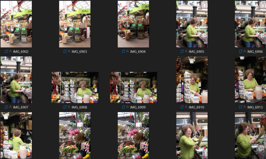
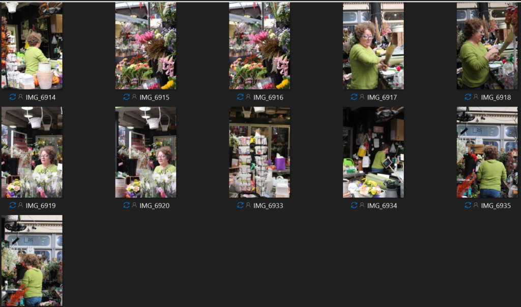
I went to the market and asked an old lady at the flower stand if I could take some pictures of her and her shop. She was quite busy, so I was only able to take pictures of her whilst she was working and doing her own thing. Them being unposted is a good thing because it made the pictures look more realistic. The lighting wasn’t that good in there and the camera settings were a bit tricky to figure out however I think I managed to get some shots in the end.
Editing One Picture

I decided to edit this image because I liked the way they were looking in the distance listening to music making it look mysterious. I also wanted to give it a more sombre look and that’s why I turned it black and white. I increased the texture and clarity to bring out the details and I also played around with the shadows and highlights.

Before 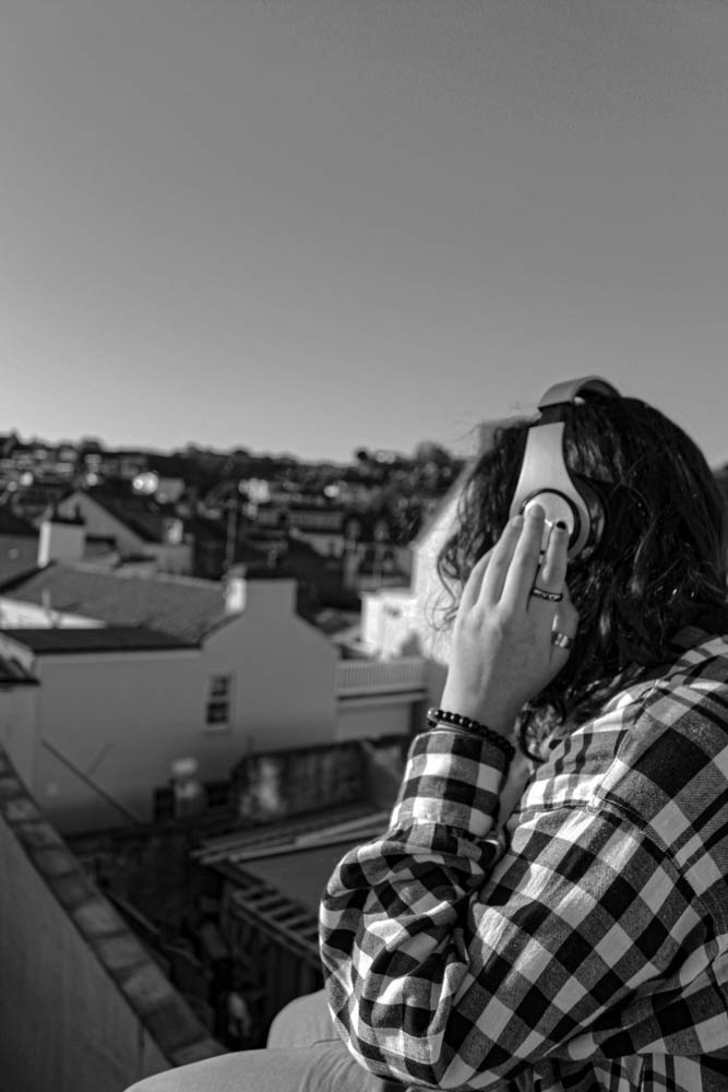
After
Final Edits


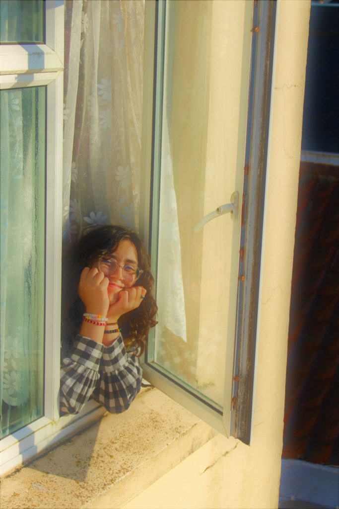


Try to capture your contact sheets and show them at a larger scale – the portraits with the book look really interesting but difficult to see! These might have been a more interesting direction to develop/follow?