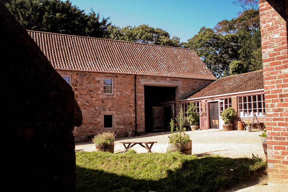
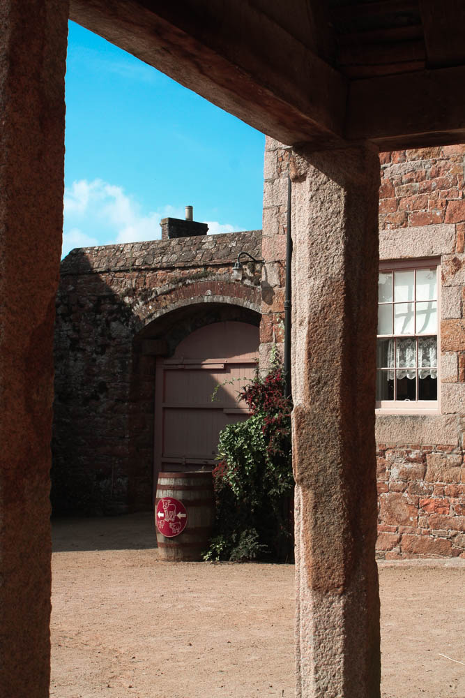
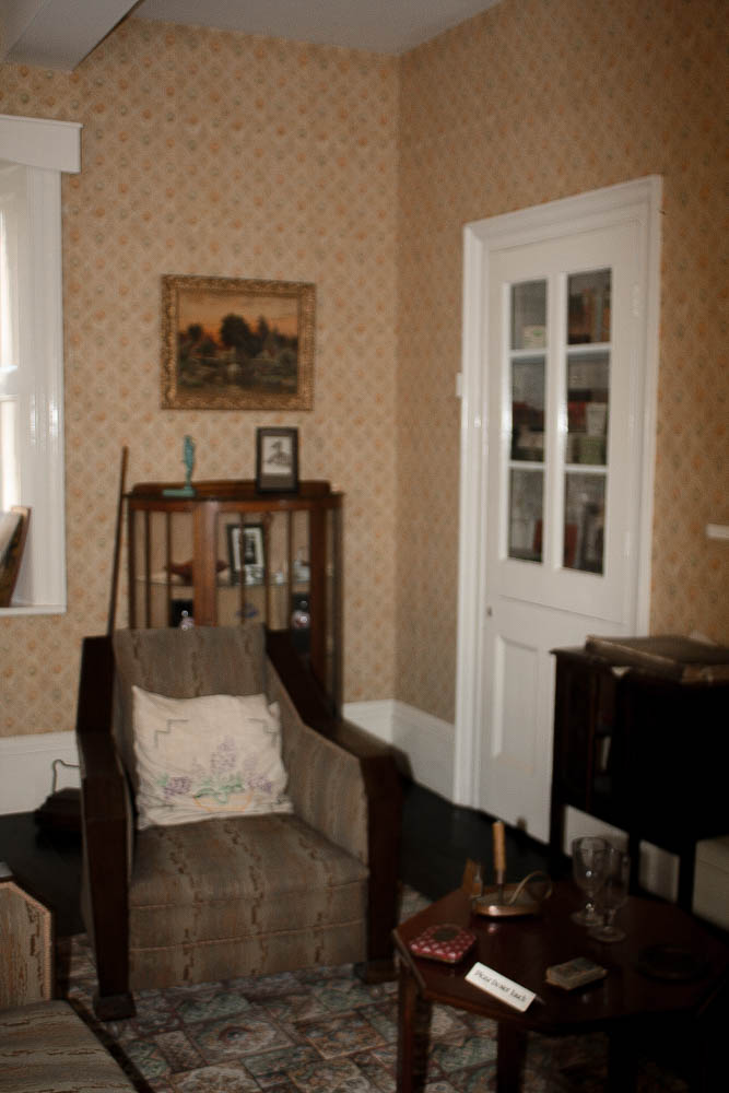
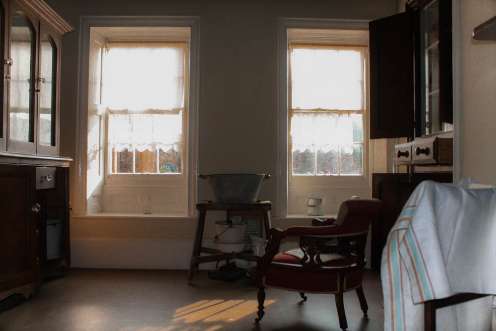
Whilst editing my photos of buildings, I tried to keep the lighting warm and bright in order to make Hamptonne look peaceful, inviting and almost nostalgic for the viewer.
Editing One of My Photos
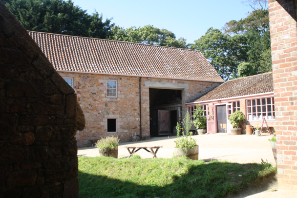
I chose to edit this image as I liked the lighting in the photo along with the framing. I felt as though I managed to capture a lot of the scenery around the building whilst still keeping the building the main focus of the photo. I thought I could improve the photo as it was slightly overexposed which made it difficult to see some of the details in the courtyard and the colours were also muted due to this.
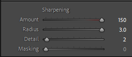
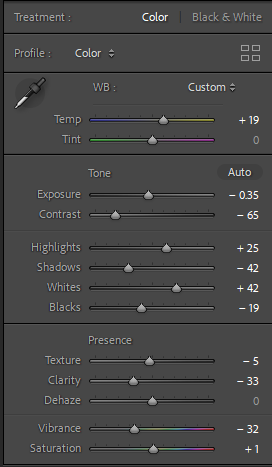
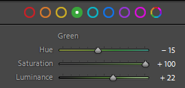
I started off the edit by decreasing the exposure slightly in order for the details in the bricks and trees to be clearer then increased the temperature of the photo in order to get a warm and inviting look. Next, I saturated most of the colours in the image so it would look brighter and more vibrant, making sure to keep down some of the yellow tones so it wouldn’t overpower the rest of the colours in the image. I finished off the edit by sharpening the image and increasing the contrast slightly so each object would be separated from each other and not one blob of colour.


My Final Edits
