HAMPTONNE OBJECTS

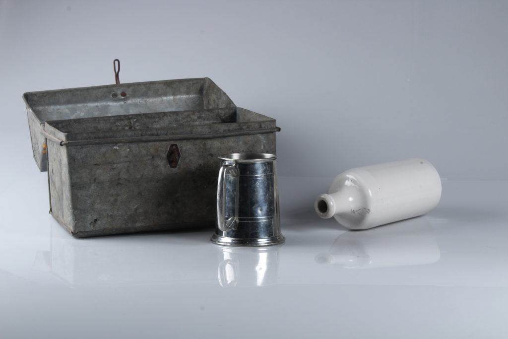
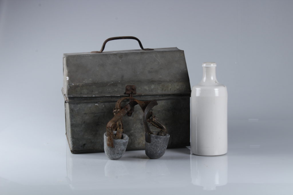
HAMPTONNE OBJECTS


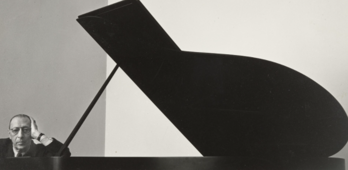
An environmental portrait is a photograph of a person, often posed, taken in a location that is individually relevant to the subject. Environmental portraits are frequently photographed in an everyday setting such as the home, place of work, or another personally meaningful locale. Good environmental portraits will tell strong stories of their subjects. Their immediate surroundings will give the viewer insight into where these people are, what they do, and who they are.
Paul Strand (1890–1976)
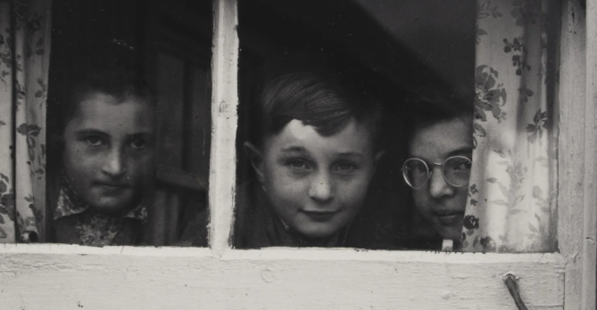
Arnold Newman (1918–2006)
Daniel Mordzinski (1960 — )
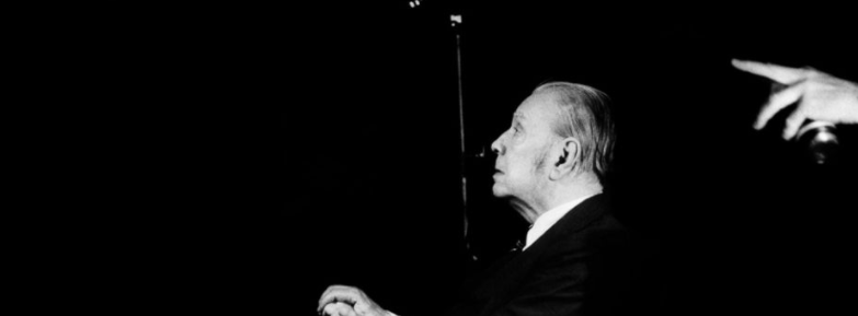
Michelle Sank
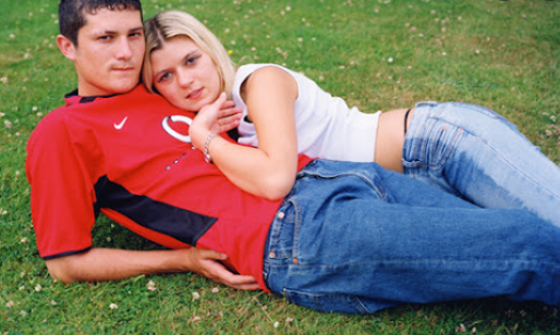
Annie Leibovitz (1949 — )
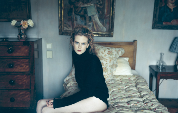
Mary Ellen Mark (1940–2015)
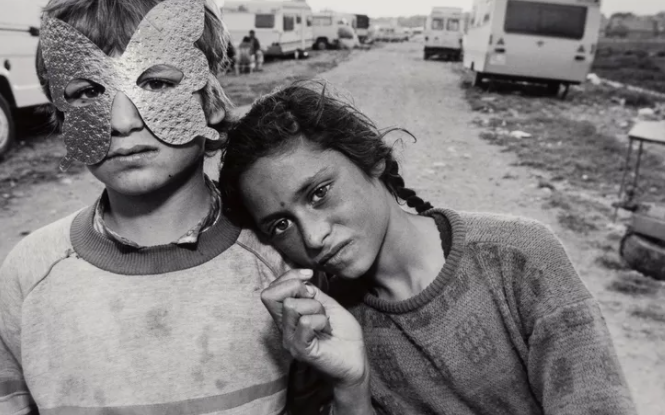
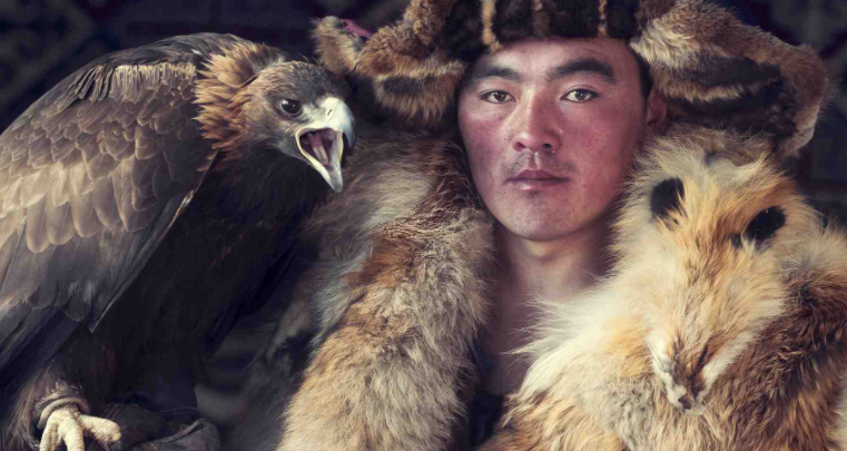
Jimmy Nelson (1967 — )
Sara Facio (1932 — )
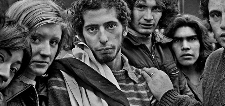

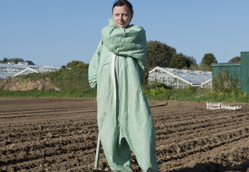
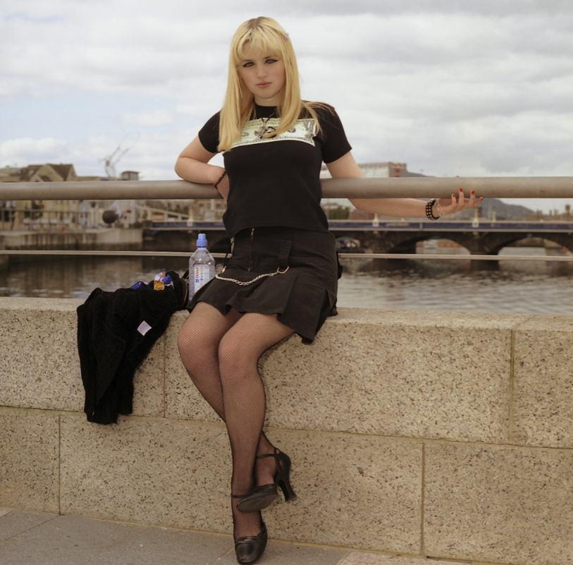
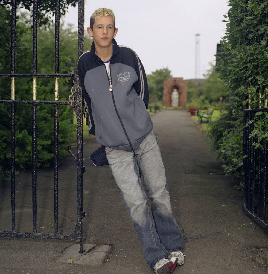
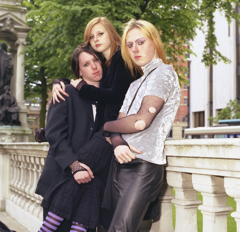
Michelle Sank was born in Cape Town, South Africa. She left there in 1978 and has been living in England since 1987. Her images reflect a preoccupation with the human condition and to this end can be viewed as social documentary. Her work encompasses issues around social and cultural diversity. ‘I am interested in how adolescence is marked by rites of passage that are reflective of cultural values and how this is expressed within ethnically diverse communities in the Black Country. I am exploring the way these rituals often mark a socially recognized transition to adulthood and responsibility and to some recognition of sexual maturity. I will document how these rites of passage can differ from male to female and how the emphasis on body image, performance and dress are a personal means of expression.‘ She has once visited Jersey and made a collection of photographs she took there, titled ‘Insula’.
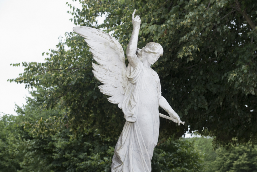
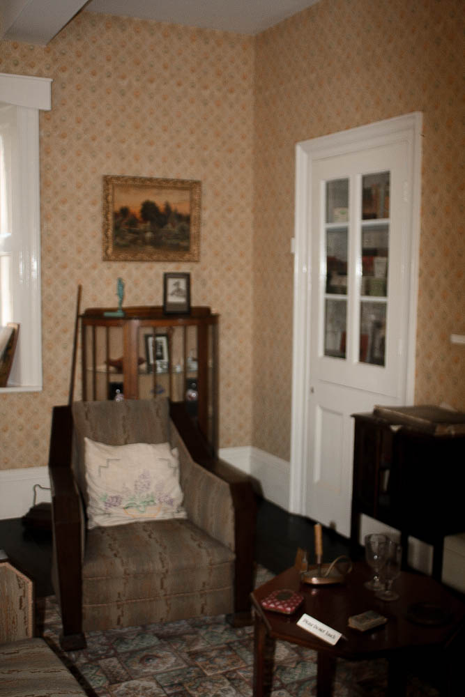
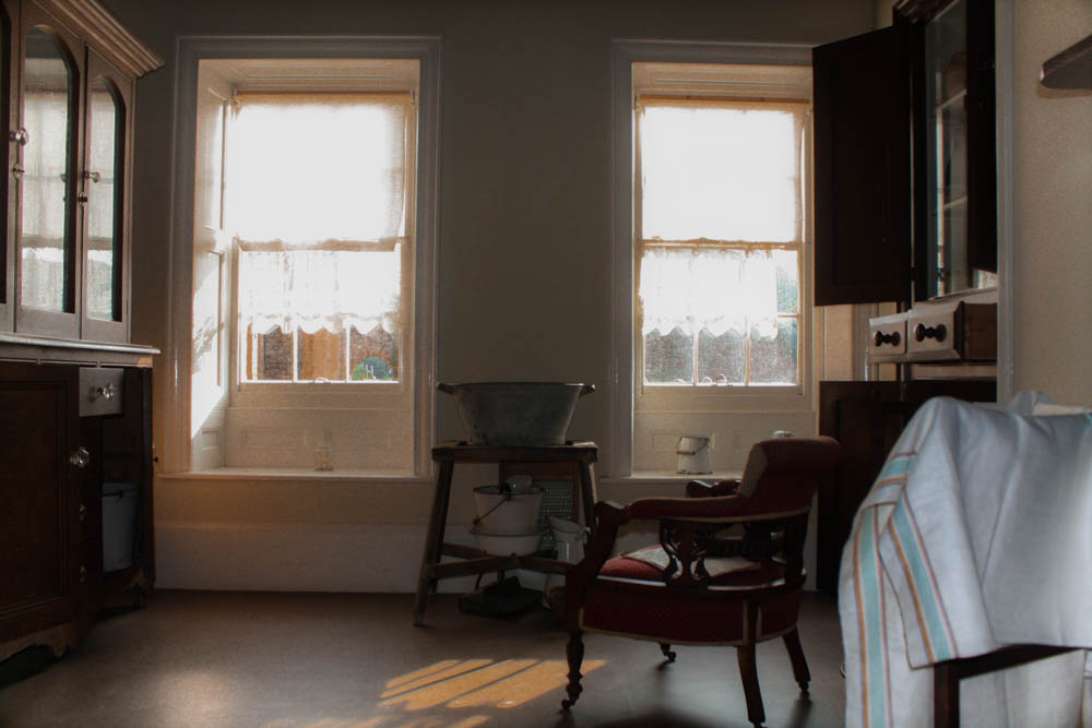
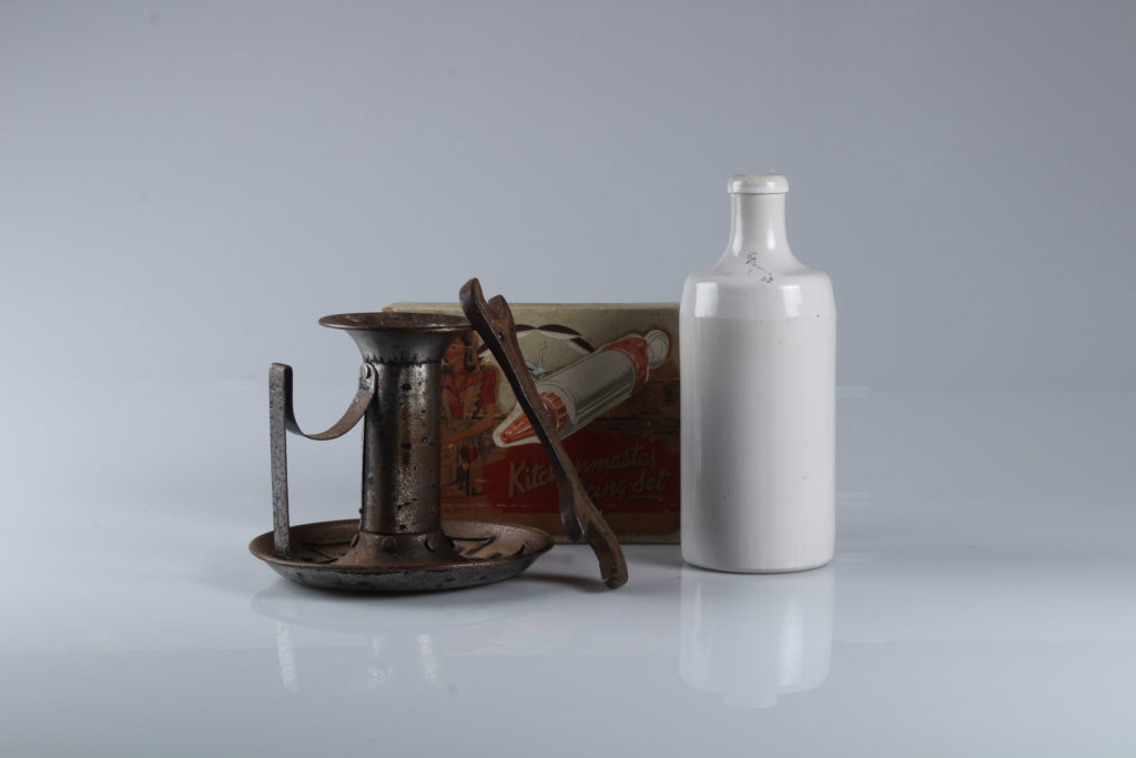
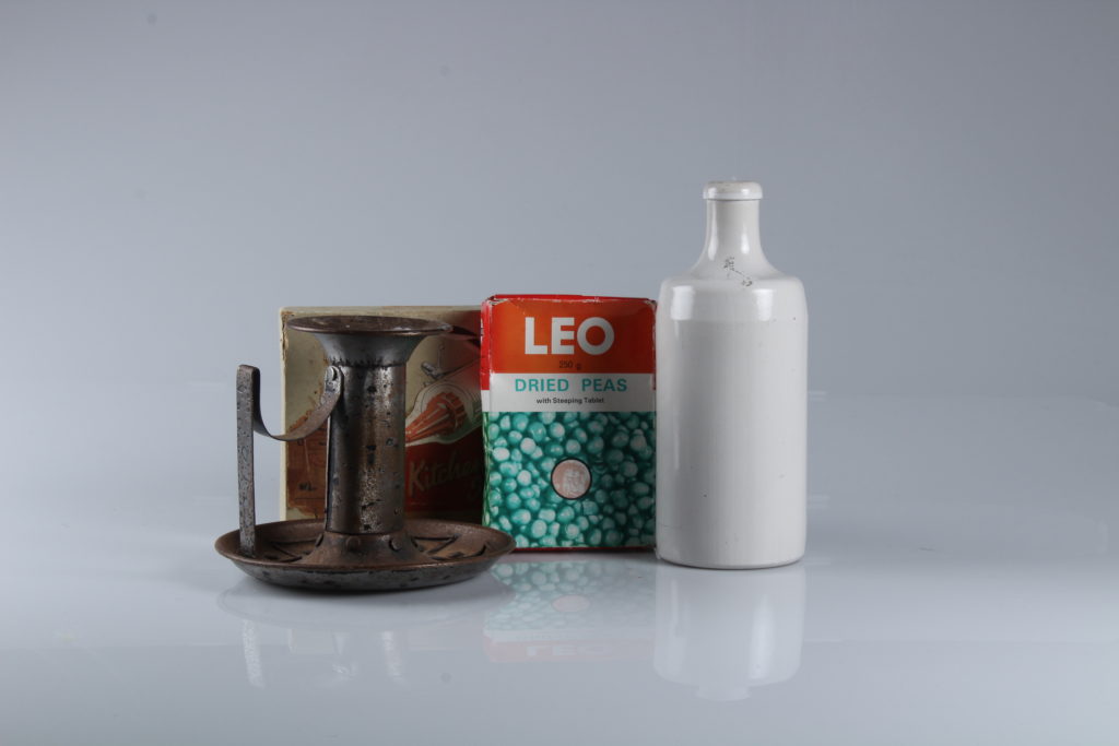
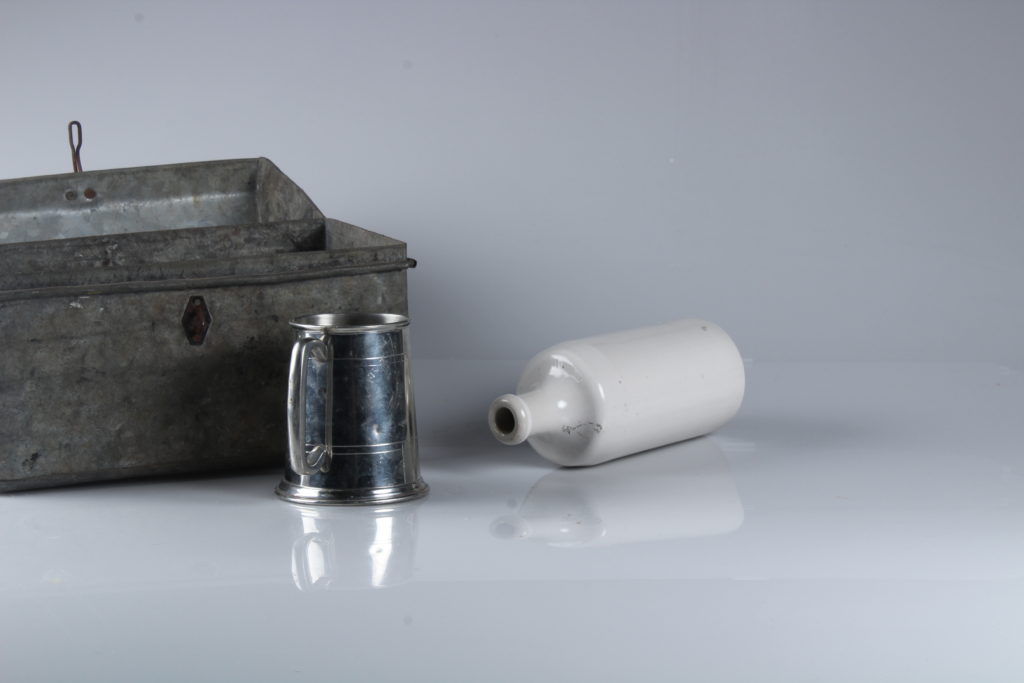
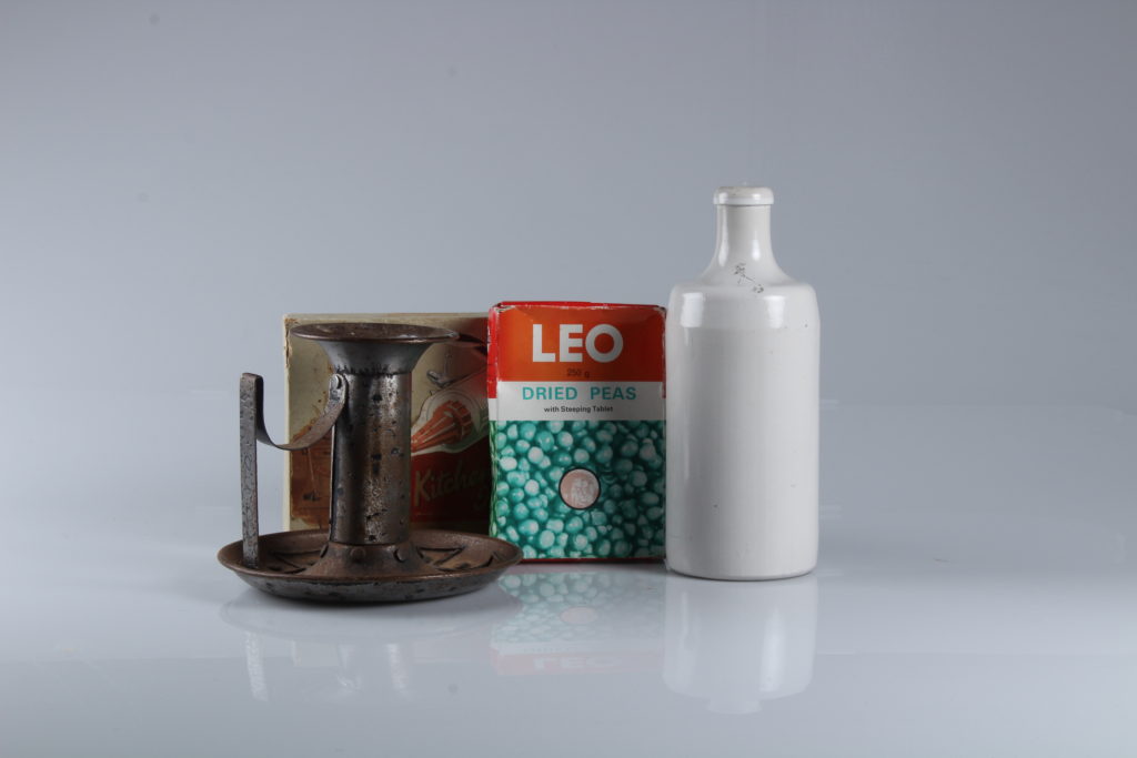
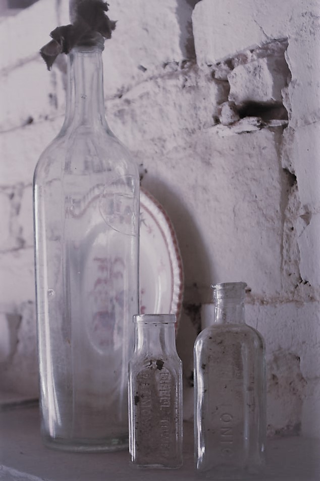
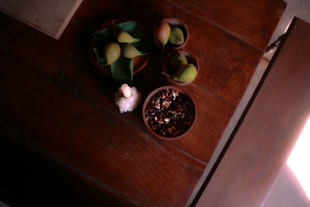
Whilst editing these objects I tried to enhance the colours that were already on screen in order to create a set of peaceful yet old images.
Editing One of My Photos
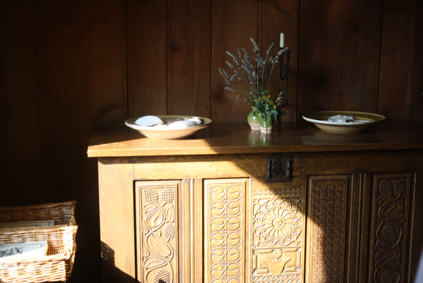
I decided to edit this image as I thought the framing and angle that the image was taken at looked interesting especially with the natural light falling upon part of the chest, enhancing the shadows and the details carved into the wood. I think I could enhance this image further by giving the light a warmer look [which’ll make the image look softer] then tint the shadows red so they don’t look clash against the light.
I started the edit by increasing the temperature of the photo, giving it a warm look before increasing the sharpness of the image, making it so the details of the chest and objects on the chest were visible. Next, I tinted the highlights so they were orange and made the highlights a subtle magenta which complimented the image nicely. I finished off the edit by adding a soft vignette, making it white as the image was already quite dark, which created a small light leak at the bottom of the image.
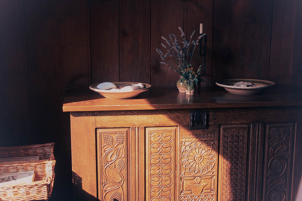

My Final Edits

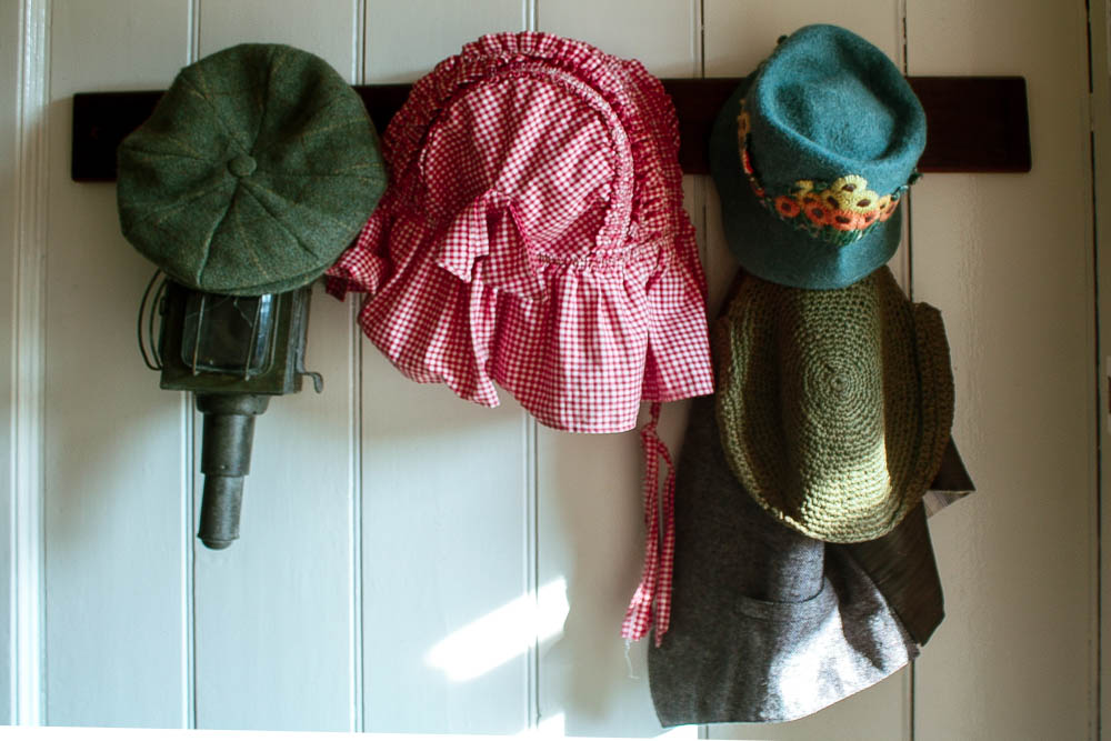
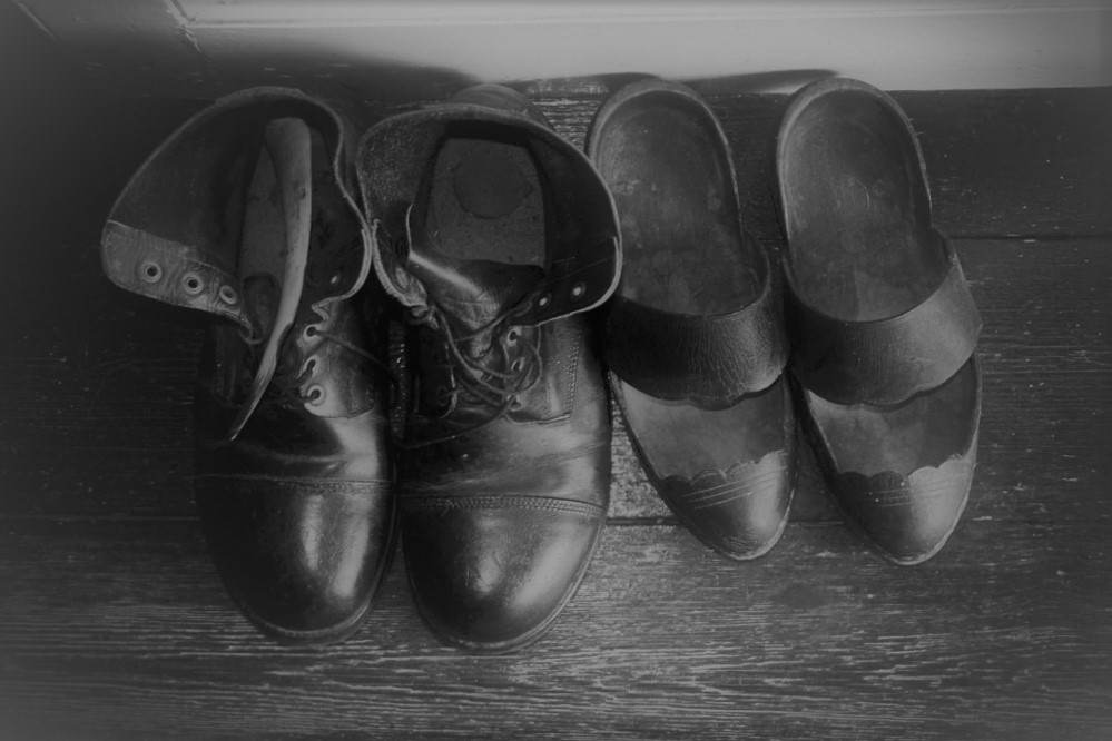
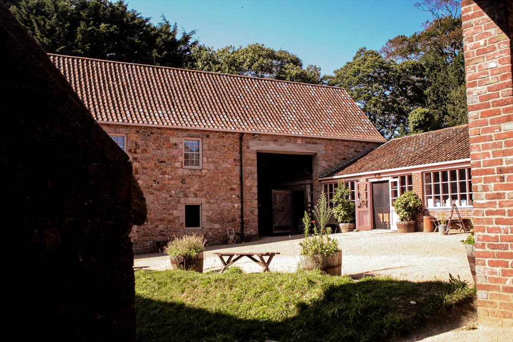
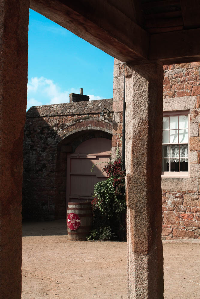
Whilst editing my photos of buildings, I tried to keep the lighting warm and bright in order to make Hamptonne look peaceful, inviting and almost nostalgic for the viewer.
Editing One of My Photos
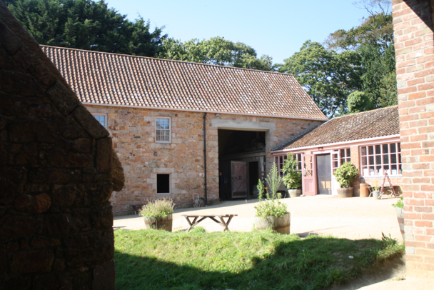
I chose to edit this image as I liked the lighting in the photo along with the framing. I felt as though I managed to capture a lot of the scenery around the building whilst still keeping the building the main focus of the photo. I thought I could improve the photo as it was slightly overexposed which made it difficult to see some of the details in the courtyard and the colours were also muted due to this.
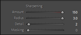
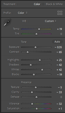
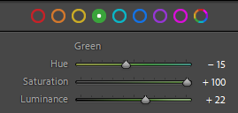
I started off the edit by decreasing the exposure slightly in order for the details in the bricks and trees to be clearer then increased the temperature of the photo in order to get a warm and inviting look. Next, I saturated most of the colours in the image so it would look brighter and more vibrant, making sure to keep down some of the yellow tones so it wouldn’t overpower the rest of the colours in the image. I finished off the edit by sharpening the image and increasing the contrast slightly so each object would be separated from each other and not one blob of colour.


My Final Edits
