Walker Evans

Walker Evans Image Analysis
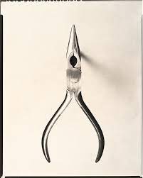
This is an image by walker evens. it has been taken in the photographers style which he is recognised for in many of his photoshoots. This image has been taken from above in a birds eye view style. this captures the shape and shade of the image very well. the ground shadow of the object has been minimised by raising the object off of the surface by placing smaller objects such as small balls off tape underneath. This image is centred in the photo which ensured it is the only object of interest in the photo. This photo has either been taken in black and white or transformed into grayscale during the editing process of the image. This could have been to enhance the contrast in the image as back and white shows more difference in shade to colour images.
My Object based photoshoot
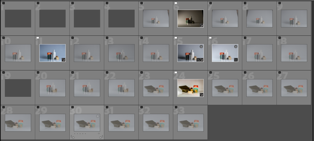
MY FINAL IMAGES
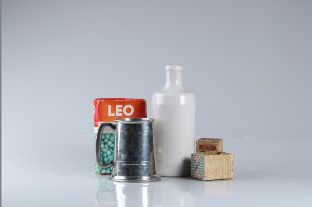
For this image the studio was set up with a white infinity curve to give the impression of an infinite white room. We had two flashing LED studio lights set up on either side of the objects at a roughly 45 degree angle. This setup eliminated shadow. The is because the one light shines on the other lights shadow so it doesn’t show. the camera was on a tripod to eliminate shake and blurring. When editing this image I lifted the contrast to bring more depth to the photo and create a more cast colour pallet.
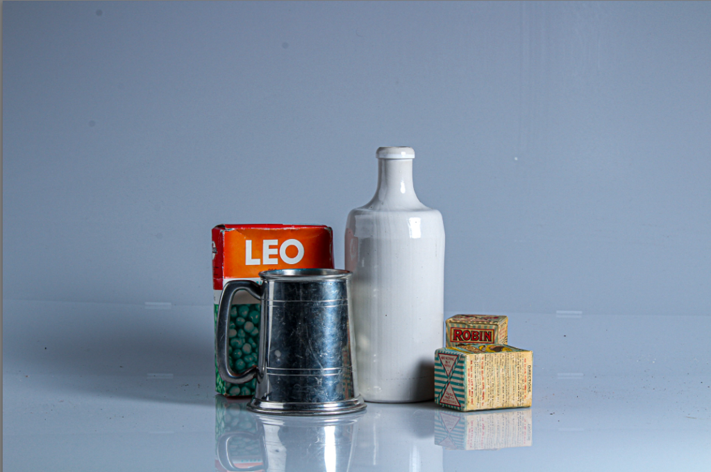
On this image I used the same set up however we deactivated one of the lights. This resulted in us getting a more ominous effect due to the darker shades, larger shadows and higher contrast. In Lightroom Classic I brought the exposure and highlights down to prevent the reflection on the shiny surfaces overwhelming the image. This also increased the contrast between the now darkened background and the lighter areas of the objects.
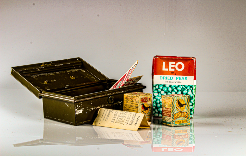
This image has a old rustic look which suits the objects within the image as they are from the second world war. This was achieved by moving the lights to get more influential shadows and stronger reflections which I think makes the image look as though it is in water. In Lightroom classic I added more contrast to make the colours pop out over the white background. I also increased the presence to make the textures of the objects clear and show the items age.
