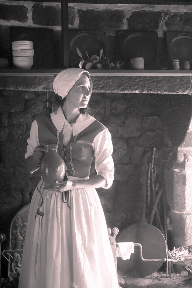
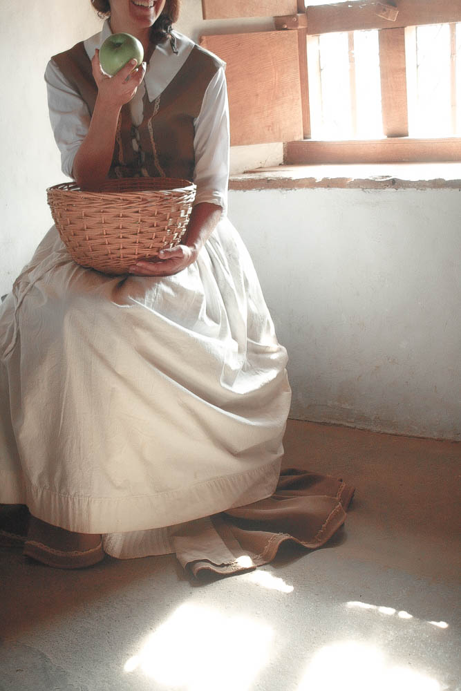
Whilst editing the portraits, I tried to make each photo seem different by using different contrast strengths and different colour schemes for each image, making some more saturated then others in order to experiment with what I like best.
Editing One of My Portraits

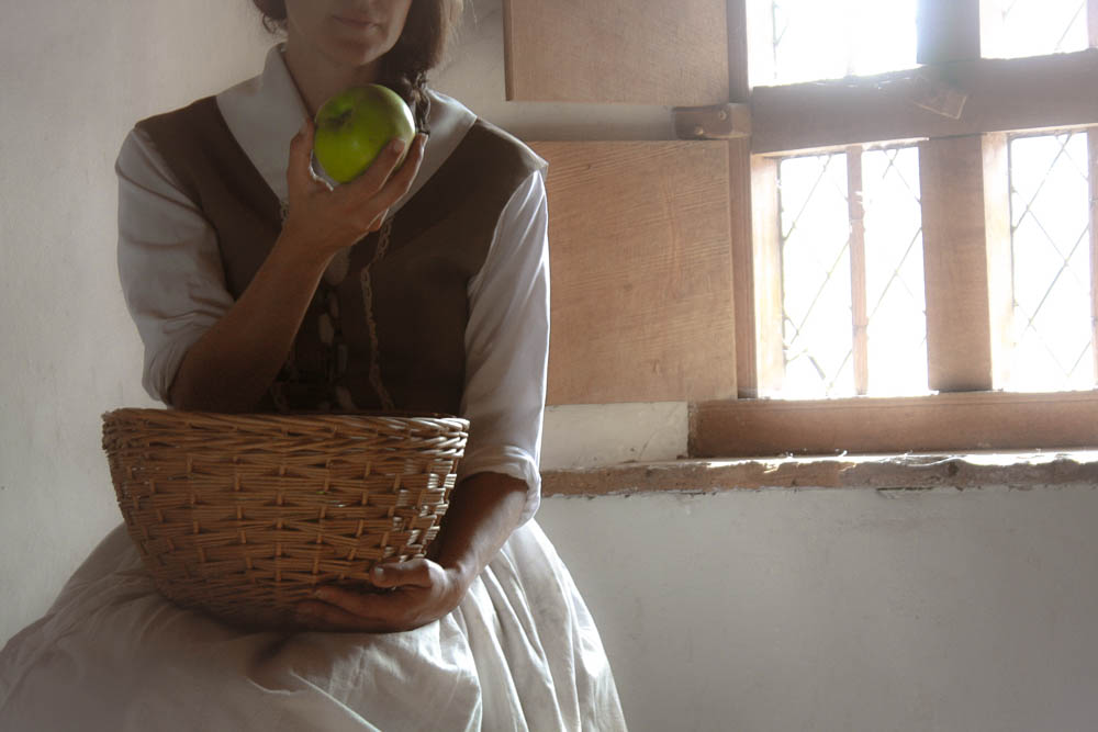
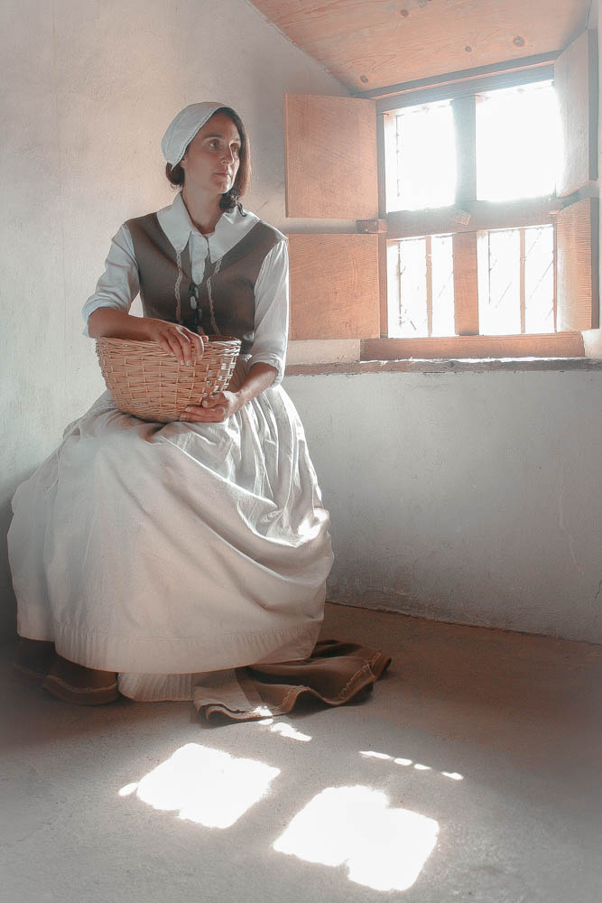
I chose to edit this image as I liked how the model was slightly off centre and out of frame as I thought it could tell an interesting story. Along with that I also liked how she was posed with the apple and basket. I felt like I had decent lighting and could improve upon this image further by adjusting the colours and exposure especially since I got the window in the background which could further add to the story.
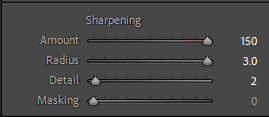
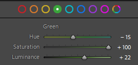
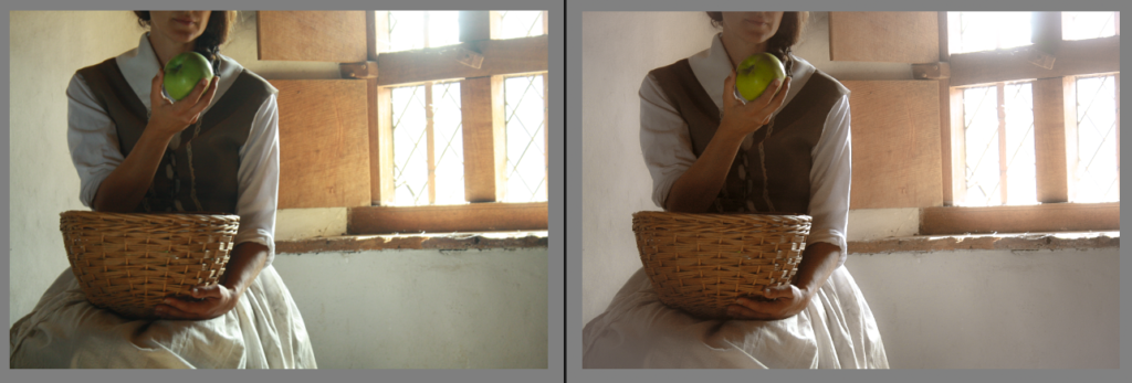
I started by sharpening the image so the details could be clearly seen before changing the temperature of the photo in order to give it a colder look. I then went onto changing the lighting by increasing the highlights and decreasing the shadows and contrast and vibrance in order to give the image a soft and dreamy look. Next, I desaturated most of the yellows in the image so it wasn’t overpowering everything else in the image, especially as I wanted the apple to be the brightest thing in frame.
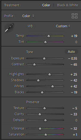
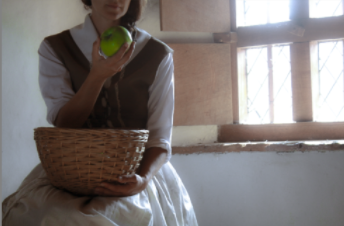
Finally, I finished off the edit by increasing the temperature [as the yellows were no longer as bright] and added a subtle white vignette which gave an almost vintage look to the image and added to the dreaminess of the photo.
My Final Portraits:


Excellent blog posts, you may want to explore aspects of tableau vivant and even the role of symbolism and metaphor in art and photography to extend your ideas and develop creative ideas here…