Introduction
The term is most frequently used of a genre of photography. By photographing a person in their natural surroundings, it is thought that you will be able to better illuminate their character, and therefore portray the essence of their personality, rather than merely a likeness of their physical features.
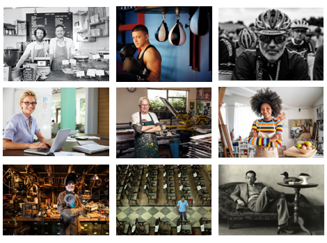
I have created a range of images to show my understanding of what an environmental portrait is, and my favourite ones. Here I selected a range from different professions to demonstrate that anyone can be apart of an environmental portrait and they’re not subject to more interesting jobs such as being a boxer.

Annie Leibovitz
Anna-Lou Leibovitz is an American portrait photographer best known for her engaging portraits, particularly of celebrities, which often feature subjects in intimate settings and poses. Her most famous work is Demi Moore, 1991. When Leibovitz photographed the movie star for the cover of Vanity Fair in August, 1991, editors at the magazine were concerned about how to hide the actress’ seven-month-pregnant figure. Accordingly, they asked that Leibovitz shoot a tightly cropped portrait of Moore’s face.

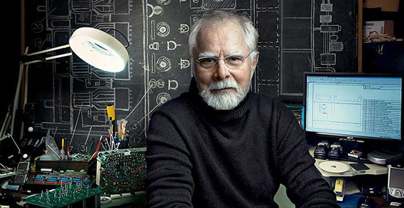
Leibovitz’s work consists of images such as the one below of Conny Dufgran, being photographed in his natural environment which looks like an office. I like how her work uses some well known people, making her work more well known. In addition, I think that the models have very neutral expressions is a smart idea as the image will age better and people can still focus on the surroundings of the image rather than just the person.
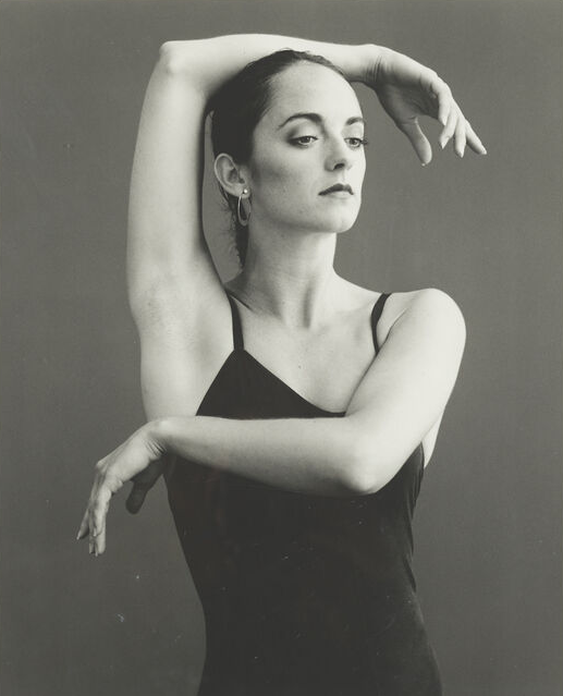
Below I have chosen one of my favourite example of Leibovitz’s work, the neutral expression mixed with the monochromatic edit makes for a classy image that portrays minimum emotions. In addition, we can appreciate how elegant ballerinas are through how simplistic this image is.
Photoshoot Plans
1st photoshoot (outside): I’ll ask my dad if I could take a photograph of him painting the outside of his house, around the time of late afternoon
2nd photoshoot (inside): I will take photographs of a family friend as he works in a bar in town. These images will be taken after school one day
3rd photoshoot (2 or more people): I have asked if I can photograph my aunt and her colleague as she works in an office in town. I hope to take these photos in the early afternoon to get the most use out of the natural lighting coming from the big windows in her office
Task
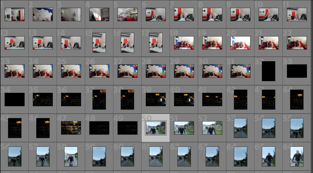
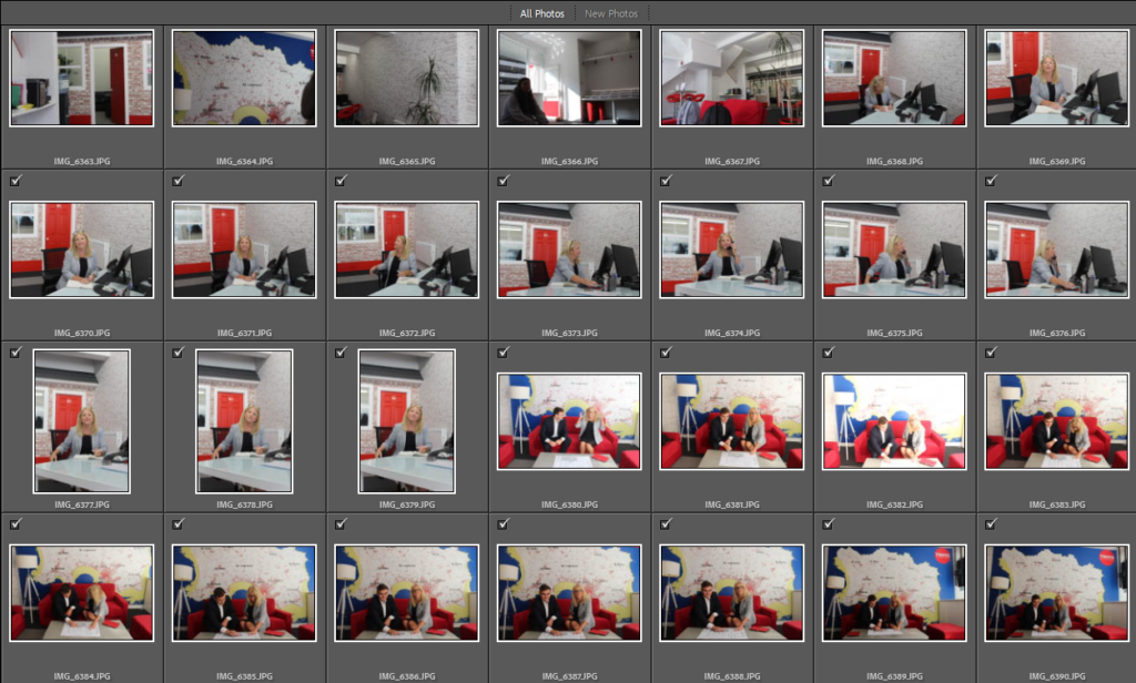
Below I have showed some of my contact sheets from my three photoshoots, the first outside with my dad, second inside with Noel and third with my aunt in her workplace. These are to demonstrate the variety and volume of photographs I have taken and how they were taken in a variety of lightings.
1st Photoshoot
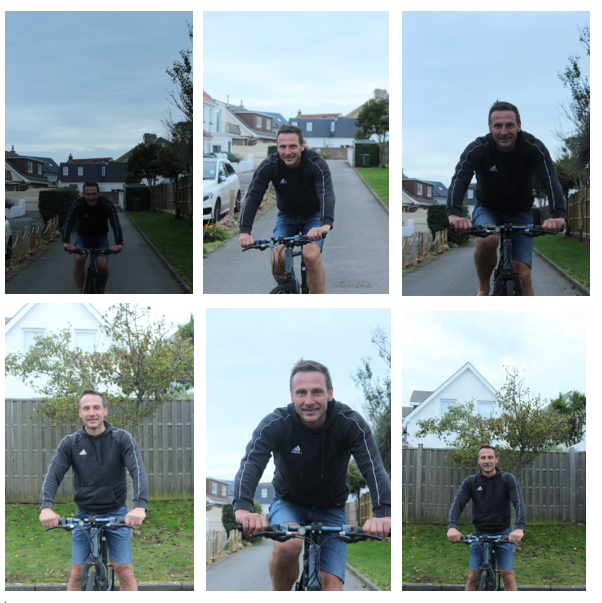
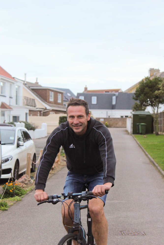
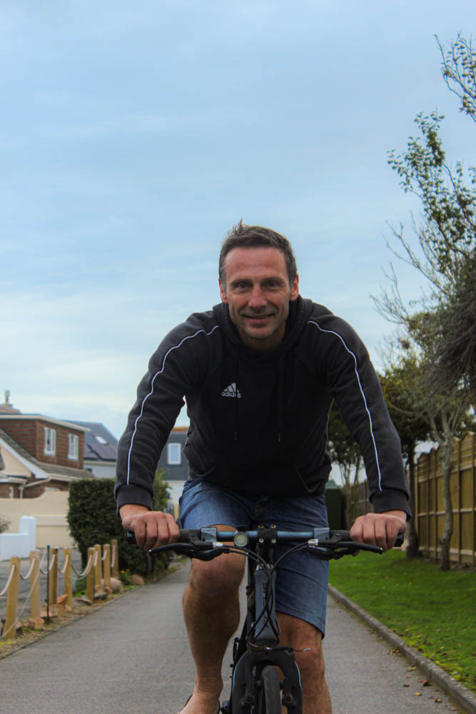
For my first photoshoot, I have selected to photograph my dad outside his house in St Clement. I decided to photograph him on/ riding his bike, I have chosen to do this as my dad rides his bike to work every morning, as also enjoys taking my brother on longer bike rides around Jersey, especially the countryside, for some exercise and fresh air. Above I have selected some of my best photographs to create a mini gallery to illustrate my work. Furthermore, I photographed him during the mid afternoon to attempt to get the best lighting despite it being a gloomy day. I think the top right and the first 2 photos on the bottom row have the potential to be the best after being edited in Lightroom Classic as i like the angles at which they were taken.
Editing
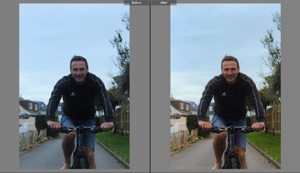
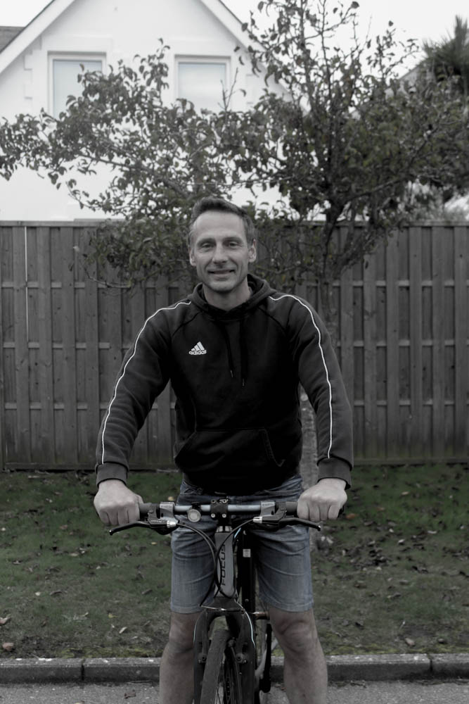
Above I have illustrated how I edited just one of my final images of my dad on his bike, I have adjusted the contrast and the exposure of the image to make it look like the original images were taken in the middle of the day rather than the afternoon. I like how the clarity of the image is mow higher and how the colour in the surroundings is now more apparent. Furthermore, the composition of the image above is aesthetic as my dad is in the middle of the image making it symmetrical.
Final Images
I have selected these for my final edited images as in my opinion the have the best compositions, as my dad is in the middle of the largest one above. I think that the image I made monochromatic looks more washed out and the image didn’t really turn out aesthetic. My favourite is the largest image above as the editing on this image makes the background colours more saturated, whilst the black tones in the foreground make my dad appear as if he very close to the camera compared to where he was actually positioned when this photograph was taken.
2nd Photoshoot
Artist Reference
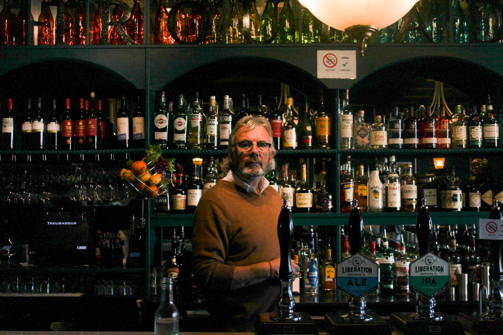
Here I have included a comparison of Noel and one of Annie Leibovitz’s work to show how I used her work for inspiration for my photoshoot, I like how her environmental portrait against mine look oddly similar and how the layout looks aesthetically pleasing. I like how the main focus of the images is the main person in the photo, and how the focus is mainly one thing (the person) whilst the background is still prominent and an important aspect of the images.

Images
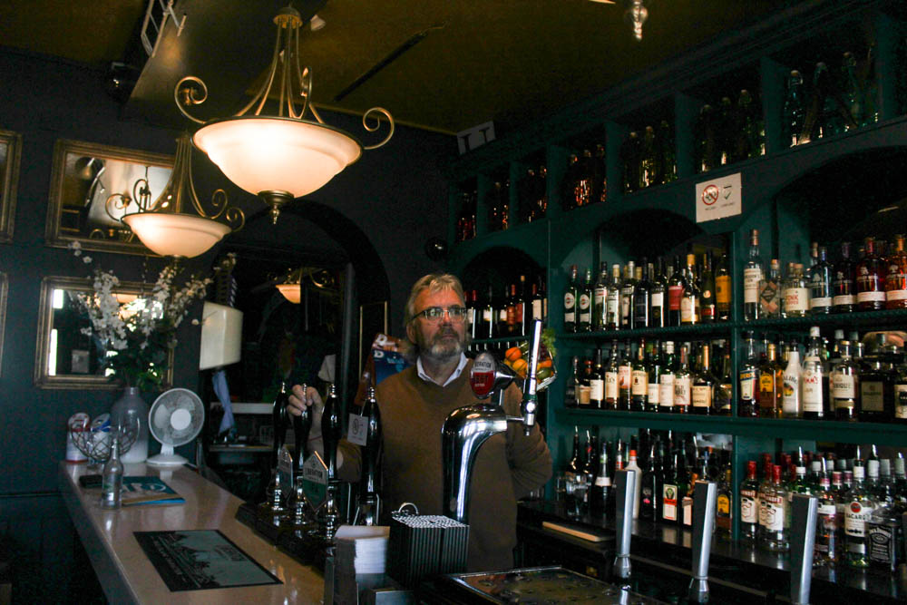
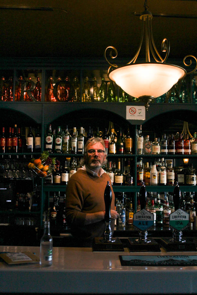
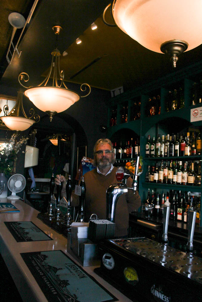
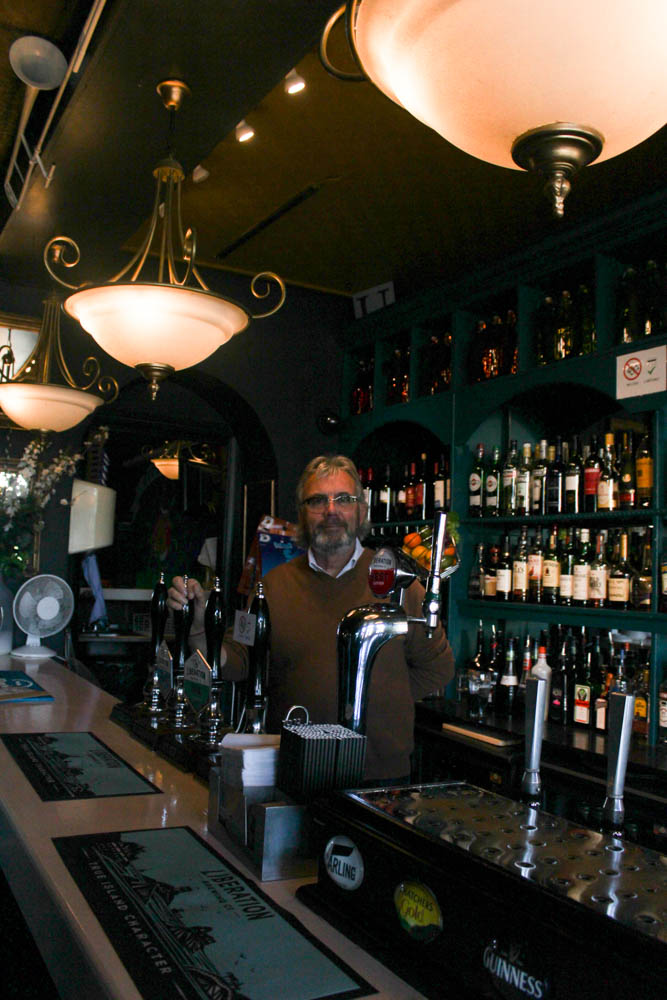
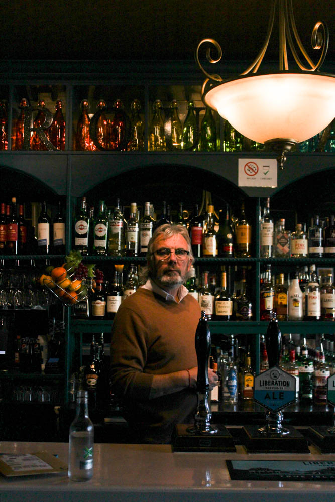
For my second photoshoot, me and my friend went to take photographs of Noel Flood whilst he was working in the Troubadour, a pub near the Royal Yacht that he owns. I decided to photograph Noel for this environmental portraits homework as i thought a bar would be a good option as it represents an average job on the island, and I could also get some nice backgrounds. Furthermore, I took photos of Noel around later afternoon, but the natural light didn’t really affect my images as the bar was lit with lots of unnatural lighting which turned out good for this photoshoot.
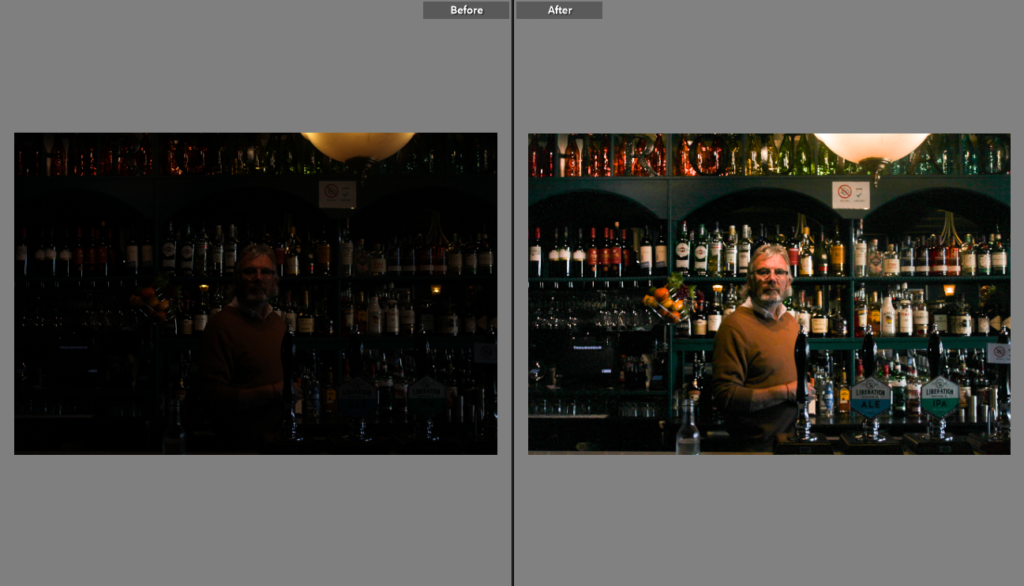
I have firstly edited all of my images that I took of Noel in Lightroom as when I took my images I was unaware that the shutter speed and was far too high and IOS was too low. This is just a starting point so I can easily see my images of Noel before adjusting other settings such as vibrancy and light balance.
Here I chosen the best of my images to edit, as most are too dark I have firstly increased the exposure to now make the images legible. I am going to edit the top and bottom right images as they originally have the most clarity and range of colours. My favourite part of these images are the background, as the ranges of tones and colours in the bottled behind make for aesthetic photographs. In addition, as I adjusted the saturation, the background becomes more vibrant as contrasts against Noel making for interesting final images.
Final Images
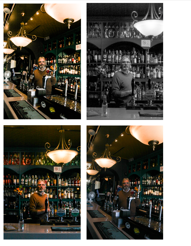
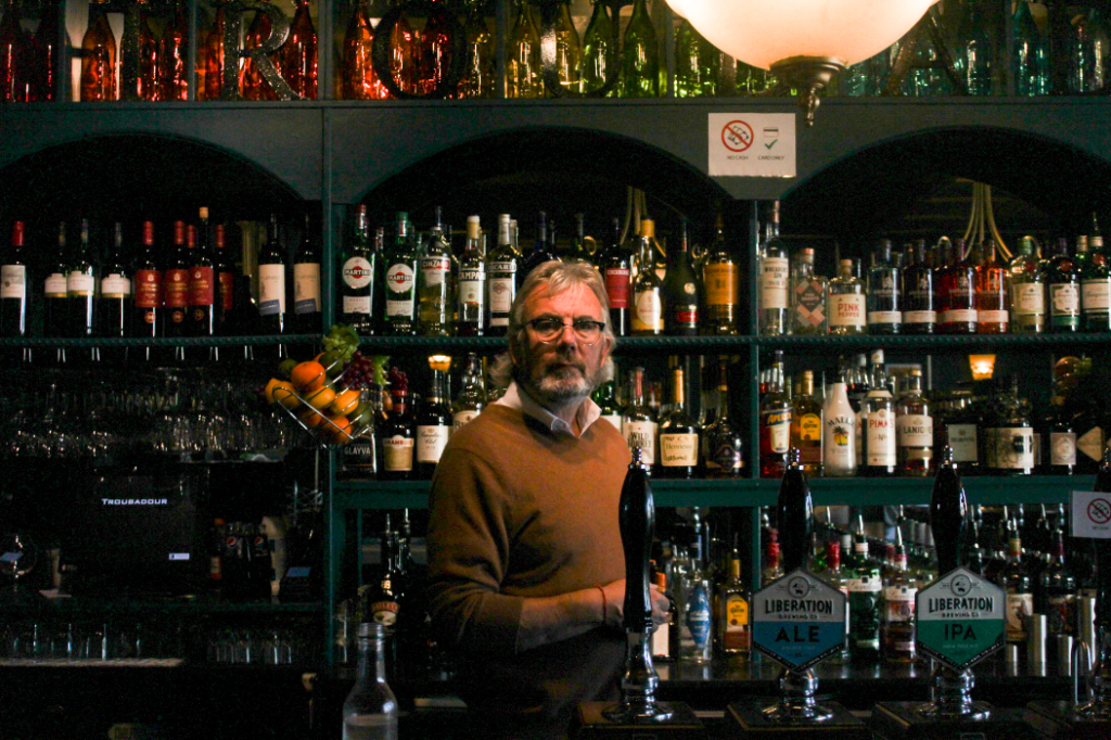
I have selected these as my final editing images as the middle of the image is the lightest, where Noel is standing, which gives the photograph a large focus point. Furthermore, Noel is looking straight into the camera and this image is one of my most symmetrical and I like the dim lighting as it’s not harsh and overpowering. the exposure in the third image in the four above is perfect and this is my best portrait photograph. I like how my final images turned out and overall taking photographs for this homework was enjoyable.
3rd Photoshoot
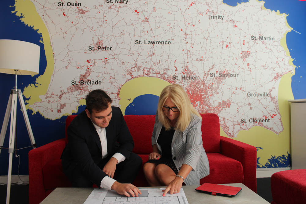
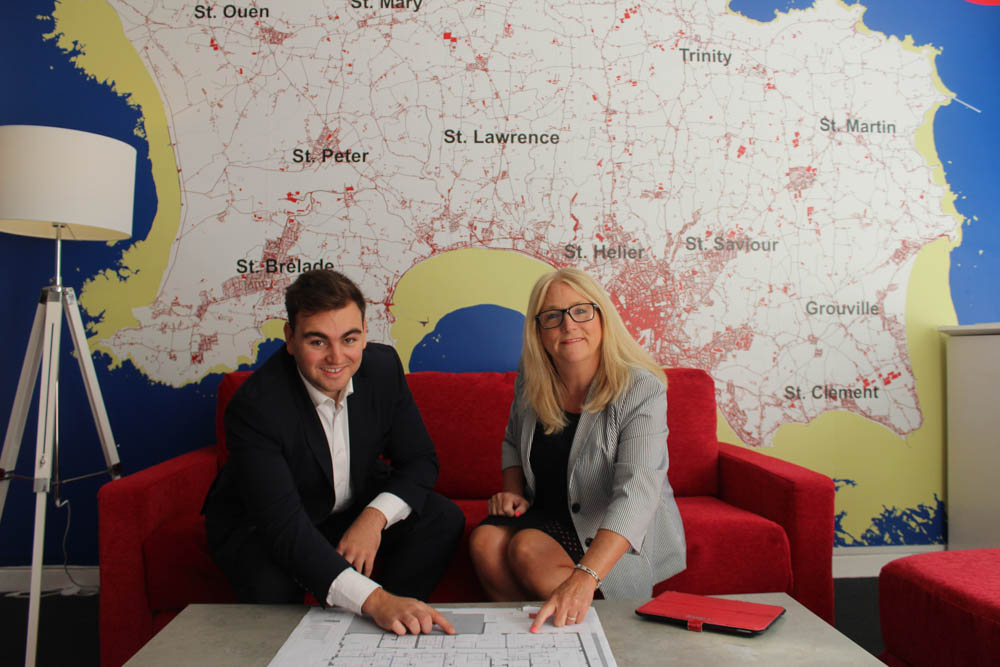
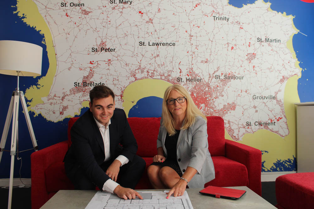
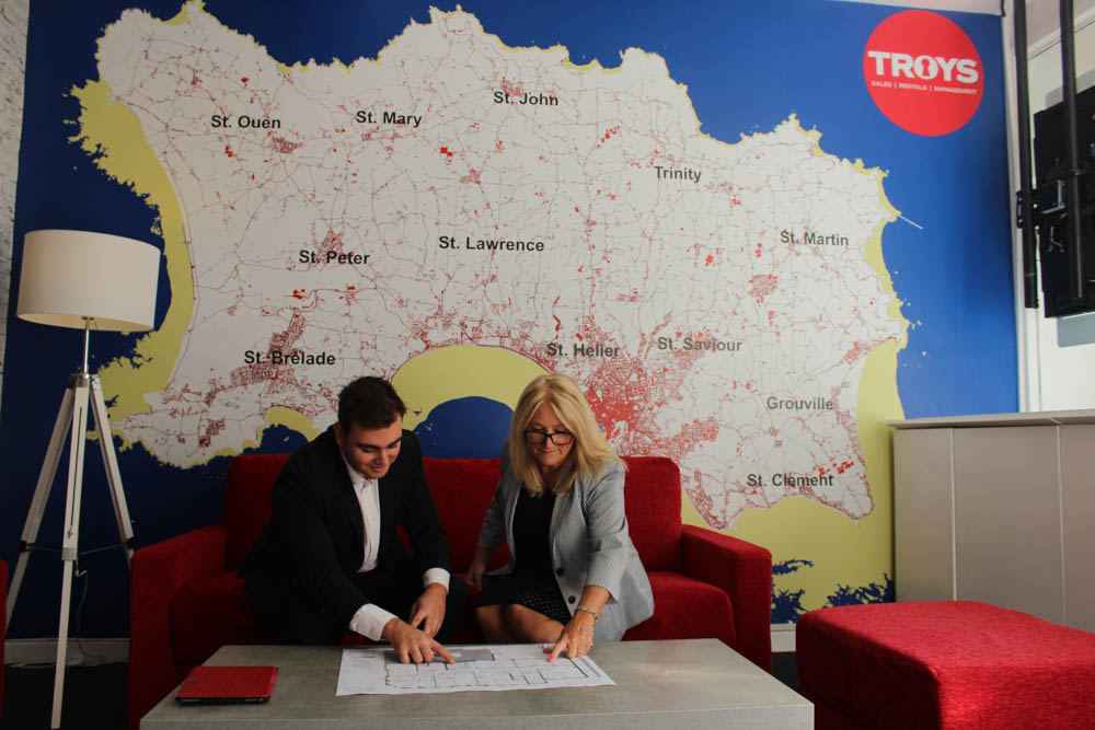
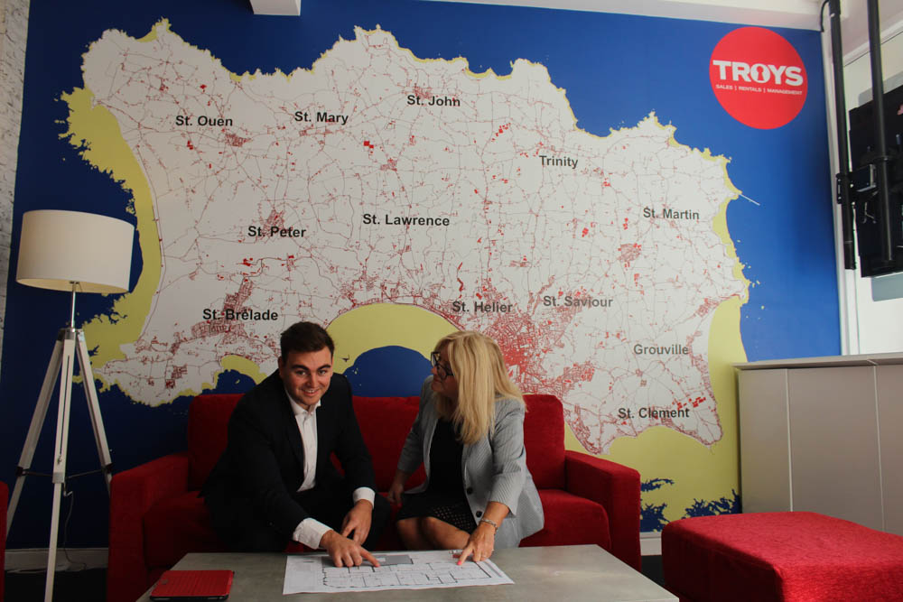
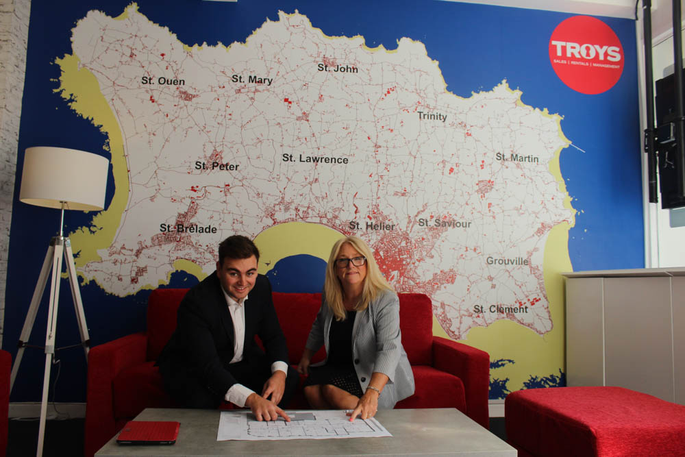
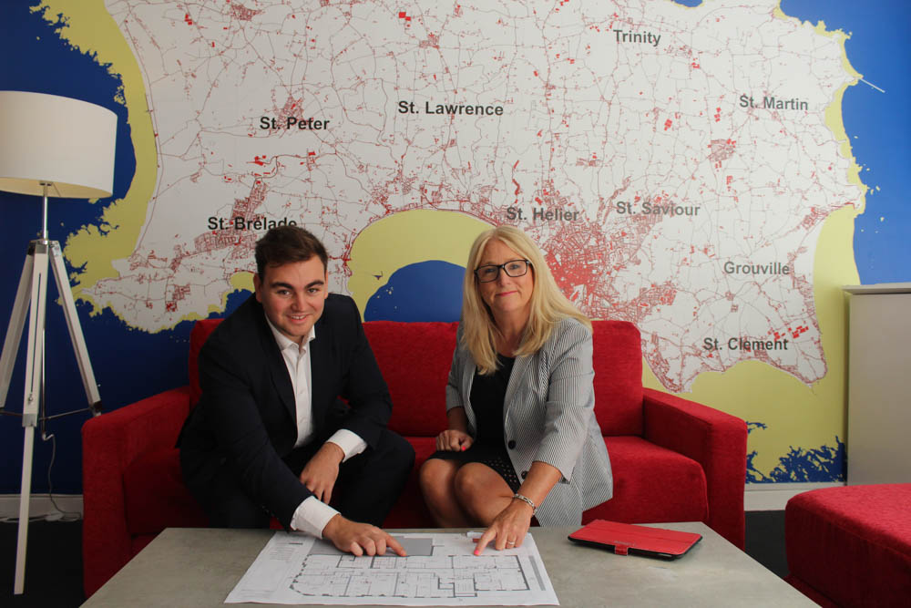
Maggie Beaumont and Sam Putka in their workplace, Troys estate agent
Here I have created a gallery of images to show how I took photos of my aunt and her co-worker. I like how the photos are all bright even before being edited, and how the red in the furniture matched with the Troys sign in the background and the red road lines on the map of Jersey, unintentionally making the image more cohesive. In addition, they look very happy to be photographed whilst they are looking at construction plans.
Final Images
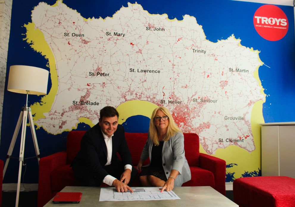

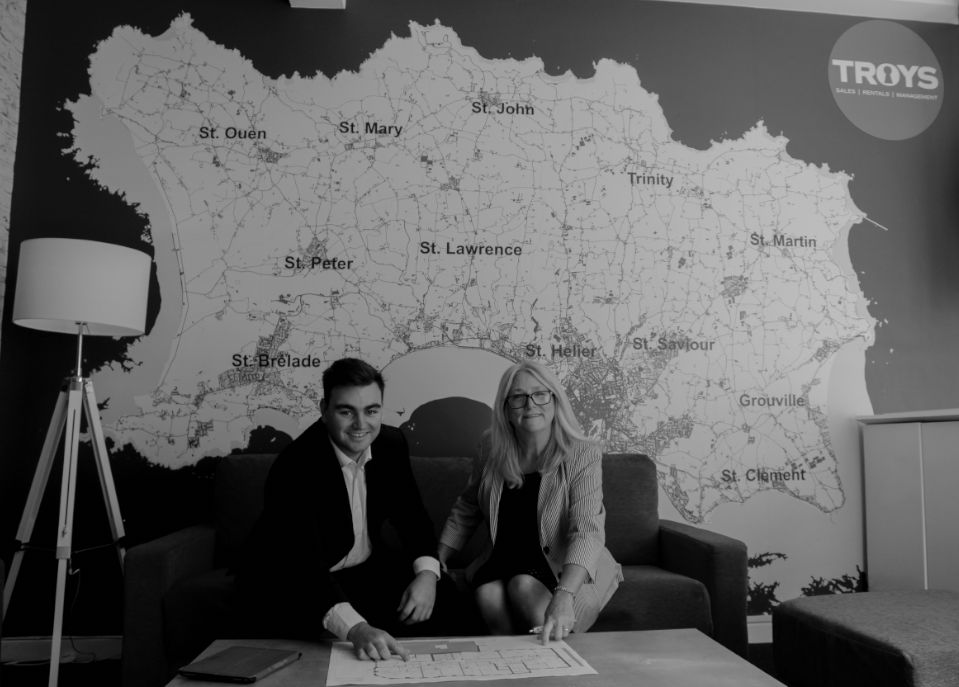
I have selected these as my final images as I believe the composition, lighting and general effect of these images are the best. As you can see the monochromatic effect doesn’t help the image at all, making it dull and i think this image isn’t aesthetic. In my opinion, the first image of these 4 is the best.

