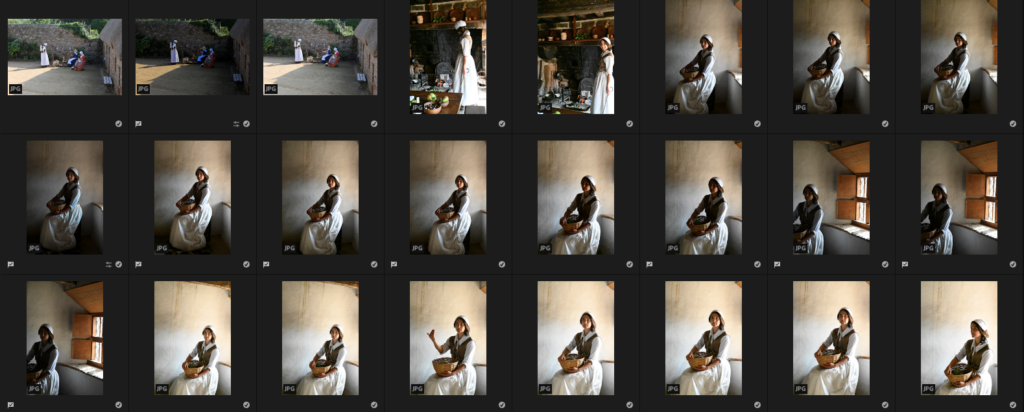
When I visited Hamptonne, we experimented with taking photos with the help of a Jersey Photographer called Tom Kennedy. He helped and taught us about how to use the natural and forced lighting and how it can change a photo to look like a painting. I enjoyed working with Tom Kennedy and the skills which I have used from him I will consider and transfer into my other work as some of the techniques and tips were quite helpful.
My photos

In Hamptonne, I began by taking a few photos of the women outside Hamptonne who were spinning wool on a wheel and looking quite casual which would look like an activity they would have done in the farm to help their families make money and create clothes fir them as well. Then I focussed on photographing this woman who acted as a housewife and with the help and influence of Tom Kennedy who began by showing us how to create a perfect photo that looks like a painting and how the lighting can change due to being in various places in the house holding different objects and carrying out a range of poses.
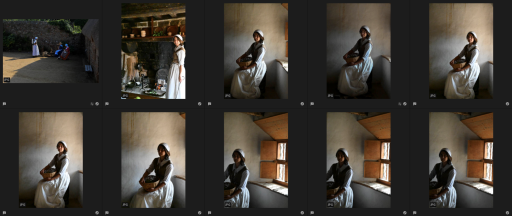
Best shots –
Then I went onto Adobe Lightroom and use “Z” to pick out my photos from the “Portraits” subfolder of “Hamptonne” that I created which I thought were my most successful ones where I could experiment editing the lighting/tones/contrasts/etc and then changing them into black and white and comparing which versions I like more.

Experimenting and comparisons
Photo 1 –

Before 

After 
Changed into black and white
For this edit, I really liked how it turned out because of the model who was caught naturally with a genuine smile on her face because it looks as if she is just carrying out a task from her everyday life with watching over the fire, which I created that homely maybe even over used feeling of the fire, that she made which can be used later on to make food for herself or her family.
I began by bringing down the exposure so that the overexposed part of the photo, which was created due to the sunlight became quite controlled and darker, then I used the contrast to make it darker as well. Then I used the highlights and whites which helped to bring back the sunlight which was lost due to this as I liked how it fell on her and created a nice glow on the surroundings too. I wanted to create the feeling as if the fireplace has burnt the surroundings of the ceiling and background, like it has been used a lot to create a homely feeling, so I used the shadows and blacks to create this coal-burnt effect on the ceiling and in the background behind it. If I were to try again with this edit I think that I could have tried to control the sunlight a little but more because it is still quite more over exposed then I would’ve liked it to be as it creates a glare on the photo which I don’t like.
I wanted to experiment with putting this picture into black and white because I wanted to create quite a dramatic atmosphere to be created from the effect of it. I think that this has been done but to improve I think that I could have experimented a little more with the contrasts and made the duller, grey/black tones darker to create a heavy contrast from the white tones, because I really like the effect it creates when editing a picture in that way. In my next edit of another photo, I will remember this and try to enhance my work so that this effect can be portrayed better.
Photo 2 –

Before 
Editing 
After 
Changed into black and white
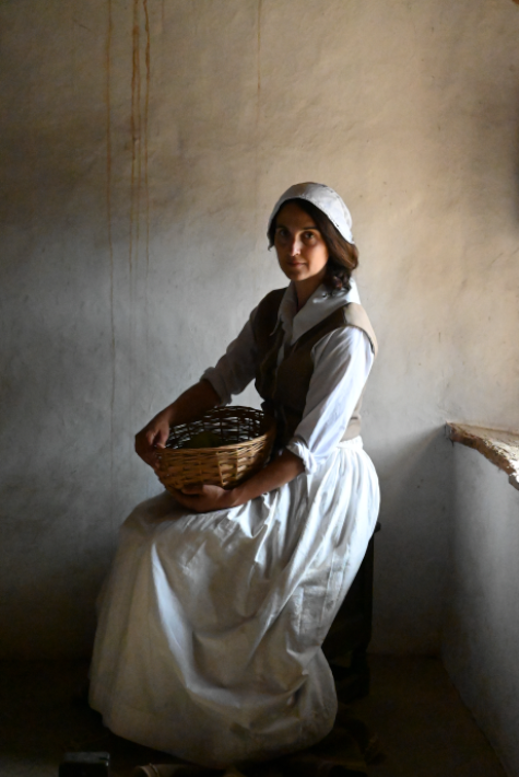
For this edit, which I created on Lightroom I think that the lighting and glare from the sunlight became controlled through the editing as beforehand it made the space next to the model look really empty and plain and then through editing it I really liked how it turned out because the details and creamy colours of the wall came through which I achieved through editing it. If I were to improve the edit, before turning it into back and white, I think that I could have centred it through cropping made sure that the editing didn’t make the lighting/colour of the wall to fall to a grey colour so that it would highlight the model behind her instead so that she would stand out well as she fades in to the wall instead.
In Adobe Lightroom I began by bringing the exposure and contrast down which made the lighting/tones of the photo darker because I wanted to create a gloomy effect instead of the warm, sunny one from the sunlight. I developed this editing further by using the shadows and blacks to create this darker border around her which you can see as it guides your focus towards her as the main subject in the photo. To control the sunlight which was creating this overexposed look on her outfit I used the whites and highlights, and by bringing them down it made it appear more defined and the finer details from the creases, became clearer to see which I really liked. If I were to improve this edit further again, like I previously said I would adjust the filters so that the wall doesn’t fall to a grey colour and I would crop it a small bit so that she appears more centred in the photo and I would get rid of the window ledge so that it makes the edit look more balanced and equal on each side.
To develop this portrait further, in Adobe Lightroom I changed the photo into black and white. I did this through using the “monochrome” option which transforms the photo, I then adjusted the options further so that it made the edit look quite balanced and to emphasize the black outline around her, which I really liked, I used the “Vignette” effect which added this darker hue around the portrait almost as if it is in a frame, which makes it look old and vintage. I really liked changing this photo into black and white as I like how I created a high contrast between the darker and lighter tones as it creates points of the photo which attract your attention well as they stand out.
