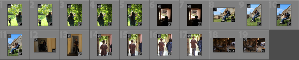
On photoshop I wanted to experiment with creating a gif on photoshop, with the images of the still life objects and other various ones which I took at Hamptonne so that there is a variation of photos.
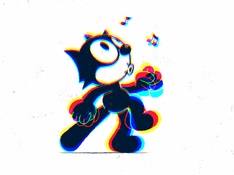
Example of a gif where 3 or more pictures are included to make the cat look like its walking.
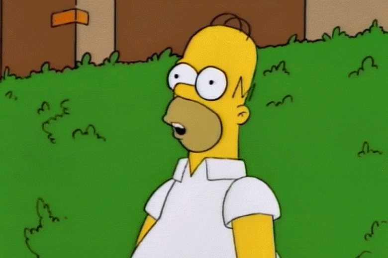
A Simpsons gif which includes 3 photos put together.
Here are the instructions of what I followed so that I could create it:
1. Create layer for each image 2. Window > timeline 3. Select > Create Frame Animation 4. Drop Menu > Make frames from Layers 5. Timeline > select Forever 6. File > Export > Save for Web Legacy > reduce image size to 720 x 720 pixels
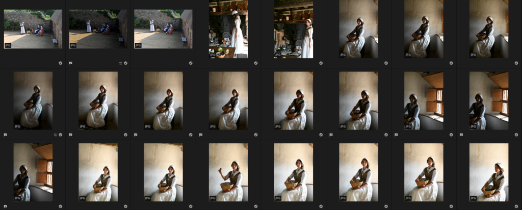
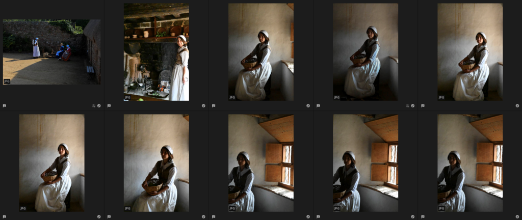
My photos that I will use
For my 3 photos that I will use, I will choose them from my photos which I had chosen to be my most successful on Adobe Lightroom from Hamptonne and Still life objects.
Editing –
I really like the way all 3 of these images have turned put as the lighting, which was over exposed due to time of day from the sunlight, has been controlled nicely which shows them to appear more detailed and clearer which I wanted to do so that they would be able to work well within the gif.
My gif
Here is the gif I made in Adobe Photoshop, I really enjoyed making it because it is able to show all of the different aspects/places which we saw at Hamptonne. It is a really unique way of revealing Hamptonnes heritage as the gif creates a story which shows the historical figures carrying out their daily activities, the lady who would look after her house in a portrait to represent her connection to the house which is linked through the picture of the interior. I also think that all of the photos compositions, filters, lighting, etc work well together as they create natural, warm tones from the sunlight which create a calm and comforting atmosphere, helping to enhance the story which the gif is creating to the viewer.
There was a range of objects which were found at Hamptonne, such as horse riding objects, shoes, clothes etc and it was really interesting seeing how well most of them have been kept. For these edits I also experimented with using Photoshop and Adobe Lightroom to see which photos I preferred.
Photoshop –
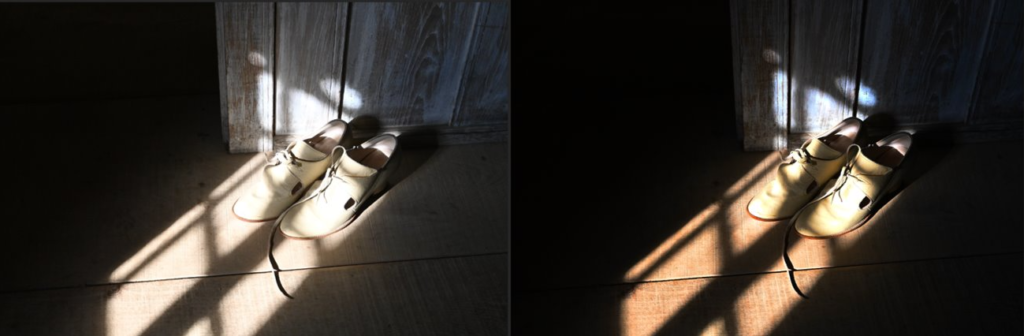
For this photo I like how it has has turned out and I think that it is really successful and came out how I wanted it to. I created this by changing the saturation, contrast, hue and vibrancy so that the shoes would be more defined in the sunlight. This makes their pale colour brighter and stand out more against the saturated colour of the wooden floor. I like how these shoes have just been lazily left on the floor which makes the photos seem more personal as it looks as if the person has come home from a long day and taken off their shoes while they potter around their home doing their chores.
Adobe Lightroom –
For this edit, I didn’t want to change much as I really liked how the original turned out. I just wanted to bring down the exposure so that the bright sunlight wasn’t overexposing the image as much as it previously was as well as bringing out the creamy wood tones which contrast well against the bright colours in the items of the hanger. I created this effect through bring the contrast up, highlights and whites down which brings put the rich colours of the red against the darker tones from the coats and wooden door. I really like how the objects are hanging on this beside the door as it adds a level of personality and makes it quite homely which makes the atmosphere of the photo quite comforting and safe as it emphasizes the fact of how it is a family home where a family once lived happily together.
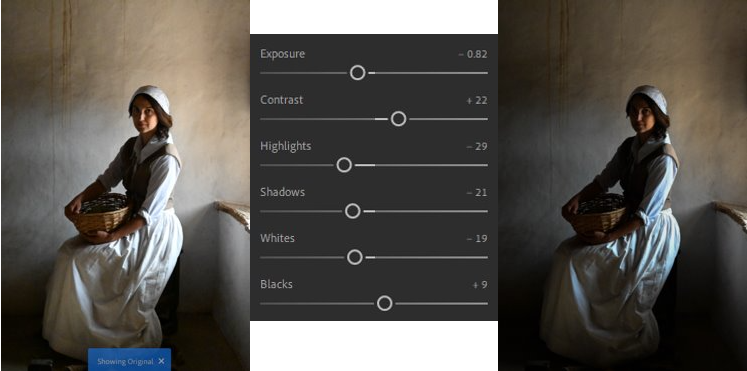
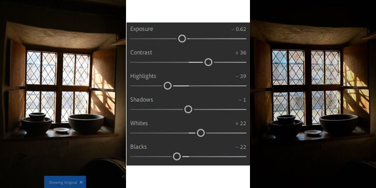
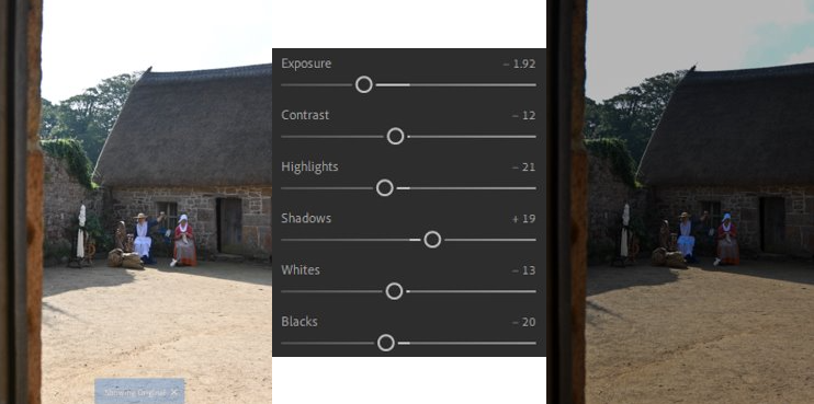
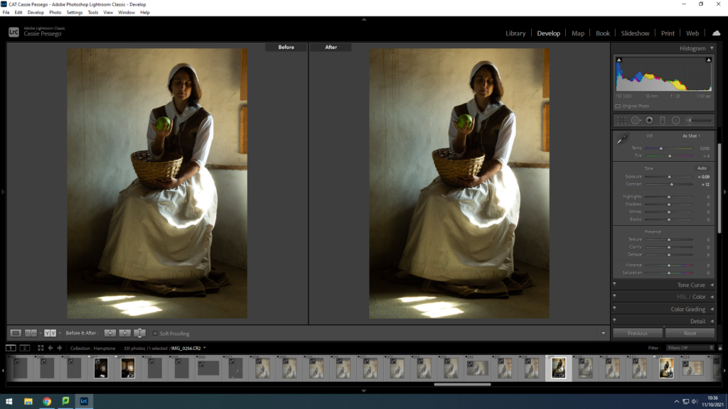
Due to the time of day when we were taking photos of Hamptonne, the sunlight was quite bright which meant that a lot of my photos which were taken outside were over exposed due to the brightness of the sun, meaning the exteriors of the houses would be lost within the photos. Below, I have chosen 2 photos to edit on Adobe Lightroom which I think are quite cleverly taken as they show Hamptonnes exterior and historical figures who were there.
For this edit, I made the lighter tones by changing the exposure, shadows and contrast which was created from the sunlight warmer which brought down the overexposure of them which creates a happier, more welcoming and comforting atmosphere around the characters. Therefore, this helps to define the characters in the photo and their surroundings because the colours of their outfits and the way they are standing is more defined, making you wonder what they could be talking about as it looks like a picture which could have been taken a while ago, resembling the activities of these historical figures.
For this edit, I wanted to create the effect as if it was taken on a vintage camera as a quick snapshot. I did this through creating a yellow hue, which many photos would have many years ago, I created this through bringing the exposure down quite a bit to get rid of the slight overexposure of the image from the sunlight then playing around with the other settings which makes the buildings exterior more defined along with the characters and their objects. I think that this picture was quite successful to begin with as it shows the historical characters in a natural way as they are being captured through this window as they are doing their daily activities. This adds a sense of story to the photo because it looks as it was taken quickly and makes you wonder what they are doing as they seem to be taking their time and paying attention to the finer details of what they are doing.
While at Hamptonne, there were various interiors which I took photos of which included various objects, giving it a level of uniqueness and individuality. Below, I have chosen two photos which I think were my most successful to edit and compare filters with. One edit I did on photoshop, whereas the other was done on Adobe Lightroom to experiment with which one I liked more.
Photoshop –
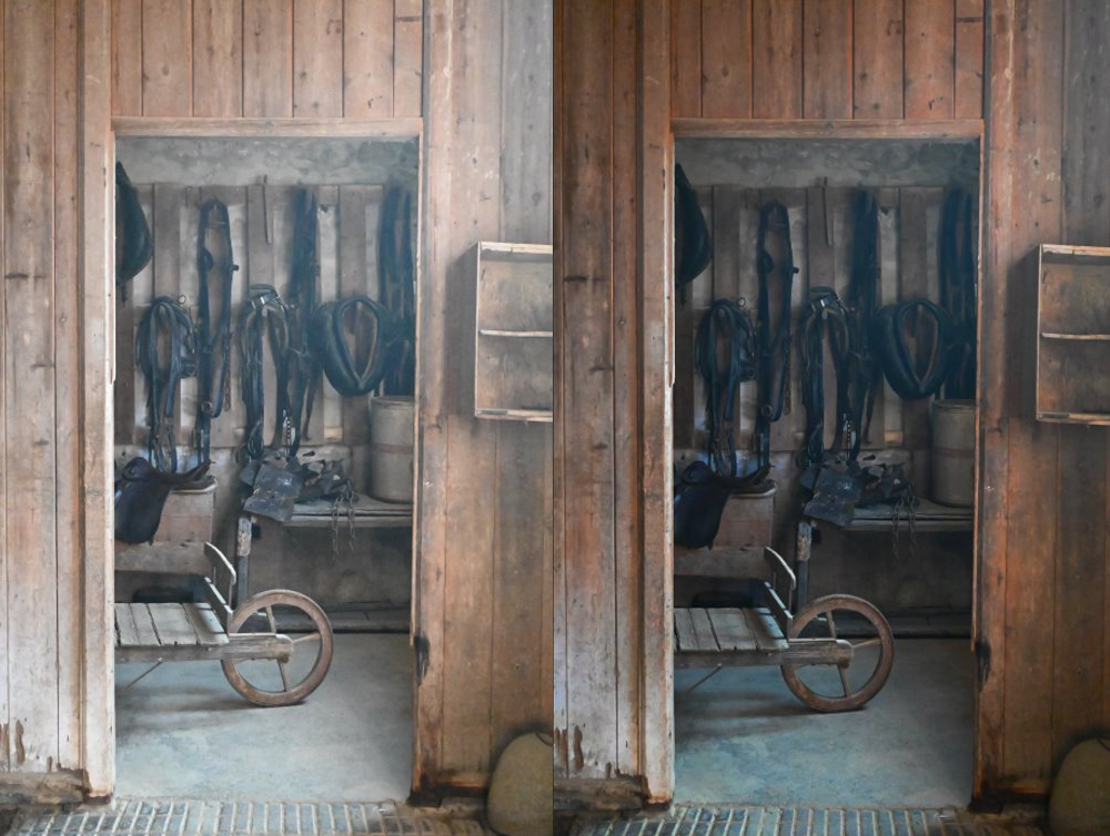
For this edit, which I did on photoshop, I think that this is a really successful edit as it has turned out really well and I achieved this by changing the saturation, contrast, hue and vibrancy so that it would make the photo darker and more vibrant. This makes the finer details stand out more due to the vibrancy of the wood tones contrasted against the light and duller tones which makes the picture look as if it is hiding more than is showing which makes you want to go in and explore more of the room.
Adobe Lightroom –
For this edit, which I did on Adobe Lightroom, I really like how this edit turned out for the interior of Hamptonne as it shows the spinning wheel clearly as the main subject of the photo, which catches your attention. I also really like how the shadow of the window on the wall has become more defined due to bringing the contrast and shadows up, this is because it creates a really nice pattern on the wall as if it is highlighting the object as it looks as if it is pointing directly at it.
When I visited Hamptonne, we experimented with taking photos with the help of a Jersey Photographer called Tom Kennedy. He helped and taught us about how to use the natural and forced lighting and how it can change a photo to look like a painting. I enjoyed working with Tom Kennedy and the skills which I have used from him I will consider and transfer into my other work as some of the techniques and tips were quite helpful.
My photos
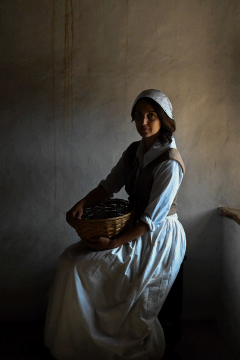
In Hamptonne, I began by taking a few photos of the women outside Hamptonne who were spinning wool on a wheel and looking quite casual which would look like an activity they would have done in the farm to help their families make money and create clothes fir them as well. Then I focussed on photographing this woman who acted as a housewife and with the help and influence of Tom Kennedy who began by showing us how to create a perfect photo that looks like a painting and how the lighting can change due to being in various places in the house holding different objects and carrying out a range of poses.
Best shots –
Then I went onto Adobe Lightroom and use “Z” to pick out my photos from the “Portraits” subfolder of “Hamptonne” that I created which I thought were my most successful ones where I could experiment editing the lighting/tones/contrasts/etc and then changing them into black and white and comparing which versions I like more.
Experimenting and comparisons
Photo 1 –
Before
After
Changed into black and white
For this edit, I really liked how it turned out because of the model who was caught naturally with a genuine smile on her face because it looks as if she is just carrying out a task from her everyday life with watching over the fire, which I created that homely maybe even over used feeling of the fire, that she made which can be used later on to make food for herself or her family.
I began by bringing down the exposure so that the overexposed part of the photo, which was created due to the sunlight became quite controlled and darker, then I used the contrast to make it darker as well. Then I used the highlights and whites which helped to bring back the sunlight which was lost due to this as I liked how it fell on her and created a nice glow on the surroundings too. I wanted to create the feeling as if the fireplace has burnt the surroundings of the ceiling and background, like it has been used a lot to create a homely feeling, so I used the shadows and blacks to create this coal-burnt effect on the ceiling and in the background behind it. If I were to try again with this edit I think that I could have tried to control the sunlight a little but more because it is still quite more over exposed then I would’ve liked it to be as it creates a glare on the photo which I don’t like.
I wanted to experiment with putting this picture into black and white because I wanted to create quite a dramatic atmosphere to be created from the effect of it. I think that this has been done but to improve I think that I could have experimented a little more with the contrasts and made the duller, grey/black tones darker to create a heavy contrast from the white tones, because I really like the effect it creates when editing a picture in that way. In my next edit of another photo, I will remember this and try to enhance my work so that this effect can be portrayed better.
Photo 2 –
Before
Editing
After
Changed into black and white
For this edit, which I created on Lightroom I think that the lighting and glare from the sunlight became controlled through the editing as beforehand it made the space next to the model look really empty and plain and then through editing it I really liked how it turned out because the details and creamy colours of the wall came through which I achieved through editing it. If I were to improve the edit, before turning it into back and white, I think that I could have centred it through cropping made sure that the editing didn’t make the lighting/colour of the wall to fall to a grey colour so that it would highlight the model behind her instead so that she would stand out well as she fades in to the wall instead.
In Adobe Lightroom I began by bringing the exposure and contrast down which made the lighting/tones of the photo darker because I wanted to create a gloomy effect instead of the warm, sunny one from the sunlight. I developed this editing further by using the shadows and blacks to create this darker border around her which you can see as it guides your focus towards her as the main subject in the photo. To control the sunlight which was creating this overexposed look on her outfit I used the whites and highlights, and by bringing them down it made it appear more defined and the finer details from the creases, became clearer to see which I really liked. If I were to improve this edit further again, like I previously said I would adjust the filters so that the wall doesn’t fall to a grey colour and I would crop it a small bit so that she appears more centred in the photo and I would get rid of the window ledge so that it makes the edit look more balanced and equal on each side.
To develop this portrait further, in Adobe Lightroom I changed the photo into black and white. I did this through using the “monochrome” option which transforms the photo, I then adjusted the options further so that it made the edit look quite balanced and to emphasize the black outline around her, which I really liked, I used the “Vignette” effect which added this darker hue around the portrait almost as if it is in a frame, which makes it look old and vintage. I really liked changing this photo into black and white as I like how I created a high contrast between the darker and lighter tones as it creates points of the photo which attract your attention well as they stand out.
Here are the photos from my Hamptonne trip which show various objects, wildlife, people and places which I photographed. For the portraits we had help from the local Jersey photographer Tom Kennedy, whose a lot of work is taken at Hamptonne.
On Adobe Lightroom I used Z to choose which ones I thought were successful which is seen below.
For most of my photos, the lighting was quite bright as it was around morning/midday. For my photos, I wanted to edit them so they would appear much darker, but still have a level of softness and contrast with the warmer wood/sunlight tones against the shadows or objects.
An environmental portrait is a portrait executed in the subject’s usual environment, such as in their home or workplace, and typically illuminates the subject’s life and surroundings. The term is most frequently used of a genre of photography.
By photographing a person in their natural surroundings, it is thought that you will be able to better illuminate their character, and therefore portray the essence of their personality, rather than merely a likeness of their physical features. It is also thought that by photographing a person in their natural surroundings, the subject will be more at ease, and so be more conducive to expressing themselves, as opposed to in a studio, which can be a rather intimidating and artificial experience.
The surroundings or background is a key element in environmental portraiture, and is used to convey further information about the person being photographed. Where it is common in studio portraiture and even in location candid photography to shoot using a shallow depth of field, thereby throwing the background out of focus, the background in environmental portraiture is an integral part of the image. Indeed, small apertures and great depth of field are commonly used in this type of photography.
Here are a few of my edited pictures from my Hamptonne photoshoot.
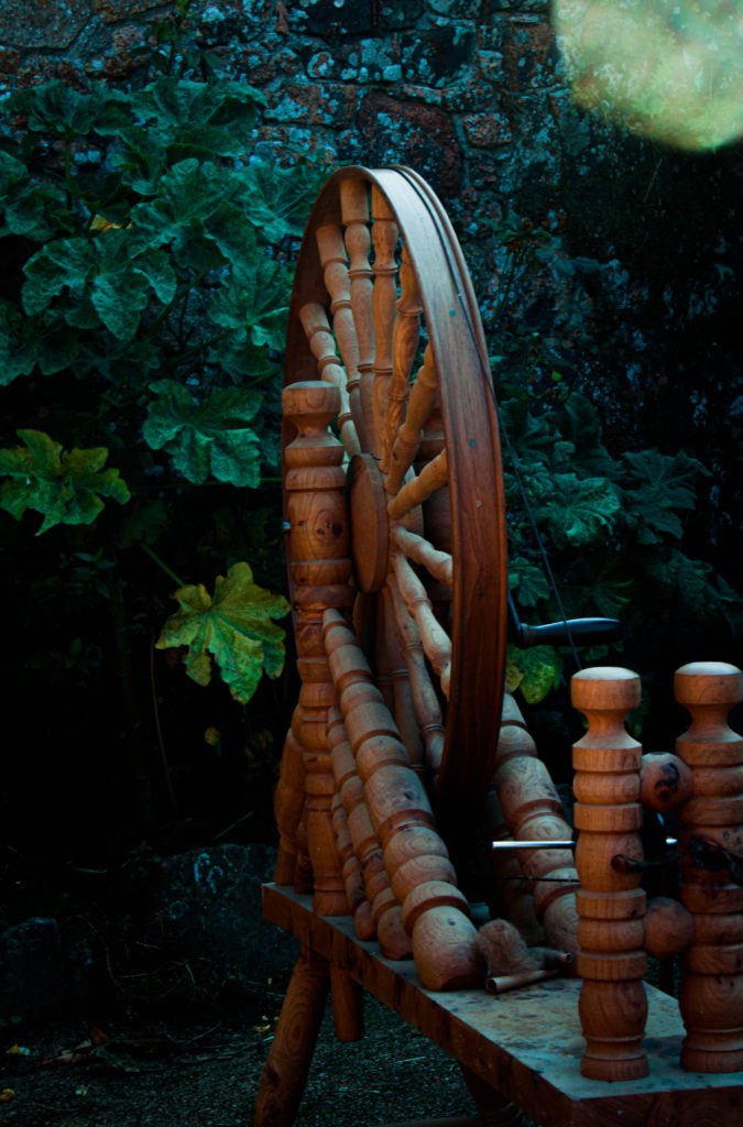
I chose this image as I love the contrasting colours from the wheel and the plants in the background, I wanted to add a green tone to the image to emphasis the plants behind.
I thought this image was good because the pigs represent the farm life at Hamptonne, I also liked the composition of the pigs because it captures them in their natural form.
I chose this image because of the almost iridescent feathers of the chicken, chickens are also a huge a part of Hamptonnes farm life, the composition of the chicken is also great as you can see its body and also its face.
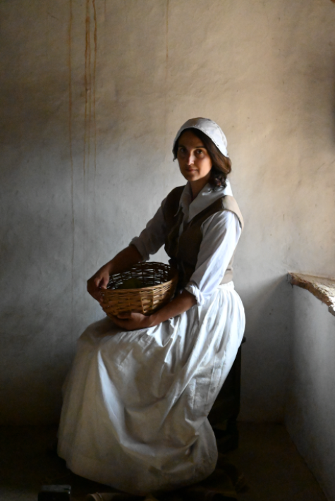
This is an image of one of the actors who plays a wool knitter, this was an important role in jerseys history as it was a large producer of wool products. I decided to edit this image because it captures the clothing and the feel of life in the Georgian era, I also found the orange shade dress was a brilliant colour.
This is an image of another actor who played a the role of a common woman in the Georgian times, I edited this one in black and white I felt it captured the shadows and light nicely.
This picture is of the same actor, she is acting as if she was doing her duties of what a woman would do at the time.
I captured the furniture and room accessories of the time to show how much times have changed, from candle lit rooms, to automatic lights that we have today.
I love the warm feel of this photo, I feel it captures the end of summer well with the vibrant red berries, and the sun light sitting on the wall.
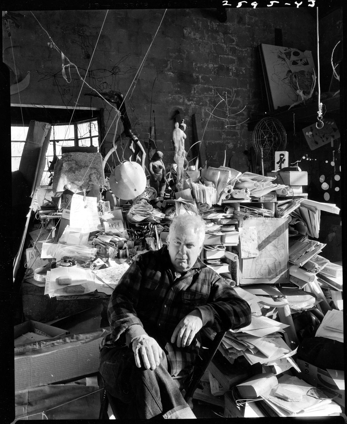
Arnold Newman (1918-2006) is well-known for his work which has changed portraiture. He is known as the “Father of Environmental Portraiture.” Newman’s work was collected and exhibited numerous of the biggest museums in the world.
Newman was an important contributor to publications such as New York, Vanity Fair, LIFE, Look, Holiday, Harper’s Bazaar, Esquire, Town and Country, Scientific American, New York Times Magazine, and many others.
There are numerous books published of Newman’s work in addition to countless histories of photography, catalogues, articles and television programs. He received many major awards by the leading professional organizations in the U.S. and abroad including the American Society of Media Photographers, The International Center of Photography, The Lucie Award, The Royal Photographic Society Centenary Award as well as France’s “Commander of the Order of Arts and Letters.”
In 2005, Photo District News named Newman as one of the 25 most influential living photographers. In 2006, Newman was awarded The Gold Medal for Photography by The National Arts Club. He is the recipient of nine honorary doctorates and has lectured and conducted workshops throughout the country and the world.
2 People
To improve my photoshoot I need to check that my camera settings are suitable for the conditions that I’m photographing in because I found that the aperture was too low leaving my photographs dark and underexposed.
An environmental portrait is a portrait executed in the subject’s usual environment, such as in their home or workplace, and typically illuminates the subject’s life and surroundings. The term is most frequently used of a genre of photography.