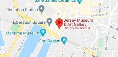
On Thursday 30th of September we visited the Jersey Museum and Art Gallery in St. Helier to observe and take pictures of their most recent “People Power Protest” exhibit, as well as their other general history exhibits, which details history of Protest on Jersey. We thought this would be appropriate for our topic of ‘Heritage’
A Link to their Page on the Jersey Heritage website:
https://www.jerseyheritage.org/explore/find-a-place-to-visit/jersey-museum-art-gallery/
Some of my Images:
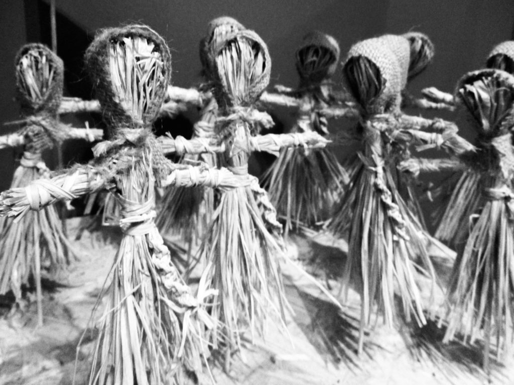
I chose to edit this image because I liked the way the straw figures were organised, their positions made them look human-like, while their faces are simply straw. I took the image at eye-level so it may appear that the viewer is a part of those figures’ organisation. I think that the way I edited it was effective as the harsh lighting, line and dark shadows makes the image look serious.
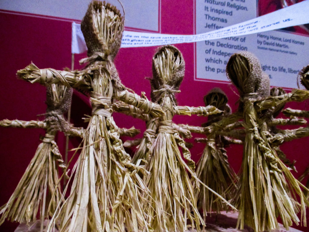
I chose to edit this image because I thought the colours and use of line was interesting to look at. Similar to the last image, I took an image of the straw figures, only this time I decided to use a low-angle shot to make the figures look more intimidating. I edited the image to have a darker, more contrasting look to help make the figures look more sinister.
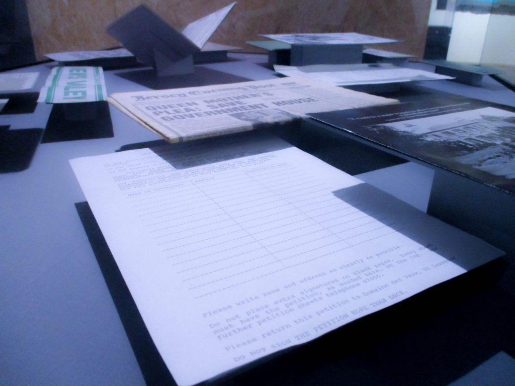
I chose to edit this image because I like how shape and line is very vivid, as well as the colder colours and clear shadows. When editing I wanted to keep all of the things that the original image did well and make them even more effective by increasing the contrast and making the image ever-so-slightly colder, which to me, makes the image look more formal.
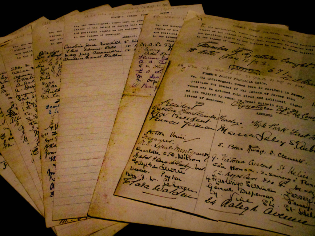
I like this image because of the way the sheets of paper are layered, it creates an angular shape which takes up the whole frame. Also, because of the layering, I get a sense of time from these pieces of paper and how it looks almost like a timeline of sorts. When editing I wanted only the pieces of paper to be visible, so I increased the contrast and lowered the exposure slightly, this also allowed the paper to look more clear.
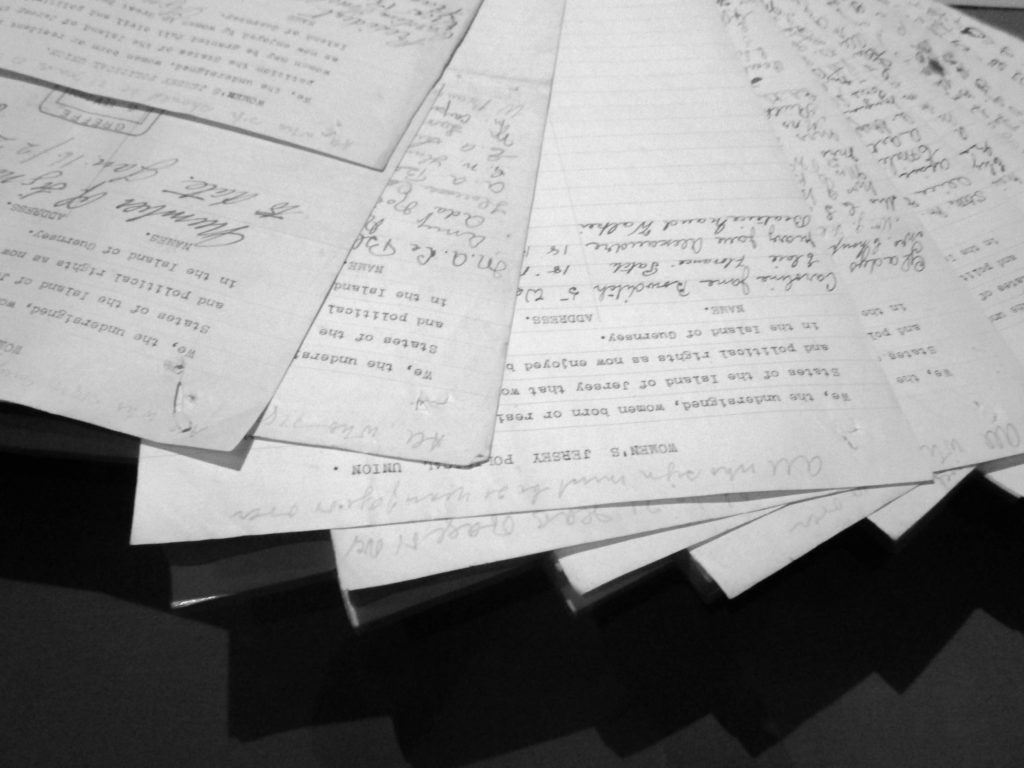
This image’s layout is similar to the last image, with an angular, staircase-like shape to it. Because of the harsher lighting and lack of colour, I think like this image is more formal and office-like, which works nicely with its ordered appearance. When editing I wanted to preserve its formal and angular look by simply increasing the contrast and exposure slightly, as well as making it black-and-white to keep the image’s formal appearance.
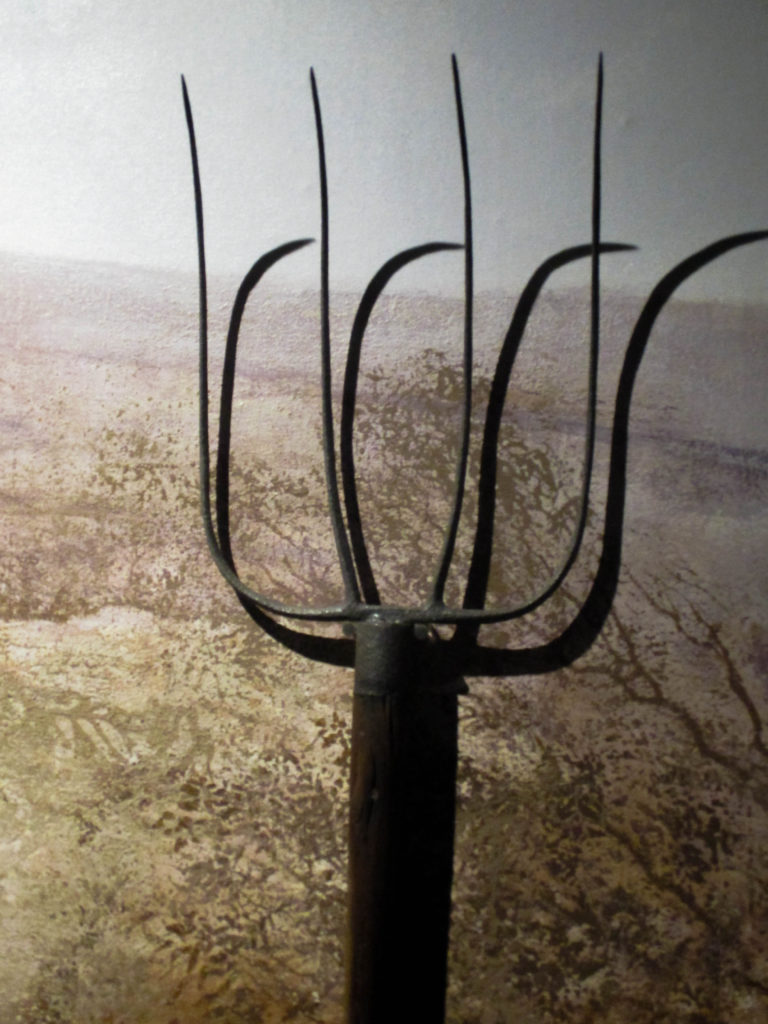
I chose this image because I like the way the object in the foreground works with the straw-like pattern in the background. I also think that the harsh lighting creates an interesting shadow that is a similar shape to the object. When editing I wanted to create a contrast that would bring out the shadows of the image, as well as keep the beige colour which, to me, makes it look more farm-like.
