Editing One Picture
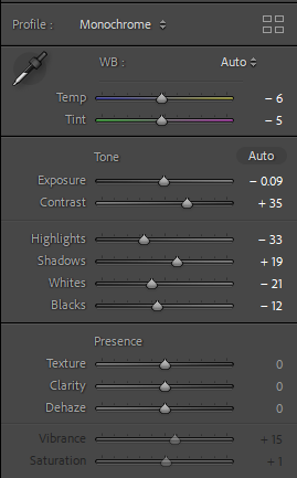
I decided to edit this picture because I liked the composition and I thought it looked quite simple and nice. I also liked the way the sun was coming from the window and the reflection it created on the wall. I started by turning it black and white to make it look old then I increased the contrast to make the lines on the wall and texture of the metal tub stand out. I also decreased the highlights and increased the shadows because It was a bit too bright.
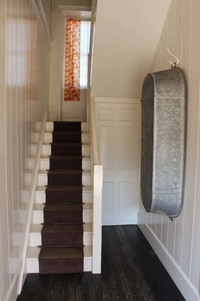
Before 
After
Final Edits
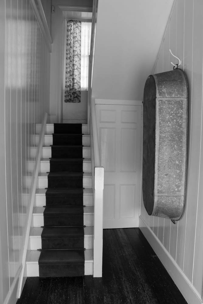
I like how this picture turned out because it looks simple and old. I think the little details on the wooden floor and curtain look nice. 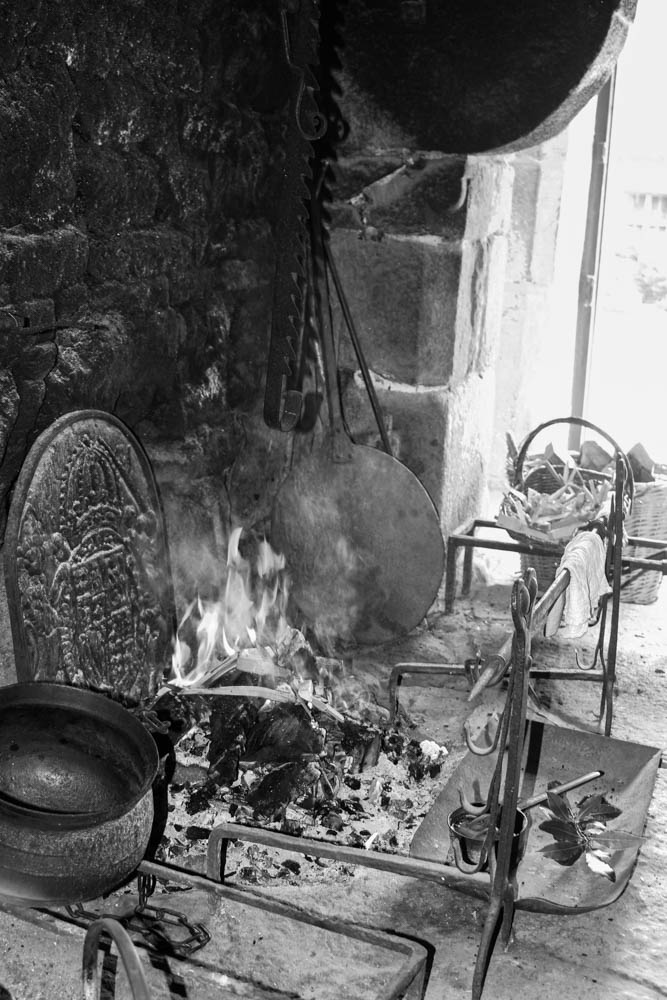
I think the fire looks quite interesting in this picture and I like how you can see all the small details of the objects around it and the fire place. The black and white gives it an older feel which I also like. 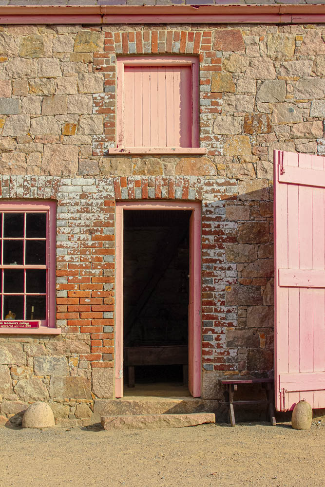
I like this edit because it’s simple and colourful. When I took this picture there was a person standing in the doorway and I managed to rop them out. 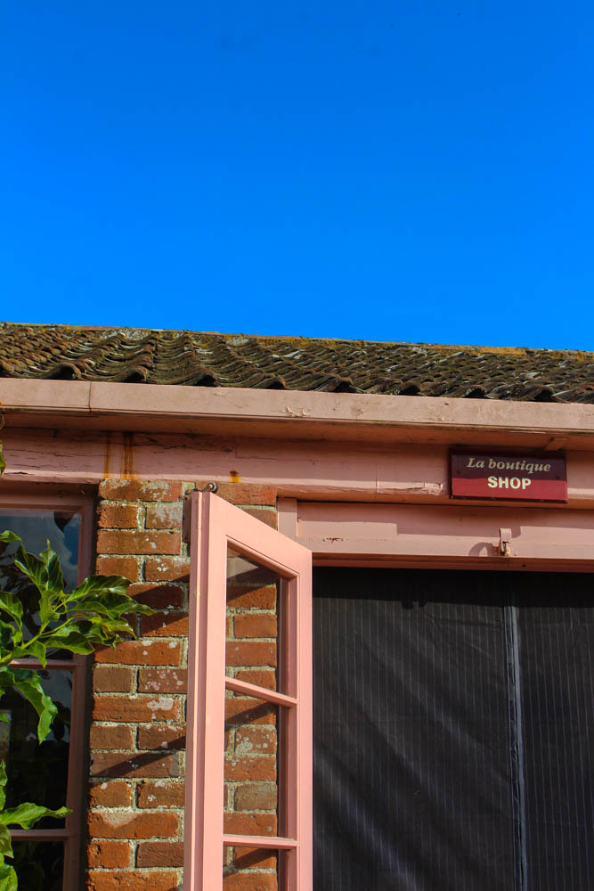
I like how the colours stand out in this picture and I think the angle is interesting. 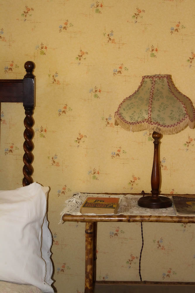
I like the framing in this one and the warm colours. 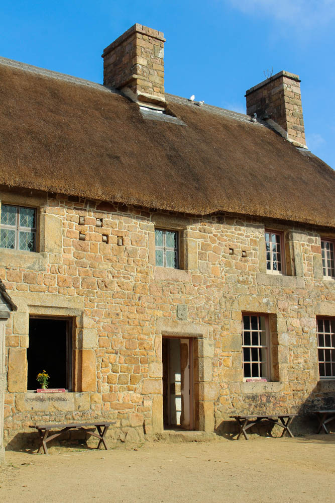
This is my least favourite edit because nothing interesting is happening and I think the angle is not as flattering.
