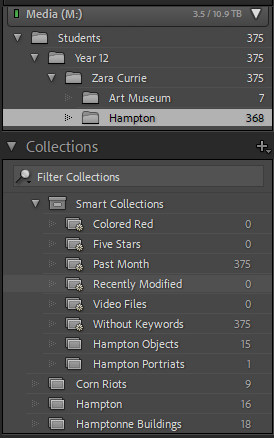
Contact Sheets
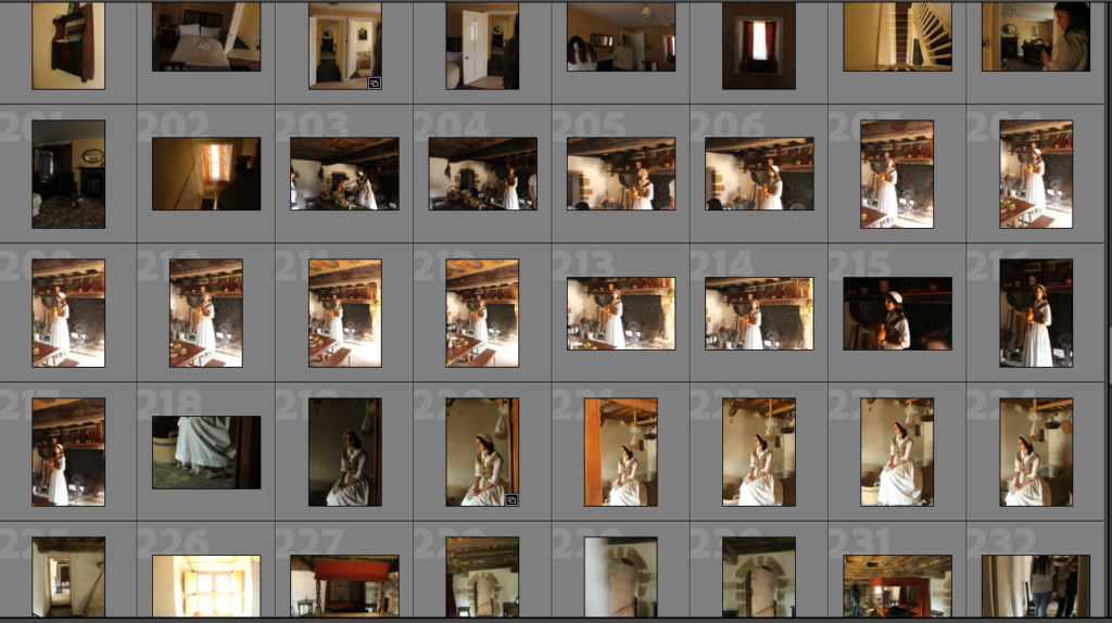
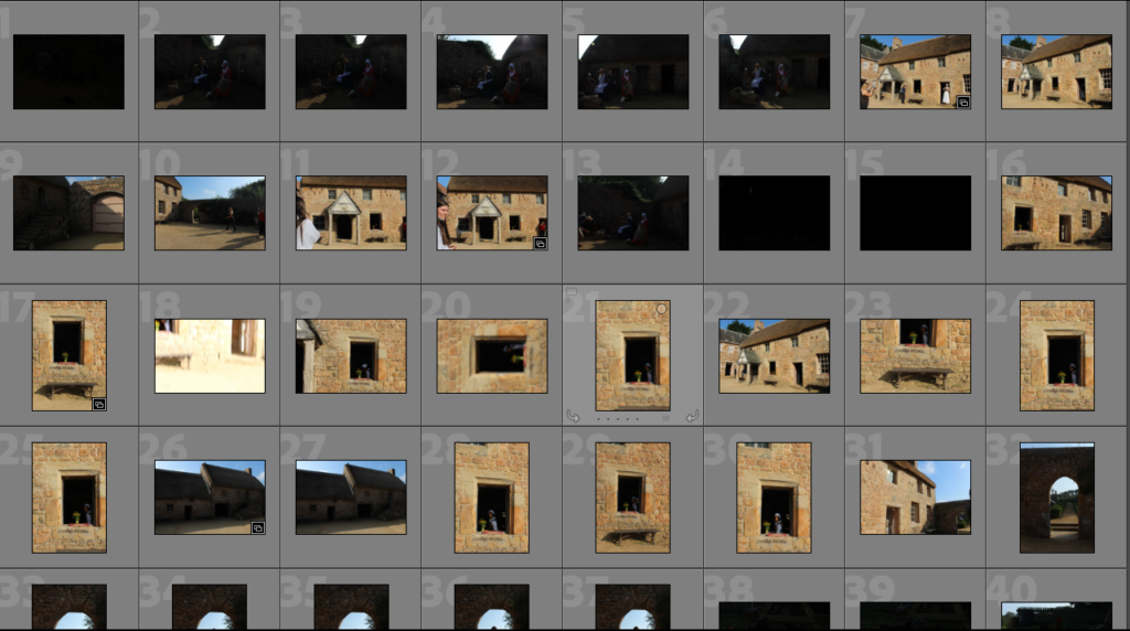
Here I have placed some images of contact sheets from Adobe Lightroom Classic, this is to show that I have developed some understanding of how to use Lightroom and how images can be edited to make some of their features stand out such as contrast and vibrancy. I like using Lightroom as I can place my favourite images into collections, this helps when editing my images to make them more aesthetic, and as adjusting their image size so I can make blog posts with the correct image sizes.
Editing
Below I have showed how i have edited my images in Lightroom by inserting screenshots whilst using Lightroom. As you can see above in my contact sheets, a lot of my photos didn’t turn out will as the exposure was to low , therefore their is limited visibility. So I have selected some images to make them lighter and more vibrant. This example of one of the living history characters is a good example of how adjusting the contrast makes the image look more professional.
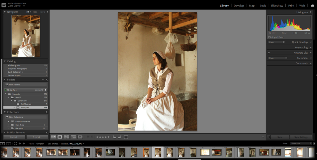
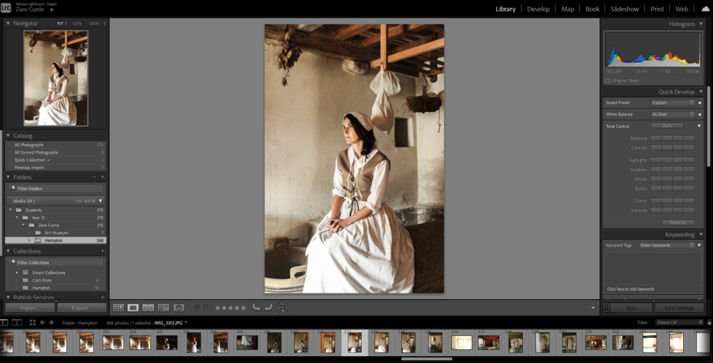
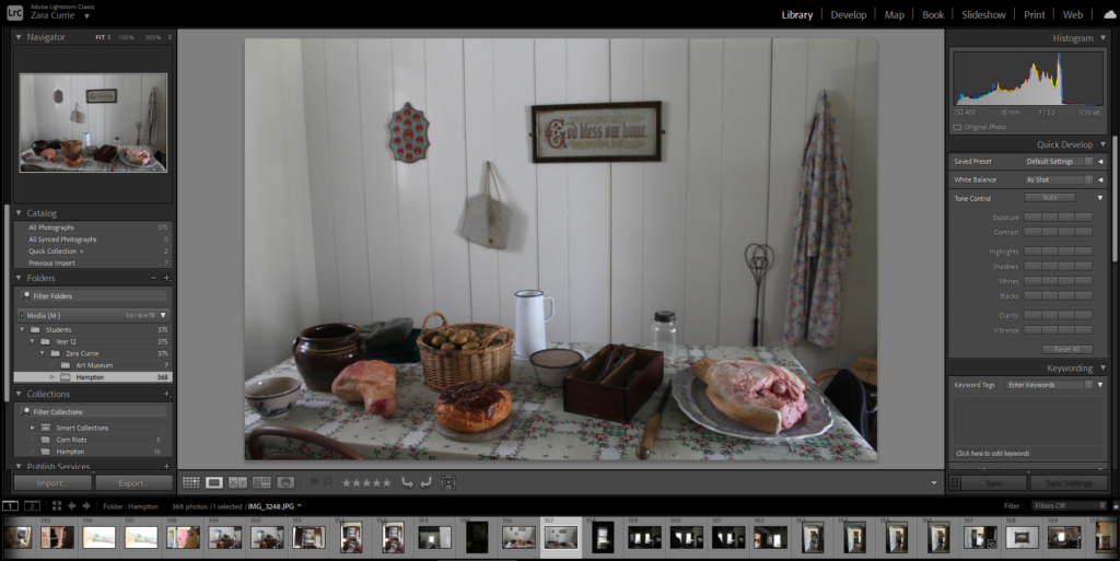
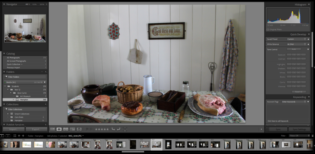
Below I have demonstrated me organising my images from Hamptonne into folders in Lightroom, this is so when I have thousands of images in the Media drive and in Lightroom, I can easily locate specific image as they will be categorised. Furthermore, I have attempted to sort them into folders which corelate with the blog posts I have been publishing.
