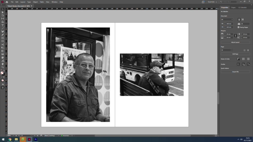
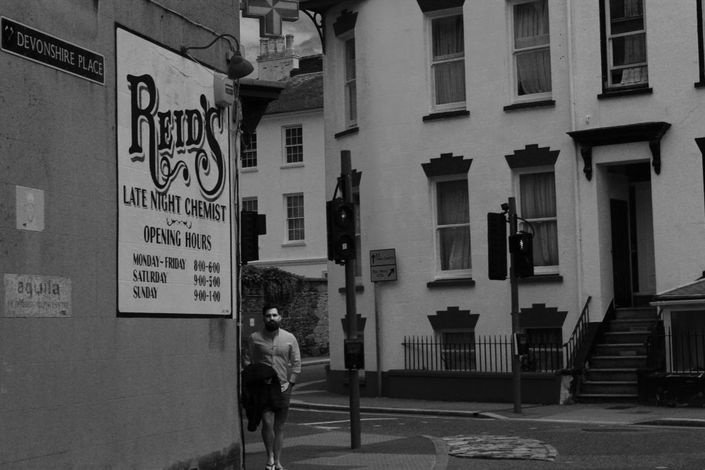
Here is a presentation of my final completed Zine, I have titled it ‘Street Stories’ drawing in connotations of street photography and community. I wanted to display the lives that are unknown, the people we see and know nothing about, their lives are a mystery but we can make guesses and make up stories we think would fit. Juxtaposing these candid images are reflections of environmental portraits, market workers and record salesmen giving us a glimpse into their working environment and engaging with the camera naturally. When I took these portraits I didn’t as for a pose or smile, I left it up to the subject to decide how they wanted to be seen. I believe this truthful display can never be entirely real, not as real as a street photography portrait, but it gives the observer a better chance to see who these people are, or how they present themselves when the camera comes out. As I spoke about in my previous post, the narrative and sequencing of my Zine shows the similarities and differences of St Helier streets, of people and of architecture – I wanted to use a mix black & white and colour images spread out across the Zine, linking back to ideas of old and new throughout time. I really enjoyed created this Zine, the presentation style is not one I had come across before and I believe it’s small size and orientation strongly helps with relaying the idea of a close community of people who ‘are not all so different’.
In terms of narrative, my Zine will focus on the various stories that pass through Jersey’s parish of St Helier everyday, the light and shade of a community that may get overlooked in modern society. I will use my images from my Character of Community and Sense of Place photoshoots to create a Zine inspired by the work of James Jay, his layout of images, style of photography and overall Zine design is something that has influenced me greatly in this task. I aim to show juxtapositions within each page of my Zine, for example an old building placed next to a modern building, representing the changes in these communities over time, or the differences between the old and young that may live there, or even suggesting the neglect some of these communities have had to face while others grow and flourish – it is up for the observer to decide. Nevertheless, in this Zine I also aim to promote the narrative of the popular theme ‘we’re not all so different’, showing the similarities between certain street scenes/buildings/architecture – the list goes on. I want to convey a story of memory and nostalgia, capturing the areas where communities feel safe, at home, comfortable and where people can fully be themselves.
Sequencing;
The overall layout of my Zine will be simplistic and easy to follow – however I wish to create some double page spreads where one image is bigger than the other, or have a different orientation. My plan with this layout idea is to break up what would be a Zine of symmetry and order, something I do not wish to convey – I want to demonstrate the freedom of being part of a community that is accepting of you, where you can feel truly yourself. My aim is for the contrasting orientations and layout to create a dynamic sequence for the observer to follow, the symmetry within certain pages will get disrupted and the storyline will hold hints towards freedom and relief. Additionally, providing juxtapositions and similarities within each double page is something I really want to develop. I plan on using my images from both photoshoots to find either a contrast or a subtle link, for example I wish to use some of the environmental portraits I captured placed on one side, with an image of something linking to their profession on the other. I want to experiment with how colour also effects how these two images link, by placing a black and white image next to a vibrant colour one I will demonstrate possible stereotypes, may that be of people or places.
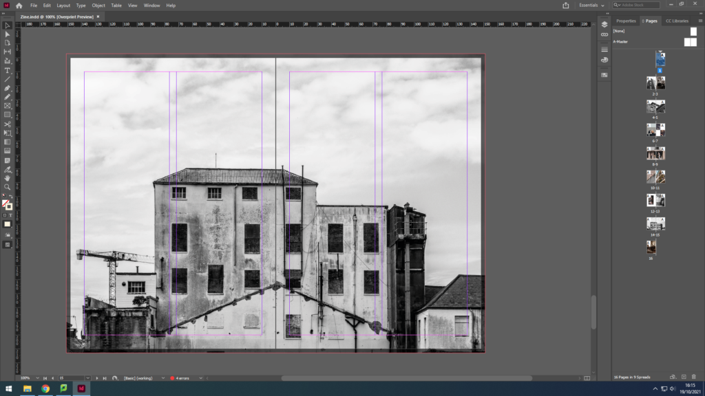
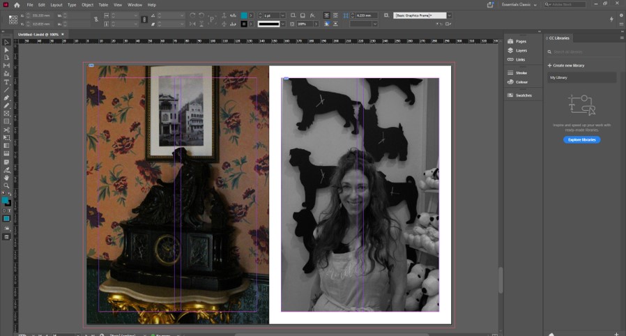
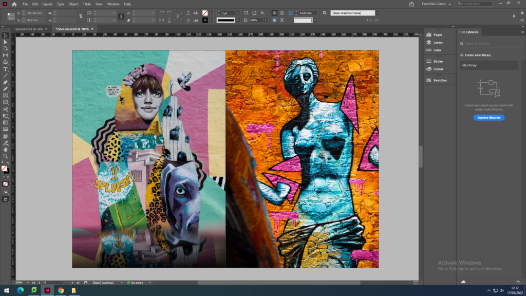
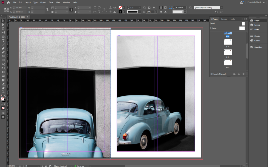
Above is a screenshot of a part of my editing process on Adobe InDesign, where I experimented by placing two images with a similar colour palette next to each other. Both images show older architecture as their primary subject, however the image of St Helier’s General Hospital on the right has a wider depth of field as we can see the side of the more modernised part of the hospital in the background. This creates a more 3-dimentional image, and in comparison to the left image, forms a jolted view for the observer. I think by placing these two images next to each other (although they hold several similarities) it does not provide the full effect of what could be portrayed, for example young Vs old if I were to place it next to an image of fully modern architecture. Additionally, while editing I had the idea to use similar geometric shapes within each image to represent the, sometimes, uniformity of a community with strict rules and regulations – juxtaposing the freedom conveyed in other pages throughout my Zine. I believe that breaking up the flow of my Zine with jarring shapes, colour changes and contrasting orientations creates an inventive and freeing piece of natural life portrayed through ‘the photograph’.
Design and Layout
Experimenting with ‘full bleed’;
During my editing process of the Zine, I experimented with how the size of my images impacted the overall mood created by the page. For example, the screenshots above show two images I decided worked well together due to colour, composition and lighting – however I could not decide whether they should be full bleed or not. A full bleed image extends or ‘bleeds’ to the edges of a page so that the image completely covers the entire page and does not show borders or white space around the edges. As these two images are landscape orientation, using full bleed while keeping the image in full frame was difficult to make work due to the large amount of white space above the image, with none at either side. Nevertheless, I enjoyed how the full bleed created a sort of togetherness between the photographs, as if they were linked in more ways than just the formal elements. I experimented with whether joining the images in the middle created the impression of the landscapes bleeding into each other as if they were the same building, however due to the composition this was a challenge. After moving the images around and changing their sizes, I decided it was better to not use full bleed on this page as the negative space surrounding the images created a clean, symmetrical layout that I believe works best when presenting images of two man-made structures.
Layout of pages;
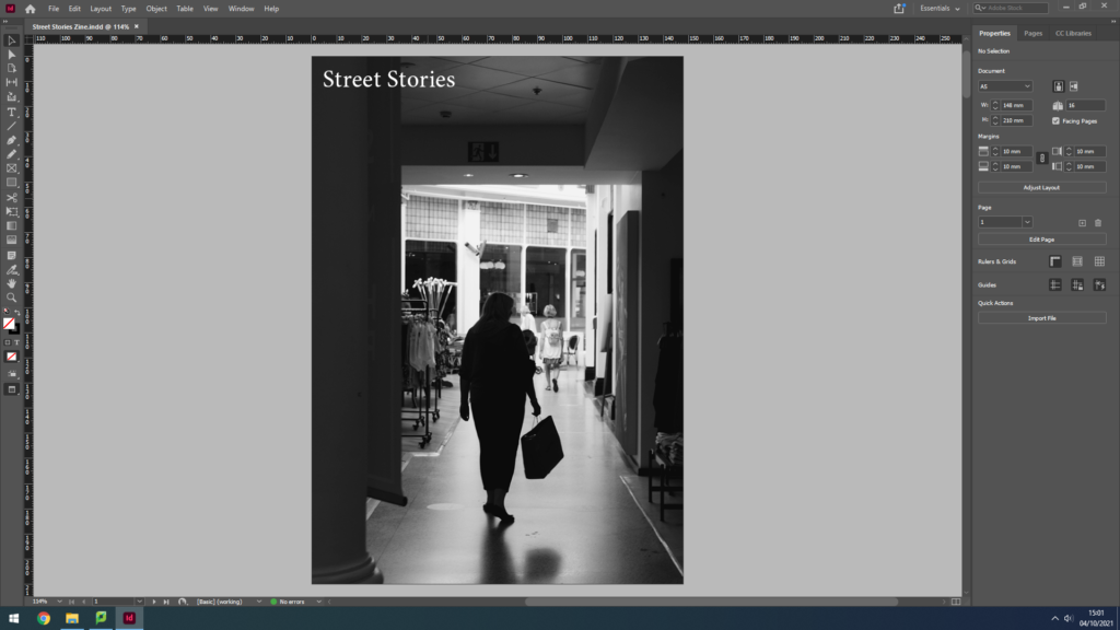
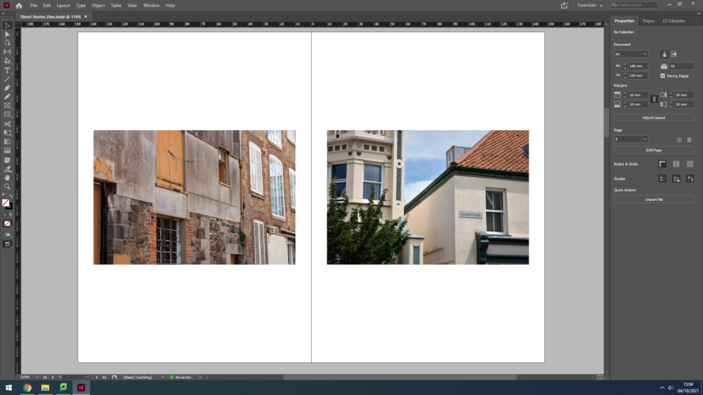
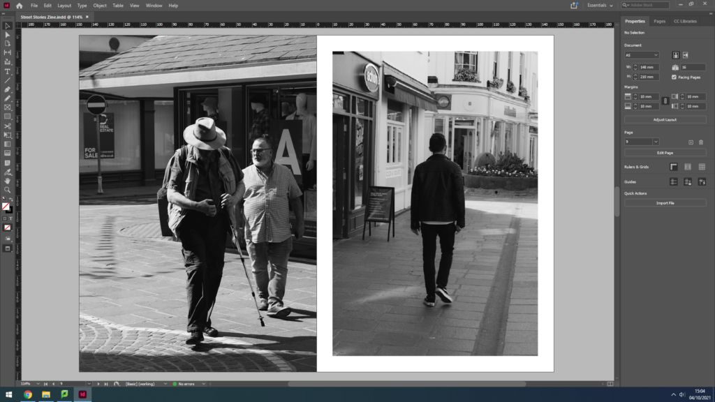
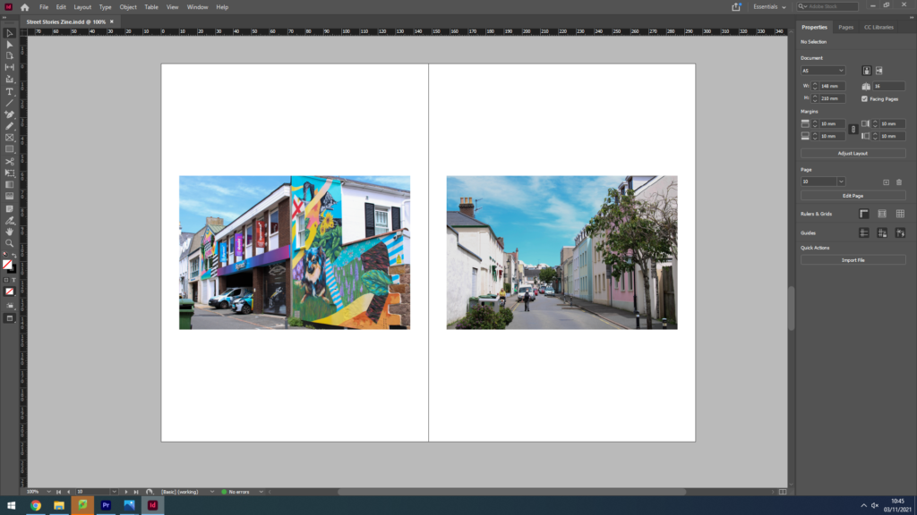
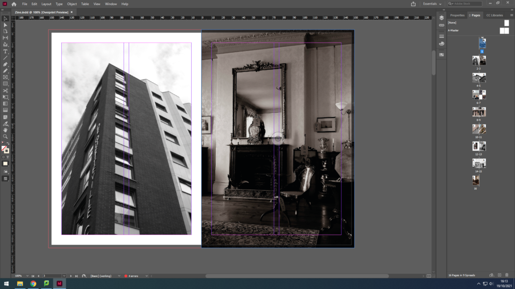
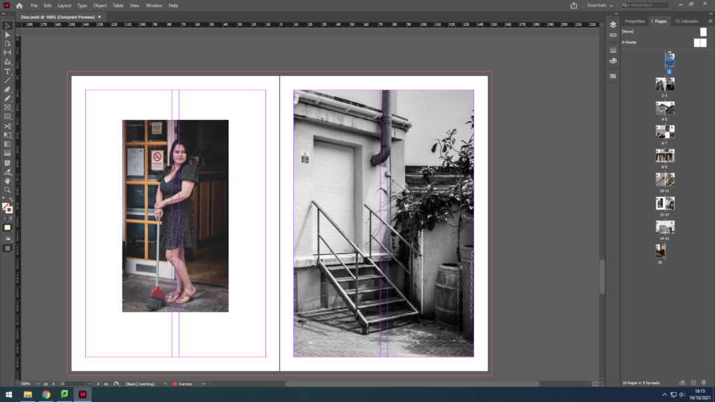
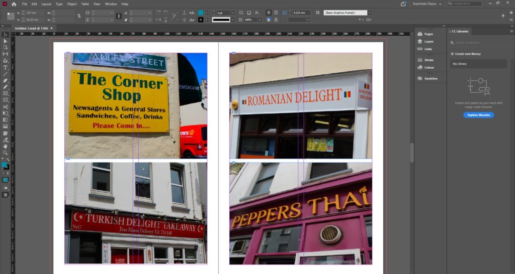
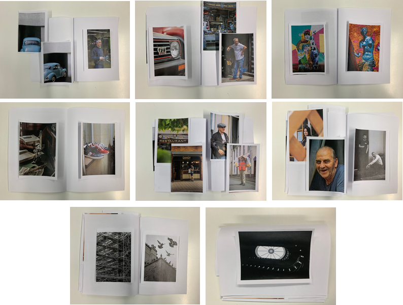
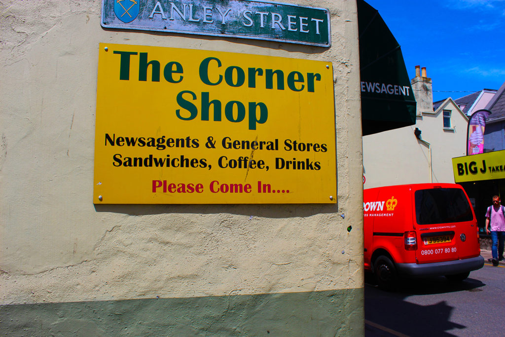
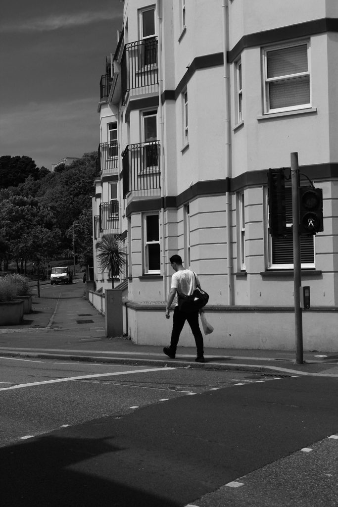
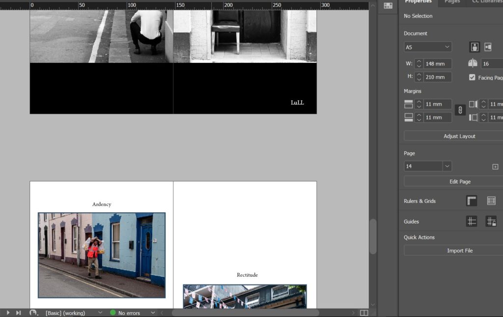
The order in which I placed my Zine pages was based on how their formats, colour schemes and layouts. I started with my front cover image, a black and white long shot of a woman’s silhouette doing some shopping, natural and normal with a sense of mystery. I wanted each double spread in my Zine to tell a story or link to each other in some way, therefore I wanted the back cover to relate to my front one; using another black and white image taken in the same shop. I then wanted to show some colour in my Zine, so my first double page shows two different buildings with minimal editing in colour, one older and one more modern. I aimed to show juxtaposition between two very similar structures. I moved on to focus on demonstrating vibrancy and portraiture and throughout the rest of my Zine I aimed to compare monochrome images to colour, relating them to each other through similar themes, shapes or ideas.
A Zine is a self-published, non-commercial print-work that is typically produced in small, limited batches. Zines can be created through a number of different mediums, sometimes by physically cutting and gluing text and images together onto a ‘master flat’ for photocopying, however more and more recently zines have been created to showcase a photographer’s work through computer editing and sequencing. Zine publication (of Zine’s most similar to those we see today) first began in the 1930’s, traced back to the Science Correspondence Club in Chicago’s sci-fi Zine called ‘The Comet.’ One of the most popular, and recognizable decades of the Zine, was the 1990’s – all thanks to the Riot Grrrl scene. During this time young girls were encouraged to make their own music, zines etc – in a male dominated industry this was a big moment for women to make a stand. Riot Grrrl was more than just a musical genre, it was a feminist movement, as Max Kessler wrote in Paper, “Whatever Riot Grrrl became – a political movement, an avant-garde, or an ethos – it began as a zine.”
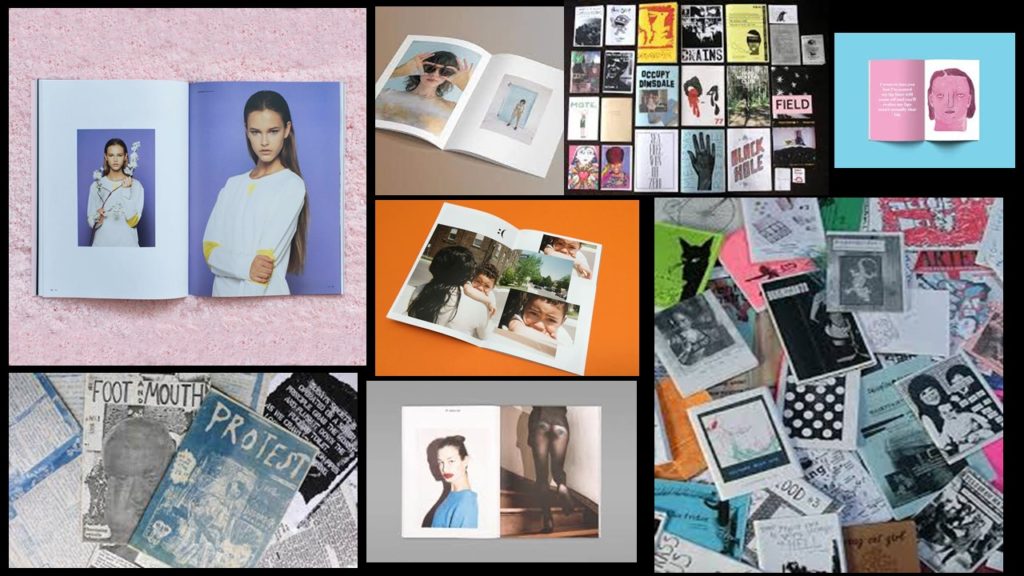
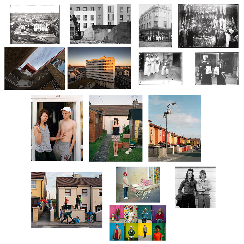
Recently, Zines are created to showcase projects, illustrations, art, photographs – the list goes on. Below I have created a mood-board of zines that interest me, may it be with their layout, images, colour palette or storyline – I wish to discover more about why artists create the Zines they make. For more on the history of zines, click here.
James Jay; I Love The World I See
James Jay is an American photographer and artist who began photographing the world around him in 2005. Jay’s images are intimate and familiar, I was really drawn to their warm yet mysterious atmosphere. The project of work I am creating a reference for is Jay’s Zine entitled ‘I Love The World I See’, which is a series holding two separate Zines, one in black and white and the other in colour. What I love about the work in this project is the way Jay can capture a different view of the community that surrounds him everyday – it is almost as if he knows every alleyway or corner of the streets to walk to capture the sincerity and honesty of his local community. An exert from the beginning of Jay’s Zine states ‘I started to shoot the world around me, everyday things. Then came my online photoblog named ‘I Love The World I See’. It was a place for me to post things that I saw, made or thought. That blog no longer exists but the phrase I Love The World I See still stays stuck in my head everyday. I love the world around me, even the chaos that comes with it, I love being able to see those things that other people sometimes neglect to see, either because they don’t slow down to look around or do not care to see. I try to capture those moments.’
Why do I want to take inspiration?
James Jay’s Zine shares with us the community around him, giving the observer an insight into his life, and those lives that pass him by everyday. His street photography style reflects that of famous candid photographers such as Henri Cartier-Bresson and Vivian Maier with his black and white mysterious images whose ambiguity leave the observer waning more, stretching their imagination to decide who this person is they are seeing, why are they there, what do they want? I think this is what inspires me most about Jay’s Zine, I wish to recreate the feel of community, the familiarity and honesty that I see around me. I am always inspired by photographers that create strong narratives, storytelling is very important to me, I aim to take inspiration from ‘I Love The World I See’ by telling the stories of each different community around St Helier, using my images from my ‘Character of Community’ and ‘Sense of Place’ photoshoots. Jay’s Zine layout is also something I wish to take influence from, I really enjoy the way he uses a range of formats to display his images, some taking up the full page, some meeting in the centre etc – I believe it helps the fluidity of the Zine, straying away from using a symmetrical format reflects the natural environment of the images not needing to be perfect; another element I wish to demonstrate in my Zine.
Due to printer issues, I was not able to print my zine successfully, so here is the zine in Adobe Design:
Evaluation
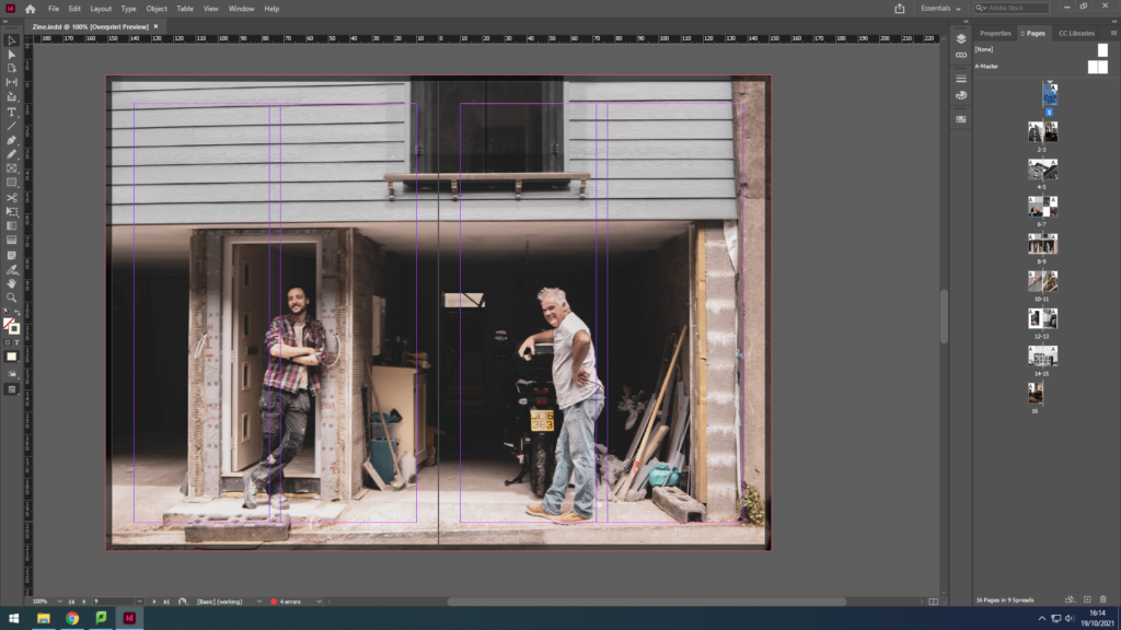
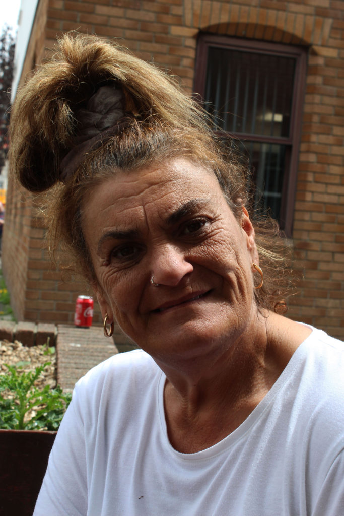
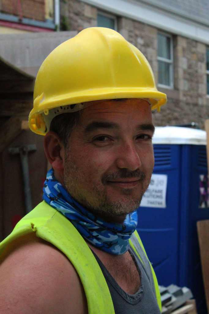
In conclusion, I believe my zine for identity and community powerfully portrays the different uniformity of the Jersey community. For example, I was able to capture the more elderly jersey community; a couple, a man waiting for his beloved, helping each other in love. I also captured the young generation; a young man fixing an automobile. To link the young and the wiser community together I have captured an adult man in his 50s in his garage fixing some items. These 3 examples can clearly show the successfulness of my zine for this project, for, not only does it juxtapose between the old and new generation, but it also makes sure to relate to the ways every individual is unique in their own way, such as, the photograph with the elderly couple gives a sense of unity, dependent on each other whereas the other images show a sense of individualism offering the idea that dependence is old-fashioned, and individualism is the new style.
Although, the zine also manages to illustrate other cultures. For instance, we can see a woman, dressed in black who has Asian heritage; she is standing outside the Gradees restaurant as an attempt to allow the residents to taste different foods from her culture like Half Roast Duckling with Orange sauce, which is a common dish in some lovely parts of Asia.
Therefore, we can understandably observe the prosperous of this zine on Identity and Community.
In class we were asked to ask to create a zine with our Images from the community/identity project. To create our own zine in InDesign we followed the following instructions:
It was a work of research, analysis and exploration. We explored different design, format, sizes and orientation. We were free to placed the images we wanted and how we wanted to placed them. We were also free to decide our title. This is mine: I decided to title it “Au vieux temps” that means to the old days. I wanted a title that represents the history of jersey communities. I wanted it to be in French because France is part of my identity. Then “in the old days” is an expression used in France
But what is a zine?
A zine is a self-published, non-commercial print-work that is typically produced in small, limited batches. Zines are created in many DIY ways, but traditionally editions are easily reproduced—often by crafting and then photocopying, folding, and stapling the pages into simple pamphlets. You also may also sewn, taped, glued them. There are no rules! People in general create zines to be more motivated, self-expression and artistic passion. Zines are usually inexpensive and sometimes distributed for free. Zines can touch on a variety of topics from music and art, to politics, sexuality, humor or even personal memoir. Their can be written, drawn, printed, collaged… Zine’s structure may be narrative, journalistic, comic-like, or completely abstract.
PRESENTATION & EVALUATION: PHOTO-ZINE
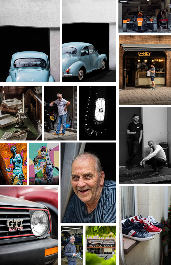
Here’s how I arranged my images. We had to have a total of 16 images with the theme of Community and Identity. I wanted the images (that are in the same page) to have something in common e.g colors, geometric shapes, patterns, people… I find that this activity has let us be creative which I appreciated
I have finished my Zine, which I designed in indesign.
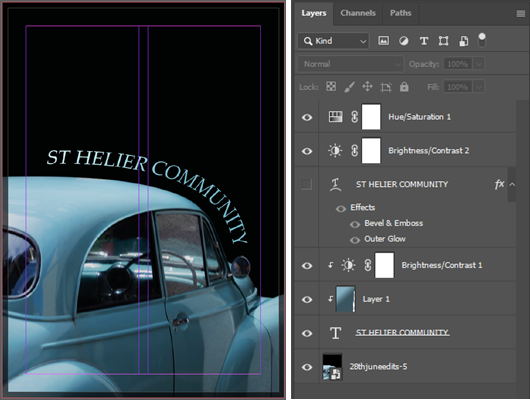
This is the front cover, which I made in Photoshop, by using text on a path the follow the same curve as the cars roof, so that the text was parallel to the car, as it look asteycilly pleasing. I used the same blue as the car against the black background to create contrast so the text is easy to read. And I used some blending options to draw attention to the text by making small adjustments to the bevel, stroke, and the inner shadow.
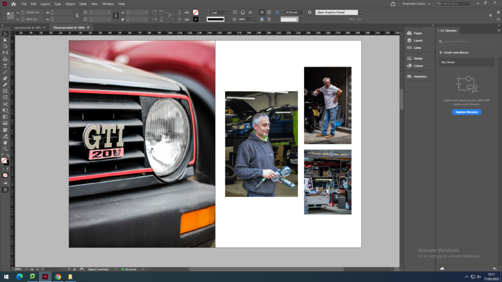
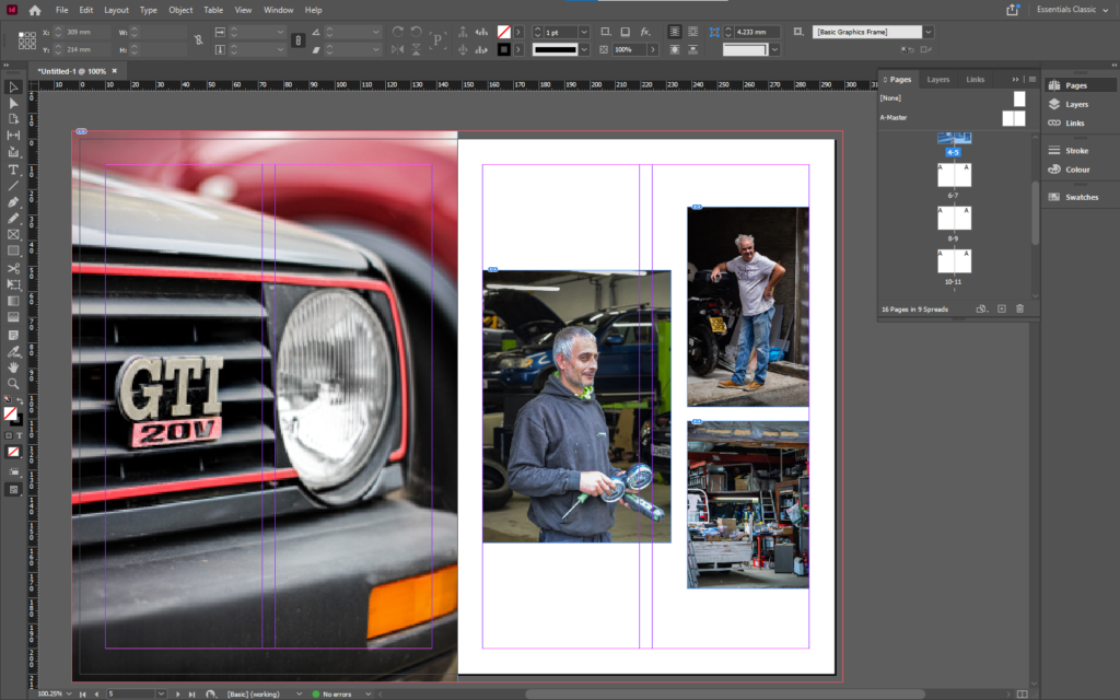
Im starting the zine off with these two images of old cars. I made my favourite image larger by making it full bleed. This works as the cover image is the same as the image on the right, however it is zoomed in more. I have set the theme with the cars which allows me to shift the focus to the newer cars and mechanics and their work place.
I used an image of a slightly newer car to create a small juxtaposition to the older cars before. Then I used a set of three images of mechanics and people working in garages, so that I can include and introduce a sense of human emotion and charisma into the zine. By having these images on this double page spread allows me to have a double page spread next on both the topics of new cars and mechanics.
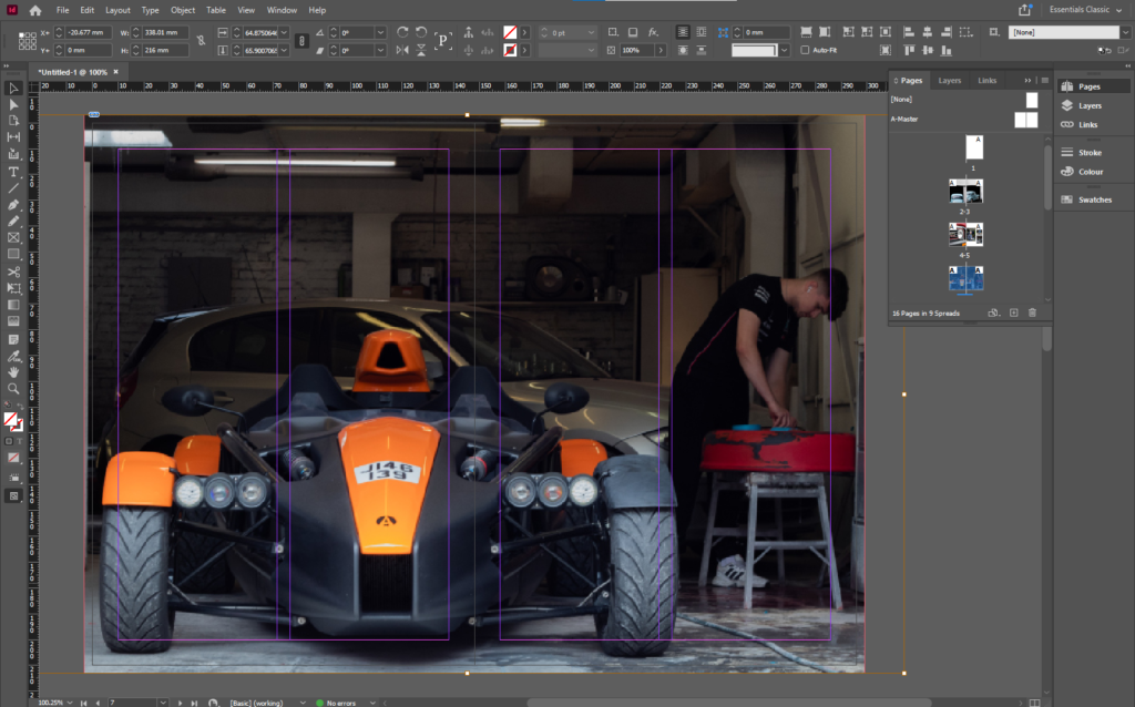
I used a double page spread to end the juxtaposition of time with in the images of cars. It is also a double page spread as it includes both the topics of cars and mechanics. I made sure that the number plate wasn’t in the middle of the double page as that’s where the gutter would be and it would have been cut off.
I used these images of street art to shift the focus from cars to more of a general view of the streets and lanes, to personal items. I used the colour orange to link the images on the previous page, as orange is the main colour of the sports car and also the graffiti in the right image.
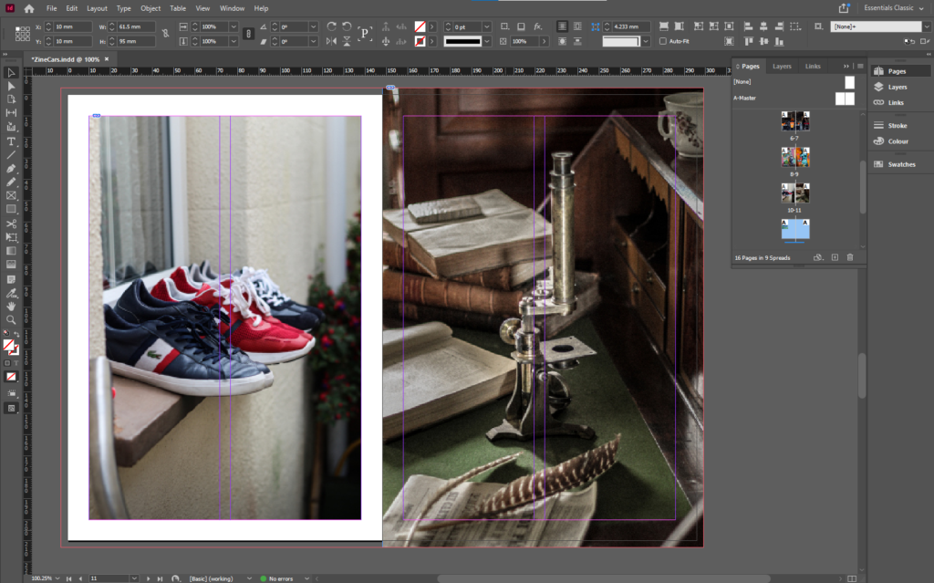
I used all the colourful colours from the previous page to link to the vibrant colours of the different shoes on the window sill, which is an example of multiple items that being to a person or people. Then the full bleed image of a single object in a staged setup, that shows that there is a lot going on in one photo.
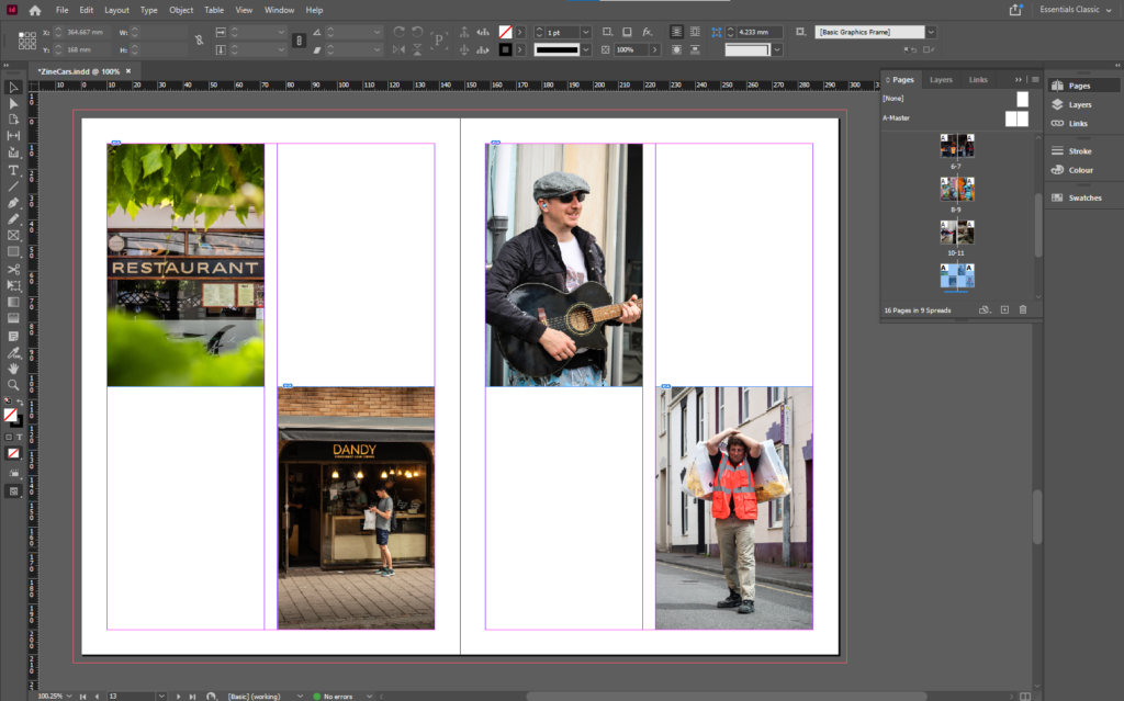
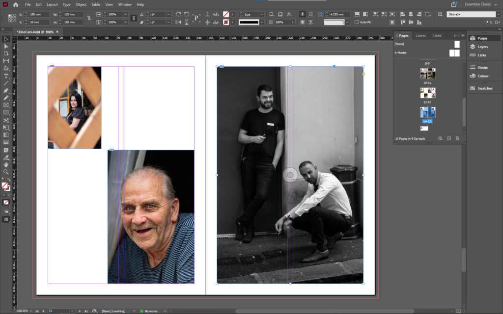
The group of 4 images represent the busy, crowded, chaotic town centre. I used a nicely framed image of a restaurant sign to link the candid image of the man outside a coffee shop. Then since I used a person in the last image, I chose that as the link to the street performer and the man carrying the bags over his shoulder. Then to create a contrast, on the right page I included more negative space. I did this by using a smaller image of a ladies face framed through the fences, with a larger image of an elderly mans face, which gives a more personal feel.
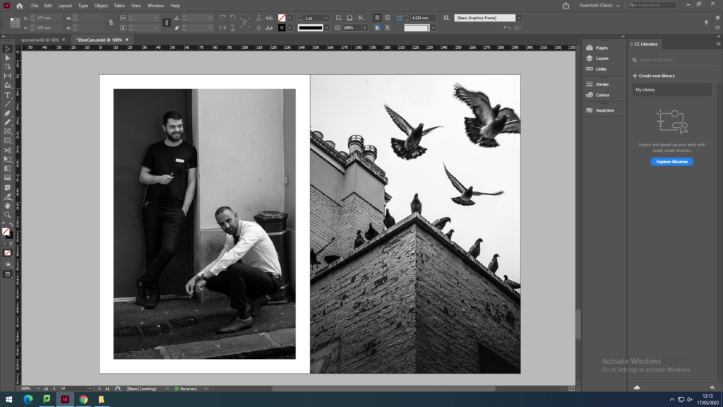
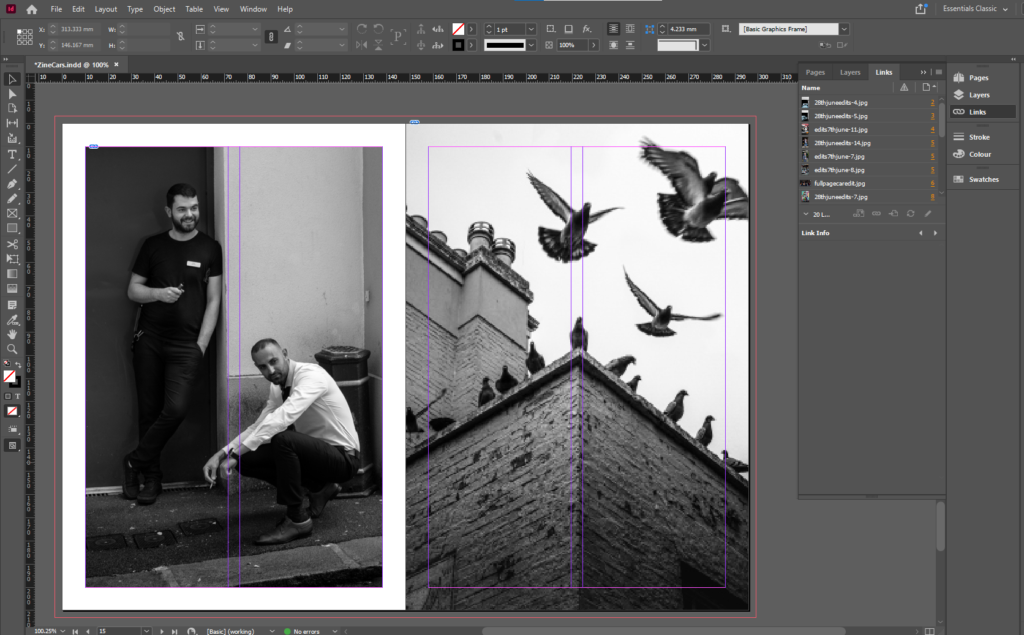
I wanted to include some black and white images so I thought that now is the right place as the pervious page has concluded the images where the subject includes people, however I used a image of people to continue the flow. I made the image on the left have white borders to emphasis the mans white shirts, which also gives the man in the black t-shirt contrast as they are at different levels, and it brings out his face as he is against a dark background. It also allows me to make the image with the pigeons full bleed as it is a visually strong image and shows motion.
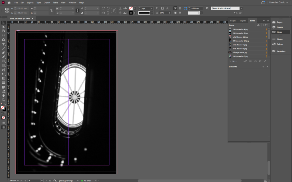
I wanted the back cover to end with a simple abstract image. I chose this image as it continues the black and white trend and is complex and interesting as the light from the skylight shows the details on the banister. It could show the journey of Jersey and the history of Jersey since it was taken in the Jersey Museum.
Overall, I am happy with the outcome which I have come up with, as there is a clear path of progression throughout the zine, which is not normally my usual work style, as I prefer to come up with 1 unique image or images that aren’t related. I have also created some very visually strong image and I am proud that I was able to include them and link them to other images that aren’t necessarily as strong.
All of these examples look factor in, how they want the design to look and feel. The format, size, orientation, narrative, and visual concept. The all have good rhythm and sequencing, with text as well as images, including a title and captions.
We made the zine in Adobe InDesign, following these instructions to set up the document:
Following these instructions, I made a concept of the layout based off the paper copies I made with my printed out images.
changed
changed
final arrangement
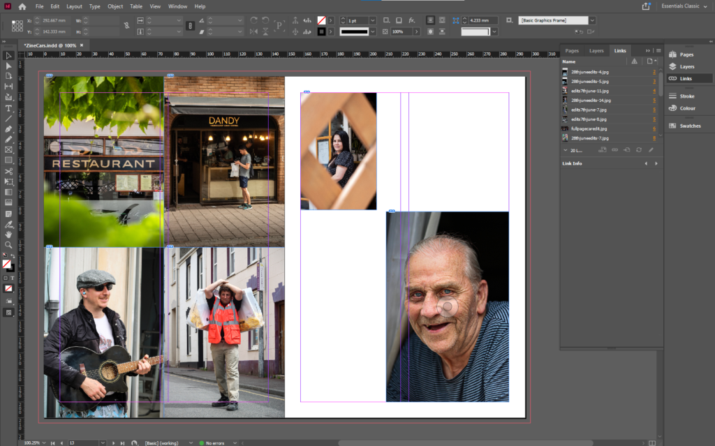
I decided to move and rearrange some images to create space for some more full page image. I like the combination of the 4 all together, as the share a similar link. The top 2 are shops, and the bottom 2 are people working.
I arranged the zine to smoothly change the subject focus from old cars, to new cars, to mechanics, to personal belongings, to street photography of work places, then to half/full body images of people, to close ups of people, then into the final black and white images.
THE FRONT COVER
I decided to use Photoshop to create the front cover as it was easier than trying to do it on the zoomed in image of the car.
First, I used the pen tool to mask a path for the text to go on. I made sure that the path was parallel to the edge of the car, then used a old styled font to keep the old theme consistent.
Overall, I believe that this is the best layout as there is a smooth, consistent flow between images, which tell a story without using any words. I have experimented by changing a few pages and rearranging the layout to come up with the final design.
STORY: What is your migrant community story, for the St. Helier shoot? Describe in:
– 3 words, A migrant community. – A sentence, St Helier Jersey’s migrant community featuring workers and cars. – A paragraph, This shoot represents the working people of St Helier, and their belongings, such as cars and houses. It also displays key features of the town itself.
NARRATIVE: How will you tell your story?
These are some common examples that people use to tell a story:
– Images > new photographic responses, photo-shoots – Archives > images from SJ photo-archive, family album, mobile – Texts > letters, documents, poems, text messages
However, I will only use images I’ve taken. This is because I feel that they tell their own story, as I’ve arranged them into a sequence which allows there to be a flow which guides the viewer through the images and tells a story.
AUDIENCE: Who is it for?
My zine will be aimed at anyone who lives in Jersey, but most specifically, St Helier. Plus, It also helps if they are 14+ as they would understand the images in more depth and detail, making it more impactful for them.
However, most image makers tend to overlook the experience of the viewer. Considering who their audience is and how they may engage with your photo-zine is important factor when they are designing/ making it.
SEQUENCING THE CONTENT – 20 images
I decided not the include any images from the archive as I have taken images which juxtapose each other. Such as, the old blue Morris Minor and the red GTI Golf. This helps tell a story and emphasise differences or similarities between the cars. I will also include other methods such as “zooming out” to create similar effects.
THEME OR STORY
The front cover will be made from a zoomed in image from one of the car photos, as it is one of the main themes.
The start of the zine will contain images related to mechanics and cars. Some of images of the cars will juxtapose each other. New vs Old. The 2 images of the old car images will be full paged on the first 2 pages, as they are major establishing shots.
Near the start of the zine there will be a double page spread images of a new, modern car, which symbolise the new technology and the way forward.
There will be a 2 page spread of just street art, both the images will be full page, and both include vibrant colours, which adds a lot of colour into the project.
For the shots of the people, I will start off with 4 multiple shots one one page, of 2 street photos, then 2 full body shots, then transition into head shots and images of peoples faces.
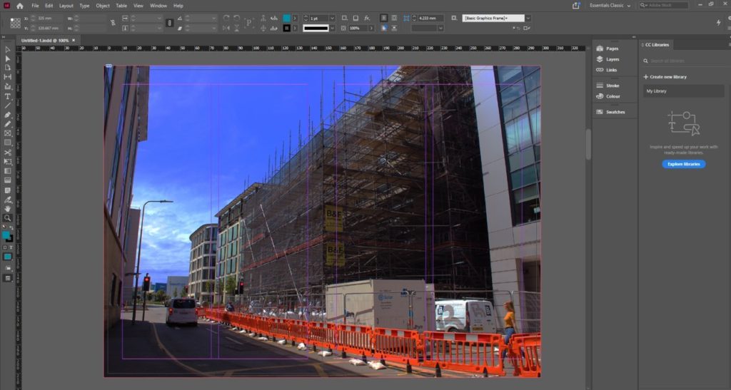
At the end I plan for there to be images of the actual town, such as the pigeon shot, and the scaffolding and the staircase in the Jersey Museum.
I have arranged it so some images juxtapose each other and zoom into each other, creating a smooth transition between images. Most of my best images will be full page as you see a lot of detail when its bigger.
This images represent, people in jersey and objects/ places from jersey
NARRATIVE: How will you tell your story?
I will use imagery to tell my story because so their can be different intreptation of the story in my image. I’ve purposely arranged them into a sequence so it feels like a little story.
AUDIENCE: Who is it for?
My zine is more for younger people around my age (16 to 20) but in reality everyone can enjoy. Is also for people from jersey so they can enjoy looking to their island. And how beautiful the island is. Here are the images I used for my story:
A zine is a small-circulation self-published work of original or appropriated texts and images, usually reproduced via a copy machine. Zines are the product of either a single person or of a very small group, and are popularly photocopied into physical prints for circulation.
Why Photographers Should Create Zines
Digital marketing isn’t always the most effective method of marketing your photography. That’s why photographers have been creating zines for years.
James Moreton is a photographer who is experienced in the art of zine making.
James Moreton
He is an artist who enjoys the tactile approach to photography. “I believe the photographic book is the best medium for photography. The ability to create impact by pairing, juxtaposing and sorting pictures into a flow in order to tell a story or instil an emotion in the viewer is unsurpassed by any other photographic medium” This is why zine making is an important element of a narrative project, therefore, I will incorporate it in mine.
Craig Atkinson is the founder of weekly publications, focussing on post-war documentary photography linked to Britain and Ireland called Café Royal Books.
This is an example of valuable photographic works being collected into the tactile and aesthetically sequential format of a zine. “The publications are bought as gifts, as nostalgic reminders. They’re used as reference for film makers, producers, screen writers and costumes designers. Universities collect the books to allow students access to the large collected history of this genre of photography, which hasn’t existed to this extent, in print, before Café Royal Books.” This shows the importance of having a tactile form of work to inspire and reference, which zines seem to capture very well.
Atkinsons zines have an aesthetic formality and consistency which I want to replicate in my zine in some form.
This video by an independent artist encapsulates the zine making process
I want my design to look like a romantisized interpretation of the buildings and communities in St Helier, I want the viewer to feel like they are walking through the town and meeting the people in my compositions when they flip through the zine.
My Format, size and orientation will be as follows:
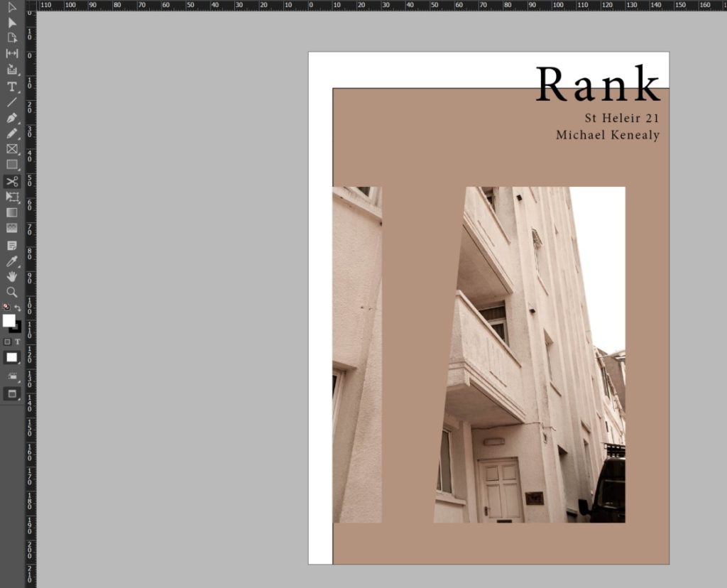
The Title for my project is ‘Rank’. This plays on the difference in class the migrants withhold, it also plays on the common feature of most towns – a taxi rank, finally it plays on the slang word for something that is disgusting – this disgust refers to the vast difference in class. I also want to caption each image with a vague subtitle allowing the viewer to think about the images in different ways.
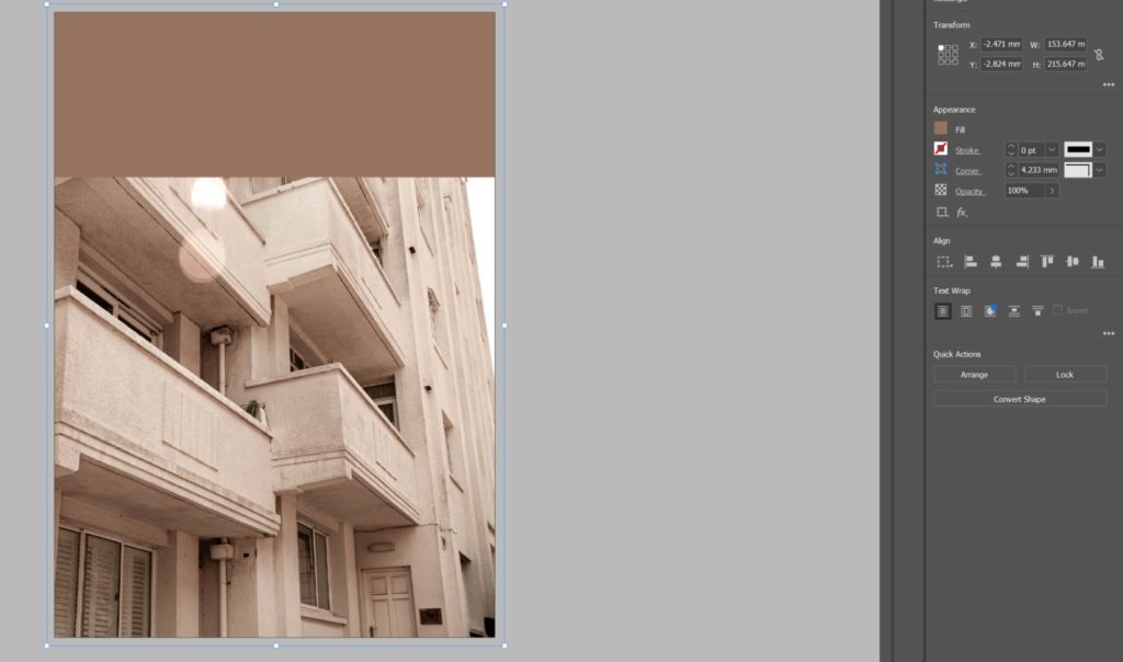
I began by setting up my page colour to be a grey shade. I made sure I added this colour all the way to the bleed line to make sure it printed in full grey without a border. I made my page colour grey to add additional dark colour to the urbanism in my images.
During experimenting, I decided that to enhance my narrative sequence I would rather have a different page colour for each page to enhance and compliment the aesthetic of each image individually. Following on from this I decided that every two parallel pages will have correlation and therefore share the same themes including page colour.
I then decided I want a more abstract look to my front cover as I wanted my zine to entice the viewer and have a more experimental theme. I did this by using the scissors tool to displace images and create different proportions and borders.
I then started adding a theme to each spread. As you can see below I introduced visual elements from my images into the rest of the spread to further develop the narrative and aesthetic of the zine.
I did this by using the eyedropper tool to select a colour from the image to use as the page colour of the spread.
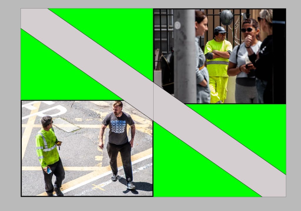
I also decided to experiment with how the page splits my images over the spread by applying some images over two pages like the image below.
I then designed a back page that correlated with the front page by using the same colours and themes.
I then scrolled through my zine adding vague image captions to further the narrative and encourage more thought about the purpose of the project.
Final Evaluation
Throughout the project I was able to endeavour into a pit of knowledge with two territories. The first being the historical and cultural contexts of Jersey and learning more about the rich cultural history the island holds. This led to understanding more about migrant communities which was the predominant theme I was exploring. The second territory of knowledge I gained was that of myself awareness. I was able to learn more about my position in Jersey’s community and my similarities and differences to others in my communities. This identity discovery waws fuelled by experiencing new people and cultures while exploring this topic and learning about the history of the place I call home. I also gained insight into an entirely different scope of art, this being the history of architecture in St Helier. I gained knowledge from an experienced historian and architect from a walk examining the wealth of historic buildings and attractive townscapes that characterise Jersey’s capital. He walked through the history of specific areas through archival records. I was also able to explore the beautifully restored Victorian House and enter the drama of a Victorian family in crisis which developed my insight into the history of how Jersey’s economy and infrastructure came to be.
I was additionally able to apply and channel my knowledge of zine making into a tangible project. I learnt about new software – Adobe InDesign and its useful qualities in terms of creating professional print works. I learnt about other significant zine publishers in Jersey – ED.EM. and others like Café Royal Books and apply them to my project. I was able to turn an idea into a tangible and aesthetically planned narrative which matched my intentions of this project sufficiently.