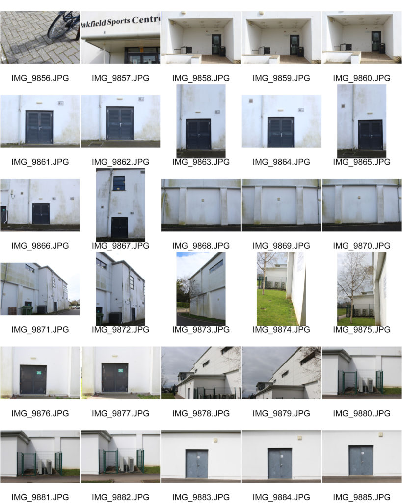
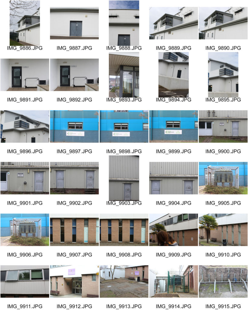
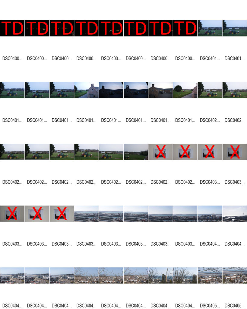
Contact Sheets


Final Edits






Artist Comparison
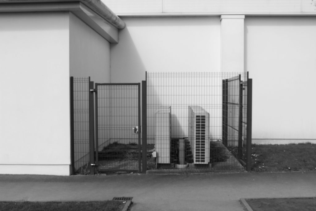
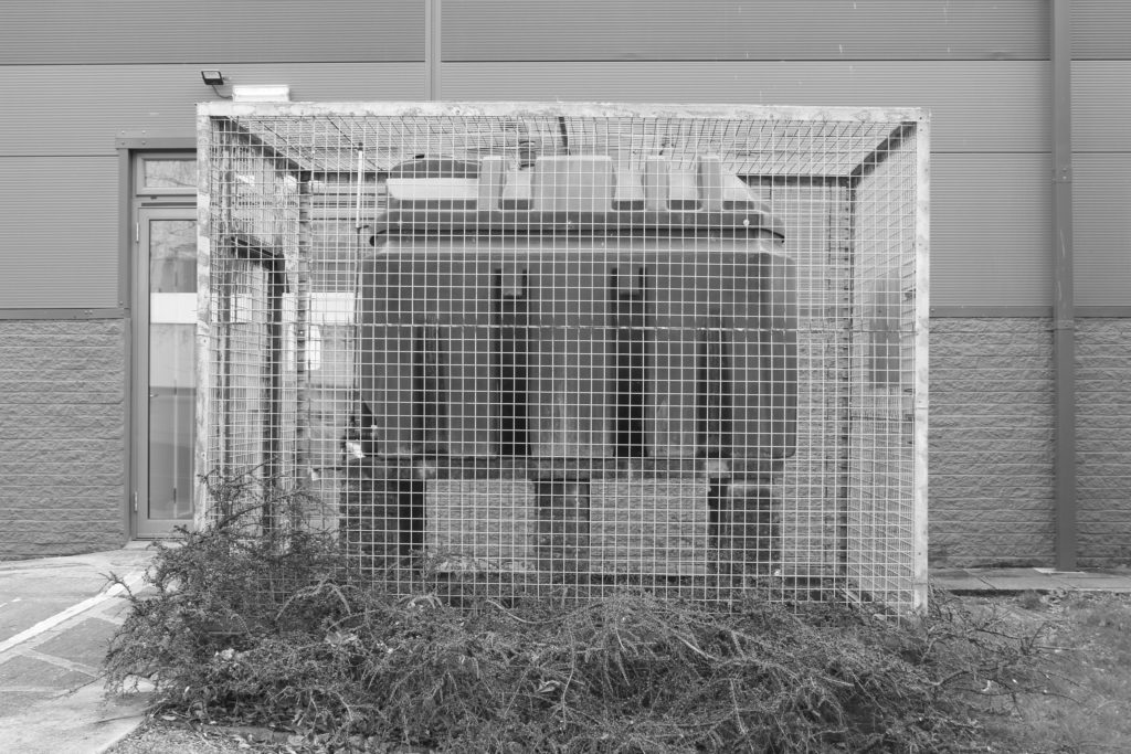
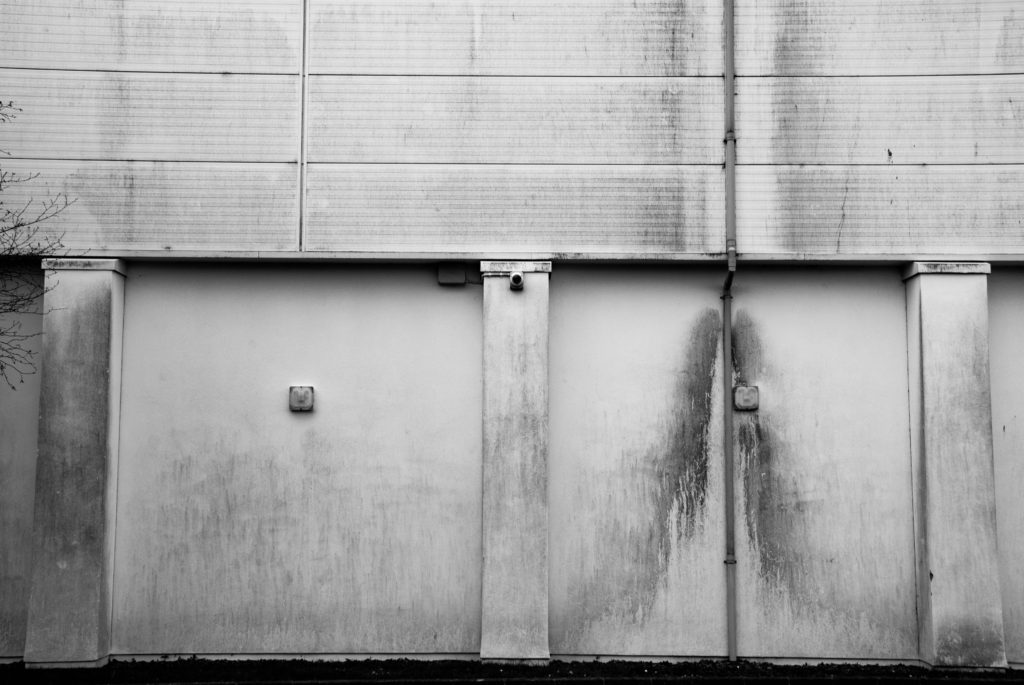
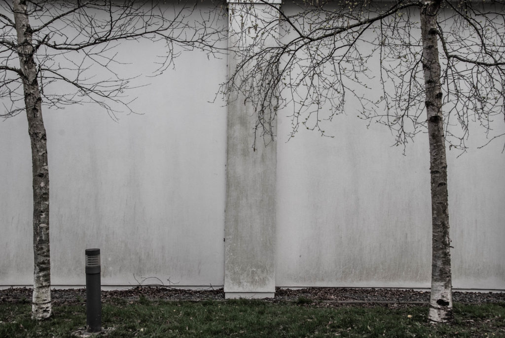
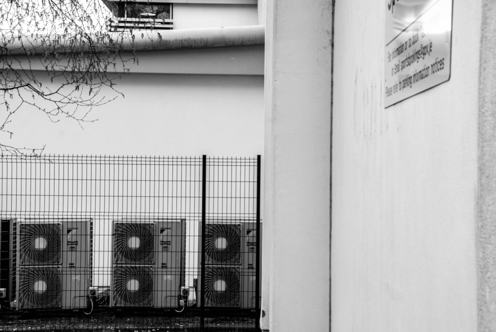
The above image – CORONA DEL MAR, was taken by Lewis Baltz in 1973. The below is my image taken at Oakfield Sports center.

Contact Sheets


Final Edits


Artist Comparison


The above image – CORONA DEL MAR, was taken by Lewis Baltz in 1973. The below is my image taken at Oakfield Sports center.

The New Topographics

Topographics was a term used by William Jenkins during 1975 as a word to describe a group of American photographers whose shots had an identical but clever aesthetic; they were monochrome, orthodox of urban / industrial landscapes in an attempt to show how humans have shaped the land. These photographers included: Robert Adams, Lewis Baltz, Bernd Becher and Hilla Becher.
Urban landscape was/is used to show an increase in population living in an urban / man built settlements. It is known as “the art of visual and structural integration of a set of buildings, streets and places that form the urban environment ” which aims to present a sense of scenery of man made settlements.
This type of photography powerfully illustrates how man have affected the Earth and evolutionized the land ourselves with earthly elements such as iron to build infrastructures. It can also serve as a way to show how we are polluting our own planet, created for our benefit; being destroyed by its own elements; science has shown that noble gases, which have been increased by engine working, have effected the ozone layer.
Stephen Shore
Stephen Shore is a famous photographer who has been widely known for over 45 years and the first living photographer to have a one-man show at the Metropolitan Museum of Art in New York, after Alfred Stiegliz.
In the 1970s he inspired many photographers in colour photography and in the use of the view camera for documentary work.
In his letter to a young artist, he states that he’s been teaching at Bard College for more than 20 years and has had the “opportunity to meet graduate students at several institutions over the years.”
He also states that he believes “art is made to explore the world and the culture, to explore the chosen medium, to explore one’s self.”
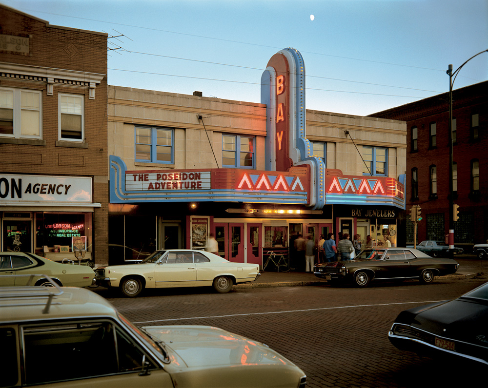
Image Analysis
Light:
The brightest part of the image is clearly the sky as it’s naturally illuminated by the sun, then the sign which grabs the viewers / habitant’s attention.
There are dark shadows and tones suggesting
The background is a bit of sky which shows natural lighting being used coming from behind. Also, since there is a 1/3 of the image containing a natural setting / environment it could show how man made structures have taken over the natural environment.
Space:
There is an ideal dream of 3D space in this 2D picture because of the monocular profundity signals utilized and caught by the photographic artist.
Texture:
The surface of these buildings feel damaged. I know this because there are a few cracks which could show how humans are breaking the natural environment. The texture of the rest of the objects in the image feel metallic, cold,
Lines / Binocular and monocular depth cues:
There is evidence of repetition of angular, vertical and horizontal lines in this industrial image in order to create a perception of height.
There is a strong variety of occlusion which creates and helps us perceive this as a 3D image. Height in plane also plays a role in this image showing that bigger objects must be closer to “us” and smaller objects must be further away creating a 3D illusion.
Shape and form:
This image has various shapes due to the urban context. For example, there are rectangular and circular shapes suggesting an industrialised environment as these shapes aren’t very common in nature. There are also triangular shapes along the lit sign showing the same thing.
There is also depth in this image as well as height and width adding to the 3D form in this 2D image. For example, relative size, occlusion, cast shadows and interposition all play a role in helping us perceive this image to be 3D.
Colour:
There is a vast amount of colour in this image spanning past the primary colours. These colours include, blue, red, yellow, brown, black, grey and more. In contrast to Ansel Adams we can clearly see a development in cameras as well as the environments.
The bright primary colours would suggest how bright and amazing this “new man-made world” is but the dark tones could also show the sinister background of such places as some towns were built by slaves.
Planning
Contents:
For this project, my main goal is to capture an urban area in the most artistic and creative way as I possible can. This will include pictures of town, building, etc, except cars.
Location:
My location will be focused around town and Fort Regent as those are the most industrialised and well known areas. I will have a go at capturing other places in order to get a vast majority of photographs and stand out.
Lighting:
For this shoot, I will be able to clearly use natural lighting since it’s an outdoor
shoot plus, it permits my pictures to seem natural and permits ME to capture the
natural scene of the land.
Camera Setting:
For this project I’ll set the ISO to a hundred since the weather seems to be sunny with the shutter speed at 1/500 so as to let enough light-weight in.
I may conjointly set the camera to automatic mode in order that the camera determines all aspects of exposure, choosing exposure parameters in keeping with the appliance at intervals the constraints of correct exposure, in conjunction with exposure, aperture, focusing, light-weight metering, white balance, and equivalent sensitivity.
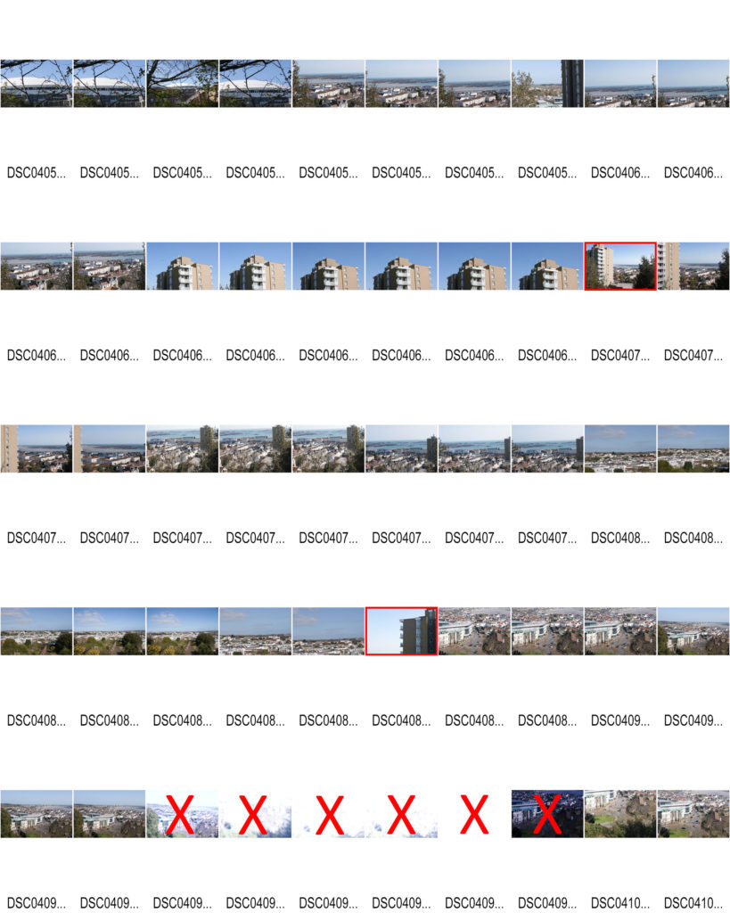
Contact sheets
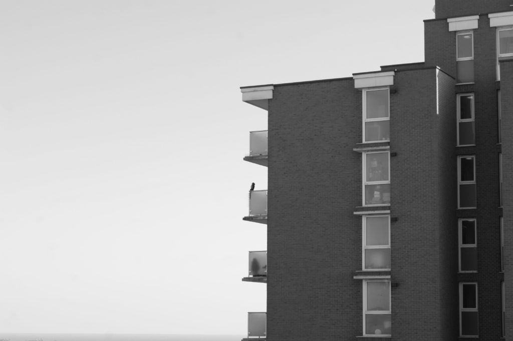
Sat by the balcony
I have decided to call this image “Sat by the balcony” due to the fact the owl statue creates an illusion that someone or something is sat on the balcony.
For this image I used the cameras auto focus and auto mode in order for a quick and automatic shot with perfect ISO, Aperture and shutterspeed.
The image is in black and white due to the aesthetic and message portrayed in this whole Landscape topic; industrialization appears to be ruining nature turning white trees darker for example. Therefore, I am attempting to create the same effect but with urban landscapes.
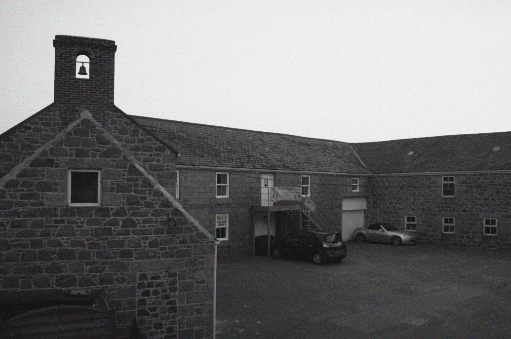
By the bell
For this image, I used the camera’s autofocus and auto mode to shoot quickly and automatically with perfect ISO, aperture and shutter speed.
The image is black and white due to the beauty and information displayed in the entire landscape theme. For example, industrialization seems to be destroying nature by blackening the white trees. Therefore, I tried to create the same effect with the urban landscape.
I have tried to use the rule of thirds to compose the image and make it more intriguing to the viewer.
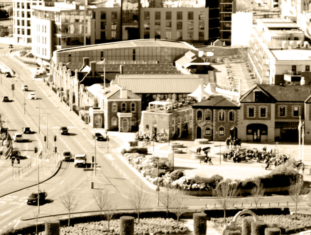
2021 but 1960
For this image, I used the camera’s autofocus and auto mode to quickly and automatically shoot with perfect ISO, aperture, and shutter speed.
Due to the beauty and information displayed throughout the landscape theme, the images are vintage related to past images and the era when Shore was born (20th century). Also, 1960 was one of my favourite eras and this filter is perfect for the first project on urban landscapes.
I tried to use the rule of thirds to compose the image and make it more attractive to the public.
In my opinion, this project was average. This is because there is powerful use of lines, composition, lightening, selection and imagery. But there is little to no manual work as most was done by the Auto mode.
I really do like the image that gives a 60s vibe as it’s my favourite epoch where most of the industrialization has already taken place. I think it is successful in a way as it shows the audience the present time but gives a retro feeling. This may also be said to create a juxtaposition or as I like to call it a paradox; “past” and present in one image sort of contradicting each other.
The black and white images add to the vintage theme but are also aesthetically pleasing as for the first image we have the building on one side and the sky on the next which powerfully shows the use of the rule of three and makes it pleasing and peaceful to look at.
In conclusion, although my images may be successful I agree to a certain extent I need to use more of the manual mode, see what ISO, shutter speed and aperture work best in different lighting and settings and apply it to future projects since most of the images came out underexposed or over exposed which limited my selection of images drastically.
What Are The New Topographics?
New topographics was a term created by William Jenkins in 1975 to describe a group of American photographers (such as Robert Adams and Lewis Baltz) whose pictures had a similar repeated aesthetic, mostly black and white prints of the urban landscapes, a human-environment with the natural terrain hiding in the background.

What was the new topographics a reaction to?
It was a reaction to the increasingly suburbanised world around them, and a reaction of idealised landscape photography that raised the natural elemental.
Rut Blees Luxemburg – (Case Study 1 / Night)
Rut Blees Luxemburg was born in 1967 is a German-born photographer. Her technique is to take photographs at night, mostly exploring the urban landscape. She experiments with exposure time and low light conditions to get an image that captures the night life in the city.

As you can see, Luxemburg uses warm colours and reflections in water puddles, which creates a unique view of her scene. Also, experiments which long exposure.
Analyses Of One Of Her Images :
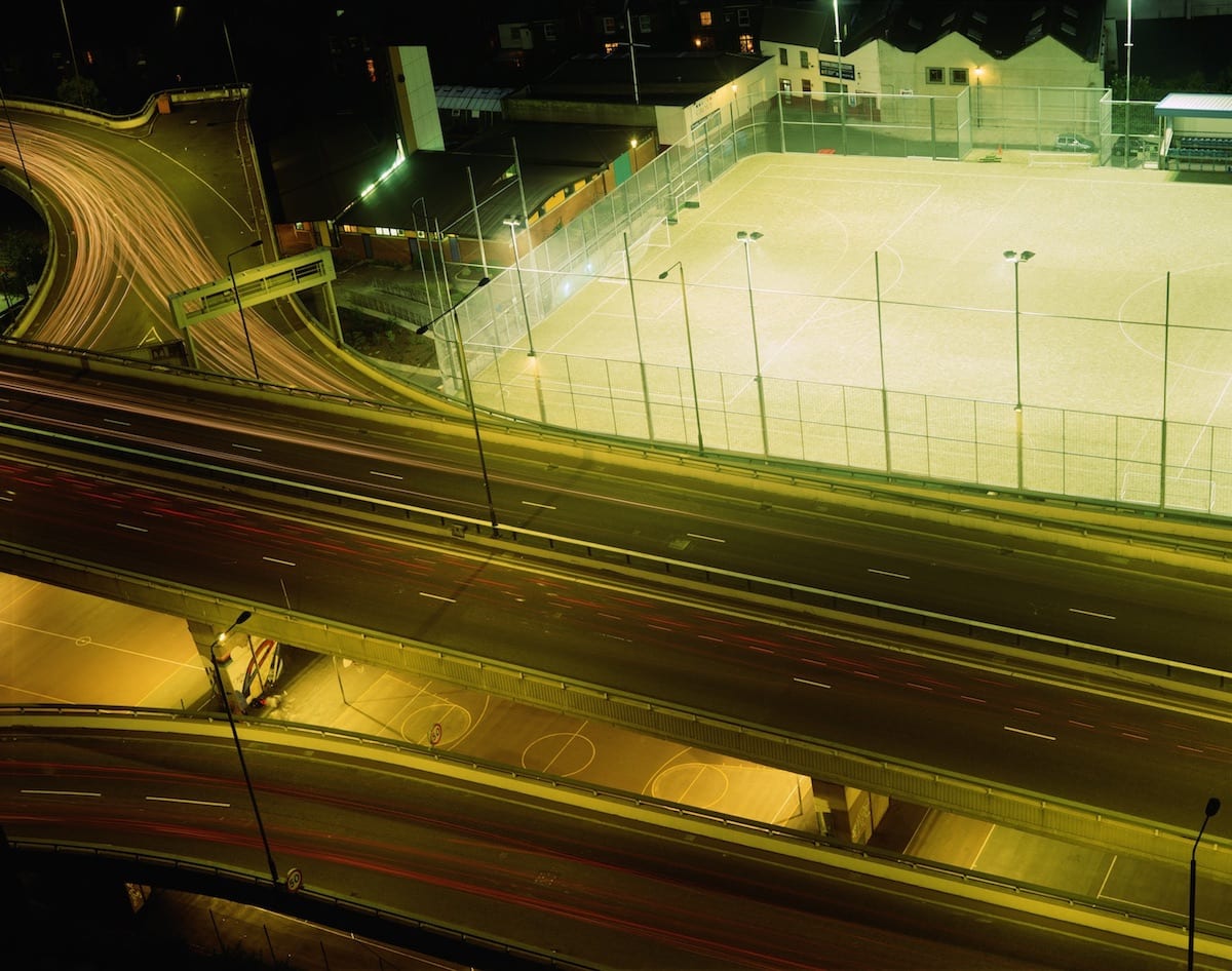
All the lighting in this image is artificial, due to it being night time. It seems that there is a tungsten tone in the lights, as there is a orange/red tint on the surface that the light hits. This means that the image has a warm temperature to it, as the colour red is represented by heat. There is also a washed out green colour to the buildings in the back, most likely caused by the reflection of the flood lights on the football pitch. The colours are muted, which gives off a serene atmosphere as it feels abandoned. Although this isn’t the case as motion is captured by using a long shutter speed, this makes it so the car lights show as a long red or white lines; depending on what way the car is driving. Since, it is night the camera will not overexpose the image, as there is no natural sunlight, therefore she would of been using a high ISO, eg 800-3200. There is a high depth of field as all the image is in focus, and also Rut Blees Luxemburg displays a wide range of tonal values, achieved by including and showing a light source and shadows under the overpass. There are many horizontal lines and geometric shapes in the image. The horizontal lines suggest a feeling of rest, because objects parallel to the earth are at rest. In this landscape, horizontal lines also help give a sense of space and attention to the 3D aspect to help visualise that the image was taken from a high place.
As she is a tutor at the Royal Collage of Art, this may mean that she has a higher status position over her students, which is why the image is taken higher up.
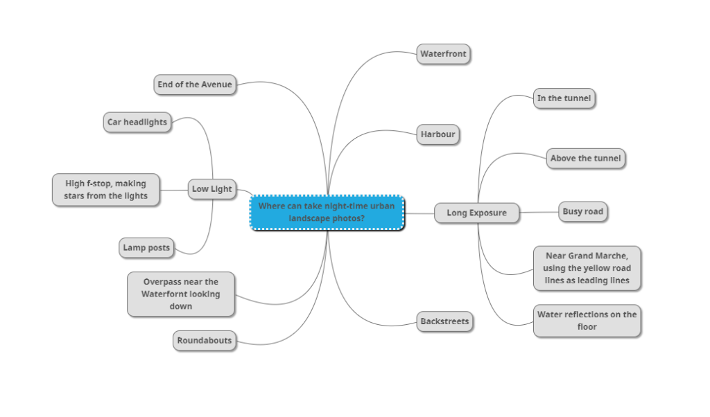
Where Can I Take Night Urban Landscapes?
Mood Board

Photo-shoot Plan

Night photos – (Contact Sheet)

Final Night Photos (Titled)
My Image Comparison To Luxemburgs Image – Venn diagram


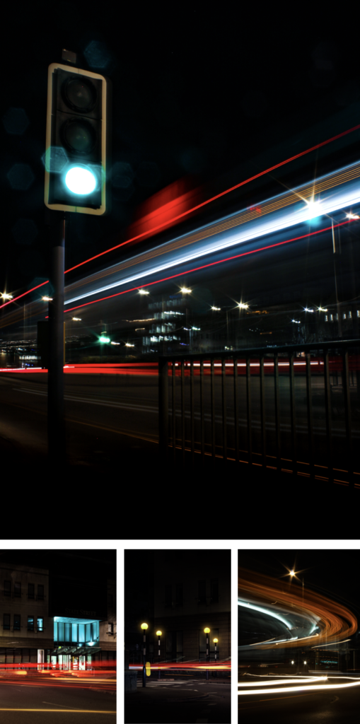
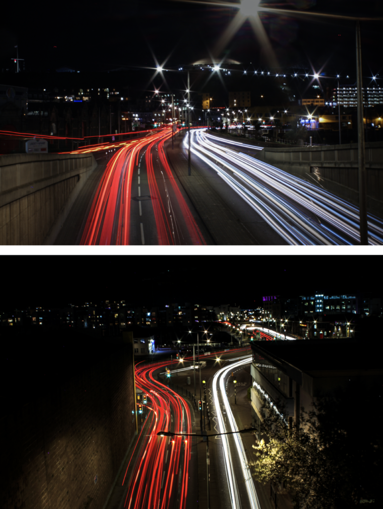
Overall, my I really like my image as it captures motion and, I have created a unique pattern with the buses lights. The colours are vibrant and the bus lights are in focus, which is the main focus point in the image. As I used a high aperture the still lights appeared as stars. For composition I go low to the ground the shoot more upwards, the lights from the bus fill up most of the image. The image is balanced and exposed perfectly even thought it was taken at night time.
Stephen Shore – (Case Study 2 / Day)
Stephen Shore’s work has been widely published and exhibited for the past forty-five years. He was the first living photographer to have a one-man show at the Metropolitan Museum of Art in New York since Alfred Stieglitz.
He has also had one-man shows, his most rememberable at : Los Angeles; Jeu de Paume, Paris; and Art Institute of Chicago.
In 2017, the Museum of Modern Art opened a major retrospective spanning Stephen Shore’s entire career. He has received fellowships from the Guggenheim Foundation and the National Endowment for the Arts.
When he was in New York; in the early 1970s, he sparked new interest in colour photography, and in the use of the view camera for documentary work.
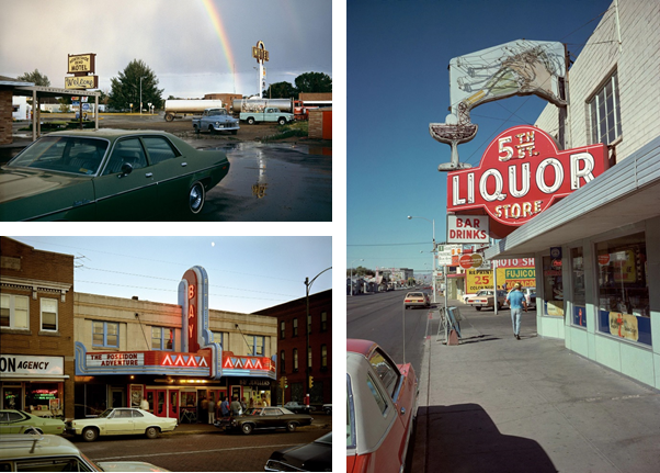
Analyse Of One Of His Images:

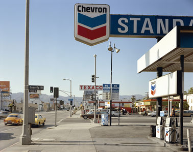
This image shows a busy American street in 1975, Shore’s took this image next to a gas station, which had a wide view over the streets. The image is bottom heavy, which means that the viewers eye is directed toward the bottom half of the image, compared to the empty blue skies.
The contrast of a busy, chaotic street and the clam, tranquil mountains in the background, signify the difference between man and mother nature. Even thought the mountains are small they are still present. The fact that the mountains don’t take up a large portion of the image shows that the industrial and urbanising world is taking over natural land.
The main colours in this image are red, blue, and white. That just happens to be a colours in the American flag. It can suggest that Shore’s is proud to be an American citizen, which he displays through his work of photography.
Overall, I think this image mostly basic, with a normal “street photography” composition, that doesn’t use any objects/techniques to grab the viewers eye. The colours are normal, but mostly blues, which gives off a cool feelings, despite being in a desert in Los Angles. Although, I do like how Shore’s has captured the history of America, by including the old cars, and billboards, (not digital).
Where Can I Take Night Urban Landscapes?

Mood Board

Photo-shoot Plan
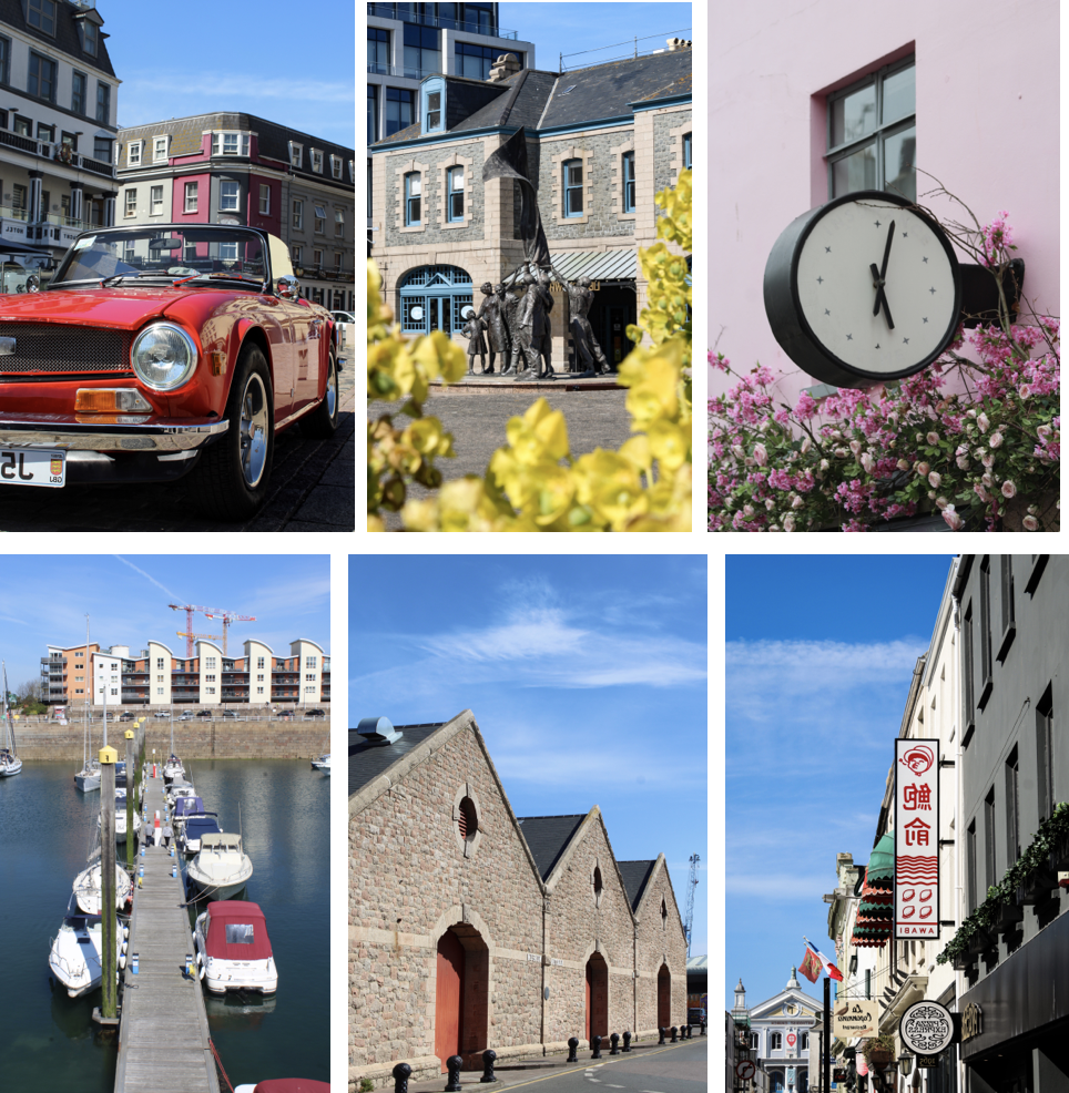
I plan to walk around town and take photos of unique buildings and scenes that I find. I would go to Weighbridge first then maybe, round the back of the tunnel to La Collette then finish off at Millennium park and the small streets round there.
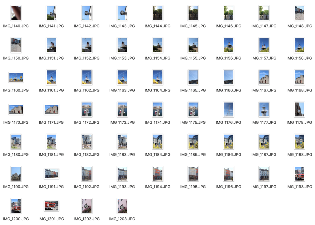
Urban Day Photos – (Contact Sheet)
Final Photos
Analyse – (Shores Vs Mine)
This is my final image I chose, as I feel that it linked to Stephen Shore’s style the best.

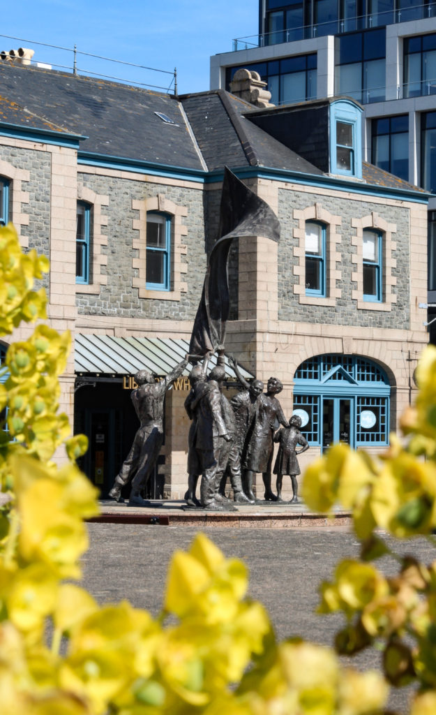
Similarly, both the image capture a historical value. My image captures the liberation statue, and Shore’s capturing change over time.
Both, include nature in a build up urban environment. In my image its the flowers in the foreground, and Shore’s its the mountains in the background.
Also, both use vibrant colours, except mine has a more vibrant summer feel. However Shore’s uses a smaller colour range, compared to mine which uses bright yellows and ultra blues.
Overall, I like mine more as there is more of a focus point; being the statue, this is achieved by using a unique composition with the flowers to almost “frame” the statue. To draw more attention to the statue I used a lower aperture to blur the flowers.
Overall Best Photos

In 1975, the exhibition titled “Photographs of a Man-Altered Landscape” of New Topographics epitomized a key moment and turning point in landscape photography. New topographic images strayed away from the usual conventions of landscape photography and gave way to unromanticised views of stark industrial landscapes, suburban sprawl, and everyday scenes not usually given a second glance. The show was curated by William Jenkins at the International Museum of Photography at the George Eastman House (Rochester, New York), and remained open to the public from October 1975 until February 1976. Photographers from the exhibition such as Robert Adams, Lewis Baltz, Nicholas Nixon and Hiller Becher took inspiration from the mundane and man-made, revealing the growing unease about how the natural landscape was being eroded by industrial development. This revolutionary style of photography was both a reflection of the increasingly modernised world, and a ‘reaction to the tyranny of idealised landscape photography that elevated the natural and the elemental’- contrasting greatly with the work of landscape photographers such as Ansel Adams.

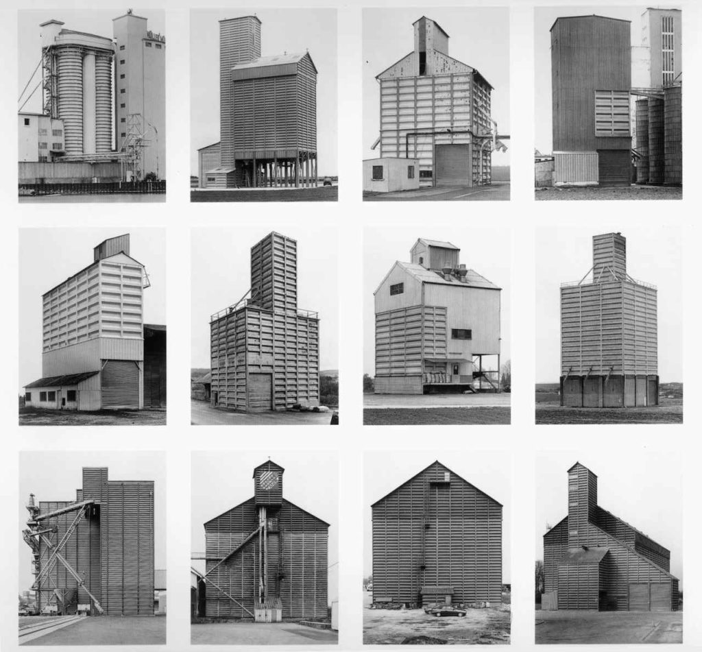
Lewis Baltz (1945-2014) was an American photographer and visual artist, most famously known for his contribution to the New Topographics movement as one of the “New Topographics: Photographs of a Man-Altered Landscape” exhibition’s original photographers. Growing up in southern California in the post-war years, he had witnessed at first hand the rapid urbanisation of the countryside and the relentless spread of suburbia. In his work, Baltz focused on capturing “a landscape that no one else had much interest in looking at”, photographing areas such as car-parks, tract housing, concrete walls, garages, vast industrial warehouses, metal fire escapes, anonymous buildings, all with an absence of people. Baltz described how his daily life took him “to shopping centres, and gas stations and all the other unhealthy growth that flourished beside the highway”- he has a clear aesthetic in his work, focusing on minimalism and rejecting the usual expectations of landscape photography, such as the romanticism of landscapes. His images demonstrated a stark geometric beauty, making the new homogenised America visible in a way that echoed, and criticised, the soullessness of urban planning.


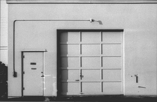


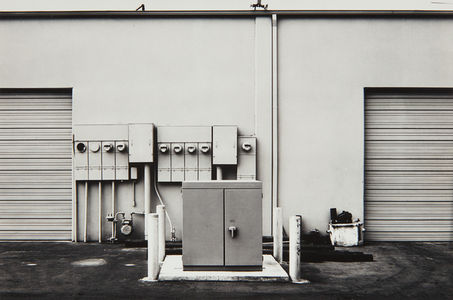

I chose to analyse this specific Lewis Baltz image due to its strong technical aspects that conform to the formal elements, while also reflecting Baltz’s views on the growing world of industrial landscapes. Firstly, I really enjoy how Baltz has captured this image with a high contrast black and white filter, whether this was a specific choice or not, the absence of colour creates a desolate atmosphere. This links to the New Topographics movement and shows Baltz’s negative opinions on the increasing urbanisation of the world. However, Baltz also wished to find the beauty in his everyday geometric surroundings, for example a static rectangular shape can be seen to the left on the door, and is repeated on the bricks, and again on the ladder- it keeps on going. The use of repetition, while aesthetically pleasing to the eye, could actually represent the uniformity of society and the landscapes we are destroying- suggesting these industrialised buildings are taking over our environment. Additionally, the geometric shapes create strong leading lines throughout this image. Particularly, the stripes of paint to the left of the photograph and the thick line created by the half-wall on the right draws the observers eye towards the ladder in the background of the image. Baltz may have wanted to highlight this aspect of his image as the ladder disappearing at the top reflects the never ending climb to save the natural world.
In addition, the natural lighting Baltz used to capture this image creates soft shadows and highlights however, there is still a big contrast between dark and light tones. The paint swatches on the left of the image move up in a gradient pattern from dark to light, becoming less uniformed as they go on. This could symbolise the destruction of nature, and how modernised buildings are slowly trampling on our environment. Overall, the tones in this image are balanced (with slight emphasis on mid-tones) which creates a muted sombre mood, possibly connoting Baltz’s feelings while taking in the landscape he has captured. In terms of space in this photograph, there is not a wide depth of field or a vast expanse of land in the background (like the work of Ansel Adams), instead the background is blocked by a manufactured wall. Moreover, the composition of this image reflects the rule of thirds with the door and paint in section one, ladder and bricks in section two and the rectangular wall structure as the third. By using this composition technique, Baltz has created a visual narrative as he guides the observers view through the image from the dark gloomy thoughts on an industrialised world, to a hopefully brighter and more optimistic future for landscapes.


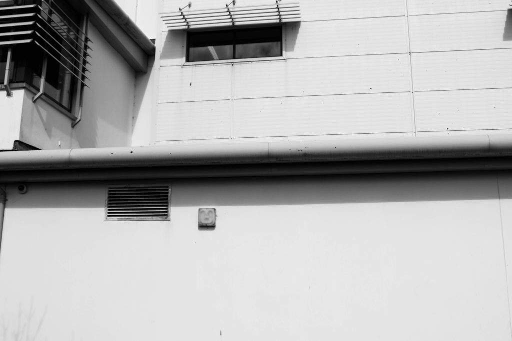

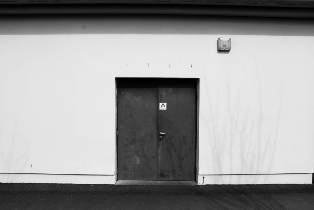


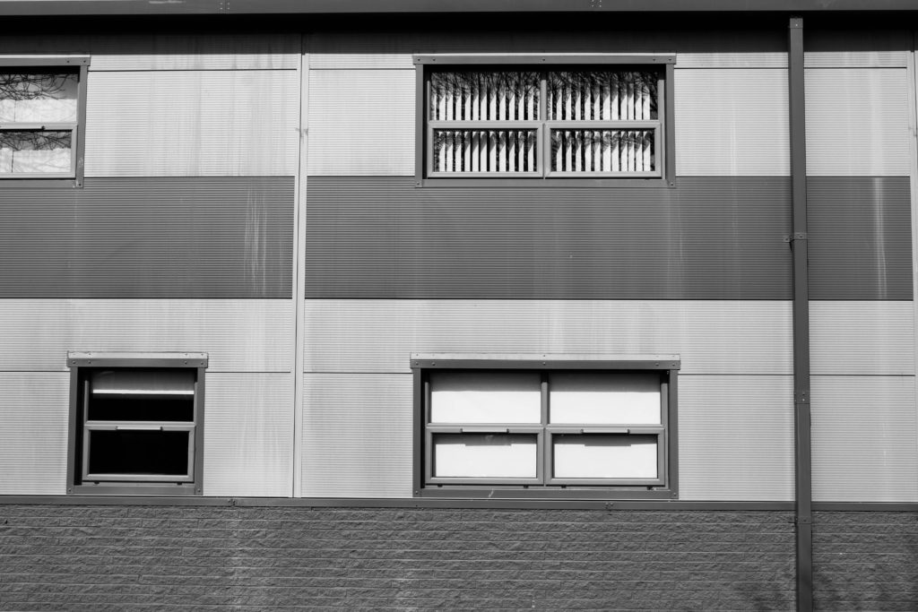


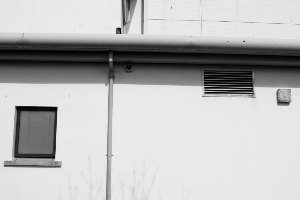

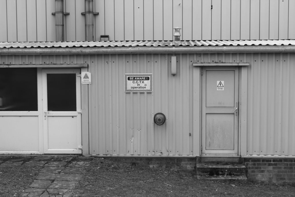
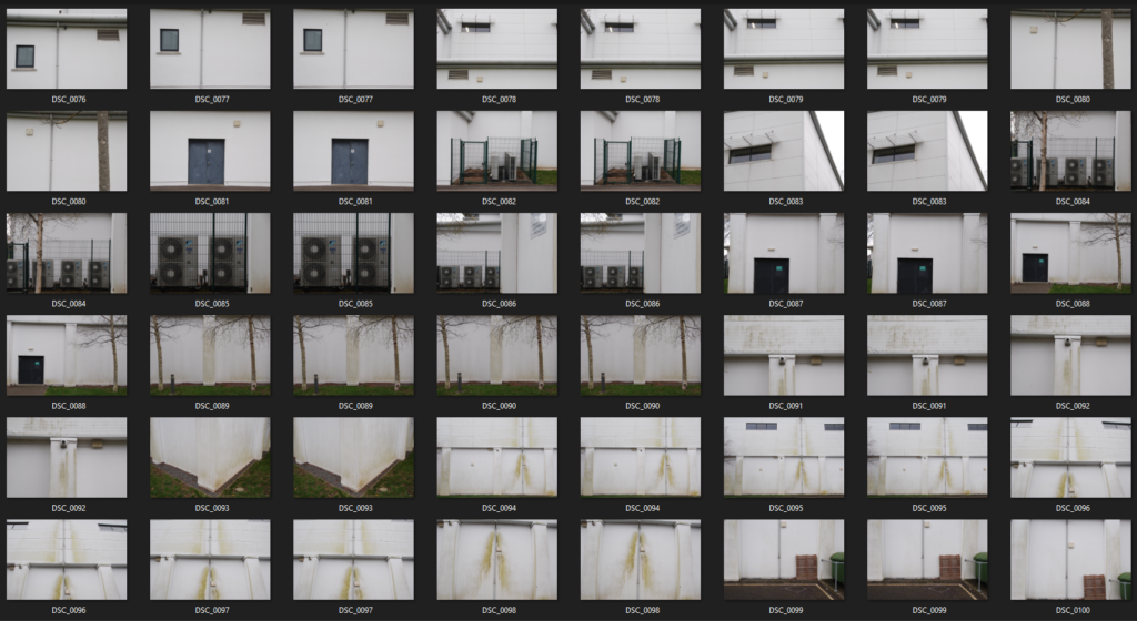
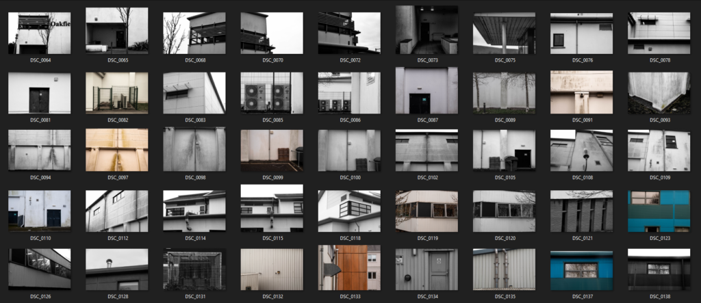
In class this week we took our cameras around the school grounds in attempt of capturing images relating to The New Topographics. I took inspiration from Lewis Baltz during my photoshoot, focusing on photographing buildings, walls, windows and doors. I wanted to include as many geometric shapes as I could see around me in my images which became easier as the lesson went on, finding industrialised areas around the back of the sports building and down near Highlands College. I knew I wanted to edit my images with a black and white filter after the shoot, so while capturing them I saw fit to stand in specific positions looking up at/down on the landscapes in order to capture contrasting shadows and highlights that would be emphasised by the unsaturated editing. My images include several vertical and horizontal leading lines of all shapes and sizes, guiding the observer’s focus along the photo to focal points such as doors and windows. Moreover, my use of repetition within these images mirrors Baltz’s technique of showing the echoes of modern society conforming to industrialised architectural ideas. Additionally, I have reflected the concern with industrialised buildings taking over our environment by capturing tree branches in the background of a few of my images- suggesting the urbanised world is covering up the beauty of nature.
