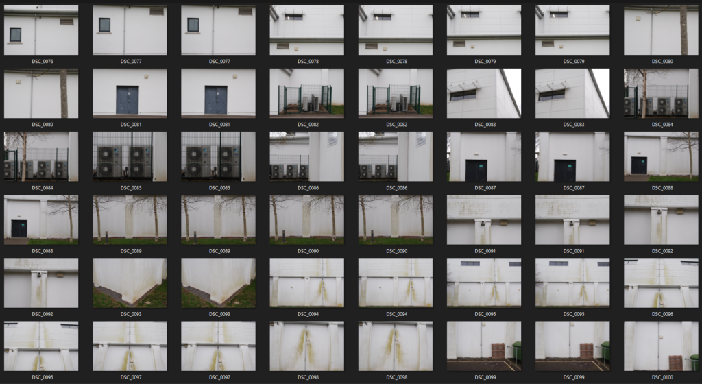
Contact Sheets


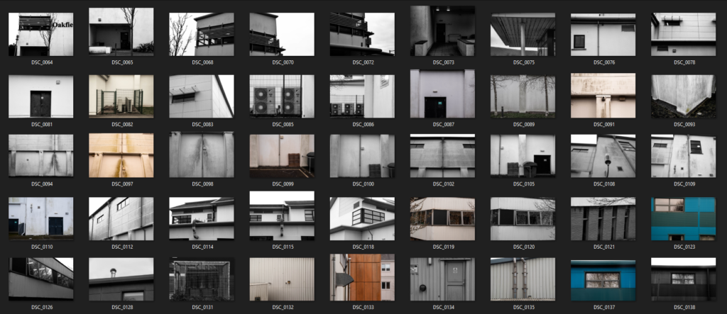
Final Edits






Artist Comparison
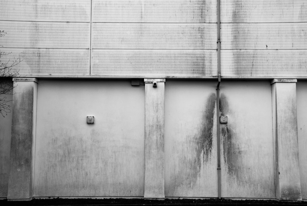
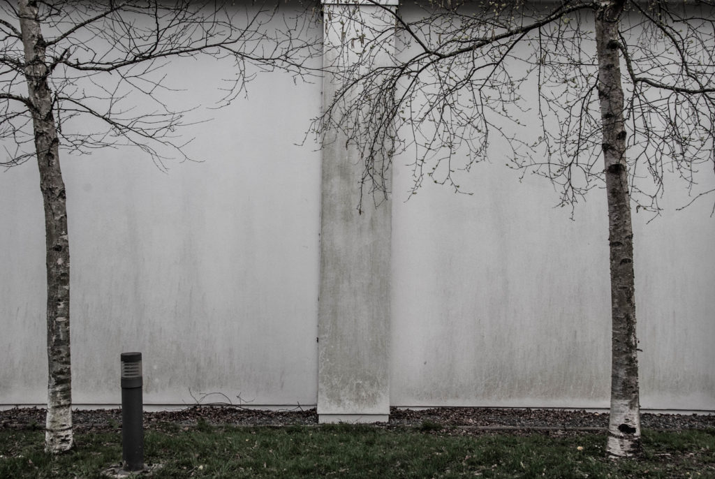
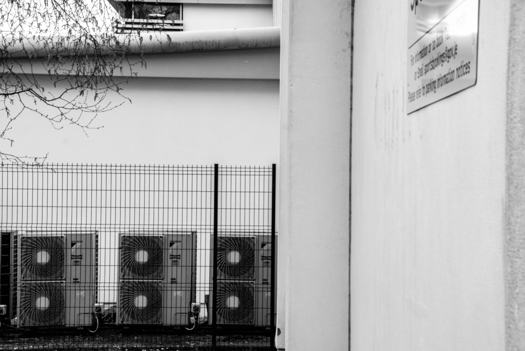
The above image – CORONA DEL MAR, was taken by Lewis Baltz in 1973. The below is my image taken at Oakfield Sports center.

Contact Sheets


Final Edits


Artist Comparison


The above image – CORONA DEL MAR, was taken by Lewis Baltz in 1973. The below is my image taken at Oakfield Sports center.

The New Topographics

Topographics was a term used by William Jenkins during 1975 as a word to describe a group of American photographers whose shots had an identical but clever aesthetic; they were monochrome, orthodox of urban / industrial landscapes in an attempt to show how humans have shaped the land. These photographers included: Robert Adams, Lewis Baltz, Bernd Becher and Hilla Becher.
Urban landscape was/is used to show an increase in population living in an urban / man built settlements. It is known as “the art of visual and structural integration of a set of buildings, streets and places that form the urban environment ” which aims to present a sense of scenery of man made settlements.
This type of photography powerfully illustrates how man have affected the Earth and evolutionized the land ourselves with earthly elements such as iron to build infrastructures. It can also serve as a way to show how we are polluting our own planet, created for our benefit; being destroyed by its own elements; science has shown that noble gases, which have been increased by engine working, have effected the ozone layer.
Stephen Shore
Stephen Shore is a famous photographer who has been widely known for over 45 years and the first living photographer to have a one-man show at the Metropolitan Museum of Art in New York, after Alfred Stiegliz.
In the 1970s he inspired many photographers in colour photography and in the use of the view camera for documentary work.
In his letter to a young artist, he states that he’s been teaching at Bard College for more than 20 years and has had the “opportunity to meet graduate students at several institutions over the years.”
He also states that he believes “art is made to explore the world and the culture, to explore the chosen medium, to explore one’s self.”
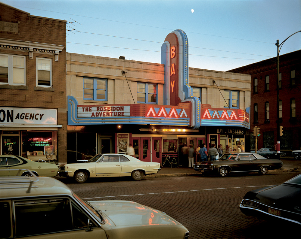
Image Analysis
Light:
The brightest part of the image is clearly the sky as it’s naturally illuminated by the sun, then the sign which grabs the viewers / habitant’s attention.
There are dark shadows and tones suggesting
The background is a bit of sky which shows natural lighting being used coming from behind. Also, since there is a 1/3 of the image containing a natural setting / environment it could show how man made structures have taken over the natural environment.
Space:
There is an ideal dream of 3D space in this 2D picture because of the monocular profundity signals utilized and caught by the photographic artist.
Texture:
The surface of these buildings feel damaged. I know this because there are a few cracks which could show how humans are breaking the natural environment. The texture of the rest of the objects in the image feel metallic, cold,
Lines / Binocular and monocular depth cues:
There is evidence of repetition of angular, vertical and horizontal lines in this industrial image in order to create a perception of height.
There is a strong variety of occlusion which creates and helps us perceive this as a 3D image. Height in plane also plays a role in this image showing that bigger objects must be closer to “us” and smaller objects must be further away creating a 3D illusion.
Shape and form:
This image has various shapes due to the urban context. For example, there are rectangular and circular shapes suggesting an industrialised environment as these shapes aren’t very common in nature. There are also triangular shapes along the lit sign showing the same thing.
There is also depth in this image as well as height and width adding to the 3D form in this 2D image. For example, relative size, occlusion, cast shadows and interposition all play a role in helping us perceive this image to be 3D.
Colour:
There is a vast amount of colour in this image spanning past the primary colours. These colours include, blue, red, yellow, brown, black, grey and more. In contrast to Ansel Adams we can clearly see a development in cameras as well as the environments.
The bright primary colours would suggest how bright and amazing this “new man-made world” is but the dark tones could also show the sinister background of such places as some towns were built by slaves.
Planning
Contents:
For this project, my main goal is to capture an urban area in the most artistic and creative way as I possible can. This will include pictures of town, building, etc, except cars.
Location:
My location will be focused around town and Fort Regent as those are the most industrialised and well known areas. I will have a go at capturing other places in order to get a vast majority of photographs and stand out.
Lighting:
For this shoot, I will be able to clearly use natural lighting since it’s an outdoor
shoot plus, it permits my pictures to seem natural and permits ME to capture the
natural scene of the land.
Camera Setting:
For this project I’ll set the ISO to a hundred since the weather seems to be sunny with the shutter speed at 1/500 so as to let enough light-weight in.
I may conjointly set the camera to automatic mode in order that the camera determines all aspects of exposure, choosing exposure parameters in keeping with the appliance at intervals the constraints of correct exposure, in conjunction with exposure, aperture, focusing, light-weight metering, white balance, and equivalent sensitivity.
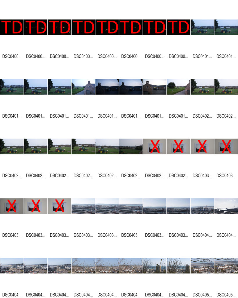
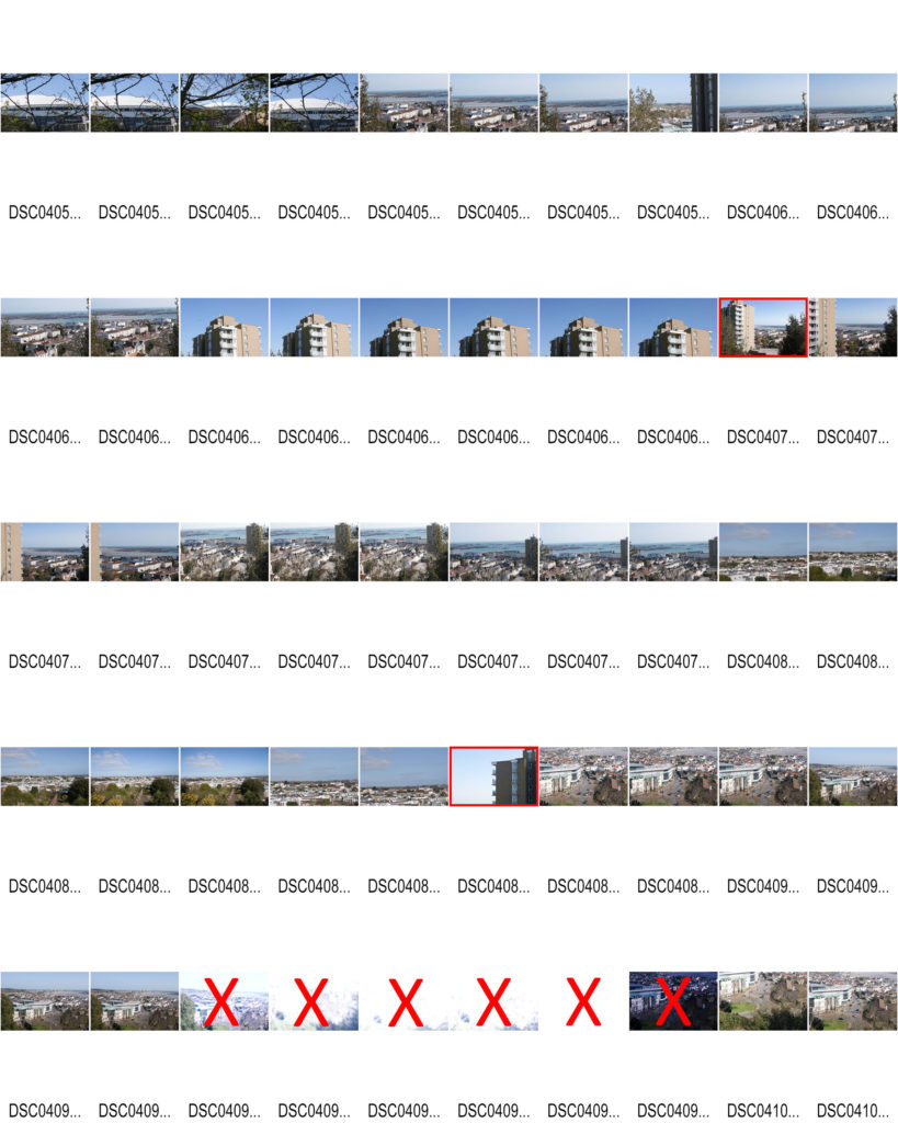
Contact sheets
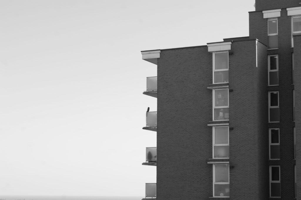
Sat by the balcony
I have decided to call this image “Sat by the balcony” due to the fact the owl statue creates an illusion that someone or something is sat on the balcony.
For this image I used the cameras auto focus and auto mode in order for a quick and automatic shot with perfect ISO, Aperture and shutterspeed.
The image is in black and white due to the aesthetic and message portrayed in this whole Landscape topic; industrialization appears to be ruining nature turning white trees darker for example. Therefore, I am attempting to create the same effect but with urban landscapes.
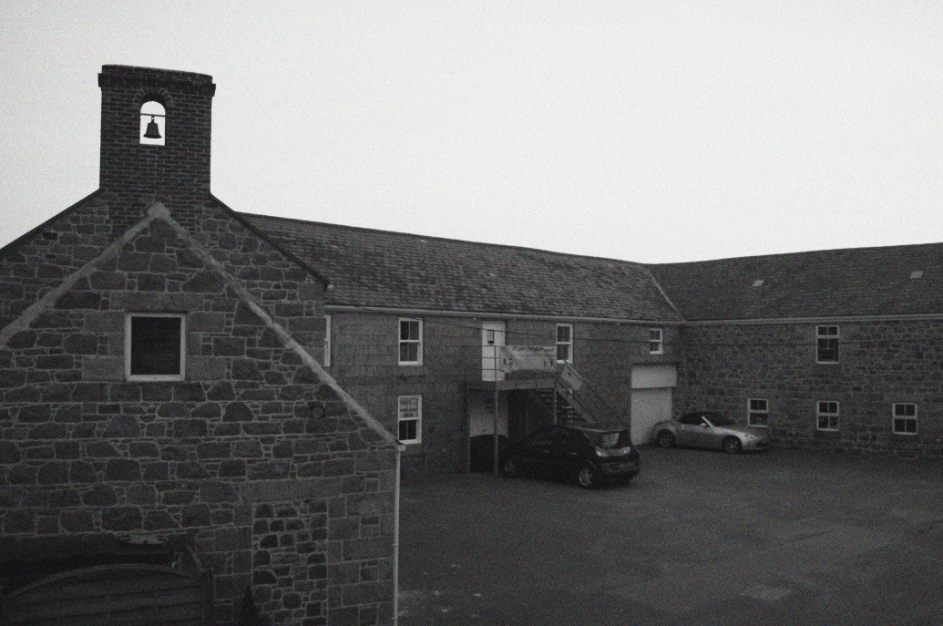
By the bell
For this image, I used the camera’s autofocus and auto mode to shoot quickly and automatically with perfect ISO, aperture and shutter speed.
The image is black and white due to the beauty and information displayed in the entire landscape theme. For example, industrialization seems to be destroying nature by blackening the white trees. Therefore, I tried to create the same effect with the urban landscape.
I have tried to use the rule of thirds to compose the image and make it more intriguing to the viewer.
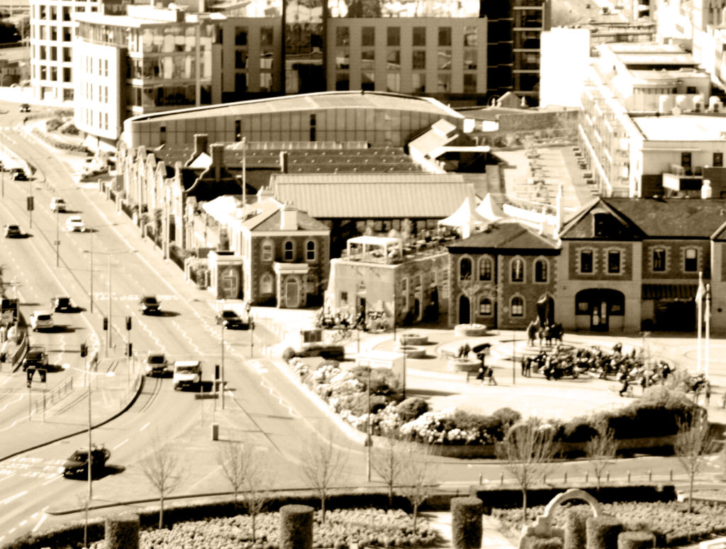
2021 but 1960
For this image, I used the camera’s autofocus and auto mode to quickly and automatically shoot with perfect ISO, aperture, and shutter speed.
Due to the beauty and information displayed throughout the landscape theme, the images are vintage related to past images and the era when Shore was born (20th century). Also, 1960 was one of my favourite eras and this filter is perfect for the first project on urban landscapes.
I tried to use the rule of thirds to compose the image and make it more attractive to the public.
In my opinion, this project was average. This is because there is powerful use of lines, composition, lightening, selection and imagery. But there is little to no manual work as most was done by the Auto mode.
I really do like the image that gives a 60s vibe as it’s my favourite epoch where most of the industrialization has already taken place. I think it is successful in a way as it shows the audience the present time but gives a retro feeling. This may also be said to create a juxtaposition or as I like to call it a paradox; “past” and present in one image sort of contradicting each other.
The black and white images add to the vintage theme but are also aesthetically pleasing as for the first image we have the building on one side and the sky on the next which powerfully shows the use of the rule of three and makes it pleasing and peaceful to look at.
In conclusion, although my images may be successful I agree to a certain extent I need to use more of the manual mode, see what ISO, shutter speed and aperture work best in different lighting and settings and apply it to future projects since most of the images came out underexposed or over exposed which limited my selection of images drastically.
Lewis Baltz was an American Photographer Born 1945 who had an important role in the New Topographics movement of the 70s.


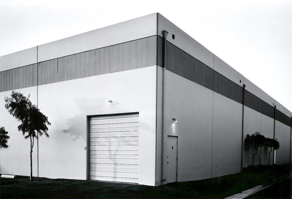
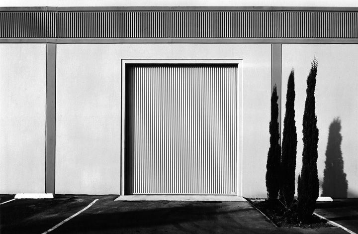

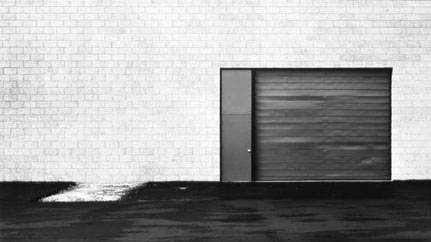


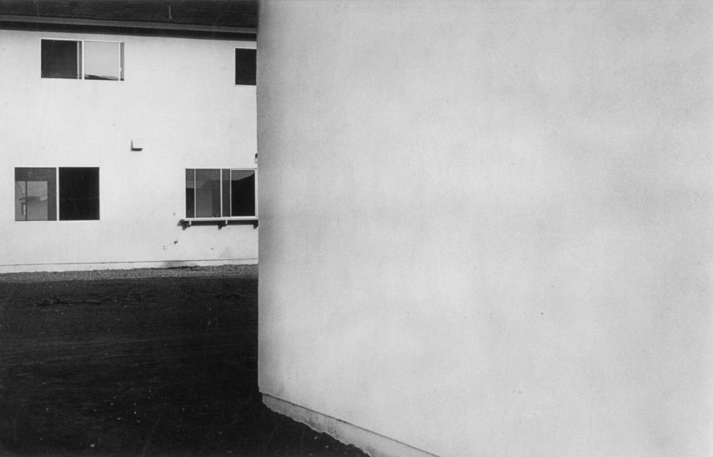

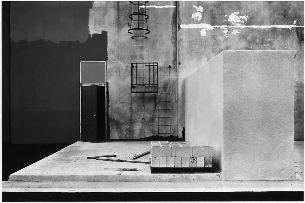

He was one of the first photographers to challenge the dominant methods of landscape photography at the time. He confronted the ideas of the “zero club” photographers at the time and along with 9 other photographers pioneered the New Topographics movement which turned photography’s perspective towards shooting urban man made features.
Lewis was trained to use photography as an art medium, to intersect with other aesthetic social questions rather than a practical form of diarizing and documentation.
Baltz grew up in one of the most rapidly urbanizing placing in the world – Southern California in the post war period. He watched the changes taking place he described it as a new world being born however not a very pleasant one.
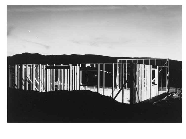
It was a new homogenized American environment that was marching across the land and being exported. He noticed that no one wanted to confront this. This realization was the initiation of his interest in shooting the urban and igniting the New Topographic.

The above image was taken in 1974 and it is called “The New Industrial Parks” and it is part of a monographic series along side “The Tract Houses”, “Maryland”, “Nevada” and “Park City” wherein Baltz addresses cultural and philosophical questions about industrial zones and an artistic documentation of the boom in the urban landscape.
This piece relates well to Lewis’ motive to focusing on the familiar and creating an aesthetic out of the mundane. He does this by shooting a mundane building but making use of a deadpan viewpoint to create a somewhat symmetrical image with many leading lines. These leading lines create a grid like triad which splits the image vertically to comply with the rule of thirds.
The image has a shallow depth of field which gives it a 2D shape which can be an allusion to the lack of humanity which comes from urbanization.
The three slender trees on the right of the image are positioned strategically in line with the rule of thirds grid Lewis created and they add a sort of contrasting tension to the composition as they look like they are being overpowered by the colossal building behind them which consumes the whole frame. This could have been an attempt at pointing to the idea of mans impact on natural landscapes and how they are being overpowered.
The low saturation and more greyscale colours in the images convey the gloomy emotions of the industrialisation. The image also has a very wide tonal range.

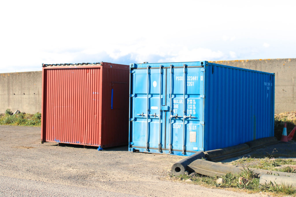
I chose this photograph as my final image for this urban/industrial project due to it’s strong similarities to the work of Frank Breuer and use of the formal elements. I believe this image reflects the industrialisation of the modern world, demonstrating the ever growing mass of manufactured products taking over the nature around us. In this image I have captured waste skips using natural sunlight, which due to the sun falling behind them, has created harsh shadows underneath. I decided to photograph this landscape in such a way to connote the theme of a post-industrial capitalist society casting a shadow over the world as it destroys the beauty of nature. Additionally, these dark shadows could be compared and seen as similar to clouds of smog from atmospheric pollution, reflecting how harmful it is that this urbanisation of our world is increasing rapidly. Furthermore, I have captured repetition of thin straight lines that fall across the warehouse in the background of my image. These lines demonstrate uniformity and present the idea that the incline in modern infrastructure has lead to a homogeneous society, where things like architecture and people are robotic and indifferent. Due to the sun’s reflection on this building, the lines are highlighted and resemble structures like prison bars or cages- further connoting the concept that society is stuck in an industrial trap and locked away from the importance of our natural environment. Moreover, to imitate the work of Frank Breuer I have edited my image slightly by increasing the whiteness and exposure to mimic his blank backgrounds. I believe this editing choice has really added to the overall message of my piece, with the negative space representing how barren and empty our beautiful natural landscapes are becoming as a result of growing industrialisation. In addition, the colour palette of this image is limited, with a subtle peachy hue sweeping across it and the only pops of colour coming from the skips themselves. This relates to Breuer’s work and connotes the idea that society is devoid of originality and inventiveness through the lack of colour and repetition of shape.


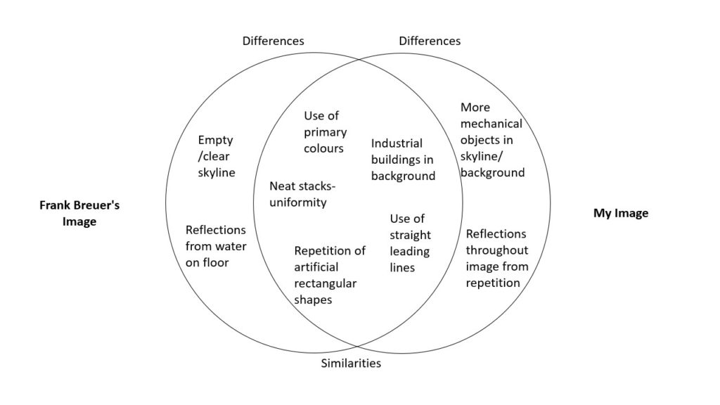
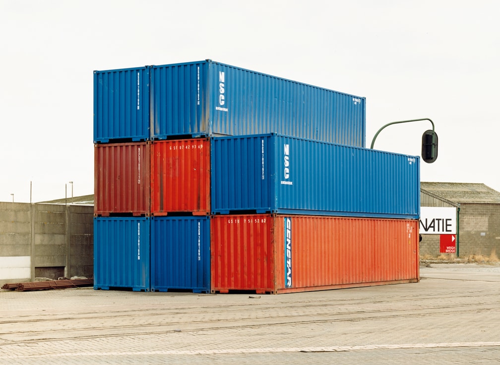
I decided to compare this image from Frank Breuer’s study of ‘Containers’ in 2002 to my image of stacks of crates at the harbour due to their wide range of similarities within the formal elements. The first obvious similarity is that both Breuer and I have captured saturated primary colours as the main tones in our images. The use of the colours red, blue and yellow allude to the simple nature of how these industrial structures are becoming so normalised in our modern world, with the three most basic colours representing its triviality. The bright vibrancy of both images also draws focus to the urbanised structures, helping us understand the importance of the subject and how its impacting our world. Furthermore, Breuer’s and my image each contain repetition of geometric shapes which create echoed patterns throughout the photograph. In my image, I have captured repeated rectangle shapes which represent the uniformity and capitalist view of society- each rectangle a member of modern civilisation. In Breuer’s image, his repeated rectangles are larger and appear to be more solid stable structures- perhaps connoting the idea that our community is too set in its ways to change the clear neglect of our natural world- as if we are stuck in a looped pattern of destruction. Nevertheless, there is a difference between the types of repetition seen in each image, as Breuer has also captured it in the reflection from the puddle in the foreground of his image. These reflections could symbolise repetition from the past, as if we are being reminded of times where the industrialisation of our planet lead to some of the most devastating times in history such as pollution from the Industrial Revolution leading to a massive impact of global warming and the depletion of natural resources. Additionally, the comparison of these images highlights the difference in how our world has become even more modernised since Breuer’s was taken. For example, in Breuer’s photograph we can see a clear skyline of negative space, reflecting the barren landscapes urbanisation creates, yet in my image there are several industrial structures in the background as well as the foreground. This demonstrates how the industrialisation of our world is still growing rapidly to this day, with the two cranes in my photos background alluding to the increasing likelihood our actions and constant elimination of our natural world- though the time may be far away- will catch up to us eventually.
What – My plan is to photograph landscapes around Jersey that hold industrial structures and equipment such as storage containers, stacks of crates, roofs of buildings, commercial signs and mechanical apparatus.
Where – I aim to capture my landscape images in settings such as the harbour, Rue Des Pres trading estate, La Collette power station, the airport and petrol stations as I believe these locations will show the industrialised aspects of the island- in terms of modern equipment and destruction of nature.
When – I plan on conducting my two photoshoots during the Easter holidays, taking advantage of days where workers may not be in warehouses/on building sites in order to capture more barren deserted images. I aim on photographing my landscapes when the weather is sunny so the subject is highlighted, yet hopefully still allowing me to replicate Breuer’s bright white backgrounds.
How – In order to take full advantage of the natural sunlight I plan on experimenting with changing the F-stop number on my camera to over-expose my images when needed, I also aim to explore who changing the white balance will effect the temperature of my images, to convey different moods.
Why – I wish to mirror the work of Frank Breuer when conducting my photoshoots, showing the growing industrialisation of our world and how an island as beautiful as Jersey can still hold the derelict manufactured landscapes ruining the beauty of the nature around us.
For my first photoshoot I decided to focus on capturing the industrial buildings, signs and equipment around trading estates and warehouses. I wanted to photograph the normality of technical structures and buildings around the island to symbolise the ever increasing urbanisation of the modern world.

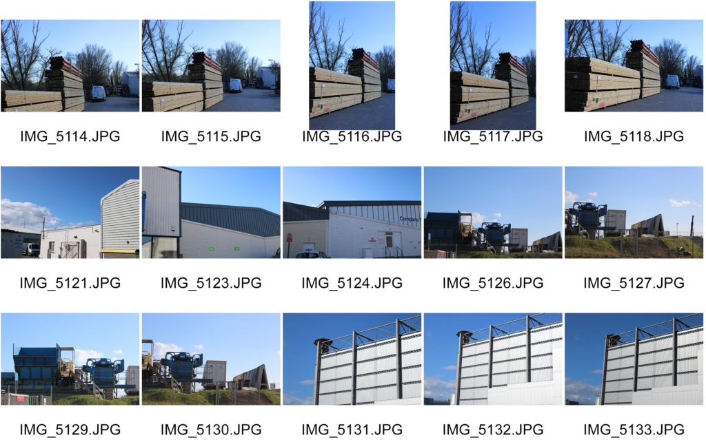
For my second photoshoot I decided to focus more on the aspects of commercial business’ equipment such as storage crates, large containers, trucks, vans and skips to reflect Breuer’s series of images and draw attention to the sheer amount of industrial, desolate areas around us. I wanted to capture objects such as skips to symbolise the way the world is treating nature like its garbage, and filling our landscapes with manufactured waste.




“New Topographic”, a term coined in 1975 by William Jenkins which referred to a photographic movement undertaken by a group of American photographers whose works had a similar look – mostly uniform, black and white urban landscapes.
Some of the photographers associated with this movement where Robert Adams, Lewis Baltz, Nicholas Nixon and Bernd and Hiller Becher.
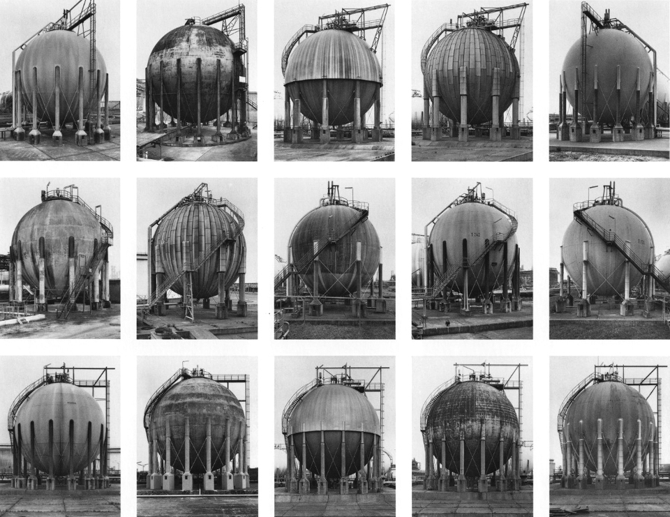


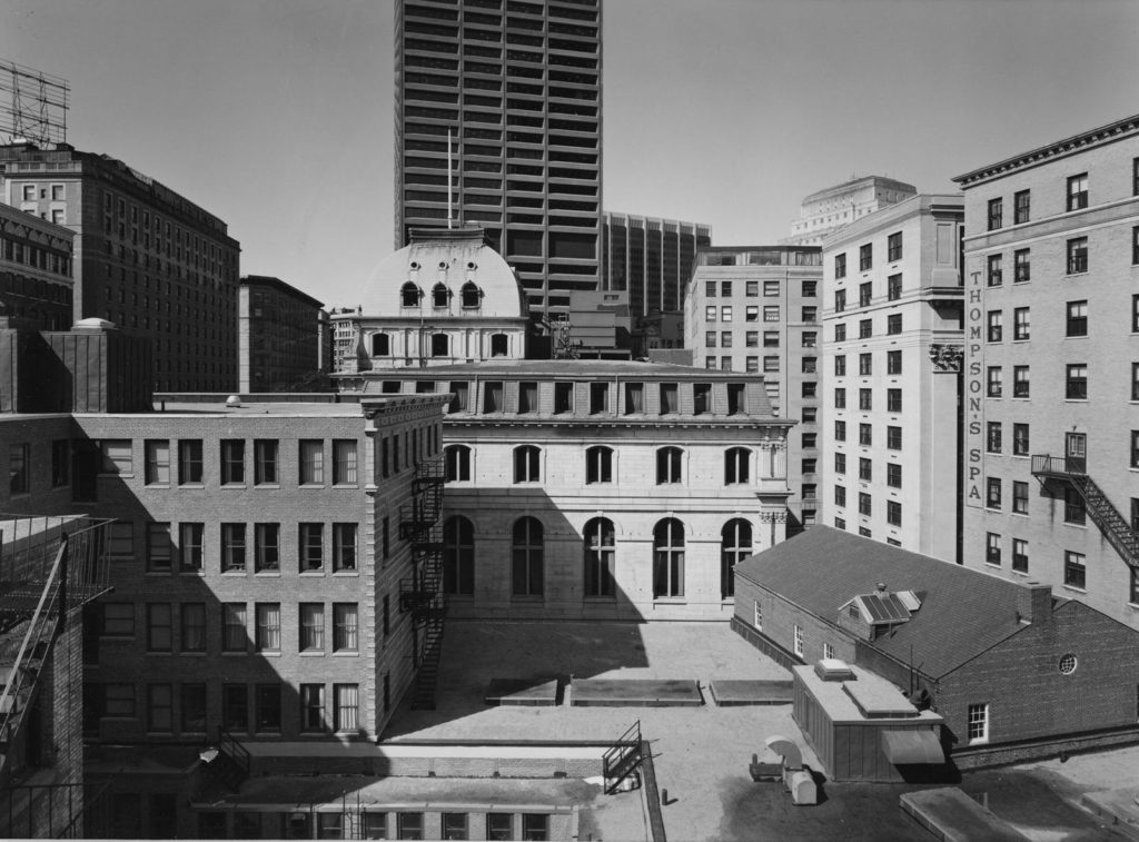
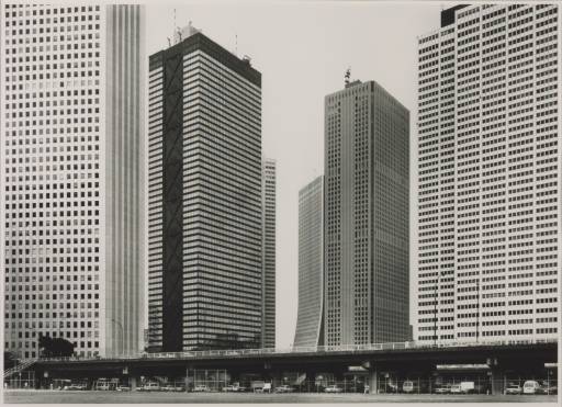
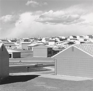

The movement captures mans impact, they photographed urban landscapes such as garages, parking lots, warehouses in a similar way to how early rural landscape photographers would shoot natural landscapes.
As environmentalism took hold of the public conscience in the 1970s landscape photography began to capture natural landscapes and human activity as a singular connected body.
New topographic pieces captured the essence and beauty of these depressing, mundane, industrialized landscapes. This aura created around the aesthetic of these images is an ironic juxtaposition to the unease the photographers felt about mans erosion of the natural environment. This was represented in their work from the emotional disparity they created in their pieces with a lack of human presence, flat contrast, lowkey tones, centred framing and unassuming depth and lighting.
On the other hand this divide they portrayed between man and nature was done with aesthetic precession. The Artists that made up the new topographic noticed how there seemed to be a sense of obscenity around photographing these urban landscapes. There was a sort of fear man had around looking at its own creations. They wanted to highlight this by photographing the urban and providing it with an aesthetic… The photographers created beauty in these images by shooting from a unique viewpoint. They shot with a deadpan aesthetic in mind and looked for sharp angles or structural elements.
Frank Breuer (1963- ) is a German photographer who studied under the notable photography professor Bernhard Becher at the Kunstakademie Dusseldorf, an academy of fine arts in Germany. Breuer travelled from 2003-2004 and became a visiting lecturer on visual and environmental studies at Harvard University. Breuer’s work holds many similarities to that of the Becher’s, focusing on capturing industrial buildings, storage units, telephone poles and detached shipping trailers in barren landscapes. In Warehouses (1995), Logos (1995), and Containers (2002), Breuer captures portraits of the post-industrial, capitalist society – facades of distribution warehouses devoid of human presence, logos of commercial businesses in nondescript places, and compositions of neatly stacked shipping containers that resonate both a sense of displacement and familiarity. Breuer’s work explores these ideas of the new topographies in a continuing globalized world, I aim to take inspiration from his minimalistic images in my urban and industrial photoshoots.
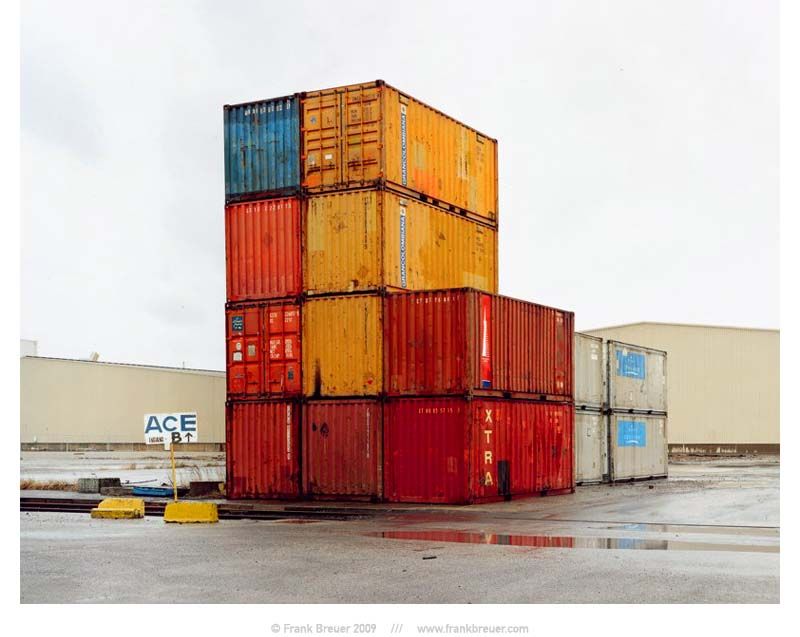

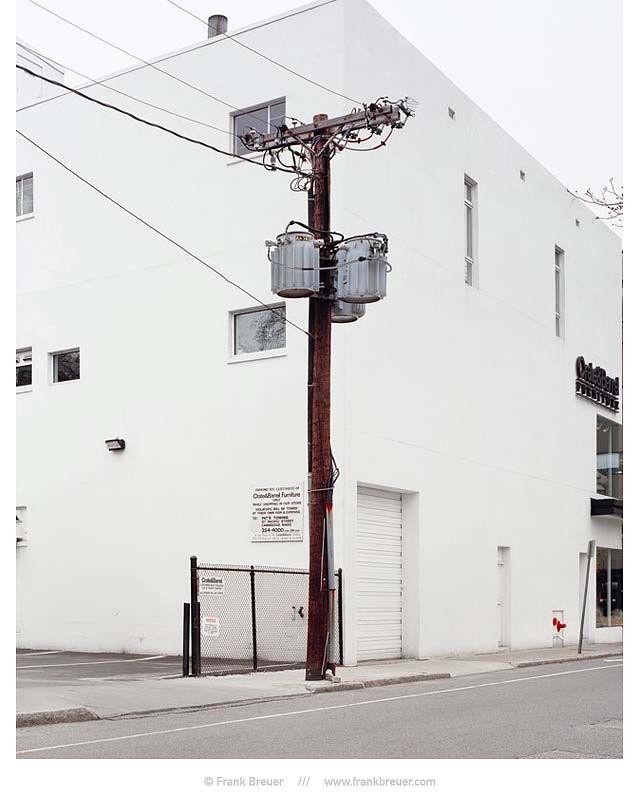
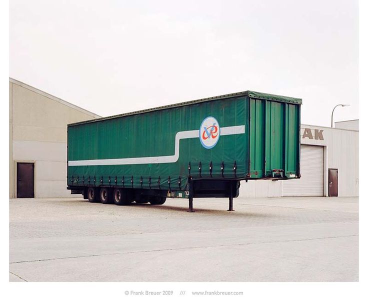
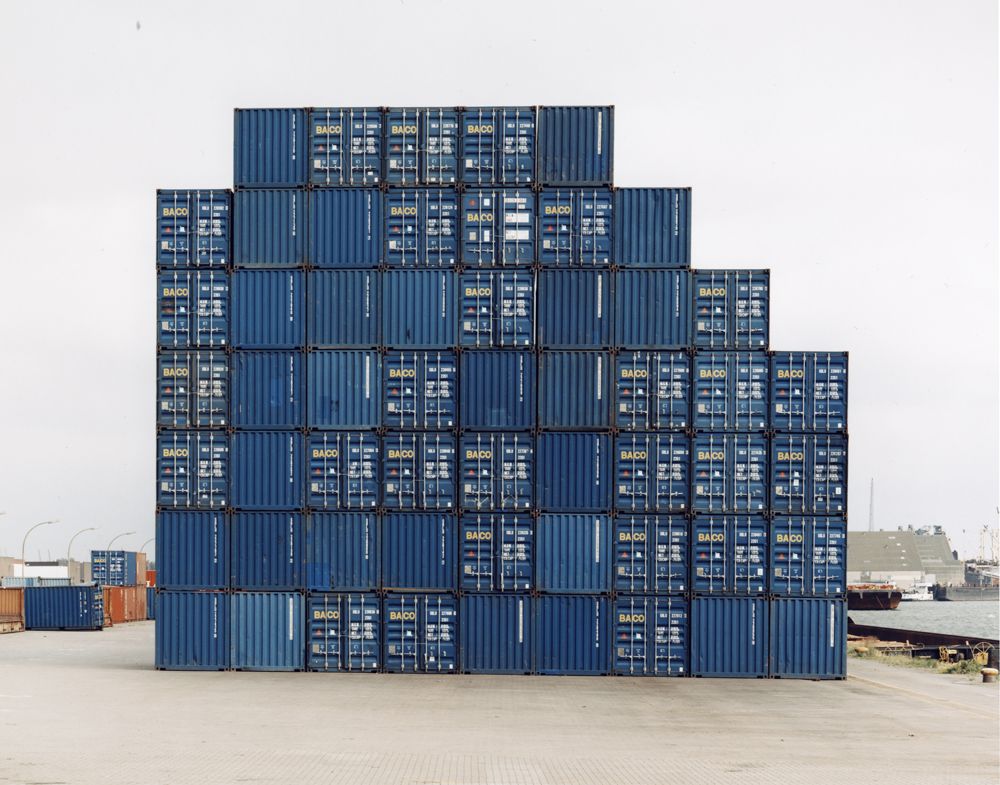
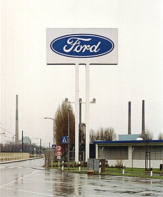
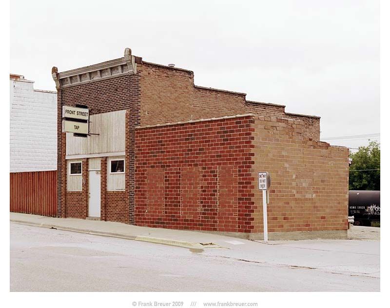
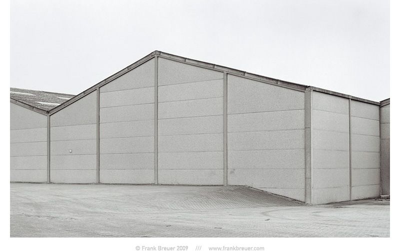
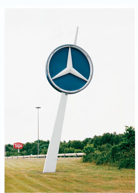
This image by Frank Breuer reflects the growing industrialisation of natural landscapes in our modern world. Breuer’s composition, photographing the subject from a lower angle, portrays the logo as imposing, as if it looks down on the people below it. Additionally, the natural environment in the background and right side of the image contrasts greatly with the industrial structure that stands amongst it. I believe Breuer has captured the structure in this way to reflect the way ‘man’ rules over the natural world, interrupting and destroying it bit by bit while keeping a watchful eye over all they create. Furthermore, in the background of the photo the sky holds little to no texture, very different from the rough texture created by the trees below. It is possible that Breuer has over exposed his image slightly to form such a bright white sky. This lack of texture behind the logo allows it to stand out greater than anything else in the image, creating the main focal point- as it has no distracting background pattern or landscape. This conveys the idea that society’s main focus is money and power, people are ignoring the natural world around them as commercial business’ are putting their influence in every place possible. The negative space created by Breuer’s over exposed sky also reflects the negative impact that urbanisation is having over the entirety of nature.

“New Topographics: Photographs of a Man-Altered Landscape” was an exhibition that epitomised a key moment in American landscape photography. Many of the photographers associated with new topographics including Robert Adams, Lewis Baltz, Nicholas Nixon and Bernd and Hiller Becher, were inspired by man-made subjects. Their aim was to find the beauty in the plain and ‘ugly’ streets of America. It was a reaction to the conflict which took place over the late twentieth century, which saw outrage that natural landscapes were being replaced with large, industrial buildings.
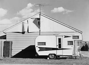

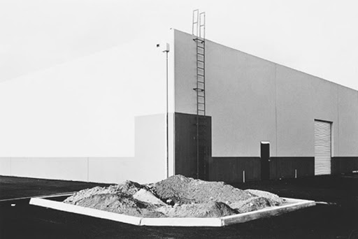
Frank Gohlke ( 1942 – ) is an American landscape photographer. Gohlke was one of ten photographers selected to be part of “New Topographics: Photographs of a Man-Altered Landscape”, the landmark 1975 exhibition at the International Museum of Photography at George Eastman House. During a career spanning nearly five decades, Gohlke has photographed grain elevators in the American midwest; the aftermath of a 1979 tornado in his hometown of Wichita Falls, Texas; changes in the land around Mount St. Helens during the decade following its 1980 eruption; agriculture in central France; and the wild apple forests of Kazakhstan. Gohlke′s photographs have been exhibited at the Museum of Modern Art; the Art Institute of Chicago; the Cleveland Museum of Art; the Minneapolis Institute of Arts; the Amon Carter Museum; and the Museum of Fine Arts, Houston.
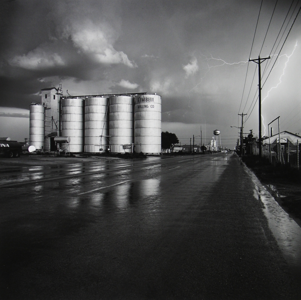


This photograph by Gohlke is entitled ‘Grain elevator under repair‘, which avoids any confusion about what the photograph is of. The lighting used in this image is natural and appears to be coming from the left hand side due to the way the various shadows are falling across the image. The brightest parts of the photograph are the white portions of the cars, which directly contrasts with the dark tones of the road and the shadows. There is a lot of repetition present in this photograph, which can be seen in the vertical lines in the background of the image, as well as the horizontal lines of the car tops, the workmen in the background and the pavement and road. The contrast between both the vertical and horizontal lines creates an interesting composition for the viewer, with each one seemingly juxtaposing each other. The shapes in this photograph are mostly geometric, for example the cement slabs on the pavement split up by straight lines and the large cylinder – like shapes in the background of the image. There is hardly any negative space in this photograph, as the whole frame is taken up by either the building in the background or the cars in the foreground. The smooth and slick texture of the cars directly contrasts with the rough and harsh texture of the pavement as well as the building in the background. Gohlke has captured this image in black and white which allows for certain features of the image, such as the contrasting tones and small details like the cracks in the building to be accentuated and exaggerated.
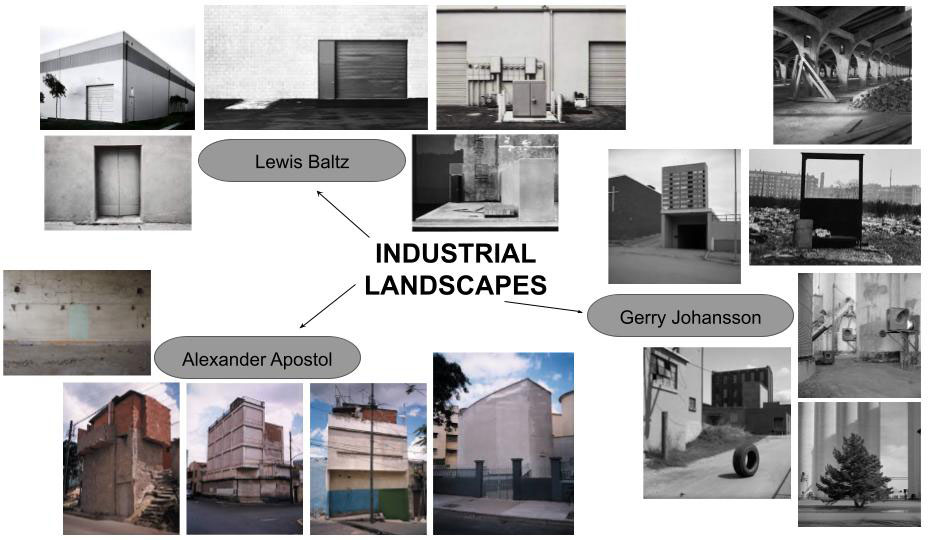
Industrial landscapes are man made landscapes which look very industrial, mainly construction sites, power plants, chimneys, and factories.
Industrial landscapes are rising in natural habitats and urban areas, changing the natural aspect of earth creating unique geometrical shapes.
The contrast between the sharp unique silhouette of a factory within our natural world. Photographers have made abstract shapes with industrial buildings. Monochrome photography is also popular for industrial photos to get the image to contrast more.
Examples Of Industrial Landscape Photography:
Urban landscape photography focuses on more culture and lifestyle.
Humans rarely appear in the photographs yet you can feel the presence of life and culture. Both cautionary and confessional, they also define challenges facing our global future.
Examples Of Urban Landscape Photography:

When taking my photos I want to focus on the idea of dereliction, old and new, altered landscapes and car parks. With an overall look on change.
Locations around Jersey:
