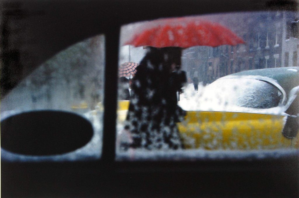
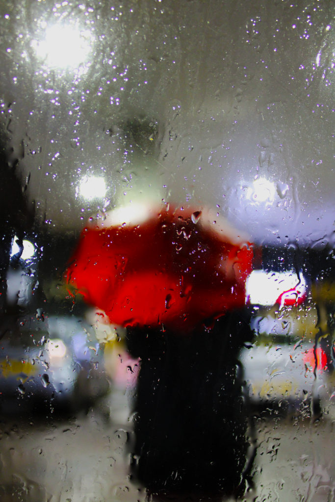
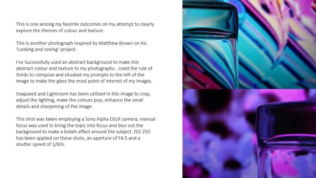
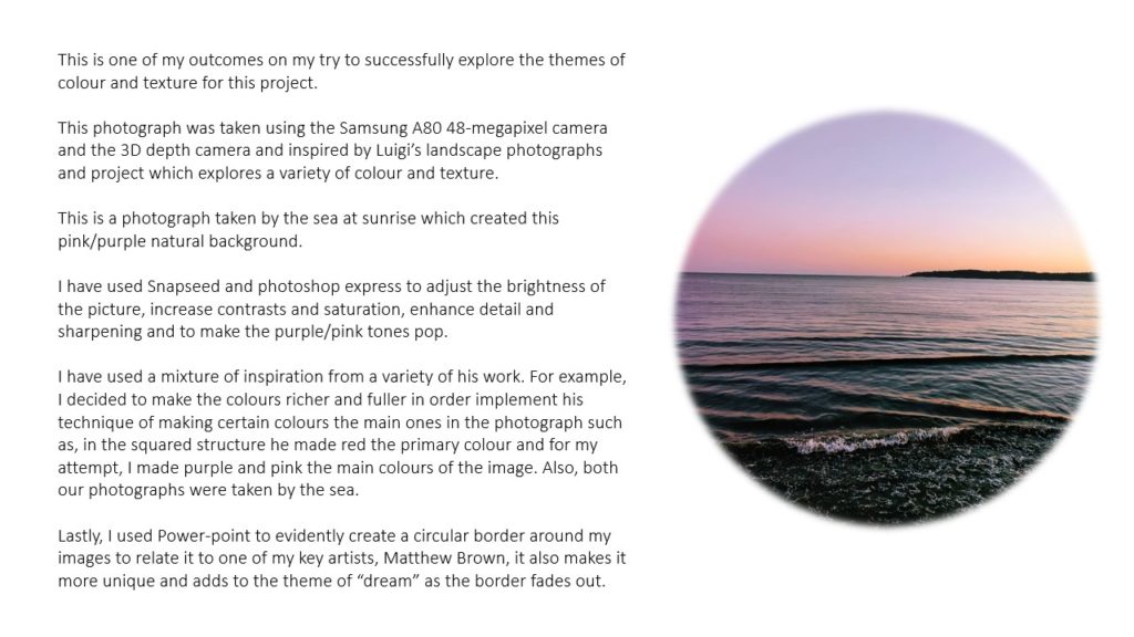
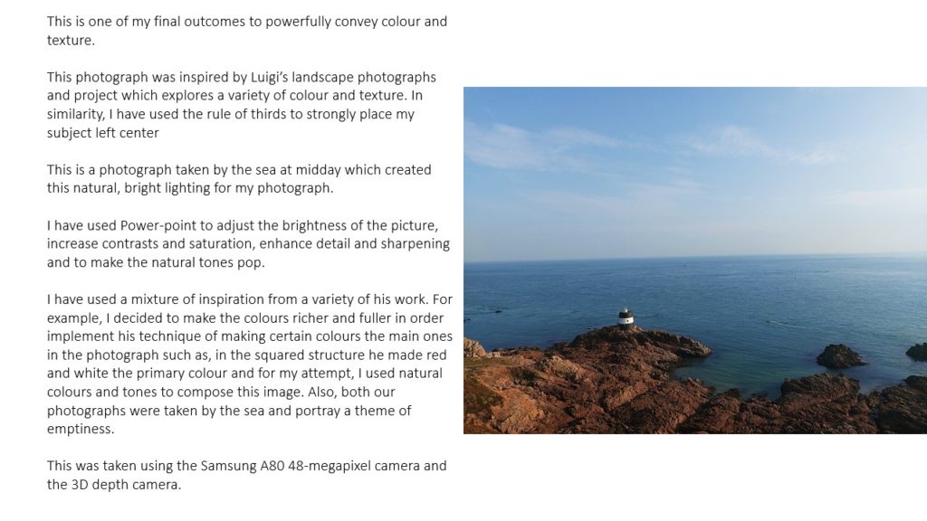
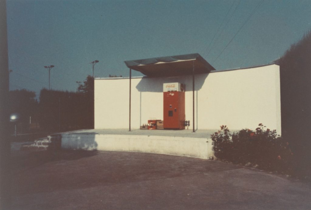
The phrase ‘candid portrait’ is often used to refer to the type of portrait taken when the subject is unaware of the photographer. This is usually seen in the genre of street photography. Typically, street photography is about candidly capturing life in public areas. And contrary to its name, street photography does not have to be done on the streets. You can do street photography anywhere. Street photography can focus on people and their behavior in public, therefore also recording people’s history. This involves having to also navigate or negotiate the changing expectations and laws of privacy, security and property. In this sense the street photographer is somewhat similar to a social documentary photographer or a photojournalist.

William Klein 
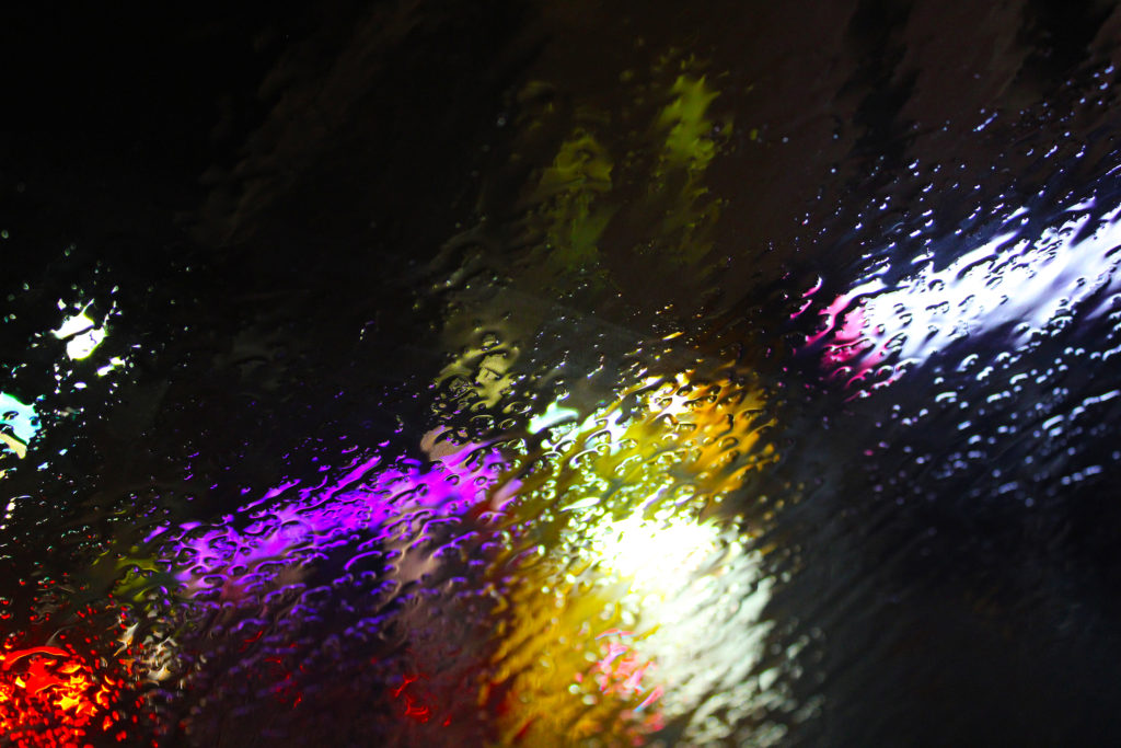
William Klein 
Gordon Parks 
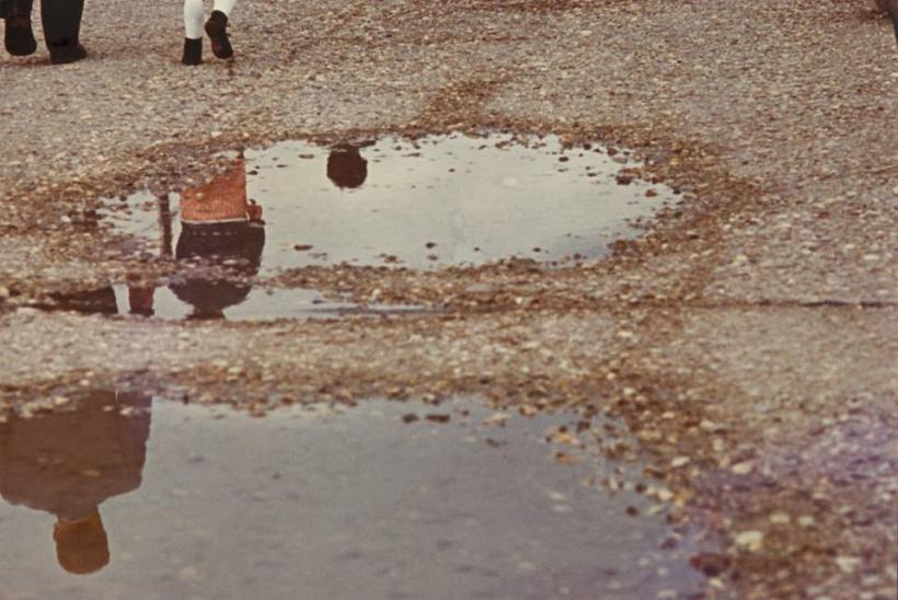
Robert Doisneau 
Robert Doisneau 
Brassai 
Tony Ray – Jones 
William Klein 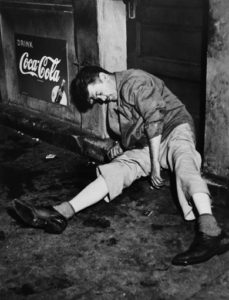
Weegee