ARTIST REFERENCES
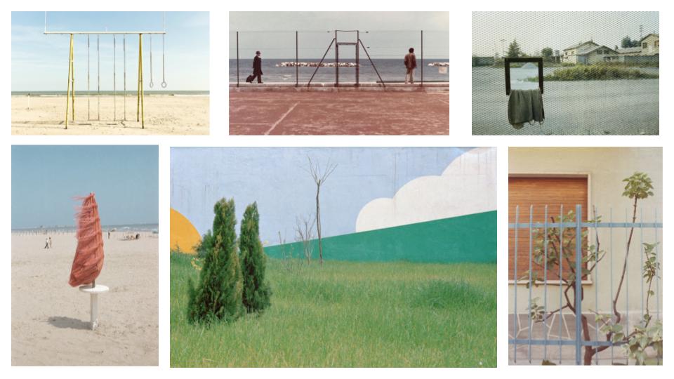
Ernst Haas (1921 – 1986) was an Austrian – American photographer who is widely considered to be a pioneering figure in the art of colour photography. His images have been featured in publications such as Life magazine and Vogue. In addition, his photographs were the subject of the first single – artist colour exhibition of colour photography at New York’s Modern Museum of Modern Art in 1962.
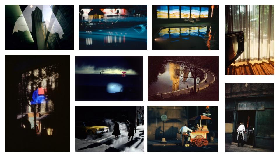
Luigi Ghirri (1943 – 1992) was an Italian photographer who gained a reputation as a pioneer and master of contemporary photography, with its particular reference to its relationship between fiction and reality. Ghirri’s work quickly attracted international attention. In 1975 Time-Life included him in its list of the “Discoveries” of its annual Photography Year publication, and he showed at the Photography as Art, Art as Photography exhibition in Kassel.
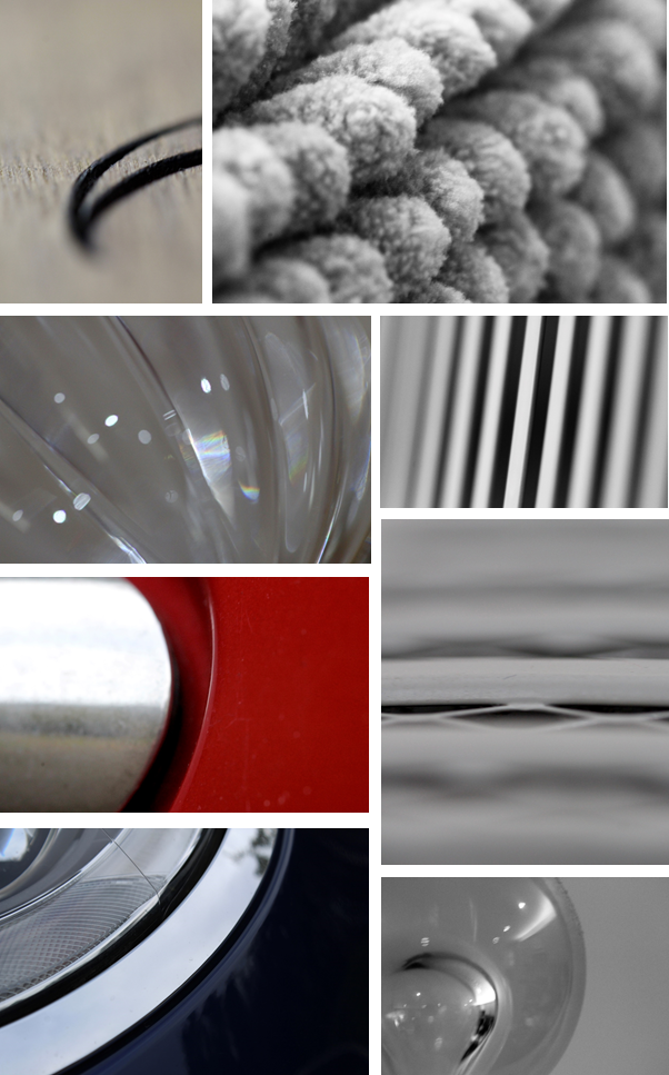
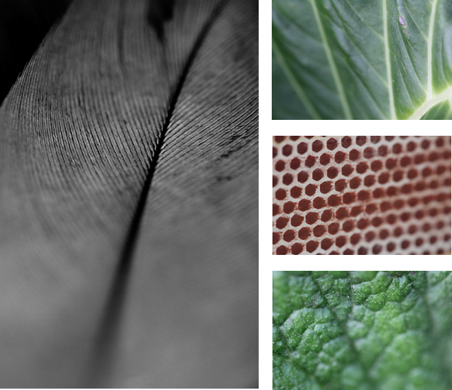
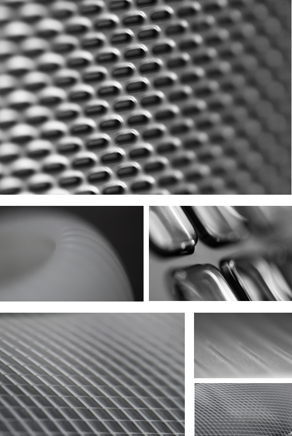
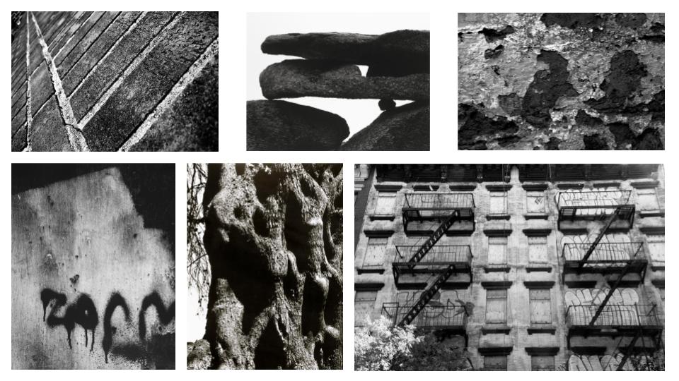
Aaron Siskind (1903 – 1991) was an American photographer whose work focuses on the minor details of its subject/s and presents them as a flat surface to create a new, independent image. Siskind used things from the real world in his photographs: close-up details of painted walls and graffiti, asphalt pavement, rocks, lava flows, ancient statues and the Arch of Constantine in Rome.
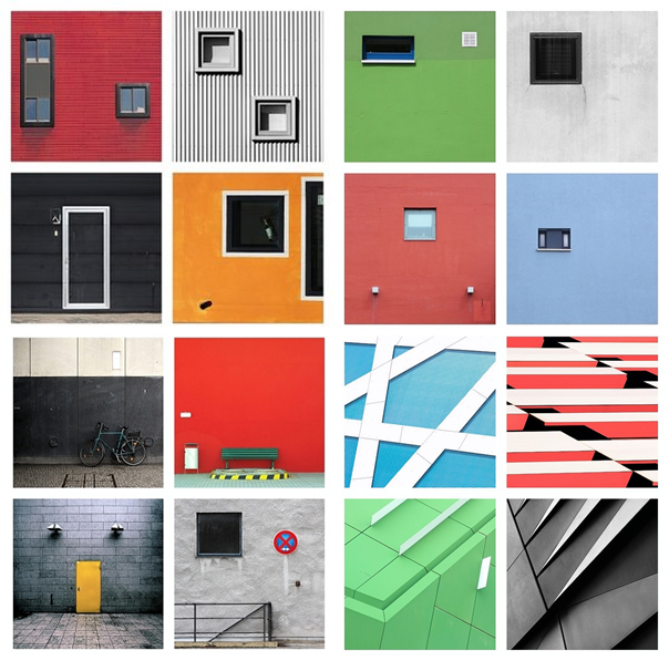
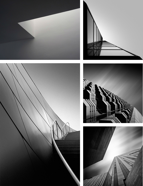
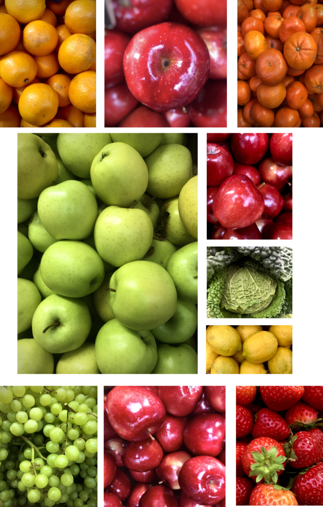
MOOD-BOARD

MIND MAP
MY RESPONSE
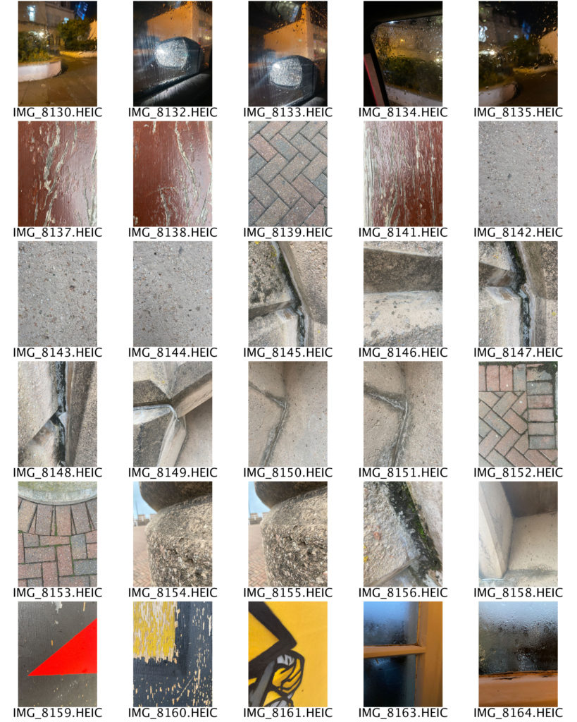


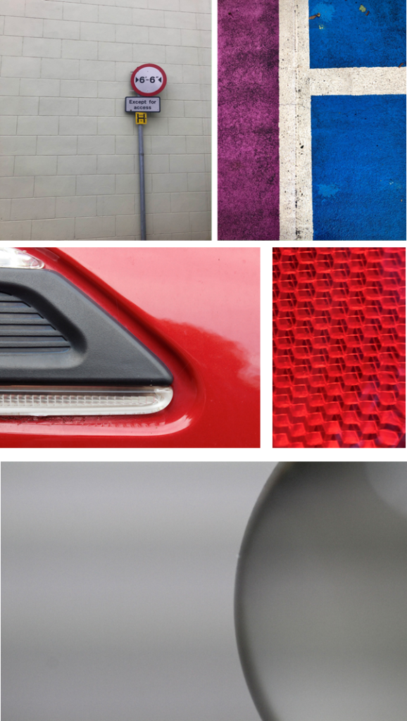
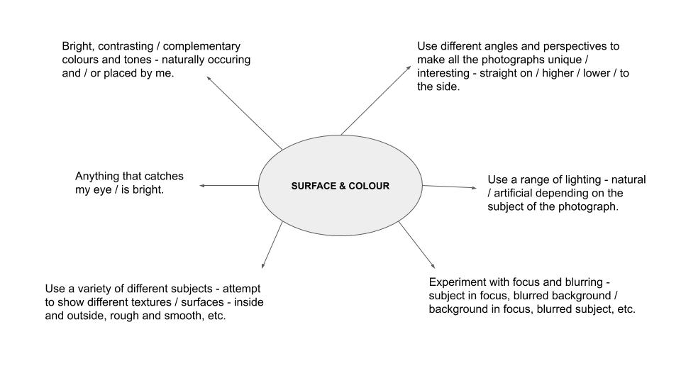
In this photo shoot I was inspired by the works of Aaron Siskind and Saul Leiter, who captured images of the condensation on windows and close up shots of different textures and surfaces. I attempted to use a range of angles throughout my photographs in order to make them more interesting for the viewer to look at. My process was to photograph anything colourful that caught my eye, which led to some unusual subjects such as plastic bags and paper towels. I also took inspiration from The Boyle Family, whose images are a bird’s eye view of various surfaces, mainly roads and pavement corners. I used mainly natural lighting in this photo shoot in order to keep the photographs as realistic as possible. I liked that in some of my images the light would reflect off of the subject, such as my photographs out of a car window, however in those images the lighting was artificial as it came from the headlights of other cars, creating a glare effect. As one of the main themes for this photo shoot was colour, I aimed to incorporated it as much as I could into my photographs. I did this by placing certain colours next to each other, making sure that they complimented one another. To help me see which colours went best together, I used a colour wheel. I also aimed to show different shapes and lines by including objects with harsh, straight lines (books) and organic, curvy lines (ribbon). Additionally, I experimented with different patterns, as seen in the photographs of the yellow coat, where I pulled back the hood to show the stripes on the inside. For the composition of my photographs I tried to use a varying range of layouts and arrangements, such as the subject being in the middle of the image, at the top or bottom, or at either side. I also explored different distances of the camera from the subject, such as far away and up close.

