Narrative;
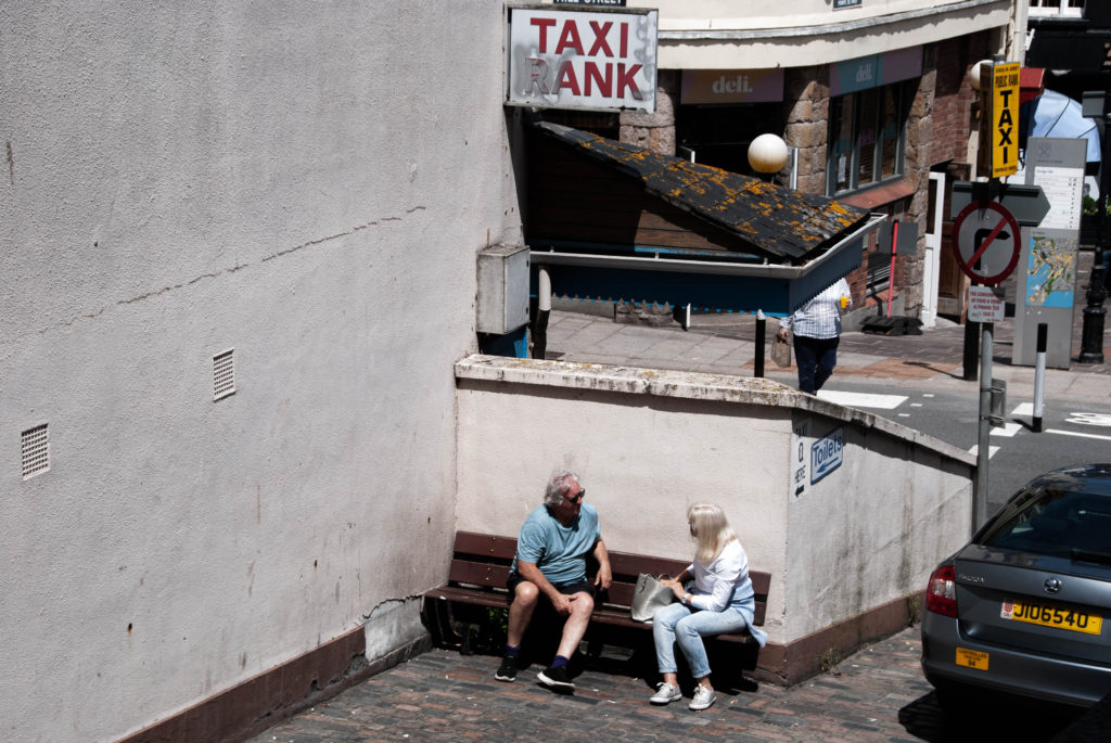
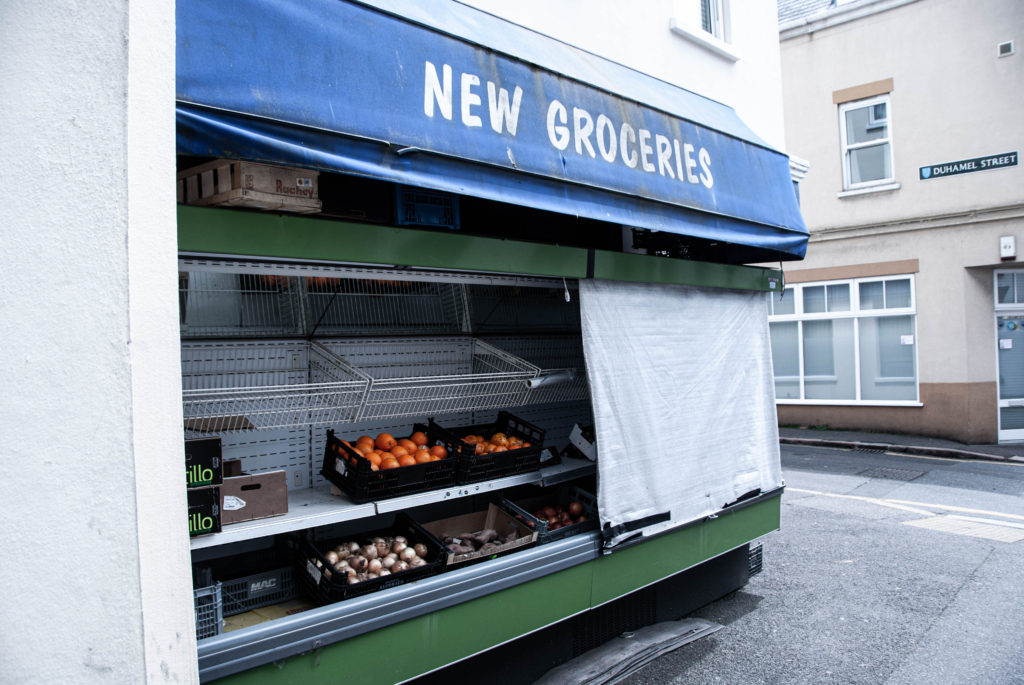
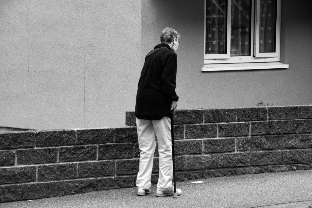
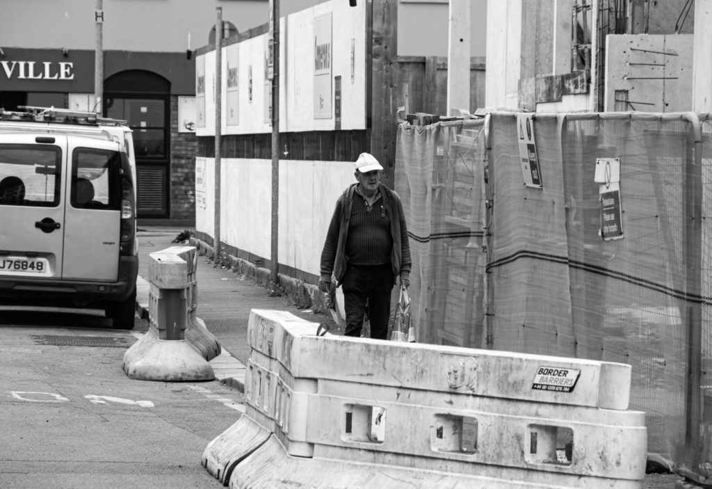
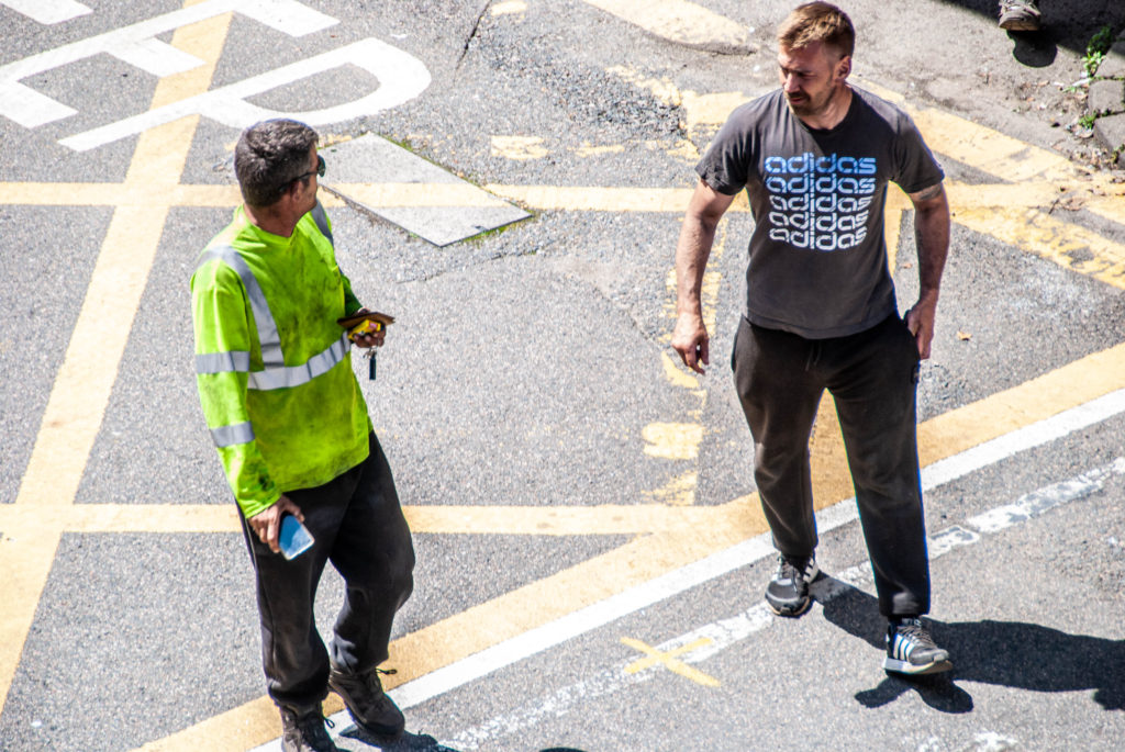
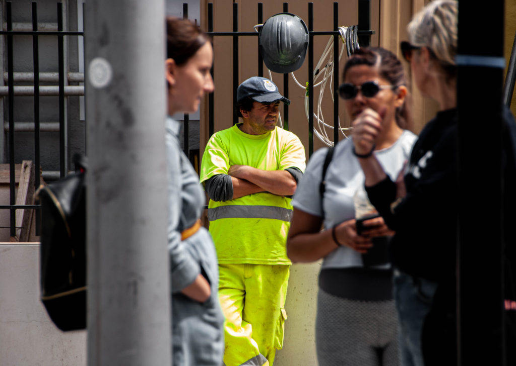
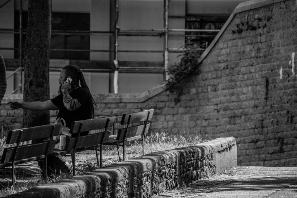
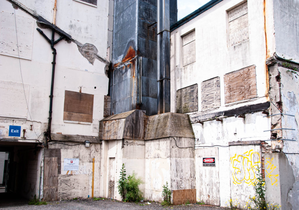
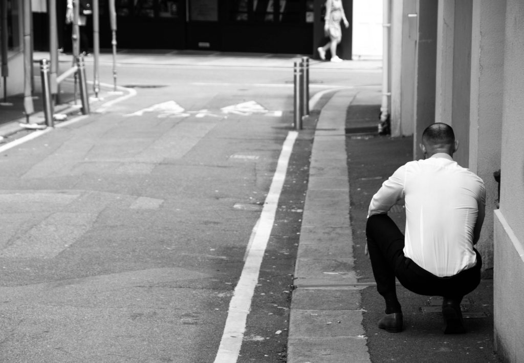
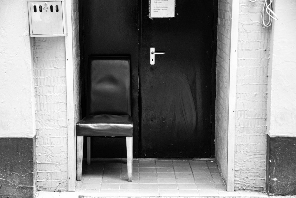
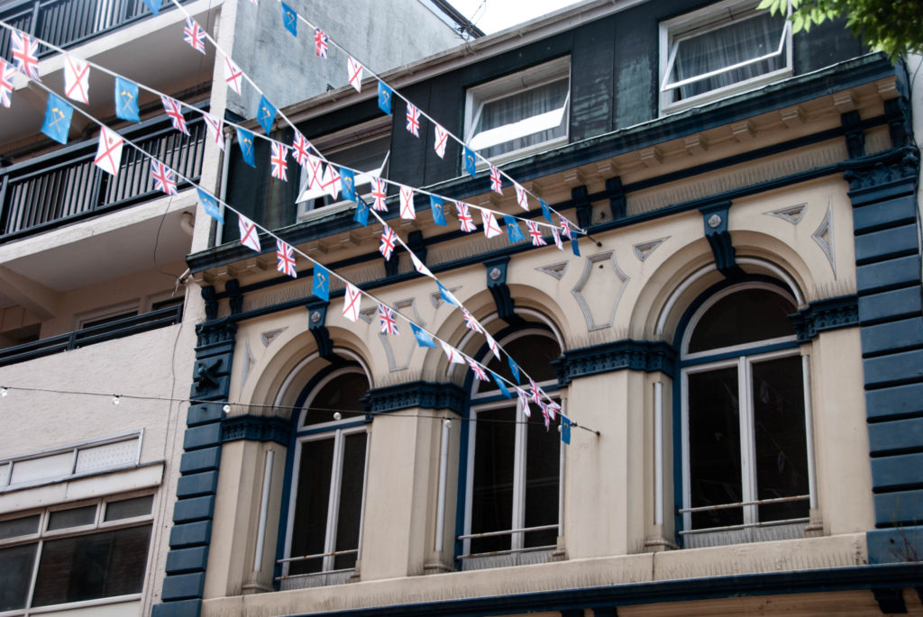
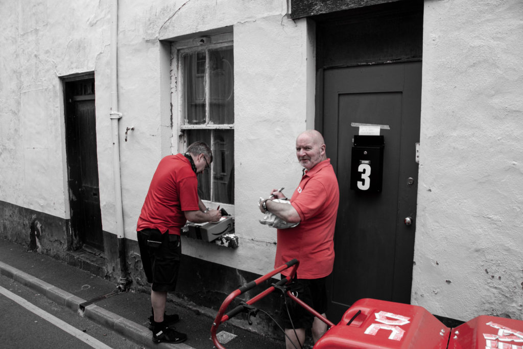
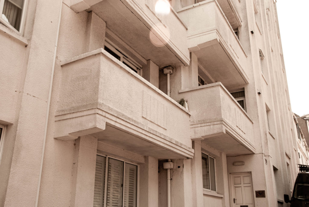
In terms of narrative, my Zine will focus on the various stories that pass through Jersey’s parish of St Helier everyday, the light and shade of a community that may get overlooked in modern society. I will use my images from my Character of Community and Sense of Place photoshoots to create a Zine inspired by the work of James Jay, his layout of images, style of photography and overall Zine design is something that has influenced me greatly in this task. I aim to show juxtapositions within each page of my Zine, for example an old building placed next to a modern building, representing the changes in these communities over time, or the differences between the old and young that may live there, or even suggesting the neglect some of these communities have had to face while others grow and flourish – it is up for the observer to decide. Nevertheless, in this Zine I also aim to promote the narrative of the popular theme ‘we’re not all so different’, showing the similarities between certain street scenes/buildings/architecture – the list goes on. I want to convey a story of memory and nostalgia, capturing the areas where communities feel safe, at home, comfortable and where people can fully be themselves.
Sequencing;
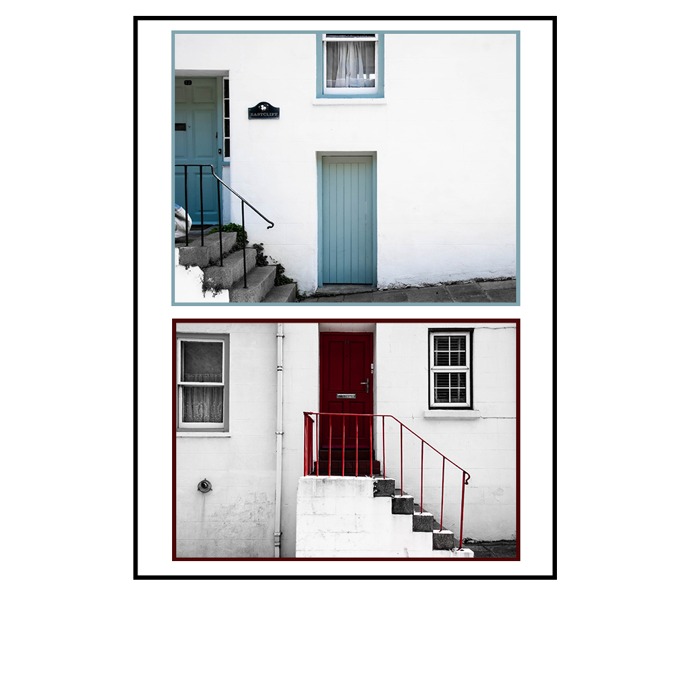
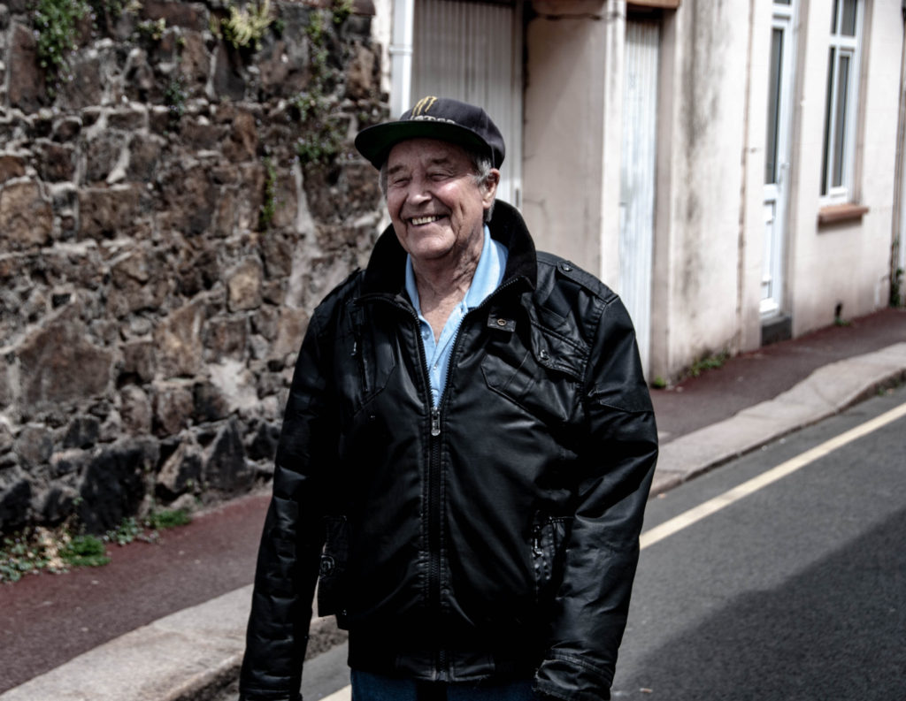
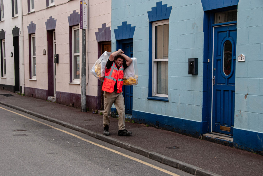
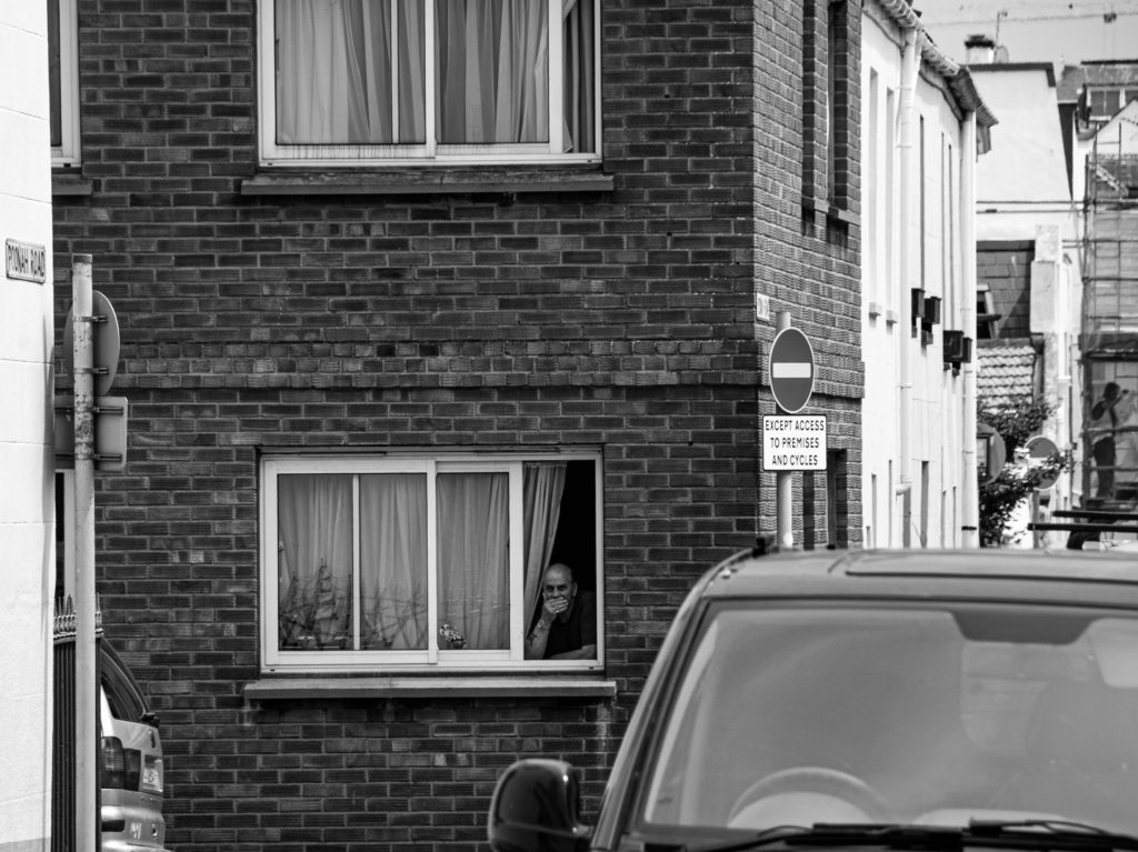
The overall layout of my Zine will be simplistic and easy to follow – however I wish to create some double page spreads where one image is bigger than the other, or have a different orientation. My plan with this layout idea is to break up what would be a Zine of symmetry and order, something I do not wish to convey – I want to demonstrate the freedom of being part of a community that is accepting of you, where you can feel truly yourself. My aim is for the contrasting orientations and layout to create a dynamic sequence for the observer to follow, the symmetry within certain pages will get disrupted and the storyline will hold hints towards freedom and relief. Additionally, providing juxtapositions and similarities within each double page is something I really want to develop. I plan on using my images from both photoshoots to find either a contrast or a subtle link, for example I wish to use some of the environmental portraits I captured placed on one side, with an image of something linking to their profession on the other. I want to experiment with how colour also effects how these two images link, by placing a black and white image next to a vibrant colour one I will demonstrate possible stereotypes, may that be of people or places.

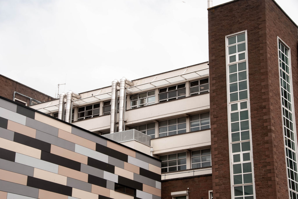
Above is a screenshot of a part of my editing process on Adobe InDesign, where I experimented by placing two images with a similar colour palette next to each other. Both images show older architecture as their primary subject, however the image of St Helier’s General Hospital on the right has a wider depth of field as we can see the side of the more modernised part of the hospital in the background. This creates a more 3-dimentional image, and in comparison to the left image, forms a jolted view for the observer. I think by placing these two images next to each other (although they hold several similarities) it does not provide the full effect of what could be portrayed, for example young Vs old if I were to place it next to an image of fully modern architecture. Additionally, while editing I had the idea to use similar geometric shapes within each image to represent the, sometimes, uniformity of a community with strict rules and regulations – juxtaposing the freedom conveyed in other pages throughout my Zine. I believe that breaking up the flow of my Zine with jarring shapes, colour changes and contrasting orientations creates an inventive and freeing piece of natural life portrayed through ‘the photograph’.
Design and Layout
Experimenting with ‘full bleed’;


During my editing process of the Zine, I experimented with how the size of my images impacted the overall mood created by the page. For example, the screenshots above show two images I decided worked well together due to colour, composition and lighting – however I could not decide whether they should be full bleed or not. A full bleed image extends or ‘bleeds’ to the edges of a page so that the image completely covers the entire page and does not show borders or white space around the edges. As these two images are landscape orientation, using full bleed while keeping the image in full frame was difficult to make work due to the large amount of white space above the image, with none at either side. Nevertheless, I enjoyed how the full bleed created a sort of togetherness between the photographs, as if they were linked in more ways than just the formal elements. I experimented with whether joining the images in the middle created the impression of the landscapes bleeding into each other as if they were the same building, however due to the composition this was a challenge. After moving the images around and changing their sizes, I decided it was better to not use full bleed on this page as the negative space surrounding the images created a clean, symmetrical layout that I believe works best when presenting images of two man-made structures.
Layout of pages;

The order in which I placed my Zine pages was based on how their formats, colour schemes and layouts. I started with my front cover image, a black and white long shot of a woman’s silhouette doing some shopping, natural and normal with a sense of mystery. I wanted each double spread in my Zine to tell a story or link to each other in some way, therefore I wanted the back cover to relate to my front one; using another black and white image taken in the same shop. I then wanted to show some colour in my Zine, so my first double page shows two different buildings with minimal editing in colour, one older and one more modern. I aimed to show juxtaposition between two very similar structures. I moved on to focus on demonstrating vibrancy and portraiture and throughout the rest of my Zine I aimed to compare monochrome images to colour, relating them to each other through similar themes, shapes or ideas.

