Tag Archives: selecting

Narrative and Sequencing

STORY: What is your migrant community story?
Describe in:

  1. Scenario, connection, diversity
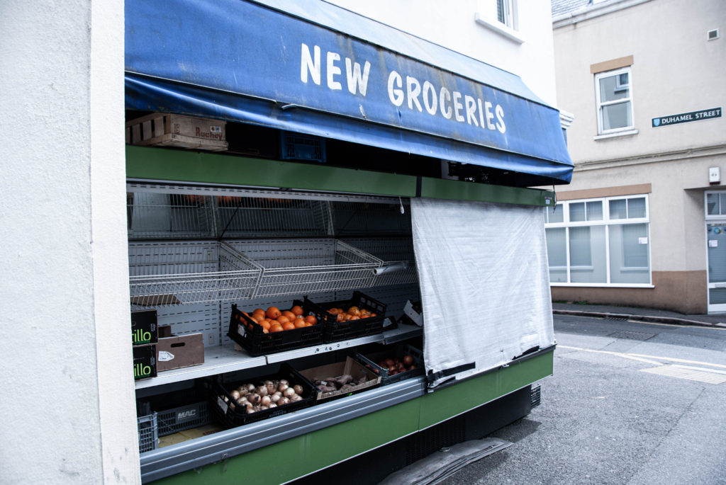
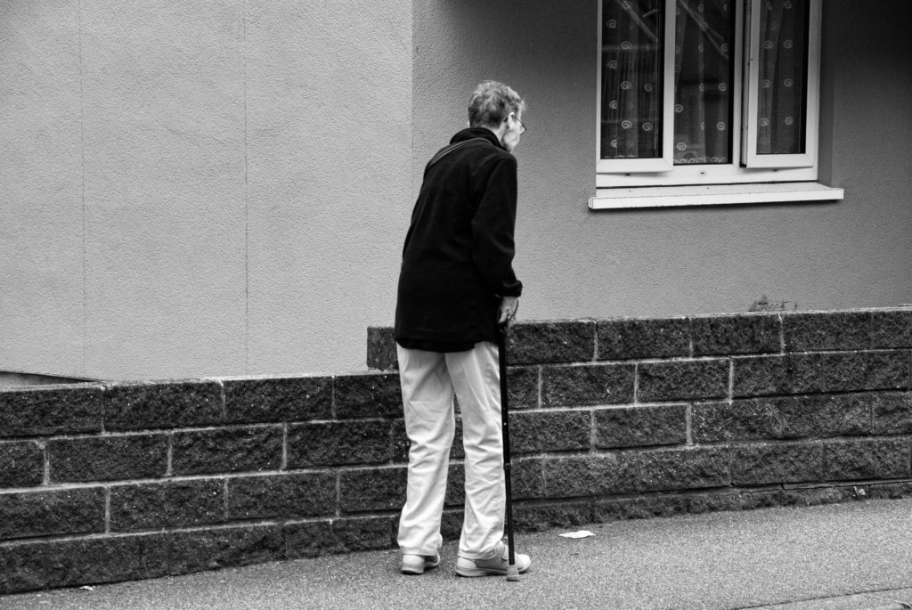
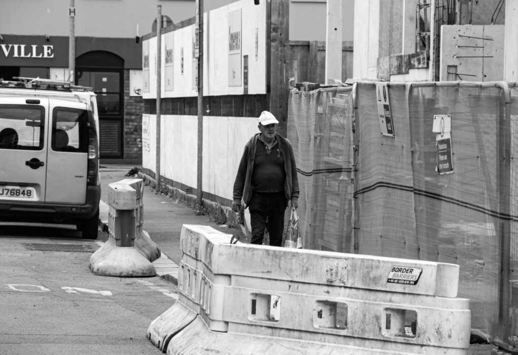
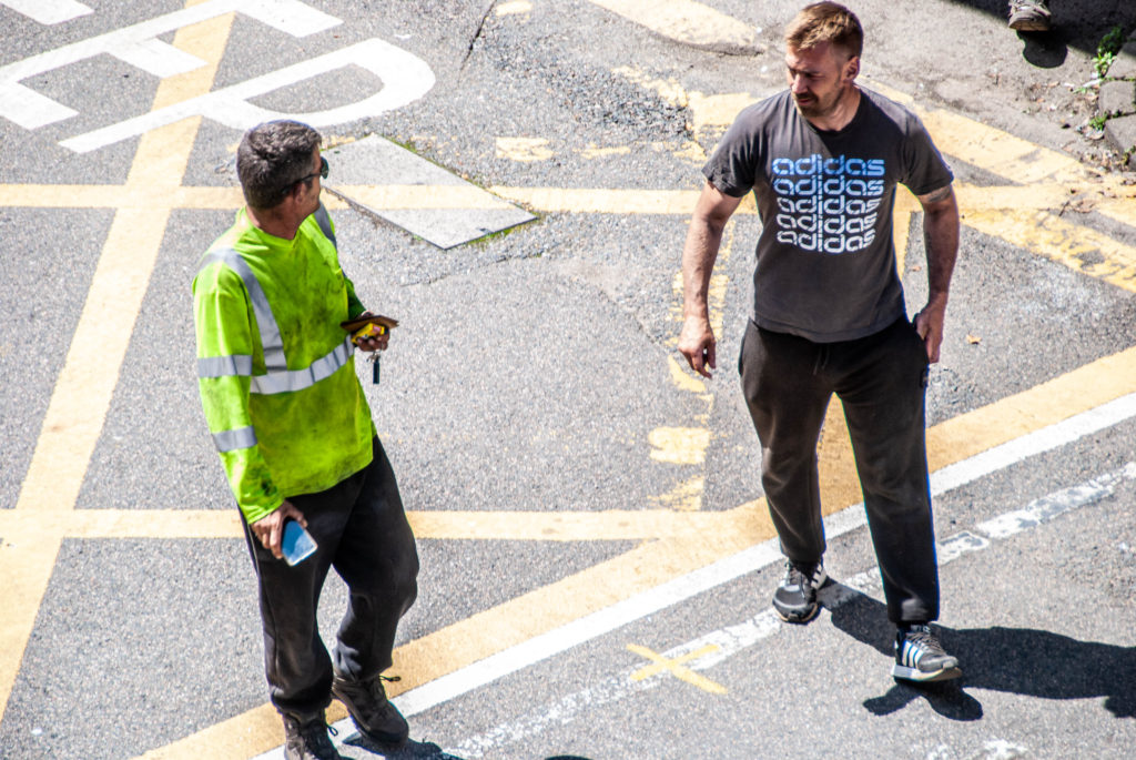
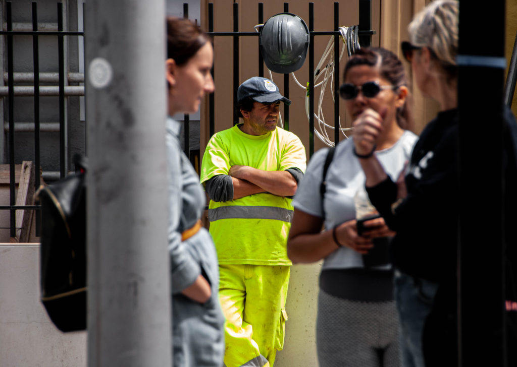
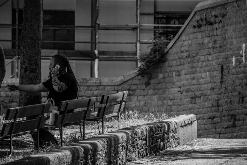
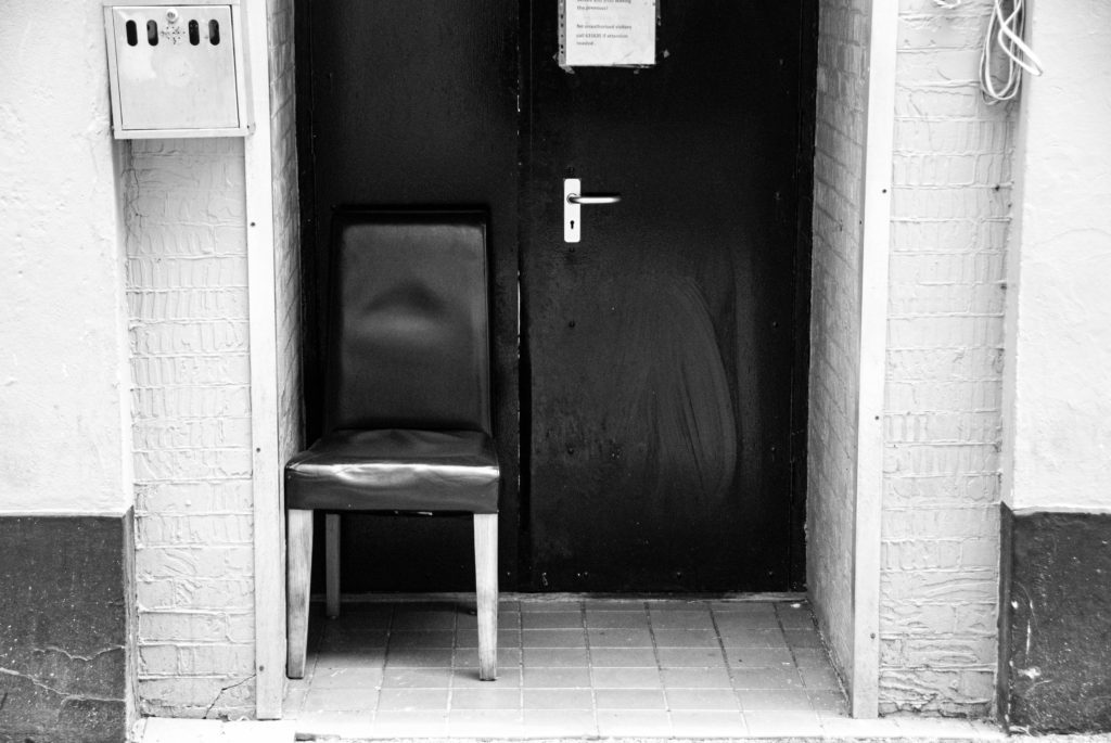
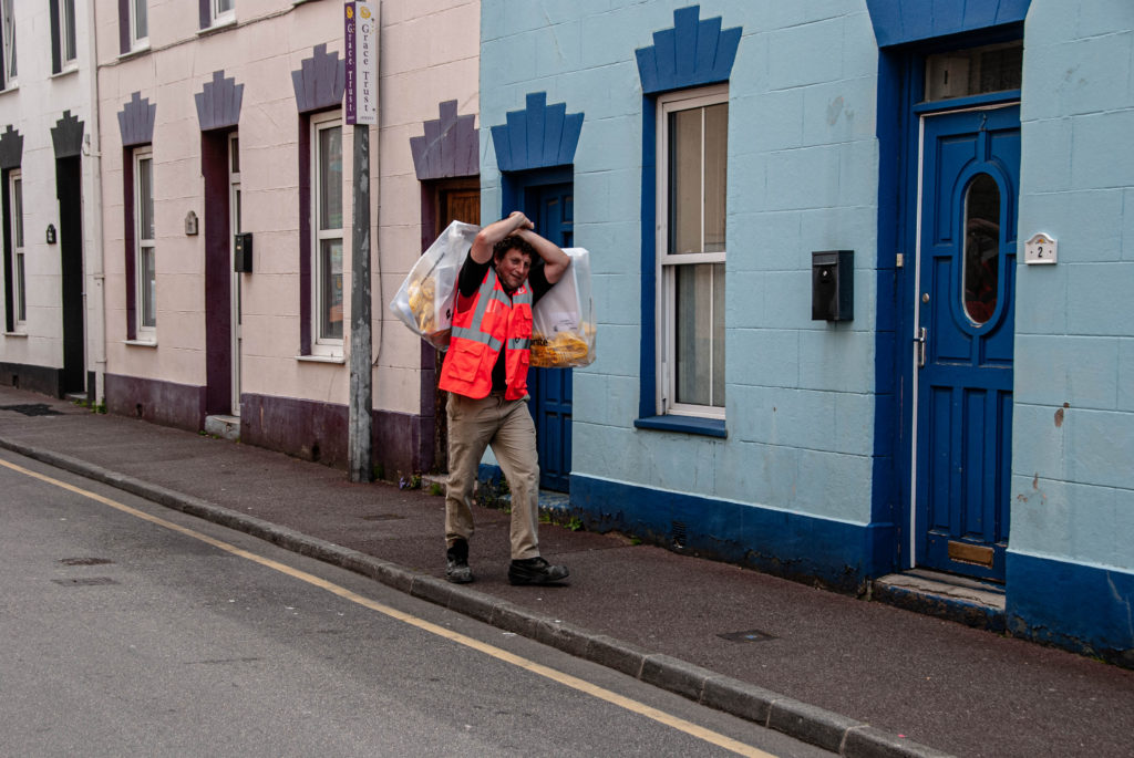
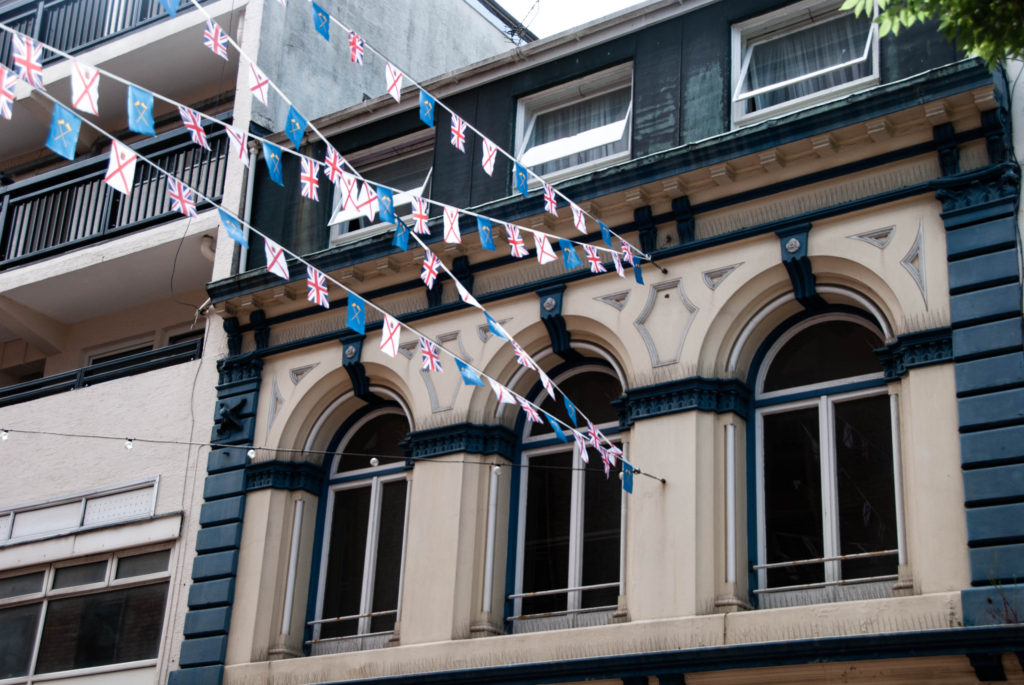
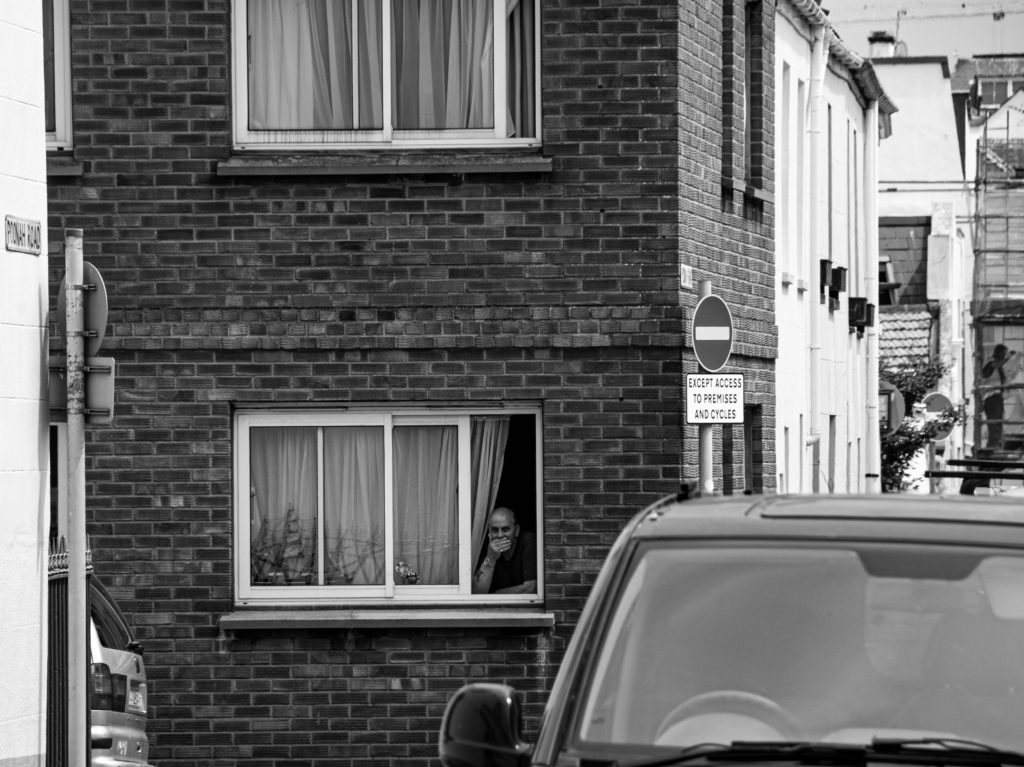
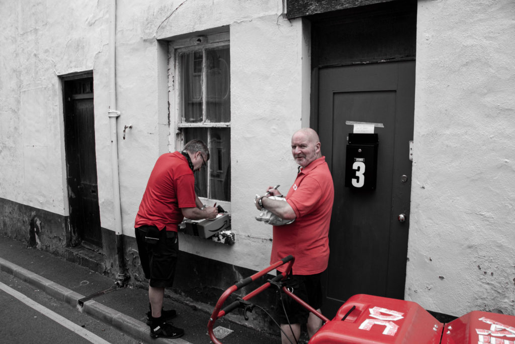
  2. Depictions of the everyday lives of migrants and their communities in St Helier.
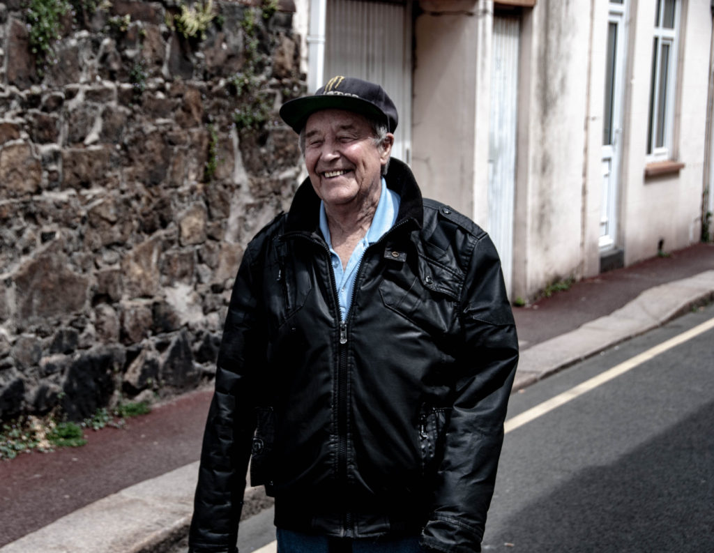
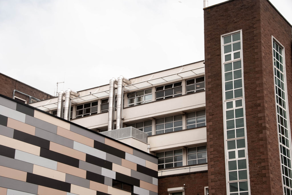
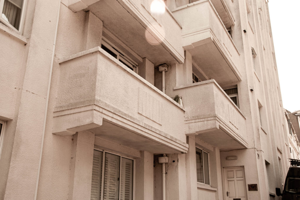
  3. Capturing everyday lives of the vast range of people that have migrated to St Helier. The way these people have formed communities and how the different communities differ in various elements but mainly their aesthetic differences. The different social and historic contexts that have defined these people.
  1. A migrant community

NARRATIVE: How will you tell your story

I will use a sequence of deliberately positioned images which capture the essence of the story in an aesthetic way and also act on the narrative. They are positioned in a way were the images trigger questions and ideas about the subjects photographed and the narrative is told through how the images are sequenced and how the reader is guided from one image to the next.

AUDIENCE: Who is it for?

Most image makers tend to overlook the experience of the viewer. Considering who your audience is and how they may engage with your photo-zine is important factor when you are designing/ making it.

I want to lure in a wide audience who live in Jersey. My project highlights the fact that everyone in Jersey is essentially an immigrant and it is important to learn about the social and historic context regarding how and why these communities have formed. Therefore, I want to specifically target an audience that is lives in Jersey but is not essentially from jersey. I also want to target a specific ‘young adult audience’; 15 -25. This is so that the younger generation of big thinkers can start to ask questions about their heritage and educate themselves about the Island and its cultures and bands of people.

Editing

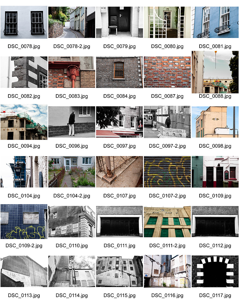
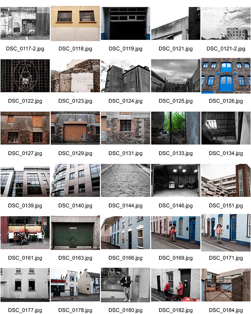
Edits from all shoots:
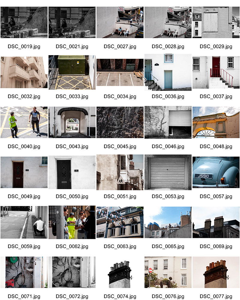
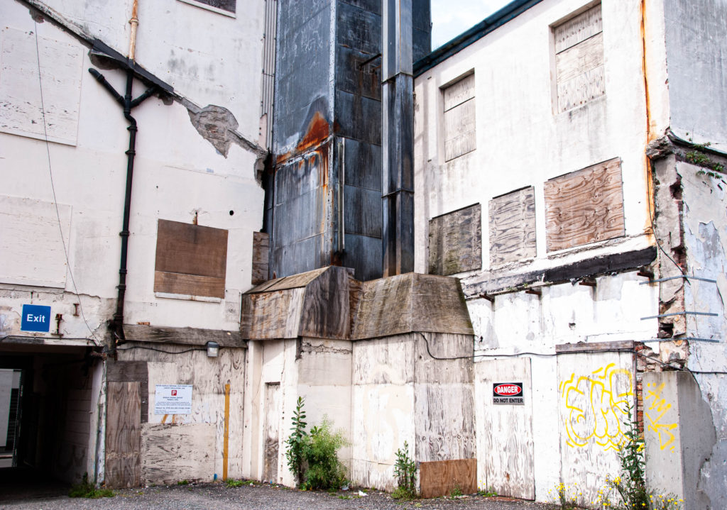
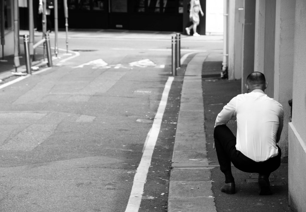
I believe that during the editing process I was able to dramatize and romanticise the locations and people of St Helier proficiently. I used a series of dramatic contrasting and aesthetic composition to begin telling the story of migrant communities in St Helier. I believe in order to start composing an effective narrative I needed to start categorizing and grouping images. This leads on to the next step in the process, sequencing.

Sequencing

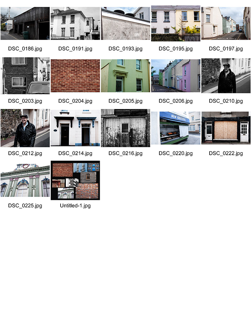
I began narrowing my image range down from about 100 images to only 18 images.

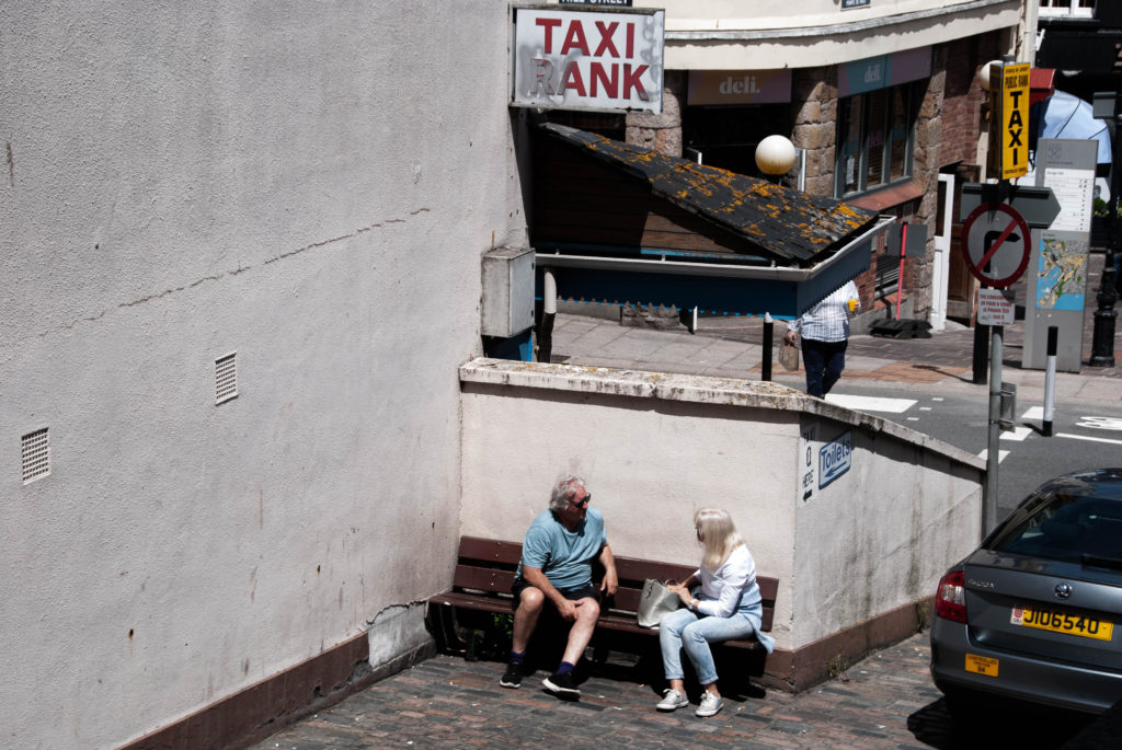
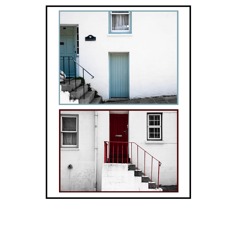
I then began a tactile process of printing my images out and, by hand organizing them into a sequence. This is so that I could move them around quickly to experiment different combinations with ease and visually connect and sequence the images. This allowed me to notice that my combination of architectural images of different styles of buildings in St Helier had correlation, visually and culturally, with the portraits of individuals in the communities. There were also a few images where I felt certain characters in them had interconnections with others, I therefore chose to position these images together in the sequence. I began to connect and contrast these together until I found a perfect sequence that told the story of St Helier’s migrant communities. This sequence is seen below in order. The
Selecting, Finalising and presenting Your Photographs

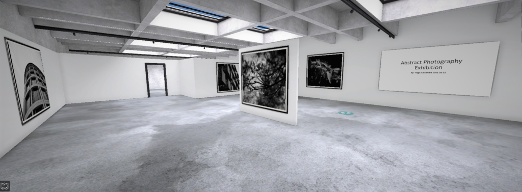
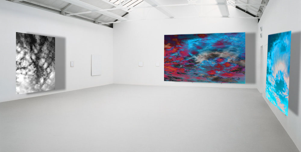
Sample of my Virtual Gallery / Exhibition:

Why I chose to present my final outcomes in this way:

I felt really inspired to present my final ideas and outcomes from these projects in a form of Virtual Reality Exhibition due to the fact of COVID-19. I took inspiration from the fact that there are now being held art exhibitions, University inductions and much more through virtual reality programs. For example, the British Museum, London has undertaken Virtual tours during the quarantine.


How I did it:

Step 1: Go to www.artsteps.com

Step 2: Sign in / up.

Step 3: Create.

Step 4: Create your own location or choose a template.

Step 5: Upload your images, put them in your exhibition, name it and give it a description. For mine, I justified my photographs.

Step 6: Present / view your Exhibition.


Evaluation

Planning: In my opinion I have given myself enough time to think about what images to use and why. I have also clearly thought and justified the reason behind my presentation.

I have clearly worked hard and considered the situation many of us are in like the Pandemic and took inspiration from Museums doing Virtual Tours during this dark time.

Image Collection: I was very satisfied with my work as I have powerfully managed to explore and present my ideas on abstract photography. I successfully picked the photographs that portrayed as much abstract and colour as possible.

Selecting and finalising and displaying

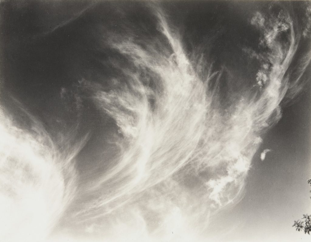
For my finalised images I got inspiration off Alfred Stieglitz in taking pictures of clouds for my image selection in my images being abstract pieces. I chose to get inspiration of Alfred Stieglitz for my final abstract pieces because when I looked at his pictures they caught my attention due to his pictures of clouds looking very abstract in the way the clouds are come across in the pictures for example, some of his pieces don’t even look like clouds although they are due to the  contrast of black and white which manipulates the picture into not looking like clouds also, the patterns and repetition of the clouds look very odd making them interesting to look at as you can almost use your imagination in making the picture come across as something else and not clouds.

As you can see from this image of Alfred Stieglitz you can use your imagination to manipulate the picture to come across as something else, with this specific image I think of the clouds looking like fluff that comes out of a puffer jacket or a pillow purely using my imagination on what I think the cloud appears to be. 

Finalised Pieces

The process I went through in making the first one in black and white on the left was by editing the picture by going onto the levels in order to change where the shadows should have been darker in order for the contrast between the black and white to bounce of each other and then I changed the image to being black and white. Moreover, I would say this picture is the closest to Alfred Stieglitz purely because the picture is in black and white with the shadows are heightened just like his pictures.

As for the picture on the far right, the process of editing that I went through in order to get the image to what it looks like was that I went onto the hue and saturation and changed the picture in having the colours of the picture being a bright blue. Also, I cropped out the image, so it was just the clouds in the picture however, this makes it very abstract as the image doesn’t appear to be a cloud and the bright colours in the picture eliminates the natural lighting or natural shadows meaning it would be difficult at first knowing what the picture is.

Finally, the picture in the middle was made through the editing stage of getting the picture on the left on top of the picture on the right merging it into one. Once that was complete, I went onto the black and white image that I put on top of the blue one and I put the opacity down which enables you to see the bottom layer of the image. After that, I changed the colour of the image in order to make the clouds be highlighted in red to make both images contrast from the colours of red and blue. 

Overall the middle picture is my favourite out of the three because of the way it doesn’t look anything like a cloud but maybe a weather report. Moreover, I feel like I have taken Alfred Stieglitz’s style of photography and evolve it in the way that it’s not in black and white which goes to show we are photographers in different time periods and this makes my photograph probably catch the eye of a younger person due to how bright the colours are in the image which makes it stand out from the rest.