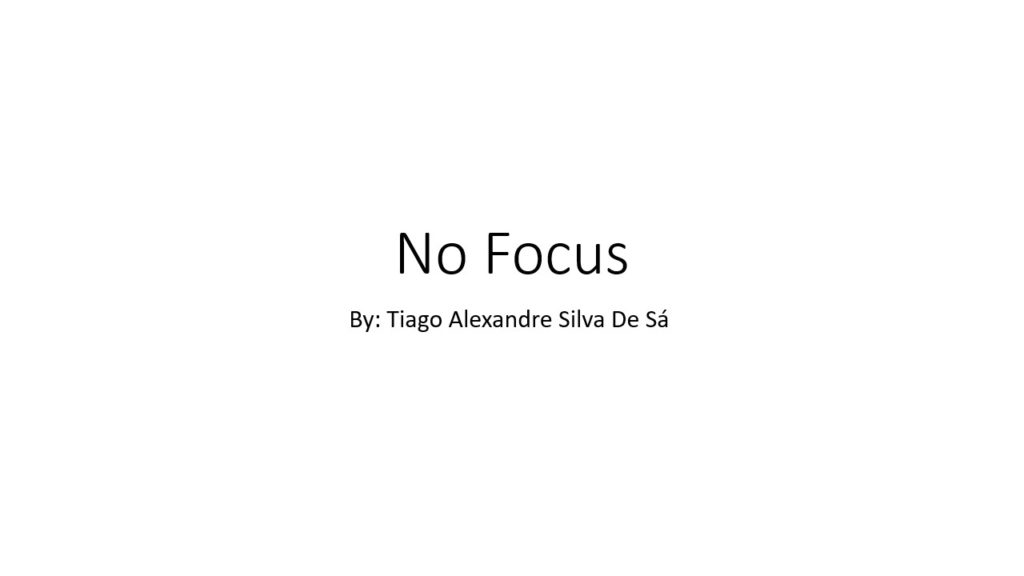
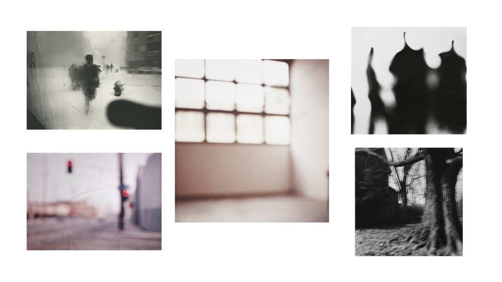
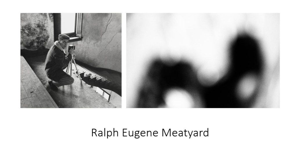
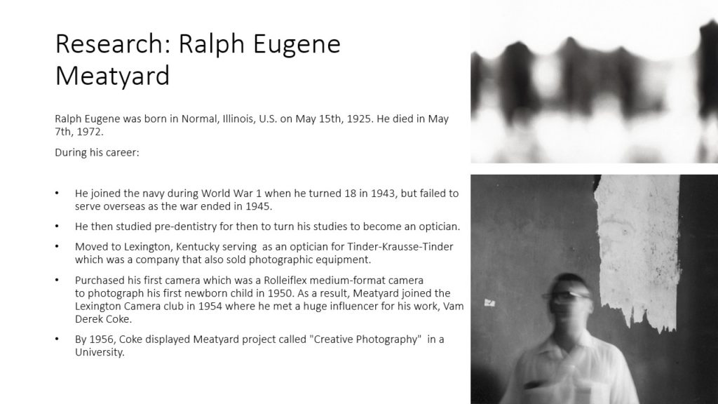
Saul Leiter

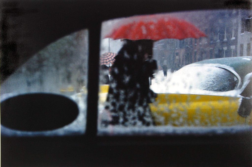
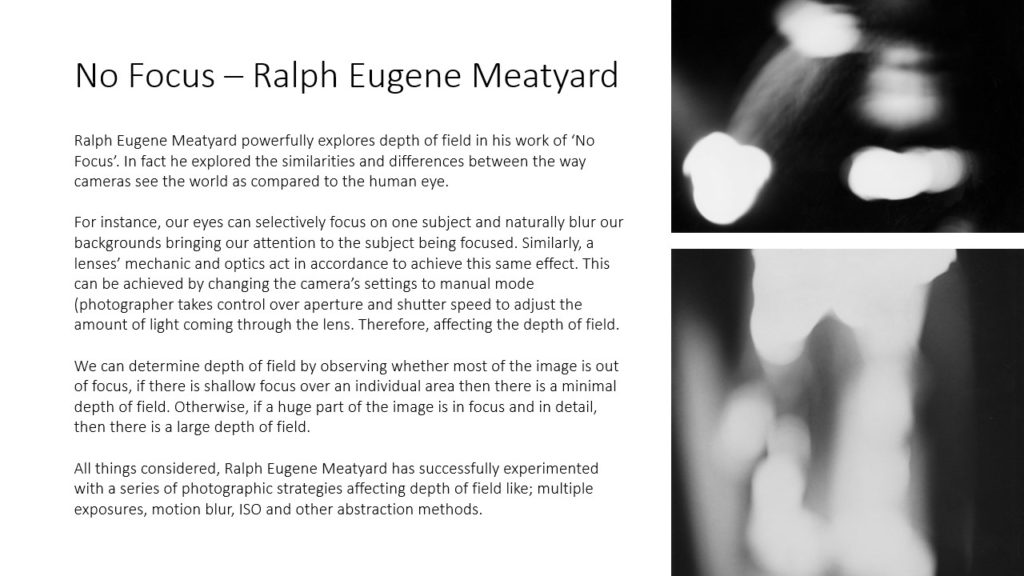
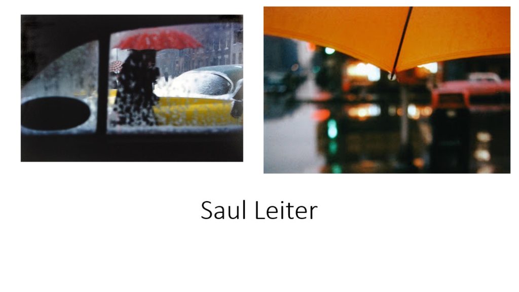
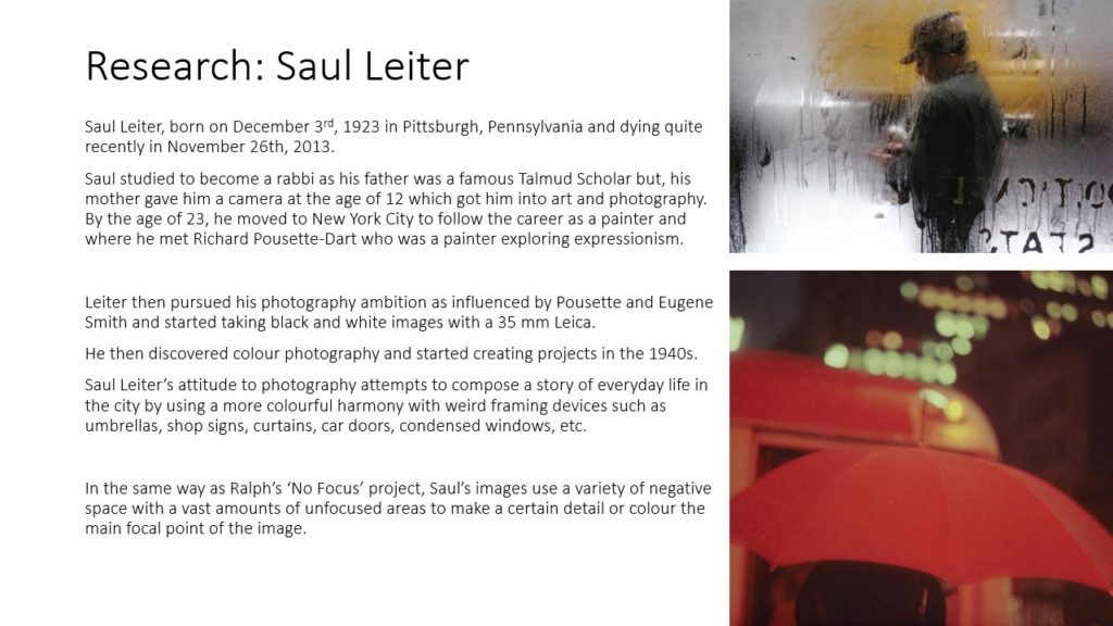
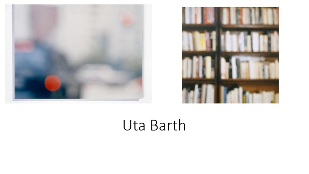
Born in Pittsburgh, Pennsylvania, Saul Leiter was a painter and photographer who started his career in the 1940s and 1950s. He left theology school and moved to New York to pursue painting at age 23, this is also where he found his love for photography. In the 1950’s, Leiter held his first colour photography exhibition at the Artist’s Club, where groups of Abstract Expressionist painters would meet and admire other work. Leiter furthered his career as a fashion photographer throughout the 1970’s, he worked for publications such as Elle, British Vogue and Nova. The Saul Leiter Foundation was founded in 2014, a year after Leiter passed away, this was dedicated to preserving the art and legacy of Saul Leiter.
Analysis of Saul Leiter’s work:
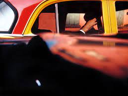
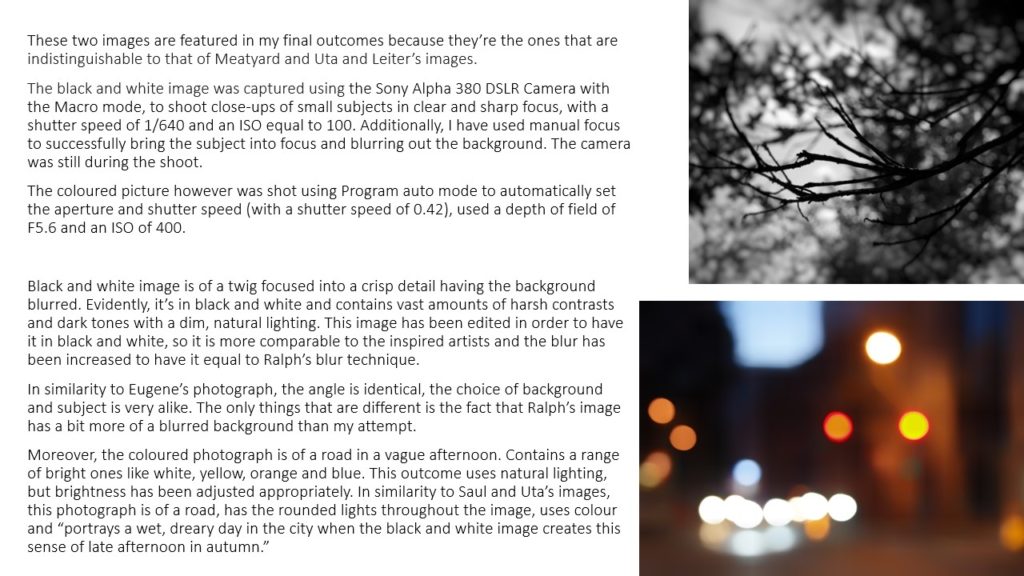
Light- The lighting in this image seems artificial as harsh shadows are created in both the foreground and background of the photograph. The lightest areas of the image are the vibrant colours of the car roof, these areas are juxtaposed against the gloomy shadows inside the car and in the foreground.
Line- The lines in the image are rather geometric and artificial, however they create a contrast as the curved lines blend with the straight lines. The lines lead your eyes to the direction of the shadows cast under the roof of the car, and to the dimly-lit figure inside the car.
Repetition- There is a repetition of curved and straight line in this image, which creates a geometric shape to the image.
Shape- The shapes in the image are geometric, this give the image an artificial aesthetic.
Space- The image has a wider depth of field, as the foreground is blurry, however the background is in focus. There is a rather a large sense of depth in the photograph.
Texture- The texture of the metal gives the photograph a smooth appearance, the highlights on the roof also add to the smoothness of the image.
Value/Tone- The image has an extreme contrasting range of tone, as the vibrant colours of the car clash with the muted shadows in the shadows and the figure’s clothing. The lightest part of the photo is the colours of the car and the darkest areas are in the shadows. Overall, the image tends towards the darkness.
Colour- The coloured parts of the image are very vibrant and intense. They display the harsh primary colours of red and yellow, which are jarring when placed next to one another.
Composition- There is a simple composition to the image as it doesn’t seem busy. There is not much going on in the image, and the photo focuses on the juxtaposition of light and dark , and colour and black and white, rather than the composition. The rule of thirds has not been used in this image, in my opinion.


