
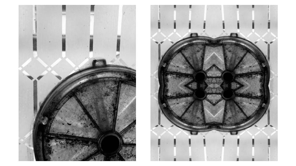
To start with I selected my image and copied it. I then increased the canvas size to double the width and length of the original. I pasted my image and flipped it vertically and lined it up so that it was even to my original image. I then selected both images together and flipped them horizontally, creating the mirrored effect.

Born in Boston, Massachusetts, in 1983, Nick Albertson has had his abstract photography exhibited in Chicago, Portland, Seattle, San Francisco and New York, as well as international exhibitions such as the Pingyao International Photo Festival. Albertson’s work focuses on patterns and repetition in ordinary, mundane objects. Nick Albertson’s work combines photography, video, and sculptural forms

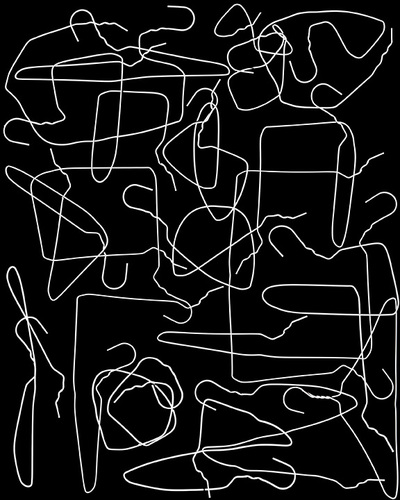
The harsh, artificial lighting powerfully illuminates the white hangers in order to create a clear contrast against the harsh, black background. No shadows are formed in this photograph as the background itself is black, therefore any shadows produced would have blended into the surroundings.
There is a clear juxtaposition between straight and curved lines in the photograph. There is no specific direction created in the image as the lines direct the viewers eyes in all directions around the screen. The lines are used more as focal points for the image rather than leading lines as there is not one singular focal point.
There is a pattern of repetition using lines in this image. The contrasting straight and curved lines create a type of swirling pattern around the screen as they cross paths with one another.
The aesthetic of the image is very geometrical and artificial, as Albertson lays out the coat hangers in a specific way and bends them in order to create juxtaposing lines. Shapes such as squares and triangles are created due to the specific bending of the lines.
The photograph is very shallow and has no use of depth of field as the whole image is in focus and no shadows have been created with the use of light. The image focuses purely on the patterns of repetition and contrasting light and dark. A larger aperture may have been uses for this image, perhaps f.4, as there is no need to capture the depth in the photograph. A fast shutter speed was probably used for this still-life image and I also believe a high ISO was used in this image in order to create the harsh whiteness.
It is difficult to depict the texture of this photograph as the image itself is very flat, however there is a lack of rough or jagged edges in the photo therefore I believe the texture must be smooth.
There is little range in tone or value in the image as the shades of black and white are completely contrasted. The blinding white lines are juxtaposed with the gloomy, black background in order to create a distinction between black and white. The whole image tends towards darkness, as the thin lines are the only use of light.
There is no colour in the photograph. This is because Albertson’s aim was to signify the contrast of black and white and focus on patterns of lines rather than the use of colour. The lack of colour allows the viewer to appreciate the pattern of lines in it’s purest form.
I feel as though this image is balanced as the whole image is busy and there is no negative space. The composition of the image is artificial and geometric, however there is no use of the rule of thirds in this image, as there is no specific focal point.

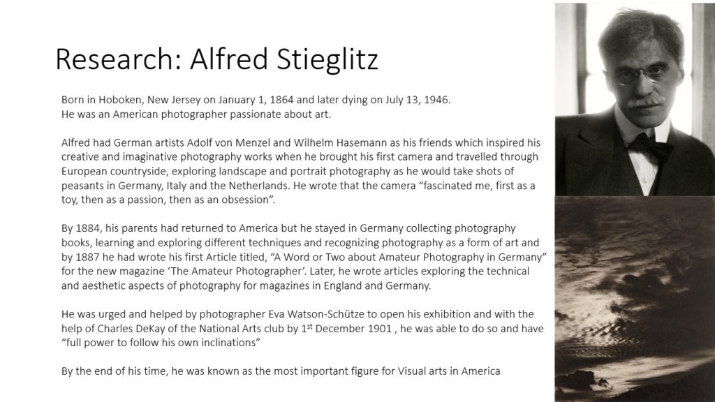
Harry Callahan, born in 1912, was an American photographer and educator who taught at both the Institute of Design in Chicago, and the Rhode Island School of Design. Harry Callahan held his first solo exhibition at the Art Institute of Chicago in 1951, he later held a retrospective at the Museum of Modern Art in New York between 1976 to 1977. In 1978, Callahan represented the United States in the Venice Biennale. Callahan was one of the few innovators of modern American photography noted as much for his work in color as for his work in black and white, and also often used the method of multiple exposures in his photographs.

The soft, natural lighting in this photograph allows for a slightly more subtle contrast of light and dark. The shadows and highlights in the image are not harsh, however they still depict a clear juxtaposition.
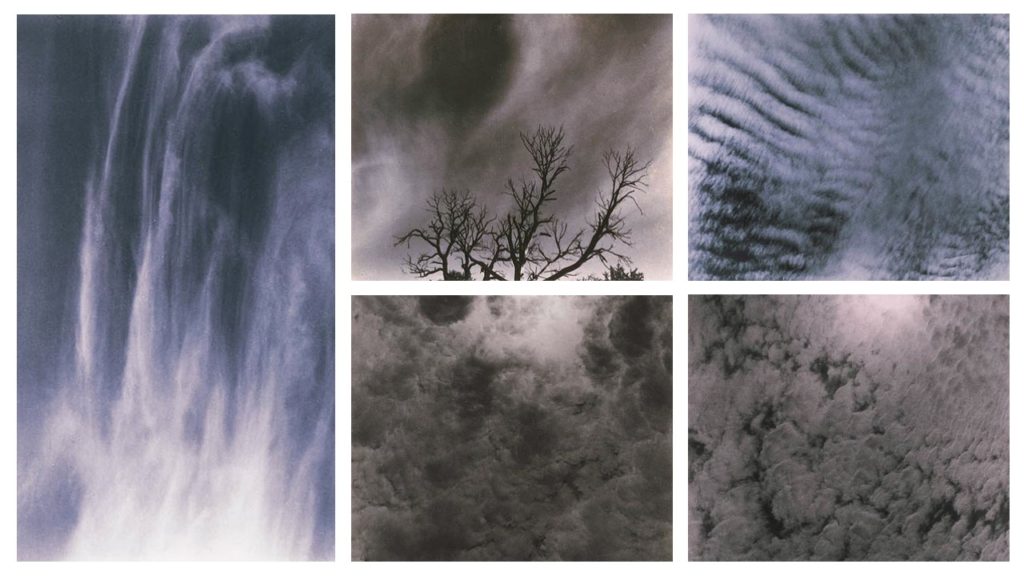
There is a clear pattern of repeated, jagged lines in the image. The lines direct the viewers eyes upwards, and towards the top third of the image.
A repetition of line is exemplified in the photograph, as the plants create both straight and curved lines that juxtapose against one another. The plants are then reflected in the water to create a further sense of abstraction, as the reflected lines are distorted by the water.
The shapes in the image are both geometric and organic as some of the lines are straight, however they become distorted and curved by the water.
There seems to be a narrow depth of field in this image as the reflections of the plants in the foreground seem to be more in focus than the background. I think this image was taken with a larger aperture and maybe a longer shutter speed in order to capture the motion of the water.
The water in the foreground of the image gives the photograph a smoother texture, however the contrast of jagged, misshapen lines also could give the image a rougher texture.
There is a range of tones from dark to light in the photograph. Although the image has a monochromatic theme, there is slight change in tone between black, white and grey. For example, the darkest area of the image is the thin, black lines created by the plants. The lightest area of the photograph is the reflections of the water in the background, which are highlighted by the sun.
There is very no colour in the image, however there is a range of tones from black to white, and a very subtle green hue to the image.
Although the composition is unorganised and organic, the composition seems balanced as the pattern of lines is consistent throughout the photograph.

Nick Albertson and Harry Callahan both interpret abstraction and especially patterns of repetition in similar ways. For example, in these photographs, they both focus on the repetition of line through different methods. In addition, these images create a strong sense of contrast with light and dark.
On the other hand, Albertson’s work is heavily artificial and organised, as he specifically places his subject into a desired pattern or shape. He also uses artificial lighting in order to highlight the repetition in his images. Harry Callahan’s work juxtaposes this as he often photographs natural forms and patterns found in nature. Because of this, he also uses natural lighting which softens the image as a whole to give less defined shadows and highlights.


I have chosen to compare a natural form image by Harry Callahan to an abstract image by Nick Albertson. Harry Callahan was an American photographer who was well-known for both his colour and black & white photographs. His work focuses on repetition, patterns and textures while also containing a high contrast between shadows and highlights. Nick Albertson is an American visual artist who uses mundane utilitarian objects to create abstract structural forms, photographing them using repetition, light and shadow.
There are many similarities between these two images, one being both photographers capture of vertical lines. Harry Callahan photographs the straight leading lines of pond reeds which reflect off the waters surface, creating a highly textured image with movement and rhythm. Additionally, Nick Albertson captures his vertical lines in the thick red tape, which stretch a uniform pattern from the top to the bottom of the image. These orderly lines create an abstract atmosphere in the image as the placing of the subjects are systematic and rigid, which contrasts with the obvious movement in Callahan’s work. There is also immense amounts of repetition in both images as the leading vertical lines echo throughout the photographs. Moreover, both images hold a sharp texture as they appear to have pointed edges and harsh lighting.
However, there are also many differences within these images. For example, Callahan’s photograph is of a natural form in its organic environment, whereas Albertson has captured a man-made form in an abstract ambiguous way. Furthermore, Callahan photographs his images in black & white whereas Albertson has bright saturation. The dominant colour red that Albertson captures creates a bold eye catching image and its vibrancy draws attention from the observer. Contrastingly, Callahan’s black and white image holds dark shadows which contrast greatly with the bright white highlights reflecting from the water. This creates a mysterious, enigmatic atmosphere within the photo as the shadowed reeds look silhouette-like against the water. In addition, these images are taken with very different lighting. Callahan uses natural light to capture his image as he is photographing the environment presently, without disturbing or changing it. However, Albertson uses harsh studio lighting in order to capture the everyday object in an abstract way. This artificial lighting choice adds to the unnaturalness and ambiguity of the image and shows how the composition of any mundane object, depending on perspective, can change how people identify it.

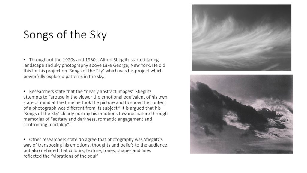
Both of these photographs are devoid of any colour and shot in black and white, making them appear old and dated. Additionally, they both are very abstract in nature, with Coburn photographing glass, crystalline shapes with the use of kaleidoscopic contraption, and Stieglitz photographing the patterns that he sees in the clouds above him. However, there are some major differences between the two images. For example, Coburn’s photograph consists of harsh, straight lines which run across the entirety of the image, with the leading, geometrical shapes drawing the viewer’s eye into the centre of the image. On the other hand, Stieglitz’s composition is made up of soft, organic, and curved lines which show the natural direction the wind in the sky. It is a much more relaxing photograph to look at, because it is pure and real, unlike Coburn’s image which had to be manhandled and manipulated in order to achieve. Technically, the lighting in both of the photographs are similar, with each of them being lit in a low light. However, it is clear that Stieglitz’s image was taken using a natural light source as the photograph is of the sky, and Coburn’s lighting was most likely artificial in order for him to ensure that the reflections were placed precisely where he wanted them to be. Also, in Stieglitz’s photograph, there appears to be a lot more empty and negative space compared to Coburn’s, whose subject takes up the entire frame.
Ernst Haas compared to Nick Albertson
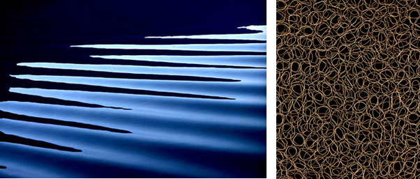
Haas takes more identifiable images, for example, a zoomed in shot of horizontal ripples on the surface of the water to create an abstract scene, where as Albertson only takes extremely close up images, to a point where you can identify what the subject is, which makes the image more fascinating as you question what the image is of.
Both images are visually appalling, as they both use circles, which is a clam looking shape as the are no pointy corners or sharp lines.
The lighting is more noticeable in Haas’s image, as there is a lot more definition due to a high contrast in the tones, because the water is at different levels, as it is 3D. On the other hand, Albertson’s image uses a black background so it is hard to tell where the light is coming from and if it is natural or artificial.
The lines on Haas’s image are horizontal and angled at a 45 degrees from the light, to create highlights and shadows in the corners of the images. The repetition adds more depth as you and see the ripples behind each other. Where as, Albertson’s photo was taken from a birds eye view directly above all the rubber bands to create a frantic and rushed mood as all the lines overlap each other.
Both images have little composition, they have a “less descriptive, more creative” approach. Which means that the image is mainly based off of it looks rather that it background and history.
The technology was different in the mid 20th century compared to the early 21st century, which is why Haas’s image has a lower quality as they only had 10mm-40mm lens which is why it is a little bit pixelated.
Haas’s image uses a fast shutter speed to capture the motion in a still frame. It also makes the image a bit under exposed as it isn’t letting in a lot light in as the hole which lets light enter the camera is small and closed up. The image has a cold tone as the colour blue is the most dominant.
Albertson’s image uses a high aperture to keep everything in focus, which makes it more chaotic as there is more to focus on in the image. Additionally, he uses a low ISO to reduce grain to create a cleaner image.