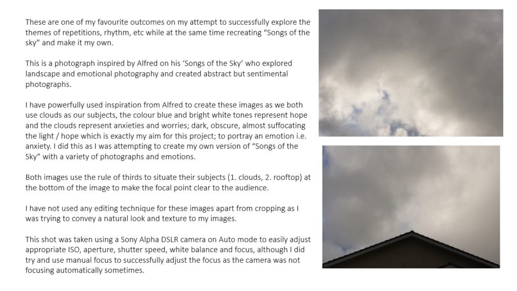
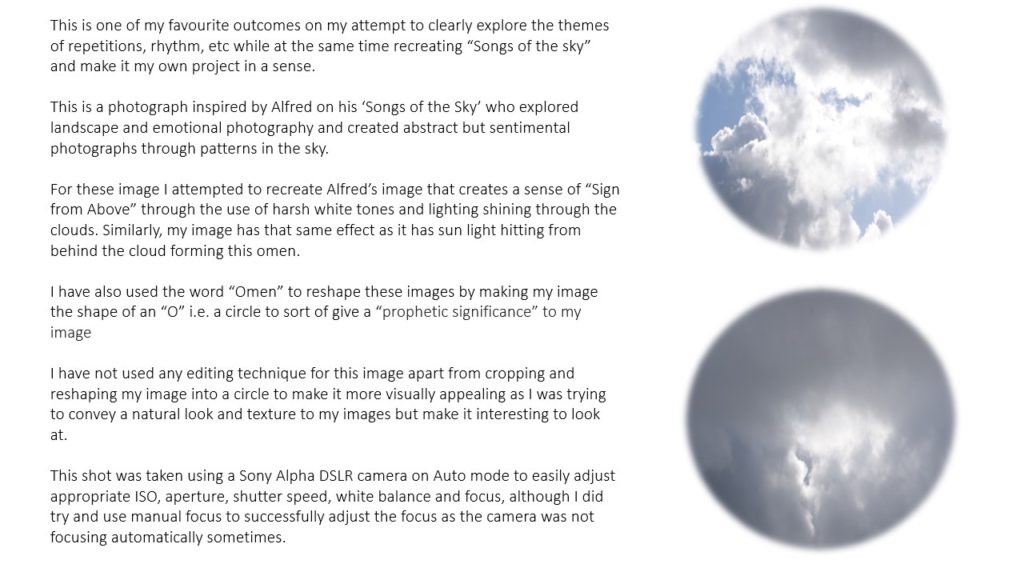
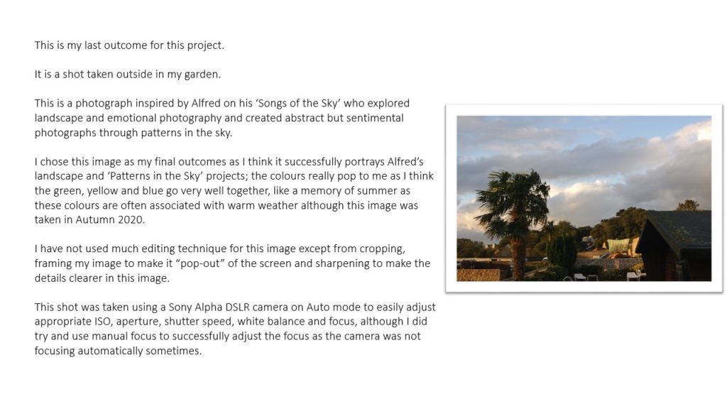


I decided in picking these two photographers to contrast and compare their work pieces as both photographers use textures, repetition and patterns in an enchanting way.
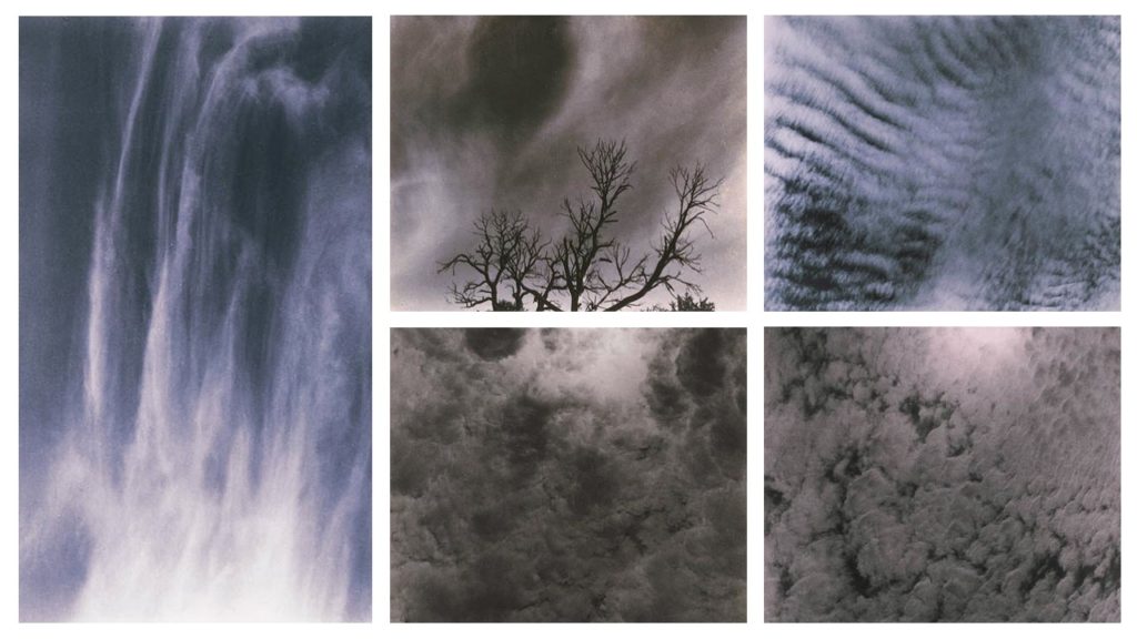
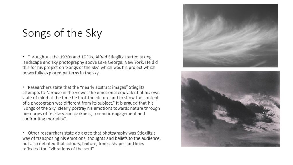
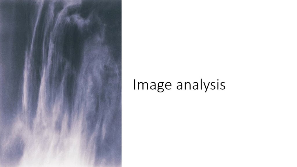
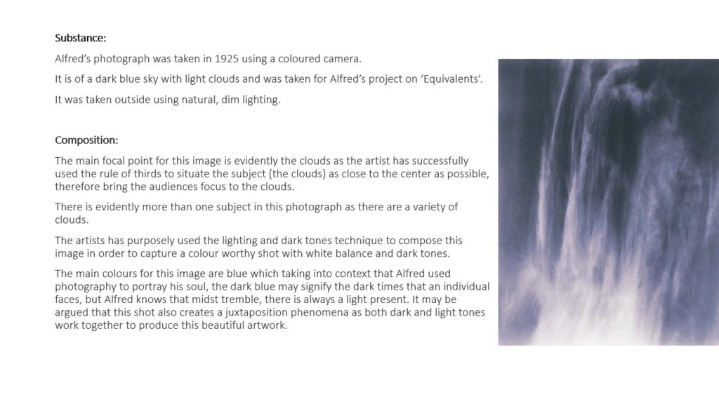
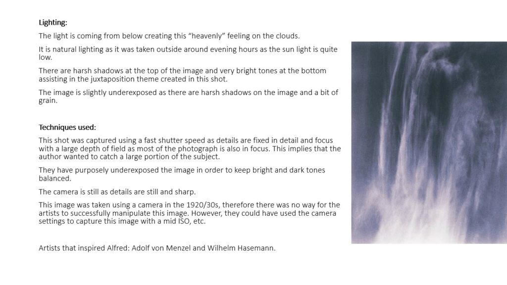
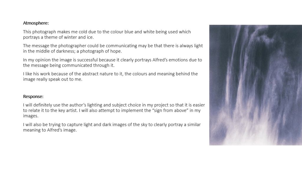
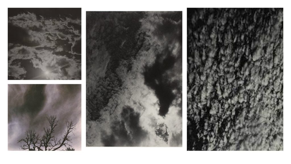
Alfred Stieglitz creates patterns and repetition when in the talking of his photos as the clouds create weird patterns and some of the patterns are repeated in the sky creating an abstract look to the clouds.
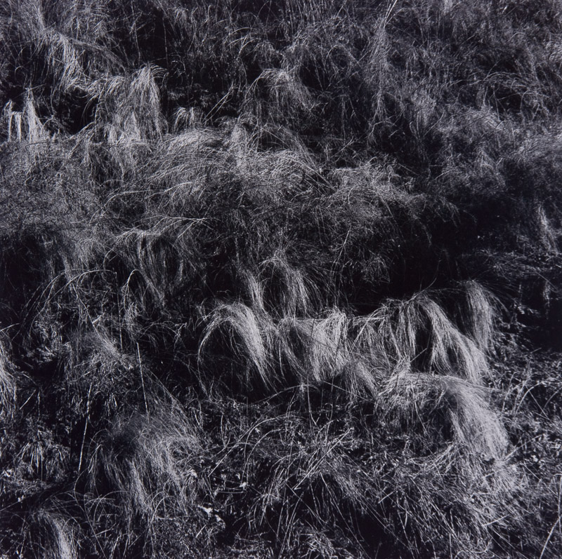
Whereas, Harry Callahan similarly experiments with these patterns and repetition in his pictures with the abstract pictures he takes of grass and repetition in the photos he has taking of trees being lined up next to each other.
Alfred’s picture on the left contains natural lighting which gives different shades into the patterns of the clouds in the sky making some of the clouds darker and lighter than other sin different regions. Visually, Alfred’s picture is appeared to seem very 2D (flat) as their isn’t much highlight’s of light in the clouds in order for them to appear to be 3D or even clouds moreover, their is a lot of patterns in this picture visually as you can see similar cloud shapes as it appears to be one big cloud with light trying to brake through different segments of the cloud. His purpose and meaning of taking these type of pictures of clouds was that it became an art form for him to take this pictures of the sky and photography quite quickly became an obsession for Alfred as he enjoyed his art form of taking pictures.
Harrys picture on the right was taken from the source of natural light with what appears to be a wide angle aperture being used in taking this picture, this enhances the shadowing and contrast in this image from light to dark tones demonstrating the differences from what appears to be wheat and grass in the picture. Visually the image is contrasted to be 3D as you due to the shadowing giving life to the surface in the picture also, their is repetition in this as you can see their is grass scattered about in the picture giving it a very earthly/ naturalistic appeal to the picture. The context of how Harry would go about in taking his pictures, was that he would just get out of bed and take numerous pictures of things that he thought interested him, this comes across in his picture in my opinion as the picture doesn’t seem to be panned but more of a ‘in the moment’ taken picture.
Alvin Langdon Coburn

Ernst Haas
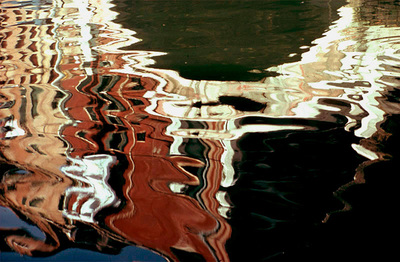

Both of this artists uses reflections in their images which creates an original and symmetrical image. Ernst Haas use the reflection of the water which gives a quite a natural way to the image.He also uses colors in his images . You can find the images in your daily life . We can notice in the reflection of the water that there are buildings so it’s quite visible. Its dynamic movement He crops the subject to increase the sense of abstraction. Alvin Langdon Coburn’s images are very symmetrical . We can notice a lots of triangles which forms.The reflections that he uses are those of the mirror which creates a repetition . We can notice some type of cristals he uses for his images.

Today we learn how to repeat a image on Photoshop. I choose this old image of a building that i like because of the architecture I thought it really was interesting . It looks like it’s reflected by the water but I just copy and paste it next and over to the original photograph. I had to select the image , copy it , increased the canvas size , paste the original picture in the white space , transform it flip it horizontally or vertically and then flattened the image.Repeat it three times.
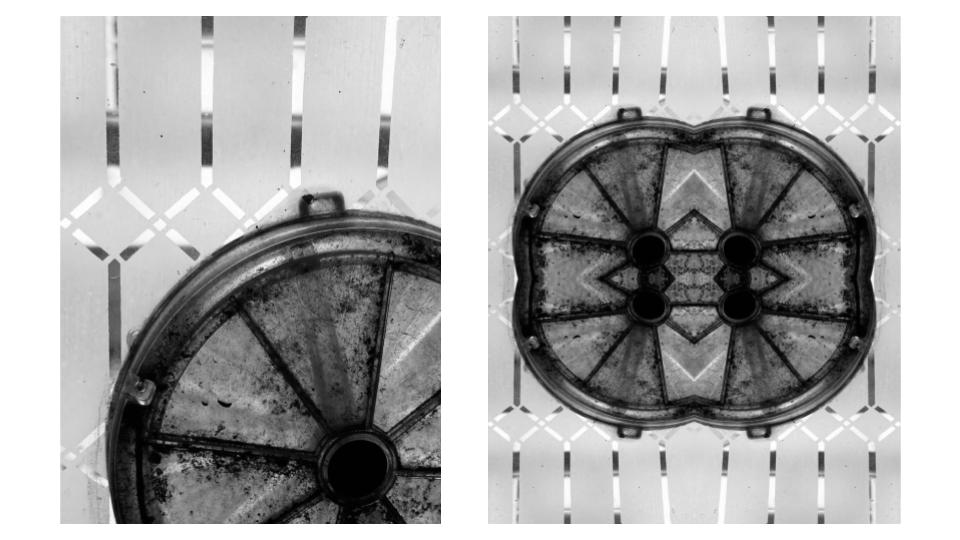
To start with I selected my image and copied it. I then increased the canvas size to double the width and length of the original. I pasted my image and flipped it vertically and lined it up so that it was even to my original image. I then selected both images together and flipped them horizontally, creating the mirrored effect.


I have chosen to compare a natural form image by Harry Callahan to an abstract image by Nick Albertson. Harry Callahan was an American photographer who was well-known for both his colour and black & white photographs. His work focuses on repetition, patterns and textures while also containing a high contrast between shadows and highlights. Nick Albertson is an American visual artist who uses mundane utilitarian objects to create abstract structural forms, photographing them using repetition, light and shadow.
There are many similarities between these two images, one being both photographers capture of vertical lines. Harry Callahan photographs the straight leading lines of pond reeds which reflect off the waters surface, creating a highly textured image with movement and rhythm. Additionally, Nick Albertson captures his vertical lines in the thick red tape, which stretch a uniform pattern from the top to the bottom of the image. These orderly lines create an abstract atmosphere in the image as the placing of the subjects are systematic and rigid, which contrasts with the obvious movement in Callahan’s work. There is also immense amounts of repetition in both images as the leading vertical lines echo throughout the photographs. Moreover, both images hold a sharp texture as they appear to have pointed edges and harsh lighting.
However, there are also many differences within these images. For example, Callahan’s photograph is of a natural form in its organic environment, whereas Albertson has captured a man-made form in an abstract ambiguous way. Furthermore, Callahan photographs his images in black & white whereas Albertson has bright saturation. The dominant colour red that Albertson captures creates a bold eye catching image and its vibrancy draws attention from the observer. Contrastingly, Callahan’s black and white image holds dark shadows which contrast greatly with the bright white highlights reflecting from the water. This creates a mysterious, enigmatic atmosphere within the photo as the shadowed reeds look silhouette-like against the water. In addition, these images are taken with very different lighting. Callahan uses natural light to capture his image as he is photographing the environment presently, without disturbing or changing it. However, Albertson uses harsh studio lighting in order to capture the everyday object in an abstract way. This artificial lighting choice adds to the unnaturalness and ambiguity of the image and shows how the composition of any mundane object, depending on perspective, can change how people identify it.

Both of these photographs are devoid of any colour and shot in black and white, making them appear old and dated. Additionally, they both are very abstract in nature, with Coburn photographing glass, crystalline shapes with the use of kaleidoscopic contraption, and Stieglitz photographing the patterns that he sees in the clouds above him. However, there are some major differences between the two images. For example, Coburn’s photograph consists of harsh, straight lines which run across the entirety of the image, with the leading, geometrical shapes drawing the viewer’s eye into the centre of the image. On the other hand, Stieglitz’s composition is made up of soft, organic, and curved lines which show the natural direction the wind in the sky. It is a much more relaxing photograph to look at, because it is pure and real, unlike Coburn’s image which had to be manhandled and manipulated in order to achieve. Technically, the lighting in both of the photographs are similar, with each of them being lit in a low light. However, it is clear that Stieglitz’s image was taken using a natural light source as the photograph is of the sky, and Coburn’s lighting was most likely artificial in order for him to ensure that the reflections were placed precisely where he wanted them to be. Also, in Stieglitz’s photograph, there appears to be a lot more empty and negative space compared to Coburn’s, whose subject takes up the entire frame.
Ernst Haas compared to Nick Albertson
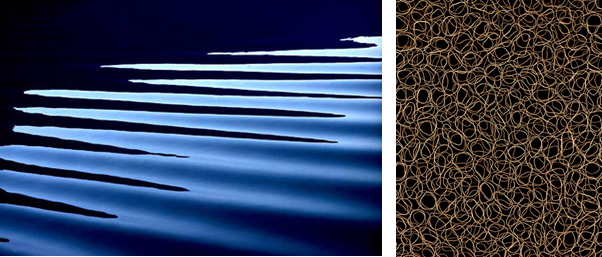
Haas takes more identifiable images, for example, a zoomed in shot of horizontal ripples on the surface of the water to create an abstract scene, where as Albertson only takes extremely close up images, to a point where you can identify what the subject is, which makes the image more fascinating as you question what the image is of.
Both images are visually appalling, as they both use circles, which is a clam looking shape as the are no pointy corners or sharp lines.
The lighting is more noticeable in Haas’s image, as there is a lot more definition due to a high contrast in the tones, because the water is at different levels, as it is 3D. On the other hand, Albertson’s image uses a black background so it is hard to tell where the light is coming from and if it is natural or artificial.
The lines on Haas’s image are horizontal and angled at a 45 degrees from the light, to create highlights and shadows in the corners of the images. The repetition adds more depth as you and see the ripples behind each other. Where as, Albertson’s photo was taken from a birds eye view directly above all the rubber bands to create a frantic and rushed mood as all the lines overlap each other.
Both images have little composition, they have a “less descriptive, more creative” approach. Which means that the image is mainly based off of it looks rather that it background and history.
The technology was different in the mid 20th century compared to the early 21st century, which is why Haas’s image has a lower quality as they only had 10mm-40mm lens which is why it is a little bit pixelated.
Haas’s image uses a fast shutter speed to capture the motion in a still frame. It also makes the image a bit under exposed as it isn’t letting in a lot light in as the hole which lets light enter the camera is small and closed up. The image has a cold tone as the colour blue is the most dominant.
Albertson’s image uses a high aperture to keep everything in focus, which makes it more chaotic as there is more to focus on in the image. Additionally, he uses a low ISO to reduce grain to create a cleaner image.