Tag Archives: reflection

Identity & Community Newspaper Reflection

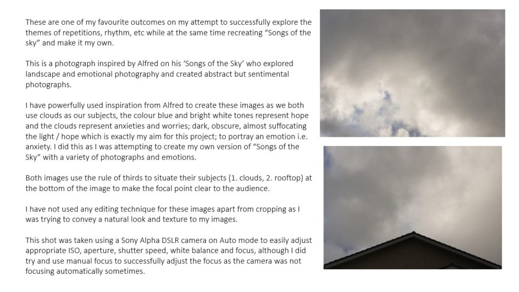
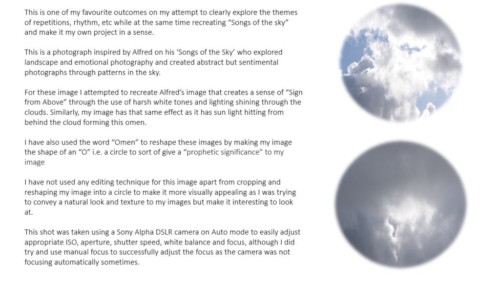
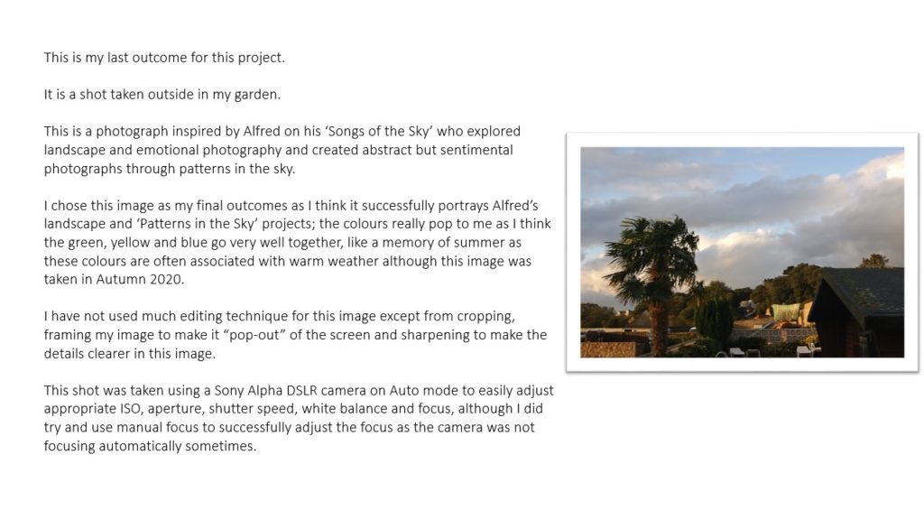
Being apart of this project is an amazing experience and has developed my photography extensively. This project has inspired top quality work and brought together a group of likeminded photographers who are presented to the public in Jerseys biggest newspaper. This allowed for my ability to connect with the subject I am photographing to be developed significantly as well as learning a lot about a communities and being able to present that in an artistic fashion.

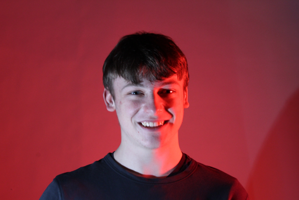
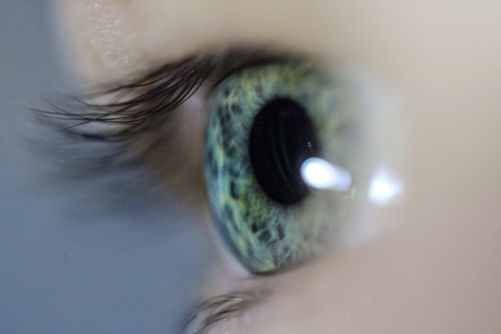
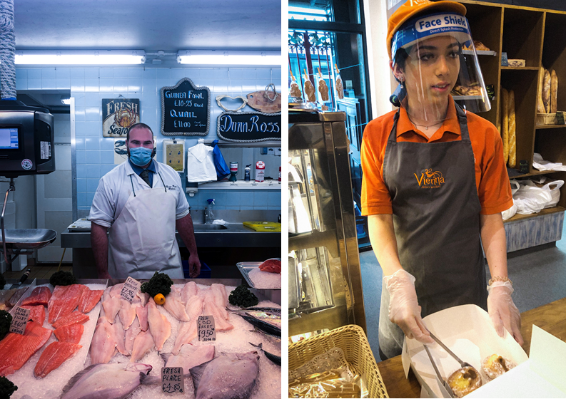
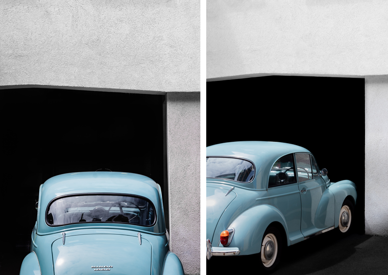
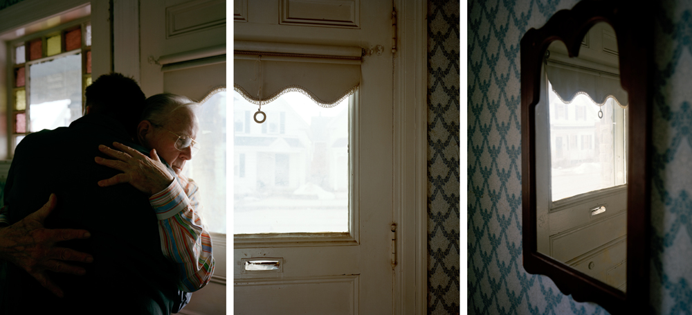
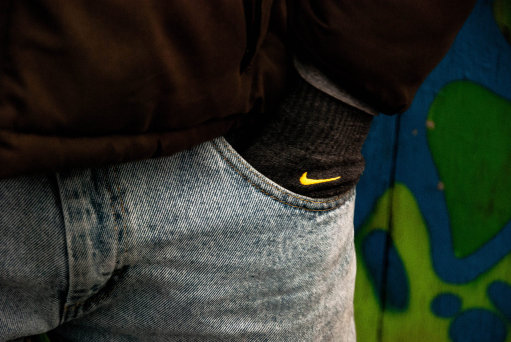
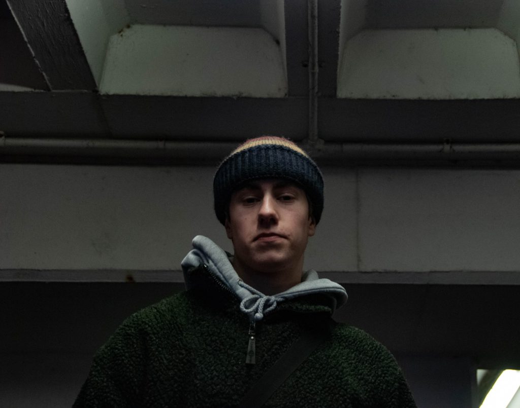
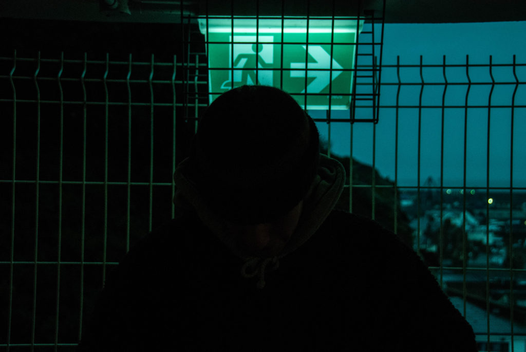
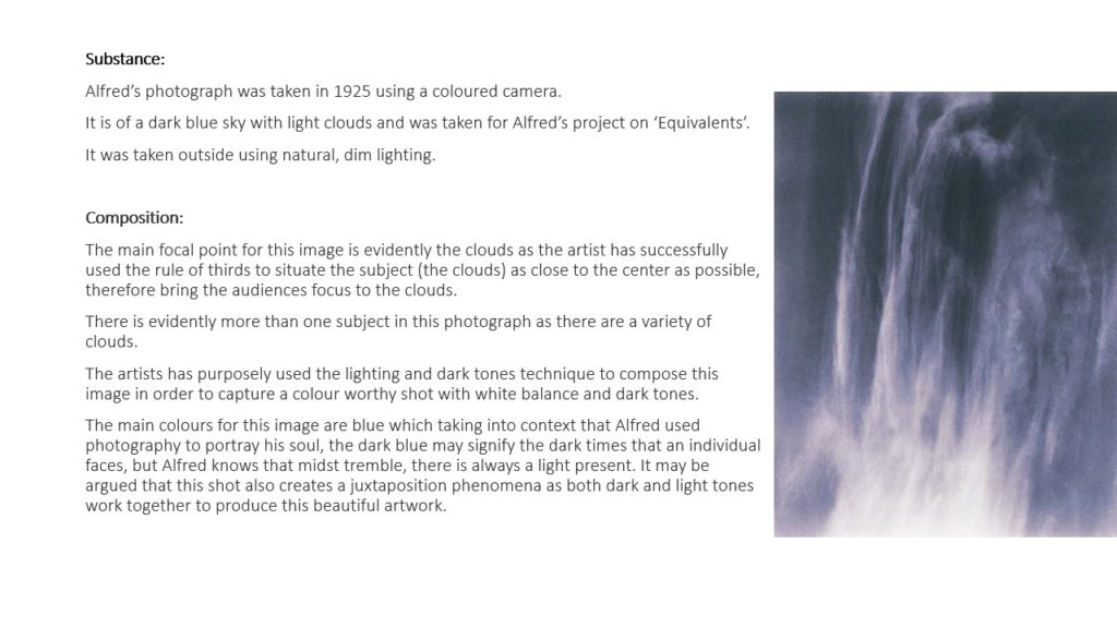
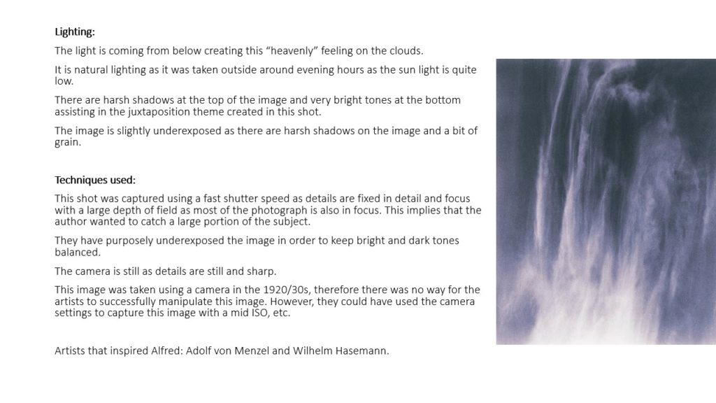
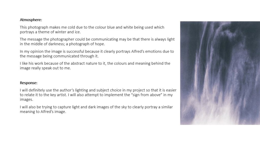
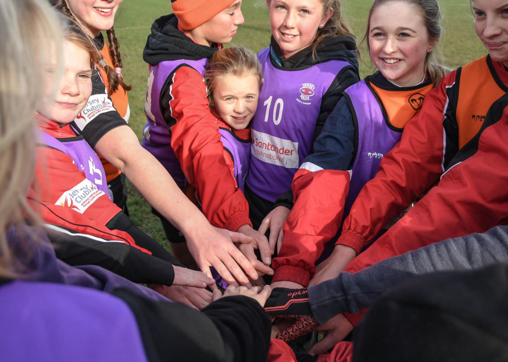
Here is an example of this connection I was able to develop with my subjects in order to capture their identity.

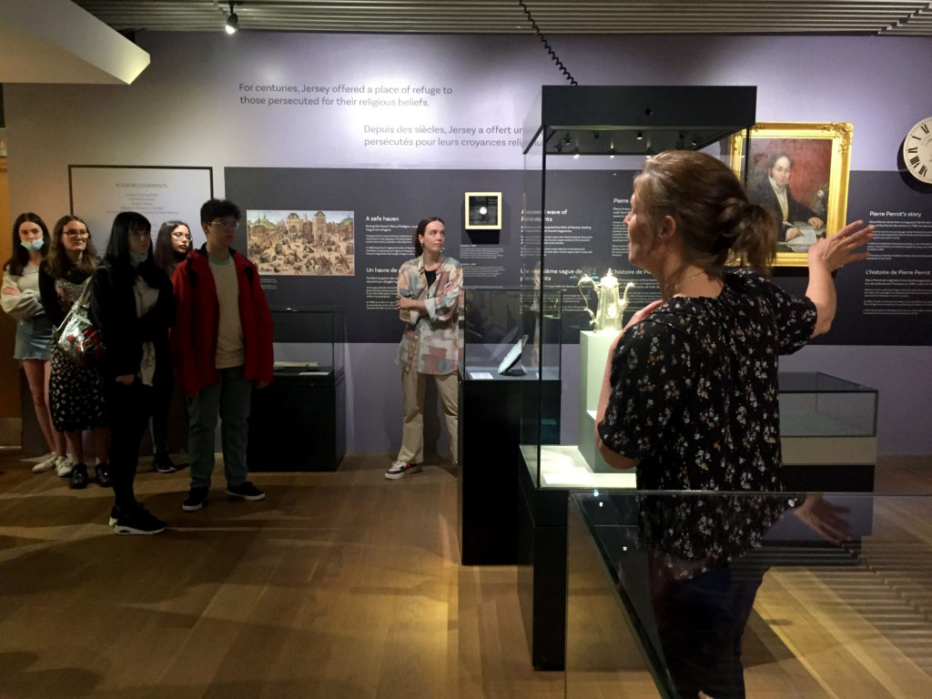
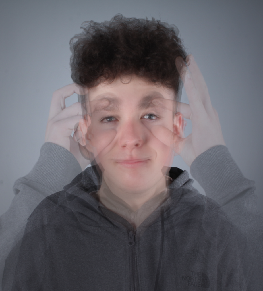
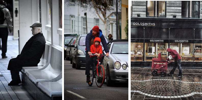
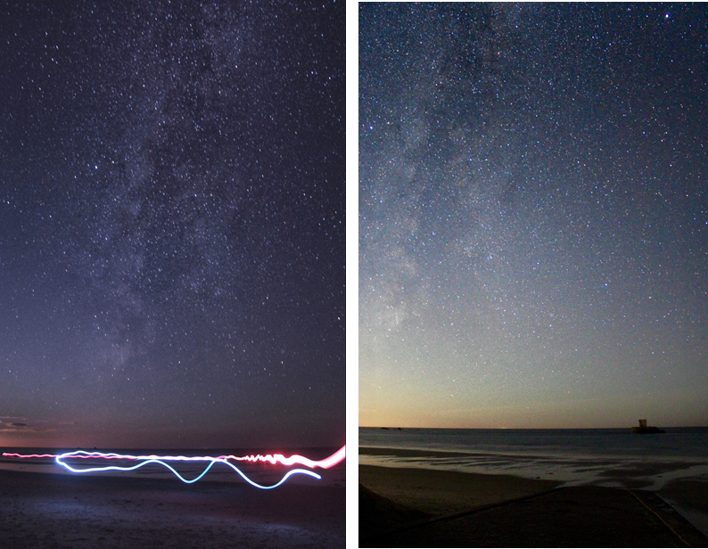
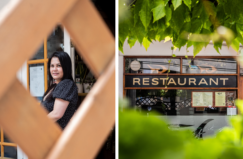
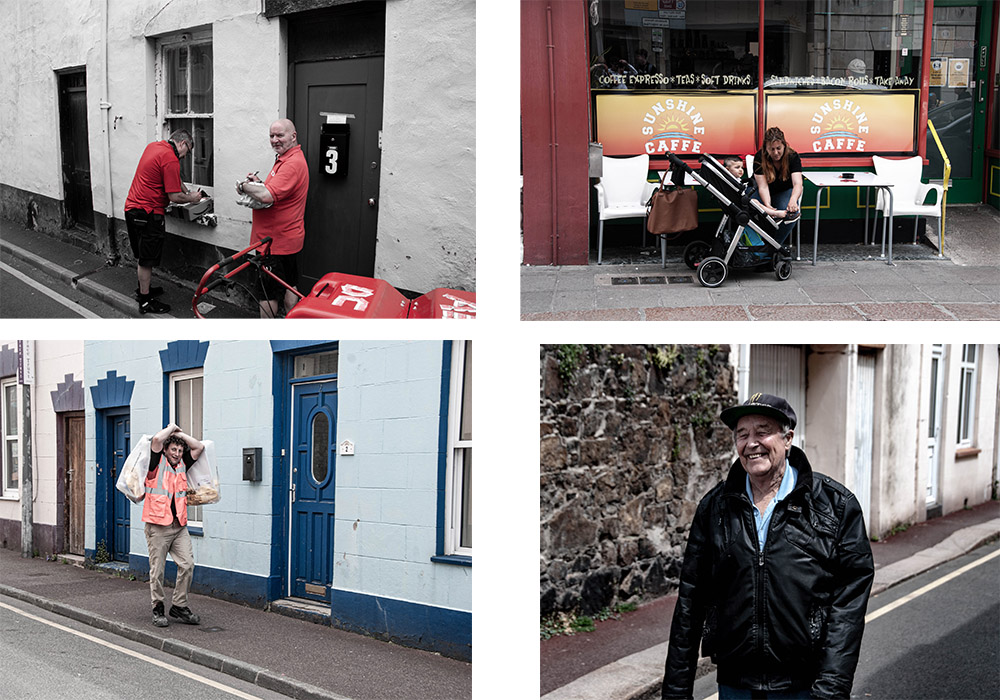
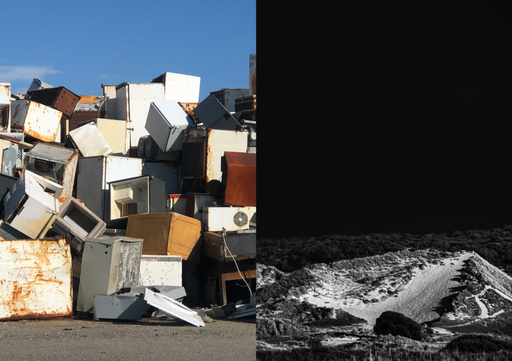
And an example of how I exhibited the community I was in alongside a peer to display the theme in an aesthetically accurate manner.

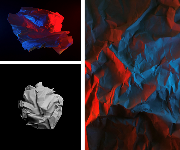
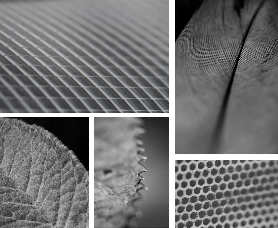
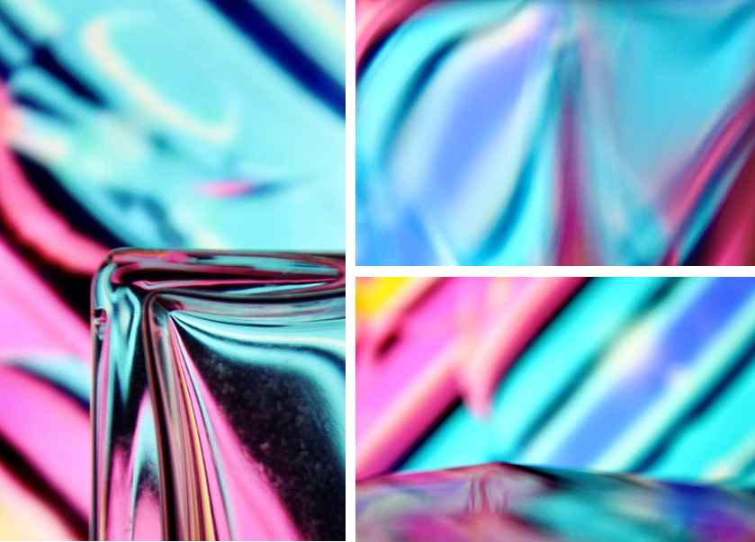
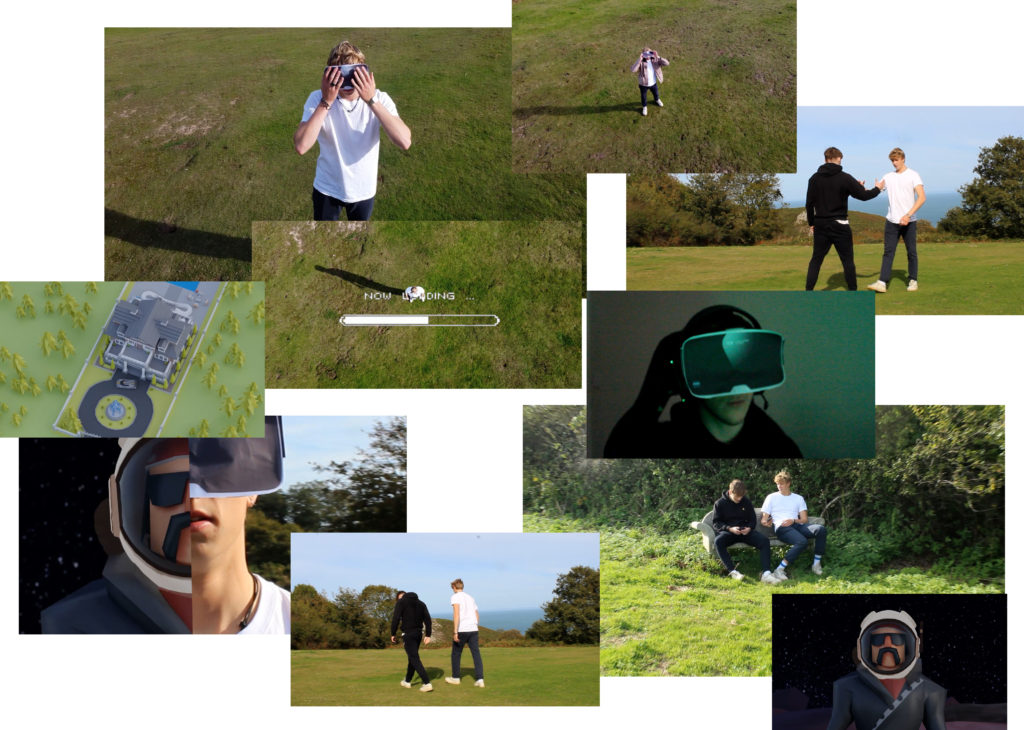
I was also able to learn and experiment with modern real world climates and contexts through photography. For example this is a montage of screenshots from a group project where we explored the theme of the metaverse and modern technologies such as NFT’s.

Overall it was a highly beneficial project and it gave me a reason to continue being excited about practicing photography.

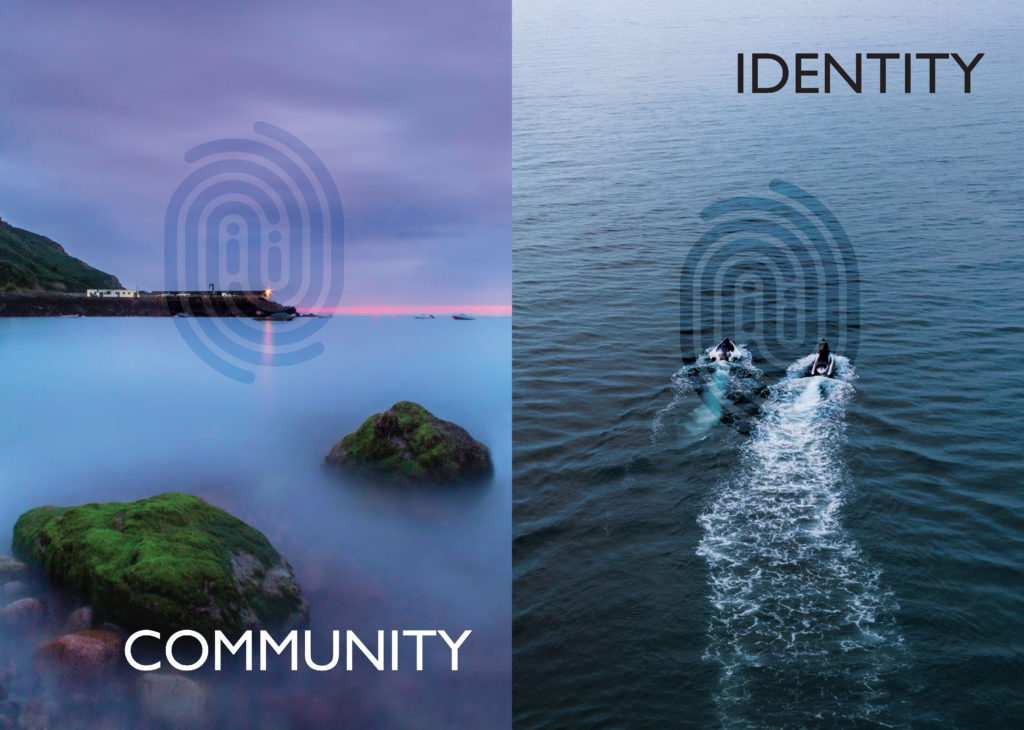
IDENTITY & COMMUNITY Newspaper

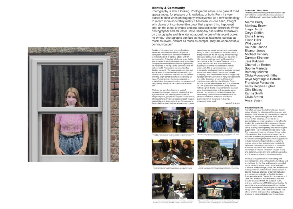
The images seen on the pages of this newspaper supplement are extracted from a variety of projects and final outcomes produced over a two-year academic programme of study by a group of A-Level photography students at Hautlieu School. In their final year the themes of Identity and Community offered a specific focus and through a series of creative challenges students developed a body of work that were inspired, partly from visiting heritage institutions to learn about aspects of Jersey’s unique history of immigration and exploring migrant communities and neighbourhoods in St Helier in a series of photo-walks. In the classroom additional inspiration was provided from workshops on NFTs (non-fungible token) and digital art, embroidery and textile art, animation and film-making, zine and photobook design led by professional artists, designers and teachers.

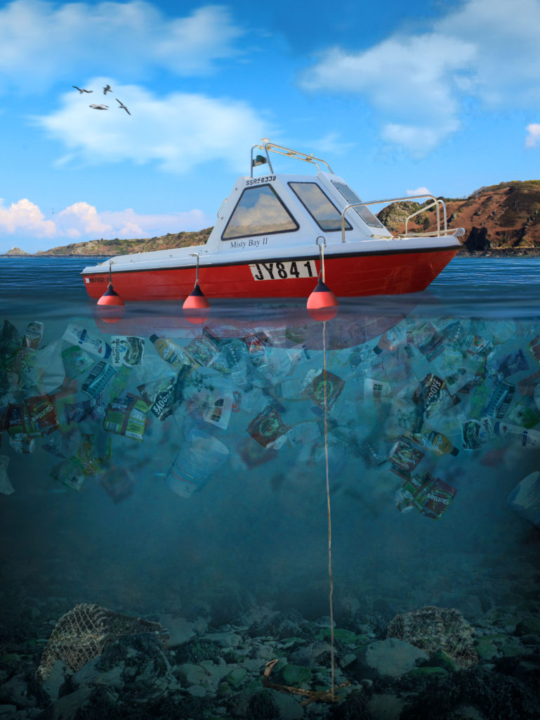
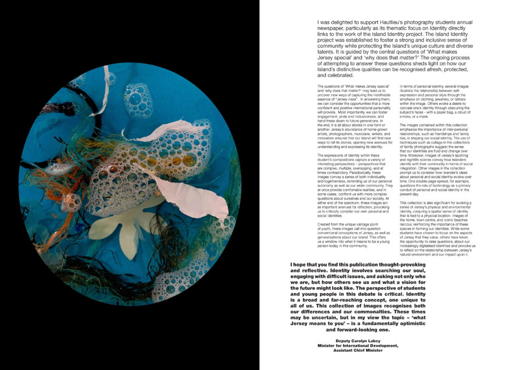
As part of the research and contextual studies students were asked to engage with some of the key questions raised by the Government of Jersey’s Island Identity project and explore through their own photographic studies how they interpret and identify distinctive qualities of island life. What can we learn from looking at a set of photographs produced by young islanders? At first sight they show us a seemingly random set of images of places, people and objects – some familiar, others surprising. On closer inspection each image is a visual sign and also a conundrum. For example, a fish stuffed in a plastic bottle may ask us to consider more closely our marine environment, commercial fishing or food consumption. As a combined sequence of images they represent different views that in many ways comment on a wider discussion on some of the primary objectives explored in the Island Identity project, such as ‘how we see ourselves’ and ‘how others see us.’

The newspaper was kindly sponsored by Deputy Carolyn Labey, Minister for International Development and Assistant Chief Minister who in her foreword shares her personal thoughts on what makes Jersey special to her in context of the Island Identity project led by her department. She says, ‘identity involves searching our soul, engaging with difficult issues, and asking not only who we are, but how others see us and what a vision for the future might look like. The perspective of students and young people in this debate is critical. Identity is a broad and far-reaching concept, one unique to all of us. This collection of images recognises both our differences and our commonalties. These times may be uncertain, but in my view the topic – ‘what Jersey means to you’ – is a fundamentally optimistic and forward-looking one.’

The Identity and Community newspaper is the fourth supplement produced in collaboration between Hautlieu School Photography Department and Jersey Evening Post. In 2018 the first issue was The Future of St Helier and last year the themes of Love & Rebellion explored experiences of isolation and lockdown during the coronavirus pandemic. Photographer and teacher Martin Toft, comments: ‘The question of ‘what makes Jersey special’ matters a great deal to every islander and as visual signs, the images printed on these pages are an attempt – not so much to provide answers – but rather asking questions about the essence of this island we call home, and how it actively will overcome current challenges in shaping a prosperous future for all.’

Various workshops and school trips for inspirations, recording and experimenting with new images and ideas of making

Reviewing And Reflecting

My pervious work over Year 12 and Year 13, that showcases some of my best images and interesting photographic techniques

Formal Elements

My first project I started was based on the formal elements using formalism, where I scrunched up and teared up paper into shapes such as, balls, holes, and different textures, then took photos of the paper. I set up multiple different lighting environments to shoot in.

Firstly, I used 1 light source, which was the camera flash, for the image of the paper ball I also made the exposure darker to emphasis the contrast between the highlights and the shadows which made creases in the ball more noticeable, additionally it made the black paper background even darker so that you couldn’t see any of the marks on the paper. This is using minimalism to direct the focus of the image to the main focal point.

In the other photos I used 2 phones to emit different coloured lights, which made the colours clash as the paper as at different heights as it was crumpled up.

In Photoshop, I didn’t really do much adjustments image were very basic. All I adjusted was the contrast and saturation, to boost the colours, or the opposite to make it black and white by setting the saturation to 0.

Surface and Colour

In this topic I used serval different camera lens to gain a different perspective. However, most of these image were shot using a macro lens.

This allowed me to achieved a really close up shot were you can clearly see the pattern and the repetition of shapes and the different textures of the subject. Additionally, I was able to use a shallow depth of field, which created a focus onto key features by blurring the edges.

Having these images in black and white helps remove any distraction of colour and helps the viewer focus on other aspects of the photo, such as the subject, the textures, shapes and patterns, and the composition.

Abstract

To create these images I played a colourful video on my laptop and shot the images through different glasses, eg, wine glasses and perfume bottles to distort the video, which created a unique and abstract effect. I also used the glass to make reflections to act like a mirror.

To also create some of these images I changed my camera to manual focus and made it super blurry, then I took photos of different glasses in front of the screen, using the same method.

Minimalism – (Artist Reference / Kevin Saint Grey)

Kevin Saint Grey is a photographer I studied who is a primarily black and white LA based photographer with a minimalist approach to his subjects which creates a drastic contrast. He shoots mostly landscape and architecture, and his work distinguishes itself for the serendipity of black and white, “humanness” and silent images. He accomplishes this by using techniques such as, symmetry and long-exposure, and he manages to get amazing, creative photographs, by using camera movements while exploring unique angles while shooting architecture.

This is one favourite minimalistic images I took, it is of a glass lamp stand. I made it so the full object is not in view as it creates a minimalistic effect, that features the curve of the sphere, and the light which reflects off of it.

I submitted this image to a photography competition hosted by the Jersey Arts Centre on their Facebook page, and it won “Best minimalistic photo of the day.”

Portrait/Close Up

This image has an empty alt attribute; its file name is image-1.png

I have used the photography studio when taking portrait photos. This allowed me to experiment with different lighting colours, set-ups, etc.

This image has an empty alt attribute; its file name is multiexposure-925x1024.png

I have created a photomontage using post-processing techniques in Photoshop by using layers after lining all the images up, which created a multi-exposure image.

This image has an empty alt attribute; its file name is smallamxeye-1024x639.jpg

The eye contact with the camera makes it a stronger image as there is more of a direct and emotional atmosphere between the viewer and the image.

This image has an empty alt attribute; its file name is UCeye-2-min-1024x683.jpg

Since I used a macro lens I was able to create a shallow depth of field. This made it so the eye and part of the eye lashes were focused, and the rest wasn’t, which draws more attention to the eye itself. Macro photography is one of my favourite ways to shoot however, it one of the hardest to get right, as its only manual focus. This means you have to move closer/further away from the object or adjust the focal length.

Landscape

The landscape project was heavily inspired by Ansel Adams. Ansel Easton Adams was an American landscape photographer and environmentalist known for his black-and-white images of the American West. Also, he is considered the most important landscape photographer of the 20th century.

Both images are of natural landscapes, which display rock formations and both cover the whole of tonal zone system, going from 0, being black through to 10 being white, displaying different shades. This really puts emphasis on the highlights as it creates a high harmonious contrast.

These two images demonstrate the 3 levels of tonal values, is what makes this image stand out. It consists of the blacks in the foreground, with the grey behind it, then finally to the light-grey figures in the background which the lighthouse is apart of. Overall the harsh contrast between the sky and the rocks juxtapose each other against light and dark. I achieved the star effect caused by the sun, by using a high f-stop value, eg. f-32.

I used multi-bracket exposure to capture these images. The camera takes 3 photos, 1 over exposed, 1 normally, and 1 under exposure image. I edited it in Photoshops Camera Raw Filter after Photoshop merged the 3 images to create a HDR image. (High Dynamic Range.)

This image has an empty alt attribute; its file name is image-52-722x1024.png

These 4 images are more generic landscape photos, however do include unique aspects such as lens flares and reflections from the water.

This are some of the urban landscape photos I took at night in town, using long exposure. Since the exposure time was so long I had to use a tripod so that the camera was stable to create a clear image. Long exposure is one of my favourite photography techniques, as it creates unique images every time.

This image has an empty alt attribute; its file name is image-15-770x1024.png

This is my favourite image from the whole urban landscape topic. It captures a bus driving past a traffic light. However it did take many attempts to capture this shot, which is part of the fun.

Long Exposure – Water Photo Shoot

On the topic of long exposure these are 2 strong images that where apart of another topic, that I really like.

Street Photography/ Candid Photography

These 2 images were tableaux (set up/knew they were being photographed) Overall, I didn’t really like asking people if it was ok to take their pictures. However, it did allow me to capture the subjects closer compared to the photos below.

Where as, these 2 images aren’t set up and captures peoples natural state, emotion, and pose. Therefore, i fell that they poses more of a story.

Anthropocene

For my Anthropocene project I split it into 2 sections. The first was space, and the second was plastic water pollution.

These were some of my favourite photos I got of the full moon at 4 AM. I used a telephoto lens and a tripod to capture the moon.

These are my attempts astrophotography, I went to the west of the island at 12-1 AM and used a 18mm lens, with a low aperture using a long shutter speed of 20 seconds to capture the stars. Before I took the photo I had to manually focus the camera on the north star, this is so that the stars would in focus. Overall, these turned out good, however it wasn’t the right season, so I could do better when the milky way is more visible.

This is my best final piece which I made in Photoshop, using my own images to create a concept image using photo manipulation of plastic water pollution in Jersey. This took approximately 7.5 hours, using over 500+ layers inside photoshop, where I documented the process on my blog. I have lots of experience in photoshop and a great knowledge of the software.

Identify and Community Photoshoots Best Images

These images were taken whilst I was walking around town. This is one of my favourite ways to photography unique and different things in a new place/area.

In these images there was a metal chain across the car. This was very distracting so I removed it in Photoshop which improved the image. I also made the black background darker to remove the small details to create an old, minimalistic style.

These images work well in black and white. The image on the left demonstrates depth of field and unique angles, however the right image captures motion of flying pigeons.

These images use framing to create a focus on the key features and remove distractions around the outside of the image.

Personal Investigation – Reviewing and Reflecting

1. Describe which themes, medium (photography, film), approaches (documentary, tableaux, conceptual), artists (incl contextual references to art history, movements and isms) and photographic skills, processes, techniques and methods (incl learning new software) inspired you the most and why.

2. Include examples of both previous and current experiments and imagery to illustrate your thinking.

3. Produce a new mind-map and mood-board based around how you interpret one/ or both theme(s) of IDENTITY & COMMUNITY using new artists inspirations and visual references etc. Reflect on the Island Identity project and also consider themes more broadly (see below)

Inspirations throughout the course;

During the photography course, in both year 12 and 13, we have learnt a considerable amount of photographic techniques around portraiture, landscapes and abstract images. My favourite medium to use is taking still shots on a camera, although I have enjoyed learning about film making and taking moving shots I believe my skills lie more in the world of static photography. I believe I do well in portraying a certain storyline or narrative with my images, it is something I wish to continue in my personal investigation – I was very inspired by the work I created in response to photographer David Hilliard during my Identity and Place project. I enjoy the way he captures naturalism in his images, they connote a sense of normality and honesty that I really loved recreating. I have taken lots of inspiration from the documentary technique of photography, I believe it allows the observer to understand the subject more within their storyline. I really enjoy using natural lighting in my images, I have used it during the course a lot more than artificial lighting and am therefore more confident photographing with it.

More on how Hilliard inspired me.

My Response to Hilliard

Additionally, I was inspired by our year 12 abstract photography project, specifically studying repetition, pattern and rhythm. The photographer Ernst Haas was one I really enjoyed looking at, I enjoyed his use of repeating lines and shapes to create movement and rhythm in his images. I gained inspiration from the abstract unit as I loved experimenting with how different shapes and patterns could represent meaning and themes – I want to continue learning about how I can manipulate an image in terms of geometric aestheticism, using symmetry and repetition to connote ideas of memories being re-lived. I also really enjoyed studying Saul Leiter during the abstract unit, his use of colour and distorted aperture settings were really interesting to experiment with. I found inspiration with how Leiter captured windows and reflections in his images, I like how the abstract elements are still recognisable as everyday sights and objects – a sense of normality is something I really hope to experiment with further in the course. Additionally, I was influenced strongly by colour during my Saul Leiter study, I wanted to exaggerate the bold colours I captured to create an expression of freedom and non-naturalism. Previously in the course I focused on black and white photography, however during this project I enjoyed working with colour and emphasising different emotions through tones and hues.

During the photography course I have enjoyed learning about different software, such as Adobe Photoshop, Lightroom, Premier Pro and InDesign. Creating a Zine during the course has inspired me to produce a photobook for my final assessment. I believe having a physical copy of my work, where I can layout sequences of images with narratives and meaning, allows me to better use my imagination. I have been influenced throughout the course by several different artists, photographers and creative individuals that demonstrate ideas through different mediums – I look forward to experimenting further with the compositional elements of photography in this Identity project. The three areas of study that I have mentioned and shown evidence of above have been my most enjoyable parts of the course – I have been inspired by creating meaning and speaking out on prominent topics during year 12 and 13, this is something I wish to continue working on during my new project.

Personal Study – Review and Reflect

To gain insight into the task of creating a personal statement and personal investigation I explored the work of a previous student.

To full understand and ensure I would cover ever aspect of this project I looked at the grading criteria.

This helped me analyse the previous students work and give him a grade which will help me understand how to get into the top grade. To ensure a top grade and achieve all the assessment objectives, ideas need to be developed through sustained and focused investigations which are supported through contextual sources which presents a developed understanding of the project. Appropriate techniques and recourses need to be explored and sustained throughout. Appropriate evidence of recorded ideas need to be included and finally a meaningful response personal to the individual that relies their intentions needs to be made. I also looked at the students work in terms of Concept, Editing, Sequencing, Design, Narrative and Aesthetic. Further criteria to assess the students essay:

  • Does the essay address its hypothesis?
  • Does it provide new knowledge and understanding?
  • Is the essay well structured with a sense of an introduction, paragraphs and a conclusion?
  • Use and flow of language, prose, punctuation, spelling.
  • Use of specialist vocabulary relating to art and photography.
  • Analysis of artist’s oeuvre (body of work) and key work(s).
  • Evidence of wider reading with reference to art history/ theory, political discourse and/or socio-economical context.
  • Use of direct quotes, summary or commentary from others to make an informed and critical argument.
  • Use of referencing system (eg. Harvard) and a bibliography.
  • Use of illustrations with captions listing name of artist, title of work and year of production.

Considering all this assessment criteria will help me create a well structured and in depth response.

Following on from this I began a reviewing and reflecting process were I looked at an overview of what I have learned so far (both as Yr 12 and Yr 13 student) and how I intend to develop my Personal Study.

The project that has inspired me the most from the what I have explored so far is my work exploring the theme of identity and place through the medium of photography.

This image has an empty alt attribute; its file name is GonzPortraitSeries_1024x1024-1.jpg

Through this project I explored the notion of telling a story in way in which I explored identity in terms of feeling a loss of identity by feeling like an outcast to society but finding identity by fitting into a sub culture. I approached the project through a combination of conceptual

This image has an empty alt attribute; its file name is DSC_0080-1024x685.jpg

And portraiture style responses

This image has an empty alt attribute; its file name is DSC_0021-2-1024x805.jpg

Through this identity project I explored more modern artists such as J grant Brittan who’s work explores the theme of identity through a romanticist style of photography. And more historic representations of Photography such as Claude Cahun, part of the Dadaist movement of photographers exploring surrealism and identity in an innovative contemporary style. Claude is a highly influential artist for me. Claude was able to massively further my knowledge and understanding of contemporary photography as well as give me a perspective on how to approach themes using my creativity through the medium of photography. I therefore also further developed my photographic skills, specifically skills relating how to create narrative with tableaux imagery and draw emotion from the subject I was shooting which has translated to my current work.

This image has an empty alt attribute; its file name is Untitled-2-2.jpg

I also experimented with more low light photography which was a challenge for me however I learnt from mistakes and fixed them which advanced me as a photographer.

This image has an empty alt attribute; its file name is DSC_0001-1024x685.jpg

This previous year 12 project is why I want to focus on developing this idea of identity to construct my personal study and investigation.

REPETITION, PATTERN, RHYTHM REFLECTION AND SYMMETRY

I decided in picking these two photographers to contrast and compare their work pieces as both photographers use textures, repetition and patterns in an enchanting way. 

Alfred Stieglitz creates patterns and repetition when in the talking of his photos as the clouds create weird patterns and some of the patterns are repeated in the sky creating an abstract look to the clouds.

Whereas, Harry Callahan similarly experiments with these patterns and repetition in his pictures with the abstract pictures he takes of grass and repetition in the photos he has taking of trees being lined up next to each other.

Alfred’s picture on the left contains natural lighting which gives different shades into the patterns of the clouds in the sky making some of the clouds darker and lighter than other sin different regions. Visually, Alfred’s picture is appeared to seem very 2D (flat) as their isn’t much highlight’s of light in the clouds in order for them to appear to be 3D or even clouds moreover, their is a lot of patterns in this picture visually as you can see similar cloud shapes as it appears to be one big cloud with light trying to brake through different segments of the cloud. His purpose and meaning of taking these type of pictures of clouds was that it became an art form for him to take this pictures of the sky and photography quite quickly became an obsession for Alfred as he enjoyed his art form of taking pictures.

Harrys picture on the right was taken from the source of natural light with what appears to be a wide angle aperture being used in taking this picture, this enhances the shadowing and contrast in this image from light to dark tones demonstrating the differences from what appears to be wheat and grass in the picture. Visually the image is contrasted to be 3D as you due to the shadowing giving life to the surface in the picture also, their is repetition in this as you can see their is grass scattered about in the picture giving it a very earthly/ naturalistic appeal to the picture. The context of how Harry would go about in taking his pictures, was that he would just get out of bed and take numerous pictures of things that he thought interested him, this comes across in his picture in my opinion as the picture doesn’t seem to be panned but more of a ‘in the moment’ taken picture.

REPETITION, PATTERN, RHYTHM REFLECTION AND SYMMETRY- 1

Alvin Langdon Coburn

In the galleries: Alvin Langdon Coburn's "Vortograph" and Barry Stone's  "Sky 3099"
Through a glass darkly: Tate Britain celebrates the work of Alvin Langdon  Coburn | The Independent

Ernst Haas

ERNST HAAS ESTATE | COLOR: EUROPE

Both of this artists uses reflections in their images which creates an original and symmetrical image. Ernst Haas use the reflection of the water which gives a quite a natural way to the image.He also uses colors in his images . You can find the images in your daily life . We can notice in the reflection of the water that there are buildings so it’s quite visible.  Its dynamic movement He crops the subject to increase the sense of abstraction. Alvin Langdon Coburn’s images are very symmetrical . We can notice a lots of triangles which forms.The reflections that he uses are those of the mirror which creates a repetition . We can notice some type of cristals he uses for his images.


REPETITION, PATTERN, RHYTHM REFLECTION AND SYMMETRY-2

Today we learn how to repeat a image on Photoshop. I choose this old image of a building that i like because of the architecture I thought it really was interesting . It looks like it’s reflected by the water but I just copy and paste it next and over to the original photograph. I had to select the image , copy it , increased the canvas size ,  paste the original picture in the white space , transform it flip it horizontally or vertically and then flattened the image.Repeat it three times.

Repetition, Pattern, Rhythm Reflection And Symmetry – Image Comparison

Comparison – Harry Callahan & Nick Albertson

I have chosen to compare a natural form image by Harry Callahan to an abstract image by Nick Albertson. Harry Callahan was an American photographer who was well-known for both his colour and black & white photographs. His work focuses on repetition, patterns and textures while also containing a high contrast between shadows and highlights. Nick Albertson is an American visual artist who uses mundane utilitarian objects to create abstract structural forms, photographing them using repetition, light and shadow.

There are many similarities between these two images, one being both photographers capture of vertical lines. Harry Callahan photographs the straight leading lines of pond reeds which reflect off the waters surface, creating a highly textured image with movement and rhythm. Additionally, Nick Albertson captures his vertical lines in the thick red tape, which stretch a uniform pattern from the top to the bottom of the image. These orderly lines create an abstract atmosphere in the image as the placing of the subjects are systematic and rigid, which contrasts with the obvious movement in Callahan’s work. There is also immense amounts of repetition in both images as the leading vertical lines echo throughout the photographs. Moreover, both images hold a sharp texture as they appear to have pointed edges and harsh lighting.

However, there are also many differences within these images. For example, Callahan’s photograph is of a natural form in its organic environment, whereas Albertson has captured a man-made form in an abstract ambiguous way. Furthermore, Callahan photographs his images in black & white whereas Albertson has bright saturation. The dominant colour red that Albertson captures creates a bold eye catching image and its vibrancy draws attention from the observer. Contrastingly, Callahan’s black and white image holds dark shadows which contrast greatly with the bright white highlights reflecting from the water. This creates a mysterious, enigmatic atmosphere within the photo as the shadowed reeds look silhouette-like against the water. In addition, these images are taken with very different lighting. Callahan uses natural light to capture his image as he is photographing the environment presently, without disturbing or changing it. However, Albertson uses harsh studio lighting in order to capture the everyday object in an abstract way. This artificial lighting choice adds to the unnaturalness and ambiguity of the image and shows how the composition of any mundane object, depending on perspective, can change how people identify it.