Link to my Photobook: Big Boys Don’t Cry
The following is an in depth analysis of the process of constructing my photobook.
Before I began physically developing images and collating them into a photobook I conceptualised the narrative and design of the book in writing.
One I had a clear understanding of how the images I had produced for this project where going to form a narrative I experimented and developed a criteria for how the book would be designed. This includes all the tangible elements of the book such as the material of the paper the orientation as well as the colour scheme and layout of the images. Once this was pre-decided I could begin the physical process of creating the book in Lightroom.
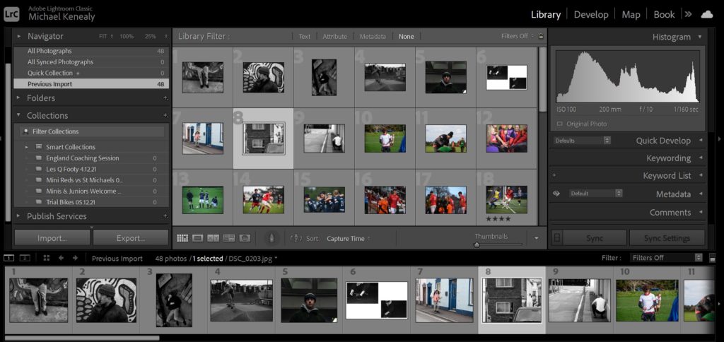
I began by importing all the images I would be potentially using and loading them into the filmstrip.
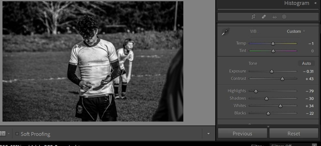
After this it was time to develop the images by editing them and making any final tweaks to make sure they worked well with each other in sequence.
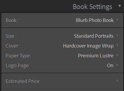
Once all the images were edited sufficiently I moved onto the “book” tab of Lightroom and began by selecting the design preferences for the book.
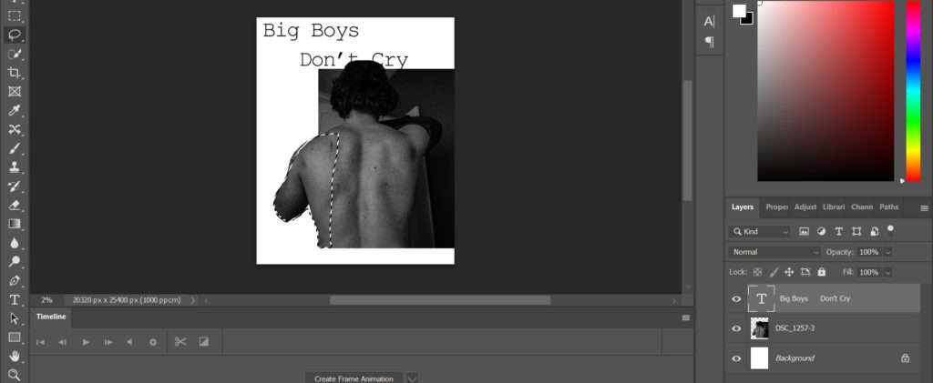
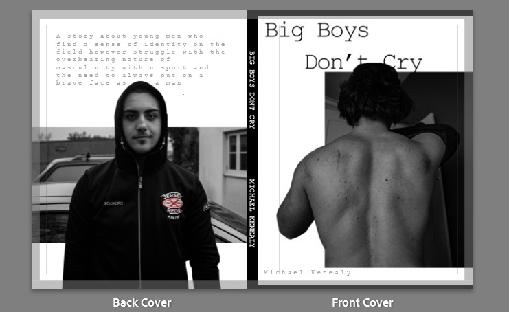
I then moved onto choosing the front cover images. I decided on an image of the main subject of my book to feature on both covers. I chose an image of the subject facing away from the camera so that his identity is not immediately disclosed. This image introduces the theme of masculinity as we see a stereotypically muscular back of an athlete. The back cover image ends with a similar medium shot of the subject however this time he is looking directly into the lens. I chose this as it juxtaposes well with the front cover and the reader has flipped through the book and been introduced to this character, ending with a shot where the character is looking at the lens interacts with the reader and solidifies this introduction. I wanted the cover to be captivating so I altered the image in photoshop to give it a layered illusion, creating more depth. While undergoing this process I decided on a font that would work well for my book and also layered that behind the subject.
To complete the covers I finally added a blurb to the back cover to briefly describe the contents and added the title and my name to the spine. I also changed the colour of the spine to black to add some contrast to the cover and it complements the greyscale images I chose for the covers.
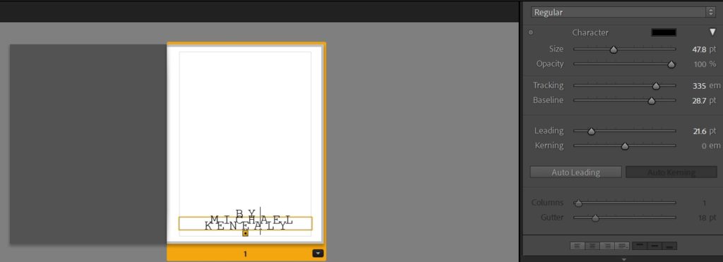
Moving on, I left the first page blank with only my name on the second page featuring stylistic typography for aesthetic affect which adds to the uniform style of the book. I created this text by experimenting with the tracking, leading and kerning of the text and then overlapped them.
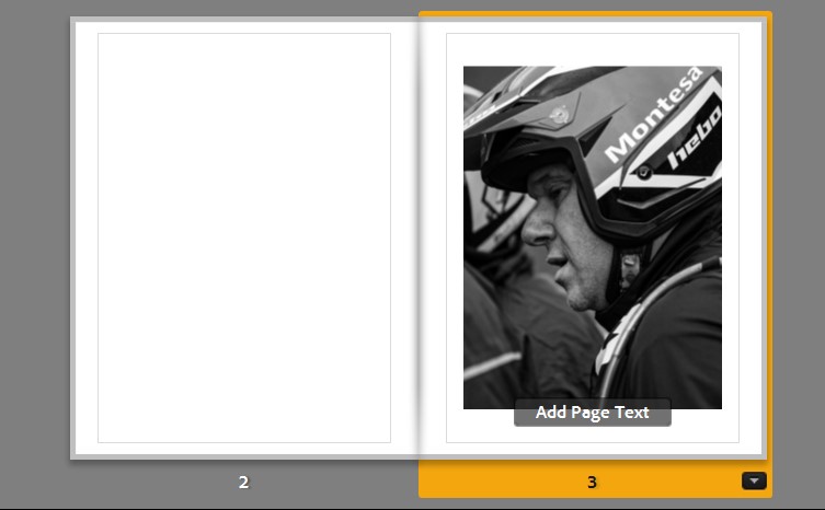
The first image I feature in the book is positioned on the third page, leaving the second blank. I chose this image as it embodies the theme of sportsmanship and masculinity from the outset. This is due to readers being introduced to a character who is stereotypically masculine with his motorcycle helmet and a serious expression on his worn face. I placed this image on the right to ensure the subject wasn’t looking away from the spine. The image also features a composition which accentuates the subjects side profile and a clarity to the image which introduces the overall aesthetic of the book. I felt this image worked well with a tight crop and central page positioning with medium padding with the boarders.
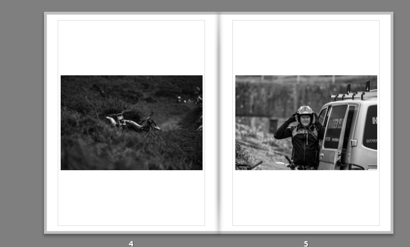
The next spread consists of two long shots. The first image was chosen as a more arbitrary link to the previous image as well as the one following it. The use of an image of objects between images helps to tell the narrative and avoid mundane repetition. The image features an interesting framing with the motorbikes being half concealed by the bush in the foreground which creates a strong leading horizontal line which dissects the image into two, giving it more depth. I also chose the images for its vast tonal differences which help bring out the objects from the foreground. This photo of bikes leads well into the next image of a man putting on his helmet. This image is powerful as it initiates interaction with the viewer as the subject is looking directly into the camera. I also like the framing with the subjects face in the direct centre of the image. The subject is in the middle of putting on his helmet which adds more action to the image and links back to the idea of masculinity in sport with the man in the image “armouring up” almost like he is getting ready for war.
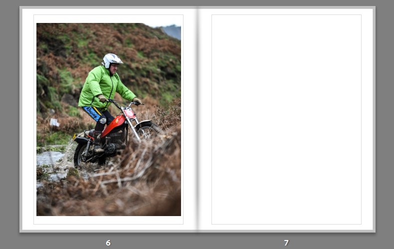
The image sitting isolated on the following spread of pages is a portrait action shot of a man riding a motorbike in a river. It follows on nicely from the previous image of the man putting his helmet on. The image is powerful with the use of a wide aperture creating a sharp focus on the subject and a blurry foreground and background. Along side this, the deep colours and texture of the make it an effective image. After this I left a blank page to allow for this image to work on its own and to allow for an interlude before the next spread.
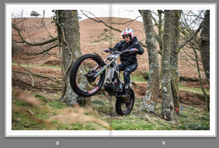
This brings me onto the first double page spread. I felt this image works well as across two pages as it s one of the more powerful action shots encapsulating the sport that I am shooting. With the “wheelie” being shot up close with an ultra wide lens starting on one page and finishing in another it really immerses the viewer in the image.
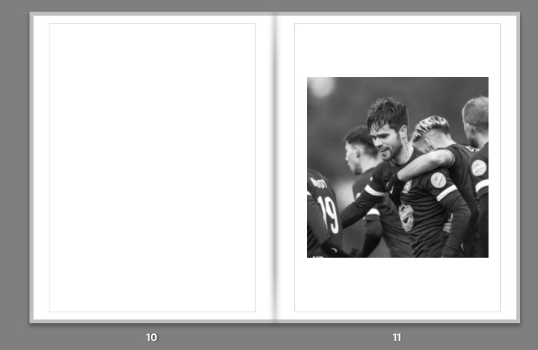
I chose the next image for its emotional impact. It is a perfect demonstration of masculinity and emotion shown in sports with the team mates gathered around congratulating the main subject who has a proud expression on his face. This exemplifies the sense of identity and belonging young men achieve through sport. The images tonal range and texture created by the low saturation give it a dramatic feel adding to the emotion that comes through with this image. I feel it works well on its own to simplify the spread and create distance from the previous double page spread.
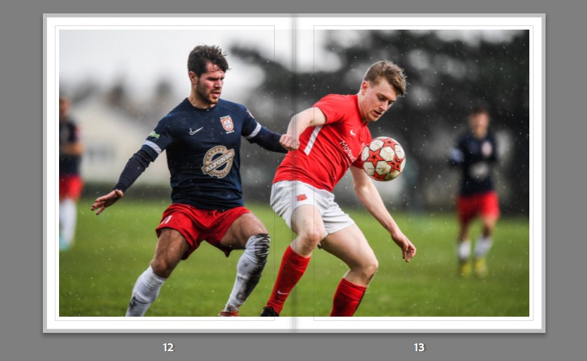
This leads well onto a double page spread of the same player in action almost trying to live up to the pride he was showing in the previous image. I chose this image for its sharp focus and bokeh effect. It works well as a double page spread as it allows for the quality and sharpness of the image to be appreciated up close as well as allowing all the elements of action to be displayed with each of the subjects faces sitting on a different page.
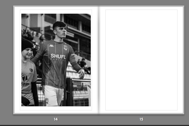
The subsequent image portrays a sense of masculinity through mentorship. The way this image is shot with the main subject guiding the younger man portrays the idea that young men idealize powerful sportsmen. The main subject is made to look powerful through the use of a low angle shot and the way his head is held high with a proud expression on his face.
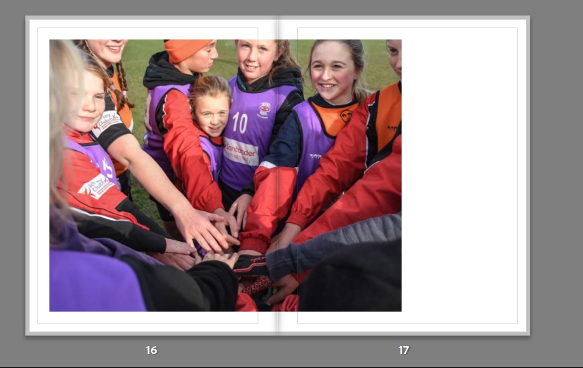
This idea of mentoring younger generations and finding identity within a sporting community carries on through the next spread. This image is compelling due to its engaging manner. This is achieved in the composistion by the subject in the center frame looking directly at the lens while everyone else is not. The positioning of the camera makes the style of this image feel intrusive like we are part of the players “huddle”. I decided to utilise this image as a double page spread as it this intrustive style feels more effective as a larger landscape image. I offcentered the image so that the subject who is looking at the lens is not positioned too close to the seam or gutter of the book; this style also allows for a difference from all the centre positioned spreads in the rest of the book.
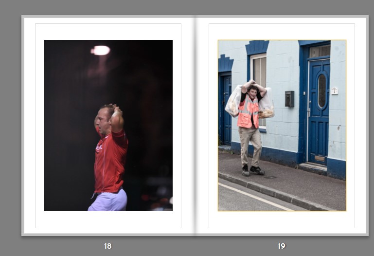
The following spread I chose two complementary images to introduce a process of comparison. Both subjects are seen to have their hands above their heads but can be juxtaposed through their emotions with the subject on the left looking frustrated and sullen while the subject on the right embodies a more elated mood. This helps to portray my idea of sport placing pressure on young men. Both figures are seen to be playing masculine roles however the sportsman seems less content with his masculinity. When editing these images I focused on using the red colours in the first image to portray that sense of anger while going for softer less saturated tones on the other image.
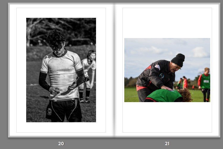
The next spread embodies the narrative. The young sportsman on the left is seen to be impugning on his abilities, as we see him hanging his head as if in defeat. This transitions well into the next image where we see a coach like father figure giving words of encouragement which can be seen as belittlement. This portrays the idea that young sportsmen are put under pressure by their father figures to “be a man”. I created a high contrast image on the left with high clarity and tonal range with no colour to further develop the dreary, defeatist mood. While the image on the right still edited with lower exposure and high contrast, has colour to represent a sense of comfort in role models.
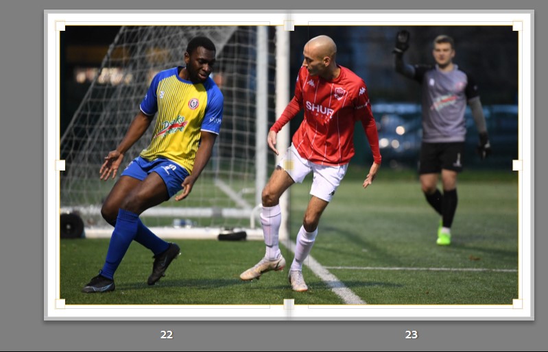
This theme of exasperation continues in the subsequent spread. This image captures that emotion well as we can see the exaggerated, reprehensible frustration on the players faces up close with a bokeh on the background, thus singling out the subjects and framing them well in the composition. The large double page spread allows for the two subjects to be somewhat split while still having that immersivity into the situation where this image was shot.
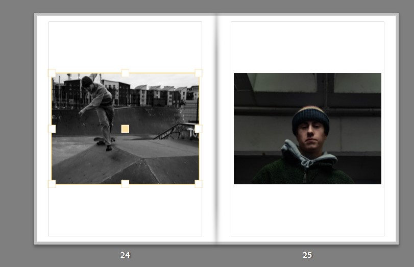
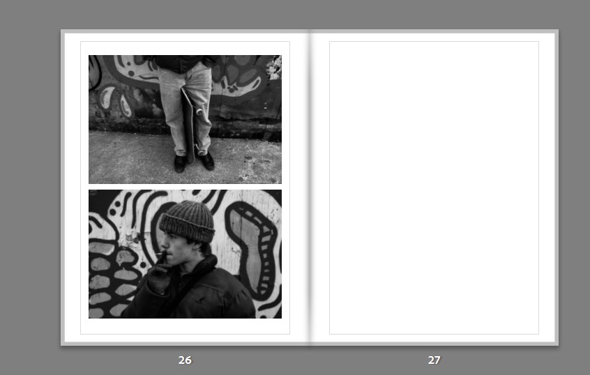
Following this, I introduce a sub narrative into the book by announcing a sportsman who has a less traditional and more rebellious attitude to sports. I do this by including a shot of him in action and then subsequently a dramatic portrait/headshot.
I continue this sequence in the next spread by using an obscure image of the subject with his equipment and then reveal his identity with a side profile portrait. I use low saturation and high contrast to create a grungy texture to add to the theme of rebellion.
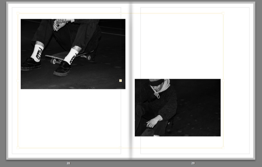
This is followed by the final set of images in the sub narrative. These fit well with the rest of images, having the one obscure and one portrait in common. I am fond of the deep black background and the sharp whites contrasting with each other. The way these images are edited to create that dark black adds to the theme of identity as a sense of isolation is being portrayed, isolation from other communities therefore feeding into the rebellious aesthetic.
The next narrative sequence shows the life of a sportsman as a fly on the wall. These series of images are taken in a photo-documentative style showing all the behind the scenes. The images portray the idea that when these young men are isolated and away from their team-mates the act they preform to appear masculine is dropped. The idea that it is not masculine to share emotions and being unbothered is idealized has an effect on the subject. The “brave face” comes off and we see the degradation of the subject and how he really feels when he is alone.
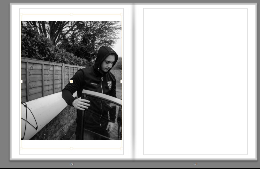
The first image starts the sequence off well as we see the subject opening his car door which essentially opens us up to this narrative.
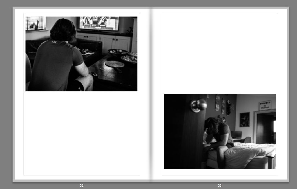
Next we see two complementary shots that give us insight into the home life and setting of the subject. We see two angles of the subject sitting down in an almost defeated fashion. We see him hanging his head in the second image illustrating his feeling of emptiness which gives more understanding of his identity. The under exposed dark shades in these images start to construct a gloomy mood.
Thereafter, a closer up image where we can see the expression on the young sportsman’s face. The use of natural Rembrandt lighting creates an effective chiaroscuro and defines the subjects face well. I chose to make this a double page spread as the form of the composition works well with the subjects arms acting as the pages. I designed it like this to also create an intimacy with the subject when we open this page.
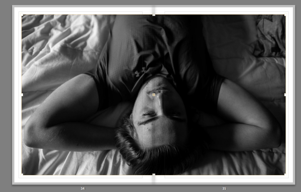
This leads onto the same position with a juxtaposing composition. We can see the subject lying down from a birds eye view. This carries the narrative well as we feel like we are moving around the subject. With the layout of this image I decided to further juxtapose from the previous image by creating distance instead of close up perspective by placing the image on its own in one corner of the spread.
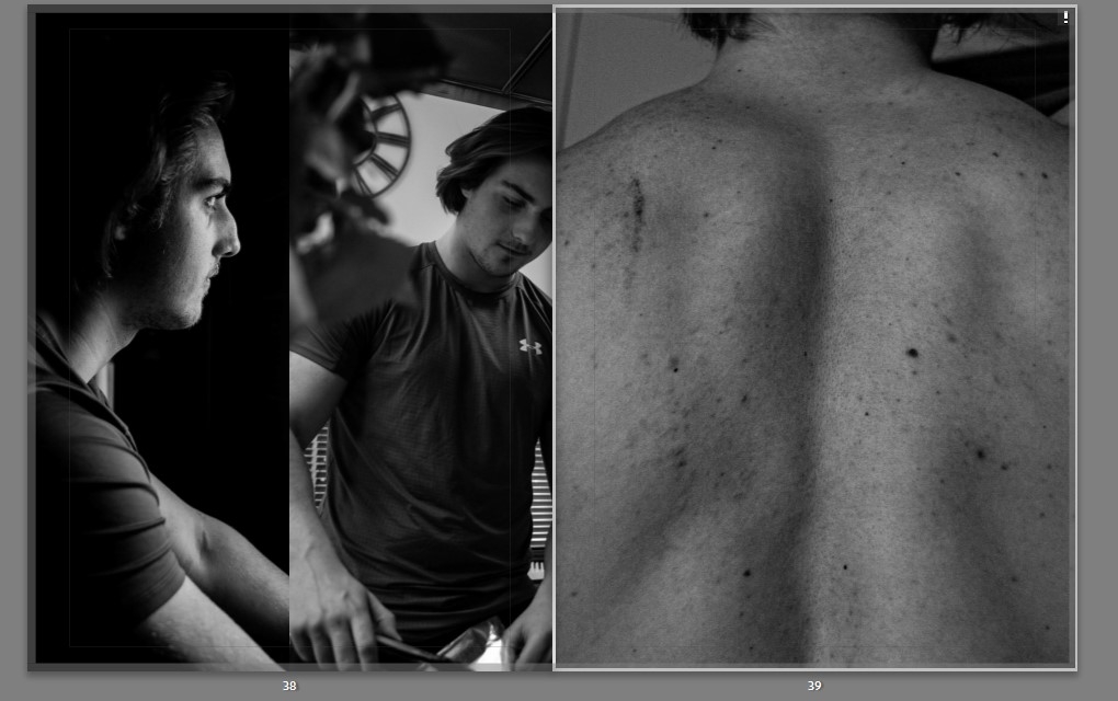
The book ends with a unique layout of two narrow portraits and a full page spread on the subsequent page. The two narrow images end the book off on a sense of self-realization with the subject appearing to almost be looking into the future. The side lighting creates a chiaroscuro and a dramatic effect to end the narrative off. The final image has been cropped tight to create an obscure composition and end the book with an intimate interaction with the protagonist and leave us with a tactile image when the book is closed. The high clarity allows for the texture of the image to be demonstrated adding to this tactility.