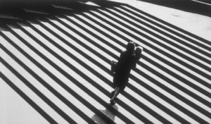
Paul Strand Vs Jaromir Funke

Paul Strand 
Jaromir Funke
I chose to compare and and contrast these two artists against each other as they both use light and shadowing techniques in very provocative ways.
Paul strand creates black and white images with exaggerated deep contrast by shooting sharp leading lines possessed by certain architecture in harsh light which creates long eloping shadows to form giving his images this contrast and tonal range.
Jaromir Funke similarly experiments with this harsh light and shadow forming technique to form these abstract black and white pieces.
The main differences between their pieces is that Jaromir creates more abstract unconventional compositions solely sue to the fact he intentionally creates his sets of random interesting objects that will clash well with light and form shadows while Paul shoots typical, mundane architecture but in a creative fashion to form his contrasting images.
Pauls image on the left contains harsh natural light to create the intense shadows bordering each of the subjects. He used a narrow aperture to create a deep depth which is supported by the leading lines running parallel through the image. His image has been infused with sharp highlights and deep blacks to accentuate the shadows and the images tonal range. His image also includes repetition, this is seen through all the duplicating steps. This image also has a sinister essence with the baby’s face emerged in a shadow it almost juxtaposes that an innocent being could be portrayed as having an evil soul
Jaromir Funke’s image contains abstract light experimentation that plays tricks on the mind. He uses a harsh fluorescent looking light to draw out shadows and create the images contrasting tones. The image contains a lot of sharp geometrical features which frame certain streams of light and let through others. His image is l=slightly under exposed to add depth to the shadows. A high ISO has been used to add sensitivity to the film which has created a slight grain and given the image texture. The space in the image is quite populated with little negative space. He has also shot the shapes at an angle instead of straight on which gives a unique perspective to how the shadows elope and given the image more depth.
