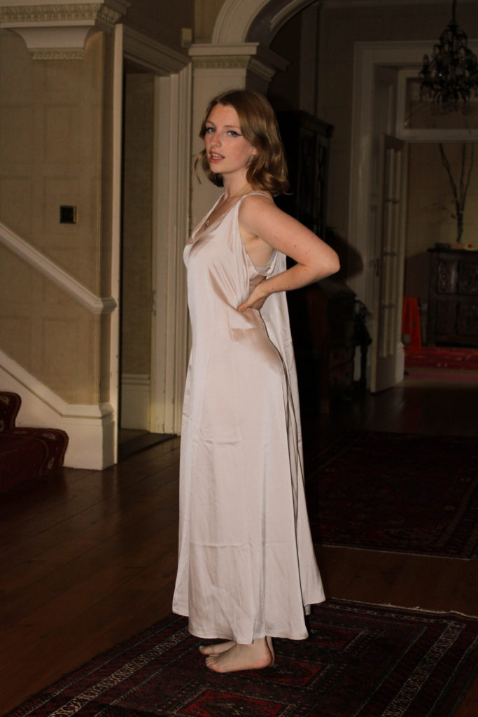
Tag Archives: nft film

Final film

New Normal:

This is the link to our final video, New Normal.

This film was created to emphasize the fact that everyone can wear what they want, when they want. We have added voice acting and music in the background of the video. We did this so that the video’s message was fully understood and conveyed.

The background of the video highlights the fact that color is often gender stereotyped. However, the white color emphasizes the fact that the clothing should be neutral, which is why we’ve got a male model wearing a skirt.

Voiceover aims to further emphasize that people should be themselves and that no one’s opinions should affect how they feel about themselves or prevent them from expressing themselves. The voice acting is masculine because many people judge men dressed as more feminine and call them hateful terms. Fashion stereotypes can be harmful to a person’s mental health. Men are often seen as strong, emotionless and closed-minded. Usually, if men don’t act this way, they are seen as weak and fragile. The most common derogatory names given to men who do not have the idea of ​​masculinity in the media are called “bloc”, “gay” or “considerate”. Although these words are not generally used to be offensive; The media has made these common words rude and if someone is called that, they are not good enough.

Although we have focused on men’s perspectives in our project, this does not mean that this topic does not apply to women. Women have been called “sluts”, “tramps” or even “slaves”. The media judge women for their clothing length and appearance (e.g., makeup) and label them as seen by younger audiences, susceptible to media influence and their opinions more, and will come up with ideas about What they “should” wear when they can wear what they want without fear of someone telling them they don’t look normal.

The media is the worst thing to read if you want to feel good about yourself. The media is constantly focusing on the topic of fixing yourself or making yourself look like the most famous person (usually wearing hair and makeup, and possibly plastic surgery). The media point out the “flaws” of celebrities, then influence the minds of the readers into what they consider an acceptable way of dressing and dressing.

Process

We asked ourt model to wear different outfits for the film:

  1. Normal clothes
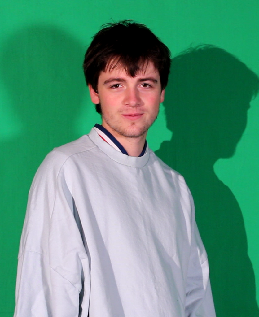
  2. Baggy sweatshirt with jeans ( masculine)
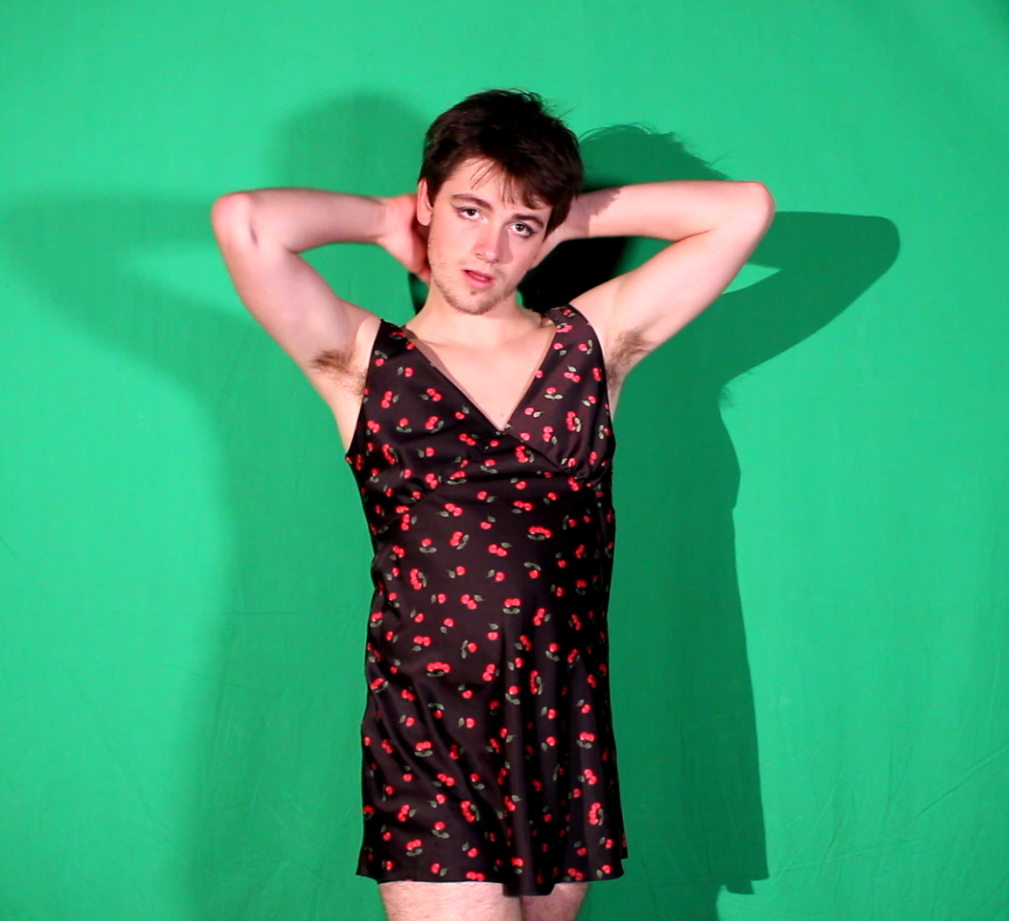
  3. Dress
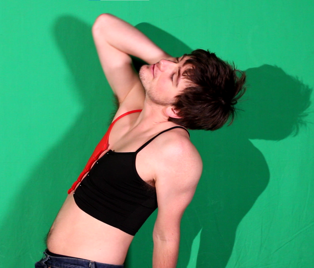
  4. Crop top alongside jeans

Screenshots from film footage

At this point of the short film, our model is dressed like this at the start. This is because we want our model to be perceived as serious and having a strong physical presence. Furthermore, this had our model juxtapose to also being feminine later on in the short film, having the two contrast against each other physically and in the clothing worn in later in the short film.

When this is edited, the green screen will be blue at this stage. The reasoning behind this is to portray the colour blue being associated with the male gender. As even when a male baby is born the only colour to portray a male baby is blue.

Pose 2

The second pose was used to slightly contrast between the poses displayed with the 1st and 3rd poses. From what you can see, the model is a lot more relaxed and not as tense as the first pose. Therefore this goes to show how in recent years gender stereotypes have changed from the past. As in both genders can now can be whoever they want to be without being judged by society. Furthermore, both genders can even swap roles as this is expected in our society today as people may feel like they were born the wrong gender.

Pose 3/4

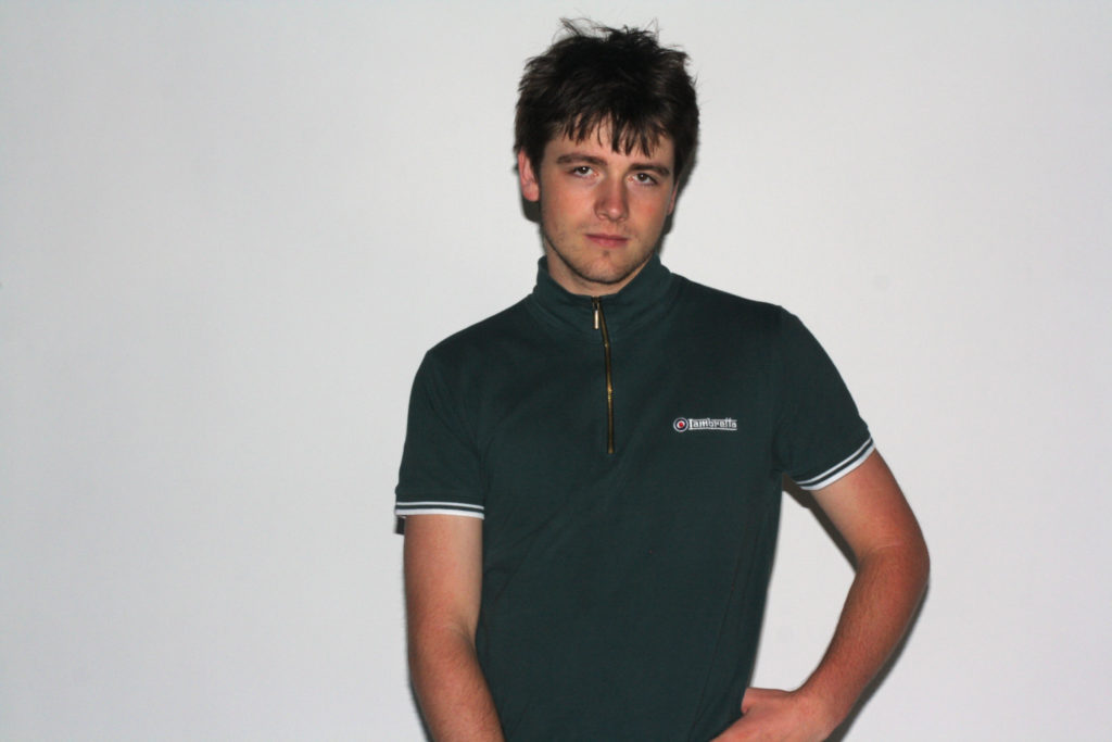
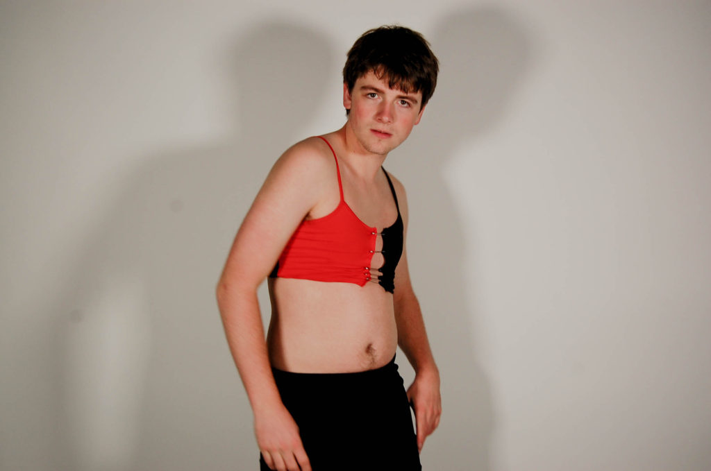
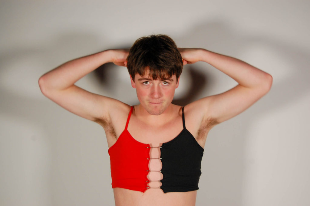
As you can see from poses 3(dress)/4(red and black top), we had our model in more feminine and fluent poses. In addition, we had our model wear feminine clothes.

Overall, the reasoning behind having our model in these poses is because we wanted it to contrast from the masculine poses earlier displayed in the short film. In the short film you see flickers of pose 4 from the masculine pose. This was to show the juxtaposition of the stereotypes behind the male gender on being able to be free and wear/ be whatever and whoever you choose to be. As for pose 3, this was displayed at the end of the short film with our model doing different poses in the outfit of pose 3. Furthermore, we had our model do feminine poses with a smile on his face. This was to show how both genders should be able to be comfortable in being whoever they want to be even if it means wearing feminine clothes as a male and vise versa. In recent years we see things such as pride month which is amazing as people get to express their feelings without embarrassment. Also, society gets the education of not judging these people.

Images of final film

Mario Testino is a famous fashion photographer who has been nicknamed “[the] godfather of fashion photography”. He has had a very close relationship with the fashion magazine VOGUE, and He has photographed celebrities such as Kate Moss, Oprah, Serena Williams and also the late Prince of Wales with the Duke of Edinburgh and the Duke of Cambridge.

https://time.com/3840119/mario-testino-i-believe-men-have-changed/#:~:text=%E2%80%9CI%20believe%20men%20have%20changed,wear%20and%20how%20they%20look.

Above is a link to a photography project Mario Testino done on how “Men have changed”.

Edited Images shoot 1

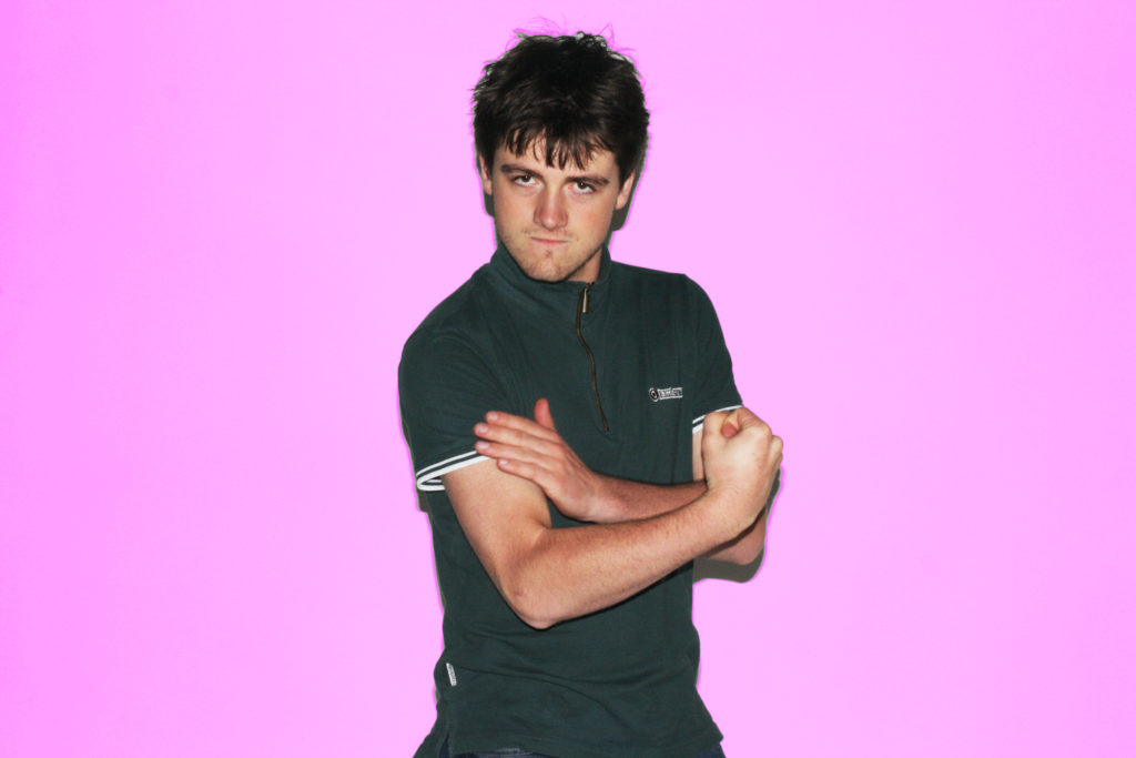
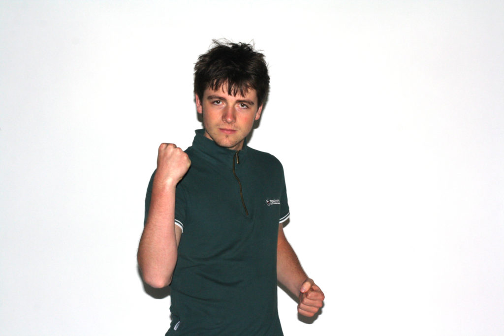
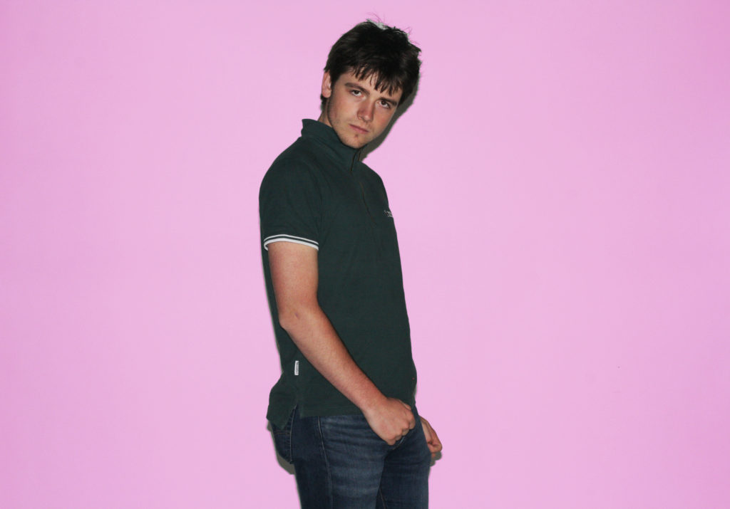
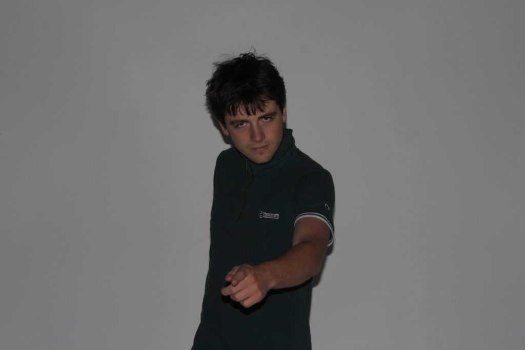
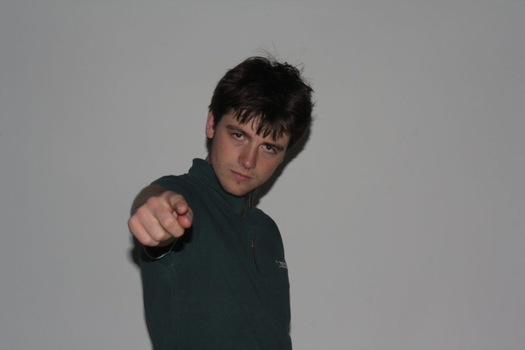
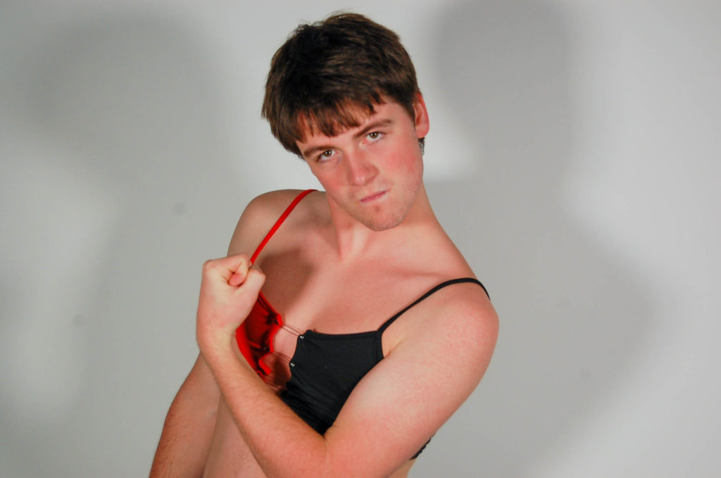
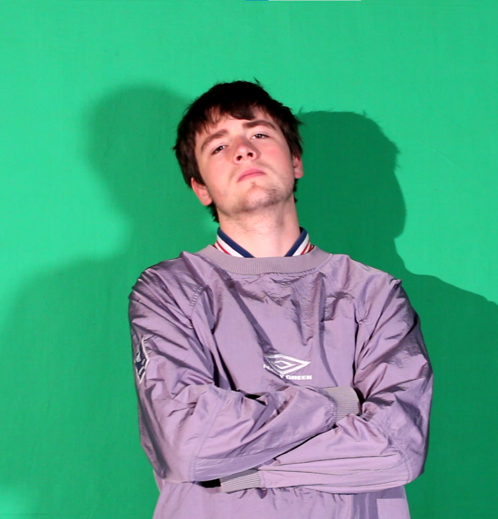
These first set of images displayed above is mean to portray the over exaggeration of what the stereotypical man is mean to look like. As you can see the images show a physical presence to them as the model is pointing directly to the camera. Also, the model appears to be tense in most of the images which portrays the masculine aspect to the images.

Furthermore, we added pink to some of this masculine set images in order to show juxtaposition form the colour pink being feminine alongside the poses being masculine. The outcome of this was to display that the male gender can be associated with the colour pink. Furthermore, how old stereotypes don’t have to be associated with today’s society. Meaning we can move on from old stereotypes and people can be comfortable within the genders.

Final/ favourite image

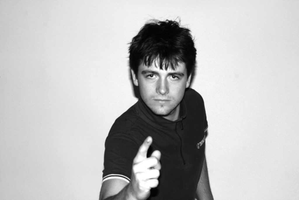
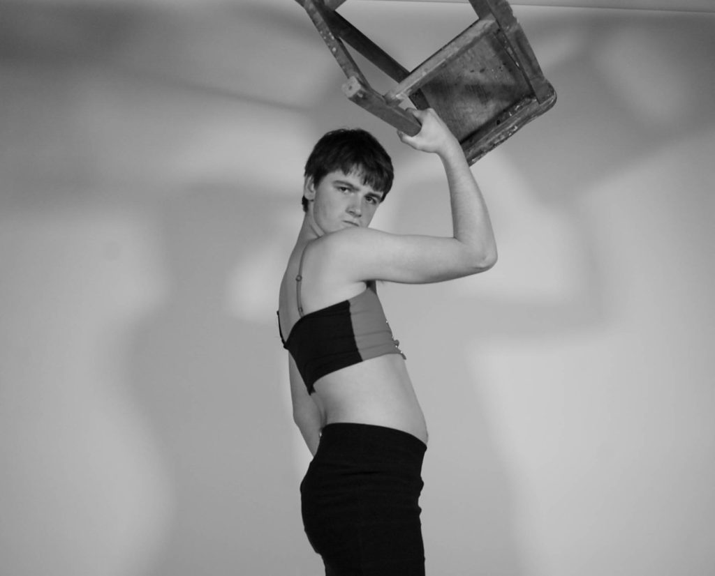
These are my favorite images because they remind me of Uncle Sammy’s propaganda that was used to call people to join the United States Army during World War I.

This is a powerful pose as it gives the viewer the impression that the model is observing and pointing at them. It shows that this problem needs to be fixed and that we need to stop expecting people to be like this or act a certain way.

Images are in black and white to represent outdated ideas that many have received from the media. The media has been the main thing for generations. The media generates opinions and many readers are influenced by what is said.

Black and white can also represent a metaphorical prison. This shows that the model is stuck in a society in which he feels out of place.

Edited images shoot 2

Editing

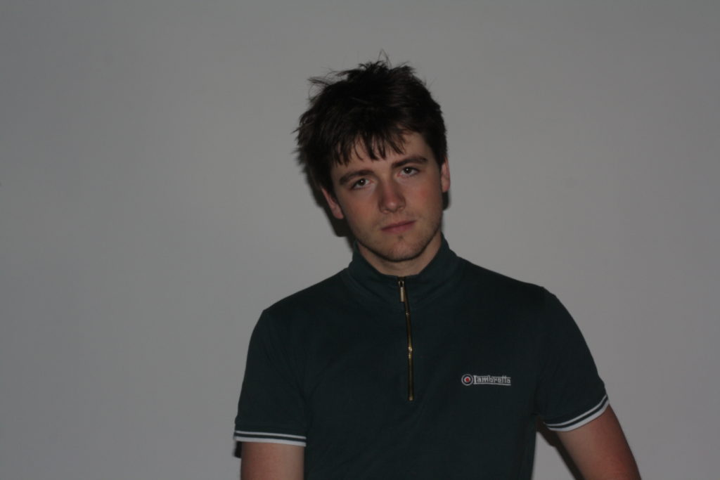
she used a quick Shutter speed in attempt to capture as much of the model’s movement as possible. The quick shutter speed allowed her to get a lot of images that looked similar so that she could get a range of images for the same pose and then choose the sharpest image.

To edit the images, she went onto Lightroom and changed the exposure, as the images were initially very bright, she then went and changed the levels of white and black in the image, once she had done that, she was able to change them to black and white. She kept the shadows quite prominent to highlight the fact that her model could be influencing others to express themselves and to not feel embarrassed.

Analysis

Men can wear whatever they want without fear of being judged. She asked the model to do this shoot because she knew he would be confident throughout the shoot. This is important to her because she don’t want to create a specially chosen photo session to depict people feeling good about themselves, when my model feels awkward, etc.

She separated black and white photos from the colour photos to emphasize that people are always two-faced.

Favourite Image

Editing

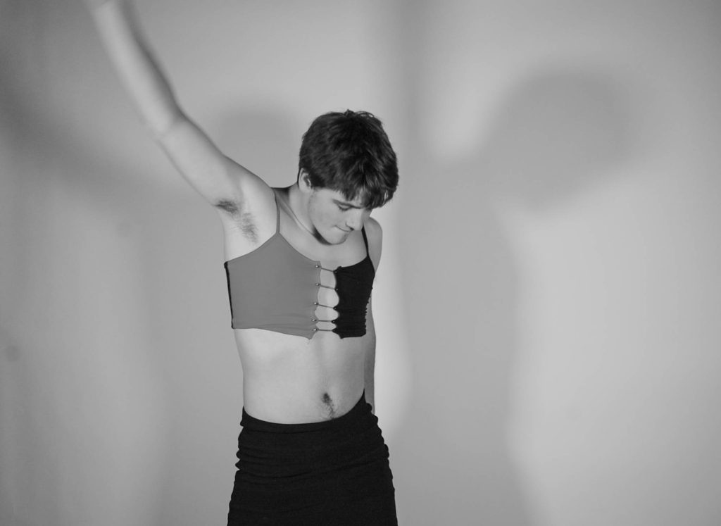
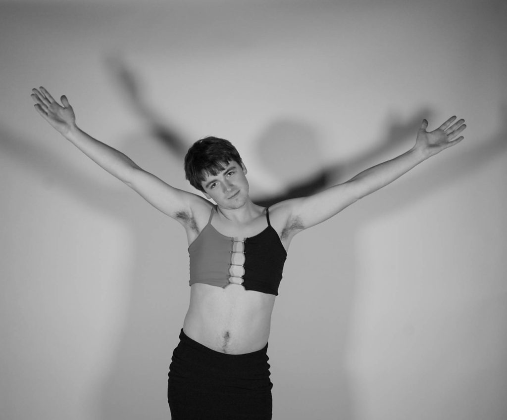
To capture these images, she used two solid white lights to cast shadows on the background. She liked that the lamp creates two shadows. She believed it represents the fact that everyone has personalities that we hide. It concerns Novella, Dr Jekyll and Mr Hyde, by Robert Louis Stevenson. Stevenson writes about how a very respectable Dr. Jekyll doesn’t always want to be what everyone sees. This is where Mr. Hyde comes in, Hyde is the evil faction of Jekyll, he does all the things that if Jekyll were seen doing them, he wouldn’t be seen again.

She edited this image in Lightroom. She increased the black level in the photo as the light created a slight sheen on the dress. It also makes the safety pins holding the shirt together more visible.

She used a fast shutter speed to try to capture most of the movement of the model made. The image she chose has a bit of a blur around the arms; However, she felt it works well with the rest of the image. The fuzzy arm helps highlight the change in people’s perspective and the fact that more and more people are starting to accept other people for who they are.

Analysis

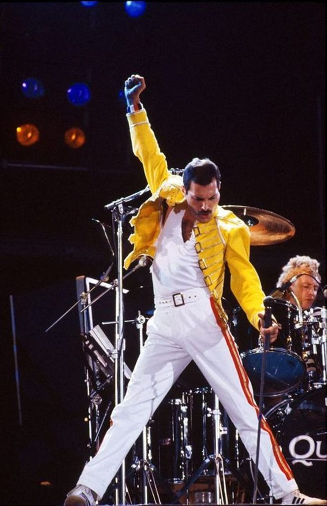
This is my favorite image because the model accidentally copied the iconic pose adopted by Freddie Mercury. Freddie Mercury doesn’t care what people think of him, that’s why I think this image is a success because our shoot was done to show that people shouldn’t care what others think about him. their appearance.

The fact that black-and-white images may show some people have very old-fashioned beliefs, such as the belief that people should limit themselves to one style of dress. The black-and-white image also depicts the model’s fear of speaking out about being trapped in a male stereotype, which is often portrayed as strong, emotionless and the backbone of her family.

The two tones of the shirt show that there is never just one explanation for something. You can always find another way if you really need it. The fact that the black and white images are rather ironic because we are a group shows that nothing in this world is truly black and white.

Community NFT – Final Image and Video

Link to video;

Womankind

https://web.microsoftstream.com/video/ebad8b1c-a10f-4ba2-b4bd-803164699d50?list=studio

Final Image;

Evaluation

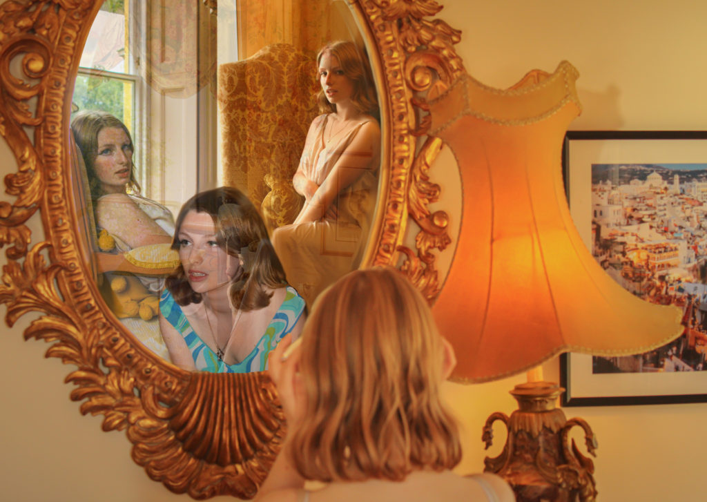
Overall, I believe that our final image and film have turned out very successful as they relate strongly to our initial intentions of commemorating the women who have fought for their own rights throughout history. I am really proud of what we have accomplished during this project, learning new skills on different software such as Premier Pro has been really beneficial in discovering the limitless elements of photography and all we can do with it. I believe our final film succeeded greatly due to our setting, lighting, camera angle and casting – using a model who has such a timeless look helped us portray different decades and styles which all together sustained the aesthetic of our film. Additionally changing our idea to using a static camera shot, instead of panning along as the model moved, assisted with the fluidity of each video; we developed our ideas well as a team by working together and listening to each other’s input. I believe that our message comes across clearly in our film through our use of visual imagery and audio, the idea to use clips from historical interviews helped focus on our main objective. Our final image was created by choosing our 4 favourite images from our shoot and editing them together to form a collage as if our model were seeing different versions of herself through a mirror. I believe we really captured a sense of pride in this image, it represents looking back on the empowerment and rights we have been given by our ancestors, feeling confident in oneself of all that has been accomplished. One part of this image that I think works particularly well is its repetition of the colour orange, symbolising strength and confidence being such a bold colour while also keeping a theme of regality throughout. If we were to have more time on this project I would have liked to improve my skills in digital animation using Adobe After Effect, we brainstormed how we could use this software in our final film but couldn’t come up with an idea of the right standard. Nevertheless, I am extremely pleased with how our final film and image have evolved and developed – I believe they represent a fight for gender equality and female empowerment successfully.

Statement

The evolution of women’s rights into the future Metaverse, a time when diversity and equality are the norms, where a woman can choose what she does with her body without the input from the government and society around her. The concept of our NFT film is to explore the three major waves of feminism in the last 100 years and to celebrate the women who have fought for women in the present to have equal rights to men. The name of our film came from a play on words for Mankind, because as a society in general we are referred to regarding men, by switching the prefix Man to Woman we are making a statement on the power of women collectively. We capitalised the K as an ironic reference to the stereotype of women being gentle and sweet-tempered. Conveying ideas about women’s rights throughout the years, suffragettes, protesters and so on, we show the cyclical theme of women standing up for what they believe in and gaining confidence, that we should all have, in themselves.

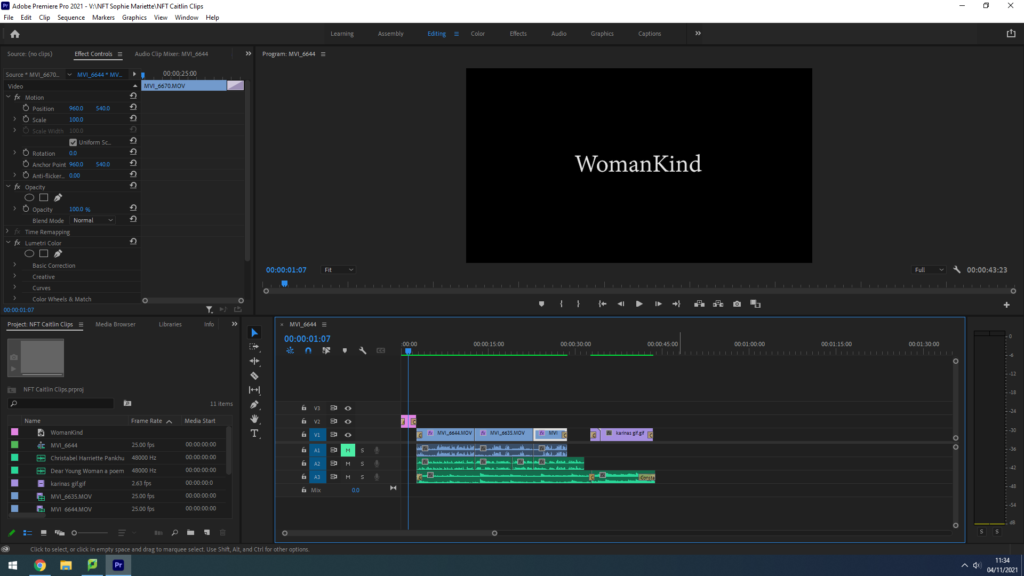
Community NFT – Editing Video in Premier Pro

Setting The Scene – Location;

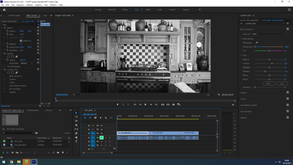
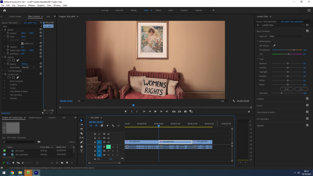
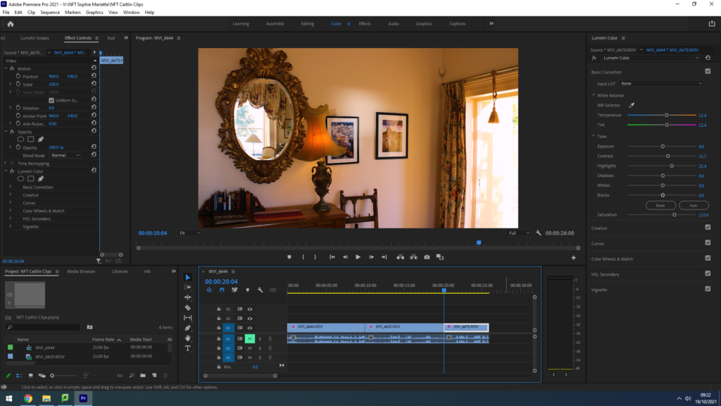
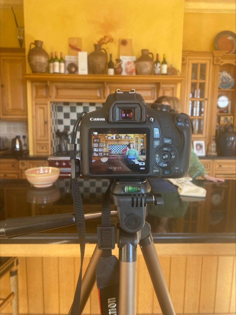
While on location filming our NFT video, using our plans from the storyboard we created, my group chose three rooms in the house that rightly portrayed our three different eras. The first room shows a rustic, un-modernised kitchen with antique original tiles and cabinets to represent our early 1900’s housewife’s home. The lighting in this room was perfect for filming, with large windows spanning from the ceiling to the floor right in front of where we planned to set up the camera, providing perfect natural light to set the scene and highlight our model’s face. To fit with our idea of showing different decades, we edited this clip with a black and white filter to replicate old silent films. We also really loved the range of geometric shapes in this location as it hinted towards the idea of order and tidiness, stereotypical ‘housewife qualities’ that broke down as our video went on. Our next room we chose was a living area with two red patterned sofas relating to those of the 60’s and 70’s, we loved the minimalistic background of this shot as the blank orange walls provided lots of negative space to draw the observer’s attention towards our models actions. We felt a need to increase the vibrancy of each clip as our film went on, therefore we edited with lower saturation and warmer tones that were more reminiscent of old film camera photographs. However, the one part of this location that could steal the observer’s gaze, for all the right reasons, was the watercolour painting of a woman sat in a field of flowers. We really loved having this painting in the centre of our shot as it conveyed the feminine stereotypes we were highlighting in this whole project, relating back to our embroidery inspiration of ‘The Bugs and the Lovers’ and keeping that motif of flowers flowing throughout our piece. Our final location for representing the modern day woman, confident and assured of herself, was anther living/office area that held a grand mirror that had regal tones of wealth and luxury. As described in our storyboard, we wanted to feature a mirror for our model to admire herself in before leaving frame, and we thought this one was perfect. The golden warm tones from the artificial lighting also helped provide links to happiness and comfort in our final shot.

Audio Editing;

We wanted to create a piece of inspiring audio with links to moments in history that defined waves of the feminist movement to play underneath our film, of course due to copy right we had to find a piece of royalty free music. I researched the free music website Audio Library and found composer Scott Buckley – his instrumental song ‘Luminance’ worked perfectly for our film, with elements of drama, suspense but an overall a calm atmosphere to be juxtaposed with historical audio clips, this piece of music worked well. We also had the idea to find clips from certain women’s rights activists throughout history to layer over the top of this instrumental track. I searched on YouTube to find feminism interviews, our first is taken from Christabel Pankhurst’s 1908 speech recording, protesting for the women’s right to vote, she states ‘the ministers suffragettes, who form the women’s social and political union, are engaged in the attempt to win the parliamentary vote for the women of this century’. Our second historical audio recording is from a NBC news report in the 1970’s on the Women’s rights movement, this woman states ‘we now have ten million women backing this particular measure before congress, that’s ten million women who are united through their organisation.’ Our final audio recording is representing the modern woman of empowerment and self love, it is from Britta Badour’s 2019 poem entitled ‘Dear Young Woman’ where she reads ‘whatever you’re going through as a woman, you have the choice to make for yourself for how gentle and kind you are with yourself’. In Adobe PremierPro, I layered this audio clips over each other to create a piece of sound that told a story throughout our films movement.

Montage Images;

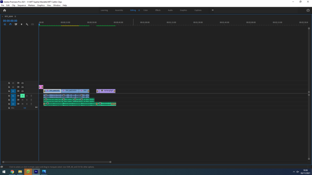
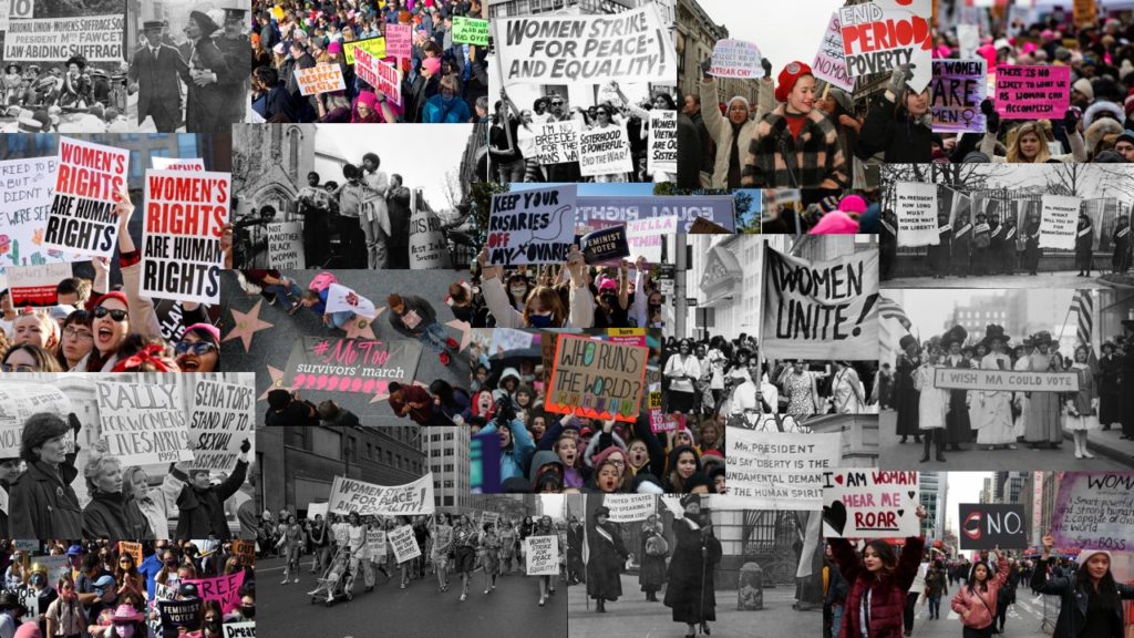
During our video editing process we experimented with how creating a montage for the end of our film would impact the overall message. We wanted to find images from several different decades, highlighting the suffragettes/suffragists as well as present day women fighting for equality and the rights to their own bodies. Each member of our group researched some of the most prominent protests/marches for equality in history, collating a set of images that we wanted to include in our montage. Using a mix of black and white/colour images was something we really wanted to feature. After choosing each photograph we wanted in our montage, we used Adobe Photoshop to create a GIF of our images using the instructions below;

How to make a GIF in Photoshop
1. Create layer for each image
2. Window > timeline
3. Select > Create Frame Animation
4. Drop Menu > Make frames from Layers
5. Timeline > select Forever
6. File > Export > Save for Web Legacy > reduce image size to 720 x 720 pixels

By using a GIF format to create our montage it gave us the ability to speed up the duration of each image, producing a fast paced series of photos that sat in time with the music underscoring our film. We wanted this montage to go at the end of our film to really finalize our message that these issues of inequality are still going on to this day.

Our Title;

As a group we discussed developing a title that summarised our views and message altogether. We came up with the idea of ‘WomenKind’ – a play on words for ‘mankind’, a word that is meant to refer to the whole human race however only refers to the male gender in the process, switching to ‘Woman’ to create a statement on collective women empowerment. We are not suggesting in this pun, or in this entire project, that women are better than men – that idea has been mentioned nowhere – we are simply drawing attention to the fact that for centuries women and men alike have fought for female empowerment and gender equality, we are giving our thanks and telling their stories. Additionally, we decided to capitalise the ‘K’ in kind to hint at the irony surrounding the stereotype of women being weak and submissive, showing kindness to all. This is clearly juxtaposed with our film celebrating the strong powerful women who still continue to fight for equality, our title highlights and challenges the parodic representation of women throughout history.

Behind the Scenes;

NFT Community – Evaluation

Our project based on highlighting ideas about the metaverse and the idea of ‘2 Lives’ was an overall success. We were able to complete the project within the time frame to a sufficient standard. My artistic intention was to deliver a project which used a-lot of digital techniques to relay a futuristic aesthetic. I believe through the use of animation and various other effects, along with the sound-design we achieved this artistic direction.

I feel we effectively spread the workload amongst the whole group. Everyone had something to do at all times when working on the project.

  • Matthew
    • Camera man
    • Animator
  • Reuben
    • Actor
    • Secondary editor
  • Ollie
    • Director
    • Manager
  • Myself
    • Main Character
    • Chief Editor

This was valuable as the editing process was intricate.
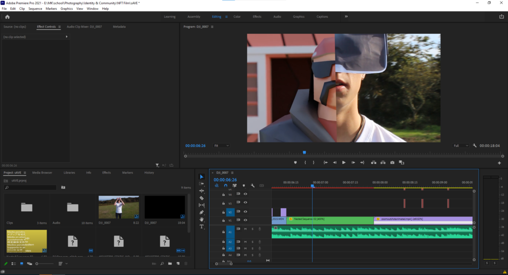
Although class time was used effectively in this way, I do feel more out of class work could’ve been done to help iron out any creases in the film as I do think it has room for improvement. For example some sections of the film do not flow seamlessly but rather cut quite chaotically and therefore more out of lesson time could’ve been spent on transitions.

Our project represented the idea of having social circles online and in the physical world which reacted to the theme of community well.

Our work was inspired by artists like Beeble and I feel we effectively displayed this aesthetic using the digital style of work

NFT Community – Final Presentation

Film

https://web.microsoftstream.com/video/7f2e5973-fc97-435e-8d97-632fd5209787

Digital Image

Final Statement

Title: Online / Offline
The concept behind our NFT video is that two friends each have two separate lives; one offline and online. Our video shows how anything can happen on an online medium, but real connection and friendship occurs in real life. As technology develops relationships of all kinds are growing apart. An example of this occurred in the height of the Covid-19 pandemic lockdown. People only experienced contact with family members in the same household and the only way to speak to people outside was via an online medium. This effected the mental health of everyone and looking back on the first lockdown we can see how much we relied on technology to keep connected with family and friends.
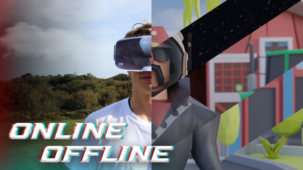
Creators: Oliver Shiplee, Matthew Brown, Michael Kenealy and Reuben Jeanne

NFT community – Story Board

What is a Storyboard?

A storyboard is a collection of images that tell a story. Basically it is a sketch of the ideas a person is trying to portray. It is another way of showing a game plan to an individual with interest on what is going on. The visual elements along with the captions allow for the story to be seen by the person reading it. Disney is to be credited with the creation of storyboards since 1920. Ever since then, it has been a great way to share information.

Online vs Offline storyboard:

Image preview

Community NFT – Photoshoot

Our Photoshoot

As planned in my Storyboard Blog Post, on October 14th my group went to shoot on location at Carmen’s grandmother’s house. We aimed to create images inspired by Lissa Rivera and Cindy Sherman, keeping our Clare Rae inspired shots for our video footage. Each member of our group took images on their own cameras for this shoot, however the final edits are comprised of my shots which we all worked hard on creating unique compositions and lighting for. I focused on photographing in areas of warm lighting, with side lamps, ring lights and natural sunlight as our source; I wanted to create an atmosphere of confidence and playfulness in these images. Each member of our group walked around the house to find rooms and areas where interesting images could be taken, we tried to focus on finding patterned wallpaper, similar to Rivera’s work, as well as rooms with mirrors, fireplaces and symmetrical backgrounds that could create dynamic changes. During our photoshoot we experimented with how using flash would disrupt or help the lighting of an image, for some it helped massively by providing natural highlights on our models face as well as illuminating the background – however, in rooms with an abundance of natural lighting the flash created highly over exposed images that did not reflect the warm tones as we had hoped. I really enjoyed experimenting with the White Balance, Shutter Speed and ISO of my camera to see how changing the setting slightly could effect an image so greatly.

Flagged Unedited Images;

In Adobe Lightroom I imported all 324 of our photoshoot images and used to ‘flagging’ tool to select which ones were the most successful. When choosing these I looked for photographs with interesting compositions, sometimes I found asymmetrical images a lot more intriguing as they showed freedom and fun, qualities of our fully empowered modern woman that, in some images, we wanted to portray. After flagging our favourite images (screenshots seen above), I went through them again giving them a 1 to 5 star rating. Any images with 5 stars I then went on to edit and refine, touching up exposure and brightness mostly, to link more to Rivera’s work and convey a sense of empowerment. When editing, I wanted to keep the warm undertones that I captured in the raw shoot as I believe they helped represent the comforting atmosphere of a woman in her own home, feeling confident and safe within herself.

Best Images – Edited;

Our images show understanding of stereotyping, taking inspiration from Cindy Sherman’s work by photographing our model in a stereotypically feminine outfit, stood/sat in exaggerated poses to create an ironic display of the female gender. We wanted to use these ideologies surrounding women to form a basis for our shoot, using irony to suggest our model feels proud of her femininity as she uses it for her own empowerment, not for the pleasure of others. Locations for these images around the house include bedrooms, offices and lounges – each holding a different stereotype being squashed by our models confidence and satirical representation of how women were (and still are) seen in society.

Image Analysis

I have chosen to analyse this image from my feminism photoshoot as it shows a clear link to all three artists I have studied with use of the formal elements and thematic composition. The first element of this image that I really enjoy is the warm lighting that creates an orange hue throughout, conveying a sense of comfort and security. The dominant colour of orange, as well as creating warmth, also helps the observer understand the subject better as the bright colour connotes ideas of confidence and happiness, things our ’empowered new-age woman’ feels in a free, equal society. The dark lighting that covered this location helped us form an image with depth and meaning from the colours that the natural sunlight, coming through a window out of frame on the right, created. This lighting also illuminated the space around our main subject, as if she were emerging from a place of purity and serenity, symbolic of a heavenly light that surrounds her while she admires herself. The range of tones in this image is quite unbalanced, with the focal point at the brightest point in the centre being surrounded by a much larger border of dark shadow. This creates an atmosphere of mystery and secrecy, linking to Clare Rae’s secretive images were she hides parts of her body so they cannot be exploited for the male gaze. The use of repetition in this piece is seen from the mirrors reflections around the edges, creating distorted versions of our models features eg. arms, hands etc, further linking to our studied artists ironic portrayal of the female gender. The reflections create some rhythm in the image, relating to the idea of flowing water around her; connoting ideas of freedom and fluidity. The overall composition of the piece adds an interesting take on the theme also, we cannot actually see the model’s physical body in the image, only a reflection of her standing out of frame. This raises the question, is she really there? Or is this maybe a ghost from the past looking in on a changed world, possibly an echo from future generations looking back on what women have accomplished – the ambiguity is for the observer to imagine.

Artist reference – Still images

Carolle Benitah

Benitah is a French visual creator UN agency worked for 10 years as a dressmaker before turning to photography in 2001, exploring memory, family and therefore the passage of your time. usually pairing recent family photos with skilled worker accents, like embroidery, beads and ink paintings, Benitah seeks to reinterpret her own story as a girl, married woman and mother.

By activity totally different faces and options, the folks photographed are nearly stripped of their identity. I selected to check Benitah as a result of I believe his art best represents the construct I hope to capture during this project.

With beads, coloured thread and scissors, French photographer Carolle Benitah has altered her family photo albums to explore the memories of her childhood, and as a way to help her understand her current identity.

Carolle herself has said:

I started to be interested in my family pictures when I was leafing through a family album and found myself overwhelmed by an emotion of which I could not define the origin.

These photographs were taken 40 years earlier, and I could not even remember the moments they were shot, nor what preceded or followed those moments.

But the photos reawakened an anguish of something both familiar and totally unknown, the kind of disquieting strangeness that Freud spoke about. Those moments, fixed on paper, represented me, spoke about me and my family, told things about my identity, my place in the world, my family history and its secrets, the fears that constructed me, and many other things that contributed to who I am today.

I decided to explore the memories of my childhood to help me understand who I am and to define my current identity.

To begin, I carry out “excavations”. Like an archeologist, I dig out the pictures in which I appear from family albums and the shoe boxes full of photographs. I choose snapshots because they are related to memories and to loss.

These photographs are fragments of my past. I interpret them from a subjective perspective as confessions. I order them, classify them, scan them, then I print them. I don’t do anything directly on the original photo; I transpose this reality on a different paper. Sometimes I crop a detail that calls out to me, and I choose my format. The work of interpretation begins with these steps.

Once these choices of images are made, I start to tell my version of the story. I turn my attention to my own history, sometimes with 40 years of distance and the life experiences that changed my perception of events. The past of a human being, unlike the remains of an antique temple, is neither permanent nor finished, but reconstructed in the present time.

For the next step, I add needlework: embroidery and beads.

Embroidering is primarily a feminine activity. In the past, the embroiderer was seen as a paragon of virtue. Waiting was tied to this activity: women embroidered, hoping for the return of the man to the home. Embroidery is intimately linked to the milieu in which I grew up. Girls in a “good family” used to learn how to sew and embroider — essential activities for “perfect women”. My mother embroidered her trousseau.

There is nothing subversive about this activity, but I pervert it with my purpose.
I use its decorative function to re-interpret my own history and to expose its failings.
The two activities — interpretation and needlework — come together again in a kind of dispute: embroidery is the sign of a good education yet the words that I speak don’t show me to be what I was supposed to be: a well behaved girl, a wise spouse and a loving mother.

With each stitch I make a hole with a needle. Each hole is a putting to death of my demons. It’s like an exorcism. I make holes in paper until I am not hurting any more.

– Carolle Benitah

Benitah’s work is linked to ours as both share the nature of images hand-composed to tell a story or present an idea through embroidery

Louise Bourgeouis

Louise Bourgeois was a French-born sculptor best known for her monumental abstract and frequently biomorphic sculptures that deal with men and women’s interactions. She was born December 25, 1911, in Paris, France, and died May 31, 2010, in New York, New York, United States.

Bourgeois’ early sketches were created to aid her parents in the restoration of antique tapestries. She received her education at the Sorbonne, where she majored in mathematics. She switched her concentration to art at the age of 25, studying at the École des Beaux-Arts, the Académie de la Grande Chaumière, and Fernand Léger’s studio, and in 1938 she married and returned to New York City with her American husband, art historian Robert Goldwater. She started displaying her surrealist paintings and engravings there. She began experimenting with sculptural forms in the late 1940s, making a series of long, slim wooden figures that she displayed single and in groups.

Those were the first of her autobiographical pieces, which were characteristically abstract but emotionally strong. In the decades that followed, she created a number of frequently unnerving settings out of latex and found materials, as well as constructions out of marble, plaster, and glass. Betrayal, anxiety, revenge, obsession, anger, unbalance, and loneliness are among the most common. She frequently revisited subjects, techniques, and forms that had previously piqued her interest. Because she refused to confine her creative output to a single style or medium, she became more difficult to label and remained on the periphery of the art world. She was given a retrospective show at the Museum of Modern Art in New York City in 1982, an honor rarely bestowed on a living artist, and she represented the United States at the Venice Biennale in 1993. She was awarded the Praemium Imperiale medal for sculpture by the Japan Art Association in 1999.

Long into her 90s, the sculptor maintained her vibrancy and originality. She constructed a massive steel-and-marble spider (Maman, 1999) from which six monumental bronze counterparts were cast in 2003, and the bronzes were shown at various locations across the world. Louise Bourgeois: The Spider, The Mistress, and the Tangerine, a documentary, was released in 2008. Her house and studio, as well as a neighboring town house in New York City’s Chelsea neighborhood, were opened to the public in 2016 as a museum commemorating her life and work.


Art analysis

Louise Bourgeois is an artist that implements her own life struggles and thoughts into physical art.

Substance:

This project was clearly created using physical works like wood, linen, thread, metal and more

This artefact is stored in a museum for the public to see.

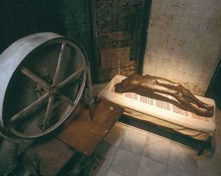
This is called “Cell of Hysteria” and Louise states that in this exhibition

Composition:

The key focus of the project is obviously the sculpture sort of hovering over the bed which has “Je t’aime” stitched through ought.

The artist has also added an antique sewing machine in this exhibition.

The dominant colours here are grey and red, successfully suggesting dark and gloomy times that have come upon Louise.

Lighting:

In this exhibition, the lighting is set towards the sculpture; powerfully drawing the viewers attention to the dis-membered sculpture.

There are a variety of lighter tones across the model, which provides better illumination for the sculpt to concentrate on, resulting in a precisely exposed cut

Techniques:

Embroidery has evidently been used to stitch the word s “Je t’aime” repeatedly

Atmosphere:

This form makes me feel empathetic because of the following:

the sculpture is dis-membered. This suggests that Louise is slowly getting rid of a memory of someone, considering the bump on the carve we can powerfully see that she’s attempting to “kill” the memory of a man. I know this because she repeatedly has called herself the murderer for this exhibition.

Also, “Je t’aime” is repeatedly stitched throughout the bed in which the sculpture is lying powerfully suggesting that the memory of this man (her husband who passed away) is killing slowly killing/ hurting her, nonetheless she still loves her husband. This is suggested by the fact the sculpture is only missing bits of its body like head, arms, and feet successfully showing the slow “murderous” process of getting rid of a memory.

Film still images

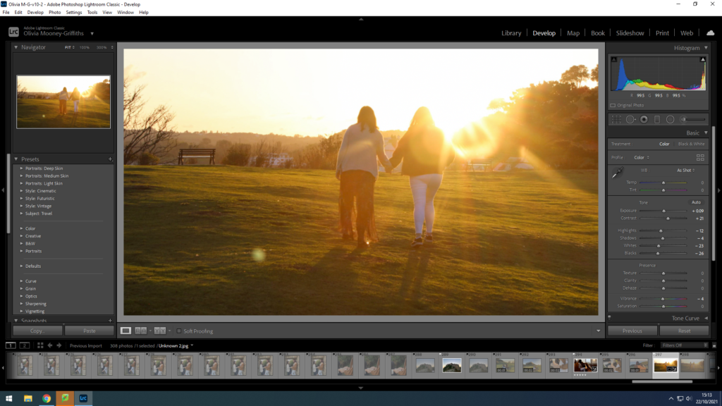
Whilst shooting our film we tend to took the chance to require stills of varied scenes, giving additional images that tell our story of the crossover between the spiritual and LGTQ communities, also as our studio pictures. These images embrace scenes like the couple within the church active Christianity while additionally feeling as if they need to repress a part of their identity. Aa well as this, there are still pictures of the dream sequence in our film that showcase the couple running through the sphere during a idealistic world for them, during which they’re free from restraints. Here Olivia actually has tried to edit in Lightroom and sorted through that images she assumed were best within the sense that they best sent our message and were clear and focussed. when this I went on to rate every of those best choice of pictures, rating them out of 5 stars. Once that was done, I proceeded to edit the still images for which I had rated four or five stars.

Editing and Developing

This still image shows one of the women working on her faith, reading the Bible, presenting another essential part of her identity. This establishes a personal relationship with the Christian religion for the character. To edit this image, I started by reducing the exposure a bit and increasing the discriminant, creating a lot of dramatic background that could later show the light match of the dream sequence. . I then adjusted the shadows, highlights, whites and blacks inside the image, increasing the highlights and whites, while reducing the shadows and blacks, further creating a larger difference. Finally, I improved the brightness and vibrancy of the image, increasing the earthy tones of this image.

This still image shows a scene where people of the same sex are separated for interest, but still looking at each other. However, in some cases, it brings happiness to the 2 communities who need to hide part of their identity to be accepted. Here, Olivia has even modified the image in the same way thanks to the previous scene, to preserve tonal consistency across the interval scenes in the church.

We tend to contradict this view that such communities should only exist in isolation, they can help each other while keeping the faith. Whether they should be together (as friends or more) is up to God for in Matthew 6:25-33 it says:

25 “Therefore I tell you, do not worry about your life, what you will eat or drink; or about your body, what you will wear. Is not life more than food, and the body more than clothes? 26 Look at the birds of the air; they do not sow or reap or store away in barns, and yet your heavenly Father feeds them. Are you not much more valuable than they? 27 Can any one of you by worrying add a single hour to your life[e]?

28 “And why do you worry about clothes? See how the flowers of the field grow. They do not labour or spin. 29 Yet I tell you that not even Solomon in all his splendour was dressed like one of these. 30 If that is how God clothes the grass of the field, which is here today and tomorrow is thrown into the fire, will he not much more clothe you—you of little faith? 31 So do not worry, saying, ‘What shall we eat?’ or ‘What shall we drink?’ or ‘What shall we wear?’ 32 For the pagans run after all these things, and your heavenly Father knows that you need them. 33 But seek first his kingdom and his righteousness, and all these things will be given to you as well.

This quote successfully shows that you shouldn’t be worrying if you’re to be with this person or not but seek God first and let him handle everything.

This image could be a still image of 1 of our installation scenes for the dream sequence. it’s a large shot that stages a surreal and surreal scene, because of the castle and therefore the shiny inexperienced grass within the background. Here, this colour grading helps the film by transportation the vibration to life as hostile the marginally darker dark tones of the church. For the dream sequence, Olivia emended the still image reducing the exposure thanks to the big quantity of daylight already within the image. additionally, I conjointly exaggerated the distinction and adjusted the highlights, shadows, whites, blacks and saturation of the image.

This threshold image is taken from a dream scene that shows the 2 figures holding hands, demonstrating the liberty to remain faithful themselves during this idyllic world, that they worry during a spiritual setting.

I emended this image a similar because the previous dream sequence, to keep up consistency in tone and heat throughout the dream world setting, to make a stark distinction to the church scene.

Here, this still image additionally from the dream sequence shows another scene within which the couple have the liberty to think of how it would bee to be in a same sex relationship, as they’re once more seen holding hands on the brink of the Radio Castle ruins. . By having a scene during this castle structure with the sunset on the left within the background, it reinforces the concept that this is often a fantasy and sadly not their reality. I additionally emended this image with constant method for alternative stills within the dream sequence, this point solely slightly reducing the exposure and increasing the achromatic colour of the image. this is often as a result of a tiny low quantity of sunshine enters the frame once taken at sunset.

The final scene during this dream sequence shows the couple holding hands once more, feeling asleep with each side of their colours, walking through the colourful inexperienced landscape because the sun sets. This another time reinforces the thought of the thought idyllic world that the characters imagine. To edit this image Olivia followed constant method because the alternative dream sequence photos, though this point I reduced the brightness and vividness thanks to the big quantity of sunshine within the frame, ensuring that it’s not washed out.

Edited Still Images

These are the final emended versions of still pictures taken throughout the shooting of our film, every showing a special stage of the plot, most of that correspond to the storyboard of the first film, with the exception of the protest scenes and d riot, that we are going to take from actual recorded events to feature genuineness to our film. These pictures conjointly build it potential to reconstruct the filming, costumes and props of the stage. For scenes within the church setting, for instance, we tend to created certain that the figures were wearing white to symbolize purity through the eyes of Christianity. Additionally, for the unreal sequence, the characters are given additional relaxed and flamboyant costumes, to any increase their freedom of expression.