Tag Archives: newspaperdesign

Identity & Community – Newspaper

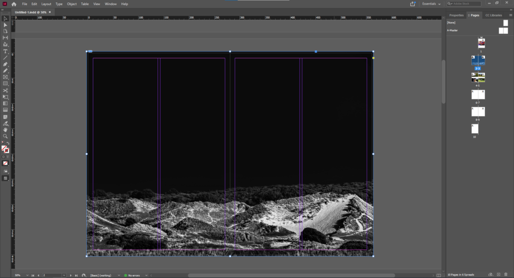
The above is the first image I chose due to its powerful use as a double page spread. This is because the landscape can fill the page and create an immersive experience when this page is opened. The negative space is also powerful as it splits the page horizontally and also presents an obscure aesthetic.
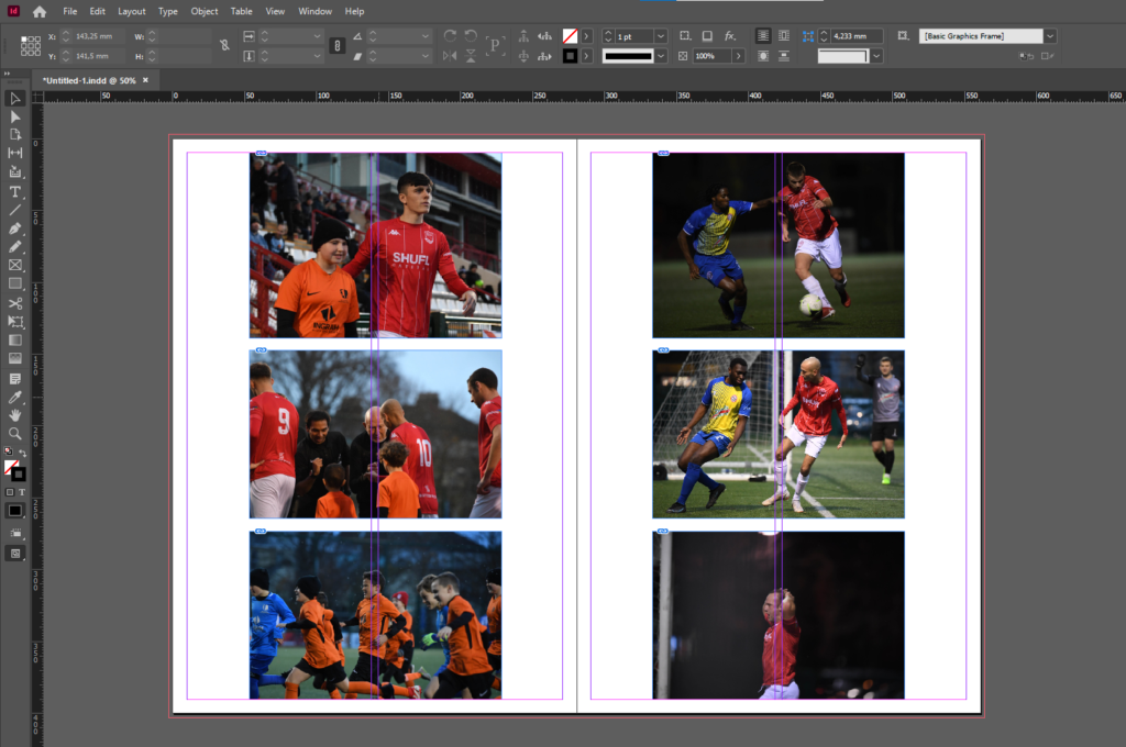
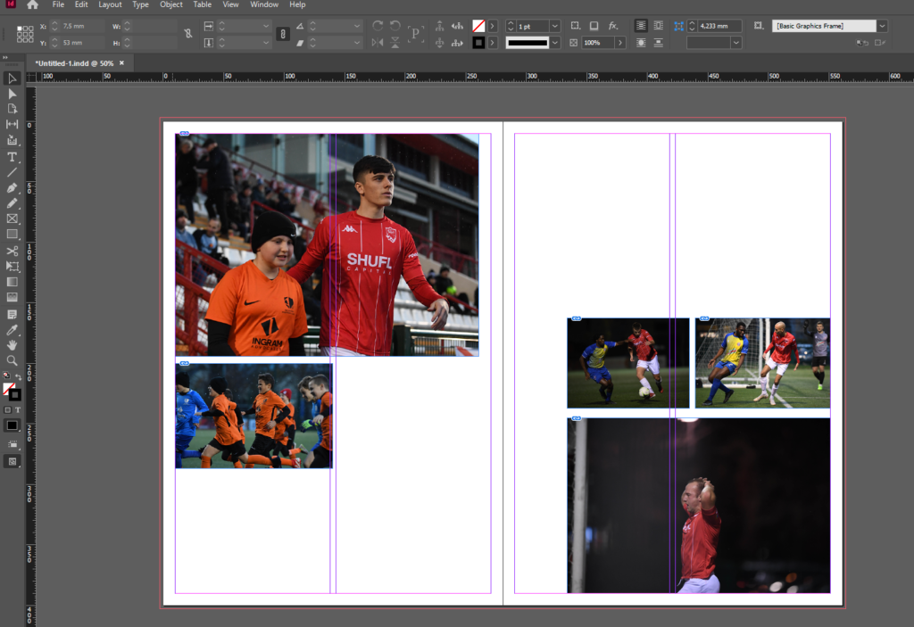
I then gathered related images and laid them out to create a photo-story. I chose theme images as they feature good framing, focus and balance while presenting the emotion of the subjects. After presenting them in this way I decided to configure them in a more traditional fashion suitable for a newspaper, with some images bigger than others and set out where a readers eye would easily follow down the page from left to right.
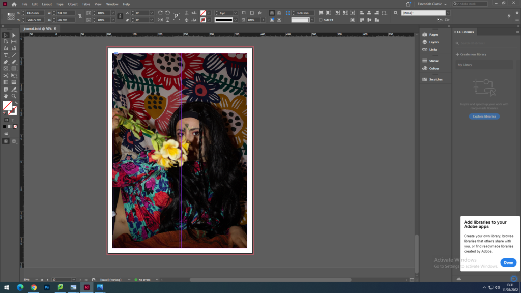
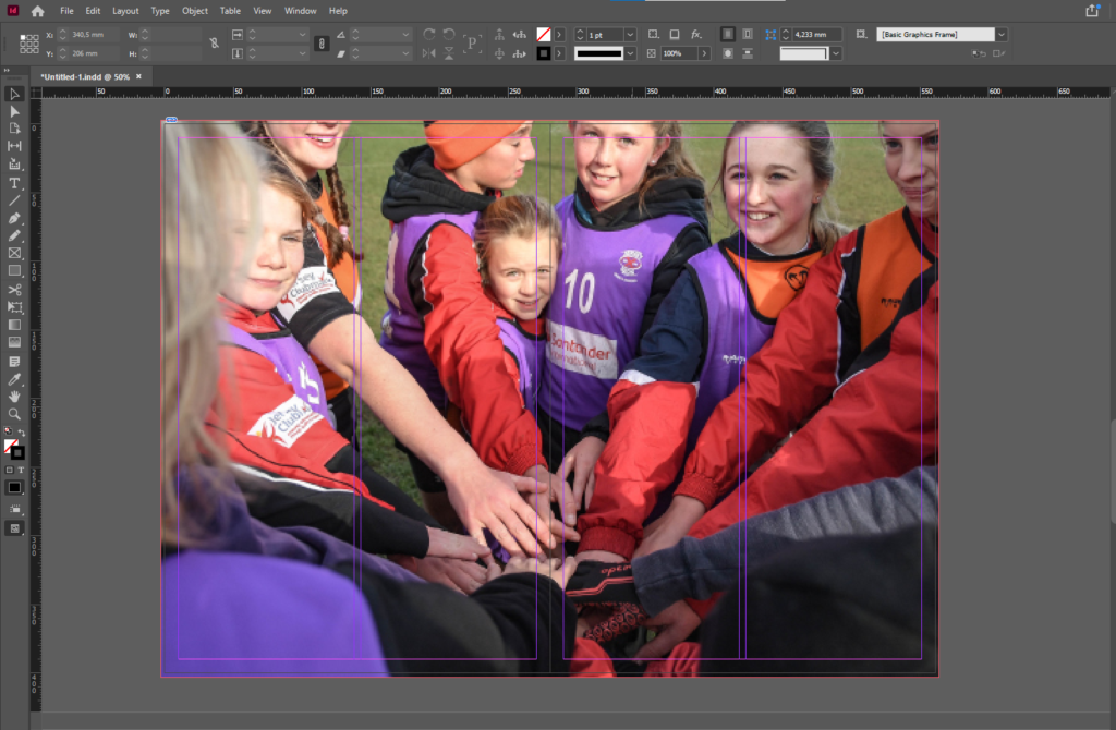
I then decided on another full double page spread using the below image as it presents the idea of identity and community well. With the girl staring into the lens it confronts whoever is looking at at the image and evokes emotion. This images is effective as a double page spread as it it immersive with depth of field created by the subjects in the foreground being out of focus while the subject in the background staring into the lens, makes it feel like you are part of the team huddle. The girls head is placed just before the middle of the spread so her head is not split in half.
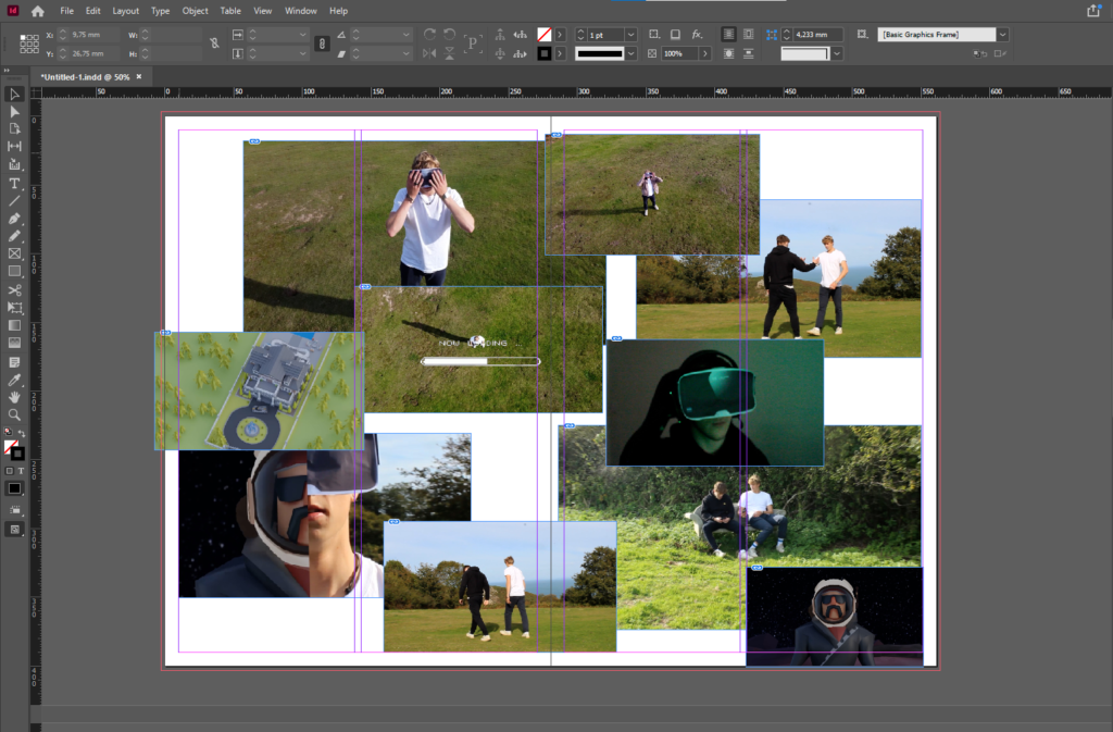
Finally I presented a montage of screenshots from the NFT film.
newspaper design

For my newspaper spread I decided to incorporate work from various different projects and topics we have covered throughout our 2 year photography course, including studio portraits, landscape, and object photography. I chose what I think were my best work from these projects and experimented with different ways of laying them out in various sequences and narratives. To begin this process, I went through all of my published blog posts and selected the images that I thought best represented my progress and effort throughout photography. I tried to use images that were not too similar to each other, in order to keep the viewer interested. I then had to check that all the photographs were high quality, and that they had the appropriate number of pixels each. After that I imported all the images into InDesign and began to experiment with different layouts until I found one that I was happy with.

FINAL LAYOUT

Newspaper

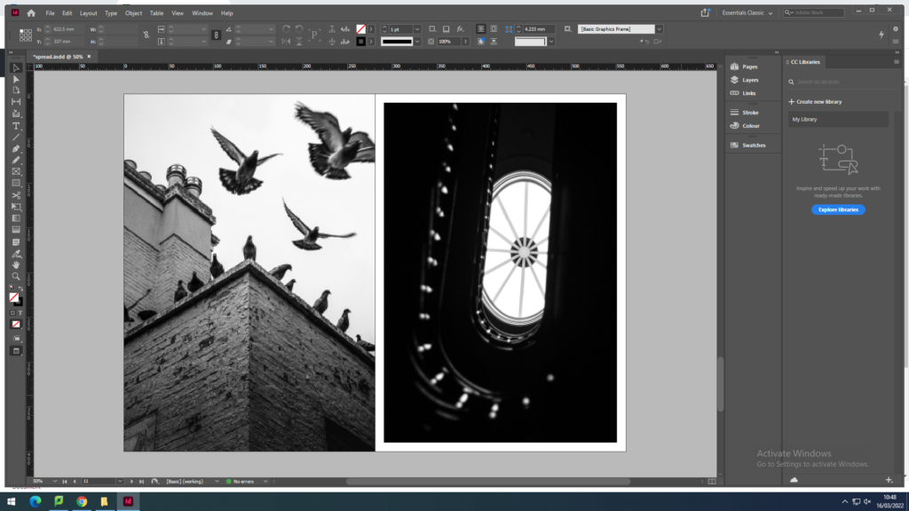
I plan to use 4-8 images which strongly summarise my work. Mainly from my recent project of Bouley Bay, the castle in the woods near Bouley Bay, and the two black and white photos from the Jersey Museum trip, of the staircase and the pigeons. And depending on how much space I have left I might include some screenshots of the NFT film.

These are the images that I plan to use:

They are all high definition which is needed to print in the newspaper. (The long edge must be 4000+ pixels)

page 1
page 2
page 3
page 4

To create the newspaper composition in InDesign. I used some the images above to make two pages of a newspaper

I made an InDesign document with the correct dimensions for a newspaper the imported the images into the area I selected with the x tool.

double page spread (featuring Bouley Bay)
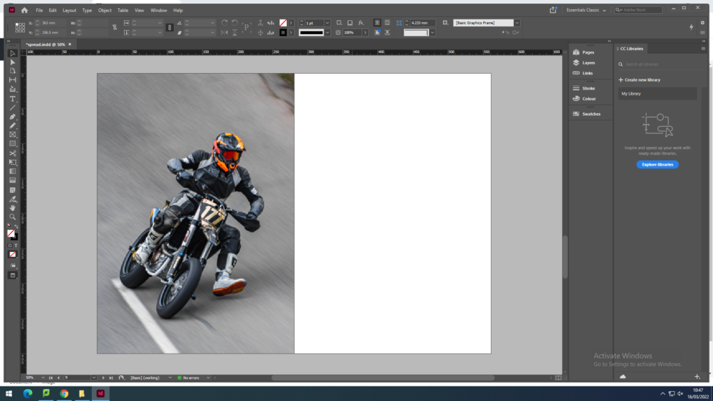
1 page of a motorcyclist at Bouley Bay Hill Climb. 1 page of town life in St. Helier.

Above I have thought about a wide range of different design layouts which includes, one page full-bleed image (sunset at Bouley Bay), a sequence of images (multiple images of Bouley Bay), large scale image with a border (Hill Climb Motorcyclist), and a juxtaposition between two images (inside/outside town images).

After rethinking my design layout, I remade the pages so that the images were bigger and had more juxtaposition to create a stronger spread layout.

I removed one of the biker images, as it was too small because it was less then 4000 pixels on the long edge, so I replaced it with a rock to create a focus on the close up studio shoots I got of small features of Bouley Bay. I ended up contrasting it with a granite heritage building.

However, I still thought I could include more contrast between the landscapes and objects.

I felt that there was a good amount of varity and juxtaposition between my images.

So I decided to package the document and save it into the shared folder where the newspaper editor (Mr Toft) can access it.

newspaper design

Our next project is newspapers. We choose photos to put on the newspaper based on images from both our current and previous projects, including zine project based on historical migrant neighbourhoods in St Helier or work we did in Yr 12 too (Identity, Anthropocene, Landscape) and select the best images. We then need follow these instructions to create our zine:

  1. Create new document in InDesign with these dimensions: 400mm(h) x 280.5mm(w), 10 pages, Orientation: Portrait, 2 columns, Column gutter 5mm, Margins: 10mm, Bleed: 3mm 
  2. Only use in high-res TIFF/JPEG files (4000 pixels)
  3. Use design ideas and layouts from your zine/ newspaper research as well as taking inspiration from artists listed here as a starting points for your spreads.
  4. Incorporate texts and typography where appropriate.

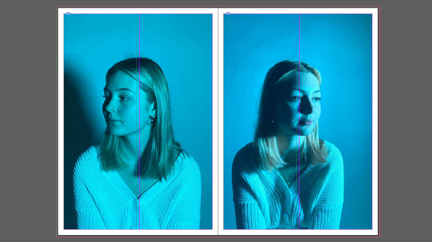
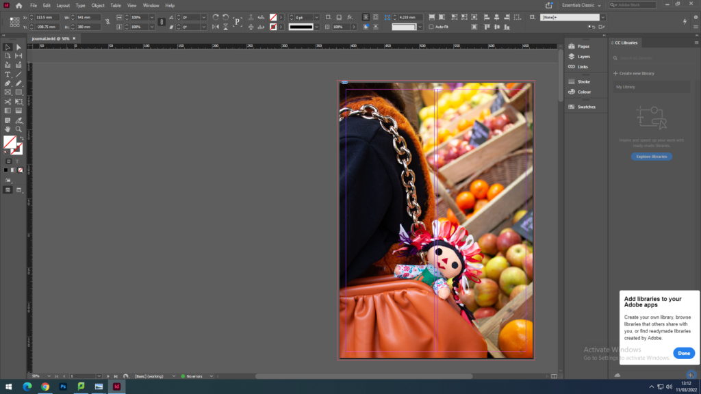
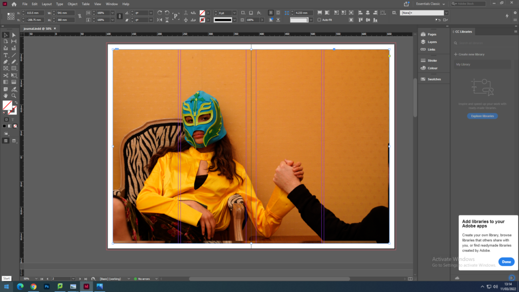
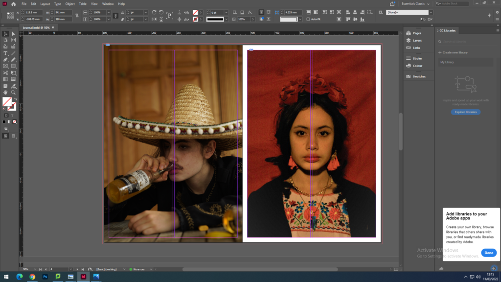
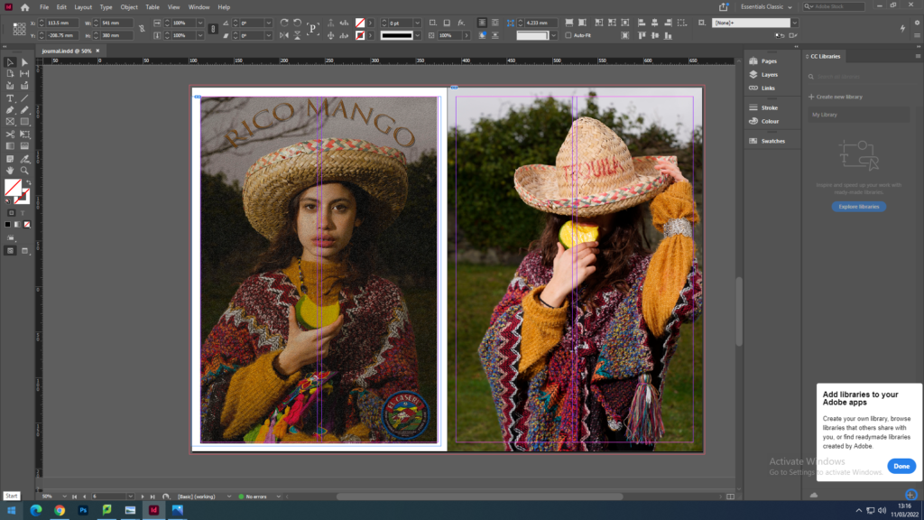
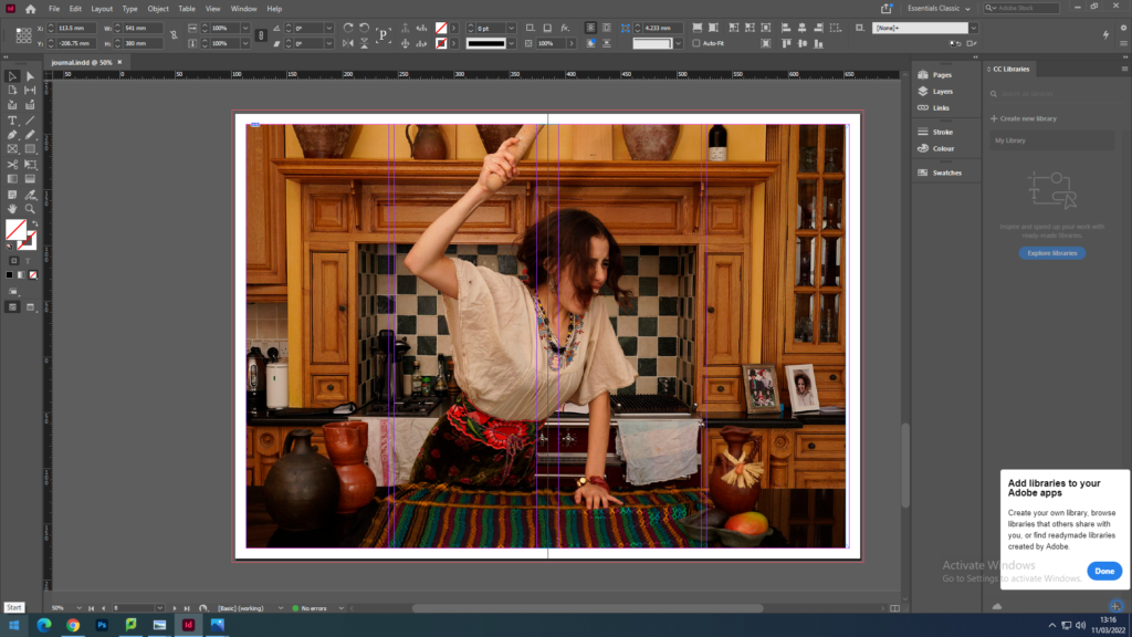
The images I have chosen to use our from my identity project nd Mexican stereotypes photos. I think both intresting photos and topics to discuss and I think they are the best work i have done. I had a lot of fun making them and is a topic that is important to me, is part of who I am.

we must design the following spreads:

  1. FULL-BLEED
  2. JUXTAPOSITION
  3. SEQUENCE
  4. MONTAGE

I decided to put my image full-bleed wich means selecting one image as a full-bleed spread because my image is an in landscape and I thought the image in full-bleed had a good balance on itself.

For created a montage on the left image and the other one is the same shoot but with none editing. To create a montage I choose to work in Photoshop for more creativity and the I import it into InDesign as one image.