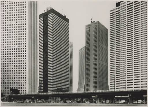
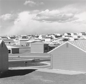
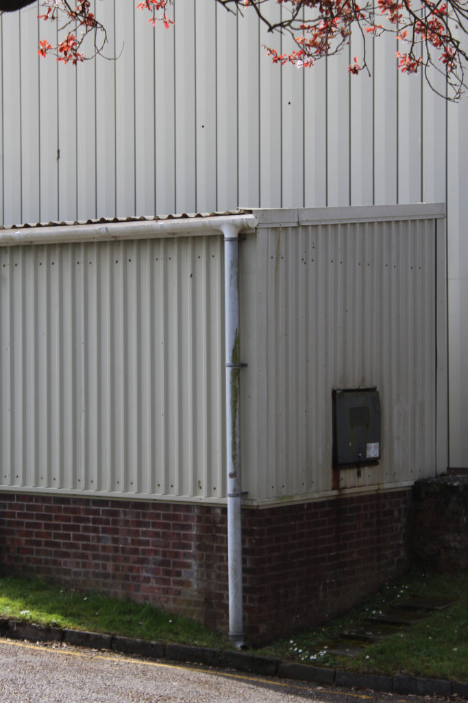
Tag Archives: new topographics

Lewis Baltz

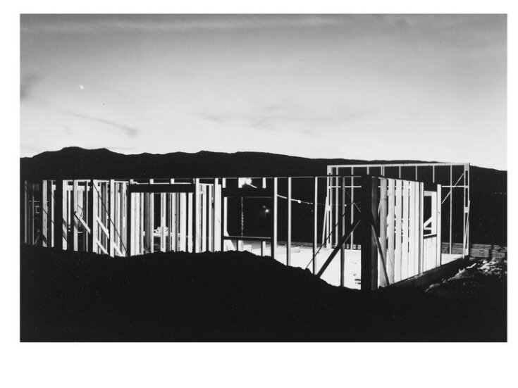
Lewis Baltz was an American Photographer Born 1945 who had an important role in the New Topographics movement of the 70s.

He was one of the first photographers to challenge the dominant methods of landscape photography at the time. He confronted the ideas of the “zero club” photographers at the time and along with 9 other photographers pioneered the New Topographics movement which turned photography’s perspective towards shooting urban man made features.

Lewis was trained to use photography as an art medium, to intersect with other aesthetic social questions rather than a practical form of diarizing and documentation.

Baltz grew up in one of the most rapidly urbanizing placing in the world – Southern California in the post war period. He watched the changes taking place he described it as a new world being born however not a very pleasant one.
It was a new homogenized American environment that was marching across the land and being exported. He noticed that no one wanted to confront this. This realization was the initiation of his interest in shooting the urban and igniting the New Topographic.

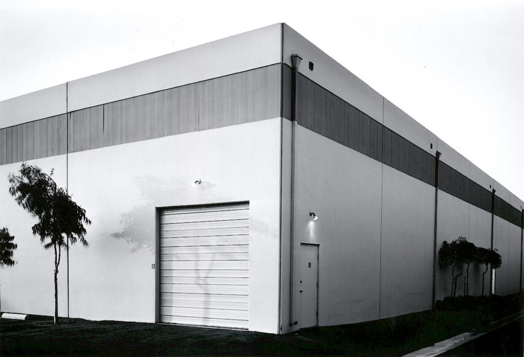
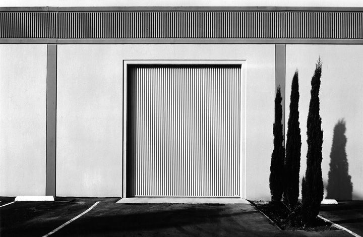
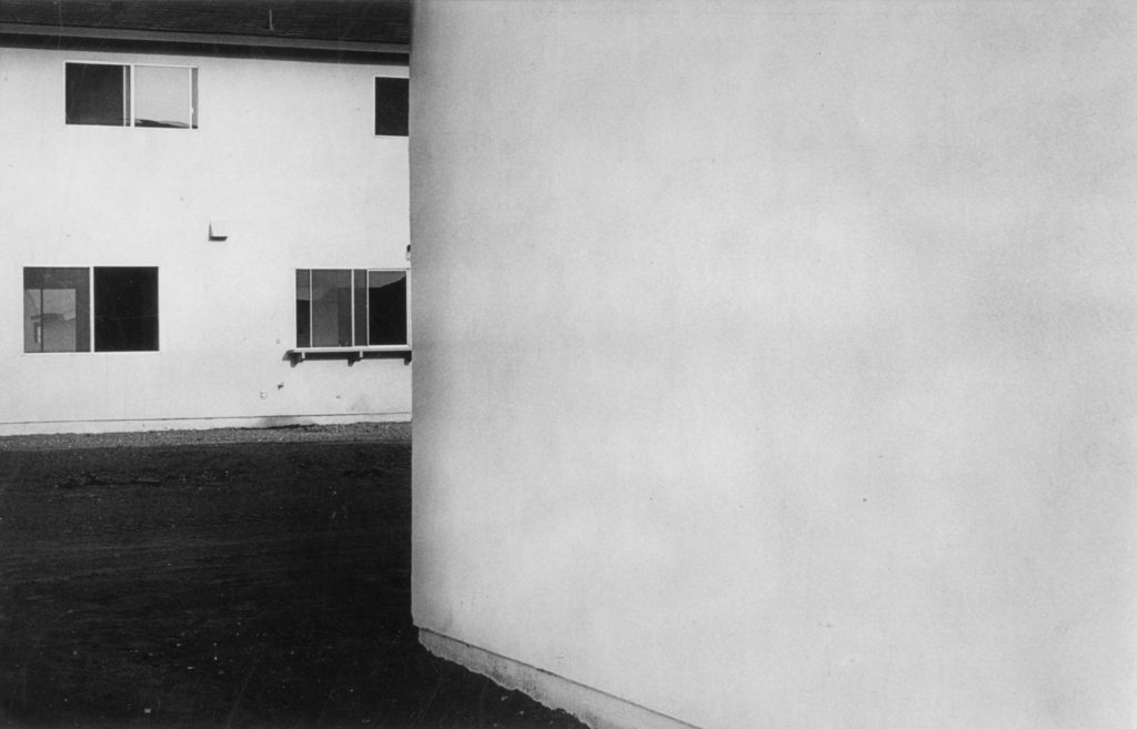
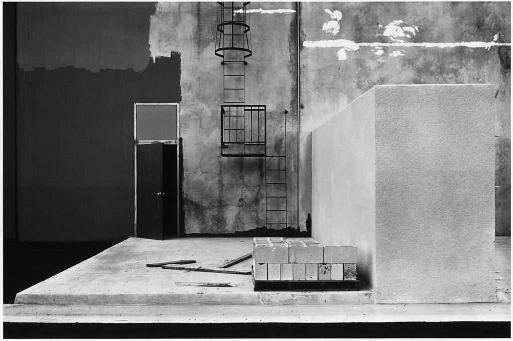
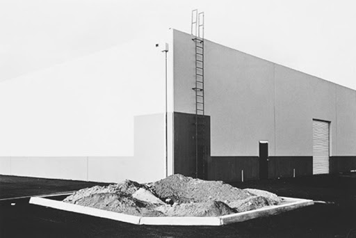
The above image was taken in 1974 and it is called “The New Industrial Parks” and it is part of a monographic series along side “The Tract Houses”, “Maryland”, “Nevada” and “Park City” wherein Baltz addresses cultural and philosophical questions about industrial zones and an artistic documentation of the boom in the urban landscape.

This piece relates well to Lewis’ motive to focusing on the familiar and creating an aesthetic out of the mundane. He does this by shooting a mundane building but making use of a deadpan viewpoint to create a somewhat symmetrical image with many leading lines. These leading lines create a grid like triad which splits the image vertically to comply with the rule of thirds.

The image has a shallow depth of field which gives it a 2D shape which can be an allusion to the lack of humanity which comes from urbanization.

The three slender trees on the right of the image are positioned strategically in line with the rule of thirds grid Lewis created and they add a sort of contrasting tension to the composition as they look like they are being overpowered by the colossal building behind them which consumes the whole frame. This could have been an attempt at pointing to the idea of mans impact on natural landscapes and how they are being overpowered.

The low saturation and more greyscale colours in the images convey the gloomy emotions of the industrialisation. The image also has a very wide tonal range.

The New Topographics

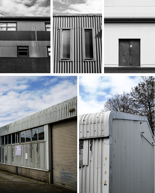
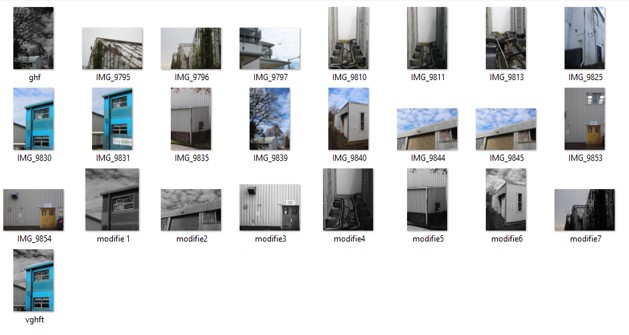
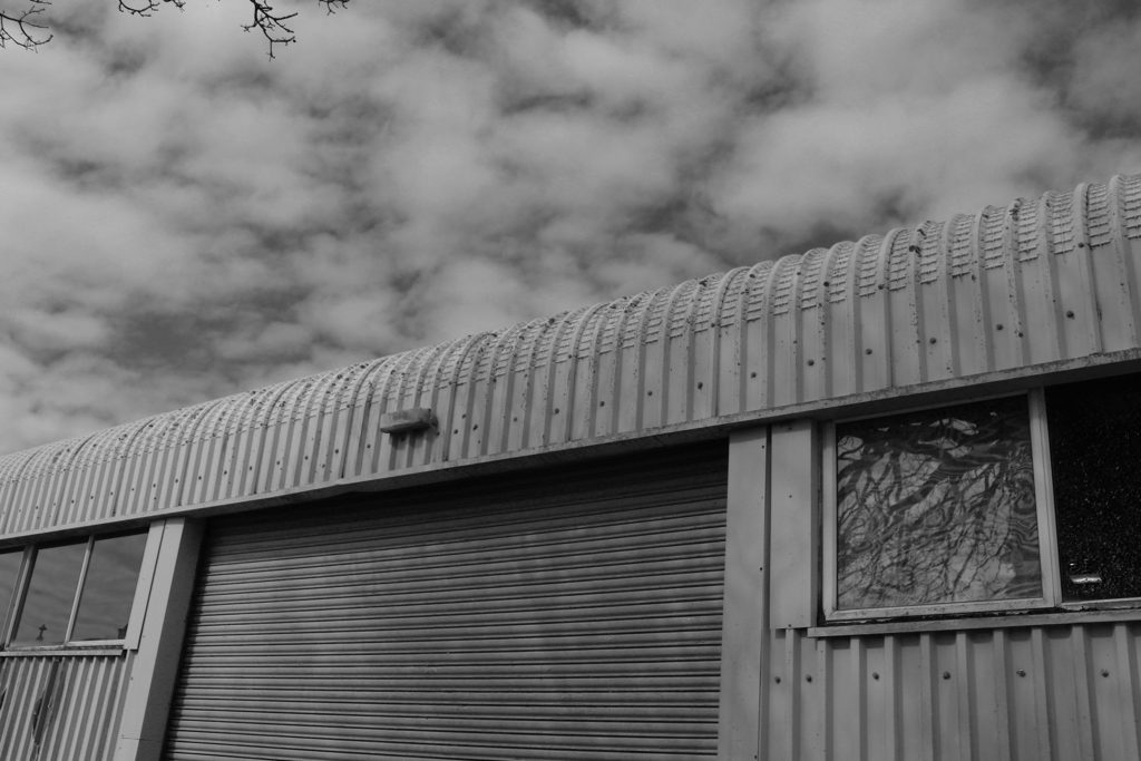
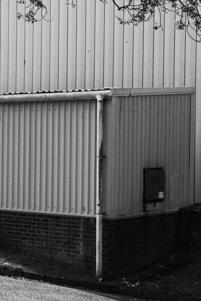
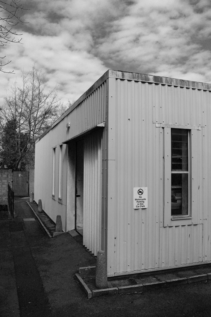
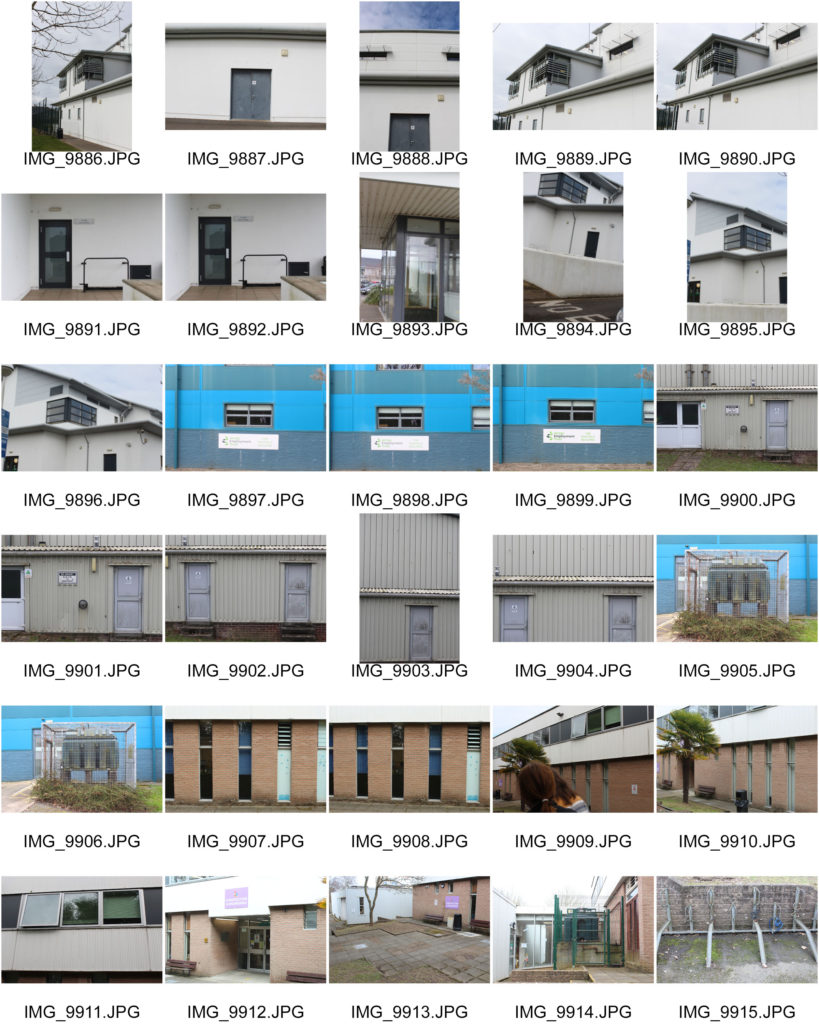
These were the photos that took to represent the “New Topographic’s” on the Highlands/Hautlieu photoshoot.

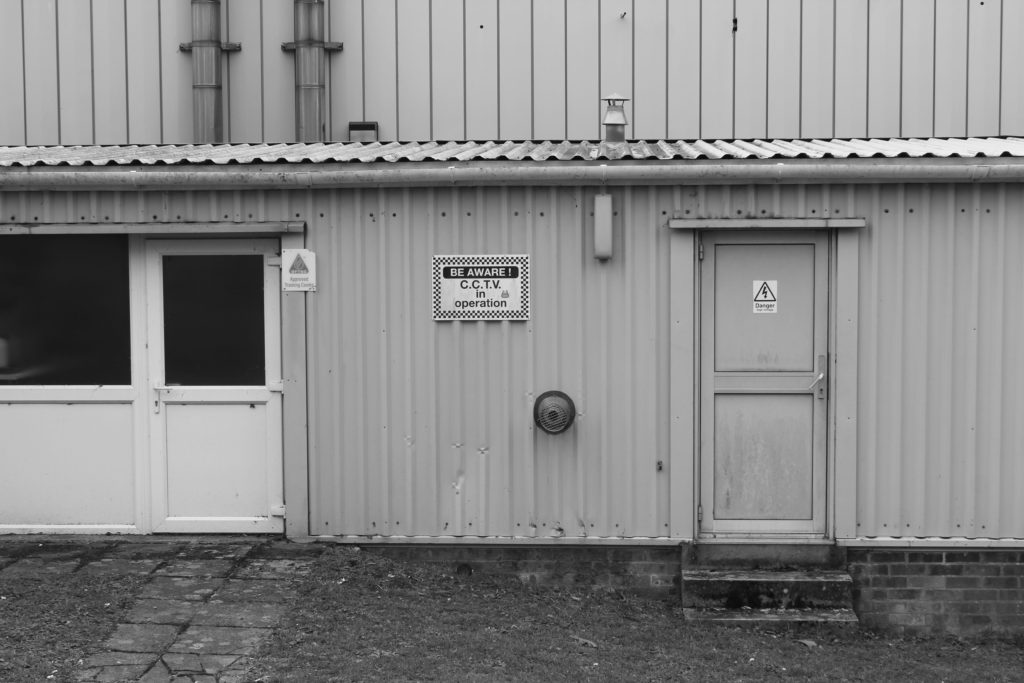
I mainly took straight-on photos of the buildings and sheds/warehouses around the area.

I used multiple exposure bracketing on some of them to get a more dramatic image.
I edited these images in Photoshop ACR / Camera-Raw.

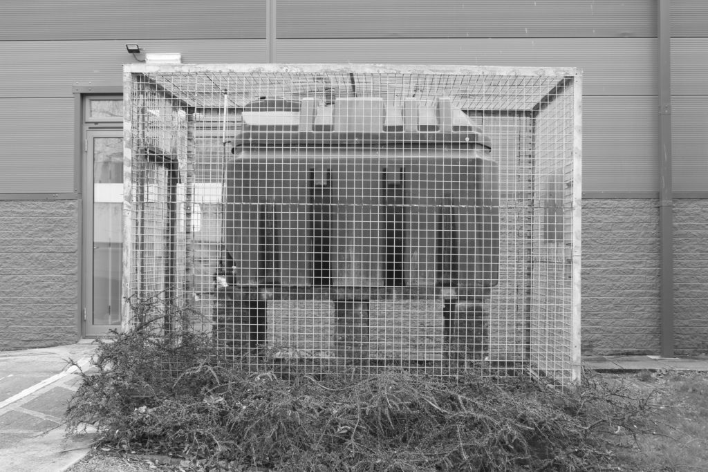
My favourite is the bottom left image, as there is a contrast between the bright blue sky and the dirty building. And lots of detail in the texture of the metal.

Introduction – New Topagraphics

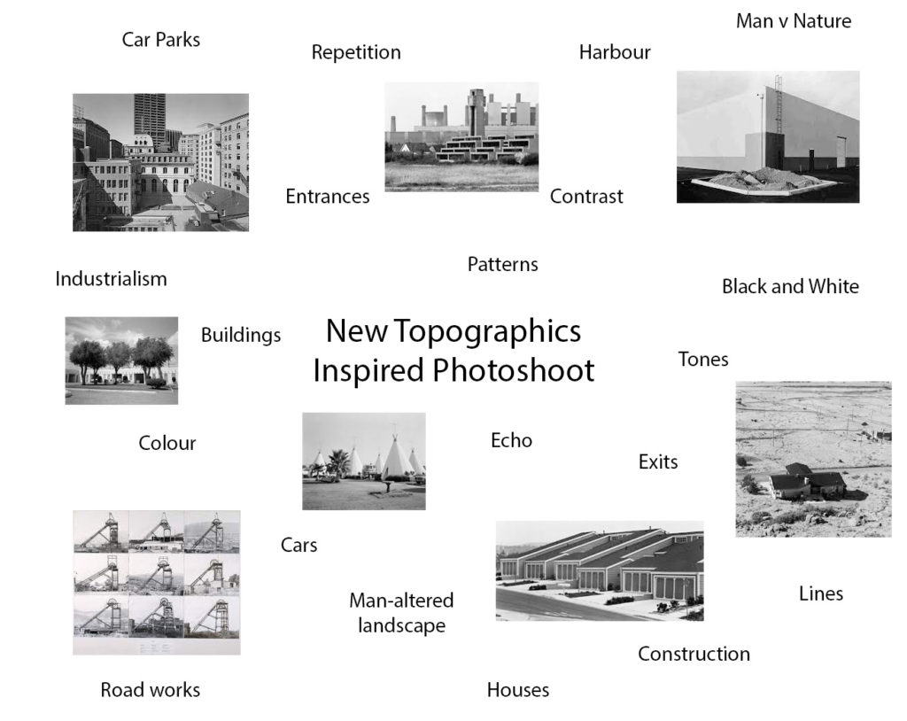
“New Topographic”, a term coined in 1975 by William Jenkins which referred to a photographic movement undertaken by a group of American photographers whose works had a similar look – mostly uniform, black and white urban landscapes.

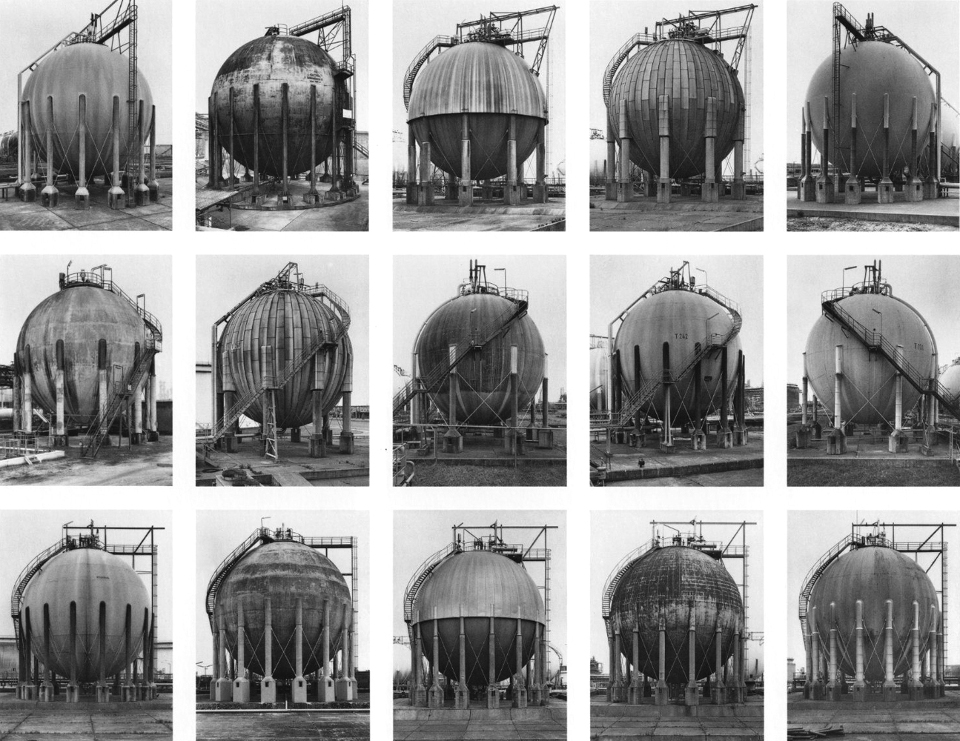
Some of the photographers associated with this movement where Robert Adams, Lewis Baltz, Nicholas Nixon and Bernd and Hiller Becher.

The movement captures mans impact, they photographed urban landscapes such as garages, parking lots, warehouses in a similar way to how early rural landscape photographers would shoot natural landscapes.

As environmentalism took hold of the public conscience in the 1970s landscape photography began to capture natural landscapes and human activity as a singular connected body.

New topographic pieces captured the essence and beauty of these depressing, mundane, industrialized landscapes. This aura created around the aesthetic of these images is an ironic juxtaposition to the unease the photographers felt about mans erosion of the natural environment. This was represented in their work from the emotional disparity they created in their pieces with a lack of human presence, flat contrast, lowkey tones, centred framing and unassuming depth and lighting.

On the other hand this divide they portrayed between man and nature was done with aesthetic precession. The Artists that made up the new topographic noticed how there seemed to be a sense of obscenity around photographing these urban landscapes. There was a sort of fear man had around looking at its own creations. They wanted to highlight this by photographing the urban and providing it with an aesthetic… The photographers created beauty in these images by shooting from a unique viewpoint. They shot with a deadpan aesthetic in mind and looked for sharp angles or structural elements.

THE NEW TOPOGRAPHICS-shoot 1

Plan

What- I’m gonna create photos of the new topographics for that I will take pictures of buildings and search for geometric figures

When- this shoot will be taken in the day during the photography class

How- exposure – 80 – IOS – 800

Where – around Hautlieu and highlands.

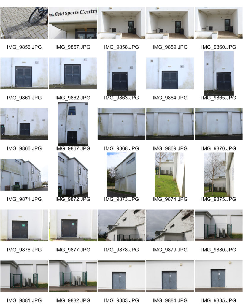
Contact sheets :

Pictures selected :

Edited:

final selection:


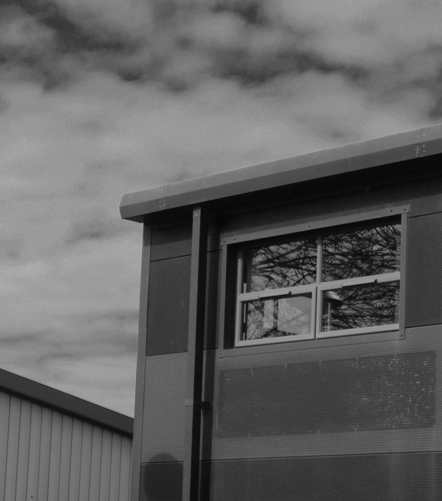
I chose this photo for the little details that can be found like we can see tree branches above the buildings and the reflection of that same tree on the windows of this building which recalls nature if you look close into the building through the window you can see a light bulb which is a human invention so in this photo we can see that nature (tree) is surrounded by human invention (the building). I therefore chose this images because it is the message that I wanted to convey with my image and then there are geometric figures (square and rectangle) like the windows, building, the front door … and we find the geometric figures in the images of the photographs of New Topographics Lewis Baltz or Bernd and Hilla Becher,

Gabriele Basilico Inspired Photoshoot (New Topographics)

New Topographics Moodboard

Photoshoot Plan

Gabriele Basilico Inspired Photoshoot

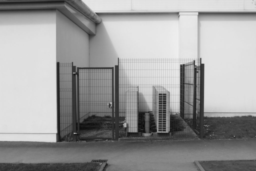
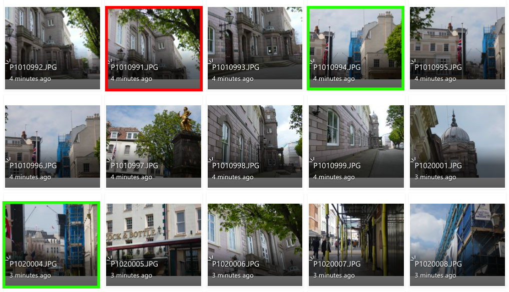
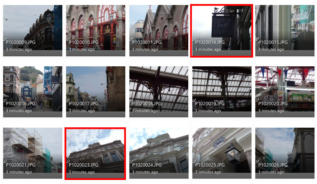
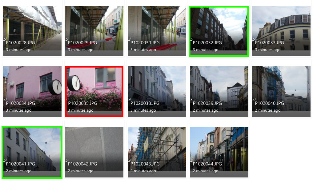
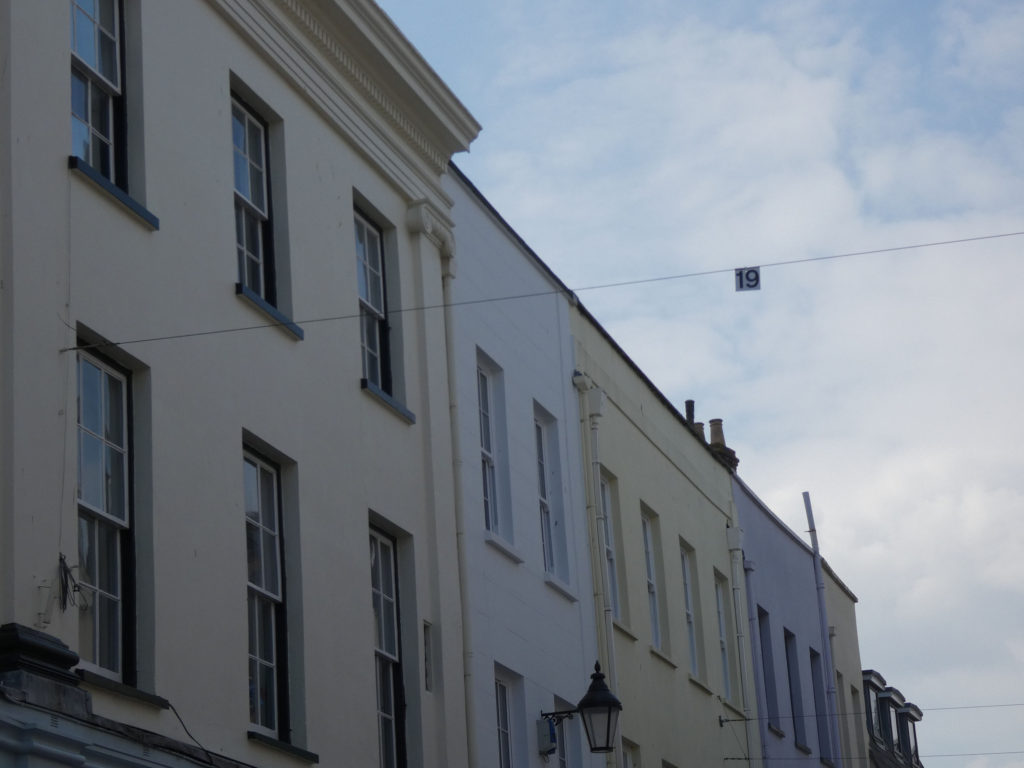
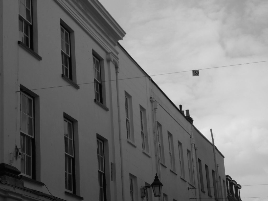
For this photoshoot I decided to use town as the setting as Gabriele Basilico shows representation of both repetitive architecture as well as unfinished industrialisation. I tried to capture both of these aspects in this photoshoot, therefore I photographed contrasting modern and more vintage buildings.

The images highlighted in red are my less successful images as they don’t clearly imitate Basilico’s work or the are taken off-centre and create a slanted affect which juxtaposes Basilico’s crisp, exact photography.

I feel like the images highlighted in green are my most successful images as they have a closer representation to Gabriele Basilico’s work. Most of these photos relate more to Basilico’s work focusing on unfinished industrialisation, however repetitive architecture can also be seen.

Photoshop Development

Original Image
Edited Image
Original Image
Edited Image
Original Image
Edited Image

To edit these images, I used the black and white filter on photoshop in order to achieve the vintage, monochrome tones that Gabriele Basilico is known for. I then altered the brightness and contrast to make the juxtaposition between the light and dark tones more intense. For the last image I used the crop and straighten tool so the image was more centred.

Comparison between mine and Gabriele Basilico’s work

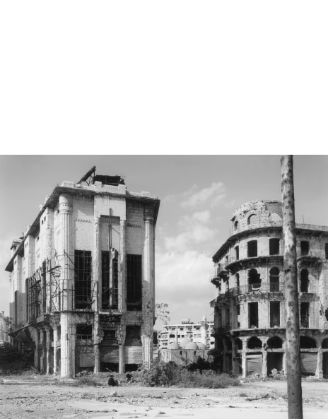
Gabriele Basilico’s work
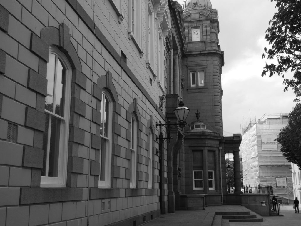
My work

There is both similarities and differences between Basilico’s work and my own work, the most obvious being the use of the monochromatic filter on both images. There are also similarities in the sense that the image captures new topographics in a more vintage sense, as the buildings appear older and more classic. However they are different in the sense that Basilico’s image is taken on a much larger scale, as the buildings are more iconic and noticeably larger. Overall, I feel like these images compared share a few similarities however if I was to recreate Basilico’s work again I would use his more modern approach of finding repetition and echo within industrialised areas.

Gabriele Basilico Study (New Topographics)

Gabriele Basilico

Gabriele Basilico, born in 1944, was an Italian photographer who contributed to the New Topographics movement with his contrasting industrial landscape photographs. Basilico orginally studied architecture before beginning his career in photography, where he started of taking images of traditional landscapes before transitioning to industrial landscapes which was influenced by his previous studies. Gabriele Basilico first became recognised for his photographic study on the buildings of Milan in 1982, with his series “Ritratti di Fabbriche, Sugarco”. This recognition led Basilico to be commisioned by the French Government to document the transformation of the Transalpine landscape, as well as helping to document the effects of war on the Lebanese capital of Beirut. The majority of Basilico’s work was captured using a traditional viewfinder camera with iconic black and white film, before he died in 2013.

Examples of Gabriele Basilico’s work

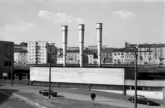
‘Milano, Quartiere Isola’ – Gabriele Basilico (1978)
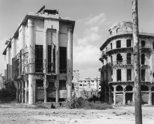
Beirut by Gabriele Basilico on artnet
Beirut, 1991′ – Gabriele Basilico (1991)
‘Milano 2012’ – Gabriele Basilico (2012)

Analysis of Gabriele Basilico’s work

‘Ritratti di fabbriche di Milano’ – Gabriele Basilico (1978)

This photograph titled ‘Ritratti di fabbriche di Milano’, taken in 1978, translates to ‘Milan Portraits of Factories’, removing any ambiguity to the context of the image. At first glace, there is a lack of a colour palette, however there is an extreme contrast in tones. There is a rather simple, repetitive composition to the photograph.

The lighting in this image seems to be natural yet harsh. The lighting is being directed from the top right of the image, meaning shadows are casted from the same direction. I would imply that this photograph was taken later in the afternoon, as the sun is beginning to set. The brightest sections of the image can be seen in the almost-blinding white painted houses, which are contrasted against the darker tones, as well as the shadows in the image.

There is a strong sense of line in this photograph, due to the geometric shaping of the houses. The lines created by the draining pipes in between each house act as leading lines that direct the viewers eyes upwards, and towards the horizontal, jagged lines created by the roofing.

There is a clear use of repetition within this image, found in the repeated structure of the houses. The use of line is also repeated in this image, although the lines differ in size. However, there is no representation of echo or reflection in this photograph.

The majority of the represented shapes in the photo are geometric, for example, the repetition of lines and squares in the houses. On the other hand, there is little representation of organic shapes such as the tree branches in the middle third of the image. This creates a juxtaposition between organic and artificial shapes.

It is difficult to tell the depth of field within this image as the majority of the image is positive space, with the background being negative space there is no way of comparing the focal lens of the photograph. Nearly all of the foreground is taken up by the houses, which creates positive space.

There is contrasting textures within this image, as the houses provide a smoother texture in comparison to the leaves and tree branches that create a more jagged texture.

There is a range of tones that contradict each within the photograph, due to the use of shadows and highlights. The darkest area of the image can be seen in both the lining of the houses and the shadow that is casted in the bottom-right corner. This is contrasted with the lighter areas of the image, especially the white houses. Overall, I think the the image’s tones are rather balanced and the image doesn’t tend towards darkness or lightness.

There is a lack of colour in this image, as Gabriele Basilico’s iconic images are taken using black and white film. I believe the lack of a colour palette allows for the tones to be accentuated within the image, and create a more intense contrast between highlights and shadows. The lack of colour also allows for other aspects to be exaggerated, such as the use of line or repetition.

The composition of the image is rather simple, as repetition is used to a larger scale and the image is taken in black and white. The positive space that fills the majority of the image isn’t complexly formed and the other sections of the image are purely empty space. However the photograph does not follow the use of thirds as the image is not separated into three clear sections and the there is multiple focal points.

the new topographics

“New Topographics: Photographs of a Man-Altered Landscape” was an exhibition that epitomised a key moment in American landscape photography. Many of the photographers associated with new topographics including Robert Adams, Lewis Baltz, Nicholas Nixon and Bernd and Hiller Becher, were inspired by man-made subjects. Their aim was to find the beauty in the plain and ‘ugly’ streets of America. It was a reaction to the conflict which took place over the late twentieth century, which saw outrage that natural landscapes were being replaced with large, industrial buildings.

FRANK GOHLKE

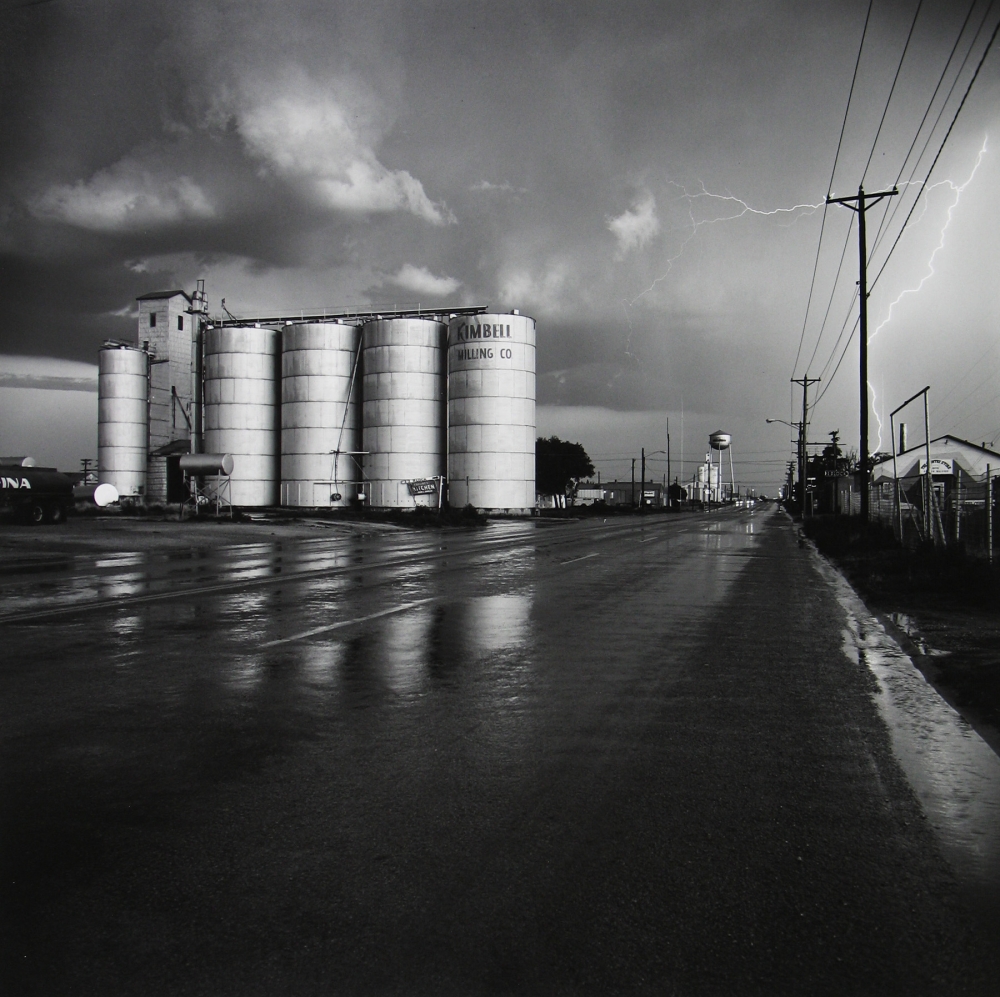
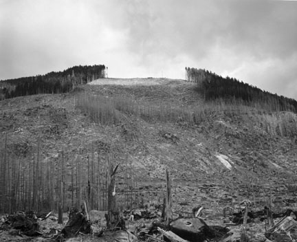
Frank Gohlke ( 1942 – ) is an American landscape photographer. Gohlke was one of ten photographers selected to be part of “New Topographics: Photographs of a Man-Altered Landscape”, the landmark 1975 exhibition at the International Museum of Photography at George Eastman House. During a career spanning nearly five decades, Gohlke has photographed grain elevators in the American midwest; the aftermath of a 1979 tornado in his hometown of Wichita Falls, Texas; changes in the land around Mount St. Helens during the decade following its 1980 eruption; agriculture in central France; and the wild apple forests of Kazakhstan. Gohlke′s photographs have been exhibited at the Museum of Modern Art; the Art Institute of Chicago; the Cleveland Museum of Art; the Minneapolis Institute of Arts; the Amon Carter Museum; and the Museum of Fine Arts, Houston.

IMAGE ANALYSIS

Grain elevator under repair – Minneapolis, Minnesota, 1974

This photograph by Gohlke is entitled ‘Grain elevator under repair‘, which avoids any confusion about what the photograph is of. The lighting used in this image is natural and appears to be coming from the left hand side due to the way the various shadows are falling across the image. The brightest parts of the photograph are the white portions of the cars, which directly contrasts with the dark tones of the road and the shadows. There is a lot of repetition present in this photograph, which can be seen in the vertical lines in the background of the image, as well as the horizontal lines of the car tops, the workmen in the background and the pavement and road. The contrast between both the vertical and horizontal lines creates an interesting composition for the viewer, with each one seemingly juxtaposing each other. The shapes in this photograph are mostly geometric, for example the cement slabs on the pavement split up by straight lines and the large cylinder – like shapes in the background of the image. There is hardly any negative space in this photograph, as the whole frame is taken up by either the building in the background or the cars in the foreground. The smooth and slick texture of the cars directly contrasts with the rough and harsh texture of the pavement as well as the building in the background. Gohlke has captured this image in black and white which allows for certain features of the image, such as the contrasting tones and small details like the cracks in the building to be accentuated and exaggerated.

Edward Burtynsky Study (New Topographics)

Edward Burtynsky

images.squarespace-cdn.com/content/v1/5915c70e5...

Edward Burtynsky, born in 1955, is a Canadian photographer widely recognised for his largely formatted industrial photography. Burtynsky’s work depicts natural locations of which are being vastly invaded by human industrialisation. His work is often compared to a unique depiction of the ‘sublime’ due to the extreme format of the over-head images. He formally studied graphic arts and photography between the 1970’s and 1980’s, and achieved a diploma in graphic arts and a BAA in photographic arts. Edward Burtynsky won the TED prize for Innovation and Global Thinking in 2005 and received the Governor General’s award in Visual and Media Arts for his collection of work so far.

Examples of Edward Burtynsky’s work

  Tetrapods #1, Dongying, China, 2016
‘Tetrapods #1, Dongying, China’ – Edward Burtynsky (2016)
  Makoko #1, Lagos, Nigeria, 2016
‘Makoko #1, Lagos, Nigeria’ – Edward Burtynsky (2016)
  Greenhouses #2, El Ejido, Southern Spain, 2010
‘Greenhouses #2, El Ejido, Southern Spain’ – Edward Burtynsky (2010)

Analysis of Edward Burtynsky’s work

  Saw Mills #3, Log Booms, Lagos, Nigeria, 2016
Saw Mills #3, Log Booms, Lagos, Nigeria‘ – Edward Burtynsky (2016)

This image produced by Edward Burtynsky in 2016 is titled: ‘Saw Mills #3, Log Booms, Lagos, Nigeria’. The title of the image removed any ambiguity to the viewer as the title describes exactly what is in the image. At first glance there is a strong focus on repetition and the use of lines, also the tones in the image appear very earthy and almost dull.

Although the lighter sections are very subtle in this image by Edward Burtynsky, they are still visible when you look closer into the image. The lighter areas can be seen in patches surrounding the sawmills, especially in the bottom third of the image. The lighting of the image seems natural as it subtly produces highlights and shadows. The shadows can be seen in the same positions as the shadows, as they weave between the sawmills, producing cloud-like areas. It is difficult to tell the time of day that the photograph has been taken, although the shadows are casted from the bottom right corner of the image, suggesting the light is also coming from this direction.

There is a strong emphasis on line in this photograph. these thin, vertical lines subvert into different directions, but overall lead the viewers eyes from the bottom to the top of the image. There is no particular leading lines in this photograph, though the multiple lines lead the viewers eyes in the same direction, in a curved motion.

Although there is no representation of echo or reflection within this image, there is a strong sense of repetition through the use of line. These thin lines curve in a snake-like motion from the bottom third of the image to the top third.

There is a contrasting combination of geometric and organic shapes in this photograph. This can be seen in the straight-edged lines being formed in a way that they appear as an organic, curved line.

This photograph has a shallow depth of field as the lines in the bottom third are in focus compared to the lines in the top third. The image consists mainly of positive space, although there is representation of negative space throughout the whole photo, which is seen in the murky waters between the sawmills.

There is not a strong focus on texture in this photograph, but the textures represented could be said to be contrasting as the water has a smooth, sleek surface when compared to the sharp-edged wood planks.

The tones in this photograph do not have an extensive range, however darker and lighter tones can be seen, for example shadows are found in between the wooden planks and sections of the water are slightly lighter, especially in the bottom third of the photograph,

The colour palette of the photograph is made up of complimentary earthy colours. These colours are subdued and subtle, and consist of greens and browns. Lighter, white colours can be seen up close within the wooden lines. If the image was taken in black and white film, the tones of the image would be accentuated, however I feel like the image would be more ominous to the viewer, as the colour of the wood would be removed.

The rule of thirds is somewhat used in the photo, as the bottom third of the image is in focus but the depth begins to fade as the viewers eyes travel up the image. There is no shape formations that can be superimposed onto this image as the composition is organic. Overall I would say the photograph is balanced as the positive and negative space are rather evenly distributed.

Joel Sternfeld Study (New Topographics)

Joel Sternfeld

Kansas City, Kansas, May, 1983
‘Kansas City, Kansas, May’ – Joel Sternfeld (1983)

Born in New York in 1944, Joel Sternfeld is known for his large-format colour photographs of American towns and cities. Sternfeld received his BA in visual art from Dartmouth College in 1965. He then began producing colour photographs in his early career in the 1970’s. Joel Sternfeld’s work documents people and places with a vibrant sense of colour, which can be seen in his series ‘American Prospects’, created in 1987. Sternfeld has had work held in exhibitions such as the J.Paul Getty Museum in Los Angeles, The Museum of Modern Art in New York, the Art Institute of Chicago, and the Fotomuseum Winterthur in Switzerland and many others. Joel Sternfeld currently lives in New York where he has taught at the Sarah Lawrence College since 1985.

Examples of Joel Sternfeld’s work

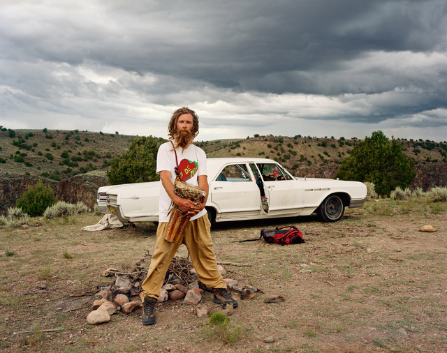
Joel Sternfeld | A Man at His Campsite, El Prado, New Mexico, August 1999  (1999) | Available for Sale | Artsy
‘A man at his campsite, El Prado, New Mexico’ – Joel Sternfeld (1999)
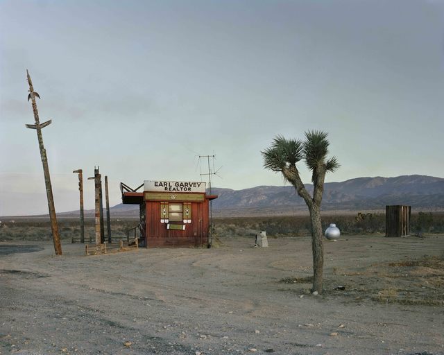
Joel Sternfeld | Earl Garvey Realtor, The Mojave Desert, California, July  1979 (1979) | Available for Sale | Artsy
‘Earl Garvey Realtor, The Mojave Desert, California’ – Joel Sternfeld (1979)
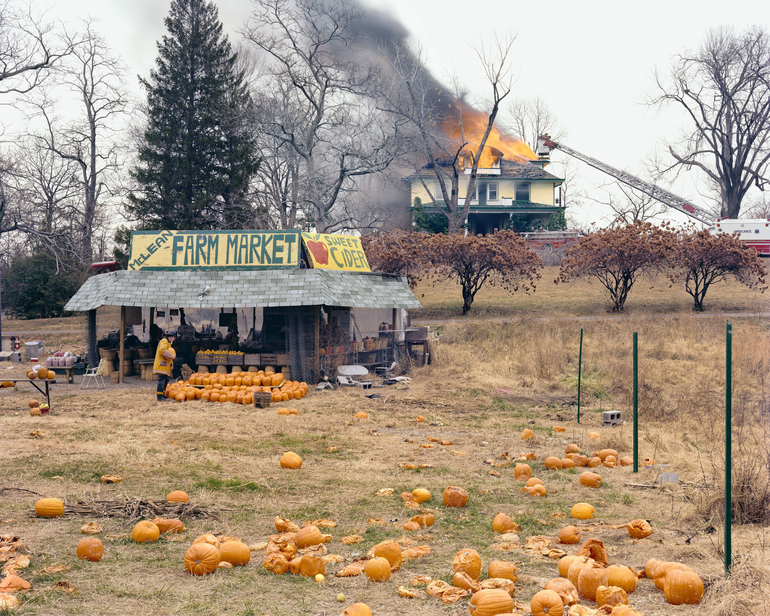
American Prospects
‘McLean, Virginia, December’ – Joel Sternfeld (1978)

Analysis of Joel Sternfeld

American Prospects
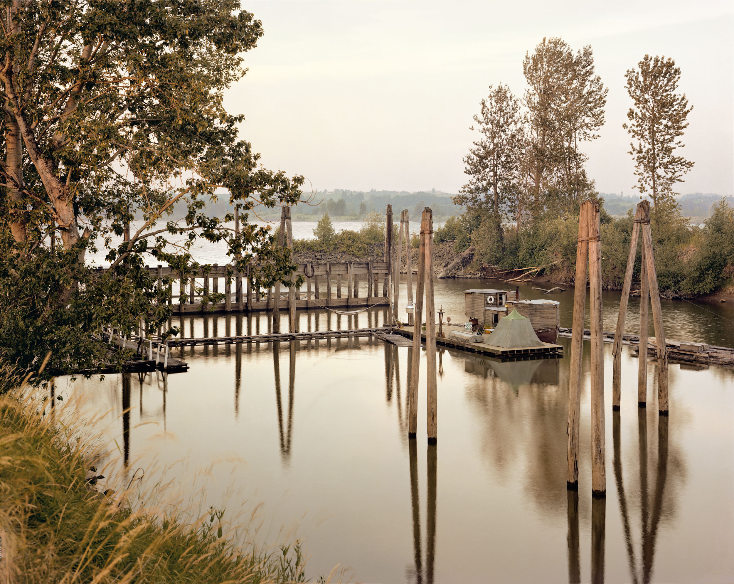
‘Sauvies Island, Oregon, June’ – Joel Sternfeld (1979)

This image taken by Joel Sternfeld, titled ‘Sauvies Island, Oregon, June’, depicts what looks to be an isolated campsite floating on the water. At first glance, the colour palette of the photograph is very earthy and muted, with a rather complex composition including a dramatic use of echo and reflection.

The natural, harsh sunlight produces harsh shadows and highlights within the image. I would suggest that this image was taken around midday as the shadows produced by the poles face directly downwards, implying that the sunlight is coming from straight above.

There is a strong use of line within this image, this is shown through both the poles and their reflections. These create the focal point as the earthy-toned wood is juxtaposed against the sombre, black poles. These thick lines direct the viewers eyes upwards, as the poles start from the bottom of the water.

There is a strong sense of echo within this image, this is shown through the poles reflecting in the water. This use of echo could metaphorically symbolise a darker planet with the increased industrialisation, as the reflection almost seems like an alternate universe. The multiple uses of lines can also be shown as a form of repetition, although the repetition isn’t constant.

There is a contrast in shapes within this photograph, as the organic shapes of the leaves and masses of trees are contrasted against the straight-edged lines and the geometrically formed house. There is also a repetition of cross shapes which can be seen in the bridge, this further proves the contradiction between natural and geometric shapes.

There is a slightly shallow depth of field in this image as the background begins to fade in the distance of the photograph. There is two representations of negative, empty space within the photo. This can be seen in both the top and bottom third of the image. This even distribution of empty space produces the illusion of a balanced composition.

The image has a multitude of contrasting textures. For example, the sharp, string-like grass is juxtaposed against the smooth, fluid waters. The water is also contradicted with the straight poles that cut into the water in a knife-like manner.

The darkest areas of the photograph are mainly found in the reflections of the waters, however the dull trees also create a strong contrast between tones against the delicate, light sky.

The colour palette of this image is very earthy- toned and subdued. The dominant colours within this photograph would be green and brown, however there is representation of blues and whites. I believe if the image were in black and white, there would be no distraction from the colours in the image, therefore accentuating the use of reflection and echo. However the use of colour in this image adds a vintage tone to the image, especially with the muted tones.

There is a more complex use of rule of thirds in this image, as the the almost-floating house is located in the middle of the image, with the reflected poles leading the viewers eyes down to the bottom third of the image. The image isn’t particularly balanced as the majority of the positive space can be seen in the bottom and middle third, whereas the top third mainly consists of empty space.