Fay Godwin, born in 1931 and died in 2005, was a British photographer who was recognised for her intense landscapes, specifically her black and white work. Godwin began her photography career with portraits of well-known writers such as Ted Hughes and Clive James, however she broadened her love for photography when she found her passion for walking and the environment. Her early landscape work was created with the intent of bringing to light the ecological crisis within the late 1970’s to the early 1980’s, where she protested the English countryside being privatised. Later, in the 1990’s, Godwin was offered a Fellowship at the National Museum of Photography, Film and Television in Bradford, where she was pushed further with in the direction of colour and urban photography.
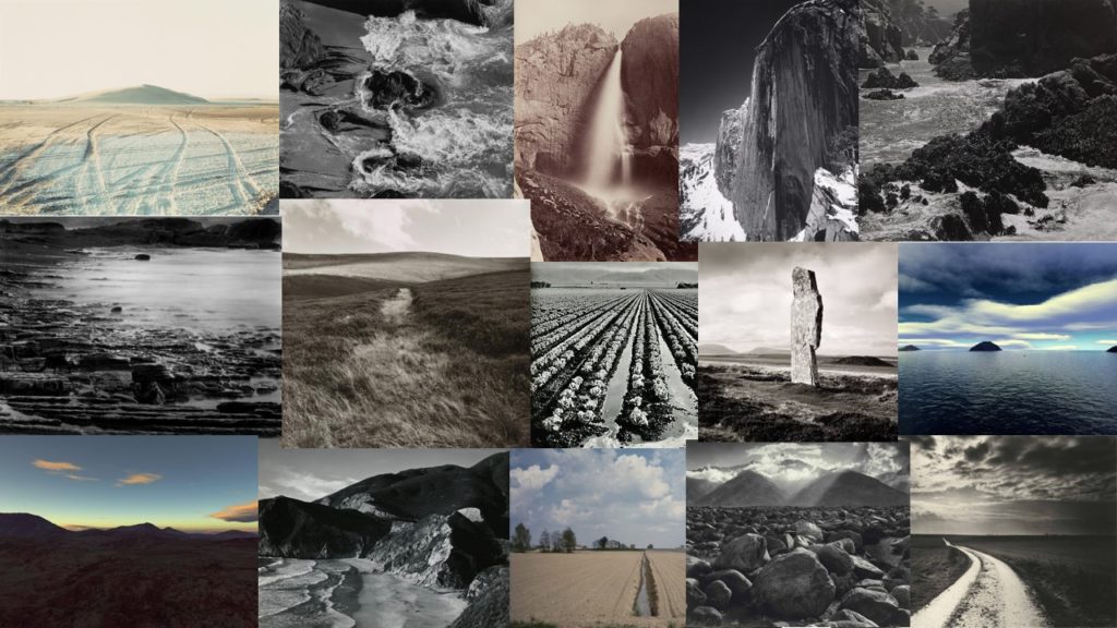
Examples of Fay Godwin’s work


Analysis of Fay Godwin’s work

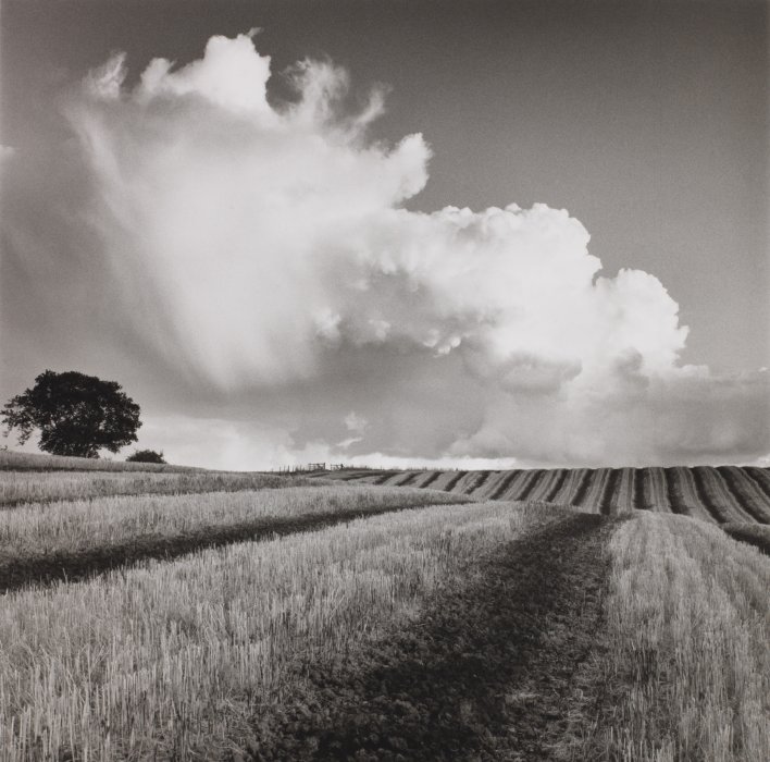
This image by Fay Godwin, titled “Path and Reservoir above Lumbutts” depicts exactly what it states within the title. At first glance, fields, ponds and moody clouds can be seen, complete with a winding pathway. This image was taken in the late 1970’s, at the prime of Godwin’s project to help preserve British public land from being privatised. This could prove Godwin trying to display both the beauty and the threat that the natural world holds over us. This is not a realistic depiction of nature as Godwin takes tonal values to the extreme to create an intense juxtaposition.
The lighting in this image is gloomy, overcast natural lighting. The lighting suggests the image may have been taken in the late afternoon, perhaps in autumn or winter. The lighting is natural yet harsh, meaning distinct shadows and highlights are created. The most well-lit sections of the image can be seen in the light reflected onto the reservoir water and the illuminated sky. The light is directed further towards the right of the image, as the majority of the left side of the image is in darkness.
There is representation of a leading line in this image, in the form of the path that winds into the distance of the image. This thick, curved line directs the viewers eyes into the left of the image. This provides a forwards movement to the photograph, although when the path comes to an end, the viewers eyes are directed to the other sections of the image. There is also representation of lines within the fields that are separated with subtle, thin lines. The line provided by the horizon also acts as a leading line that directs the viewers eyes from one side of the image to the other.
There is a subtle representation of repetition in this image, which can be seen in the repeated squares of fields in the background of the image, as well as repetition of line within the leading line and also the slightly indistinct lines separating the fields, however these lines do not create any sense of pattern or rhythm.
The majority of the shapes in this photograph are curved and organic, for example the clouds are very irregular with soft edges, also the leading line of the image is curved. The only visual geometric shapes are the square-shaped fields in the background.
There is a shallow depth of field in this image as the foreground of the image is in focus and the background is captured with a slight blur. The shadows produced by the clouds also create the sense of a shallow depth of field as the darkened areas are indistinct and indistinguishable. The entirety of the photograph is filled with positive space.
The aesthetic of this image has a rough texture due to the masses of sharp-cut grass. However this is juxtaposed with the exceptions of the soft, light clouds as well as the calm waters.
The range of tones in this image range from dark to light. The darkest areas of the photograph can be seen in the background towards the left, and also the clouds. These areas are contrasted with the lighter areas of the photo, for example the glistening water and the gleaming sky. Overall, the image tends towards darkness, especially in the top third with the near-black clouds.
There is a lack of colour in this photograph. I think this is because Godwin wanted to show the power and beauty of nature in it’s purest form, and the extreme contrasting tones adds a sense of intimidation to the aesthetics of the image. Metaphorically speaking, as Fay Godwin’s message in her work is to preserve the natural world, the use of the monochromatic filters could signify the death and destruction of the world, as the image provides a gloomy, depressing atmosphere.
There is a complex composition to this image, as it follows the rule if thirds in some sense, yet also follows it’s own unique composition. The rule of thirds can be seen to be used horizontally, as the image almost separates into layers of contrasting dark and light. However, there is no use of the rule of thirds vertically as the focal points, being the footpath and the reflected water are not located in the middle third. I think the composition is fairly balanced as the light and dark tones are rather evenly spread throughout the image.


