Tag Archives: landscape photography

Edward Burtynsky Study (New Topographics)

Edward Burtynsky

images.squarespace-cdn.com/content/v1/5915c70e5...

Edward Burtynsky, born in 1955, is a Canadian photographer widely recognised for his largely formatted industrial photography. Burtynsky’s work depicts natural locations of which are being vastly invaded by human industrialisation. His work is often compared to a unique depiction of the ‘sublime’ due to the extreme format of the over-head images. He formally studied graphic arts and photography between the 1970’s and 1980’s, and achieved a diploma in graphic arts and a BAA in photographic arts. Edward Burtynsky won the TED prize for Innovation and Global Thinking in 2005 and received the Governor General’s award in Visual and Media Arts for his collection of work so far.

Examples of Edward Burtynsky’s work

  Tetrapods #1, Dongying, China, 2016
‘Tetrapods #1, Dongying, China’ – Edward Burtynsky (2016)
  Makoko #1, Lagos, Nigeria, 2016
‘Makoko #1, Lagos, Nigeria’ – Edward Burtynsky (2016)
  Greenhouses #2, El Ejido, Southern Spain, 2010
‘Greenhouses #2, El Ejido, Southern Spain’ – Edward Burtynsky (2010)

Analysis of Edward Burtynsky’s work

  Saw Mills #3, Log Booms, Lagos, Nigeria, 2016
Saw Mills #3, Log Booms, Lagos, Nigeria‘ – Edward Burtynsky (2016)

This image produced by Edward Burtynsky in 2016 is titled: ‘Saw Mills #3, Log Booms, Lagos, Nigeria’. The title of the image removed any ambiguity to the viewer as the title describes exactly what is in the image. At first glance there is a strong focus on repetition and the use of lines, also the tones in the image appear very earthy and almost dull.

Although the lighter sections are very subtle in this image by Edward Burtynsky, they are still visible when you look closer into the image. The lighter areas can be seen in patches surrounding the sawmills, especially in the bottom third of the image. The lighting of the image seems natural as it subtly produces highlights and shadows. The shadows can be seen in the same positions as the shadows, as they weave between the sawmills, producing cloud-like areas. It is difficult to tell the time of day that the photograph has been taken, although the shadows are casted from the bottom right corner of the image, suggesting the light is also coming from this direction.

There is a strong emphasis on line in this photograph. these thin, vertical lines subvert into different directions, but overall lead the viewers eyes from the bottom to the top of the image. There is no particular leading lines in this photograph, though the multiple lines lead the viewers eyes in the same direction, in a curved motion.

Although there is no representation of echo or reflection within this image, there is a strong sense of repetition through the use of line. These thin lines curve in a snake-like motion from the bottom third of the image to the top third.

There is a contrasting combination of geometric and organic shapes in this photograph. This can be seen in the straight-edged lines being formed in a way that they appear as an organic, curved line.

This photograph has a shallow depth of field as the lines in the bottom third are in focus compared to the lines in the top third. The image consists mainly of positive space, although there is representation of negative space throughout the whole photo, which is seen in the murky waters between the sawmills.

There is not a strong focus on texture in this photograph, but the textures represented could be said to be contrasting as the water has a smooth, sleek surface when compared to the sharp-edged wood planks.

The tones in this photograph do not have an extensive range, however darker and lighter tones can be seen, for example shadows are found in between the wooden planks and sections of the water are slightly lighter, especially in the bottom third of the photograph,

The colour palette of the photograph is made up of complimentary earthy colours. These colours are subdued and subtle, and consist of greens and browns. Lighter, white colours can be seen up close within the wooden lines. If the image was taken in black and white film, the tones of the image would be accentuated, however I feel like the image would be more ominous to the viewer, as the colour of the wood would be removed.

The rule of thirds is somewhat used in the photo, as the bottom third of the image is in focus but the depth begins to fade as the viewers eyes travel up the image. There is no shape formations that can be superimposed onto this image as the composition is organic. Overall I would say the photograph is balanced as the positive and negative space are rather evenly distributed.

Romanticism

Romanticism was an art movement that originated in the late 18th century. It relates to the glorification of emotion in art. It was a reaction to the age of enlightenment and modernity.

Romanticism in landscape photography deals more with emphasising this emotion in the sublime and drawing out and exaggerating natural elements.

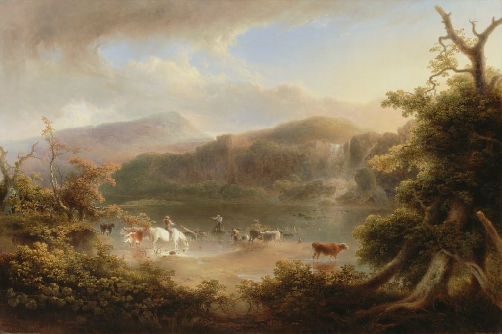
Below is an example of romanticism in one of Thomas Doughty’s paintings from around 1830. It portrays the landscape in a way the human eye couldn’t see it. Thomas exaggerates the colours and the textures of the landscape.

Landscape Photography – Archives

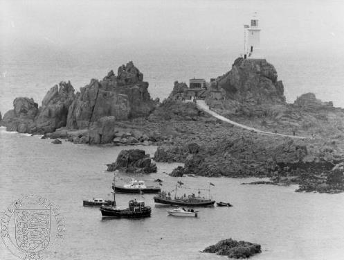
Our task was to juxtapose one of our original landscape images to one from the Societe Jersiaise: a photographic archive of 80,000 images dating from the mid-1840s to the present day. When on the website, I searched for images of Corbiere Lighthouse, where I found the image below that I thought would match up with a photograph I took there more recently.

Chosen Images

When editing these images together in photoshop I tried to line up the horizon lines by cropping sections of each photograph. The juxtaposition of these images show little difference in the landscape, other than the past having boats in the water and people on the causeway whereas mine does not. The structures and rock forms around the water have changed slightly due to sea erosion however not drastically to note any difference.

Final Edit

Ansel Adams

Ansel Adams is an American photographer born in 1902 and is widely regarded as one of the most influential figures in landscape photography.

His work aims to convey the scale and the power of natural scenes. He does this in a unique way by romanticizing these landscapes. This means he enhances the landscapes past what the eye can see.

He was also a pioneer for a tonal system called the Ansel Adams Zone System – his photographs would convey a very large tonal range from true blacks to true whites in the exact same image.

Ansel Adams: The Formative Years - precise-moment.com

He was part of a new wave of photographers in the early 20th century who divorced themselves from pictorialism and he became an advocate for “pure photography”. This is a style of photography which focuses on sharp focus high clarity and great tonal ranges.

He is known for his stunning landscapes of American national parks specifically the mountains he captures.

The above image is of the Snake River in the Grand Tetons in 1942.

The first discernable feature of this image distinctive to Ansell Adam’s work is the impeccable contrast and tonal range where he has captured every tonal level from the pure black in the foliage in the bottom left and some of the mountains to the pure whites in the river, the snow and the clouds. Ansell probably used a lot of burning when exposing this image to get these pure whites. Knowing Ansel’s past and his emphasis on the pure photography movement we can relate this to the above image with the emphasis on a high clarity crisp image with high contrast. This detail adds a sharp texture to the image which can be seen to emphasize the sharp summits of the mountains in the background.

The image also has a great depth of field. There are many components layering the image from foreground to background. The distant mountains contrast with the near foliage. The winding river adds perspective of depth with its ripples which create a sense of detail being prominent in the foreground, these details and the rivers size slowly diminish as it meanders and winds like a snake through the middle of the image.

The summit of the mountain is framed in the center of the image which creates a sort of aesthetic pyramid form to the image.

Landscape Photography – Response

Photoshoot Plan

What – My plan is to photograph landscapes around Jersey that link to Romanticism- focusing on the coastline, woodlands and areas with dramatic weather changes. My idea is to capture images from contrasting perspectives, for example through trees, to experiment with how this effects the depth of an image.

Where – I aim to capture these photographs in locations such as Greve De Lecq beach, Noirmont woods, Queens Valley Reservoir and the coastline at Corbiere. I believe these settings will hold romanticized areas that will show the beauty of nature, for example cashing waves, dense forests etc.

When – I plan on conducting these photoshoots over the span of a few days to take advantage of the different weather forecasts. I aim on capturing clouded skies, sunsets, clear skies and dusk to explore how the range of the time of day images are taken effect their quality and the atmosphere they create.

How – To take full advantage of the differing lighting in my images, I plan on experimenting with the ISO on my camera as well as changing the white balance to suit the area I’m photographing. I will also change the image’s perspective by getting lower to the ground for some shots, and then higher looking over the landscape for others.

Why – I am conducting this romanticized rural landscape photoshoot to explore the secluded, natural environment of Jersey, capturing images relating to photographers such as Ansel Adams. I want to create drama and atmosphere in my images which I hope to do through the use of vivid contrasts and wide depths of field.

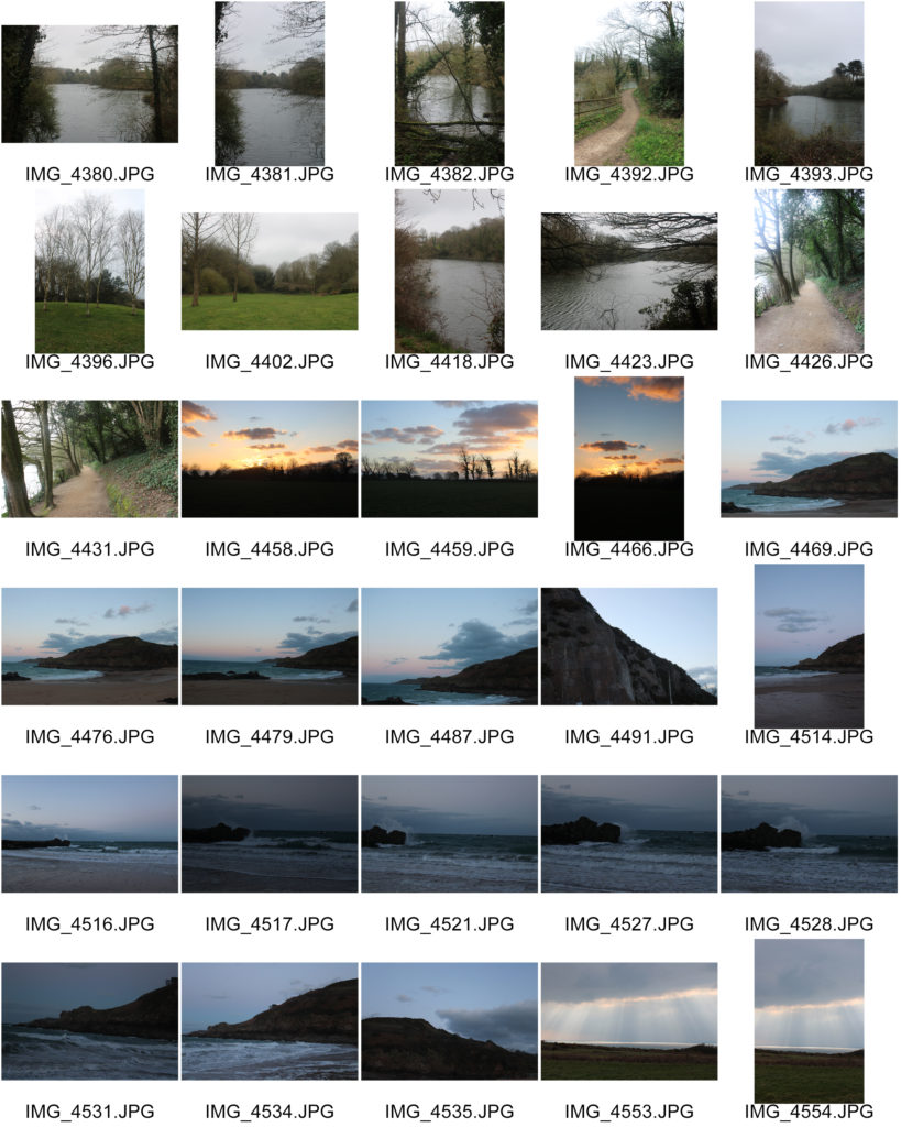
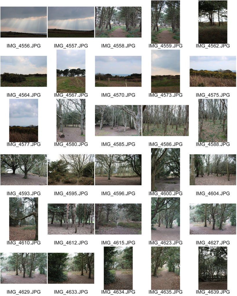
Contact Sheets

Edited Images

During my editing process, after my first selection of favourite images, I experimented with adding a black and white filter. I did this in order to reflect the work of Ansel Adams, emphasising the dramatic dark and light tones I have captured. I really enjoy how these images look when black and white as I believe that the unsaturated filter adds a mysterious, impactful atmosphere to the images, demonstrating the natural world as a climactic experience for society to view. Additionally, making these images black and white has exaggerated the impression and emotions that these locations have surfaced- similar to the way Adams expressed his feelings on the surroundings of Yosemite National Park.

Final Image

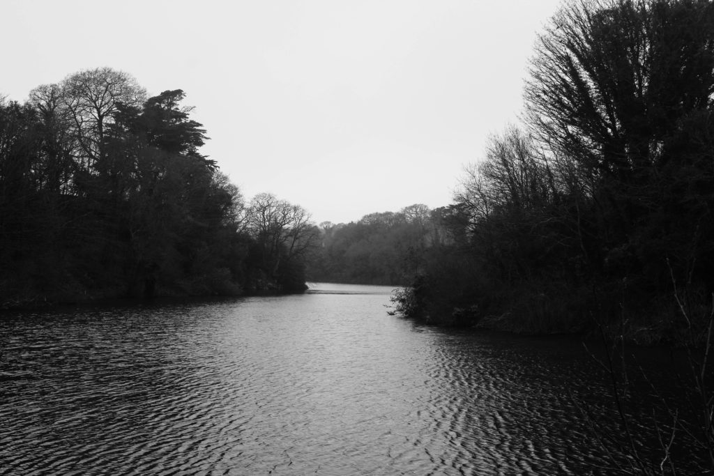
I chose this image, taken at Queen’s Valley Reservoir, due to its wide range of tones, textures and interesting composition. The first element of my image that I really enjoy is the perspective it’s taken at, looking along the reservoir. I believe this composition forms a thick leading line from the foreground to the background of the image, guiding the observers eyeline through the landscape as it disappears into the distance. The wide depth of field that I have captured by experimenting with aperture settings exaggerates the vast scale of the landscape, creating a gripping atmosphere. Furthermore, my composition uses the rule of thirds as the foreground shows the glistening water surface, the middle of the image shows the span of dense trees and in the final third we see the bright sky. This composition technique reflects the landscape photography of Ansel Adams, emphasising the beautiful elements of the natural world in different stages- water, earth and air. Additionally, I really love the way the natural sunlight creates dramatic highlights over the water and shadows across the trees. This contrast in tones shows evidence of Ansel Adams’ Zone System, demonstrating zone 1/2 for the reflection of the trees on the water’s edge (as it is clearly the darkest point of the image however minimal texture can still be seen), and zone 8/9 on the water’s surface. This lighting/range of highlights and shadows creates a rippled texture across the reservoir which contrasts with the spiked texture of the tree tops. I used Adams’ Visualisation technique to imagine how this difference in texture would compliment each other, showing the fascinating patterns nature can make.

Ansel Adams Comparison

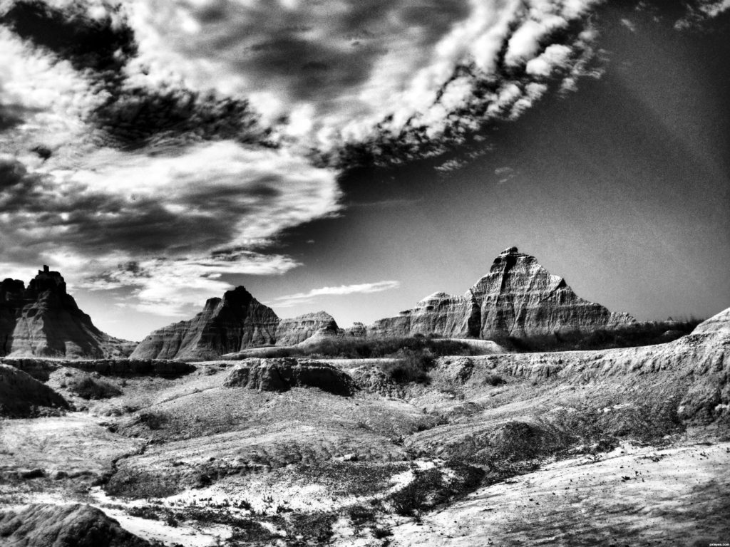
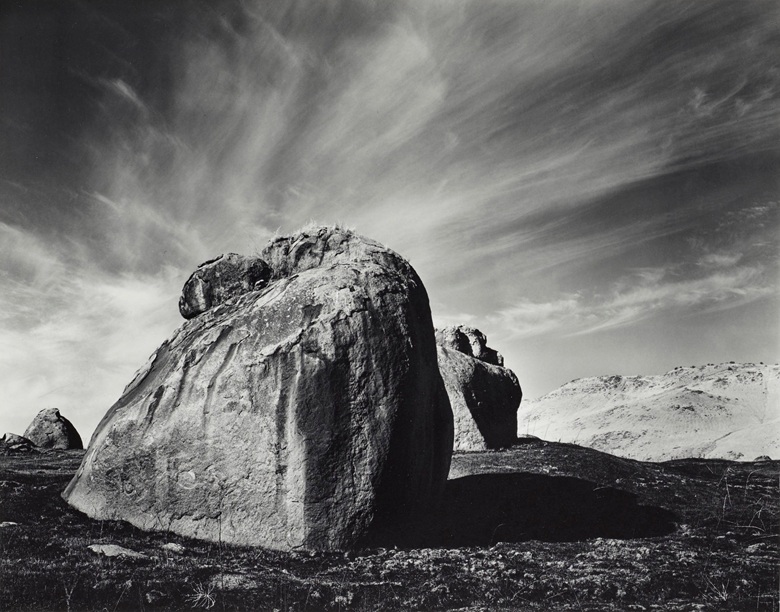
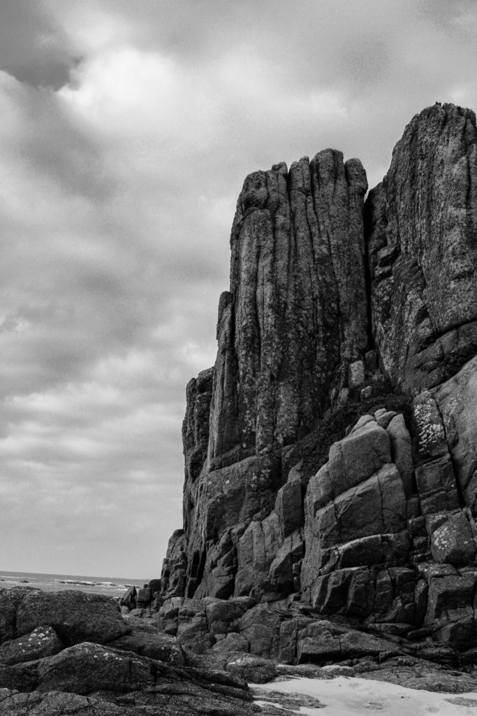
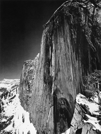
I have chosen to compare this image of mine to Ansel Adams’s “Monolith, the Face of Half Dome, Yosemite National Park,” 1927 due to their similarities in composition, subject and also their differences in texture and depth. I captured this specific image at La Corbiere Beach as it is a special place on the island for me and my family, full of nostalgia and childhood memories. It is clear Yosemite National Park was a special place to Adams as it was the main location for most of his landscape photography. Both images share similarities in composition, but both have independent aspects that make the images unique and contrasting, despite both being of rock-like structures. In my original image I captured the structure from a lower perspective in order to make it appear a lot taller than it was, which is a common technique Adams used in his work. Additionally, there is a similarity in the texture of the rock formations with both holding leading lines that fall down the edge of the cliff face. These irregular lines in Adams’ image, while they don’t reflect physical movement, emphasize the vast height of the mountain and create an effect as if the structure is growing taller and taller. In comparison, my image holds a rougher more jagged texture, as the leading lines have more jolted edges and sides- showing how the power of nature can manipulate the shapes and atmospheres of our surroundings.

Furthermore, there is a contrast within the colour and texture of each image’s sky which create differing moods. In the background of Adams’ photograph, he has captured a dark area of negative space making the sky seem as if it is an empty void, with little to no texture. Whereas in my image, I have captured the soft fluffy texture of clouds that disappear into the background creating a wider depth of field, as well as a brighter tone showing the main highlights in the image compared to Adams’ sky as his darkest part. However, I have taken inspiration from Adams’ Zone System in order to help me visualise the dramatic contrast in dark and light tones that I wanted to capture. For example, I have photographed zone 8/9 in my skyline which stands out behind zone 2/3 seen in the tones of the rocks. To create this effect while conducting my photoshoot I experimented with the ISO and shutter speed settings on my camera, this really helped me when editing my images in photoshop as I already captured quite dramatic differences in tone. Similarly, in Adams’ image we can see zone 0/1 in the dark abyss of the sky which contrasts greatly with zone 9/10 seen in the luminous white snow. These aspects of both images mirror the excitement and awe felt in each location, demonstrating how the beauty of nature comes in several forms, though similar; entirely different.

Joel Sternfeld Study (New Topographics)

Joel Sternfeld

Kansas City, Kansas, May, 1983
‘Kansas City, Kansas, May’ – Joel Sternfeld (1983)

Born in New York in 1944, Joel Sternfeld is known for his large-format colour photographs of American towns and cities. Sternfeld received his BA in visual art from Dartmouth College in 1965. He then began producing colour photographs in his early career in the 1970’s. Joel Sternfeld’s work documents people and places with a vibrant sense of colour, which can be seen in his series ‘American Prospects’, created in 1987. Sternfeld has had work held in exhibitions such as the J.Paul Getty Museum in Los Angeles, The Museum of Modern Art in New York, the Art Institute of Chicago, and the Fotomuseum Winterthur in Switzerland and many others. Joel Sternfeld currently lives in New York where he has taught at the Sarah Lawrence College since 1985.

Examples of Joel Sternfeld’s work

Joel Sternfeld | A Man at His Campsite, El Prado, New Mexico, August 1999  (1999) | Available for Sale | Artsy
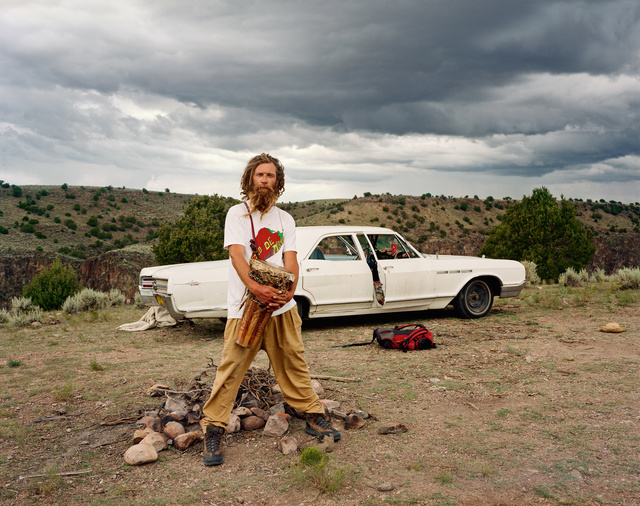
‘A man at his campsite, El Prado, New Mexico’ – Joel Sternfeld (1999)
Joel Sternfeld | Earl Garvey Realtor, The Mojave Desert, California, July  1979 (1979) | Available for Sale | Artsy
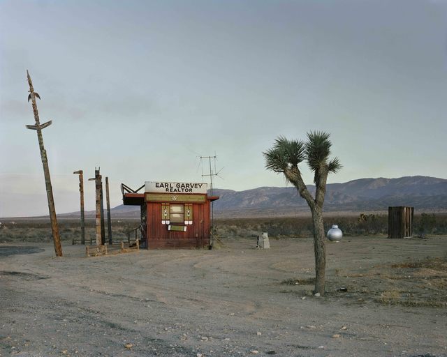
‘Earl Garvey Realtor, The Mojave Desert, California’ – Joel Sternfeld (1979)
American Prospects
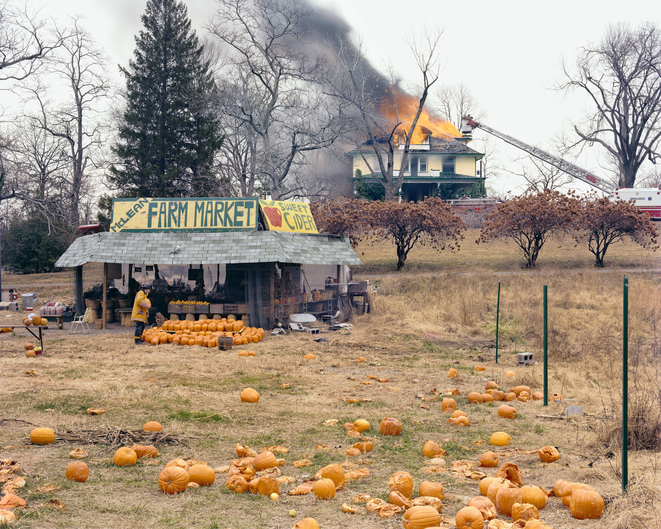
‘McLean, Virginia, December’ – Joel Sternfeld (1978)

Analysis of Joel Sternfeld

American Prospects
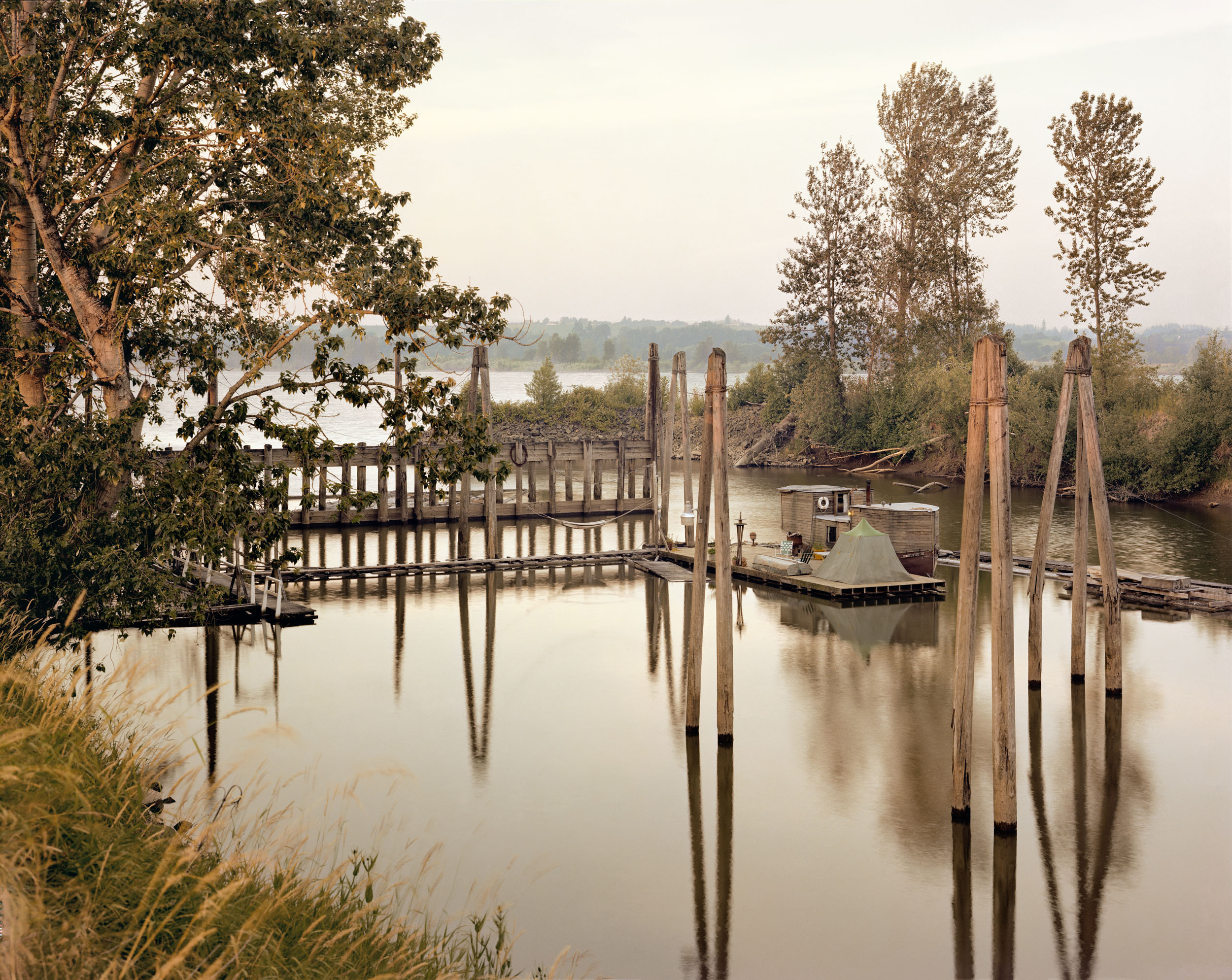
‘Sauvies Island, Oregon, June’ – Joel Sternfeld (1979)

This image taken by Joel Sternfeld, titled ‘Sauvies Island, Oregon, June’, depicts what looks to be an isolated campsite floating on the water. At first glance, the colour palette of the photograph is very earthy and muted, with a rather complex composition including a dramatic use of echo and reflection.

The natural, harsh sunlight produces harsh shadows and highlights within the image. I would suggest that this image was taken around midday as the shadows produced by the poles face directly downwards, implying that the sunlight is coming from straight above.

There is a strong use of line within this image, this is shown through both the poles and their reflections. These create the focal point as the earthy-toned wood is juxtaposed against the sombre, black poles. These thick lines direct the viewers eyes upwards, as the poles start from the bottom of the water.

There is a strong sense of echo within this image, this is shown through the poles reflecting in the water. This use of echo could metaphorically symbolise a darker planet with the increased industrialisation, as the reflection almost seems like an alternate universe. The multiple uses of lines can also be shown as a form of repetition, although the repetition isn’t constant.

There is a contrast in shapes within this photograph, as the organic shapes of the leaves and masses of trees are contrasted against the straight-edged lines and the geometrically formed house. There is also a repetition of cross shapes which can be seen in the bridge, this further proves the contradiction between natural and geometric shapes.

There is a slightly shallow depth of field in this image as the background begins to fade in the distance of the photograph. There is two representations of negative, empty space within the photo. This can be seen in both the top and bottom third of the image. This even distribution of empty space produces the illusion of a balanced composition.

The image has a multitude of contrasting textures. For example, the sharp, string-like grass is juxtaposed against the smooth, fluid waters. The water is also contradicted with the straight poles that cut into the water in a knife-like manner.

The darkest areas of the photograph are mainly found in the reflections of the waters, however the dull trees also create a strong contrast between tones against the delicate, light sky.

The colour palette of this image is very earthy- toned and subdued. The dominant colours within this photograph would be green and brown, however there is representation of blues and whites. I believe if the image were in black and white, there would be no distraction from the colours in the image, therefore accentuating the use of reflection and echo. However the use of colour in this image adds a vintage tone to the image, especially with the muted tones.

There is a more complex use of rule of thirds in this image, as the the almost-floating house is located in the middle of the image, with the reflected poles leading the viewers eyes down to the bottom third of the image. The image isn’t particularly balanced as the majority of the positive space can be seen in the bottom and middle third, whereas the top third mainly consists of empty space.

Rural Landscape Intro

A landscape is the visible features of an area of land, its landforms, and how they integrate with natural or man-made features.

Landscape photography is a broad genre of photography, it focuses on the capturing of a this landscape scene and brings the viewers to this scene. These scenes can range from broad and vast landscapes to more microscopic focused landscapes.

They can be rural or urban. Rural Landscapes are subjectively delusive of anything manmade and they focus on the sublime and nature. Urban landscapes highlight mans disturbances on these natural scenes.

Rural Landscapes Mood board

New Topographics

New Topographics

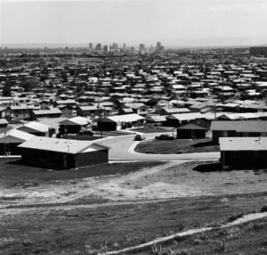
“Mobile Homes, Jefferson County, Colorado” – Robert Adams (1973)

‘New Topographics’ are also widely known as photographs of a ‘Man-made landscape’, as they display the contrast of industrialisation into nature. This exhibition was curated by William Jenkins in the October of 1975. Jenkins recruited a group of landscape photographers including Robert Adams, Lewis Baltz, Joe Deal, Frank Gholke, Nicholas Nixon, John Schott, Stephen Shore and Henry Wessel Jr. He also later invited the German couple, Bernd and Hilla Becher. The New Topographics movement projects the beauty of industrialism incorporating into the natural world, the exhibition had very mixed reviews by the public and some saw the art as a juxtaposing, pleasant view on landscapes with the mixing of industrialism and nature, whereas others believed it proved that industrialisation is ruining the natural beauty of the planet.

Examples of New Topographics

Bernd Becher and Hilla Becher, ‘Pitheads’ 1974
‘Pitheads’ – Bernd Becher and Hilla Becher (1974)
‘The New West’ – Robert Adams (1974)
‘Untitled View (Boulder City)’ – Joe Deal (1974)

The movement of New Topographics was created almost in retaliation to the romanticism movement, that was popularised by artists such as Ansel Adams. The group of photographers wanted to photograph against the tradition of landscape of photography, that romanticism made unrealistic to the modern human eye.

the new topographics

The new topographics was the turning point in history in 1975 which was a shift away from photographing traditional landscapes, to photograph of landscapes that are unromanticised, industrial urban landscapes. This movement of new landscape photography was made because of the fact that society wasn’t recognising the issues of how the world was being slowly decaying from the natural landscapes being altered to urban, man made buildings taking over, raising awareness of the issue that was on the uprise. The photographers that where involved in this movement where 10: Robert Adams, Lewis Baltz, Bernd and Hilla Becher, Joe Deal, Frank Gohlke, Nicholas Nixon, John Schott, Stephen Shore, and Henry Wessel.

Pitheads 1974 Bernd Becher and Hilla Becher 1931-2007, 1934-2015 Purchased 1974 http://www.tate.org.uk/art/work/T01922

As you can see from the image above, this photograph is perfect in terms of the explanation of the “new topographics”. This reasoning behind this is because in the image you can see how there are industrial images as the main focus when you look at the image, however, if you look in the surroundings of these images you can see that there is some natural scenery in the surroundings of these industrial landscape images. This is because the photographers that where apart of this movement tried to get across that if society carries on with having urban/industrial landscapes cover up the world, we wont be having many more natural landscapes or even beautiful scenery to appreciate from what the world has given us.

Plan

Where – photo shoot will be taken around oakfield sports center and highlands.

What – I will be taking some deadpan images of industrial buildings

When – I will be carrying out this photo shoot during the daytime at around 1pm.

How – These photos will be taken at head height with the camera facing starring onto the object that i will be taking pictures of with the setting’s being exposure/80 and IOS/400.

Why – I am taking these pictures in inspiration of the new topographic in taking my own pictures to do with this project.

Contact Sheet

Final Images

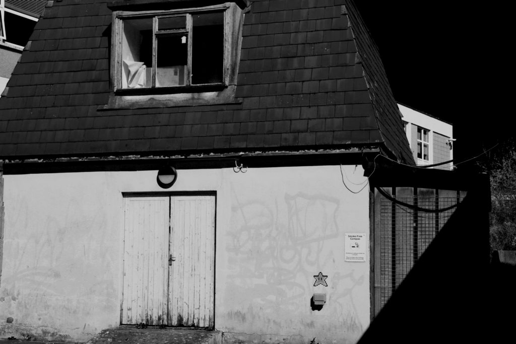
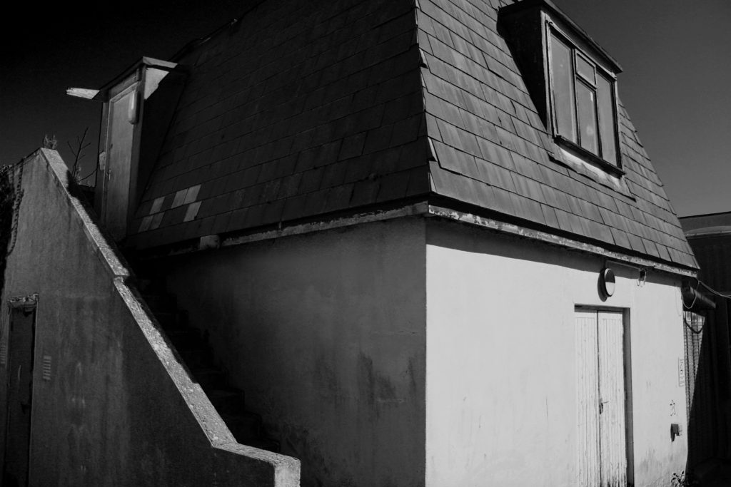
From my final images, i got them to look so appealing in the compositions of black and white through editing. The process I went through in editing the images where making them black and white, then i went ahead and changed the colours that where in the images originally to enhance some proportions of the images. For example, it is shown in my images that you can see some dirt and textures that are enhancing from the edit making them appealing.

Comparison

Frank Gohlke

My Image

In both images, the lighting used is petty much identical, Frank’s image was lighted by natural light coming from above and behind the two focal points of the image which is directly above the structures. I know this because it shown in the picture’s that there are shadows on the ground in front of the objects on the ground. In my image, I used an aperatu

rural landscape photoshoot

ACTION PLAN

LOCATIONS – North coast cliffs ( Grosnez, Plemont, Portlet ), St Ouen’s ( sand dunes ), rocky beaches ( Archirondel, Green Island, La Hocq, La Rocq ), fields.

WEATHER / LIGHTING – Foggy, misty, sunny, bright, rainy, cloudy, stormy, windy, overcast, sunset, sunrise.

CAMERA SETTINGS / VIEWPOINTS – Bird’s eye, worm’s view, straight on / eye level, through trees, ISO, shutter speed, different exposure levels.

ARTIST REFERENCES – FAY GODWIN

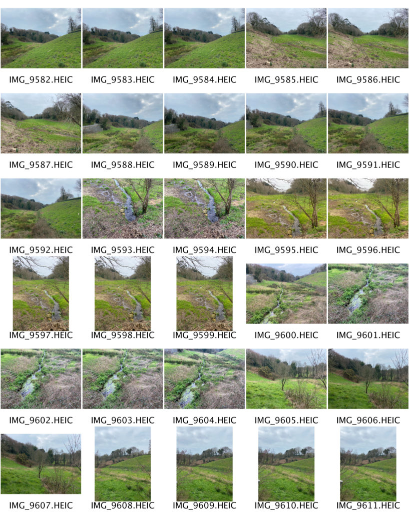
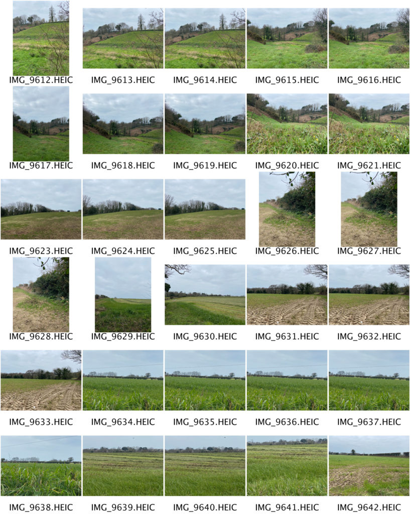
MY RESPONSE – CONTACT SHEETS

FINAL IMAGES

EDITING – BLACK AND WHITE

ARTIST COMPARISON

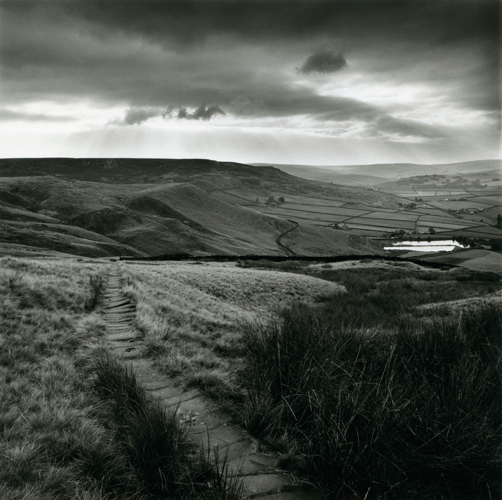
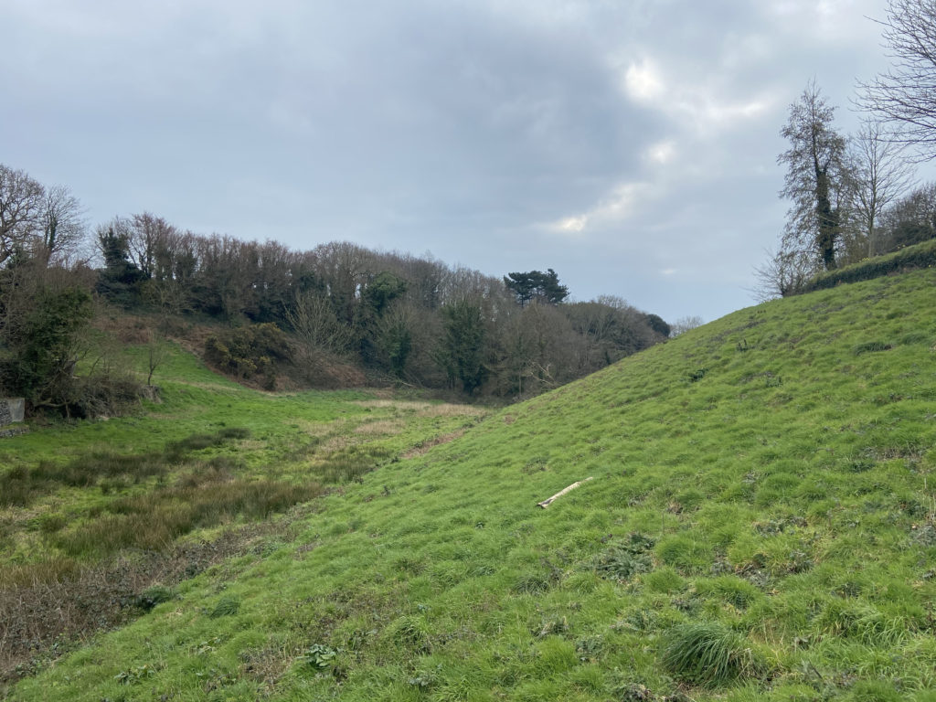
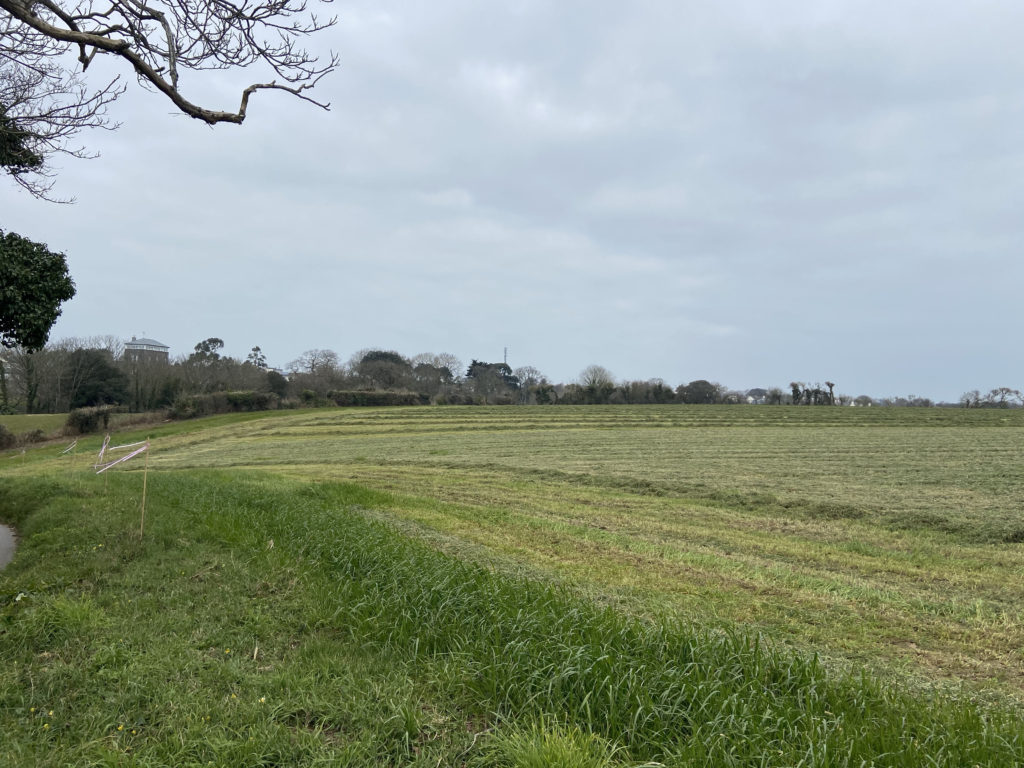
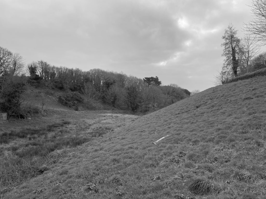
When taking my photographs I tried to always refer back to Godwin’s work, and I went to places and locations which looked similar to those in her own images. For example, in the photograph above I shot in a field that looked close to the one in her own image. There are many similarities between these two photographs, one being that the landscape is sloping downwards in both images. Fay Godwin has captured the slanting landscape in the background of her photograph, whilst in mine it is in the foreground. I aimed to keep my image as real and unedited as possible just as she had done in order to give the viewer a real depiction of the environment that I was in. The weather conditions in the two photographs are very similar, with the clouds in the background creating a moody and melancholy atmosphere. Additionally, the white colour of the clouds contrasts with the darker tones of the trees and the grass. The lines that appear in both of these photographs are natural and curvy, which shows how the environment hasn’t been touched or changed. If this was the case, there would be straight, rigid and repetitive lines, which is something that Godwin wanted to avoid in her images. I think that my final photograph successfully shows influences of Fay Godwin’s work, and that both images portray the same mood and feeling to the viewer.