Tag Archives: industrial landscape

Urban/Industrial Landscapes – Analysis + Comparison

Final Image

I chose this photograph as my final image for this urban/industrial project due to it’s strong similarities to the work of Frank Breuer and use of the formal elements. I believe this image reflects the industrialisation of the modern world, demonstrating the ever growing mass of manufactured products taking over the nature around us. In this image I have captured waste skips using natural sunlight, which due to the sun falling behind them, has created harsh shadows underneath. I decided to photograph this landscape in such a way to connote the theme of a post-industrial capitalist society casting a shadow over the world as it destroys the beauty of nature. Additionally, these dark shadows could be compared and seen as similar to clouds of smog from atmospheric pollution, reflecting how harmful it is that this urbanisation of our world is increasing rapidly. Furthermore, I have captured repetition of thin straight lines that fall across the warehouse in the background of my image. These lines demonstrate uniformity and present the idea that the incline in modern infrastructure has lead to a homogeneous society, where things like architecture and people are robotic and indifferent. Due to the sun’s reflection on this building, the lines are highlighted and resemble structures like prison bars or cages- further connoting the concept that society is stuck in an industrial trap and locked away from the importance of our natural environment. Moreover, to imitate the work of Frank Breuer I have edited my image slightly by increasing the whiteness and exposure to mimic his blank backgrounds. I believe this editing choice has really added to the overall message of my piece, with the negative space representing how barren and empty our beautiful natural landscapes are becoming as a result of growing industrialisation. In addition, the colour palette of this image is limited, with a subtle peachy hue sweeping across it and the only pops of colour coming from the skips themselves. This relates to Breuer’s work and connotes the idea that society is devoid of originality and inventiveness through the lack of colour and repetition of shape.

Image Comparison

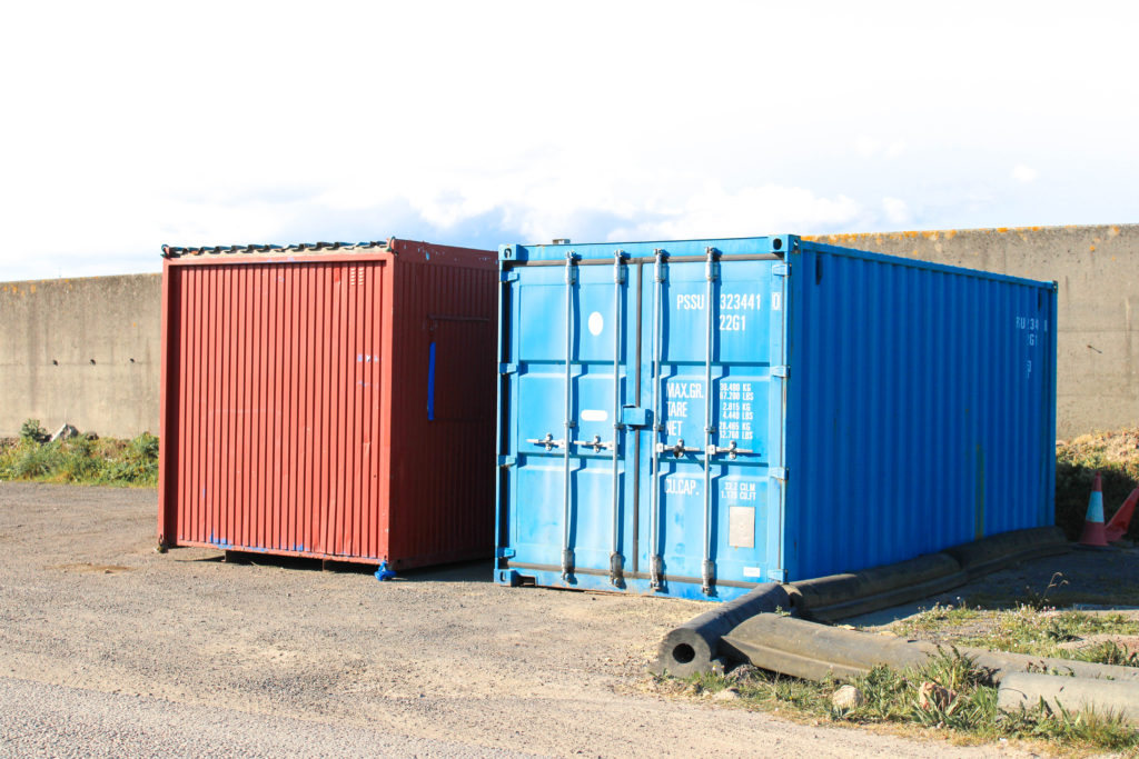
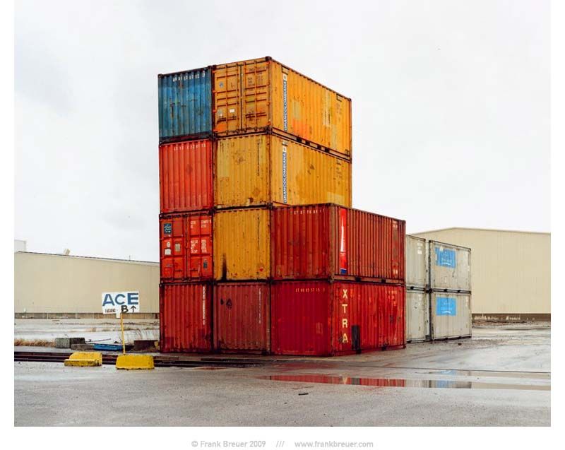
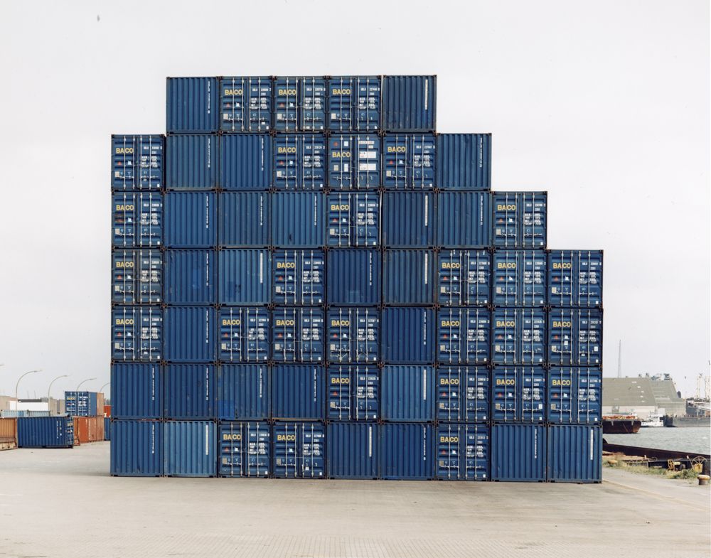
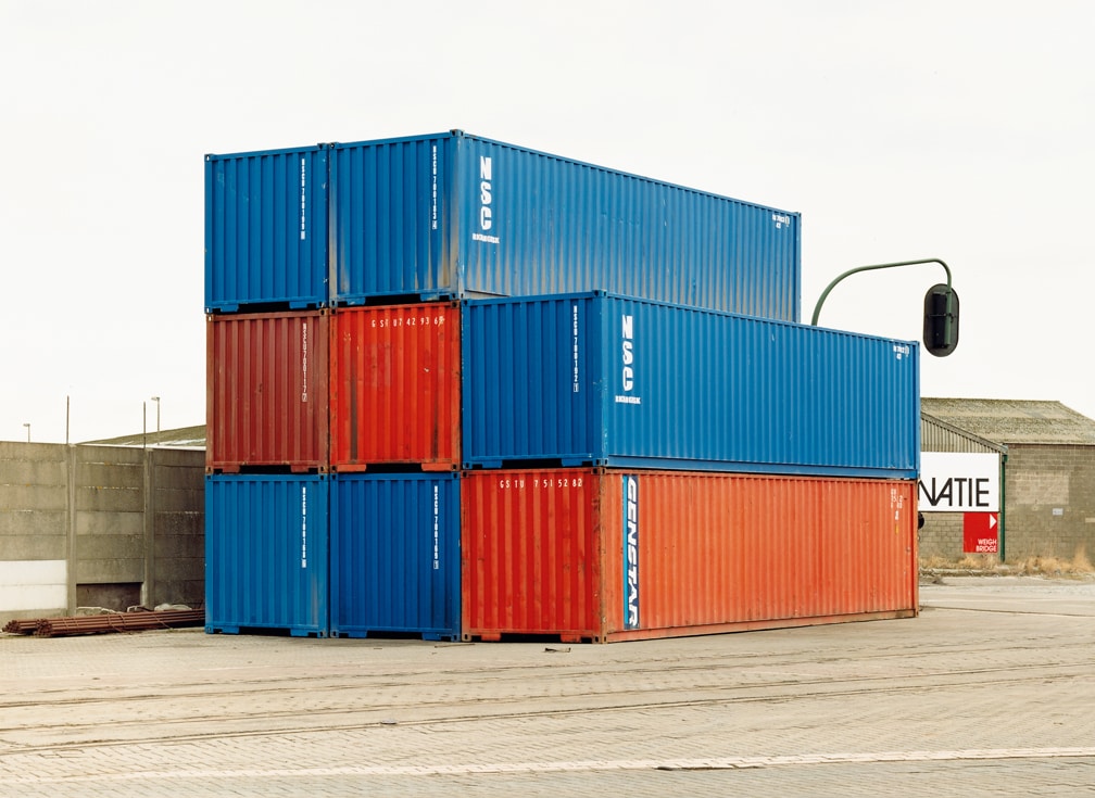
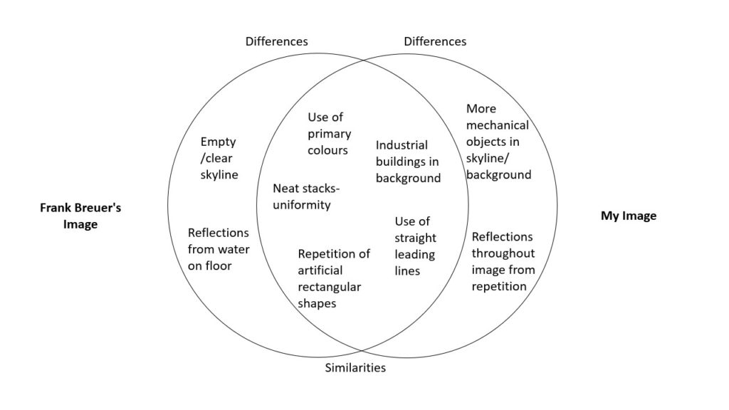
I decided to compare this image from Frank Breuer’s study of ‘Containers’ in 2002 to my image of stacks of crates at the harbour due to their wide range of similarities within the formal elements. The first obvious similarity is that both Breuer and I have captured saturated primary colours as the main tones in our images. The use of the colours red, blue and yellow allude to the simple nature of how these industrial structures are becoming so normalised in our modern world, with the three most basic colours representing its triviality. The bright vibrancy of both images also draws focus to the urbanised structures, helping us understand the importance of the subject and how its impacting our world. Furthermore, Breuer’s and my image each contain repetition of geometric shapes which create echoed patterns throughout the photograph. In my image, I have captured repeated rectangle shapes which represent the uniformity and capitalist view of society- each rectangle a member of modern civilisation. In Breuer’s image, his repeated rectangles are larger and appear to be more solid stable structures- perhaps connoting the idea that our community is too set in its ways to change the clear neglect of our natural world- as if we are stuck in a looped pattern of destruction. Nevertheless, there is a difference between the types of repetition seen in each image, as Breuer has also captured it in the reflection from the puddle in the foreground of his image. These reflections could symbolise repetition from the past, as if we are being reminded of times where the industrialisation of our planet lead to some of the most devastating times in history such as pollution from the Industrial Revolution leading to a massive impact of global warming and the depletion of natural resources. Additionally, the comparison of these images highlights the difference in how our world has become even more modernised since Breuer’s was taken. For example, in Breuer’s photograph we can see a clear skyline of negative space, reflecting the barren landscapes urbanisation creates, yet in my image there are several industrial structures in the background as well as the foreground. This demonstrates how the industrialisation of our world is still growing rapidly to this day, with the two cranes in my photos background alluding to the increasing likelihood our actions and constant elimination of our natural world- though the time may be far away- will catch up to us eventually.
Urban/Industrial Landscapes – Photoshoots

Photoshoot Plan

What – My plan is to photograph landscapes around Jersey that hold industrial structures and equipment such as storage containers, stacks of crates, roofs of buildings, commercial signs and mechanical apparatus.

Where – I aim to capture my landscape images in settings such as the harbour, Rue Des Pres trading estate, La Collette power station, the airport and petrol stations as I believe these locations will show the industrialised aspects of the island- in terms of modern equipment and destruction of nature.

When – I plan on conducting my two photoshoots during the Easter holidays, taking advantage of days where workers may not be in warehouses/on building sites in order to capture more barren deserted images. I aim on photographing my landscapes when the weather is sunny so the subject is highlighted, yet hopefully still allowing me to replicate Breuer’s bright white backgrounds.

How – In order to take full advantage of the natural sunlight I plan on experimenting with changing the F-stop number on my camera to over-expose my images when needed, I also aim to explore who changing the white balance will effect the temperature of my images, to convey different moods.

Why – I wish to mirror the work of Frank Breuer when conducting my photoshoots, showing the growing industrialisation of our world and how an island as beautiful as Jersey can still hold the derelict manufactured landscapes ruining the beauty of the nature around us.

Contact Sheets

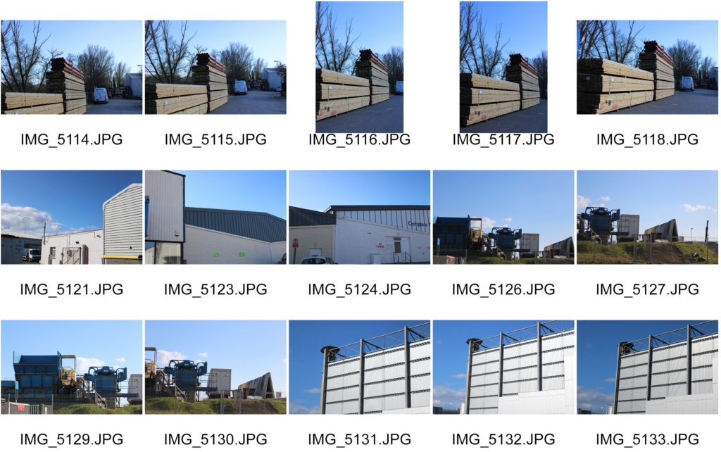
Photoshoot 1 – Buildings & Structures

For my first photoshoot I decided to focus on capturing the industrial buildings, signs and equipment around trading estates and warehouses. I wanted to photograph the normality of technical structures and buildings around the island to symbolise the ever increasing urbanisation of the modern world.

Photoshoot 2 – Containers & Storage

For my second photoshoot I decided to focus more on the aspects of commercial business’ equipment such as storage crates, large containers, trucks, vans and skips to reflect Breuer’s series of images and draw attention to the sheer amount of industrial, desolate areas around us. I wanted to capture objects such as skips to symbolise the way the world is treating nature like its garbage, and filling our landscapes with manufactured waste.

Edited Images

URBAN AND INDUSTRIAL LANDSCAPE PHOTOGRAPHY

What Are The New Topographics?

New topographics was a term created by William Jenkins in 1975 to describe a group of American photographers (such as Robert Adams and Lewis Baltz) whose pictures had a similar repeated aesthetic, mostly black and white prints of the urban landscapes, a human-environment with the natural terrain hiding in the background.

Image taken by Robert Adams, Mobile Homes, Jefferson County, Colorado, 1973.

What was the new topographics a reaction to?

It was a reaction to the increasingly suburbanised world around them, and a reaction of idealised landscape photography that raised the natural elemental.

Rut Blees Luxemburg – (Case Study 1 / Night)

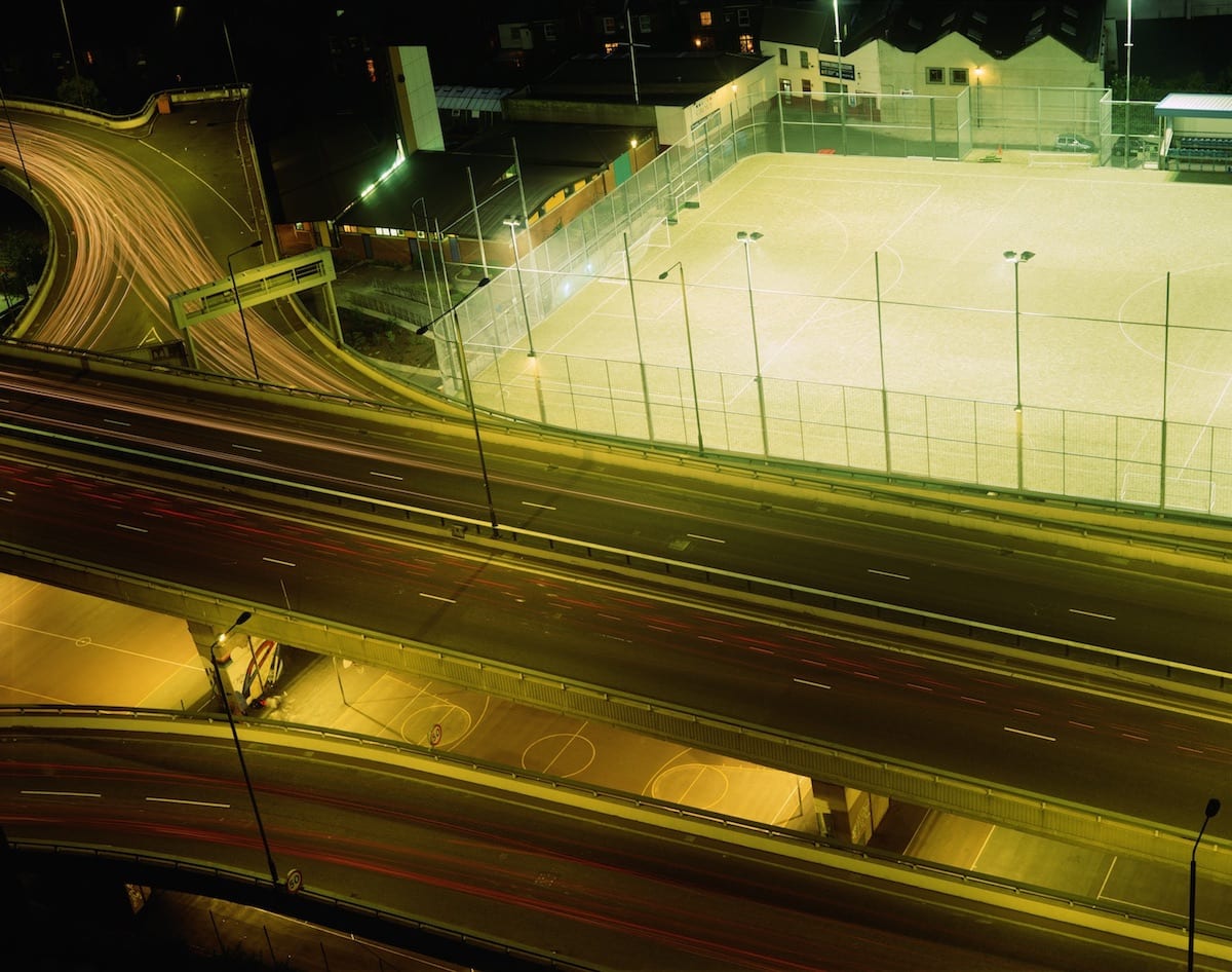
Rut Blees Luxemburg was born in 1967 is a German-born photographer. Her technique is to take photographs at night, mostly exploring the urban landscape. She experiments with exposure time and low light conditions to get an image that captures the night life in the city.

As you can see, Luxemburg uses warm colours and reflections in water puddles, which creates a unique view of her scene. Also, experiments which long exposure.
Analyses Of One Of Her Images :

London: A visual love song | 1854 Photography

All the lighting in this image is artificial, due to it being night time. It seems that there is a tungsten tone in the lights, as there is a orange/red tint on the surface that the light hits. This means that the image has a warm temperature to it, as the colour red is represented by heat. There is also a washed out green colour to the buildings in the back, most likely caused by the reflection of the flood lights on the football pitch. The colours are muted, which gives off a serene atmosphere as it feels abandoned. Although this isn’t the case as motion is captured by using a long shutter speed, this makes it so the car lights show as a long red or white lines; depending on what way the car is driving. Since, it is night the camera will not overexpose the image, as there is no natural sunlight, therefore she would of been using a high ISO, eg 800-3200. There is a high depth of field as all the image is in focus, and also Rut Blees Luxemburg displays a wide range of tonal values, achieved by including and showing a light source and shadows under the overpass. There are many horizontal lines and geometric shapes in the image. The horizontal lines suggest a feeling of rest, because objects parallel to the earth are at rest. In this landscape, horizontal lines also help give a sense of space and attention to the 3D aspect to help visualise that the image was taken from a high place.
As she is a tutor at the Royal Collage of Art, this may mean that she has a higher status position over her students, which is why the image is taken higher up.

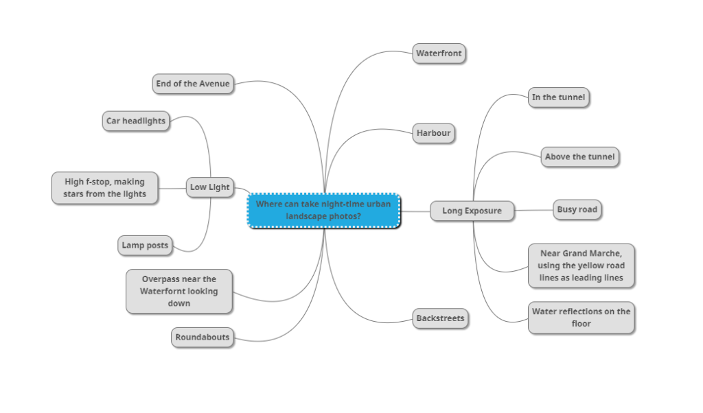
Where Can I Take Night Urban Landscapes?

Mood Board

Photo-shoot Plan

Night photos – (Contact Sheet)

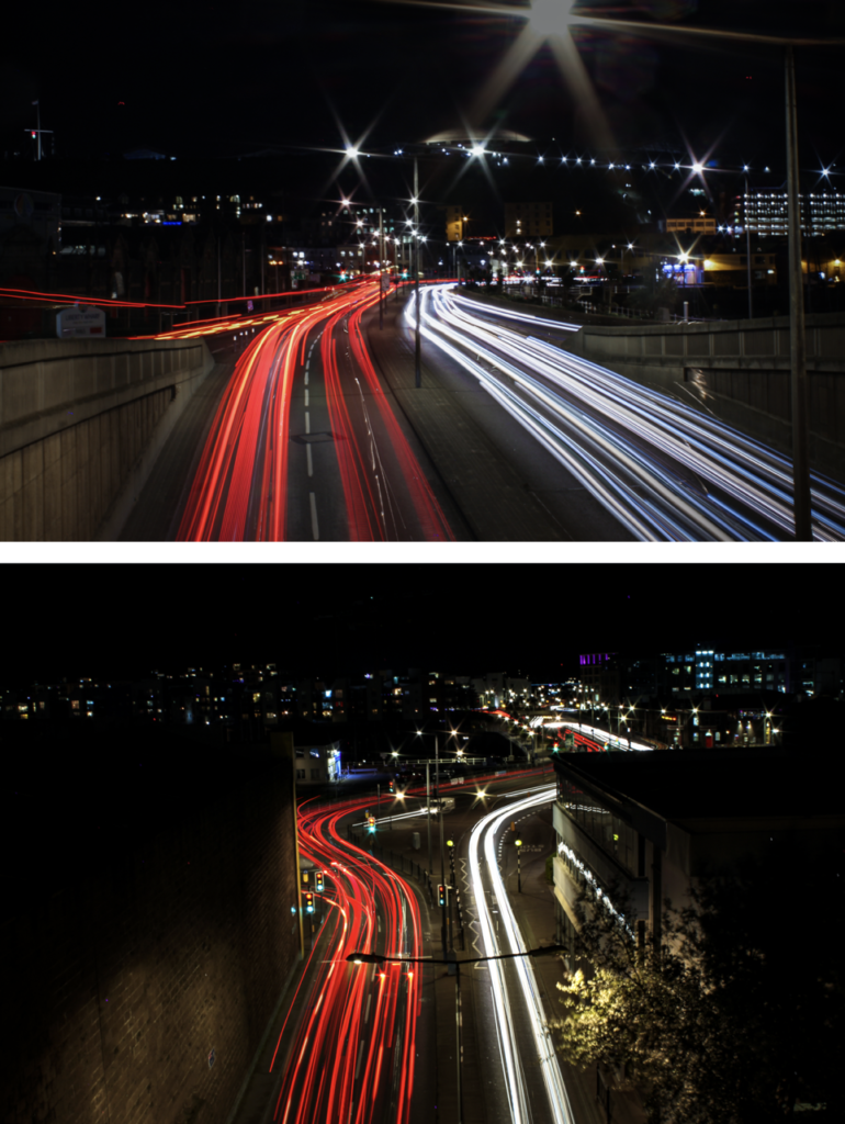
Final Night Photos (Titled)

  1. Go.
  2. Roundabout turn off.
  3. Crossing.
  4. Roundabout.
  5. Overpass.
  6. Above the tunnel light trails.

My Image Comparison To Luxemburgs Image – Venn diagram

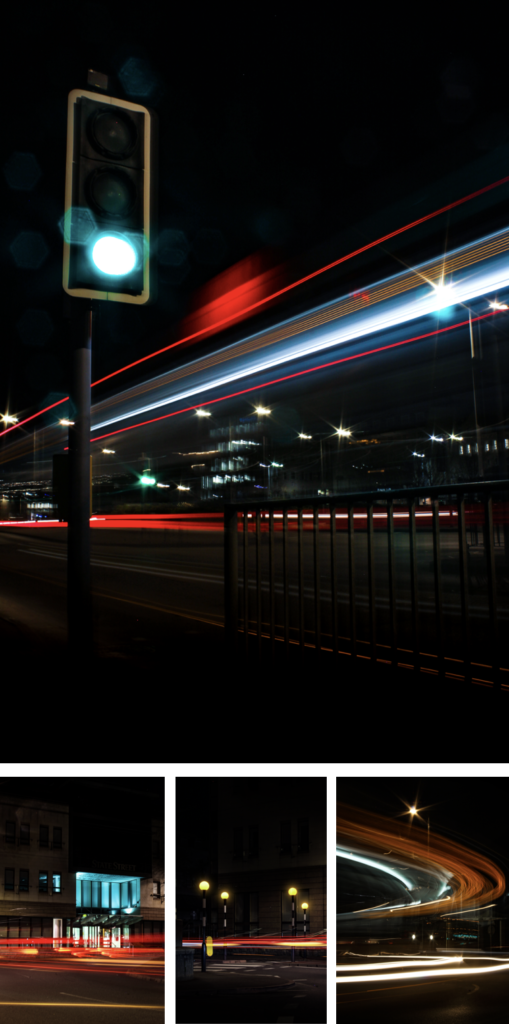
Overall, my I really like my image as it captures motion and, I have created a unique pattern with the buses lights. The colours are vibrant and the bus lights are in focus, which is the main focus point in the image. As I used a high aperture the still lights appeared as stars. For composition I go low to the ground the shoot more upwards, the lights from the bus fill up most of the image. The image is balanced and exposed perfectly even thought it was taken at night time.

Stephen Shore – (Case Study 2 / Day)

Stephen Shore’s work has been widely published and exhibited for the past forty-five years. He was the first living photographer to have a one-man show at the Metropolitan Museum of Art in New York since Alfred Stieglitz.

He has also had one-man shows, his most rememberable at : Los Angeles; Jeu de Paume, Paris; and Art Institute of Chicago.

In 2017, the Museum of Modern Art opened a major retrospective spanning Stephen Shore’s entire career. He has received fellowships from the Guggenheim Foundation and the National Endowment for the Arts.

When he was in New York; in the early 1970s, he sparked new interest in colour photography, and in the use of the view camera for documentary work.

Analyse Of One Of His Images:

Stephen Shore - 107 Artworks, Bio & Shows on Artsy

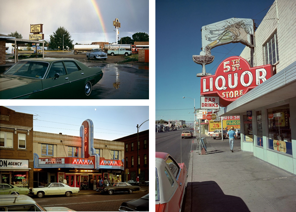
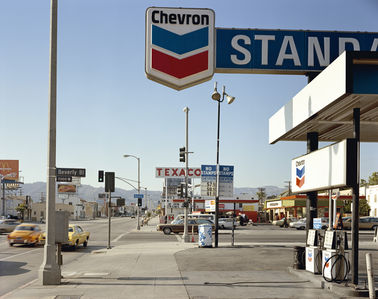
This image shows a busy American street in 1975, Shore’s took this image next to a gas station, which had a wide view over the streets. The image is bottom heavy, which means that the viewers eye is directed toward the bottom half of the image, compared to the empty blue skies.

The contrast of a busy, chaotic street and the clam, tranquil mountains in the background, signify the difference between man and mother nature. Even thought the mountains are small they are still present. The fact that the mountains don’t take up a large portion of the image shows that the industrial and urbanising world is taking over natural land.

The main colours in this image are red, blue, and white. That just happens to be a colours in the American flag. It can suggest that Shore’s is proud to be an American citizen, which he displays through his work of photography.

Overall, I think this image mostly basic, with a normal “street photography” composition, that doesn’t use any objects/techniques to grab the viewers eye. The colours are normal, but mostly blues, which gives off a cool feelings, despite being in a desert in Los Angles. Although, I do like how Shore’s has captured the history of America, by including the old cars, and billboards, (not digital).

Where Can I Take Night Urban Landscapes?

Mood Board

Photo-shoot Plan

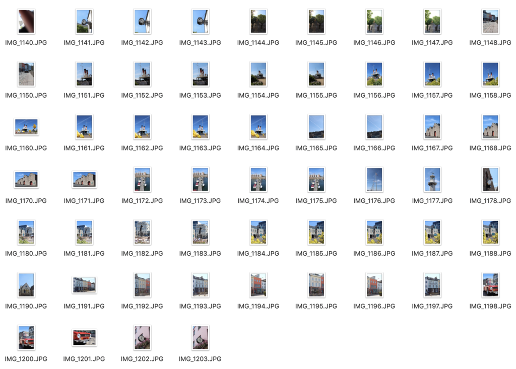
I plan to walk around town and take photos of unique buildings and scenes that I find. I would go to Weighbridge first then maybe, round the back of the tunnel to La Collette then finish off at Millennium park and the small streets round there.

Urban Day Photos – (Contact Sheet)

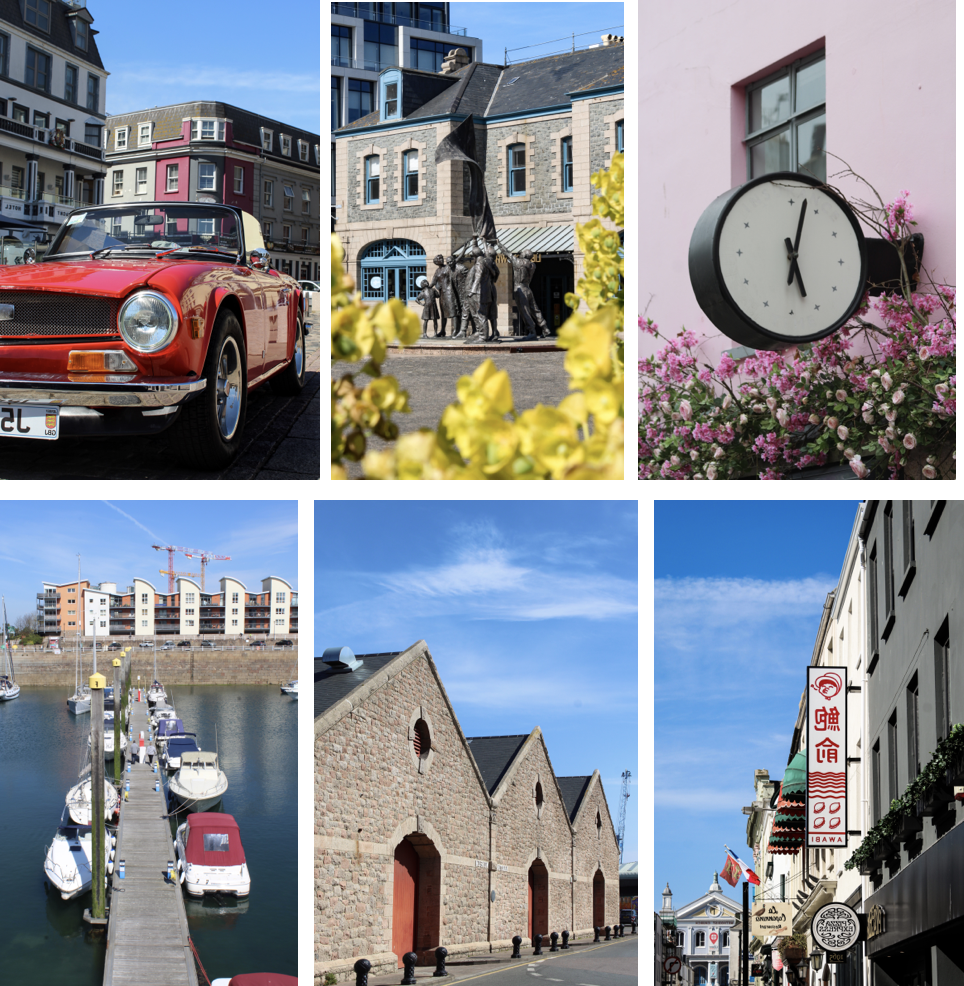
Final Photos

Analyse (Shores Vs Mine)

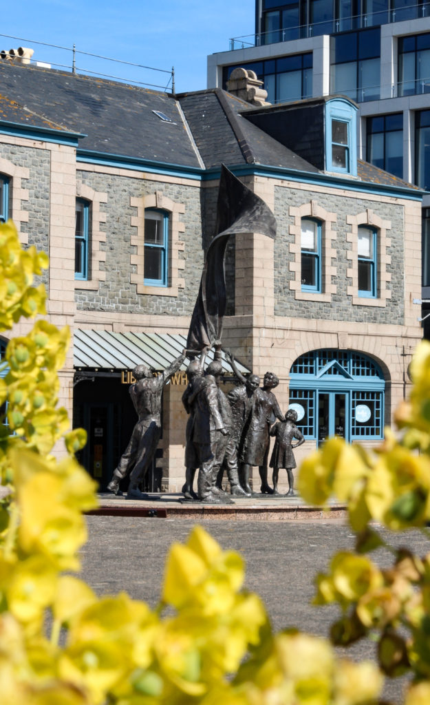
This is my final image I chose, as I feel that it linked to Stephen Shore’s style the best.

Similarly, both the image capture a historical value. My image captures the liberation statue, and Shore’s capturing change over time.

Both, include nature in a build up urban environment. In my image its the flowers in the foreground, and Shore’s its the mountains in the background.

Also, both use vibrant colours, except mine has a more vibrant summer feel. However Shore’s uses a smaller colour range, compared to mine which uses bright yellows and ultra blues.

Overall, I like mine more as there is more of a focus point; being the statue, this is achieved by using a unique composition with the flowers to almost “frame” the statue. To draw more attention to the statue I used a lower aperture to blur the flowers.

Overall Best Photos

Urban/Industrial Landscapes – Frank Breuer

Frank Breuer

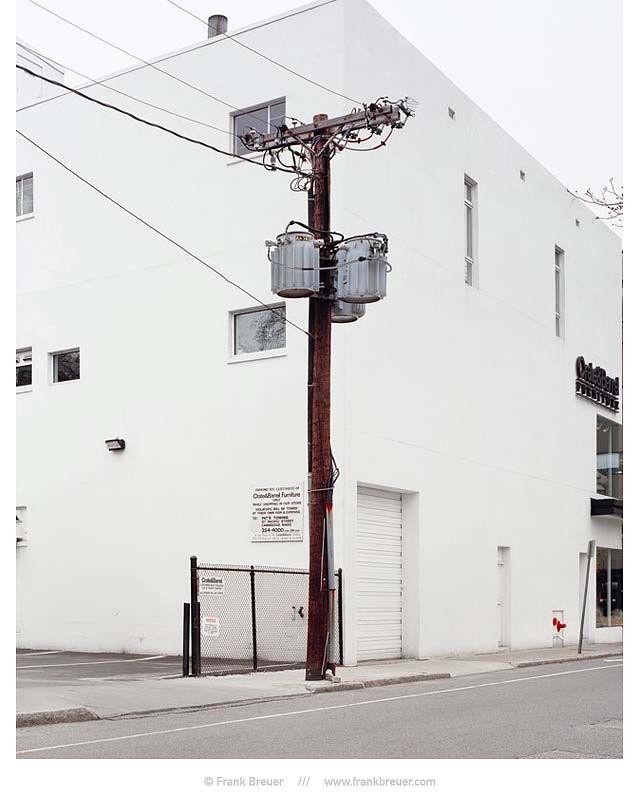
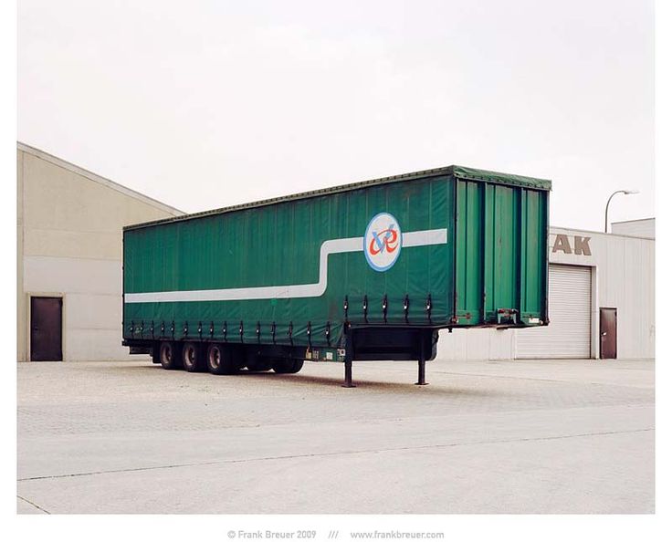
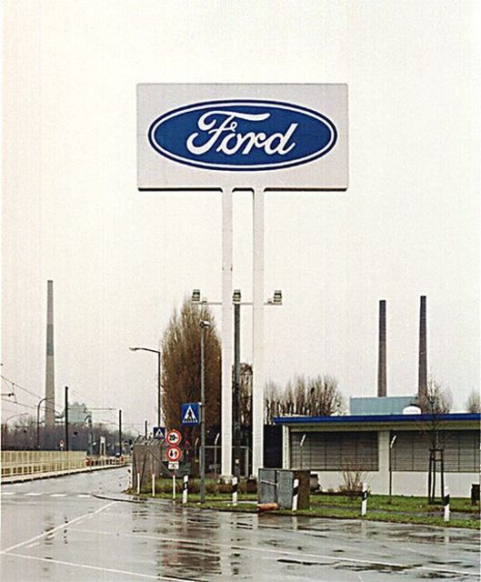
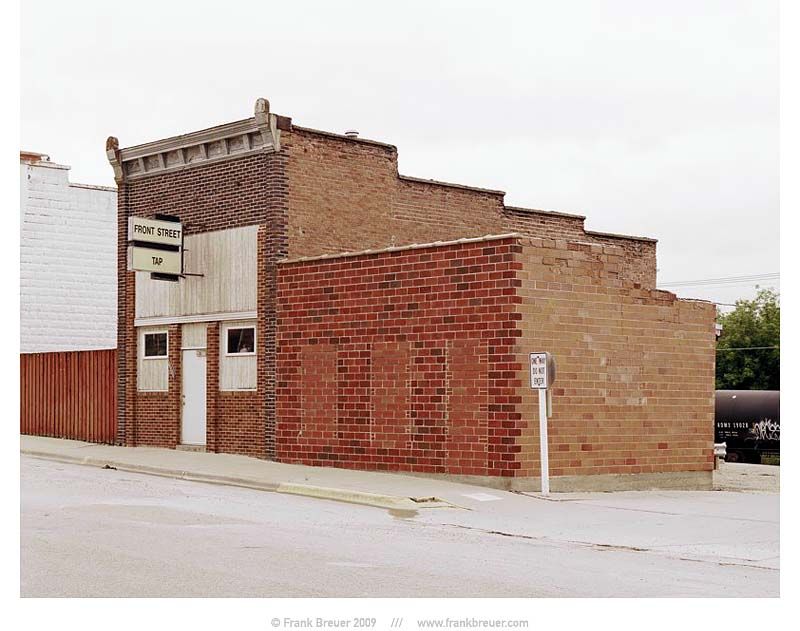
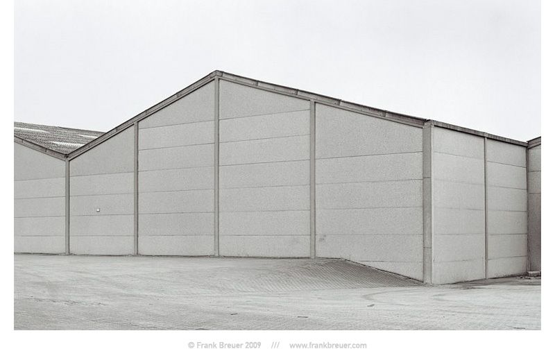
Frank Breuer (1963- ) is a German photographer who studied under the notable photography professor Bernhard Becher at the Kunstakademie Dusseldorf, an academy of fine arts in Germany. Breuer travelled from 2003-2004 and became a visiting lecturer on visual and environmental studies at Harvard University. Breuer’s work holds many similarities to that of the Becher’s, focusing on capturing industrial buildings, storage units, telephone poles and detached shipping trailers in barren landscapes. In Warehouses (1995), Logos (1995), and Containers (2002), Breuer captures portraits of the post-industrial, capitalist society – facades of distribution warehouses devoid of human presence, logos of commercial businesses in nondescript places, and compositions of neatly stacked shipping containers that resonate both a sense of displacement and familiarity. Breuer’s work explores these ideas of the new topographies in a continuing globalized world, I aim to take inspiration from his minimalistic images in my urban and industrial photoshoots.

Image Analysis

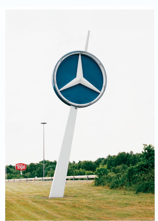
Frank Breuer | Mercedes | Logos 1995

This image by Frank Breuer reflects the growing industrialisation of natural landscapes in our modern world. Breuer’s composition, photographing the subject from a lower angle, portrays the logo as imposing, as if it looks down on the people below it. Additionally, the natural environment in the background and right side of the image contrasts greatly with the industrial structure that stands amongst it. I believe Breuer has captured the structure in this way to reflect the way ‘man’ rules over the natural world, interrupting and destroying it bit by bit while keeping a watchful eye over all they create. Furthermore, in the background of the photo the sky holds little to no texture, very different from the rough texture created by the trees below. It is possible that Breuer has over exposed his image slightly to form such a bright white sky. This lack of texture behind the logo allows it to stand out greater than anything else in the image, creating the main focal point- as it has no distracting background pattern or landscape. This conveys the idea that society’s main focus is money and power, people are ignoring the natural world around them as commercial business’ are putting their influence in every place possible. The negative space created by Breuer’s over exposed sky also reflects the negative impact that urbanisation is having over the entirety of nature.

Locations Mind-map

Urban/Industrial Landscapes – The New Topographics

The New Topographics

In 1975, the exhibition titled “Photographs of a Man-Altered Landscape” of New Topographics epitomized a key moment and turning point in landscape photography. New topographic images strayed away from the usual conventions of landscape photography and gave way to unromanticised views of stark industrial landscapes, suburban sprawl, and everyday scenes not usually given a second glance. The show was curated by William Jenkins at the International Museum of Photography at the George Eastman House (Rochester, New York), and remained open to the public from October 1975 until February 1976. Photographers from the exhibition such as Robert Adams, Lewis Baltz, Nicholas Nixon and Hiller Becher took inspiration from the mundane and man-made, revealing the growing unease about how the natural landscape was being eroded by industrial development. This revolutionary style of photography was both a reflection of the increasingly modernised world, and a ‘reaction to the tyranny of idealised landscape photography that elevated the natural and the elemental’- contrasting greatly with the work of landscape photographers such as Ansel Adams.

Lewis Baltz
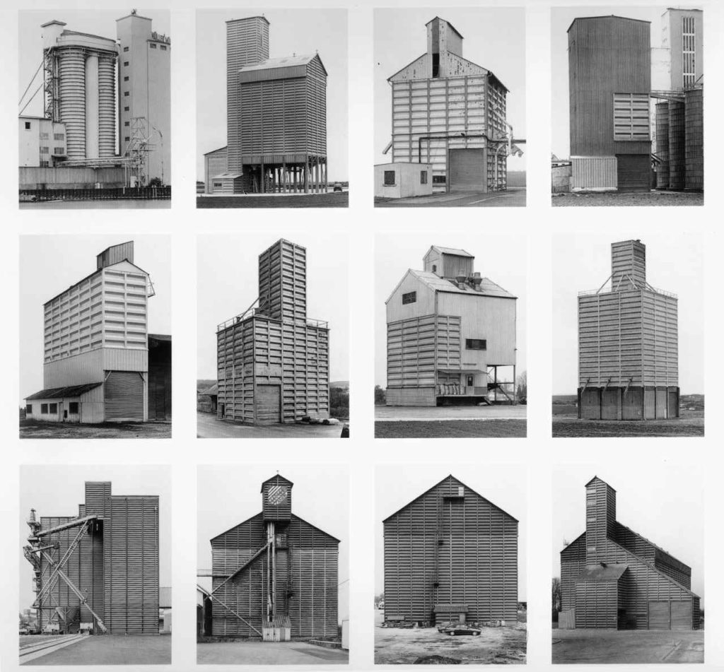
Bernd & Hilla Becher

Lewis Baltz

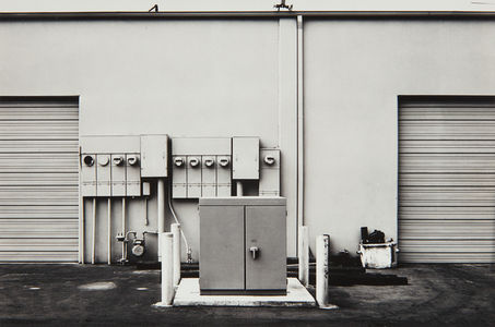
Lewis Baltz (1945-2014) was an American photographer and visual artist, most famously known for his contribution to the New Topographics movement as one of the “New Topographics: Photographs of a Man-Altered Landscape” exhibition’s original photographers. Growing up in southern California in the post-war years, he had witnessed at first hand the rapid urbanisation of the countryside and the relentless spread of suburbia. In his work, Baltz focused on capturing “a landscape that no one else had much interest in looking at”, photographing areas such as car-parks, tract housing, concrete walls, garages, vast industrial warehouses, metal fire escapes, anonymous buildings, all with an absence of people. Baltz described how his daily life took him “to shopping centres, and gas stations and all the other unhealthy growth that flourished beside the highway”- he has a clear aesthetic in his work, focusing on minimalism and rejecting the usual expectations of landscape photography, such as the romanticism of landscapes. His images demonstrated a stark geometric beauty, making the new homogenised America visible in a way that echoed, and criticised, the soullessness of urban planning.

Examples of Baltz’s Work

Image Analysis

 Lewis Baltz | 1974 | “The new Industrial Parks near Irvine, California”

I chose to analyse this specific Lewis Baltz image due to its strong technical aspects that conform to the formal elements, while also reflecting Baltz’s views on the growing world of industrial landscapes. Firstly, I really enjoy how Baltz has captured this image with a high contrast black and white filter, whether this was a specific choice or not, the absence of colour creates a desolate atmosphere. This links to the New Topographics movement and shows Baltz’s negative opinions on the increasing urbanisation of the world. However, Baltz also wished to find the beauty in his everyday geometric surroundings, for example a static rectangular shape can be seen to the left on the door, and is repeated on the bricks, and again on the ladder- it keeps on going. The use of repetition, while aesthetically pleasing to the eye, could actually represent the uniformity of society and the landscapes we are destroying- suggesting these industrialised buildings are taking over our environment. Additionally, the geometric shapes create strong leading lines throughout this image. Particularly, the stripes of paint to the left of the photograph and the thick line created by the half-wall on the right draws the observers eye towards the ladder in the background of the image. Baltz may have wanted to highlight this aspect of his image as the ladder disappearing at the top reflects the never ending climb to save the natural world.

In addition, the natural lighting Baltz used to capture this image creates soft shadows and highlights however, there is still a big contrast between dark and light tones. The paint swatches on the left of the image move up in a gradient pattern from dark to light, becoming less uniformed as they go on. This could symbolise the destruction of nature, and how modernised buildings are slowly trampling on our environment. Overall, the tones in this image are balanced (with slight emphasis on mid-tones) which creates a muted sombre mood, possibly connoting Baltz’s feelings while taking in the landscape he has captured. In terms of space in this photograph, there is not a wide depth of field or a vast expanse of land in the background (like the work of Ansel Adams), instead the background is blocked by a manufactured wall. Moreover, the composition of this image reflects the rule of thirds with the door and paint in section one, ladder and bricks in section two and the rectangular wall structure as the third. By using this composition technique, Baltz has created a visual narrative as he guides the observers view through the image from the dark gloomy thoughts on an industrialised world, to a hopefully brighter and more optimistic future for landscapes.

My Photoshoot – Contact Sheets

Edited Images

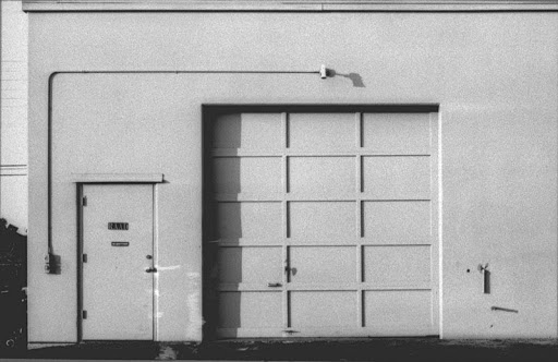
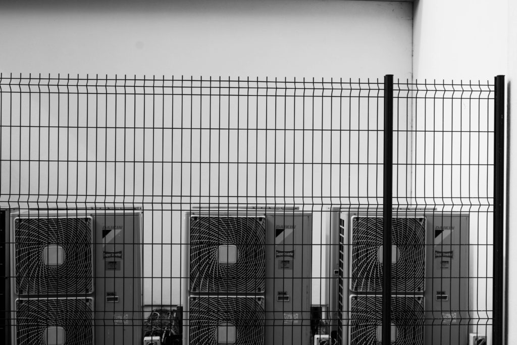
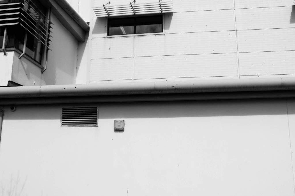
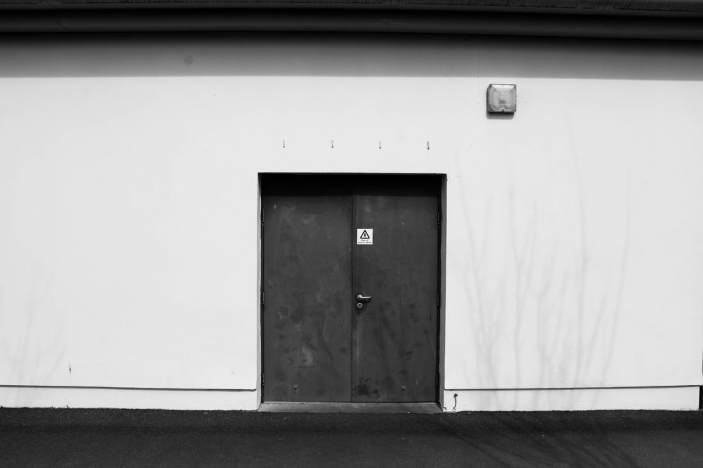
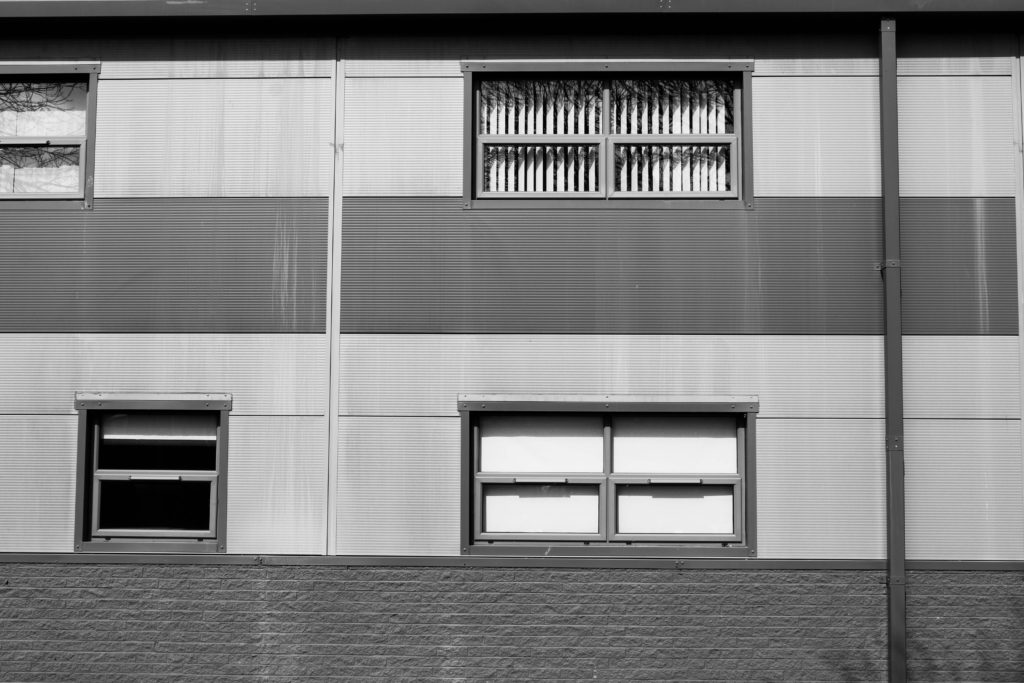
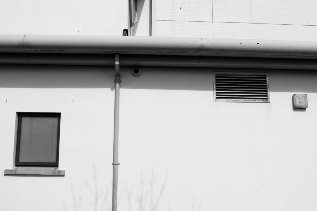
In class this week we took our cameras around the school grounds in attempt of capturing images relating to The New Topographics. I took inspiration from Lewis Baltz during my photoshoot, focusing on photographing buildings, walls, windows and doors. I wanted to include as many geometric shapes as I could see around me in my images which became easier as the lesson went on, finding industrialised areas around the back of the sports building and down near Highlands College. I knew I wanted to edit my images with a black and white filter after the shoot, so while capturing them I saw fit to stand in specific positions looking up at/down on the landscapes in order to capture contrasting shadows and highlights that would be emphasised by the unsaturated editing. My images include several vertical and horizontal leading lines of all shapes and sizes, guiding the observer’s focus along the photo to focal points such as doors and windows. Moreover, my use of repetition within these images mirrors Baltz’s technique of showing the echoes of modern society conforming to industrialised architectural ideas. Additionally, I have reflected the concern with industrialised buildings taking over our environment by capturing tree branches in the background of a few of my images- suggesting the urbanised world is covering up the beauty of nature.

Urban + Industrial Landscapes: Introduction and Ideas

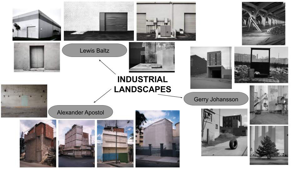
Industrial Landscape

Industrial landscapes are man made landscapes which look very industrial, mainly construction sites, power plants, chimneys, and factories.

Industrial landscapes are rising in natural habitats and urban areas, changing the natural aspect of earth creating unique geometrical shapes.

The contrast between the sharp unique silhouette of a factory within our natural world. Photographers have made abstract shapes with industrial buildings. Monochrome photography is also popular for industrial photos to get the image to contrast more.

Examples Of Industrial Landscape Photography:

Urban Landscape

Urban landscape photography focuses on more culture and lifestyle.

Humans rarely appear in the photographs yet you can feel the presence of life and culture. Both cautionary and confessional, they also define challenges facing our global future.

Examples Of Urban Landscape Photography:

Photo Shoot Locations

When taking my photos I want to focus on the idea of dereliction, old and new, altered landscapes and car parks. With an overall look on change.

Locations around Jersey: