Tag Archives: InDesign

ZINE – Design And Layout

Examples of different of zines and newspapers:
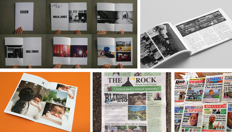
All of these examples look factor in, how they want the design to look and feel. The format, size, orientation, narrative, and visual concept. The all have good rhythm and sequencing, with text as well as images, including a title and captions.

We made the zine in Adobe InDesign, following these instructions to set up the document:

Create new document
width: 148mm
height: 210
pages: 16
orientation: portrait
columns:2
column gutter: 5mm
margins: top, bottom, inside, outside: 10mm
bleed: top, bottom, inside, outside: 3mm

Using paper images to create a layout.

Draft 1:
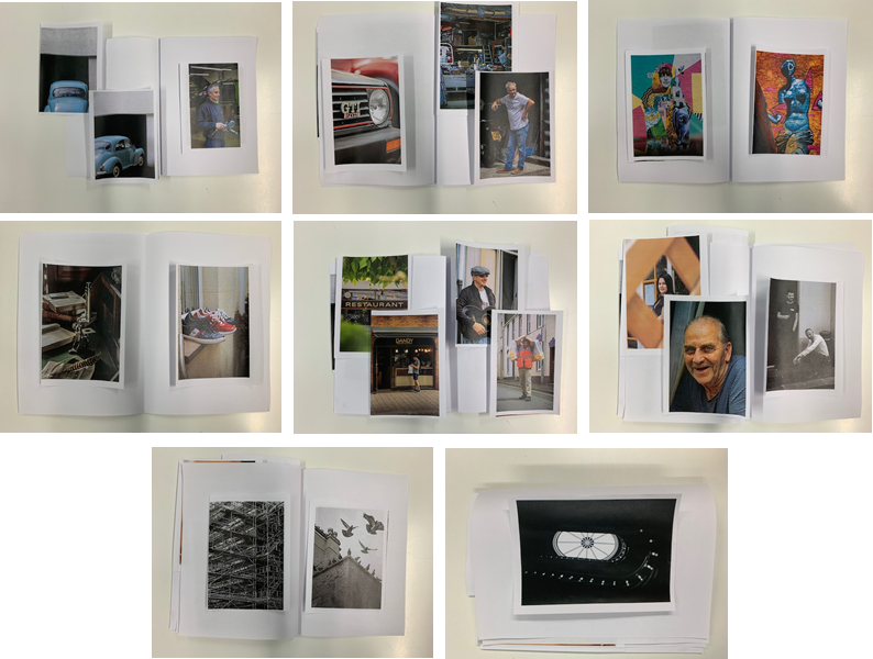
Draft 2:

Final Arrangement:

Following these instructions, I made a concept of the layout based off the paper copies I made with my printed out images.
changed
changed
final arrangement

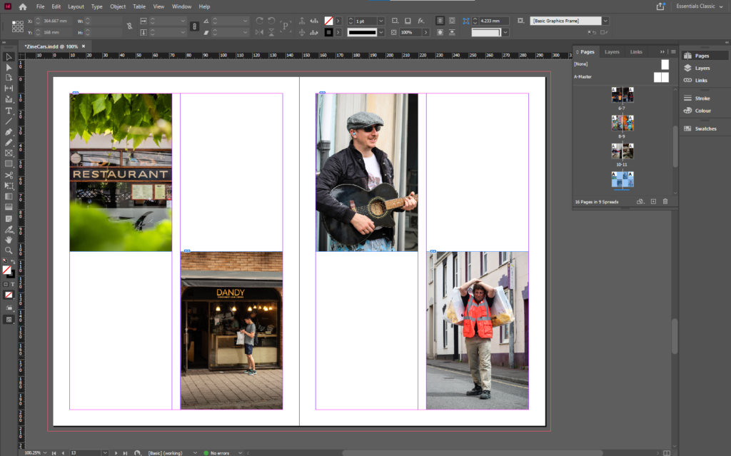
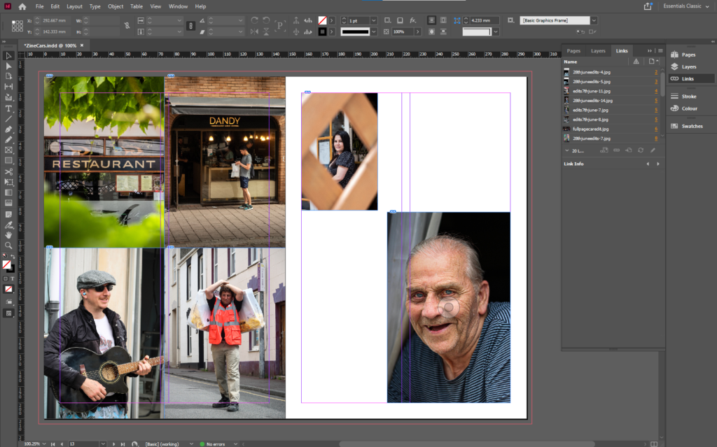
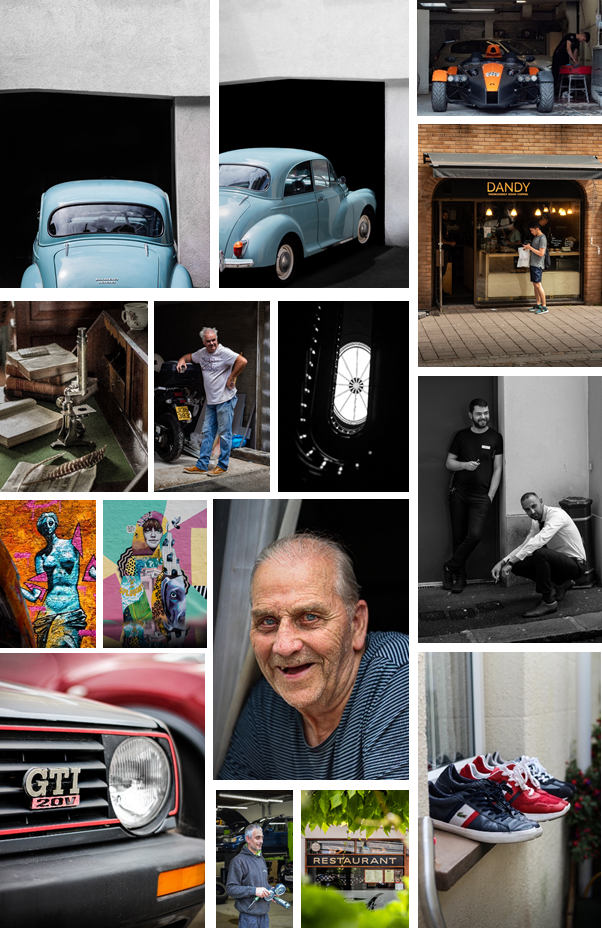
I decided to move and rearrange some images to create space for some more full page image. I like the combination of the 4 all together, as the share a similar link. The top 2 are shops, and the bottom 2 are people working.
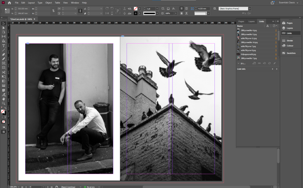
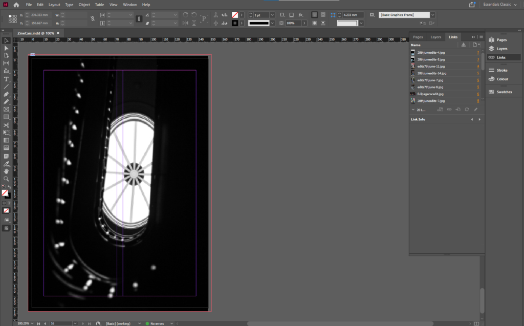
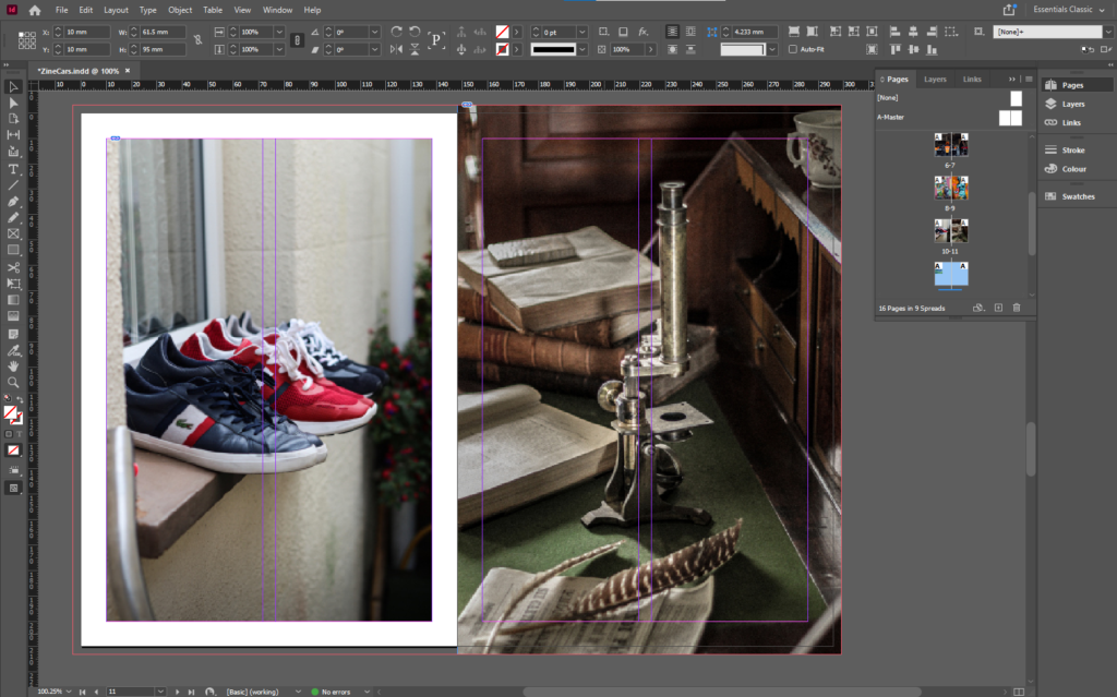
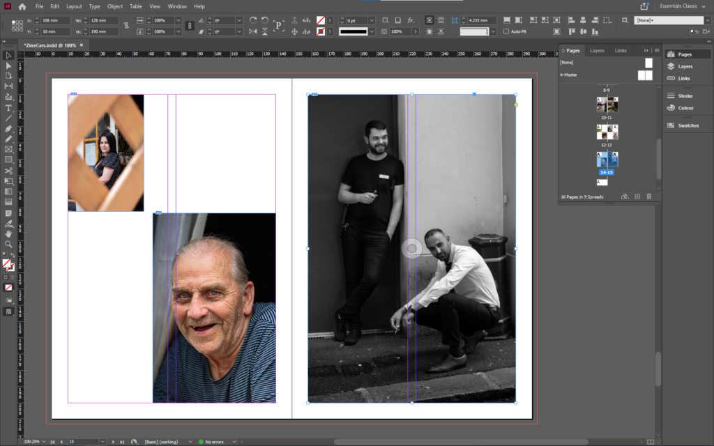
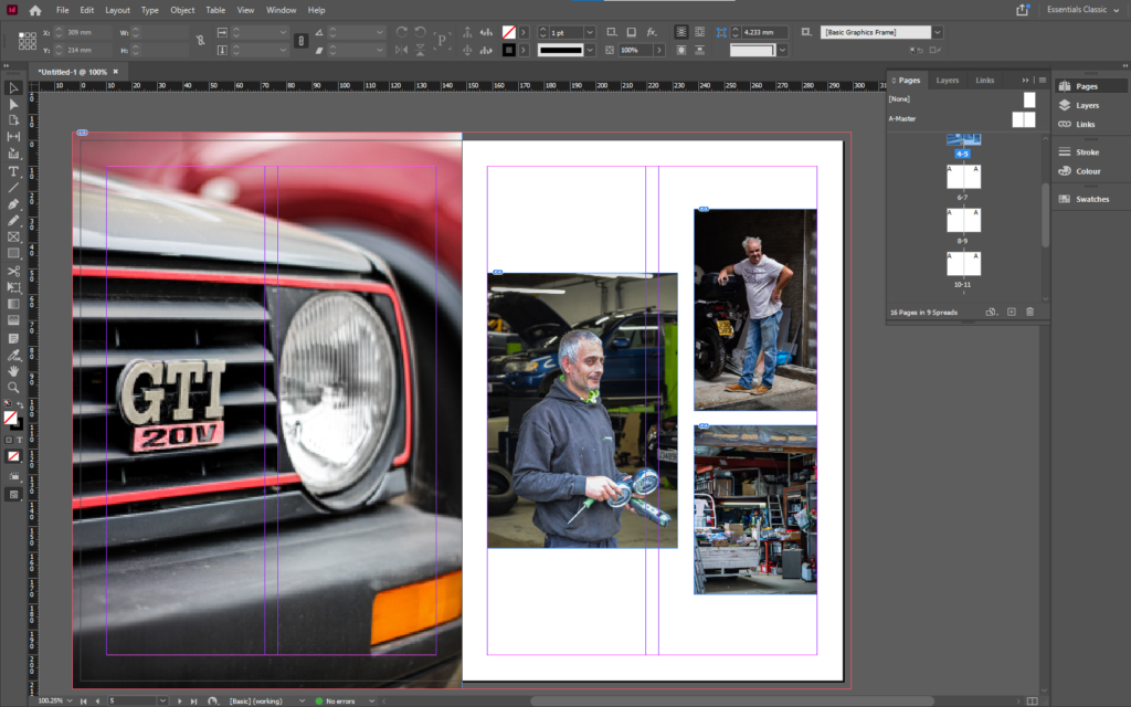
I arranged the zine to smoothly change the subject focus from old cars, to new cars, to mechanics, to personal belongings, to street photography of work places, then to half/full body images of people, to close ups of people, then into the final black and white images.

THE FRONT COVER

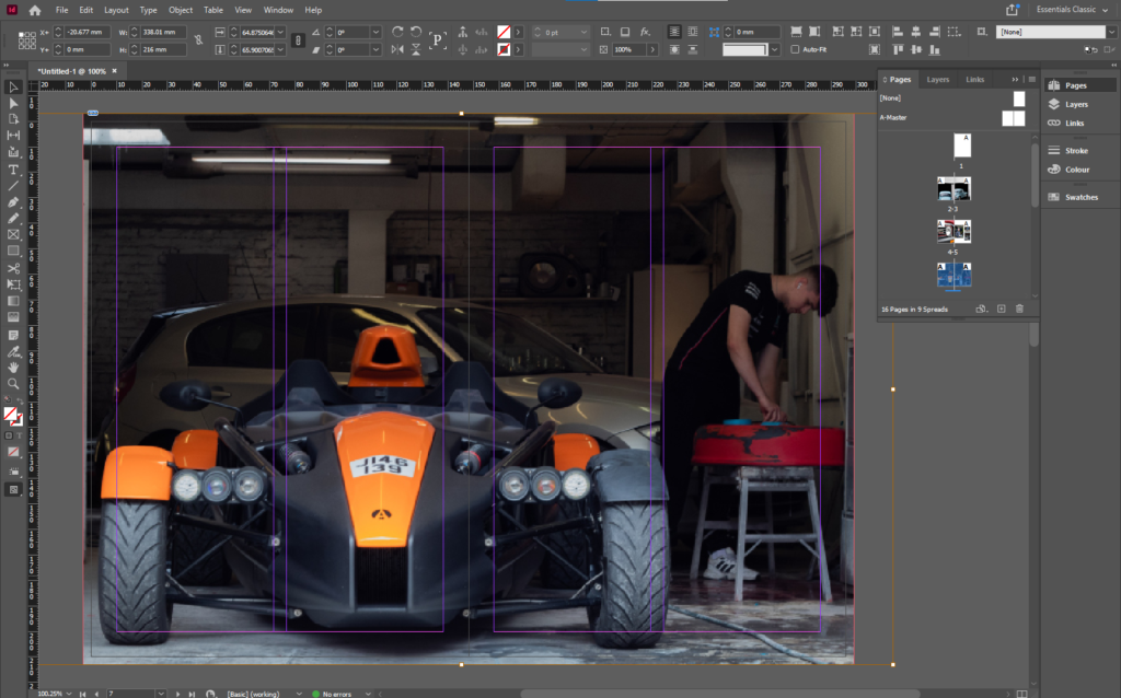
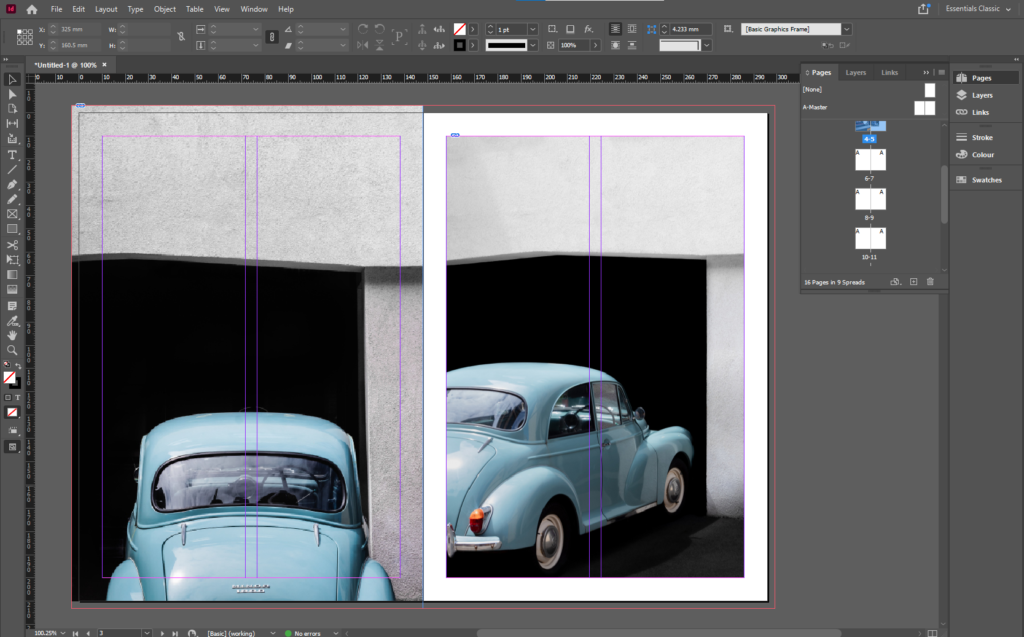
I decided to use Photoshop to create the front cover as it was easier than trying to do it on the zoomed in image of the car.

First, I used the pen tool to mask a path for the text to go on. I made sure that the path was parallel to the edge of the car, then used a old styled font to keep the old theme consistent.
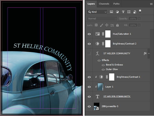
Overall, I believe that this is the best layout as there is a smooth, consistent flow between images, which tell a story without using any words. I have experimented by changing a few pages and rearranging the layout to come up with the final design.

ZINE – Narrative And Sequencing

STORY: What is your migrant community story, for the St. Helier shoot?
Describe in:

3 words, A migrant community.
A sentence, St Helier Jersey’s migrant community featuring workers and cars.
A paragraph, This shoot represents the working people of St Helier, and their belongings, such as cars and houses. It also displays key features of the town itself.

NARRATIVE: How will you tell your story?

These are some common examples that people use to tell a story:

– Images > new photographic responses, photo-shoots
– Archives > images from SJ photo-archive, family album, mobile
– Texts > letters, documents, poems, text messages

However, I will only use images I’ve taken. This is because I feel that they tell their own story, as I’ve arranged them into a sequence which allows there to be a flow which guides the viewer through the images and tells a story.

AUDIENCE: Who is it for?

My zine will be aimed at anyone who lives in Jersey, but most specifically, St Helier. Plus, It also helps if they are 14+ as they would understand the images in more depth and detail, making it more impactful for them.

However, most image makers tend to overlook the experience of the viewer. Considering who their audience is and how they may engage with your photo-zine is important factor when they are designing/ making it.

SEQUENCING THE CONTENT – 20 images

I decided not the include any images from the archive as I have taken images which juxtapose each other. Such as, the old blue Morris Minor and the red GTI Golf. This helps tell a story and emphasise differences or similarities between the cars. I will also include other methods such as “zooming out” to create similar effects.

THEME OR STORY

The front cover will be made from a zoomed in image from one of the car photos, as it is one of the main themes.

The start of the zine will contain images related to mechanics and cars. Some of images of the cars will juxtapose each other. New vs Old. The 2 images of the old car images will be full paged on the first 2 pages, as they are major establishing shots.

Near the start of the zine there will be a double page spread images of a new, modern car, which symbolise the new technology and the way forward.

There will be a 2 page spread of just street art, both the images will be full page, and both include vibrant colours, which adds a lot of colour into the project.

For the shots of the people, I will start off with 4 multiple shots one one page, of 2 street photos, then 2 full body shots, then transition into head shots and images of peoples faces.

At the end I plan for there to be images of the actual town, such as the pigeon shot, and the scaffolding and the staircase in the Jersey Museum.

I have arranged it so some images juxtapose each other and zoom into each other, creating a smooth transition between images. Most of my best images will be full page as you see a lot of detail when its bigger.