
MY AIM / GOAL / IDEA
My aim is to create a piece in Photoshop in the style of Dillon Saw (the first artist/photographer I studied) an altered landscape/image manipulation, but with Sebnem Coskun’s (2nd photographer) content, which is the plastic pollution in the ocean and ocean pollution.
I envision a boat with buoys on, in the center of the ocean that has lots of rubbish and bottles floating around in the sea. You would be able to see under water and above the water.
THE PROCESS
- Image selection
- Making the image (showing the development)
- Presenting the image
IMAGE SELECTION
Firstly, I decided to chose images that I plan to use from the Bouley Bay photo shoot and the St Brelades photo shoot. These photos would be the ones that I used to make the final image in Photoshop.
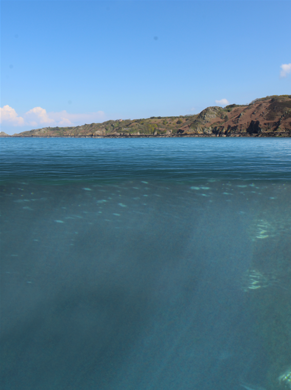
These are the photos I chose to use from the St Brelades photo shoot. The water is for the main top of the water, the seaweed I plan to have floating underwater. And the rock would be underwater on the sea floor, or maybe poke above the surface (if there is enough space).
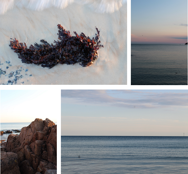
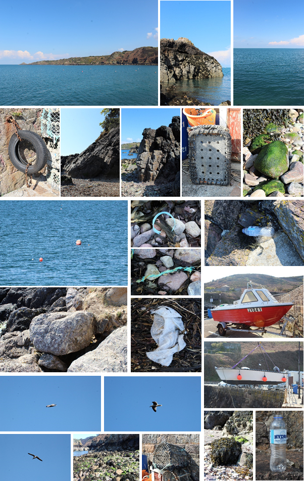
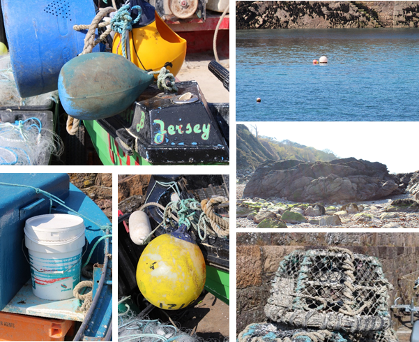
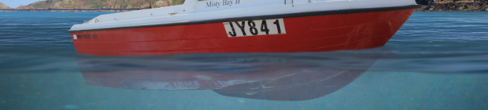
These are the photos I plan to use from the Bouley Bay photo shoot. The headland/coast will be the background. The rocks would be underwater and the seabed. All the fishing nets, rubbish and fishing equipment will be floating in the sea. The red boat will be in the center.
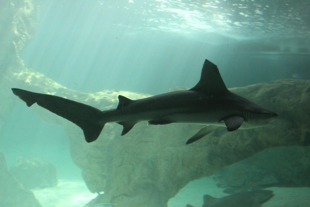
The underwater picture. I checked with Mr Cole, if I was allowed to use it. It is a picture I took in an aquarium then in photo shopped everything out and only kept the underwater perspective. I will change the saturation and hue later.
Before 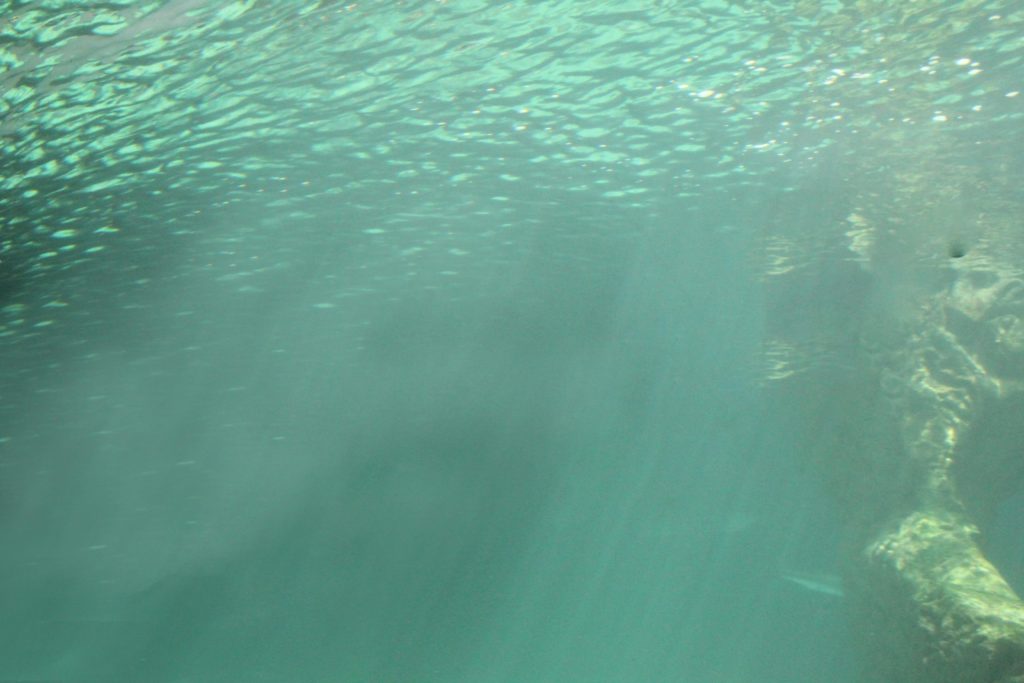
After 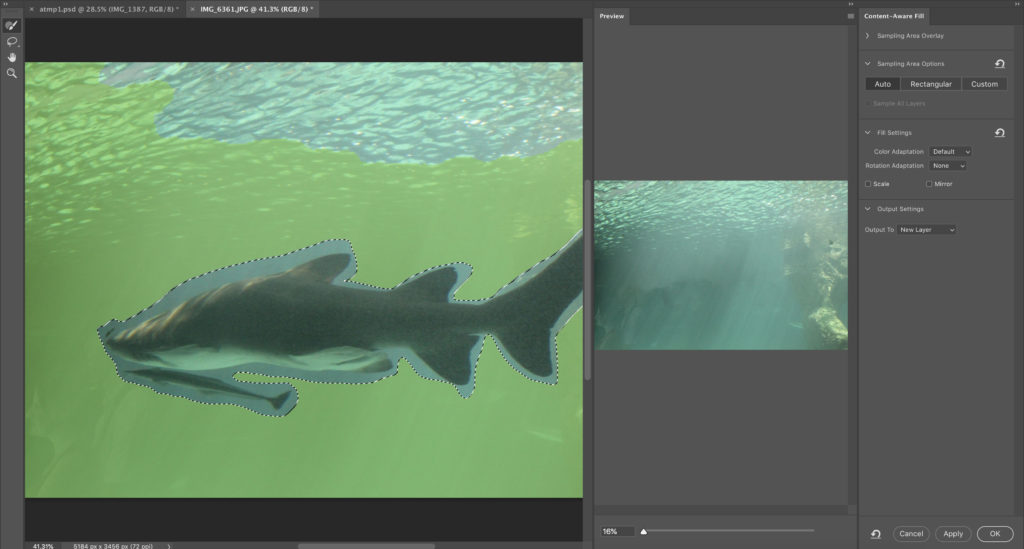
Screen grab from Photoshop
MAKING THE IMAGE
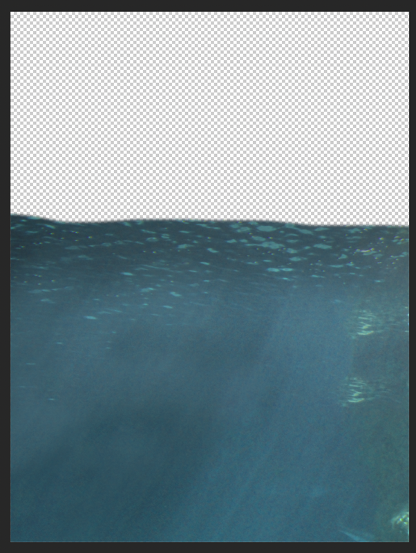
Firstly, I made a new document in a good portrait dimension, I chose portrait as I would like the viewer to concentrate on the main focus, the rubbish and pollution. Then I added the underwater image, and positioned it to fill up a bit more then half of the screen.
I changed the hue and saturation to match the next image. I also added some shadow to the top of the image to make it a little darker, On top of the brightness and contrast adjustment layer, where I made it darker and increased the contrast.
After, I added the photo of the sea from the St Brelades photo shoot, however, the sunset colours didn’t really match the whole ascetic, so instead I used the image from the Bouley Bay photo shoot, which was better. I positioned it above the underwater picture, then I made only the vertical part of the image “squished” to match the perspective I was going for.
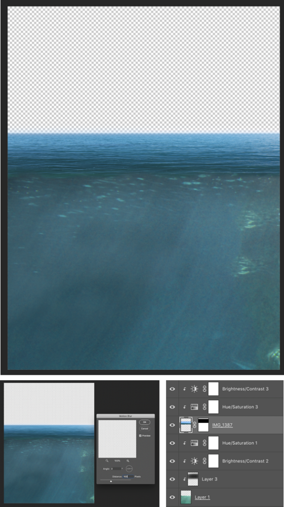
At that point, I added a layer mask of get rid of the sky and background, using the black gradient tool. After, I changed the brightness and contrast, and hue and saturation, to match the two images together. I made the top of the sea brighter as the sun would be lighting it up. Then a added a small amount of motion blur at a 0-2 degree angle, to make it a bit smoother.
Next, I deiced to add a background, which was from the Bouley Bay photo shoot, and was the image of the headland/coastline. I put that layer to the back so everything was on top of it. I aligned it so that the water I edited was on top of the water in the background photo, which kept the perspective.
Additionally, later I will edit out the dirt on my camera; as you can see in the sky, using the spot healing brush. Then I increased the saturation of the background, to make it stand out more.
There was something off, it felt like the transition from above to below the water was to sharp. So I made a waterline from a zoomed in image of the sea I took, then used the eraser tool to make a “wave” effect. Then dragged it on to my main image, and put it on top of where the change is.
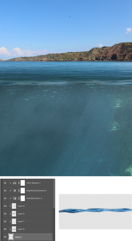
When I put it on my main image it was very blue, so I applied extremely similar adjustment layers to the water line, then added shadows and highlights to blend it into my image. I also used the eraser at 50% hardness and 15% flow, to fade the top of the water into the waterline. Furthermore, To create a sense of depth and distance, I added Gaussian blur to the waterline, to make it look like it was closer.
Following, I made some small adjustments, moved the underwater part up so that you couldn’t see the top of the water. This helped match the perspective. Afterwards, I made the edges of the underwater section darker, this made it more realistic, and created a sense of darkness, which can represent evilness. This is where ill be putting the rubbish, so it makes sense that it has a negative atmosphere, as it is a world wide problem.
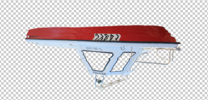
Then, I added the boat in, first I had to remove the background. Which I used the eraser and magic wand tool. I temporarily made the background black to see if i missed any parts.
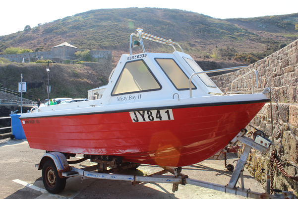
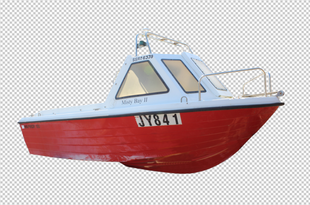
After I made the windows a separate part from the boat so I could change their opacity and add a reflection of the sky.
When I removed the background the trailer was covering the boat, so I used the clone stamp tool to manually fix the haul of the boat.
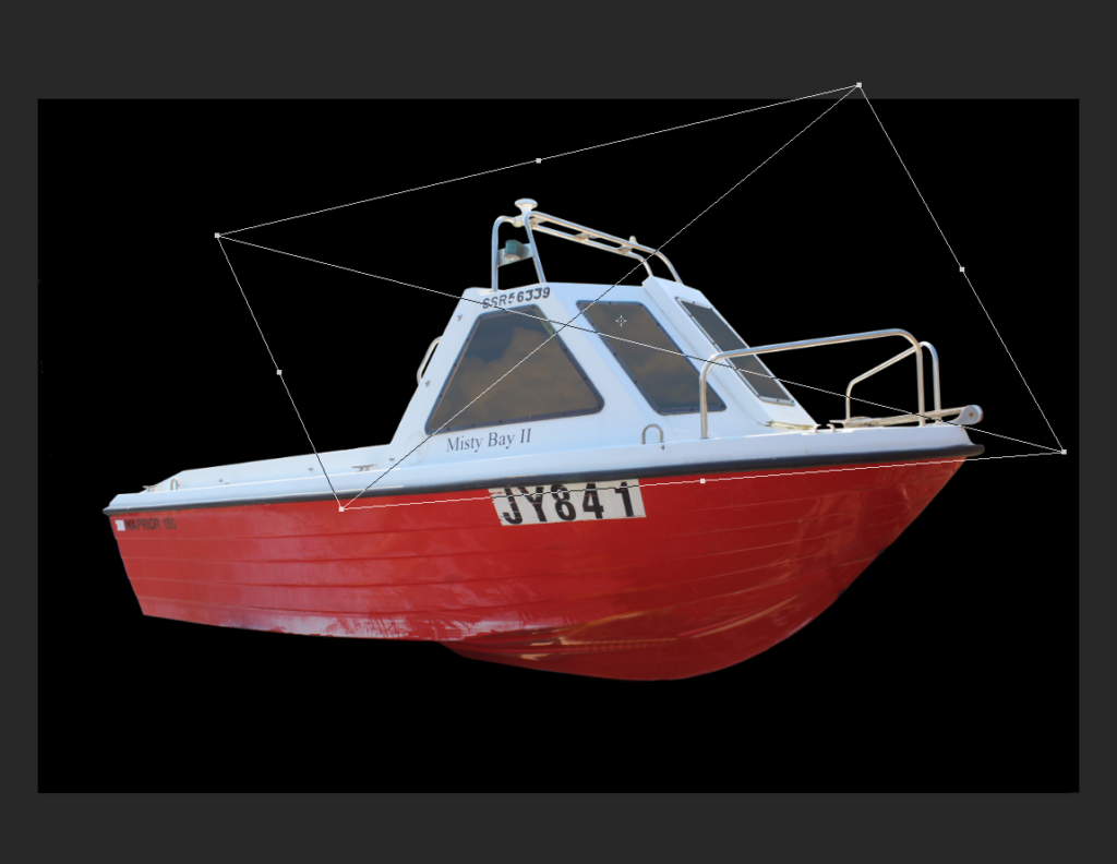
I added the boat into scene, I put the boat and windows on the top layers, and the duplicated only the boat and put it above the underwater picture, to get the blue underwater effect, I changed the blend mode to soft light, then after I erased the bottom of the boat (top layer) to let you see the layer underneath, to give the effect of it floating in the water.
I added adjustment layers to match the boats colour with the scenery. Additionally, I added shadows to the bottom of the boat, and highlights to the top.
After, I added a reflection on to the water of the boat, this would make it more realistic.
I added the reflection to the top water layer and waterline, I set the opacity to 15% on each so that it wasn’t a solid.
I used Filter > Liquefy to make the reflection more realistic.
I distorted the reflection using a brush with 38% pressure and 50 size, and dragging the cursor over the reflection.
I use a photo of the rocks at low tide from the Bouley Bay photo shoot, to create a seabed in the bootom of the image.
I used a layer mask and a black gradient, to fade the rocks into the water above it. Then applied some adjustments to decrease saturation and increase contrast.
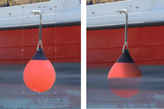
I decided to add buoys to the boat, to add details, I added shadows and highlights to the buoy, then after I added a reflection in the water from the buoy.
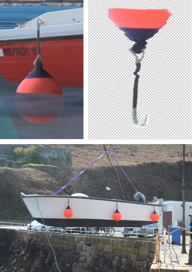
Then used the same technique when I distorted the boats reflection, to the buoy and will keep the reflections consistent, to match the astatic.
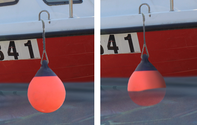
The second buoy before and after photos, I used a different buoy, but the same techniques to add shadows and highlights.
Finally, I finished the last buoy. Then moved on to the rubbish in the water.
I started to add the rubbish into the water. I started remove all the backgrounds of the images from the rubbish photo shoot, I did this in Photoshop. First, I opened the image in Photoshop, then used Select > Subject, then duplicated the selected selection (the object), then deleted the original image.
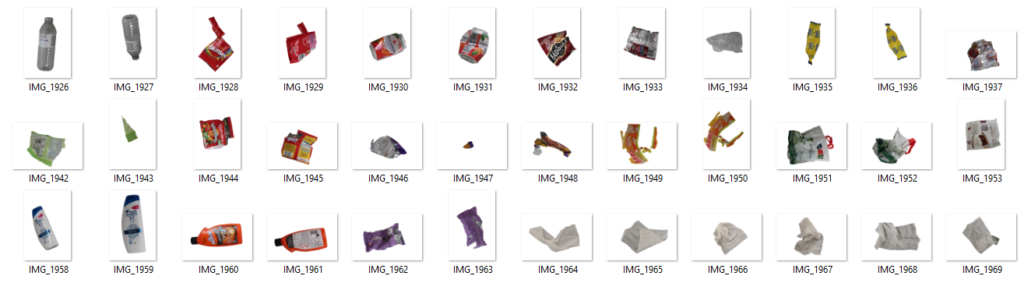
One by one, I added each into my final image, after I used all of them I duplicated them, and merged selected layers, the flipped them horizontally to fill the other side.
After, they were arranged, I added a hue & saturation layer, to decease saturation, to give it the old, dull, washed out look.
I then needed to add the fishing equipment to the seabed, which was left behind by fishermen.
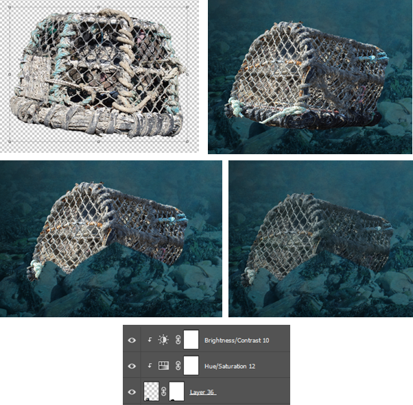
I removed the background of the net, then dragged it into the scene. I positioned it behind the rock, then used a layer mask to remove the parts that were over the rock,so it looked like it was behind the rocks. Then I added hue and saturation to decrease saturation, and the brightness and contrast to make it darker as I took the photo in daylight which is a dramatic difference to at the bottom of the sea, where there is no light.
I did the same with a tire in the center underwater.
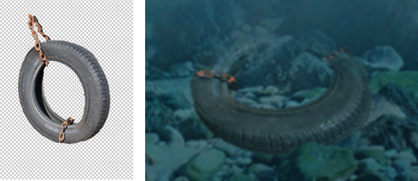
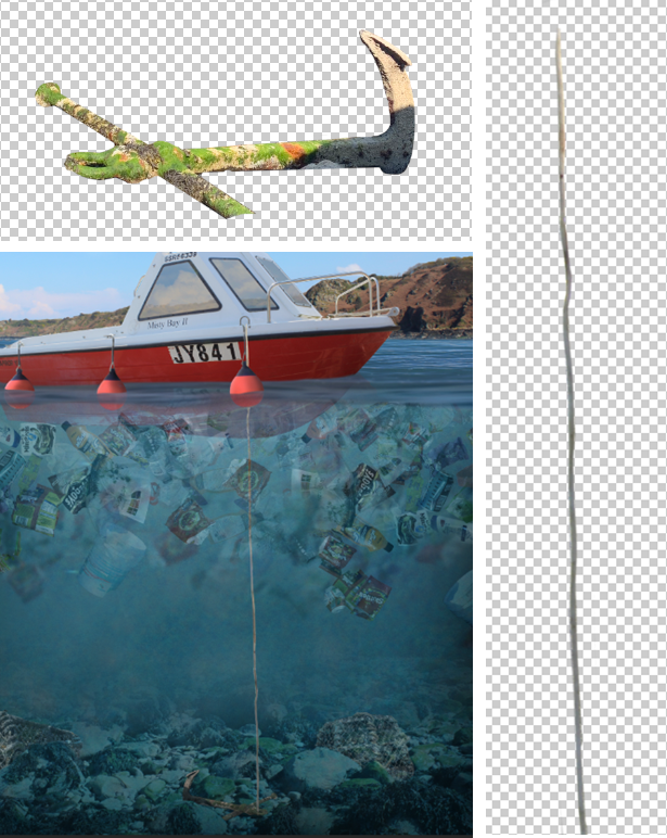
I didn’t like this as it felt to organised. So instead, I deleted it and made and anchor coming off the boat. I used the rope from the Bouley Bay photo shot, when boat was hanging in the air. And the old anchor from the same shoot.
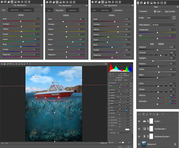
This was all the edits I planed, so finally, I added a Camera-Raw Filter to fine tune some of the settings and adjustments. I changed almost all the settings, these were the adjustments I made:
FINAL IMAGE – ANALYSE / EVALUTION
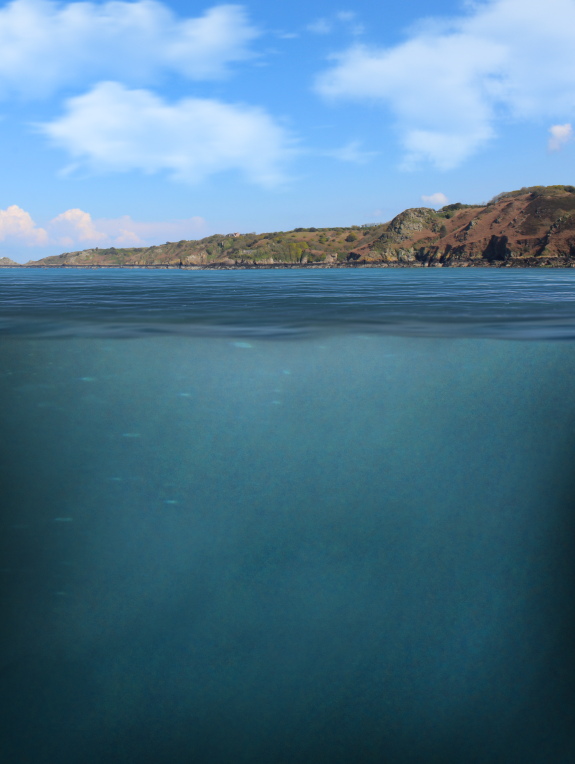
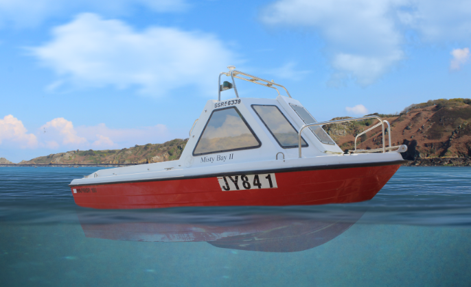
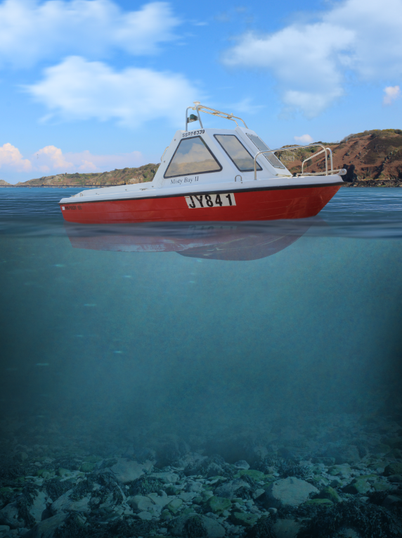
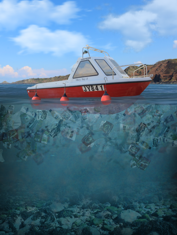
This is my final piece, it represents plastic pollution, which was inspired by Sebnem Coskun, using the style of Dillon Saw, and his altered landscapes/image manipulation. Overall, this is exactly what I said I was going to do from the start.
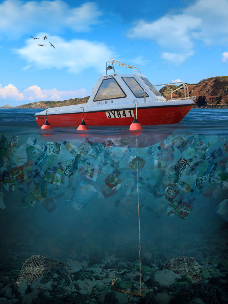
Overall, I think it turned out well! I like how it worked, and demonstrates how, we cannot see the whole plastic problem from the surface, and how we have to look at it from a different angle to see how bad it is.
This being the main piece, which I made in Photoshop. It demonstrates my editing and Photoshop skills, whilst still showing my actual photography and camera skills, as I had to envision the angles and light at which I was taking the photo. This shows how I stuck to my original idea.
I have considered how weight factors in. The bigger items such as crab nets sank, and the light plastic items floated, although some were being held underwater as there was no room the reach the surface, due to the amount of plastic in the sea.
The composition is a strength, and is good as most of the image is taken up by the underwater part, which is the main part of the image. And it holds the message that I want to get across, which is, “ocean pollution is a huge world wide problem.” I chose to do it portrait as, if I did it in landscape there would be empty space.
There is a heavy contrast in colour between the two “worlds”. The underwater section is more green, which signifies freshness and materialism, which juxtaposes the waste in the water, that varies in material, due to the type of rubbish. The sky is a nice, colorful, and vibrant blue, which is the main type of contrast in this image, other than clean vs dirty.
CRITIQUE
There are 2 things I don’t like about the image I made. Firstly, how blue the underwater part is, I would of liked it to be more green, but this is not a big deal. And secondly, I don’t like how the plastic didn’t really overlap. When I tried to overlap them some pieces got lost and turned invisible. Also, I would of moved them up to the surface more, although, I wanted to show that the boat was floating, without covering the bottom of the boat with plastic.
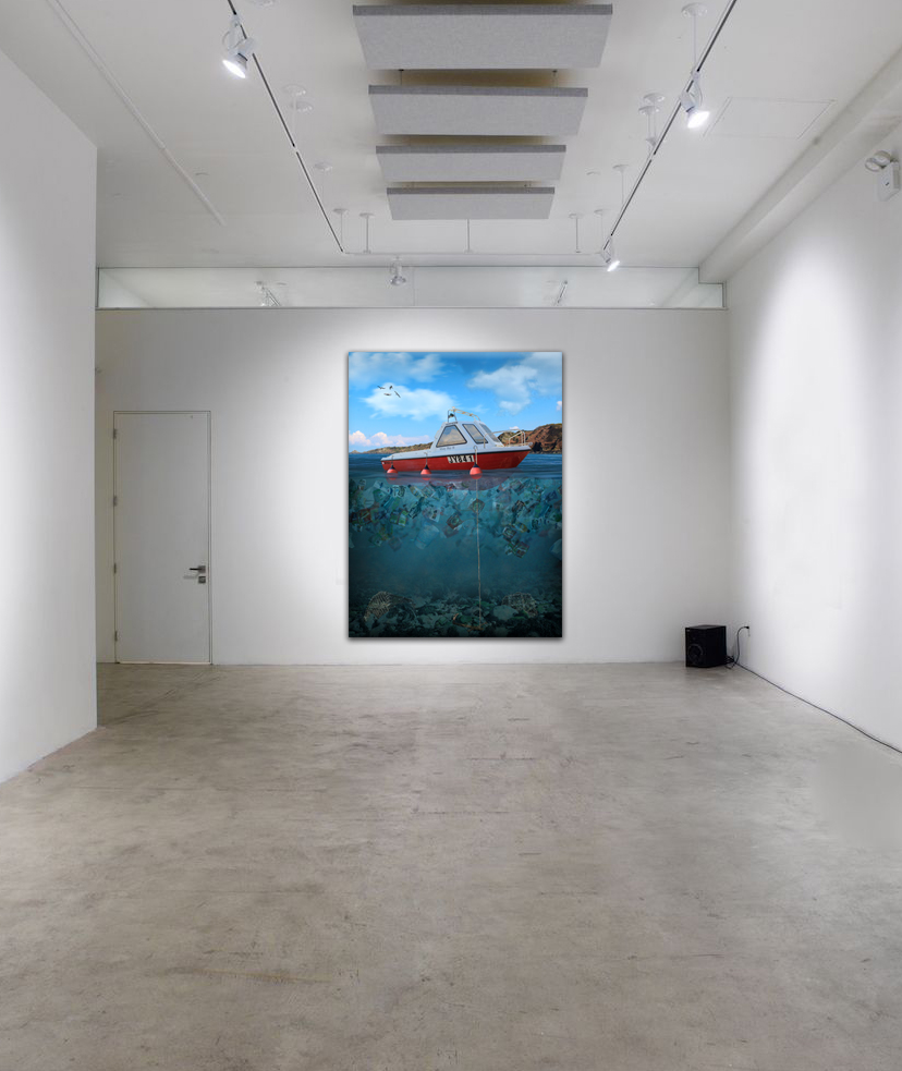
DISPLAY
I got an image of an empty gallery on Google, the brought it into Photoshop and put my image onto the wall. I resized it and added bevel and emboss and a drop shadow at 90 degrees. This added a 3D depth to it, therefore it looked more realistic.
The website that it downloaded the image from.
COMPARISON

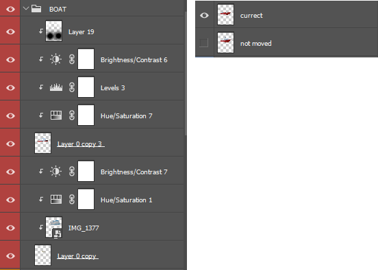
On the left is my final image, on the right is that same image without and adjustment layers, shadows, and highlights. This shows how much editing I’ve done, and all the 300-400 layers there that made this piece look much better.
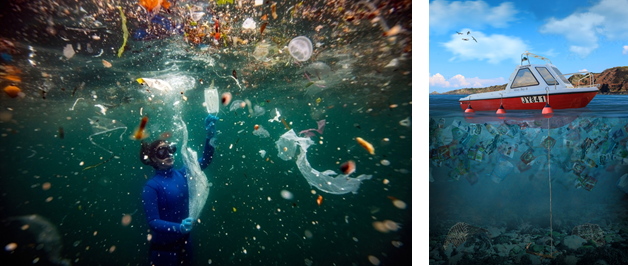
MY IMAGE VS COSKUN
My image is on the right, Coskuns photo is on the left.
Starting off with a Venn diagram, to visualise the similarities and differences.
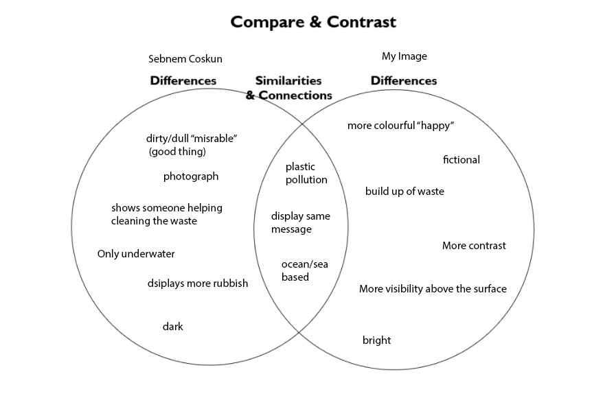
As you can see both take on the same concept, which is plastic pollution and the view from underwater.
Coskun’s work being and actual photo, and mine being a digital art piece which implements photography. They shares some similarities, Coskun’s has more depth, this is because she took it deeper underwater, where as mine in the perspective from between the surface and underwater.
Overall, Coskun’s image has more of an impact, just because it is an actual photograph, so when people look at it they realise that, this is actually happening and is a real thing. On the other hand, my piece is fictional, despite being modelled and based of real references. But people know its not reality. Its more of a concept of reality, using conceptual realism. However, both imply the same message about ocean plastic pollution, and how it is a real thing.