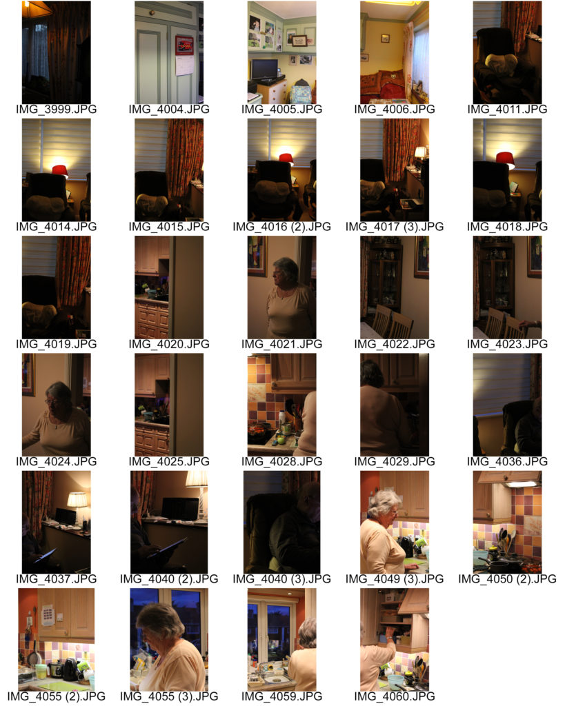
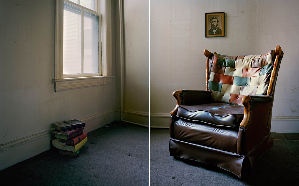
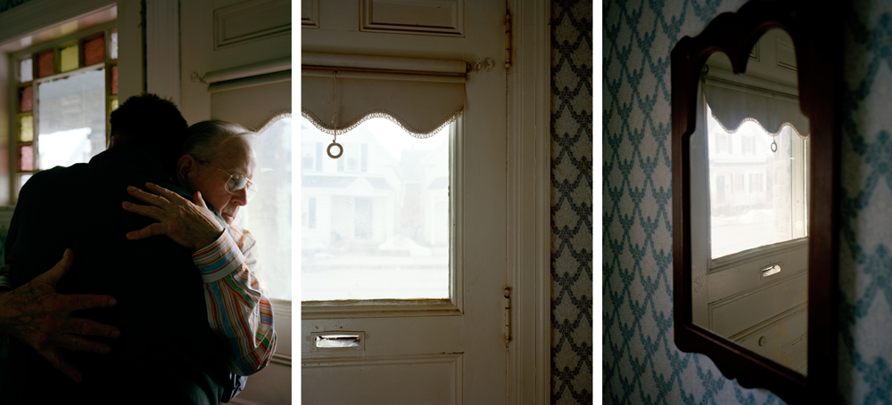
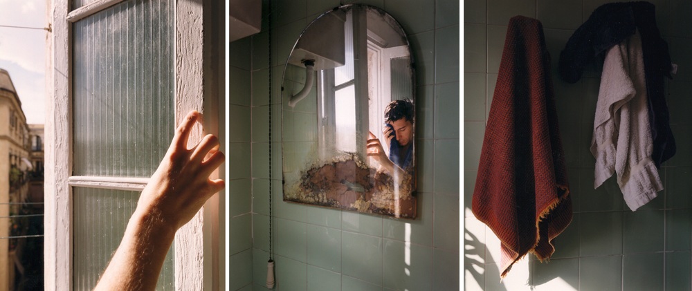
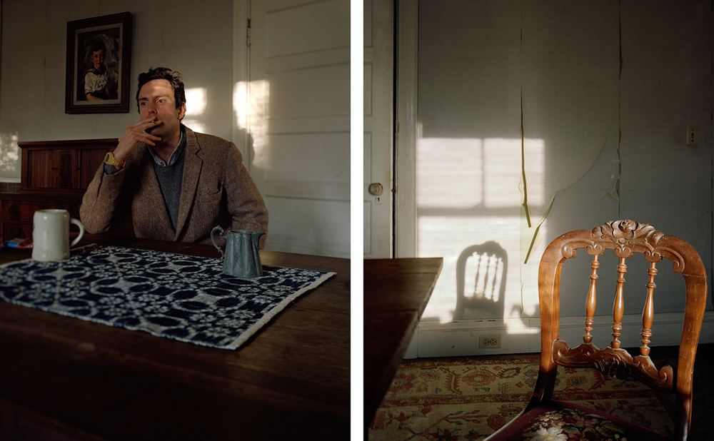
Julian Germain Inspired Photoshoot
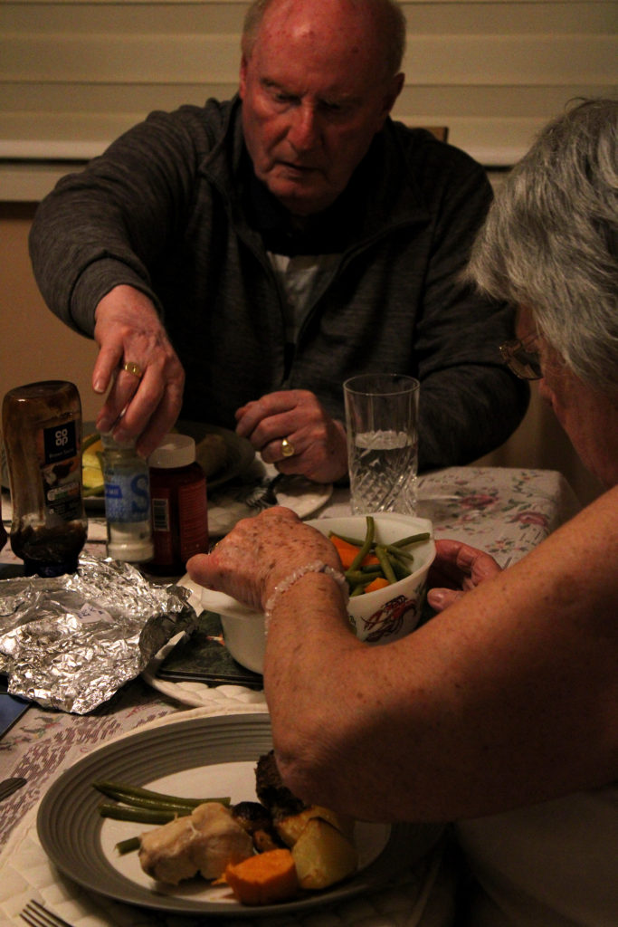
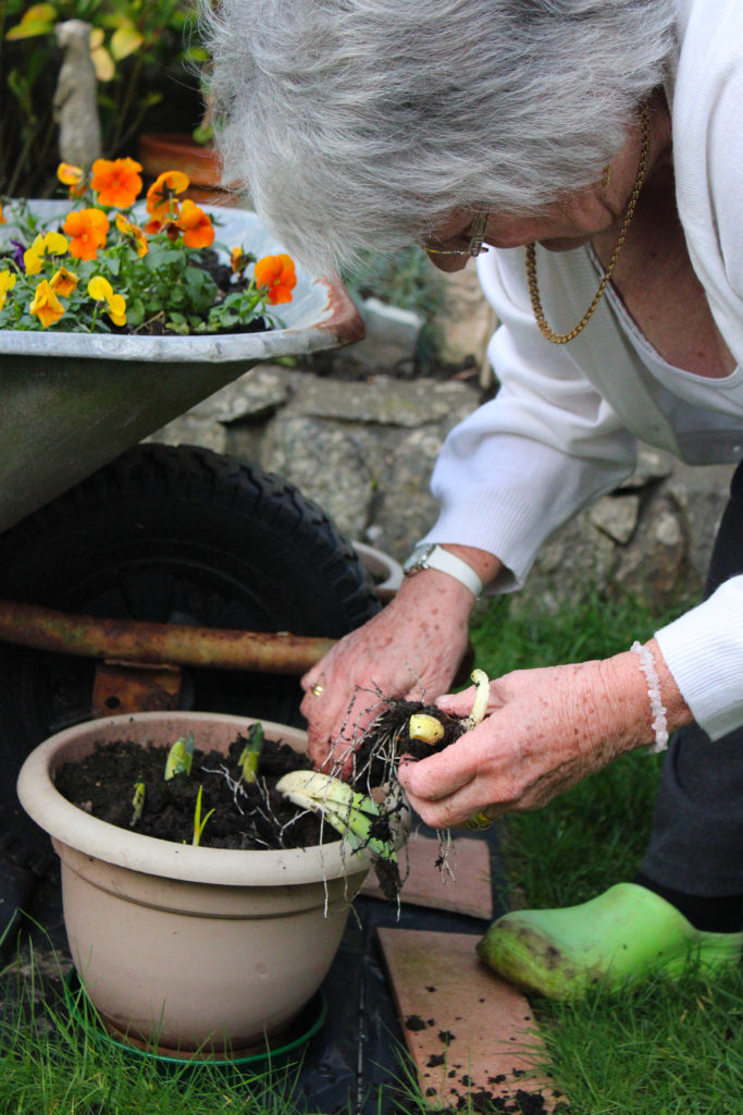
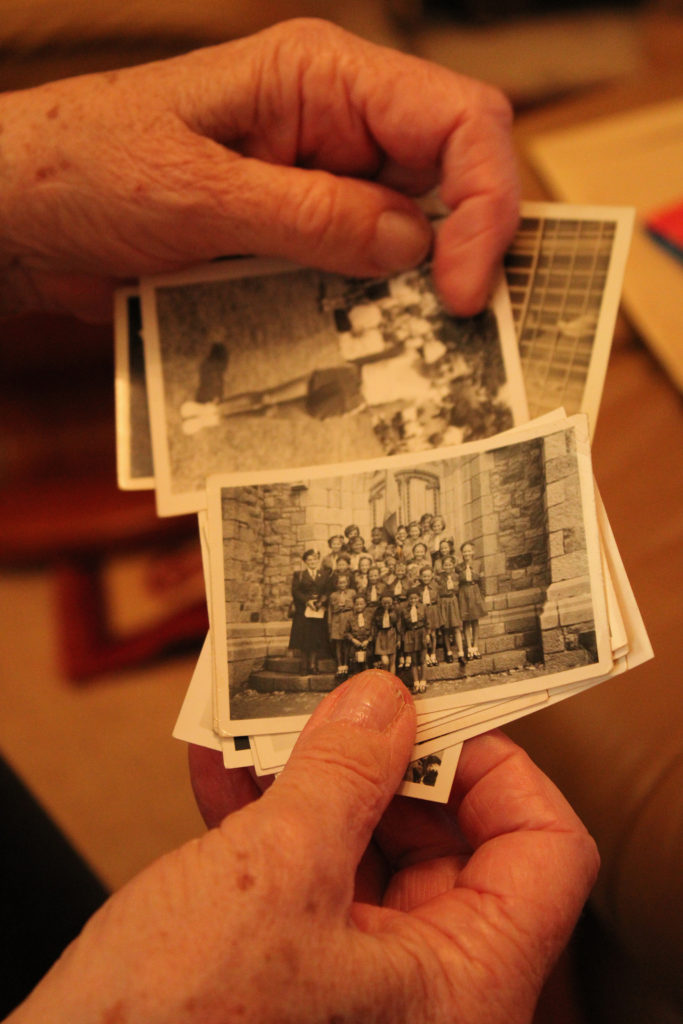
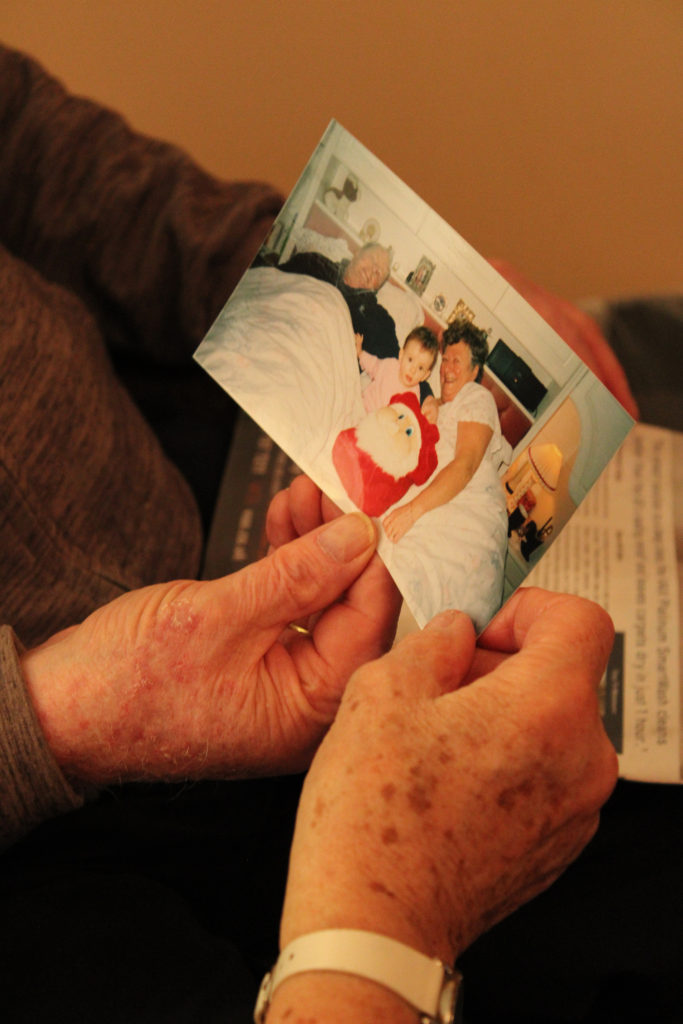
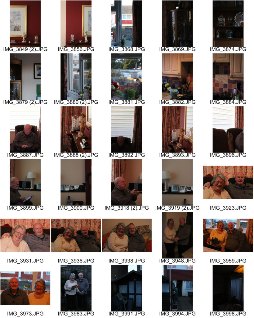
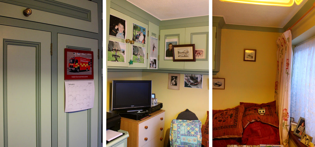
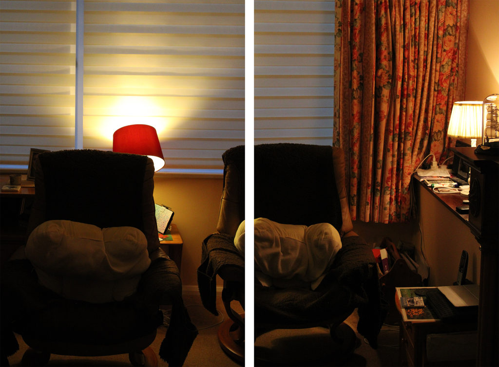
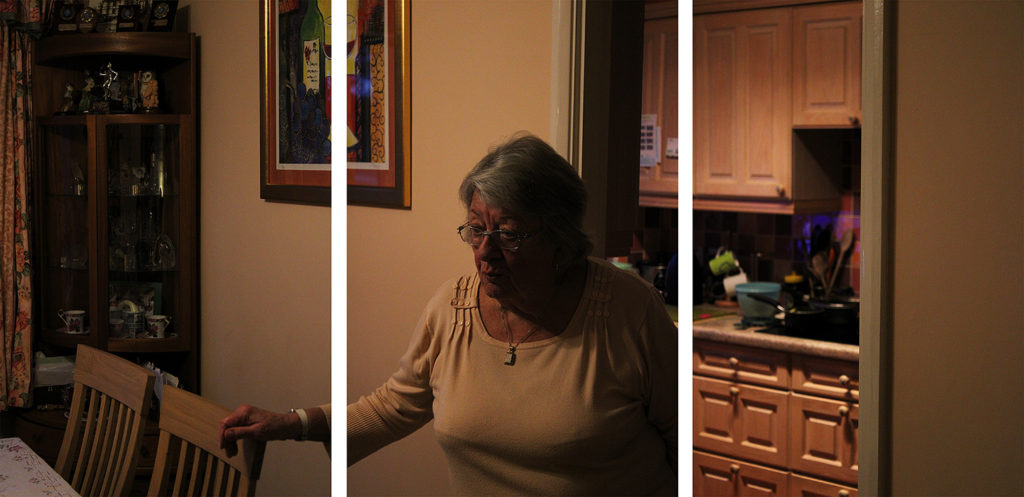
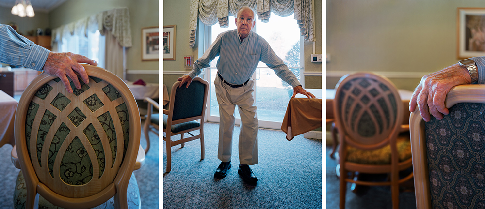
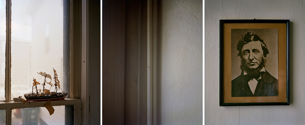
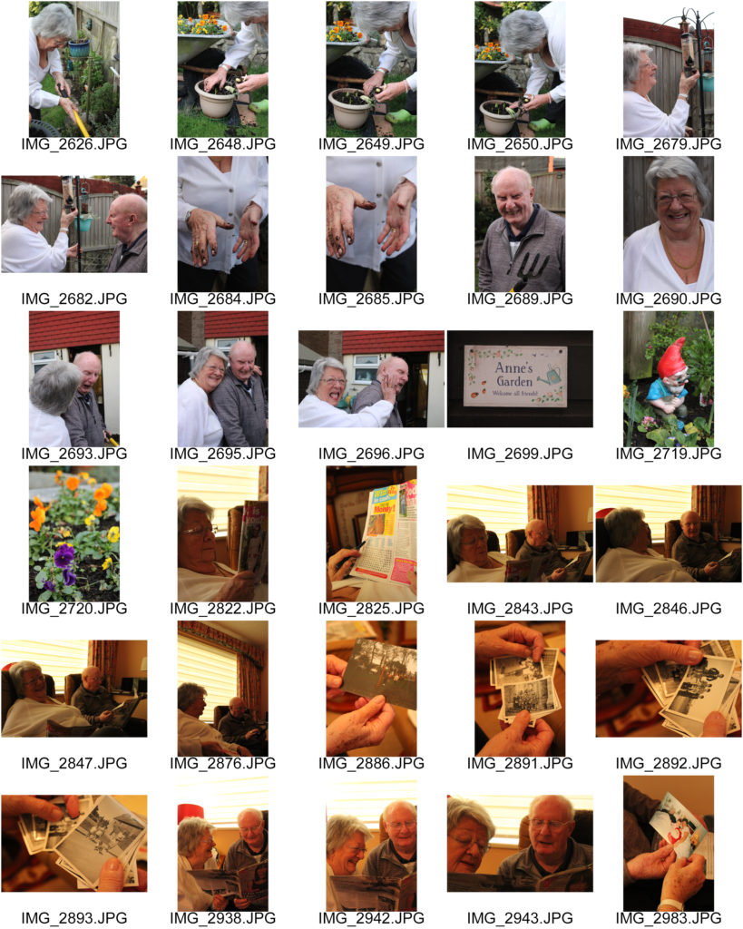
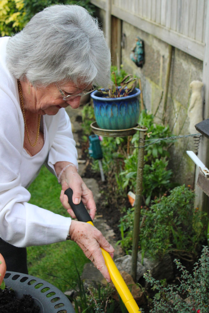
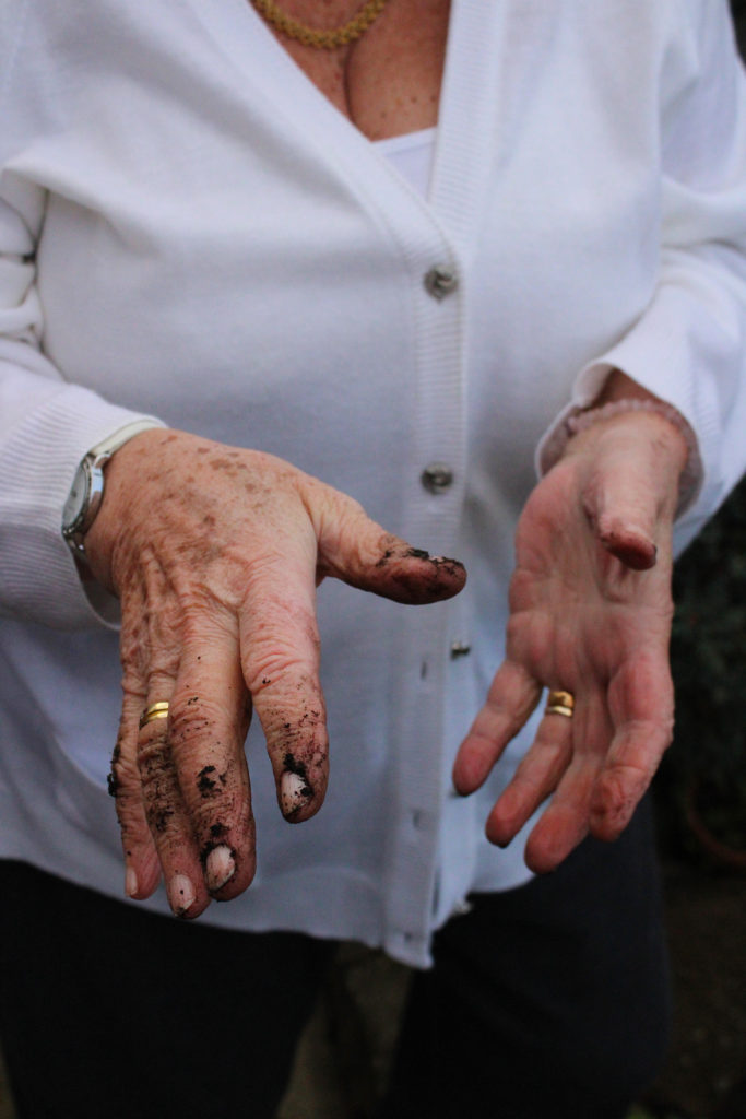
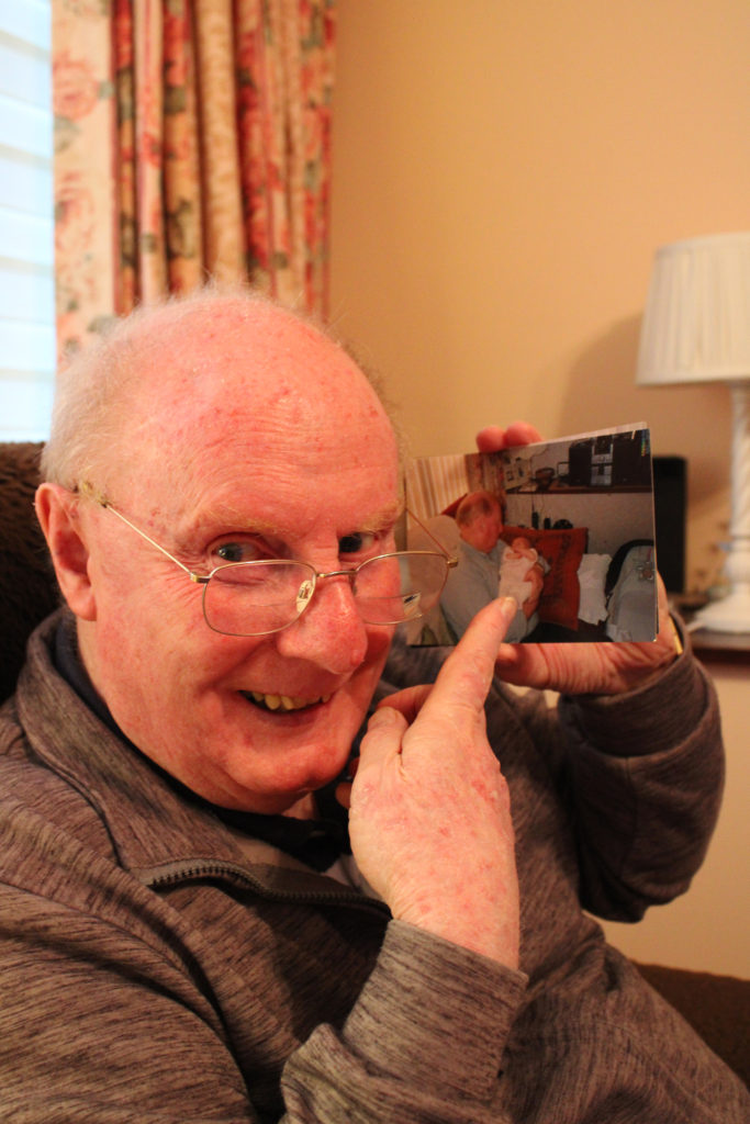
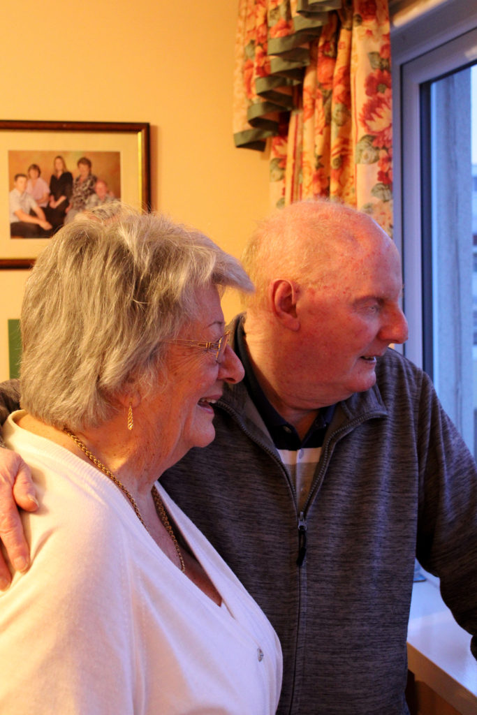
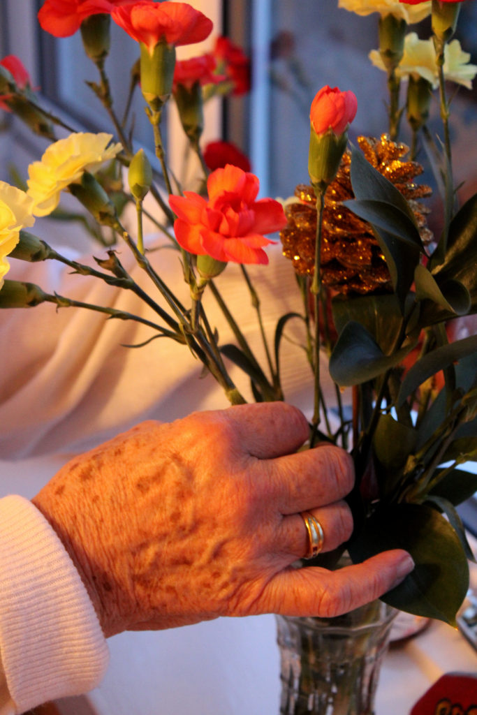
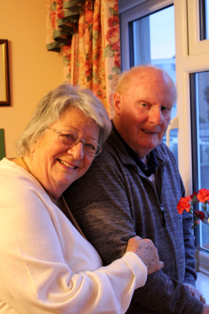
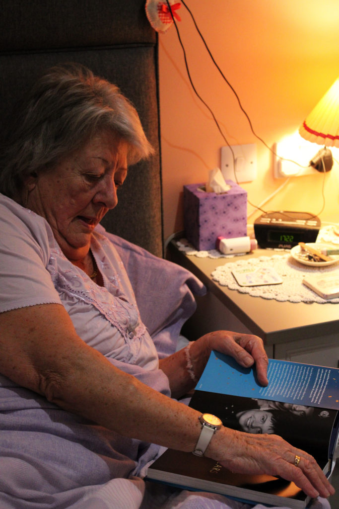
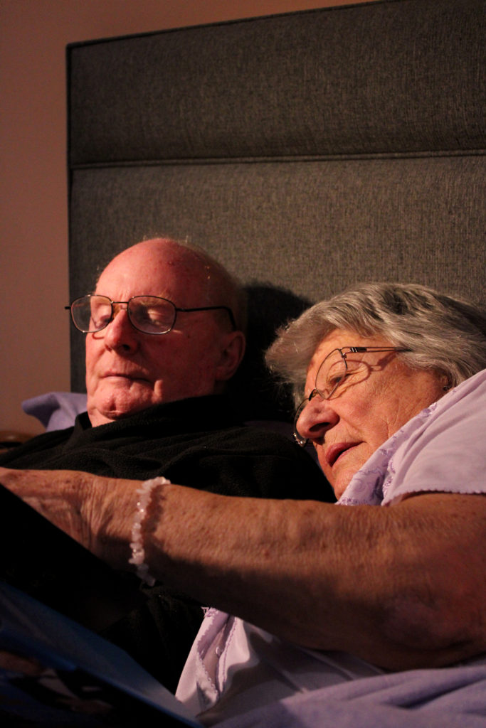
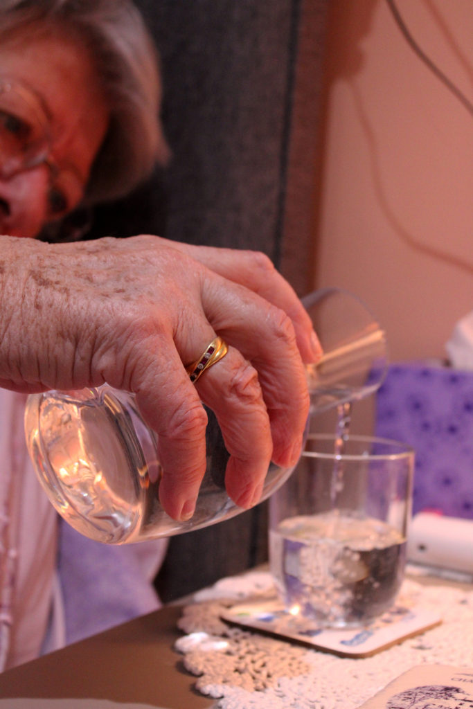
During my editing process of these 3 sequences I decided to keep it quite minimalistic, only heightening or lowering the saturation and brightness so that each group fit together better. Similar to the work of Julian Germain, I wanted to focus on creating a warm, happy environment within each group of images. When editing, I found it important to keep saturation of bright colours high, in order to reflect the joyful energy that overwhelms you when entering my grandparents home. I really enjoy how each sequence has a strong contrast between highlight and shadow, I think this range of tones creates quite an impactful image that quickly catches the observer’s eye while also helping them to understand the influence family has on identity- as if the light overweighs the shadow and makes it clear how important family relationships are.
Experimenting With Multi Exposure
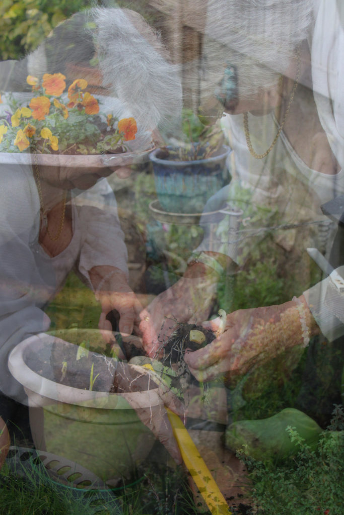
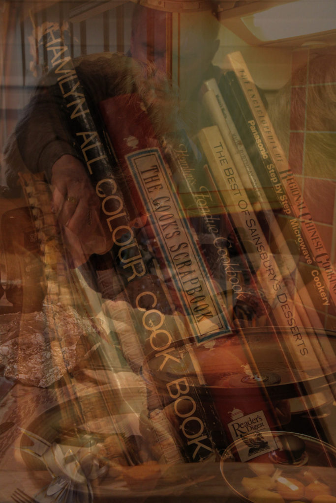
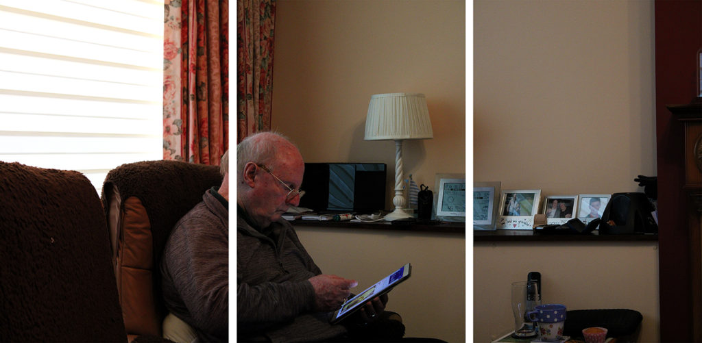
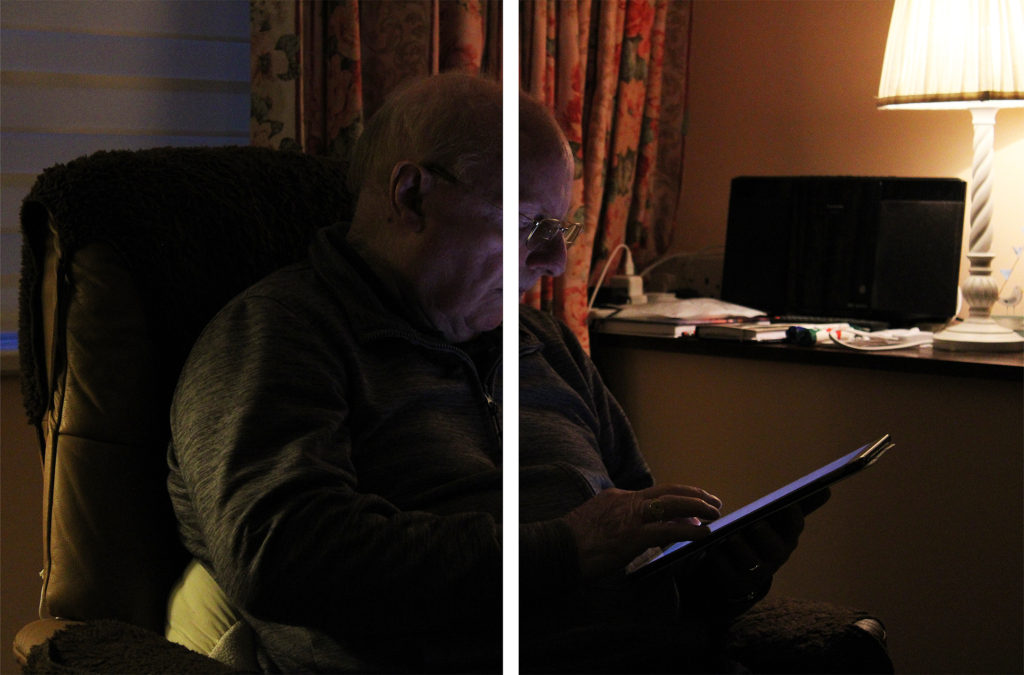
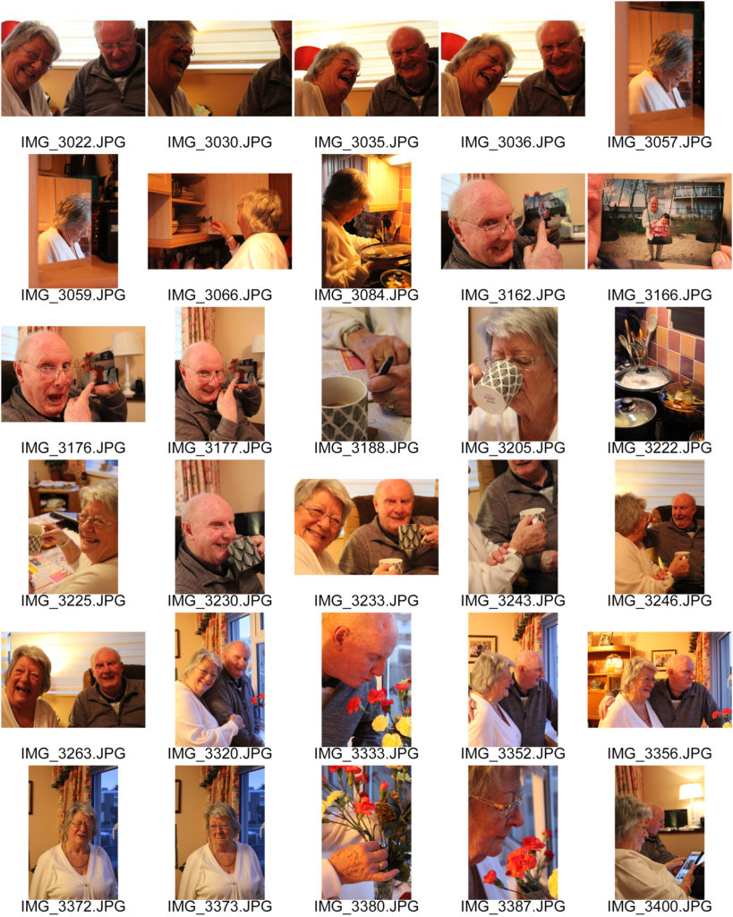
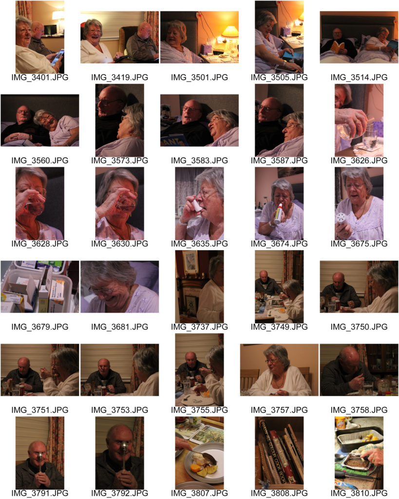
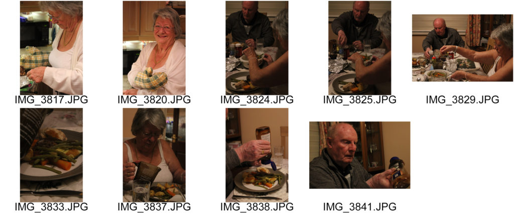
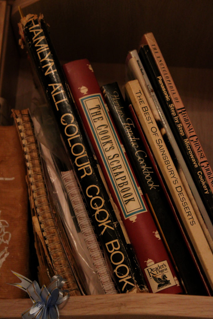
I decided to experiment with creating two multi-exposure images to see whether telling the story was as easy with each image overlapping each other, to them being next to each other. I produced these two images on Photoshop by copying each layer and then pasting them over one another, lessening the opacity each time. I really like how multi-exposure images look and how they can tell a story through repetition- the work of visual artists such as Man Ray are very inspirational to me when creating these types of pieces. I believe that someone’s identity can be very much influenced not only by their surroundings, but what they choose to do in them. When creating these experiments it was clear to me that my grandparents identify immensely with the hobbies they do, I think these multi-exposure pieces really emphasise the importance of these activities to them and show the overwhelming joy the receive from doing what they love. Additionally, the images overlapping each other symbolises the many layers of meaning these scenes hold, like they are echoes of the past that my grandparents remember each time they start the cycle of activities again. Furthermore, I really like how in the second image the focus is on the cookery books yet the other 2 images are layered on top of them. I decided to make this editing choice because of my grandmother’s freedom in the kitchen- she owns so many recipe books yet never ends up sticking to the recipes inside them. This multi-exposure technique symbolises the overcoming love my grandmother has for cooking and how she would prefer to make up her own exciting meals rather than following what someone else tells her to do in a book. These two images hold many interesting ideas and connotations, however I believe the multi-exposure editing actually makes it quite difficult to really see what each images is, and the quality of the images themselves. I think when evaluating my ideas for my final pieces, these images wouldn’t flow as nicely when telling my grandparents story as the prior sequences would.
David Hilliard Inspired Photoshoot
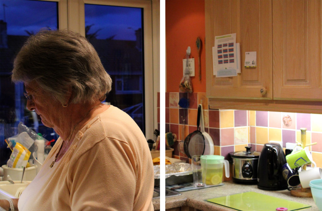
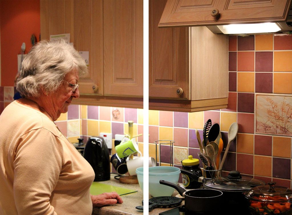
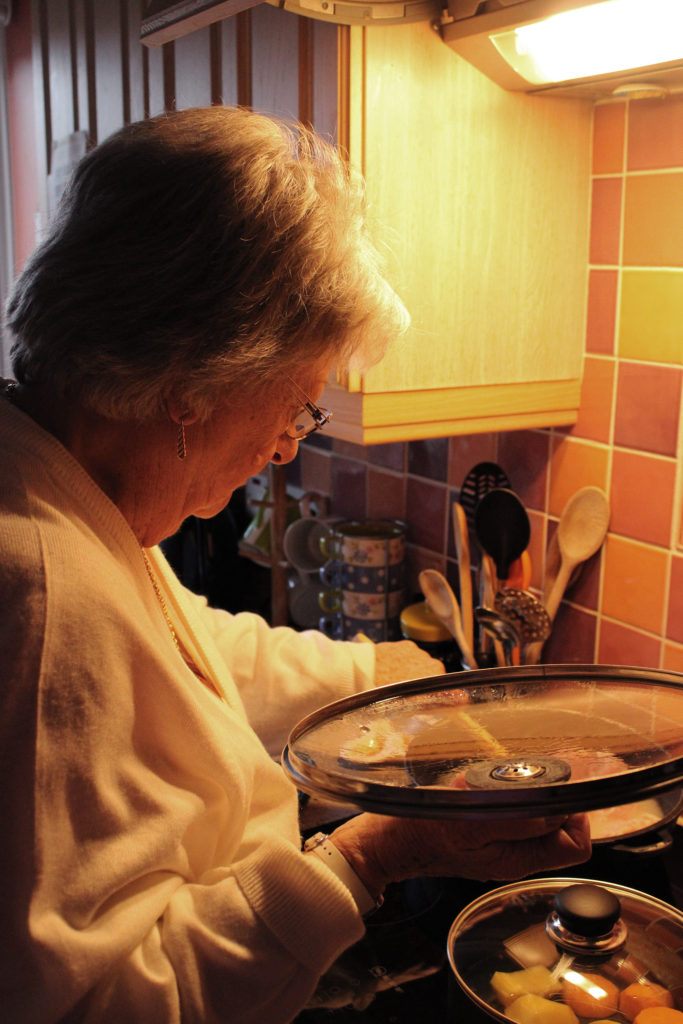
When editing these three images from my David Hilliard inspired photoshoot I decided to, again do minimal editing, but also experiment with how vibrancy and colour can effect the mood or atmosphere of an image. These three images hold many vibrant colours, with the repetition of orange in the kitchen walls providing the clear dominant colour throughout. To keep this vibrancy, I slightly heightened the saturation of each image to really emphasise the bright atmosphere inside my grandparents home- which has impacted my family’s identity for the better through times of sorrow and loss. In addition, I wanted to make sure each element of this special room, such as mugs and kitchen utensils in the background, were easily recognisable. This was because my grandparents are not the biggest fans of change, nearly everything in their kitchen has been their since I was a toddler; the memories they all hold of us baking together when I was little are very special to me. In order to keep these things noticeable, I used the ‘sharpen’ tool on Photoshop for better clarity in each photograph.
Experimenting With Black and White
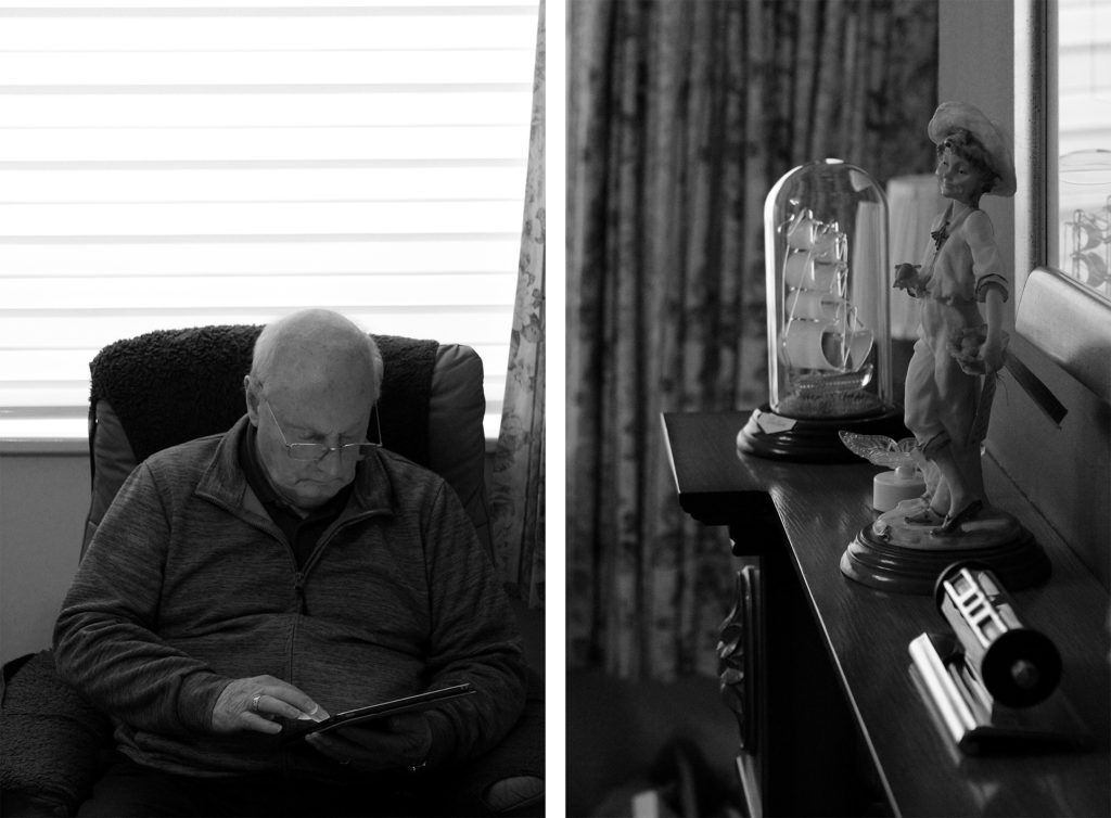
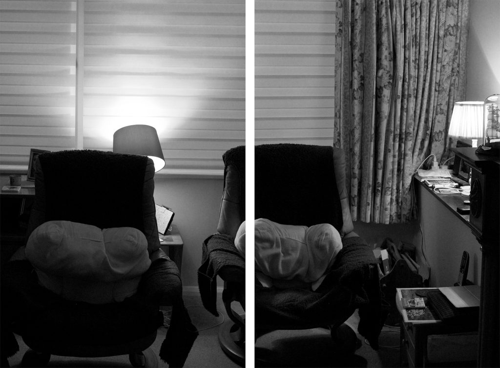
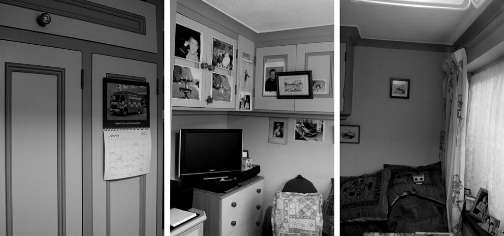
I chose to edit these specific three arrangements in black and white to experiment further with how colour can effect the atmosphere of an image- however in these images I believe the lack of colour actually influences the message and meaning of the photos. The unsaturated filter mirrors the photographs that were taken when my grandparents were children themselves, the black and white image is nostalgic to them and holds many happy memories. In fact, many of the images on the walls of my grandparents home were taken before colour cameras, so this editing links strongly to their childhood and their home itself. I love how the black and white filter emphasises the strong dark and light tones in these photos, it allows the observer to see a range of shadows that fall across each image. Furthermore, this editing clearly shows that the top two images have quite unbalanced tones, leaning more towards the shadow than highlight, whereas the bottom sequence is balanced between light and dark. Moreover, I chose these particular three images because of their link to my family’s identity, they hold many fond memories from past gatherings and childhood. The image exhibiting my grandparent’s chairs is very special to me, the area is a place in their home they will nearly always be and I love how the black and white editing allows the image to link with their past. Additionally, I chose to edit the bottom image due to its sentimentality towards my whole family’s life, with pictures on each wall depicting former achievements and the room’s joyful memories of family BBQs where we would set out drinks tables along with mountains of food. I think this unsaturated editing has added lots of links to the past to these images, however it has also taken away the warm happy atmosphere- it is possible the black and white filter has added a more gloomy mood to the photos so when choosing final images I will need to consider which option is best.


