Tag Archives: identity and community

Identity and Community – Research

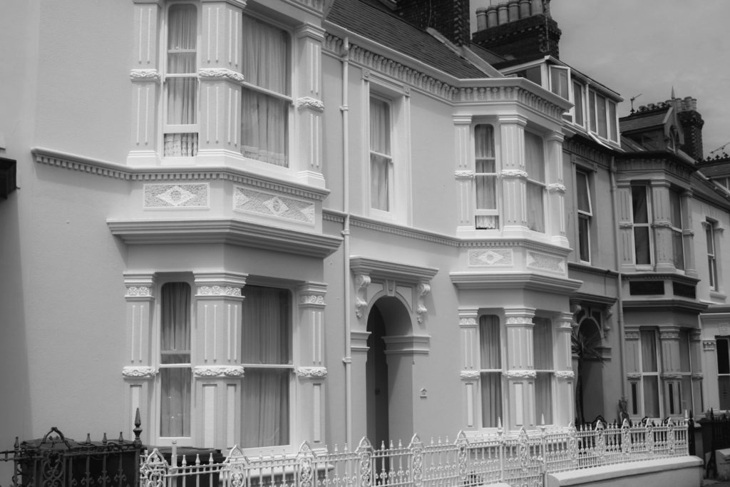
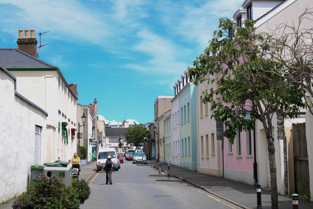
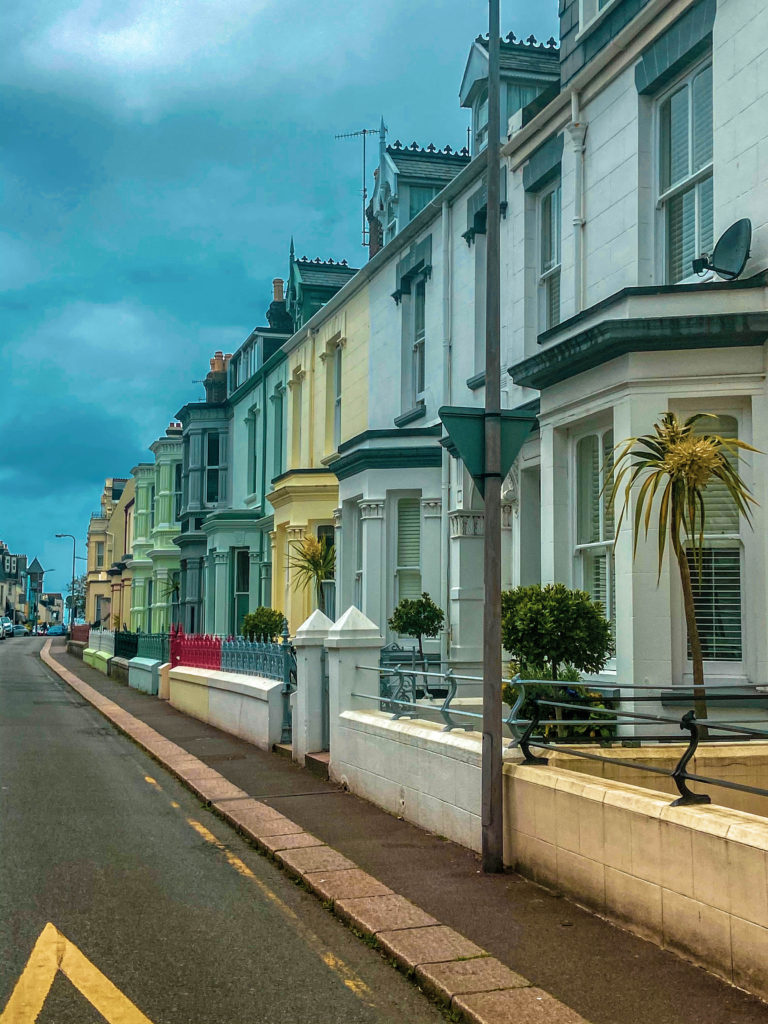
My visit to the Jersey Museum began with a dive into an exhibition room with multitudes of well designed walls detailing Jerseys lengthily history which began almost 250,000 years ago when the first people arrived in Jersey and continues through the centuries to explore the factors that have shaped this unique Island and the people who live here. This intrigued my interest in immigration and specifically how people from all over the globe come together in an inspiring feat of unity. This interest can be sourced from the fact that I am an immigrant in many forms as I have lived in a few countries and all of them have been extensively culturally diverse such as the place I call my home; South Africa. Which is just like Jersey in terms of its diversity.

https://en.wikipedia.org/wiki/Rainbow_nation#:~:text=Rainbow%20Nation%20is%20a%20term,fully%20democratic%20election%20in%201994.

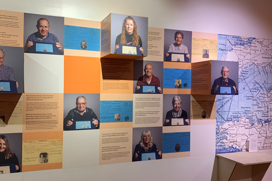
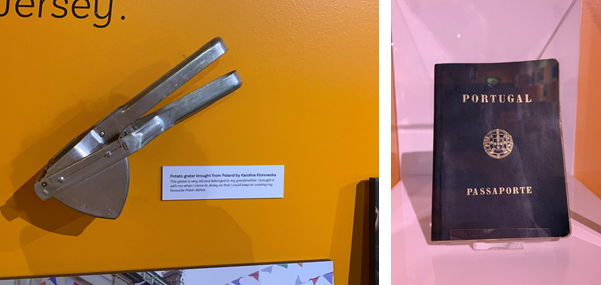
I moved to the island just 3 years ago. The exhibition states; ‘Every Jersey resident has an immigration story – whether their family came here 500 years or five years ago. This exhibition explores some of these stories and the ways in which immigration has shaped and influenced the Island we know today.’ This statement immediately creates an a sense of belonging and inclusivity for me being a recent immigrant to the island considering that everyone has a story they can share and relate to one another with, even the most local islanders.

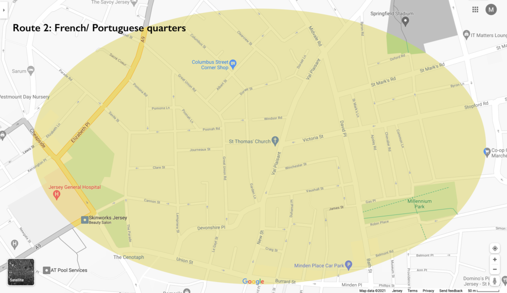
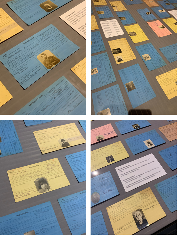
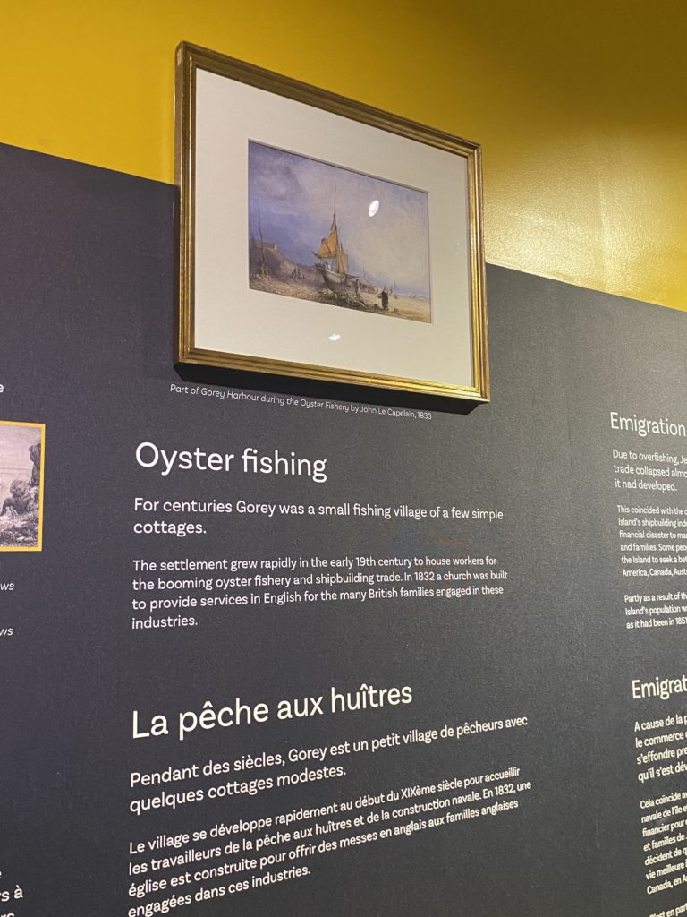
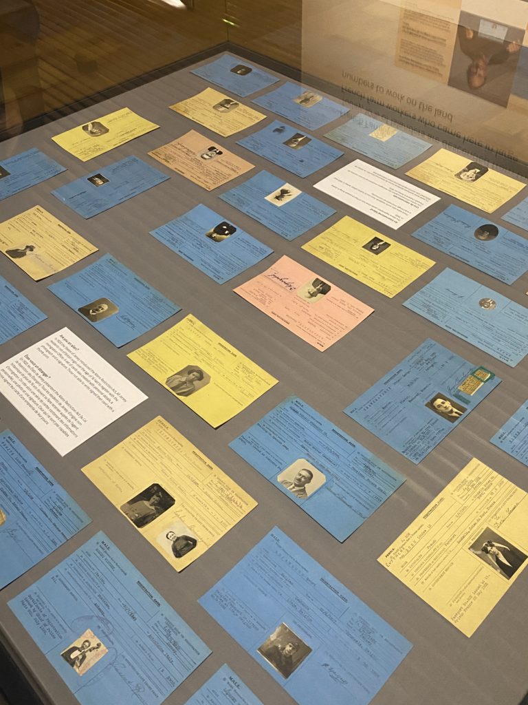
The section of the museum we visited first focused on immigration to jersey and tells the story about why people have moved here over the centuries.

https://www.facebook.com/JerseyHeritage/videos/735935120595905/

One of the areas of the exhibition I was most interested in was the section on tourism to jersey. Jersey saw a boom in tourism in the 50s, 60s and 70s.

https://www.theislandwiki.org/index.php/Photographs_of_Jersey_in_the_%2760s_and_%2770s_by_Pierre_Mette

It was nicknamed honeymoon island as it was a favourite location for newlyweds. Jersey attracted this boom of people as it had everything people wanted when they started looking to holiday in the post WWII years. Jersey was an escape from life on the mainland and it had better weather and better beaches.

Jersey's rich immigrants 'contribute lots to the community' | Jersey  Evening Post

Everything in jersey at the time was also much cheaper which attracted even more holiday goers.

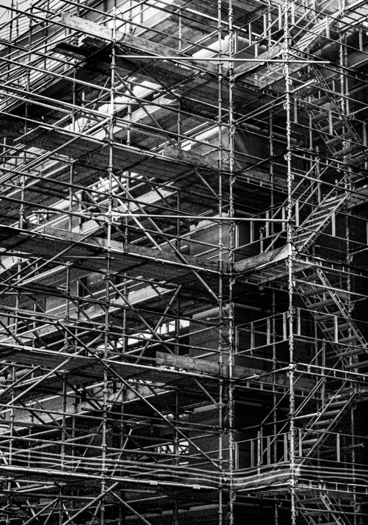
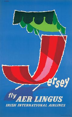
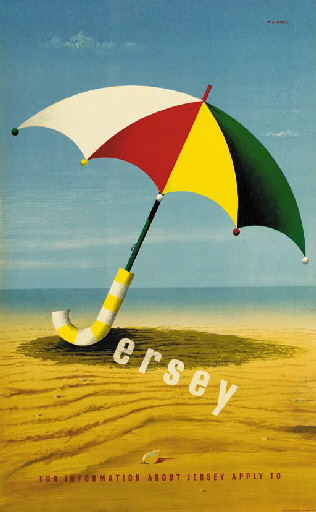
This boom in travel to Jersey changed the island in many ways. Just one example being the fact that aeroplanes used to land on the beach at low tide in jersey but due to the boom they built an airport. This segment of the exhibition took my attention due to the fascinating and aesthetic vintage travel posters used by British and Irish airlines and French railway lines to advertise travel to the island

This part of the exhibition also rang bells in another personal way for me. It relates to another South Africa to Jersey migration story. The story begins with a pair of South African surfers in the 60s got fired from the Umhlanga Hotel for swinging on the chandeliers. I grew up surfing in this area and this is a hotel I have stayed in many times so this story has many personal connections with my life and to learn about these migration stories is incredibly compelling and fulfilling. The surfers then decided to hop on a boat to the UK after getting fired from their job to look for greater opportunities. While working in the UK they realised that the cold, rainy weather and being far from the ocean was not for them. One evening they spotted perfect curling waves and blue skies on a Jersey tourism ad during the time of the tourism boom and hopped on the next boat over. They built their own boards and began surfing down at St Ouen’s Bay. The owner of the Watersplash restaurant and night club at the time noticed the lads and due to the increased number of ocean related deaths happening outside the restaurant, he decided to hire them as head lifeguards. The South African lifeguards continued to surf outside the Watersplash and this grabbed the attention of the local islanders as surfing had not yet arrived on the island. The two men had created a surge in popularity for surfing in Jersey and are responsible for bringing one of Jerseys most popular sports to the island.

Identity and Community – A Sense Of Place

The Photoshoot

On Monday 28th June, as a photography department, we had a day of learning and information at The Societe Jersiaise Photo Archives. During the day we went out into different areas of St Helier focussing on separate communities who came from different immigrant backgrounds, such as the Merchant Quarter, the French/Portuguese Quarters and the British Quarter. My aim for this photoshoot around town was to capture a sense of place, photographing different buildings, shops, businesses, architecture, streets as well as capturing some environmental shots of people working/living in or just travelling through these areas. The group I carried out this photoshoot with focused on walking through the French/Portuguese Quarters, I was able to plan while walking about the kind of people/places and types of buildings I wanted to take images of. My plan was to photograph the comparison between old and new St Helier buildings, showing how the sense of place changed over time, as new communities entered and old ones left. Additionally, I planned on capturing street photography inspired portraits of these communities to show a range of ethnicities residing on the island – I found it important while taking these images to be respectful around certain areas where people were not comfortable having their photo taken. Altogether, I really enjoyed this photoshoot around different migrant communities, showing a sense of place changing over time and people in a natural and not staged environment.

Editing – Contact Sheets

For the editing process of this photoshoot, I took a different approach, in class this week we learnt how to use different filters such as ‘flagging’ and ‘star rating’ using Adobe Lightroom to filter out specific images I liked or disliked to perform a quicker and easier edit. During the photoshoot I took around 100 images in St Helier, before importing them to Lightroom I did an initial sort through and delete of any images I knew that I did not like/did not tell a story or were just not right in lighting/angles – this left me with around 60 images which I imported to edit. Once my images were in Lightroom I went into ‘Develop’ mode to start filtering my preferred images. I started by trying the ‘Flagging’ filter, using controls ‘P’ for a white flag (preferred image) and ‘X’ for a grey flag (disliked image) and holding down ‘shift’ – this really helped speed up my selection and let me clearly see which photographs were my favourite. Next, I used the ‘Star Rating’ feature to filter each image from 1-5, one star as the worst and five stars as the best, which again really assisted me in seeing which images worked better than the others.

Editing – Over Exposed

While I was editing my images, I discovered a few came out very over-exposed during the time where I was experimenting with my camera’s shutter speed. On Lightroom I went into develop mode to see whether I could edit these images to correct their exposure – under the ‘tone’ section I lowered the highlights, exposure and blacks. Furthermore, on the image where I have photographed the ‘Romanian Delight’ shop, under the ‘transform’ section I discovered how to straighten my image to create more symmetry and level lines throughout by changing it to ‘auto’. I wanted to edit these images in this way to represent and really show the bright colours of the communities we visited, heightening the vibrancy of the coloured houses and shops to demonstrate their character and beauty in the more secluded areas of town.

Editing – Black and White

During my editing process of this St Helier photoshoot, I decided to experiment with editing some of my images with a black and white filter. I wanted to edit in this way to see how darker and lighter tones would affect the mood and atmosphere of an image. I produced this edit in Adobe Lightroom, highlighting each of my five star flagged images and selecting the ‘soft black and white’ filter. After seeing what each image looked like black and white, I was able to select my favourite monochrome photos that worked best in terms of contrast and tone. Additionally, I chose these six images due to their link to my theme of this shoot, showing the change of a sense of place in St Helier through it’s architecture. Each image forms a pair with the one next to it, the left hand image represents an older sense of St Helier and the right image shows the more modern/re-built buildings around town. Each pair is a sort of mini sequence showing the progression of architecture, I love the way the ‘older building’ images have darker tones and harsher shadows which symbolizes the possible atmosphere of St Helier’s past around these secluded areas. Contrastingly, the ‘modern buildings’ hold lighter tones with more white and negative space, creating a clean and crisp atmosphere. The natural lighting produces a softer texture, which is interrupted by the repetition of details on each building such as the windows, brick work and doorways.

Final Edited Images

As well as producing black and white edits of certain images from this photoshoot, I have also decided to experiment with how different colours can tell a story within an image. I edited these final photos on Adobe Lightroom, after filtering out my favourites with flagging and star rating, exploring the different features of the app and correcting any mistakes made while photographing outdoors. For example, as shown before in this post, I made the mistake of over-exposing two interesting images, however was able to amend this by turning down highlights, blacks and exposure. Additionally, I wanted to portray the realness and natural atmosphere of these photographic locations, hence why I conducted minimal editing so not to tamper too much with the ‘sense of place’. I wanted vibrancy, however not so overly enhanced that the images looked artificial – I heightened the contrast and highlights of several images to achieve this bright and lively atmosphere. I wanted to edit my images in this way to juxtapose the otherwise empty streets I was capturing, while some images show life and movement, most are static without people to provide character. This was the main reason I wanted to show a sense of place with the area’s architecture, through repetition, space and shape, connoting the idea of a built up landscape of small business and homes which may not seem much to some, but to those living there is their world.

Archives

Archives

“Everyone today has a story; the world’s an archive.”

― Anne Rice, The Wolf Gift

An archive is a database with records holding the history of humanity. These include, books, certificates, photographs, items and more.

These records actually gives the current and future generations knowledge of previous events, what the world used to look like in the past in comparison to today. They may also provide context which helps us understand why a certain picture was taken, it provides reference points between information sources which improves our knowledge of the world and past.

The reason to looking back into the past is so we learn about various events but most importantly past mistakes so we do not repeat history.

Société Jersiaise Photography archive

Only nine months after it was initially published in the major centres of England and France, photography arrived in Jersey on May 9 of 1840.

It features 19th-century photographs by notable photographers such as William Collie, Charles Hugo, Thomas Sutton, and Henry Mullins. The collection includes collections from late-nineteenth-century studios by Jersey photographers such as Ernest Baudoux, Albert Smith, and Clarence Ouless.

In the 21st century, we have had a major photo-journalist, the Emile Guiton-archive archive, who’s an honorary curator and the founder of the Photo Archive of Société Jersiaise, which contains more than a thousand negative images by Dunham Percival.

Along with this, we got the chance to see Mullins’s portraits of Victorian islanders as preserved on the pages of his photograph albums, which served as a catalogue of clients for his professional
practice at the time.

Henry Mullins

Henry Mullins began his working at 230 regent Street, London in the 1840s. During this time he was part of the circle of photographic pioneers at the Royal Polytechnic Institute, Regent Street, London here the first photographic studio in Europe opened in 1941. Mullins then went to Guernsey in the summer of 1847 and ultimately moved to Jersey in 1848 and set up a studio called the Royal Saloon at the 7 Royal Square in St. Helier.

By 1849 he worked alone and began his work on Cartes de visite which translates to visiting cards. They were daguerreotype photographs which for Mullin, his subjects were people. He would take portraitures of family and their children. By the end of his life, he had created an album of at least 9,000 portraits of islanders between 1852 and 1873, Jersey population at the time was 55.00 therefore he managed to capture at least 16% of the population.

He was one of the most prolific photographers of the first generation of Jersey photographers in the mid-nineteenth century.

He ended up being the photographer of choice for leading members of Jersey society and successful local and immigrant families. It was common for his portraits to be printed on a visiting card which were commercial photographs created using egg whites to glue the photographic graphic chemicals to the paper. This is what a daguerreotype is. These cards were very small normally measuring 54×89 mm and commonly mounted on a piece of card measuring 64 by 100 mm. However, Mullin mounted his shots on an album.


Image analysis

Substance:

This image was taken in the 19th century by Henry Mullins.

Obviously, this is a daguerreotype; as mentioned above, “It was common for his portraits to be printed on a visiting card which were commercial photographs created using egg whites to glue the photographic graphic chemicals to the paper.”

It was taken to document the types of people in Jersey.

Composition:

Considering the image was taken in the 19th century, the composition of this image is quite amazing. For example, Mullins has successfully centred the subject. This suggests he used the rule of thirds to compose the image. This allows enough space for the subject to appear while revealing pieces of the background equally.

Evidently, the focal point of this image is the man. He appears to be important since he is wearing a uniform and uniforms were typical of someone of authority. Considering his dead stare, it may be argued he’s part of the military since they are normally serious. May be argued he’s a soldier since we see no medals.

Mise En Scène:

As mentioned in Composition:

We can successfully see Mullins has captured an image of someone of authority.

He’s dressed in uniform with buttons and a collar which usually suggest military.

His appearance is quite radiant but serious at the same time; having his eyes fixed on a specific point.

He appears to have a bag with him since there is a strap going over his chest.

Techniques:

This daguerreotype is a direct-positive procedure that creates a very detailed picture on a sheet of copper with a thin silver layer without the use of a negative. To fix the picture, the plate has been submerged in sodium thiosulfate or salt solution and subsequently toned with chloride gold.

Atmosphere:

This photograph makes me feel quite intimidated since he looks important.

This image also has me wondering who this man actually is, is he a soldier? Sergeant?

Lighting:

The lighting in this image is quite low due to the quality of the daguerreotype. However, it may be argued that artificial lighting was used since it was taken in a studio and only one part of his face us properly lit.

Obviously, there are dark tones in this image due to the process used.

Conclusion

In summary, I largely agree that we can really learn from prior photos. As noted earlier: “These records actually inform current and future generations of previous events about what the planet used to look like in the past. They can also provide a context which enables us to understand why a certain photograph has been shot, which provides points of reference between data sources that enhance our understanding of the world and the past.” In order to display the difference in classes we learned, for example.

Through his work we have also learned that everyone is human at the end of the day. His role, power and dressing are simply the only distinction between people.

In addition, it’s vital to look back at the past in order not to repeat past errors such as the holocaust but to learn about diverse events that have made humanity to where we are today.

On the other hand, I felt that photos and archives are vital for conveying a tale, for showing how people used to be and how we have thus far evolved.

Henry Mullins has led me to portray people from a range of professions for my own project. And to use film to generate an effect comparable to photographs of Mullins. I’ll take my time on vacations to Madeira (my place of birth), go to museums and possibly archives, and photograph Madeira and Jersey, since they have both shaped my identity.

Lightroom Adjustments

Original Image
Edited Image
Original Image
Edited Image
Original Image
Edited Image
Original Image
Edited Image

How I edited my images

Firstly, I converted the original colour image into black and white to add a uniformed monochromatic theme to the images.

I then adjusted exposure, brightness etc in order to achieve a higher contrast between the black and white tones, and to also give the images a similar tone overall, and making sure none were too dark or too bright.

I decided to make these images black and white as I believe this uniformed theme adds a sense of unity between the communities of Jersey, but also adds a sense of ambiguity to the identities of the people in the images.

identity & community – photoshoots

For my first photoshoot I walked the route above (from Royal Sq walk towards St Thomas Church via Broad St, Pitt St, Dumaresq St, Hue St, Le Geyt St, Devonshire Pl, Great Union Road + side streets with character, such as Journeaux St, Aquila Rd, Poonah Rd, Albert St, Columbus St, Dorset St, Clairvale Rd towards Rouge Boullion) and took photographs of anything which caught my eye or sparked my interest. I did my best to ensure that my images were as interesting and as eye catching as possible.

EDITING IN LIGHTROOM

To start with I imported all of my images into Lightroom into a collection called ‘Identity and Community‘ and then into a subfolder entitled ‘Photoshoot 1‘.

I then went through all of my images with the flag tool, and rejected the ones that I didn’t feel were my best work until I was left with a set I was happy with.

I then decided to give my remaining images a star rating out of 5 until I had my final images from my first photoshoot.

For my second photoshoot, I followed the same route (from Royal Sq walk towards St Thomas Church via Broad St, Pitt St, Dumaresq St, Hue St, Le Geyt St, Devonshire Pl, Great Union Road + side streets with character, such as Journeaux St, Aquila Rd, Poonah Rd, Albert St, Columbus St, Dorset St, Clairvale Rd towards Rouge Boullion). This time, however, I attempted to take photographs of different things that perhaps I hadn’t seen last time, or didn’t think were interesting enough. Again, I tried to keep my images as eye catching as possible. I also used the same methods of editing in Lightroom.

FINAL IMAGES

EVALUATION

Overall, I think that my images from both of my photoshoots around St Helier produced some good quality images. However, one thing which I could improve upon would be the positioning of the camera when I capture the images. This is because I had to reject some good photographs as they were wonky or blurry. For my next photoshoot my aim is to think more carefully about where I am positioning the camera as well as myself in order to produce an abundance of quality work.

identity and community – jersey museum

‘Every Jersey resident has an immigration story – whether their family came here 500 years or five years ago. This exhibition explores some of these stories and the ways in which immigration has shaped and influenced the Island we know today.’

Jersey’s first permanent settlers arrived around 7,000 years ago. They were driven by a changing climate to seek a new and sheltered place where they could plant their crops and raise their families. Since that time, waves of immigrants have arrived in Jersey. Some were fleeing religious or political persecution and they found refuge in this Island. Others were economic migrants seeking a better way of life for themselves and their families, from retired English army officers in the 19th century to Breton farm workers in the early 20th century.

The French Wars of Religion took place during the 16th century between Catholics and Huguenots (Protestants). Consequently, many Huguenots fled to Jersey in order to escape being persecuted for their beliefs. In fact, so many Huguenots came to the island that an additional market day had to be introduced to cope with the crowds. Large numbers of Protestants left France after 1685, when the Edict of Nantes was revoked, which took away their right to practice their religion. This therefore led to an influx of Protestant immigrants who established many small businesses on the island. The shipping industry was created on the back of the Atlantic cod trade.  The first large scale commercial shipyard was built in Jersey in 1815.  The industry benefited from the Island’s tax-free status, being able to import timber more cheaply than competing British shipyards.  Much of the labour in the shipbuilding industry was migrant labour from other parts of the British Isles.  The shipbuilding and shipping industries began to decline in the 1860s as a result of a depression in world trade and the switch from sail to steam.

From 1820 the Jersey economy was boosted by the first real inflow of wealthy immigrants, largely retired military offers, half pay officers and senior officials from the colonies.  These individuals came mainly from the UK or British Colonies and were attracted by the tax regime, mild climate, improved travel and the Island way of life. It was estimated that there were 5,000 English residents in Jersey in the early 1840s three-quarters of these were half-pay officer s and their families.  Their local spending power would have created local jobs and contributed to the growth of St Helier during this period.  High Value Residents continue to come to Jersey for many of the same reasons.

https://www.jerseyheritage.org/family-history/jersey-immigration

The part of the exhibition which I found the most interesting was the ‘Alien Registration Cards’, which were introduced as a result of the Aliens Restriction Act passed in February 1920. Under this new law, all aliens over the age of 16 living in Jersey were forced to register with an Immigration Officer, no matter how old they were or how long they’d been living on the island. The Alien cards were issued up until the 1960s and, initially, any woman who married a foreign national was also required to register for a card, as well as anyone of foreign parentage. 

https://www.jerseyheritage.org/news/alien-registration-cards-added-to-jersey-heritage-s-online-catalogue

Identity And Community Photo Shoot 2

We went on a walk around the Merchant Quarters, and took photos on our walk.

Route 1: Merchant quarter around St Helier Parish Church > Royal Sq, Library Pl, Bond St, Broad St, Mulcaster St, Hill St, Snow Hill, La Motte St, Colomberie > follow onto Ann St, Hillgrove St (French Lanes), Wesley St, Ingouville Pl, Belmont Pl/ St towards Minden Pl, Rue de Funchal walk towards Val Plaisant towards St Thomas Church.

Editing in Lightroom Classic

I imported all my photos from the walk into Lightroom Classic, then used the P and X method to filter out the good/bad images.

Example

This is an example of my editing process using the 2 images of the old cars.

BEFORE AND AFTER

For this edit, I wanted to show how simple life was in the old days without technology and other distractions. I started by removing the detail in the background where the door was. I then removed the modern lights on the wall with the spot healing brush, as they conflicted with the old car, as it is the main focus. I used the adjustment brush, to create a mask on the background then brought the shadows, and blacks down to make it completely black, to create a simply composition, made from the white wall, black background and the car.

BEFORE AND AFTER

I used the same process as the other car image, so they would match in a collection. Then I used Photoshop to edit the chain out of the photo, as it was distracting.

Editing a monochrome image

I made this photo into black and white to add more mood and make it more serious. The composition of the subjects is good as they are at different heights. It would of been better if they swapped places, so it wasn’t black on black, and white on white.

Final Image Selection

Meaning of the colours:
– Green = Good
– Yellow = Medium
– Red = Bad

All the green colour coded images are the final images, and will be displayed below.

Final Images

Analyse

Overall, I like how my images turned out. Most of the images were colourful, and used different techniques.

The street art image was taken using my phone as a reflection, so that way I didn’t have to include all the people walking on the pavement. Instead, it created a unique reflection.

The restaurant and the portrait of the lady, were both using the framing technique. It helped removed unnecessary features and it leads the eye to the subject.

I really like the images of the cars. I was able to accomplish the simplified style I was going for by darkening the shadows, and removing modern light. the teal/light blue car really stands out against the white walls, and dark floor and background.

CONTEMPORARY Artist Inspiration – Dana Lixenberg – (Identity And Community)

Who is Dana Lixenberg?

Dana Lixenberg (born 1964)s a Dutch photographer and filmmaker. She lives and works in New York and Amsterdam. Lixenberg pursues long-term projects on individuals and communities on the margins of society.

Her most recent project is called “Imperial Courts”, and was made between 1993-2015. It is a project about Imperial Courts, a social housing project in Watts, Los Angeles. The project contains work made over a period of 22 years and consists of a book, exhibition and web documentary

“Austere and involved perspective” was her style as quoted by Muse Magazine, by one of her most great supporters.

Mood Board

This images were constructed from Dana Lixenberg’s website in the Portrait section.

Analysis – “Brian” – 2015

Firstly, Lixenberg has positioned her subject in a way which creates a moody composition. The subject, isn’t making eye contact , which signifies anger and wanting to be alone, to not talk to anyone. The subject is also slightly leaning forwards to create an engaging pose, and he has his body and shoulders slightly away from the camera for a more natural feel.

This image was shot in natural daylight, so the subject is well lit. It is most likely a overcast day, as the whites in the image aren’t overexposed, and there are shadows on the subject face, which helps to create depth and define facial features.

Lixenberg used a low aperture e.g. f/1.8 and focused on his eyes, to completely blur the background which helps keep the focus on the subjects face. It also slightly blurred the subjects jacket as well, which created a distinction between his chin and the jacket has they are of similar colour. The background is a good choice, as is completely white, which draws attention to the subject.

Lixenberg, probably used a 50mm lens as the subject fills up most the frame. She was close to the subject to get a sharper image. The reason why I think she shot with a 50mm lens, is because anything over 50mm it can make the subjects facial features seem flattened, and anything under 50mm creates lens distortion.

Overall, I like the aesthetic which Lixenberg was going for. I think it is a great image, and an interesting subject. The detail in his hair and beard help create a unique composition to demonstrate mood. The black and white effect makes us pause and look closely. Removing colour from a picture helps the viewer to focus on a subject’s emotional state.

Links

Imperial Courts introduction video made by Dana Lixenberg:

http://www.imperialcourtsproject.com/portrait/introductie-slide/#

GRIMM Gallery about Dana Lixenberg:

https://grimmgallery.com/artists/42-dana-lixenberg/

MUSE Magazine about Dana Lixenberg:

A great supporter of Dana Lixenberg’s “austere and involved perspective”, he was the first in the United States to publish a portfolio of her Imperial Courts series

https://www.musemagazine.it/dana-lixenberg/

Photo shoot In the style of Dana Lixenberg

I will plan a shoot in her style in a separate blog post. Where I get up close headshots of people using a low aperture, and a 50mm lens. I will ask people in town with interesting facial features.

IDENTITY AND COMMUNITY – PEOPLE MAKE JERSEY MUSEUM EXHIBITION + TRIP + Shoot 1

RESEARCH

On Monday the 7th of June; the last day of the exhibition, we visited the “People Make Jersey – our stories of immigration” exhibition, at the Jersey Heritage museum in St Helier.

The exhibition is based on the fact that, “Every Jersey resident has a story of how they come to be living in the Island, whether their family came here 500 years ago or five years ago. ‘People Make Jersey’ explores some of these stories and the ways in which immigration has shaped and influenced the Island we know today.”

The oldest items in the exhibition belonged to Jersey’s first permanent settlers, who arrived around 7,000 years ago. The created basic stone tools and lived in a sheltered place where they could plant their crops and raise their families.

Picture of tools, Jadeite polished stone axe and ring. These would have been brought into Jersey from mainland France around 6,000 years ago.

It then follows the waves of immigrants who have arrived in Jersey over the centuries. Some of the people were religious, which introduced different cultures and beliefs into the island.

There was an glass display island in the exhibition which displayed lots of passport type cards. These were the Aliens registration cards, which show lots of French people living in Jersey in 1920.

There were also some residents from much further afield. Jersey in 1920 was a surprisingly international community. E.g. Belgium, Toulouse, and Czech Slovakia.

There was a wall which featured the current generation holding there ancestors registration cards, this was a good way to visualise the different cultures in Jersey and its history.

Near to the registration cards, there was a map on the wall, which mostly focused on France. It showed where some of the popular surnames originated from. In the old days the surname just meant where you were from, e.g. John Coutanche, who was from Coutances, France. These are all the names and places displayed on the map :

UK
– LANGLOIS from England
– LE GALLAIS from Wales
– HAMPTONNE from Southampton

FRANCE
– DE CARTERET from Carteret
– DE LA HAYE from La Haye de Puits
– DE GRUCHY from Gruchy
– COUTANCHE from Coutances
– LE BRETON from Brittany
– NORMAN from Normandy
– PERCHARD from the Perche region
– LE POIDEVIN from Poitou
– D’AUVERGNE from Auvergne region.

There was a wall that had items which people brought to Jersey when they first came. Each person had one item that had a significant value/memory to them. Some of the weird/interesting items was a, Potato grater, which was brought to Jersey from Poland by Karolina Klonowska, as it was very old and belonged to here grandmother, she brought it to Jersey so she could cook her favourite Polish dishes. There were other items such as dolls, passports and, musical instruments such as a flute.

Around the exhibition there were old images of Jersey maps, notes and news papers. I thought they were interesting as so much has changed over the years, for example the Waterfront wasn’t even there in the map, as it was build recently. These are the Old vs New comparisons using images from the exhibition and new versions from today.

OLD NEWSPAPER VS NEW NEWSPAPER
OLD MAP VS NEW MAP
OLD FRENCH MONEY

PHOTO SHOOTS

After the exhibition, we visited the Victorian part of the museum, and went on 2 walks round town. The first walk we were looking at the different types of bricks and stones in the buildings. There was this one building which have blue bricks that reflected in the sunlight (the building with the French flag). The second walk we went round town. This is a image of a map where we went. We took photos as we walked around town of the buildings and anything we saw, mainly focusing on:

MIGRANT COMMUNITIES IN ST HELIER
– a sense of place
– character of community
– people, portraiture

EDITING IN LIGHTROOM CLASSIC

I imported all my images into Lightroom from the museum trip on the 7th June.

This is the selected flagged images, that use the p (pick) and x (reject). The white flag is placed on the good images, where as a black flag on the rejected images. I used this to filter all my images, which was around 300 to get it down to 10-30 good images.

I did basic adjustments to the images, increasing clarity, decreasing dehaze, increasing contrast etc. Including gradient and radial filters.

I took some of the images into Photoshop (using edit in –> Adobe Photoshop, option in Lightroom) and removed distracting elements such as ropes and security cameras.

I tried a black and white, (monochrome) look to see if it would add more drama and create a moody atmosphere.

Then I used Lightroom compare view to compare the edited black and white image with the edited colour image.

Portrait – I like how the black and white brings out the details, and adds more age to the image. This works well due to the subject being of age. Although, I prefer the colour version as it shows more personality, which is crucial in portrait photography. The detail in his eyes and mouth is more defined in the coloured image, the colours also create depth, which is hidden in the black and white version.

Detailed Image – There is lots of detail so, the black and white image separates the whites and the blacks making them more defined creating depth. It gives a cleaner look the the image, but this is not the aesthetic I wanted as it is a messy, dirty building site. Which is why I like the coloured image more, as I shows sections of dull colour between the metal poles.

Fast Shutter Speed Image – This image shows motion in the faster flying birds, whist still freezing time as the birds fly. I like this image better in black and white, as there is more contrast and detail, compared to the coloured version. It also helps bring out the shadows in the birds more.

CHOOSING MY FINAL IMAGES

Lightroom made it easier to see all my images, as they were all in one place. Lightroom has different view features, such as, full screen, compare view, and survey view.

I used the survey view to display my good images, them I ordered them best to work using the star system inside Lightroom.

The purple colour tagged image was the best/my favourite, so I marked it 5 stars. This becomes useful when I have to make a zine, so I can just filter by 4+ stars, so I get my best images.

I colour coded my images based on its topic. Ill will try to keep it consistent throughout to year, so it is easier to find images.

The colours are:
– Yellow – Indoors
– Green – Outdoors
– Red – Portrait (environmental) / People
– Purple – Black and white photography

These are the final images in Lightroom, I then exported them into my PHOTO-SHOOTS folder in a sub-folder called June 7th Edits.

FINAL IMAGES

The larger images are my favourite ones, as there have a really nice compositions and colour.

Overall, there was a good variety of images, consisting of portraits and street photography. My favourite type is street photography, just walking around and using temporary objects to create foreground elements, since I use angles, reflections, and shapes to create my images, E.g. the car reflection in the orange street art image.

Identity And Community – ‘People Make Jersey’

People Make Jersey Exhibition

‘People Make Jersey’ was an exhibition held at the Jersey Museum which we visited on Monday June 7th. Information and facts on resident’s of Jersey’s history were displayed around the site, from farmers to local last names, the exhibition told it all. We started the day with a talk from an expert at the exhibition who took us around the area explaining different sections, such as information on religious/political refugees, economic migrants that arrived to support new industries such as oyster fishing, ship building, construction, agricultural workers and tourism.

Statement from ‘People Make Jersey’ –

‘Every Jersey resident has an immigration story – whether their family came here 500 years or five years ago. This exhibition explores some of these stories and the ways in which immigration has shaped and influenced the Island we know today.’

After attending the exhibition, I carried out some further research by speaking with my grandparents about their heritage, where their family lived, their jobs and any other interesting information on their lives being residents of Jersey. At the exhibition I was really interested in a display listing several local Jersey surnames, the display had information about where these surnames originated from and when conducting further research I wanted to discover more. When speaking with my grandmother she told me of how people of similar last names in Jersey would live in specific areas of the island. For example, my grandmother’s maiden name is Perchard; a very local Jersey name meaning ‘a man from Perche in the South of Normandy’ – many Perchard’s resided in the east of the island, in St Martin and Grouville. Additionally, when speaking with my grandfather he told me of how his father was born in Jersey and how people with his (and my) surname of Mariette were also from the East of the island in Gorey, and how many Mariette’s were fishermen. More on Jersey surnames can be found here. I found out that my grandmother’s parents were also both born in Jersey and as were their parents before that, when asking my grandmother about her parents careers she told me of how her father was the manager of a big general merchants store called ‘George D Laurens’ which was believed to be established as early as the 18th century, originally a hardware store but by the 1960s was one of Jersey’s major toy shops as well as selling general goods. I found it so interesting to compare some of my family’s heritage to the peoples I read about at the Jersey Museum, learning about their careers and lives was very eye-opening.

St Helier’s History – Stuart Fell

Later in the day, half of us joined Stuart Fell on a walk around the St Helier town centre discovering information about the architecture of this area in Jersey. We learnt about how wealthy residents who arrived in Jersey had an impact on these buildings, I found it so interesting to find out about how influential these people were in actually creating the foundations of our island. Stuart also gave us heaps of information on the different types of bricks used in St Helier’s architecture, for example we found out that brick making was once a thriving industry in the island during the 19th Century, which traded across the world, and that the most common colour of Jersey brick was red. On our walk we looked out for any red bricks in building’s chimneys, as Stuart informed us they could have been built over 150 years ago. More information on the Jersey brick making industry from islander Enid Gautier can be found here.