This project will be based off of a central question, (below) and we will have to create a 30 second video and a still image in a group of 4. After, one of our creations will be minted as an NFT (non-fungible token) on the public Ethereum blockchain as part of the 2lives NFT exhibition based in Jersey.
What will the future of Jersey look like as a community in the metaverse?
The word “Metaverse” is made up of the prefix “meta” (meaning beyond) and the stem “verse” (a back-formation from “universe”); the term is typically used to describe the concept of a future iteration of the internet, made up of persistent, shared, 3D virtual spaces linked into a perceived virtual universe.
Mind Map
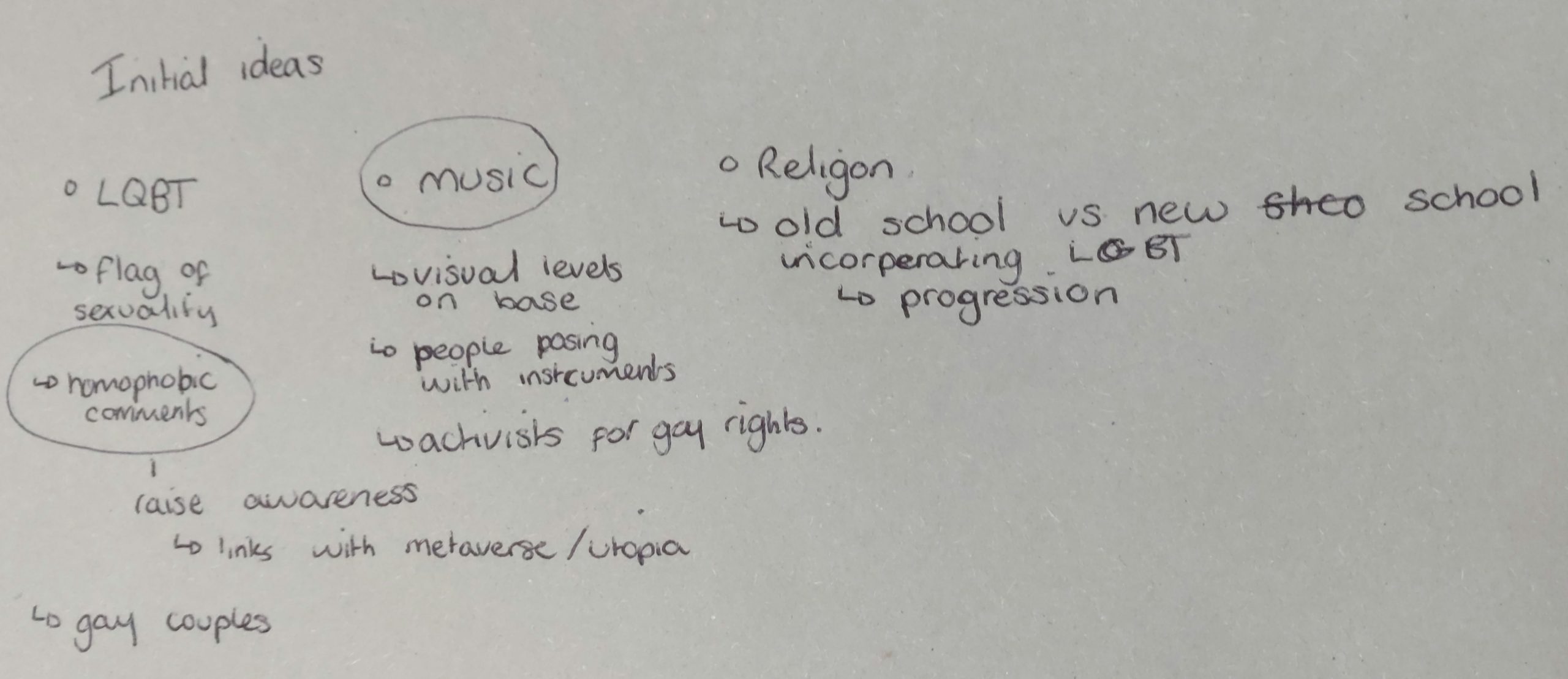
First, we got into groups of 4, to create a mind map about the different communities we related to/know of in Jersey.
The communities we thought of were mainly the hobbies we did out of school and subjects in school, such as, Online Community, sports communities, friend groups and the photography community. Where as, other communities such as race, religion and gender we still wrote down as they are some of the biggest and most known communities in the world.
Mood Board
After we we made a mind map, we discussed what communities we thought we wanted to move forwards with for our project. So we chose the communities we were most involved with, they were the online world and the how its a different identity compared to in real life.
This ties in nicely with the 2lives exhibition and how we have an online presence which is different to our real life.
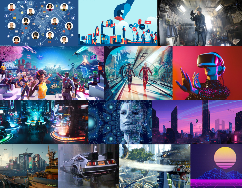
Since, the metaverse is virtual there is no limits. So we all thought it would look highly advanced and futuristic. There is a film called Ready Player One, which is what we think it will look like.
It is a dystopian world and people use a utopian metaverse to escape poverty and corruption. The concept of living two life’s; online and offline, is an idea which we liked, and relates to the exhibition name, 2lives.
STATEMENT OF INTENT
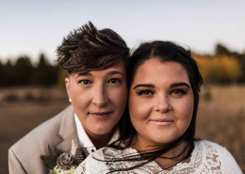
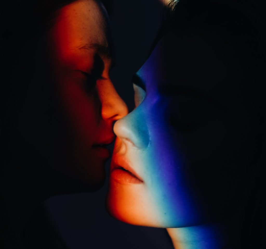
Together we are interpreting the theme of community as online and offline. And how we have bonded with people in person, but online they can be a totally different person. Also, online you can basically do whatever you want in a virtual world with anyone you want, where as in person you are limited to what’s around you. We plan to make a short film which visualises friends in real life and what changes when they go into the virtual world online.
CONCEPT: What will the future of Jersey look like as a community in the metaverse?
Describe in:
3 words – futuristic, modern, advanced
A sentence – St Helier will be a futuristic, modern, advanced world where people are living the perfect utopia life.
A paragraph – The community of St Helier would be idealised as a perfect utopian life in the metaverse. It would have futuristic, modern, and advanced qualities, as there is no limit to a virtual world. It would most likely to be sunny all the time, with flying cars and trains, with holograms everywhere. To people living in St Helier, and their community would mostly communicate online using screens, rather than in person as quality of life would be increased and the way of living would have changed.
CONTENT: How will you make your film?
Our 30-second film will be very visual, so we will be using mostly photo and video responses, video recordings, animation, analogue/ digital montages to create a story about the online and offline community of St Helier. The use of audio and sound effects would be impactful to exaggerate actions in the video, and possibly some loyalty free music. We plan to animate some parts of the video to represent the online world, where as the other half we plan to meet up and record some scenes based off the storyboard.
“Come to me, all you who are weary and burdened, and I will give you rest. Take my yoke upon you and learn from me, for I am gentle and humble in heart, and you will find rest for your souls. For my yoke is easy and my burden is light.” – Matthew 11:28-30
What will the future of Jersey look like as a community in the metaverse?
– Inclusion
– Equality
– Harmony
A community that is inclusive and fights for equality and lives in harmony.
I believe the community in Jersey are going to be one that fights for the inclusion of everyone; loves thy neighbour regardless. A community that’s social and makes certain nobody gets left behind, one that lives harmonised with one another and is Just.
A Zine is a self-published, non-commercial print-work that is typically produced in small, limited batches. Zines can be created through a number of different mediums, sometimes by physically cutting and gluing text and images together onto a ‘master flat’ for photocopying, however more and more recently zines have been created to showcase a photographer’s work through computer editing and sequencing. Zine publication (of Zine’s most similar to those we see today) first began in the 1930’s, traced back to the Science Correspondence Club in Chicago’s sci-fi Zine called ‘The Comet.’ One of the most popular, and recognizable decades of the Zine, was the 1990’s – all thanks to the Riot Grrrl scene. During this time young girls were encouraged to make their own music, zines etc – in a male dominated industry this was a big moment for women to make a stand. Riot Grrrl was more than just a musical genre, it was a feminist movement, as Max Kessler wrote in Paper, “Whatever Riot Grrrl became – a political movement, an avant-garde, or an ethos – it began as a zine.”
Recently, Zines are created to showcase projects, illustrations, art, photographs – the list goes on. Below I have created a mood-board of zines that interest me, may it be with their layout, images, colour palette or storyline – I wish to discover more about why artists create the Zines they make. For more on the history of zines, click here.
James Jay; I Love The World I See
James Jay is an American photographer and artist who began photographing the world around him in 2005. Jay’s images are intimate and familiar, I was really drawn to their warm yet mysterious atmosphere. The project of work I am creating a reference for is Jay’s Zine entitled ‘I Love The World I See’, which is a series holding two separate Zines, one in black and white and the other in colour. What I love about the work in this project is the way Jay can capture a different view of the community that surrounds him everyday – it is almost as if he knows every alleyway or corner of the streets to walk to capture the sincerity and honesty of his local community. An exert from the beginning of Jay’s Zine states ‘I started to shoot the world around me, everyday things. Then came my online photoblog named ‘I Love The World I See’. It was a place for me to post things that I saw, made or thought. That blog no longer exists but the phrase I Love The World I See still stays stuck in my head everyday. I love the world around me, even the chaos that comes with it, I love being able to see those things that other people sometimes neglect to see, either because they don’t slow down to look around or do not care to see. I try to capture those moments.’
Why do I want to take inspiration?
James Jay’s Zine shares with us the community around him, giving the observer an insight into his life, and those lives that pass him by everyday. His street photography style reflects that of famous candid photographers such as Henri Cartier-Bresson and Vivian Maier with his black and white mysterious images whose ambiguity leave the observer waning more, stretching their imagination to decide who this person is they are seeing, why are they there, what do they want? I think this is what inspires me most about Jay’s Zine, I wish to recreate the feel of community, the familiarity and honesty that I see around me. I am always inspired by photographers that create strong narratives, storytelling is very important to me, I aim to take inspiration from ‘I Love The World I See’ by telling the stories of each different community around St Helier, using my images from my ‘Character of Community’ and ‘Sense of Place’ photoshoots. Jay’s Zine layout is also something I wish to take influence from, I really enjoy the way he uses a range of formats to display his images, some taking up the full page, some meeting in the centre etc – I believe it helps the fluidity of the Zine, straying away from using a symmetrical format reflects the natural environment of the images not needing to be perfect; another element I wish to demonstrate in my Zine.
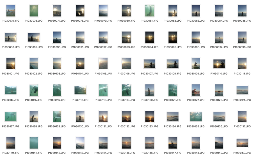
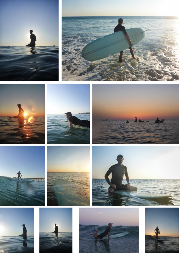
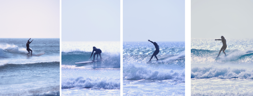
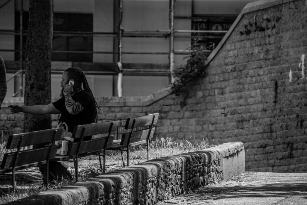
I chose to photograph the surfing community because I surf myself, and because we live on an island most other people do as well. And, I feel that the surfing community isn’t captured a lot in Jersey, so I thought I will capture it in about 10 photos.
Technically, there are two side to surfing based on the board, short boarders and long boarders. I an mostly involved with long boarding as its what I learn on years ago.
PHOTOSHOOTS
Since there are so many variables to photographing surfers, it was hard to arrange and plan what time and what day. It had to be sunny; as it makes the shot look cleaner, as there would be better light. Plus, it had to be good swell, as most people go surfing when its 2ft plus. Both the weather and swell statistics can only be seen accurately a week in advance, which made it harder to plan shots, so I just went when it the time was right.
Shoot 1 – Kempt Tower
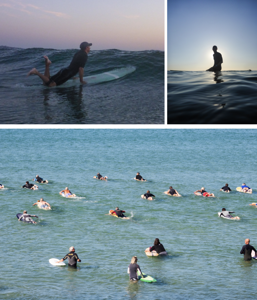
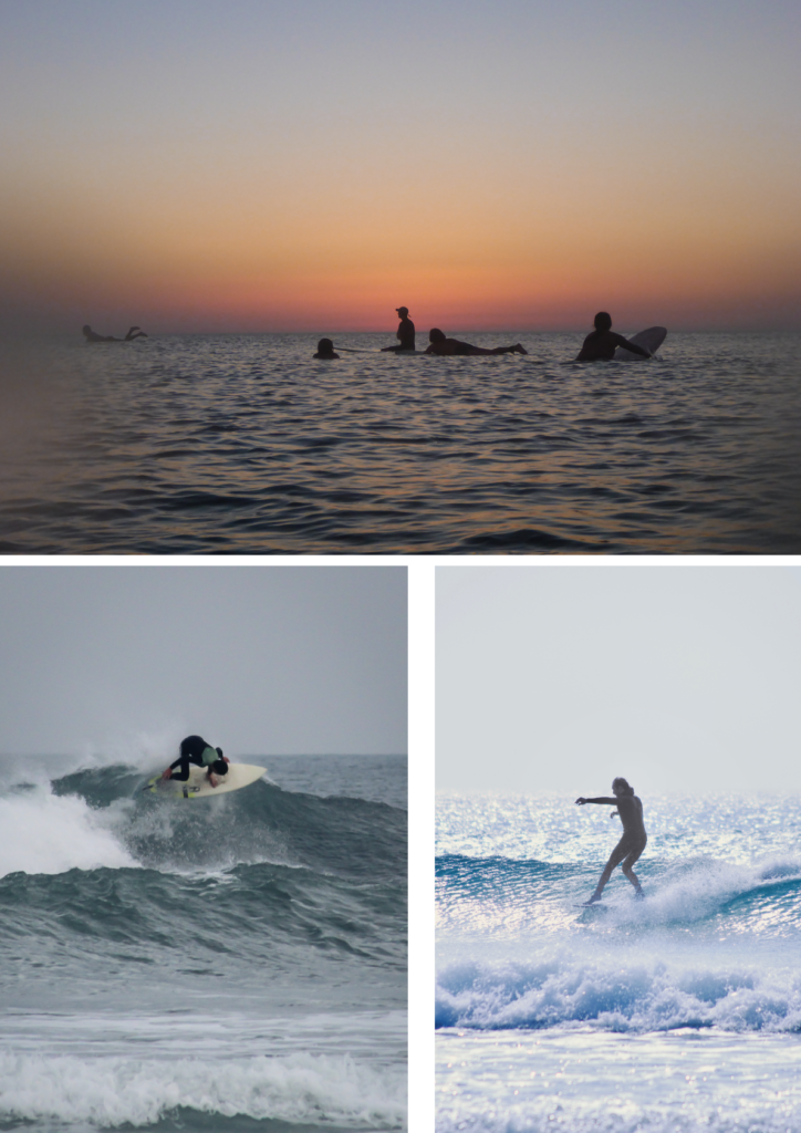
I went into the water with a waterproof camera and also a GoPro with a dome on to get 50/50 shots. I went in the evening, just before the sunset. The waves were really small, but it was a good time to take pictures of people sitting on their boards. It would be a closer insight into what it is like out back.
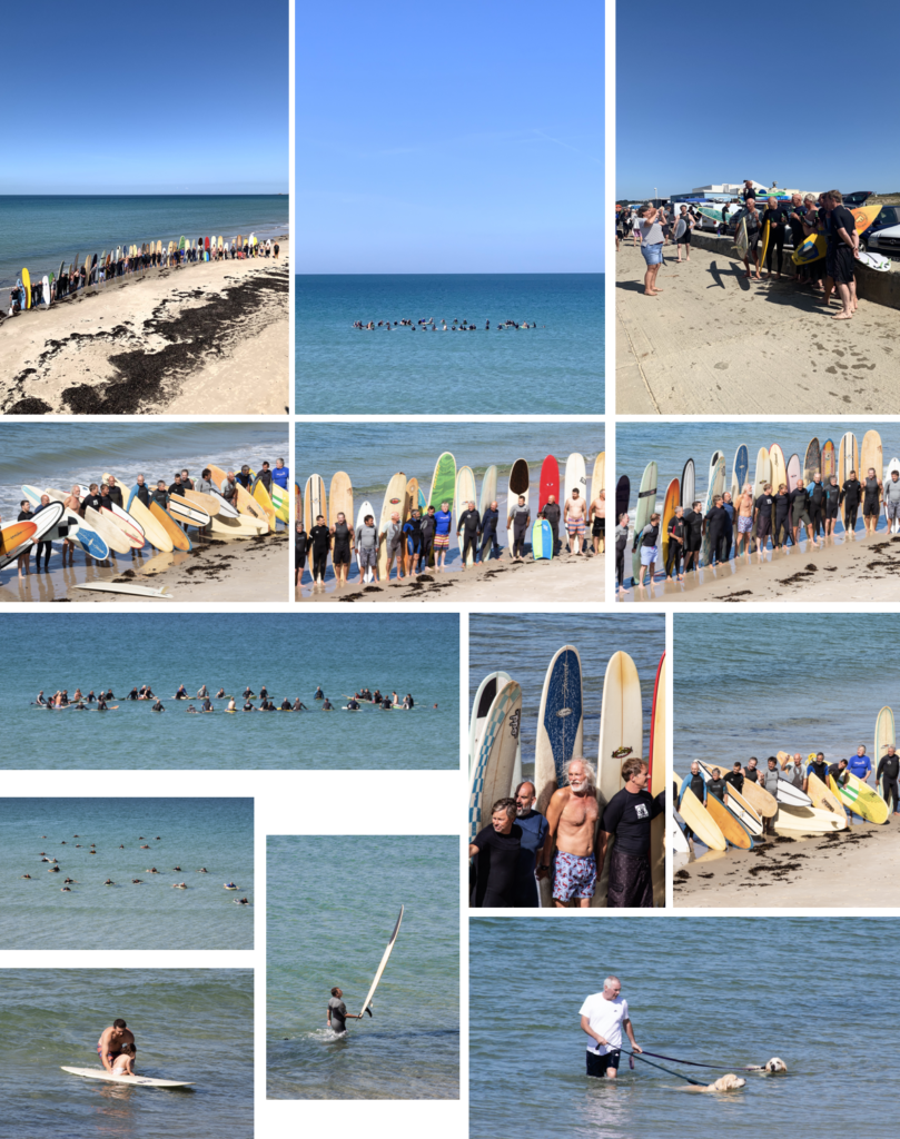
Shoot 2 – Water Splash, Connie Farmer Ceremony
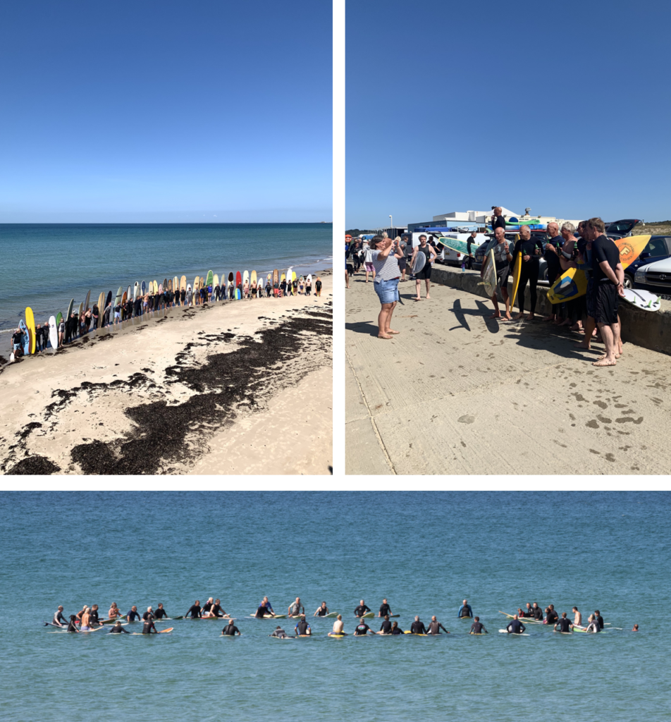
I was told that there was a paddle out ceremony, for Connie Farmer, who was a surfer in Jersey, which most the older people knew, and he was a really good surfer, and very athletic who passed away. So I captured the paddle out ceremony from the sea wall. They paddled out about 100 metres and made a circle to scatter his ashes. It shows the other side of the surfing community, and it shows how everyone is so supportive and respectful to each other, and it was great to see everyone come together.
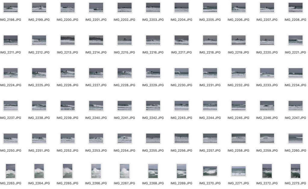
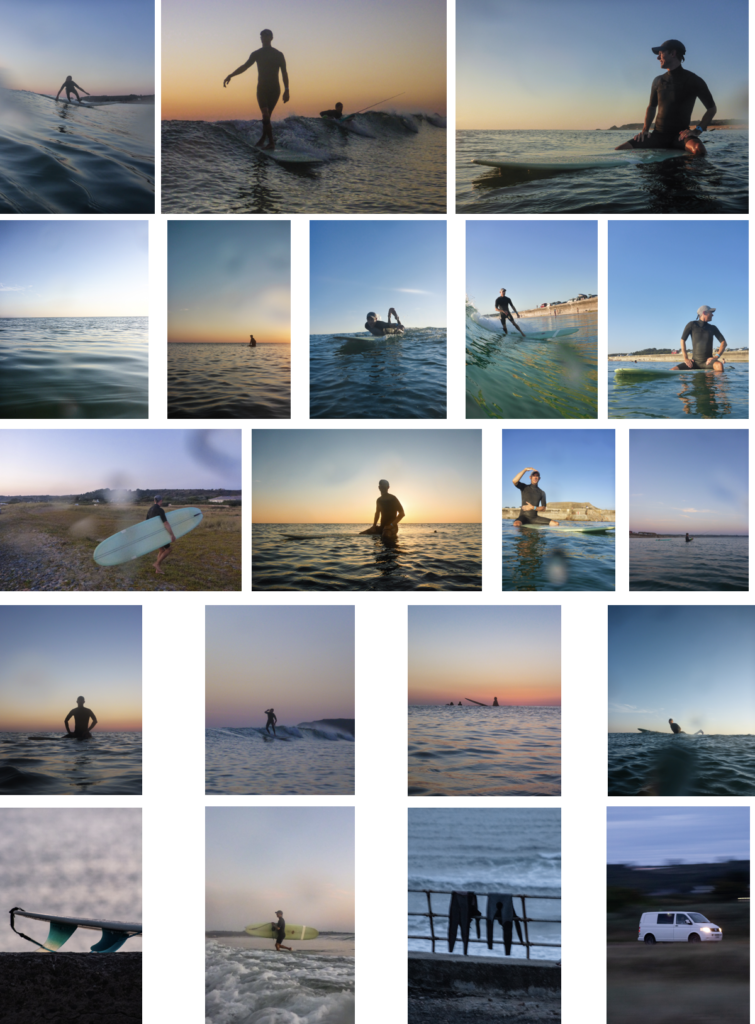
Shoot 3 – Le Port + Shoot 4 (re-visited)
Le Port is always busy when the surf is good. So I decided to go there when the surf was good. I went down to the waters-edge and used a 100-300mm lens to capture the surfers riding the waves. Also, when the tide came up I went up on the sea wall, which gave me a better vantage point where I could see over the waves better.
I came to revisit Le Port and get more photos to have a better selection. Most the photos of fast action sports are blurry, I found 1 in 10 were not great. Which, is one of the main reasons I wanted to go back.
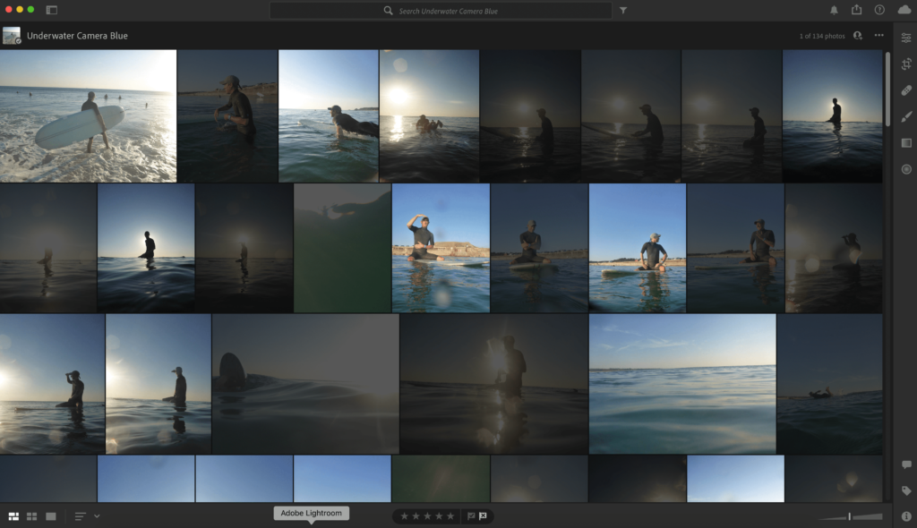
EDITING PROCESS
I used the same editing process for all the images. I used Adobe Lightroom CC, and used the Z and X to pick and refuse images. Then I edited all good ones, then exported them.
All I edited was contrast, saturation, clarity and, dehaze. Most the images didn’t need much editing don’t as I shot them in good lighting and used the right settings. Then exported them.
SHOOT RESULTS
Shot 1 – All these images turned out good. there is a variety of daylight images and sunset images, since I took them before sunset. They have a greater insight into surfing as it shows what it is like to take part.
Shoot 2 – I managed to get some good compositions, this was mainly as I was higher than everyone and I used a good zoom lens to frame the shot how I wanted to, instead of limiting myself to 55mm. Which, is the usual average lens maximum zoom.
Shoot 3 – These were shot on a cloudy day, which wasn’t ideal. However, the swell was decent, which meant there were more people to photograph, and made for some more dynamic shots.
Revisited shoot 3 – I revisited shoot 3, to try and get some shots when it was sunny. However, they turned out more blue, but I did get some more good action shots.
THE BEST SHOTS
The story of these images shows the process in order of what happens when you go surfing. First, you paddle out, then sit on you’re board until a wave comes. Then it goes to the shots when people were getting out the water, and some wetsuit hanging up. The end shots give a strong ending to the image sequence, as it shows how the surfing community comes together in important times.
EVALUATION
Overall, I am pleased with the outcome of all the images. The only thing I would change is that, I would of gone to do shoot 1 when there were bigger waves so the shots would look more intense.
To develop my images further, I would try to capture more of the community aspect in greater detail, even thought I captured a strong insight into the community, since a iconic member passed away. As I felt I captured the journey and fun side of surfing more than the community side.
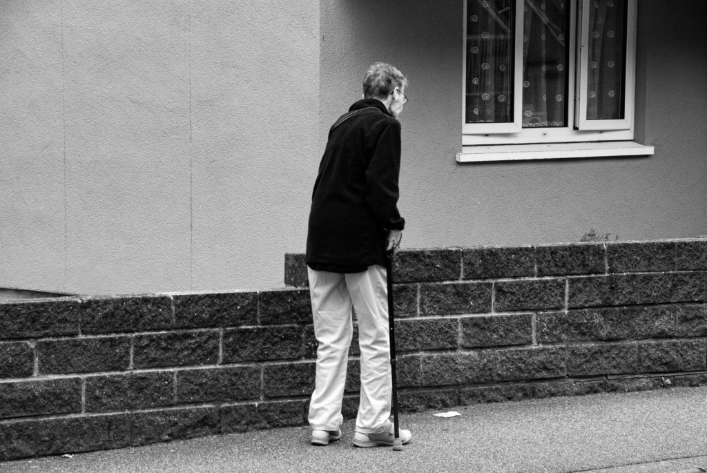
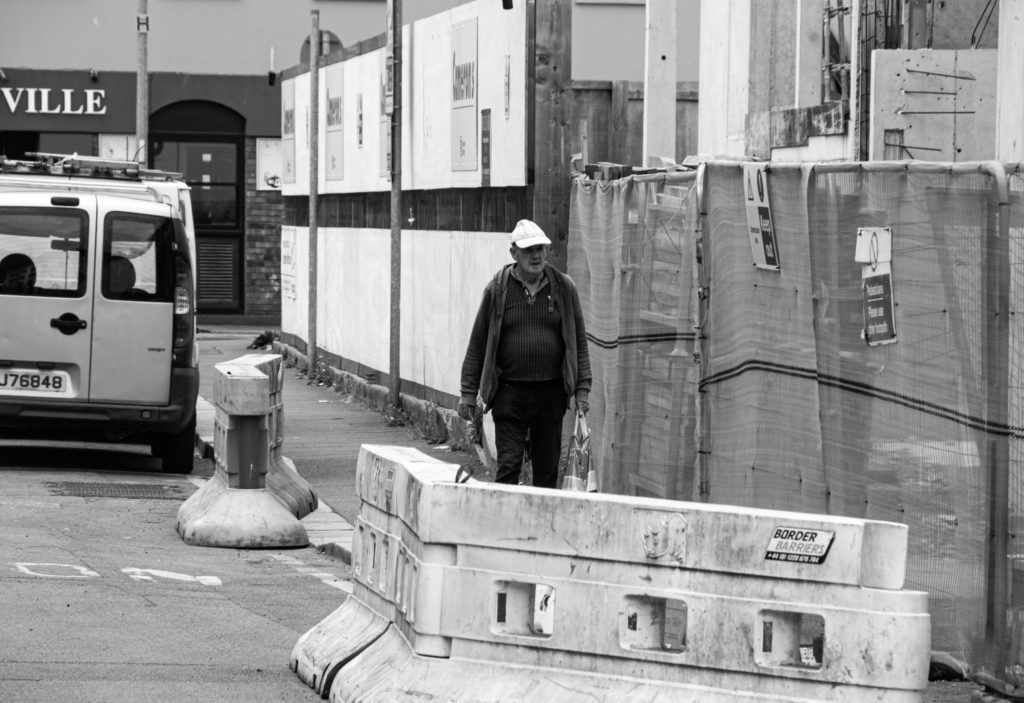
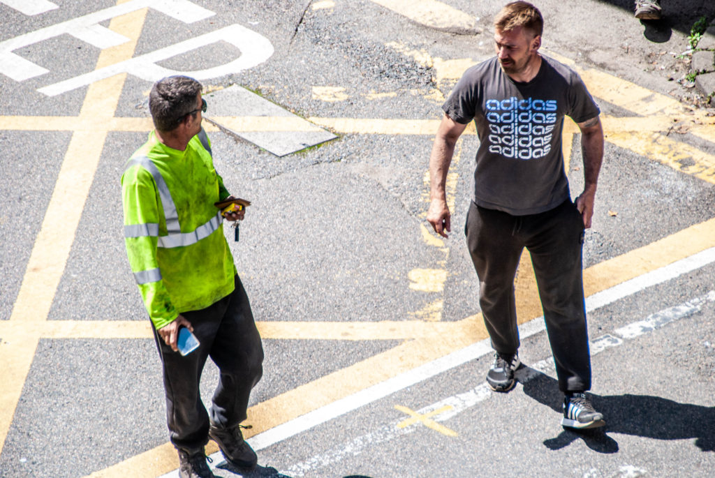
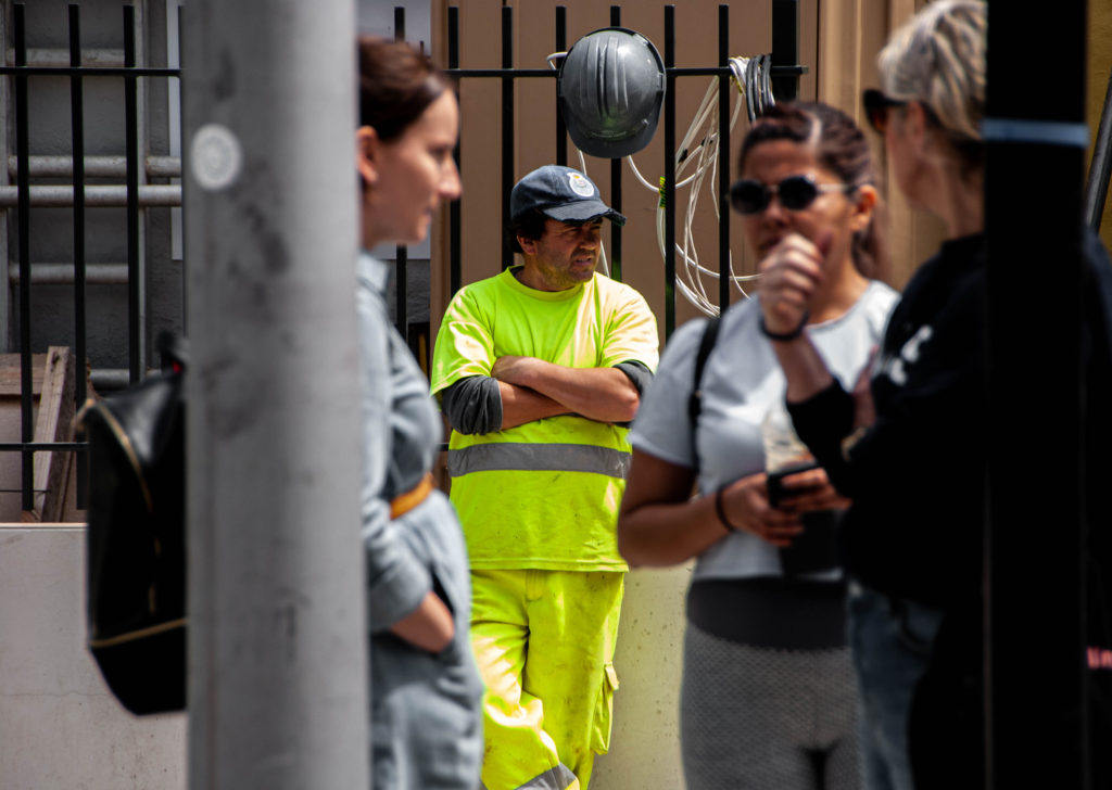
Who – For one of my photoshoots I plan on capturing street photography style images of people passing through town, running errands, working, chatting etc. I aim to photograph normality and comfort in many of these images by highlighting the warm atmosphere of location.
What – I plan on photographing people living their day to day lives without interfering with or changing anything within the frame, capturing realness and sincerity. I really enjoy taking images in this street photography style as I believe they really allow the observer to feel immersed in the photo as life carries on around them.
Where – I am going to carry out this photoshoot around the Merchant Quarter of St Helier, focusing on the busier streets of shoppers and workers. When researching these areas of St Helier it was interesting to find out which buildings and businesses have drastically changed over the years and which still hold similar shops to those decades ago.
When – I aim to take these images on July 10th as it is a Saturday meaning the St Helier streets will be quite busy, additionally the weather is meant to be bright and sunny which will aid my images in creating a warm atmosphere and mood, and again will increase the chance of more people being in town to photograph.
How – I plan on walking through the Merchant Quarter of St Helier normally, going into shops when I need to and capturing images as I go. I aim to have some images holding a different mood to the rest, capturing singular people on the streets or in shops alone. Additionally, I want to create 3 environmental portraits on my photoshoot with the subject interacting with the camera to contrast the street photography style.
Why – I want to carry out this photoshoot to show the character of this St Helier community by focusing on portraiture and street photography. I am aiming for some my images to show sequences depicting workers to their work and shoppers to their shopping, sort of showing a juxtaposition between them.
Editing – Contact Sheets
When I first imported all images from my photoshoots into Lightroom I did an initial delete of any photographs I knew were not up to standard, were blurry/out of focus or had issues concerning White Balance or Exposure which there was little point fixing due to another image of the same scene being of better quality. After this first sort through of images I was left with 75 to look at in depth, editing them down with star rating and flagging. I went into ‘Develop’ mode to start filtering my preferred images. I started by using the ‘Flagging’ filter, using controls ‘P’ for a white flag (preferred image) and ‘X’ for a grey flag (disliked image) and holding down ‘shift’ – this allowed my editing process to speed up massively and let me clearly see which photographs were my favourite. Next, I used the ‘Star Rating’ feature to filter each image from 1-5, one star as the worst and five stars as the best, which again helped me select the best images that worked well together in groups, sequences and pairs. .
Experimenting With Sequences
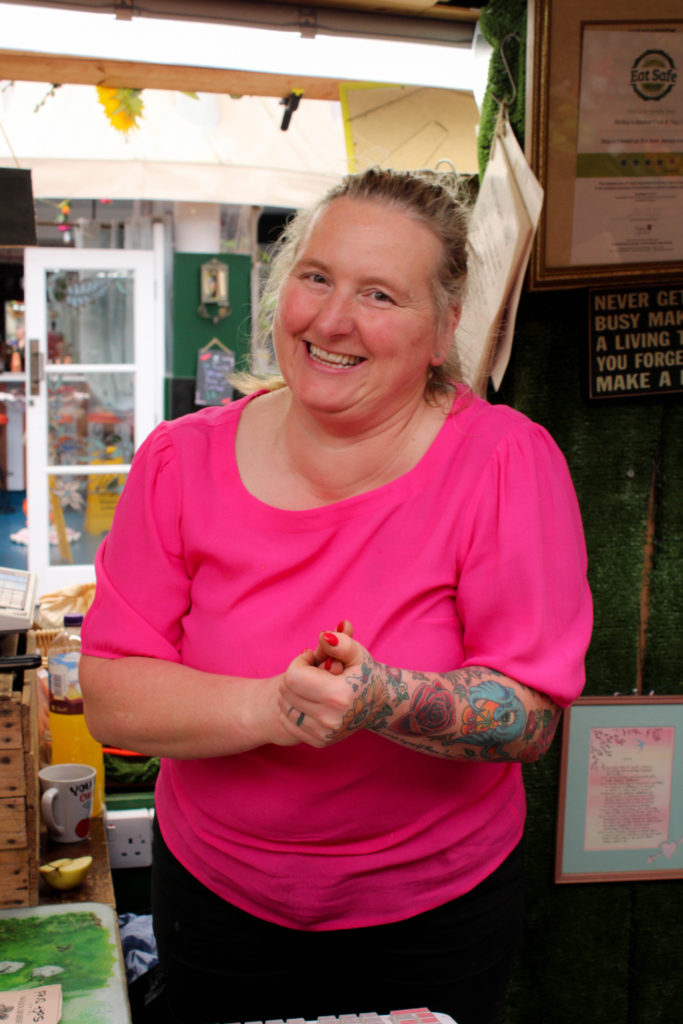
While on my photoshoot through St Helier, I found it important to stop in shops along the way to try and capture some shots of people browsing and buying items for themselves, after I captured this first silhouette style image on the top right of a lady carrying a shopping bag I thought of the idea to also photograph the area of the shop she had come from, showing the motivation for her movement. I really enjoyed how this sequence demonstrated context to the final image captured, almost like a backstory to the scene. When editing the first two images in Lightroom, I wanted to experiment with a black and white filter to add a more dramatic and mysterious atmosphere to the scene as I believe it reflects the ambiguity of the woman’s silhouette and her back turned to the observer. Contrastingly, I wanted to create a similar sequence to the first however using warmer tones and direct address to the camera to create a more welcoming atmosphere. The second two images were captured in the St Helier Market at a fruit and veg stall, I was really drawn to its vibrant colours and tones, juxtaposing greatly with the first sequence. After purchasing some produce from the stall I asked the server whether she would be happy having her photo taken for this project, explaining the interest in the merchant communities. I really wanted to capture a natural and comfortable image of the lady, her warm energy was infectious and I found it important to not stage the image too much in fear of losing this. To capture this vibrant photograph I continued having a conversation with the woman about her day, snapping moments where she would laugh or smile at the camera naturally – I found it so interesting to discover the history of the time she has spent working in the market and how she loves when customers would actually have a conversation with her when she serves them, it was very eye-opening. To reflect this positive energy when editing I made very minimal changes due to the camera already capturing such raw vibrancy, only heightening the brightness and contrast slightly to match the boldness of the fruits in the first image.
Final Edited Sequences
Environmental Portraiture
During my street photography and portraiture photoshoots I wanted to capture 3 environmental portraits with the subject engaging with the camera. The reason I kept this number of portraits low was because I wanted to spend time getting to know the subjects and the field of work they were in, taking the time to understand the to capture an image representing them naturally.
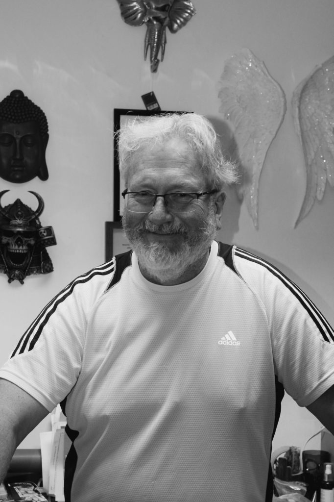
The first image is a photograph of Simon who owns the metaphysical shop Zen, in my image I wanted to reflect the welcoming atmosphere of his business through angles, body language, composition and light. I positioned my camera with Simon in the centre of the frame, his natural body position worked brilliantly with demonstrating the shop’s open friendly mood and the soft artificial lighting provides a range of dark and light tones across his face that hold no harshness or bold disruption to the rest of the image. Additionally, in the background of each environmental portrait I wanted objects depicting each person’s field of work, in this first image I wanted the most negative space however with hints towards the business and its goods, this was because I wanted to reflect the mystery of the shop while also using negative space to highlight and draw the observer’s attention to the main subject, Simon.
My second environmental portrait was taken in Seedee Jons of owner Jono. I wanted to capture Jono in a natural position, however still showing his fun and easy-going personality through angles, body language and lighting. I took my image just below eye-level, standing to the left of my subject and asking him to engage with the camera in whichever way felt most natural to him. I believe this angle contrasts well with my first and last image as the side-on view reflects the business’s cool unique atmosphere of the shop. Furthermore, I wanted this image to hold darker tones with more contrast to mirror the gradient of tones on the shop logo wall in the background of the image. I captured this range of dark and light with artificial lighting and when editing in Lightroom I slightly increased the ‘Blacks’ and ‘Highlights’ of the photo to create this more edgy atmosphere. I also wanted to capture the different shapes in the background of the image, showing the contrast between the geometric rectangle of the mirror behind the subject and the repetition curved circles to the right of the image.
My final environmental portrait was taken of a worker in the Cartridge Centre phone repair shop. I took this image at eye-level, with artificial lighting capturing minimal shadows or distracting highlights over his face. I wanted to capture the repetition of straight leading lines that fall across the background of this image creating a sense of movement due to their link with the business’s fast paced and quick working style to help customers and repair items with tight deadlines. Additionally, the geometric shapes in the background of the photograph also hint towards technology and modernised items showing this job requires more technical thinking and skills. The black and white filter allows the range of contrast and tones in the image to be emphasised, with the darkest tone falling over the subject’s hair and the lightest on the phone products behind him. This draws the observer’s focus towards the centre of the image, with the main focal point on the subjects face.
Street Photography – Colour
Street Photography – B&W
During my photoshoots capturing portraiture and the character of a community I photographed many street photography portraits of people walking the the Merchants Quarter of St Helier. I wanted to do minimal planning for the photos as they were to look natural and unstaged, I captured images of people shopping, walking, talking etc, trying to be as subtle as possible to photograph an organic moment. My first set of images I have kept in colour, doing little editing on Lightroom by only touching up exposure and brightness when needed – I chose which images worked best in colour by looking at my subject’s surroundings where I decided I wanted each colour image to have the repeated motif colour of red somewhere in frame. This red colour appeared frequently in my photoshoot and I loved how much of a vibrant and warm atmosphere it created. Additionally, my colour photographs all have a landscape orientation and all but one have more than one person in frame, capturing more of a community feel and a busier composition. My second set of images held more of a dreary mysterious atmosphere, so I have edited them with a black and white filter to emphasise the darker tones. The subject’s surroundings in the photos are more bare and empty, with only one or two people in frame, some with their back turned or from a side-on angle. In addition, my subject’s facial expressions are not smiley or content and sometimes hidden away from sunglasses or a hat – I wanted to include these images in my final edits as they show a great contrast to my environmental portraits and colour street photography, demonstrating how in a community there is a range of different people, having different emotions and days which can be translated through a photograph in a right or wrong way. The ambiguity of the images leaves it up to the observer’s imagination to decide what kind of person the subject of the image is, but they will never really know.
STORY: What is your migrant community story? Describe in:
Scenario, connection, diversity
Depictions of the everyday lives of migrants and their communities in St Helier.
Capturing everyday lives of the vast range of people that have migrated to St Helier. The way these people have formed communities and how the different communities differ in various elements but mainly their aesthetic differences. The different social and historic contexts that have defined these people.
A migrant community
NARRATIVE: How will you tell your story
I will use a sequence of deliberately positioned images which capture the essence of the story in an aesthetic way and also act on the narrative. They are positioned in a way were the images trigger questions and ideas about the subjects photographed and the narrative is told through how the images are sequenced and how the reader is guided from one image to the next.
AUDIENCE: Who is it for?
Most image makers tend to overlook the experience of the viewer. Considering who your audience is and how they may engage with your photo-zine is important factor when you are designing/ making it.
I want to lure in a wide audience who live in Jersey. My project highlights the fact that everyone in Jersey is essentially an immigrant and it is important to learn about the social and historic context regarding how and why these communities have formed. Therefore, I want to specifically target an audience that is lives in Jersey but is not essentially from jersey. I also want to target a specific ‘young adult audience’; 15 -25. This is so that the younger generation of big thinkers can start to ask questions about their heritage and educate themselves about the Island and its cultures and bands of people.
Editing
Edits from all shoots:
I believe that during the editing process I was able to dramatize and romanticise the locations and people of St Helier proficiently. I used a series of dramatic contrasting and aesthetic composition to begin telling the story of migrant communities in St Helier. I believe in order to start composing an effective narrative I needed to start categorizing and grouping images. This leads on to the next step in the process, sequencing.
Sequencing
I began narrowing my image range down from about 100 images to only 18 images.
I then began a tactile process of printing my images out and, by hand organizing them into a sequence. This is so that I could move them around quickly to experiment different combinations with ease and visually connect and sequence the images. This allowed me to notice that my combination of architectural images of different styles of buildings in St Helier had correlation, visually and culturally, with the portraits of individuals in the communities. There were also a few images where I felt certain characters in them had interconnections with others, I therefore chose to position these images together in the sequence. I began to connect and contrast these together until I found a perfect sequence that told the story of St Helier’s migrant communities. This sequence is seen below in order. The
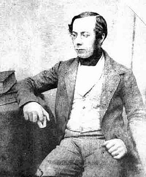
William Collie was probably the first photographer to use the calotype process in Jersey. This is a technique, were a sheet of paper coated with silver chloride was exposed to light in a camera obscura; those areas hit by light became dark in tone, yielding a negative image.
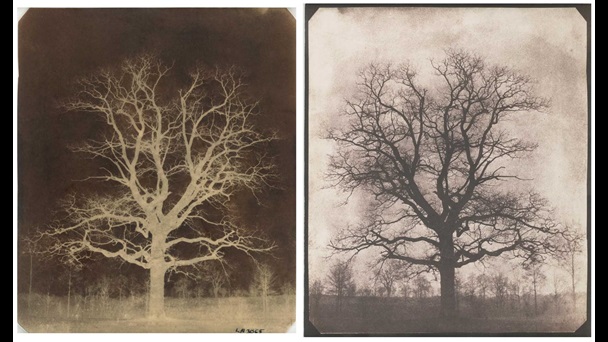
An oak tree in winter – William Henry Fox – 1842
The first pioneer of calotypes was a photographer called Willam Henry Fox.
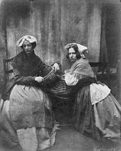
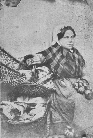
Some of Colliers previously unpublished photographs featured alongside those of Fox in an exhibition at the Musée Dorsay in Paris in 2008. This exhibition boasted some of the first photographs taken on paper in Britain from 1840 to 1860. Below is one of those photographs. It was taken in 1847. It is of Jersey Market women.
This photograph leads onto the next interesting element to note about Williams work. Williams work capturing these portrait style images was one of the earliest signs of tableau photography recorded. Tableau photography is an intentional form of photographing characters whom are arranged for picturesque or dramatic effect and appear absorbed and completely unaware of the existence of the photographer/viewer.
Marin Toft – from Tableaux Vivants
William shot a series of photographs, some of the oldest in Jersey, of Jersey market women. They were tableau photographs were the women were dressed up to look like market women.
I believe this was a huge step into the progress of photography, specifically photography as an artform. Photography during Colliers era was mainly focused on documentative intentions, photos were mainly used to record events, document, log and report. William was part of the early photographers who brought an essence of art and creativity to photography and these early tableau’s support this notion.
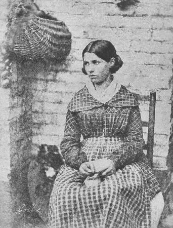
The above photograph is part of Williams ‘Market Women’ collection. The image is of a professionally composed tableau portrait where a young lady is dressed as a Jersey market woman. She is wearing what would be working class clothing of the time. The mise en scene of the image tells the story of a market environment with the hanging basket and what seems to be produce on the ground. The subject has been directed to look away from the lens. This enforces a notion that the subject is absorbed and used to create a dramatic effect; this almost gives the character a sense of elegance but also sovereignty . This sense of emotion the lady is portraying could give us an understanding of the historical context of the image as in the 19th century Jersey saw massive changes in society. A large influx of immigrants from England made Jersey a more connected island than ever before, and brought with it cultural changes and the desire for political reform. During this period, the States reformed to become more representative of the population and the Jersey culture became more anglicised and less religious. The island also grew economically and the built-up areas of the island expanded, especially St Helier, with the development of public transport on the island. This lady could have been represented as a part of this powerful time in St Helier as she is portrayed as a market woman, aiding in the growth of the town. The image has an artistic contrast created by the calotype method of photography that Collier was renowned for. The negative light give a wide tonal range from dark tones in the subjects hair to a pure white tone just an inch down on her collar. This contrast also gives the background a grainy texture as the shadows on the bricks are accentuated.
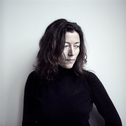
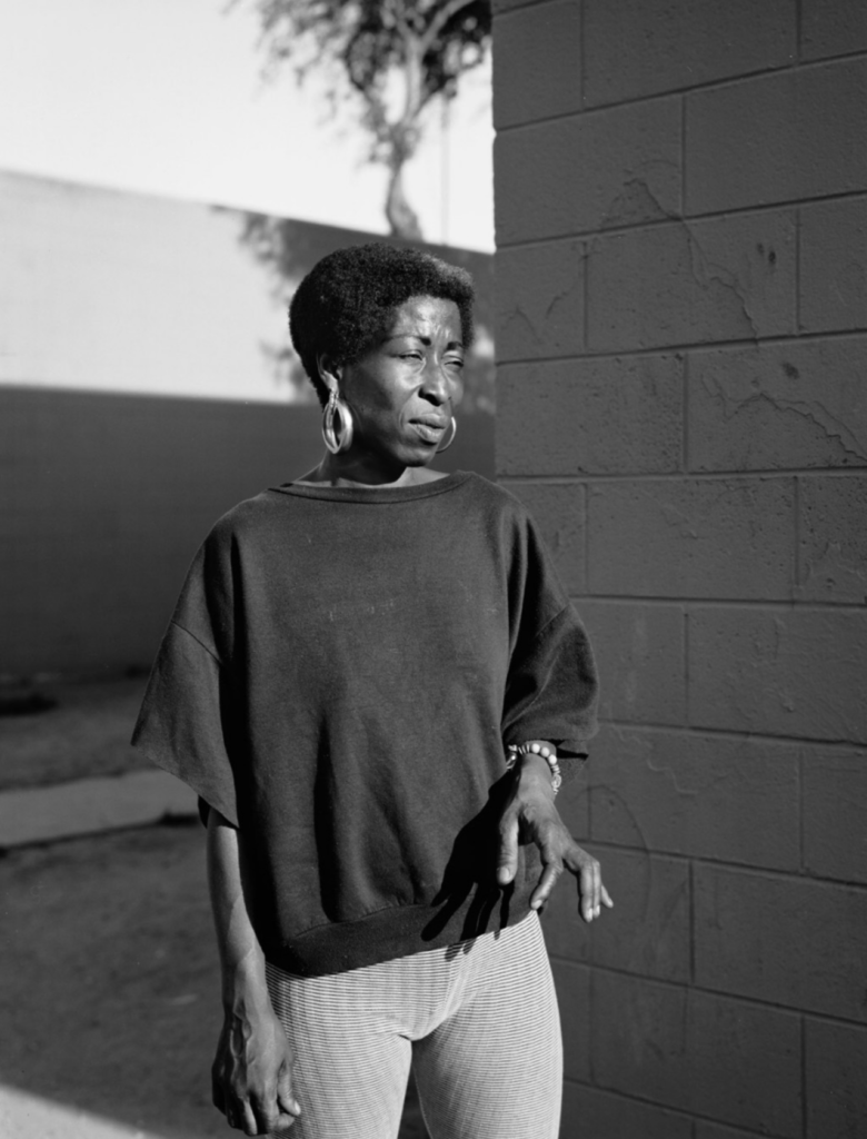
Dana Lixenberg Dana Lixenberg is a Dutch photographer and filmmaker. She lives and works in New York and Amsterdam. Lixenberg pursues long-term projects on individuals and communities on the margins of society.
(self portrait)
Her work strips down her subjects to their fundamental characteristics. Her photographs allow the viewer to interoperate every element of the characters identity and essence.
Dana uses a large format field camera which are completely mechanical sheet film photography cameras. The process is highly meticulous, none the less Dana sacrifices convenience for high quality negatives. I believe that Danas use of these cameras is also a way of making the photography process a more meaningful tangible affair. This sentimental process is also probably a method of connecting with the subject she is shooting more, as her passion is contagious and will leak into the subject she shoots.
It makes the process what Dana calls a ‘slow dance’ with her subjects.
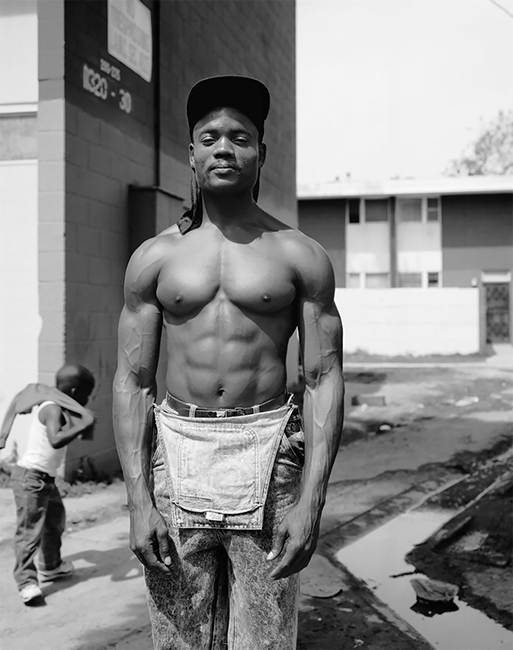
Dana pursues long-term projects with a primary focus on marginalized communities. One of these projects being Imperial Courts 1993 -2015. It is Lixenberg’s most extensive body of work to date. The project took inspiration directly after the 1992 Rodney King riots. Spanning 22 years, the project tracks the shifting configuration of an underserved community in Watts, Los Angeles. In contrast to the often one dimensional, sensationalized media coverage of this neighborhood, Lixenberg employs a more unobtrusive and community driven photographic approach. Like her other projects, Imperial Courts consists of a series of photographs and a publication. Exploring other media for the first time, Lixenberg also included audio recordings and created a three-channel video installation. The project was awarded the Deutsche Börse Photography Foundation Prize in 2017 and continues to be exhibited internationally.
She manages to give us such an in depth look into the residents of this neighbourhood with just street portraiture.
The above is a comparison between William Collie’s image on the left with Dana Lixenberg’s image on the right. Both these photographers are highly evolutionary with the art of photography and telling a story; they both strived to get the most out of their subject. William is pioneering new photographic technology and new styles of shooting portraiture in an artistic way. Dana is evolutionary in the opposite way. She did not try and implement the newest technologies but rather stepped away from the mainstream digital boom of photography she was born into and used older equipment to make her photography a connecting process with her subjects.
Both images are negatives and feature a black and white colour scheme. I believe this allows the viewer to focus on the structure of the image and creates a clear contrast which builds the foundation of the image and shines focus on the features of the character being shot. Both images are composed in a similar way with their subject sat down in a similar way with similar body language. The way their body’s are at a tilt and their hands are together allows both photographers to capture the subjects sense of innocence. The main difference with how the subjects have been composed is that Dana’s is engaging with the camera by looking directly into it; whilst Williams’ subject is pretending the camera isn’t there. Danas portrait makes the viewer feel as if they are engaging with the subject in a personal way whilst William’s is more tableau, making the viewer feel like they are ‘standing on the side-lines’ watching a natural scene take place.
Dana uses a very narrow aperture lens. This gives her image a shallow depth of field and a lot of bokeh. This isolates the subject and creates a neat visual aesthetic with not too many elements clashing. On the other hand William has everything in focus in his portrait. This intentionally allows the viewer to interoperate what environment the woman is in, thus giving her the identity of a market woman.
With this series of images I attempt to tell a story about an area of St Helier with historical or contemporary links with migrant communities.
My work will focus on three main elements to capture the historical context of the theme of identity and community in St Helier:
A sense of place – for example; location, site, environment, residential area, communal park, architecture and details, Interior of church, community centre, house or home.
Character of community – for example; street scene, decisive moment, staging or performing for the camera.
People and portraiture – For example, a resident outside his/her house/apartment block, shop/ business owner, street portrait/ passer-by.
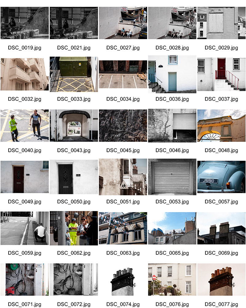
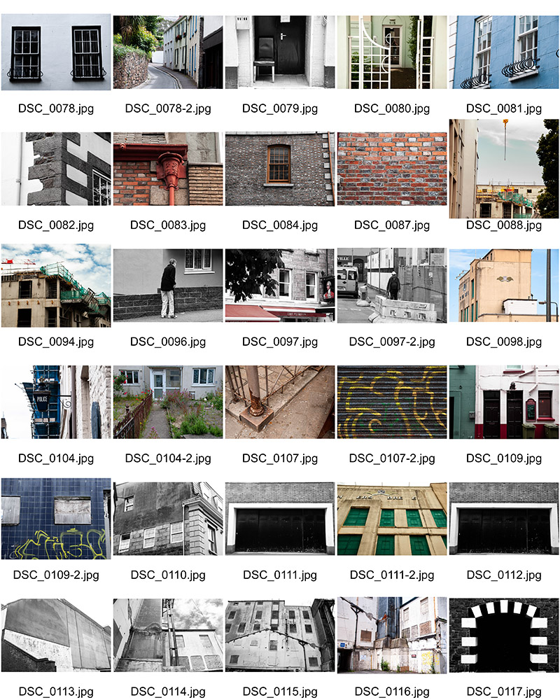
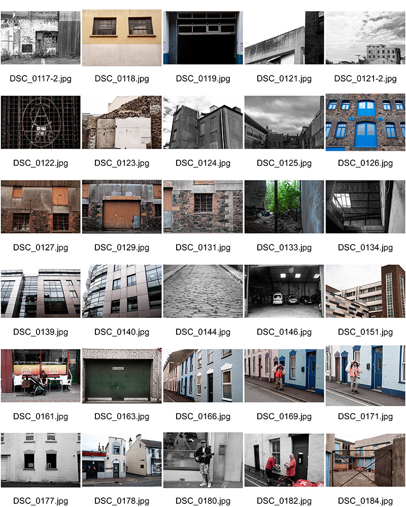
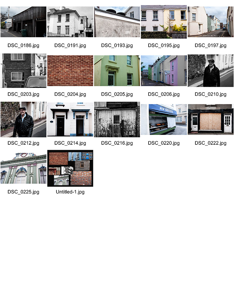
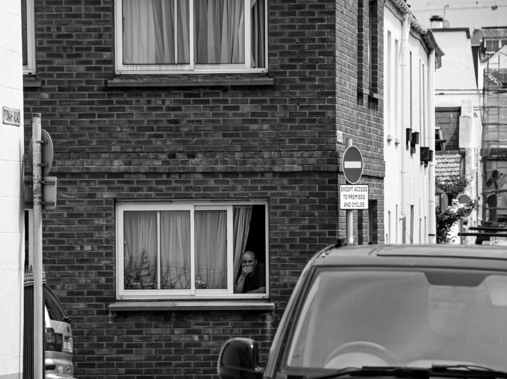
I focused on three contrasting areas of St Helier:
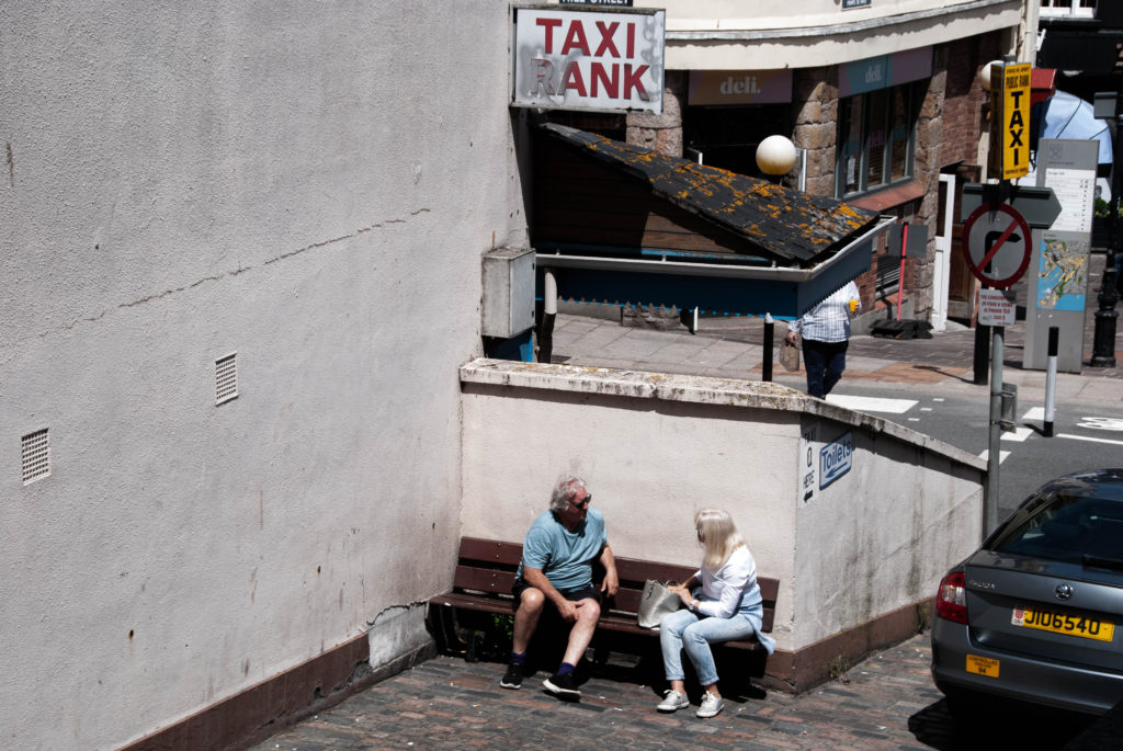
Route 1: Merchant quarter – This area of town was once where the core community of merchants were located. It was once located right on the waters edge in the 1800s but now boarders the marina – this gives merchants easy access to their ships and therefore gives insight into why this area is dubbed the merchant quarter. I enjoyed photographing the character of community in this area as people fused with their environment and seemed to interact with it well.
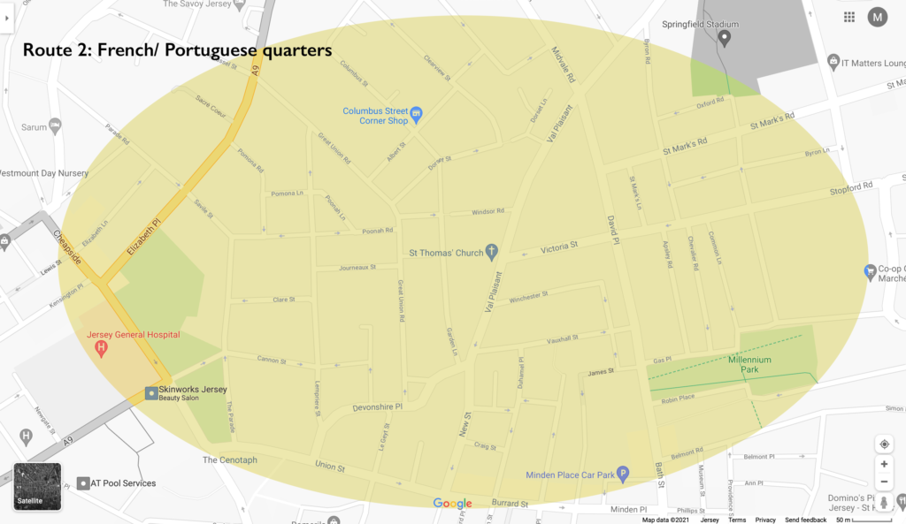
Route 2: French/ Portuguese quarters – This area of town is where most of the European migrant such as the large number of French and Portuguese people that began settling. This area features a diverse range of neighbourly people who form a lively community. This is why I found this area was most interesting to shoot in terms of people and portraiture.
Route 3: British expats/ wealthy residents (Rouge Boullion) – The United Kingdom is Jersey’s closest international partner. Deep social, cultural, economic and constitutional links between us have been built up and maintained over hundreds of years. This area is where most of the wealthy residents and British expats began to settle. The rich architecture in this area is what I found most interesting to shoot. The wealthy British would bring their builders over from the UK to build the magnificent houses. Shooting a sense of place in this area was what I focused on.
Mood Boards
Sense of Place
Character of Community
People and Portraiture
Contact Sheets
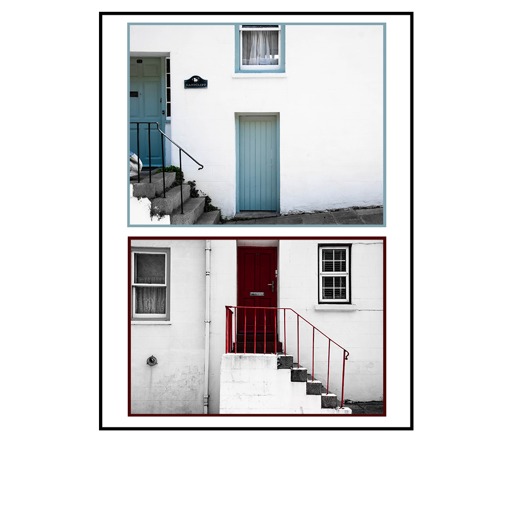
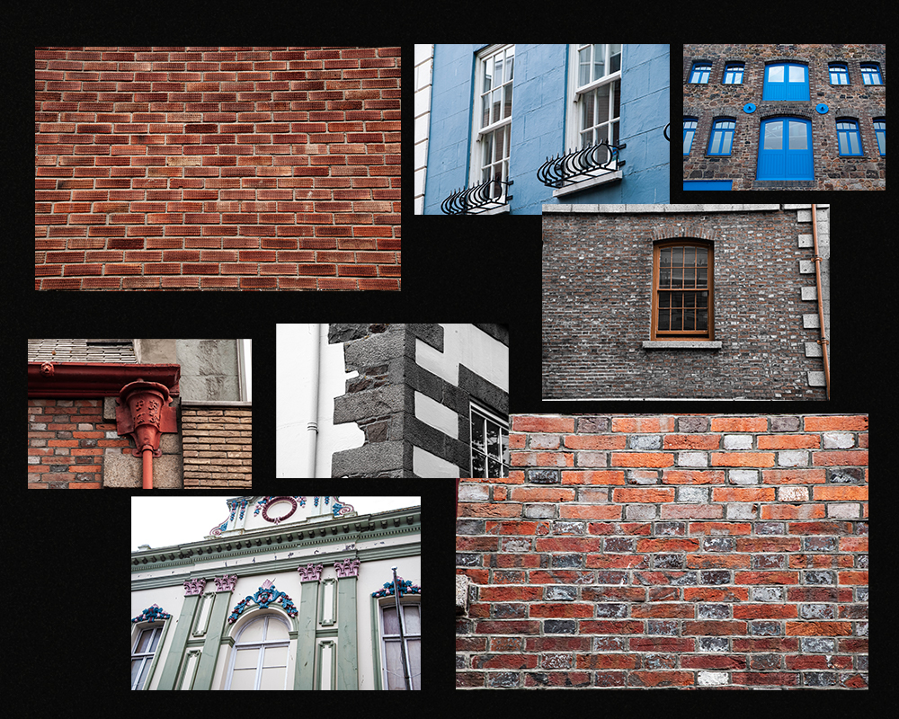
Shoot 1 – a sense of place
During this shoot I focused on capturing St Helier’s buildings and homes in a manner that encapsulated the social and historical contexts of Jersey. I did this by shooting different styles of buildings – Portuguese, British, houses, shops, offices. I also shot structures which had different ages; I shot newer office blocks and also old houses that had been around since St Helier’s birth.
During my editing I focused on aesthetic composition; I therefore made sure to frame everything in a symmetrical or artistic manner.
I also focused on dramatizing the buildings using deep colour schemes and contrast.
Final Images:
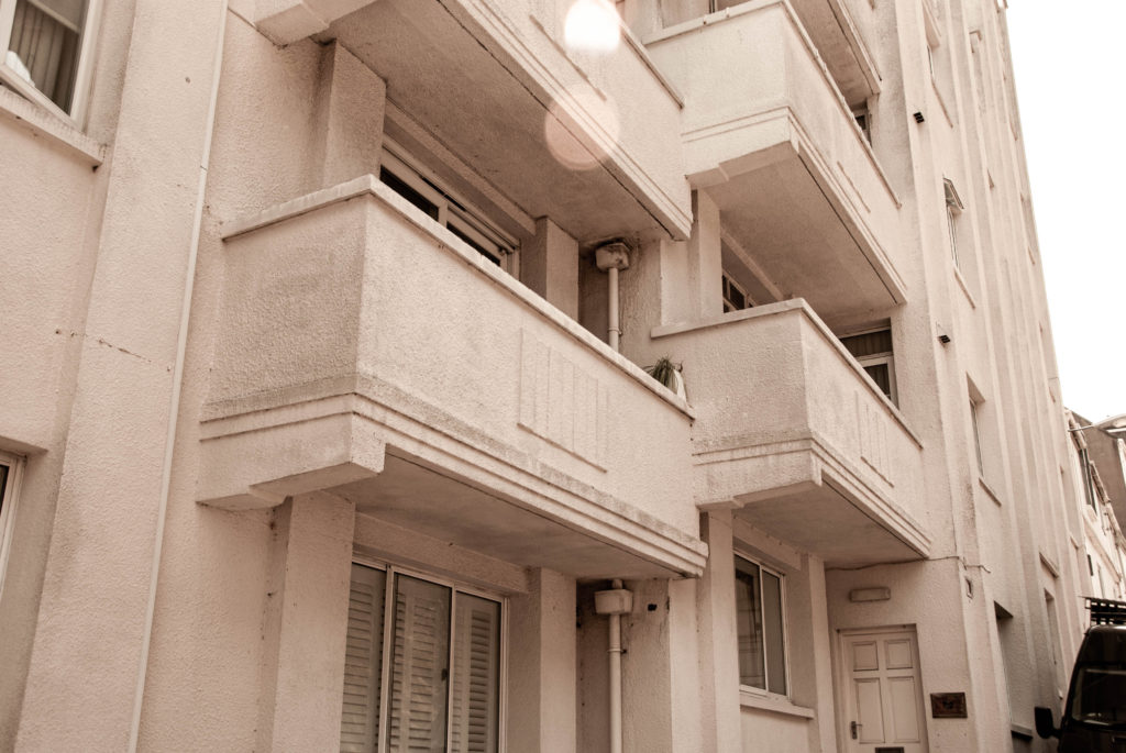
The image above presents a pleasing visual aesthetic as the images share a consistency. They are consistent with framing and composition with the two doors and stairs framed identically. This image tells a story of community and their connection through identical housing, but also shining focus on unique identity shown by the different colour choices of the doors. These images are also effective at referencing a sense of place A few other images that achieve this message in one composition are shown below.
The below images share warm tones and a ‘lens flare’ in the top of the composition that give the images a sense of prosperity that suggests the buildings have been stood happily looking down on the community for a long time.
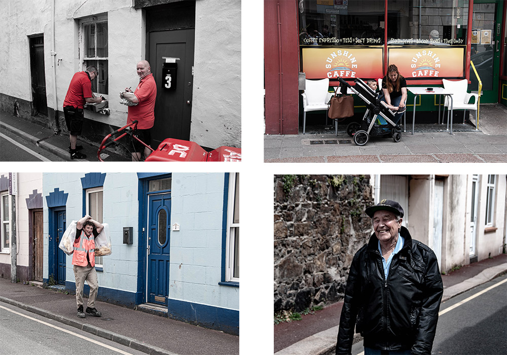
Shoot 2 – Sense of Character
For this shoot I shot people of St Helier interacting with their environment and each other. This produced a wide range of emphatic images expressing emotion and telling a story about the area they are in and about what type of people they are.
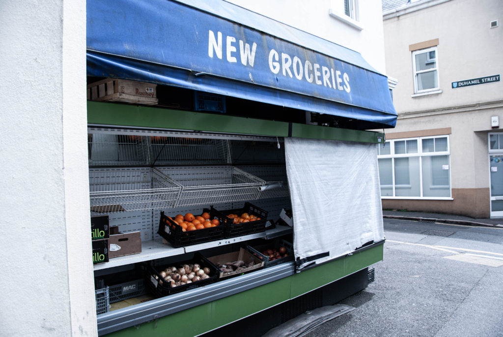
I also shot images where there was a lack of people in the shot in a physical sense. I instead shot urban landscapes where there was a setting created by people and shaped by the community but lacked the physical presence of people. For example this image of a food stall tells a story about the community and their everyday lives without anyone actually being present in the image.
The following images are of scenes composing of characters of the community. I like the way they are composed in a way were they blend in with their environment, and all look to be living the hustle and bustle of St Helier, just like their migrant fisherman, merchant ancestors.
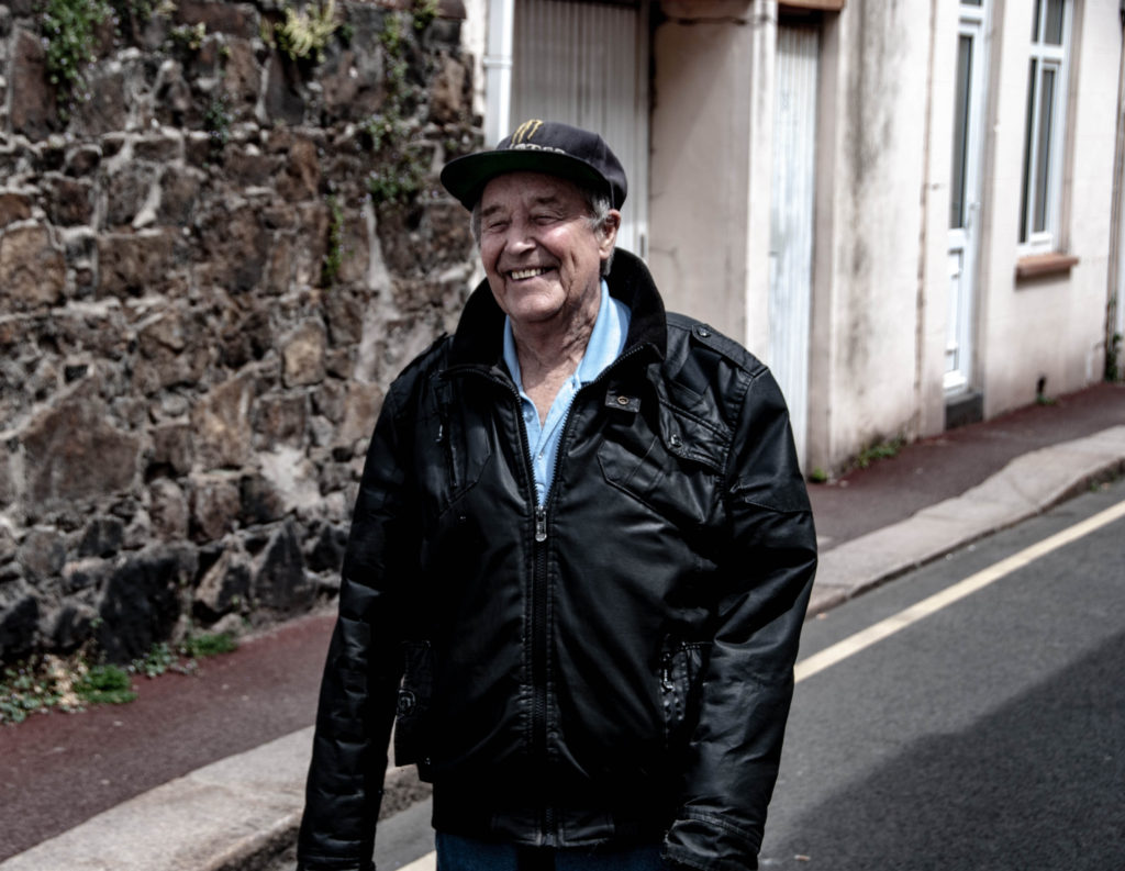
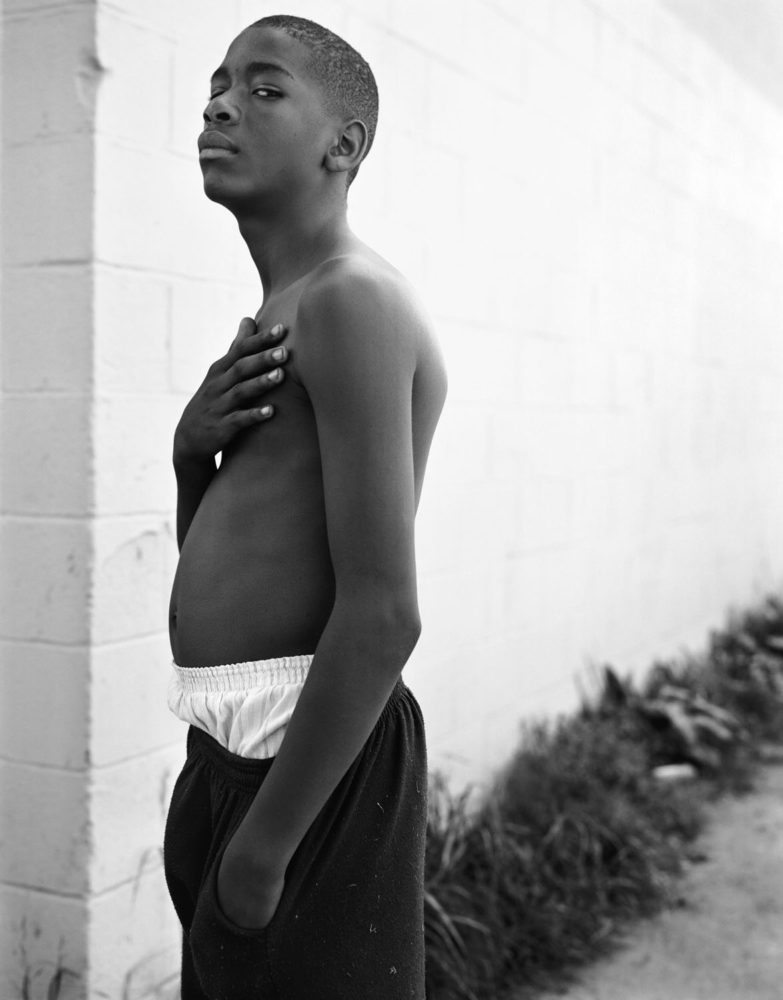
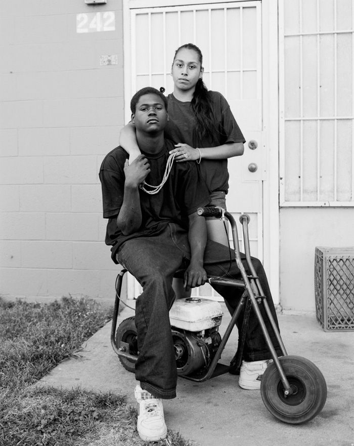
Shoot 3 – People and Portraiture
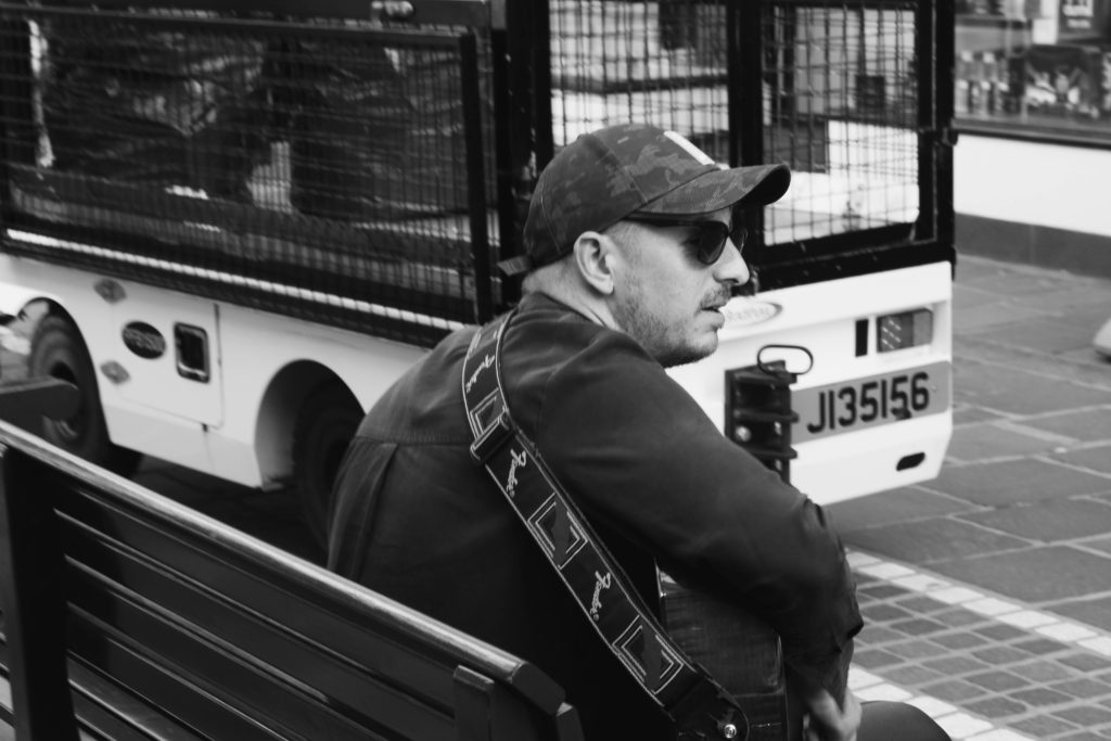
For this shoot I focused on capturing the emotion of the people I shot. I also focused on shooting people who were busy going about their day in a variety of different ways, weather that be playing guitar on the pavement or taking a smoke break; the images tell a story of identity.
After our tour of the museum we were able to explore the beautifully restored Victorian House and enter the drama of a Victorian family in crisis. Thereafter, we were taken on a tour on the streets near the museum by a passionate historical architecture expert Stuart Fell.
I documented the tours keeping migration and communities in mind and shot it in a fashion that focused on
– a sense of place – character of community – people, portraiture
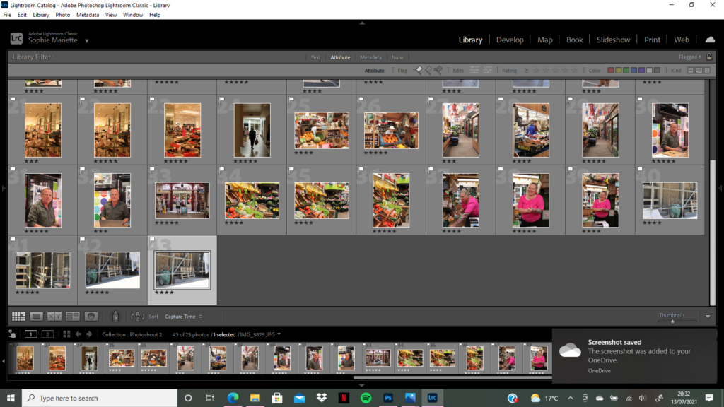
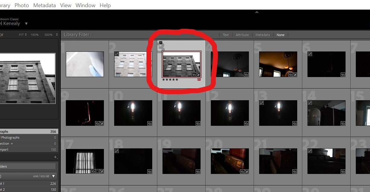
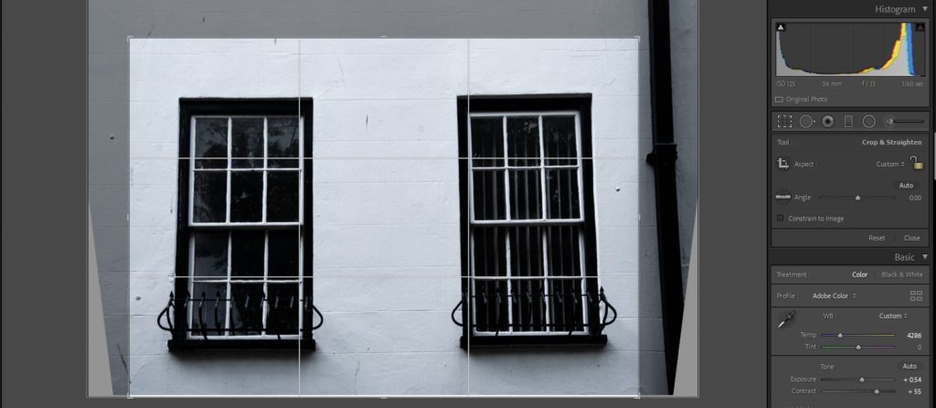
I began my editing process by using the software Adobe Lightroom Classic to start identifying my most powerful and useful images. I did this by working in the Library window and implementing LR’s features that help organise and rank photos. I gave a series of images a ‘flag’ which indicates if I picked them or not. I then gave each image a star rating which narrows down how much I like the image even more and therefore makes the displaying and selecting of my images an easier process. Finally I colour coded images that I believed would work well presented together
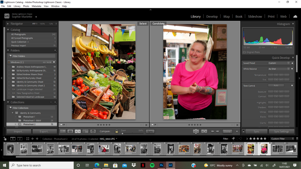
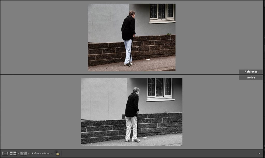
I then used the compare views feature to make comparisons between the same photo edited in deferent ways and to reflect on the before and after of my images to experiment how they could be tweaked differently and what works well to emphasise the emotion in my photographs.
The above is an example of this feature being used where I compare two different images edited in two different fashions. The feature makes it easy to see which image works better at one quick glance.
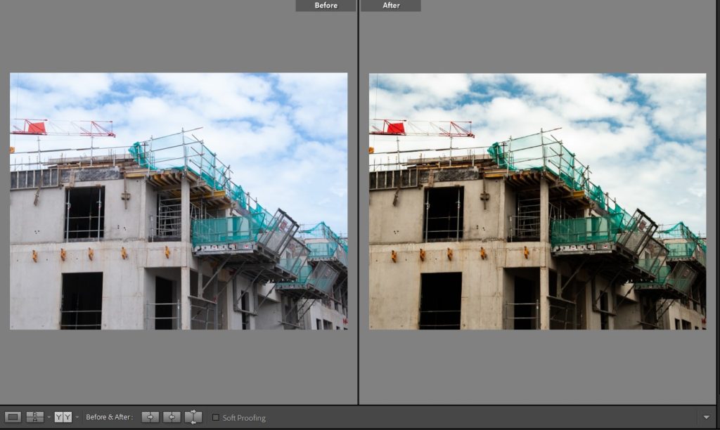
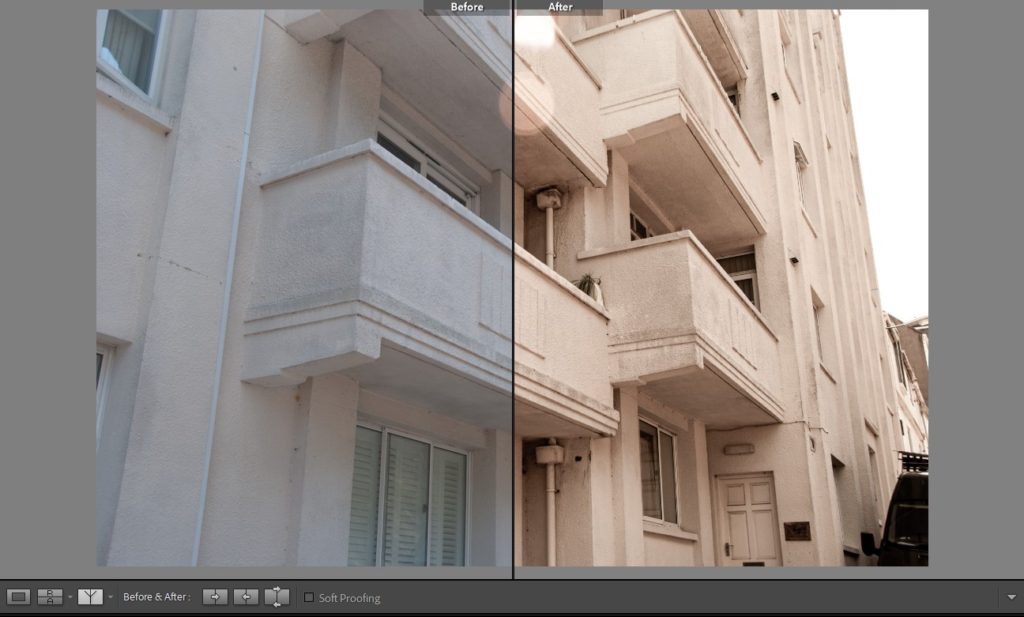
The above is an example of a before and after comparison where the image is split in half and an easy examination into what editing took place can be made.
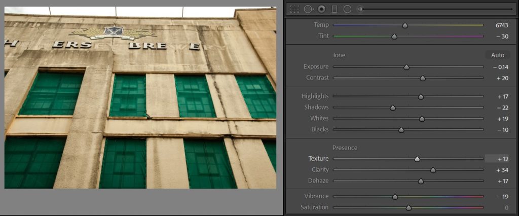
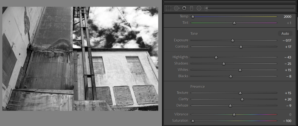
When editing my images the first element of the image I pay attention to before I start tweaking anything else is composition. I adjust the image using the crop overlay tool to frame and compose the image artistically.
After this I experiment with the colour elements of the image
I do the same but, experiment with a completely desaturated monochrome version of an image.
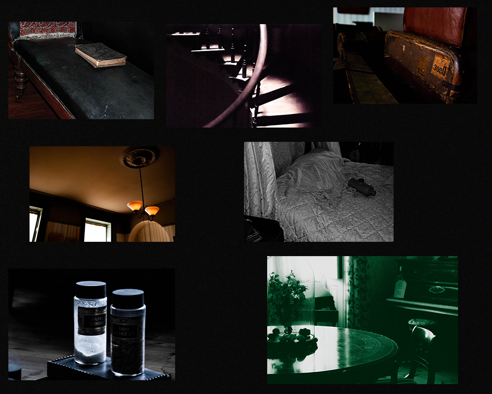
Below are the final edits of the museum and architecture walk grouped into two collages.