Tag Archives: gallery

Gallery

Gallery

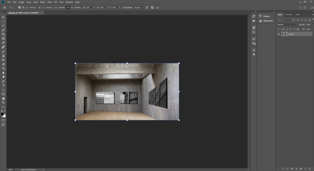
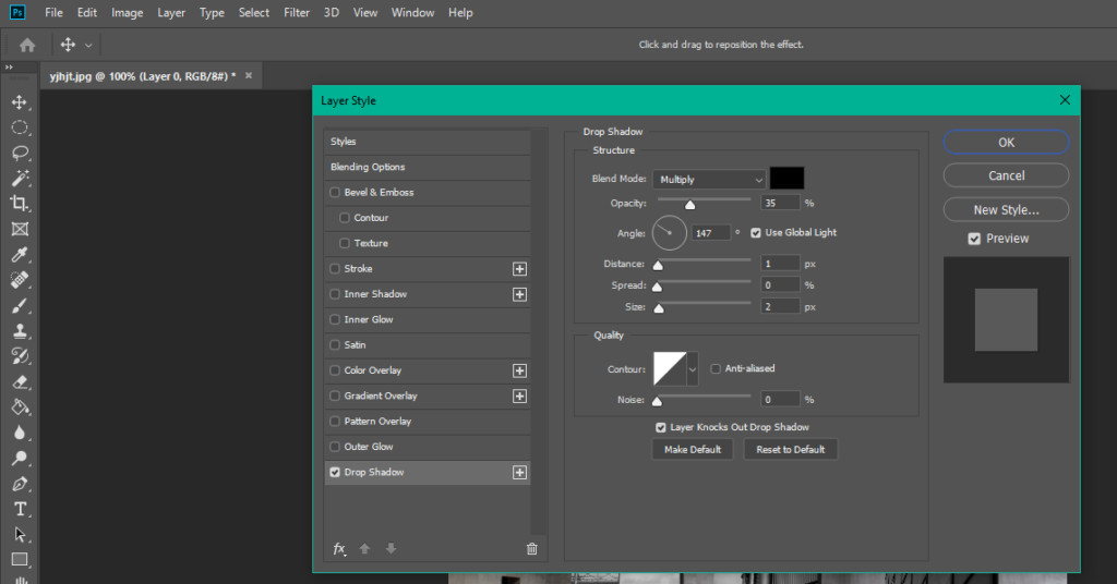
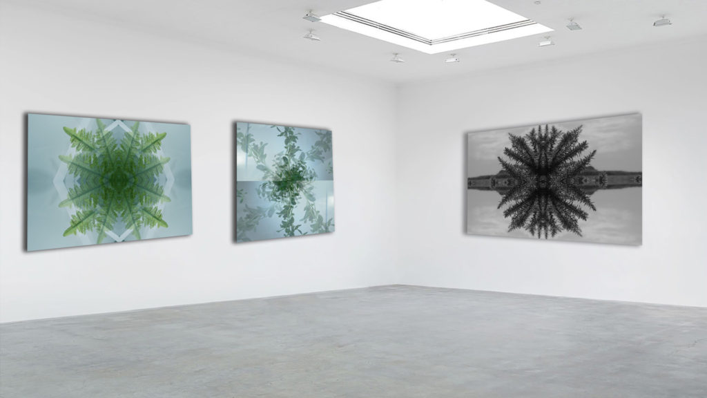
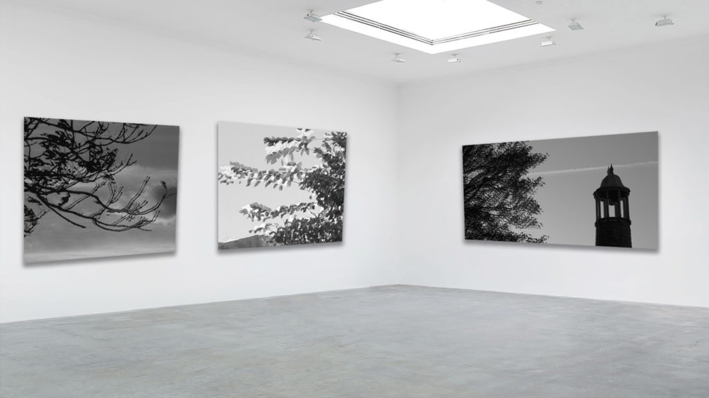
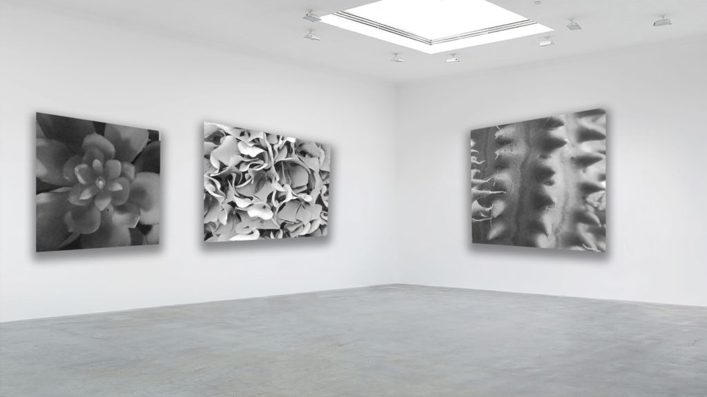
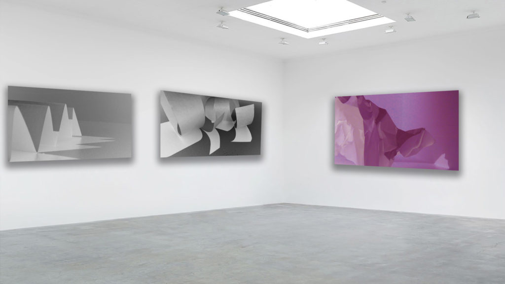
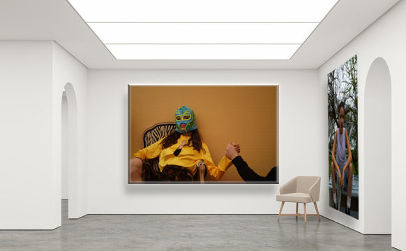
Our task was to put our final prints in an internet gallery. To begin, one has to look for an empty gallery on the internet and be careful and determine if the proportions of the paintings are adequate. Then you open photoshop and start modifying your images. To make your image fit into the boxes, you play around with the transform utility to transform your image. You have to obviously make it smaller, distort it and rotate it that should do the trick. To finish, it is a recommended option is that you put a shadow below your image so that it looks more real. To put a shadow on your image, you press the blending options button and there you can play with the shadows, that is, put the darkest shadow further away… Also if you want you can put texture on your image or whatever you want. And this is how I create my gallery.
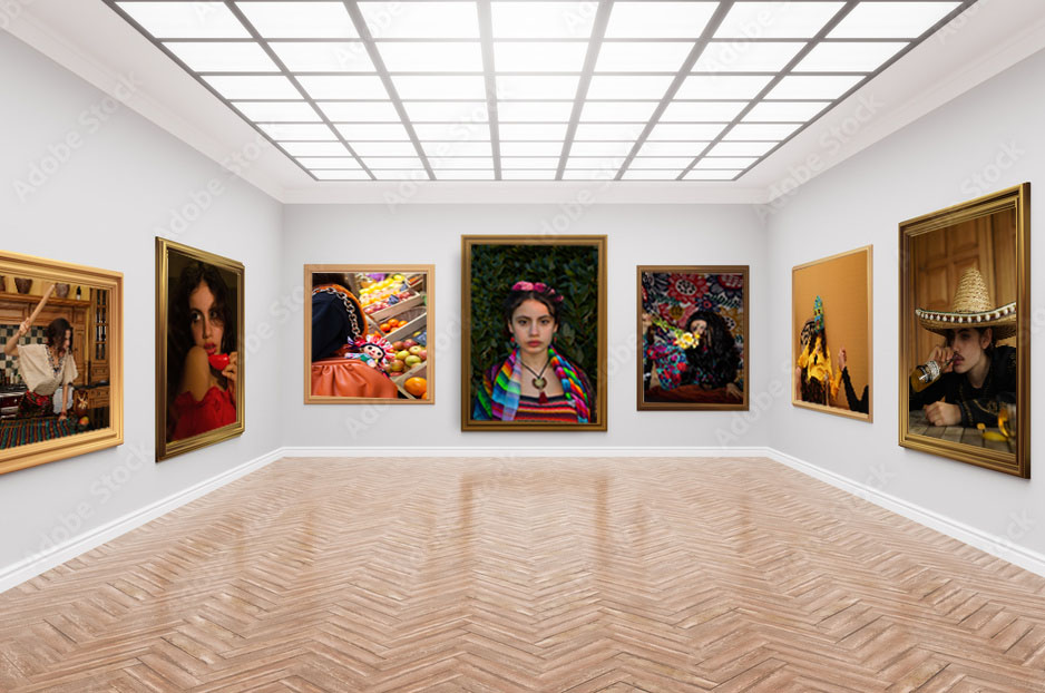
SELECTING, FINALISING AND DISPLAYING…

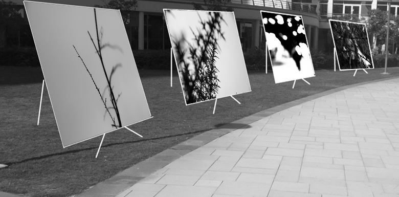
I grouped the above images together as they portray the same vertical leading line architecture both with each other, and with the gallery they are displayed in.

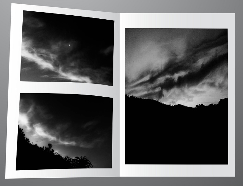
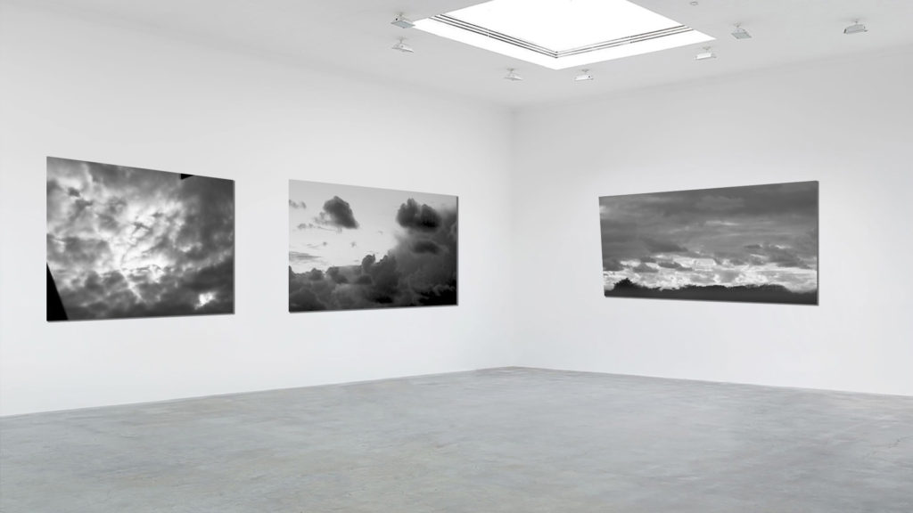
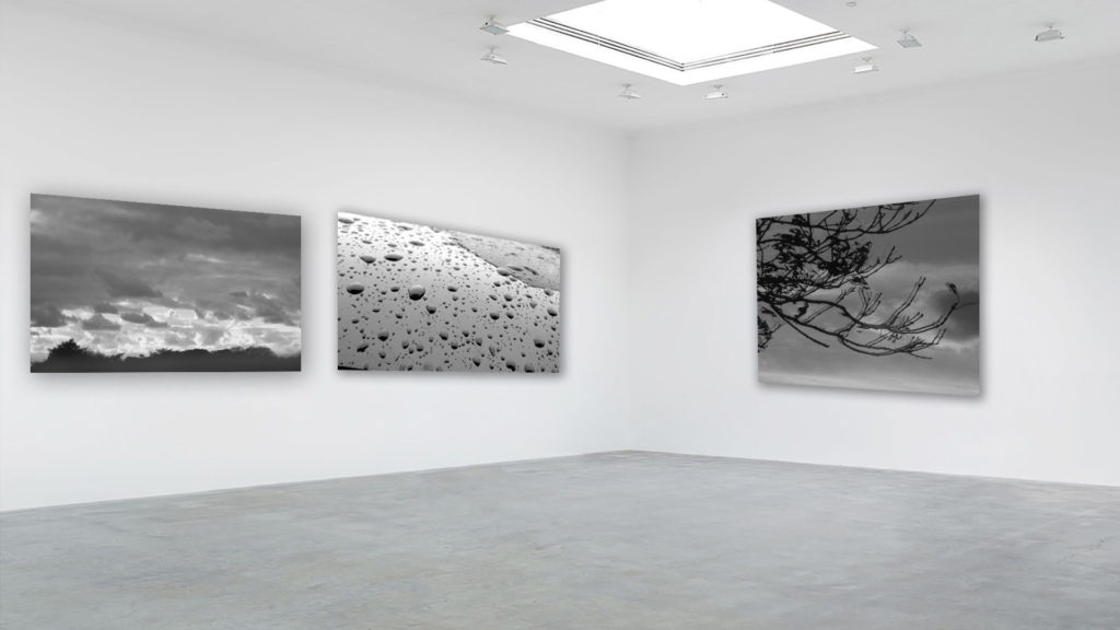
These images I decided to display in a digital zine format. They follow the same tonal and textual features showcasing the sandpapered clouds in a dark underexposed style.

The above images follow the same desaturated and geometric rectangle features which coincides with the gallery I chose which features grey walls and geometric rectangular architecture.

These images feature the same experimental focal style. They all have unconventional focus features with varying depths of field which made it suitable to use the immersive gallery which provides depth of field as some images look closer than the others.

The above images are curated together into that setting for the way they look like a portal into a different universe.

Method

I first gathered my my images according to how aesthetic they would look simultaneously, into five sub-galleries

I then chose a fitting empty background to stitch the clusters of images onto. I chose backgrounds that possessed similar shape and form of the images and also any other visual elements such as similar cloud patterns.

I then used photoshop to transpose these images onto the coinciding backgrounds by making use of free transform and warp to make the images look naturally apart of the background. I also added a drop-shadow to the images to help achieve this.

SELECTING AND FINALISING AND DISPLAYING

Paris abstract

Photos selected

Gallery

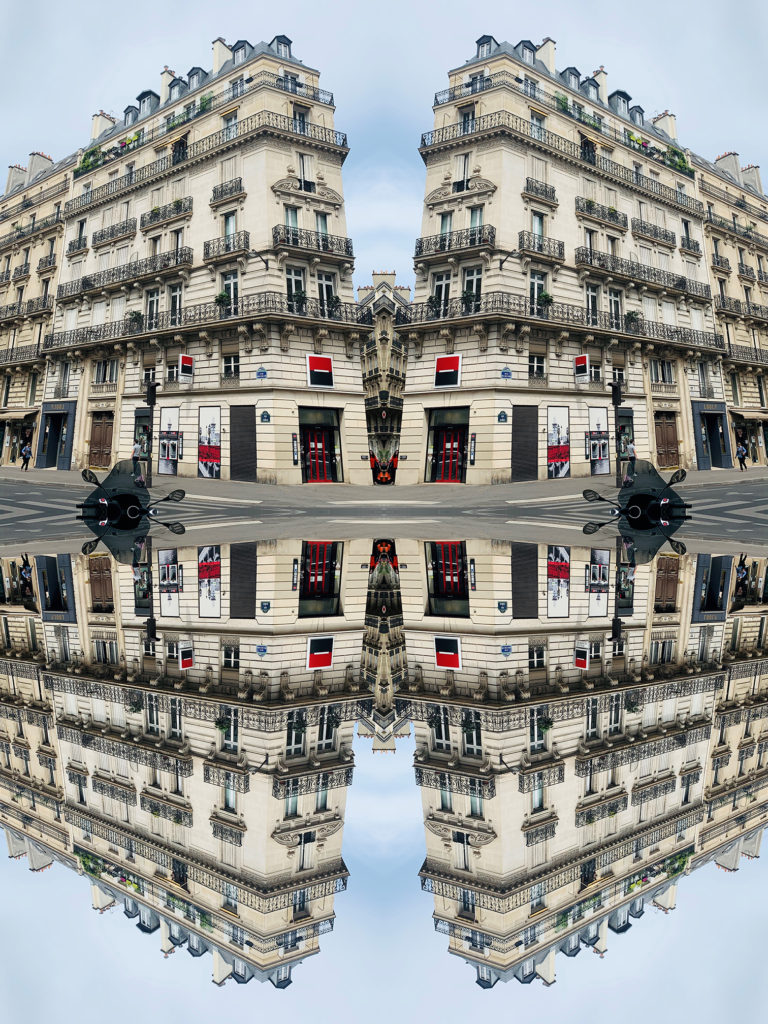
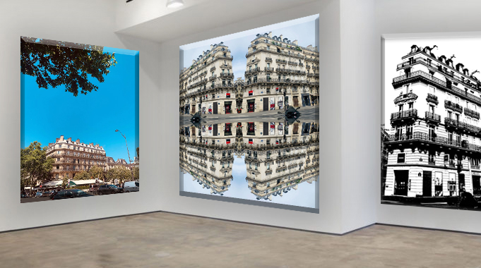
This gallery is composed of three different subjects: the firt one is an original photo the seconde one it's the REPETITION, PATTERN, RHYTHM REFLECTION AND SYMMETRY task and the third one is the BLACK LIGHT task. I named this Gallery because they are all pictures I took from Paris.

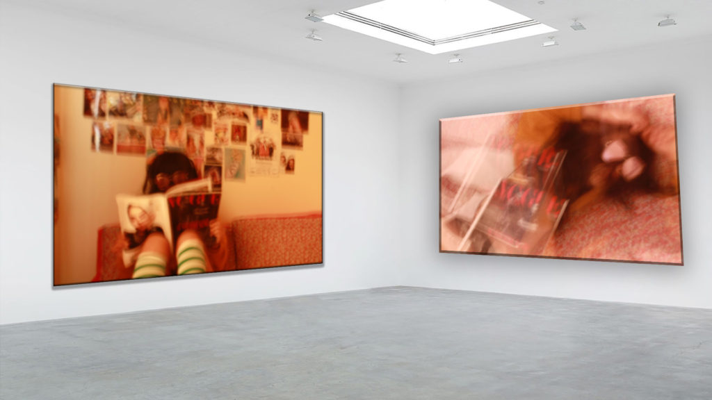
Strange teenager

Photos selected

This image has an empty alt attribute; its file name is IMG_0146-1-1024x683.jpg

Gallery

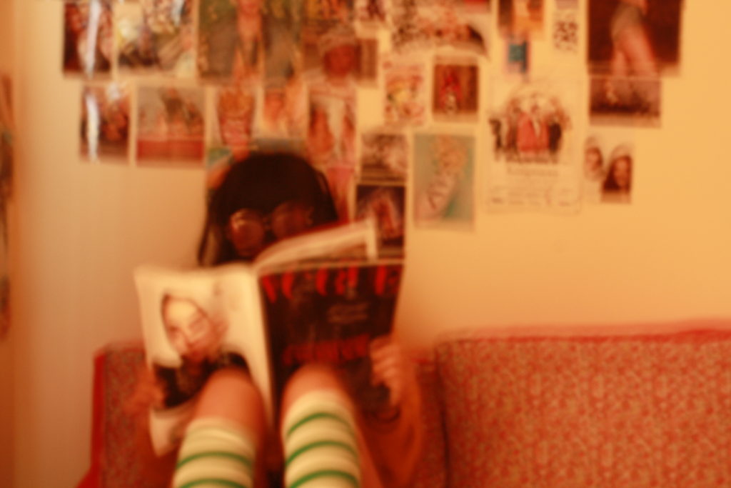
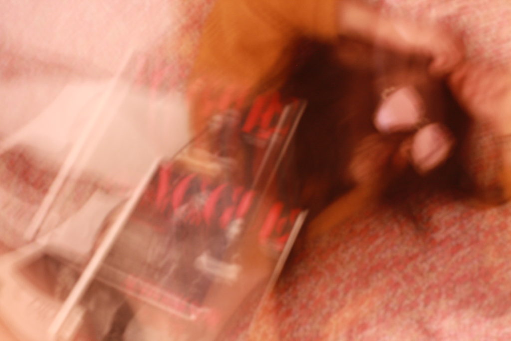
This two photos are from the looking and seeing task. I got inspired by Ralph Eugene Meatyard and Saul Leiter’s images.What I like about this two images is that it’s my own style and it looks a bit a fashion photographie. It gets closer to what I would like to be later. I also like rthat it is blurry I think it creates a fun effect.


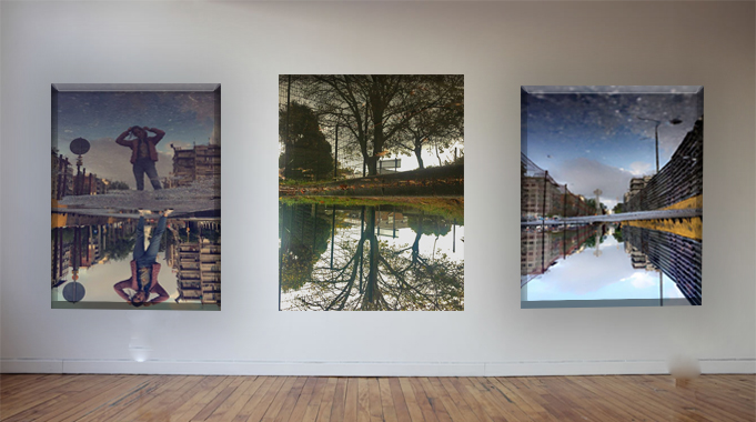
The world upside down

Photos selected

Gallery

This gallery is from my REPETITION, PATTERN, RHYTHM REFLECTION AND SYMMETRY task . I was inspired by Ernst Haas who took some pictures of the reflection of the water .I tooked two pictures 2 years ago on my holidays in Greece I liked because it was like if the world was upside down. The one on the middle was favourite picture on my task I loved the detail of the tree reflected on the water.


Abstract Final project

Surface and Colour

Pattern and Rhythm

Reflection and Symmetry

Looking and seeing

The World is Beautiful

The Formal Elements – Paper

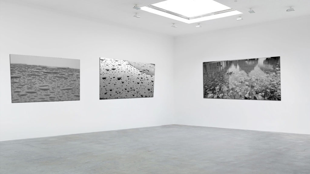
Black Light

This image has an empty alt attribute; its file name is black-light-gallery-1024x683.jpg

Abstract Project final gallery

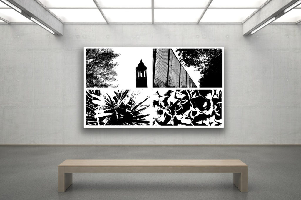
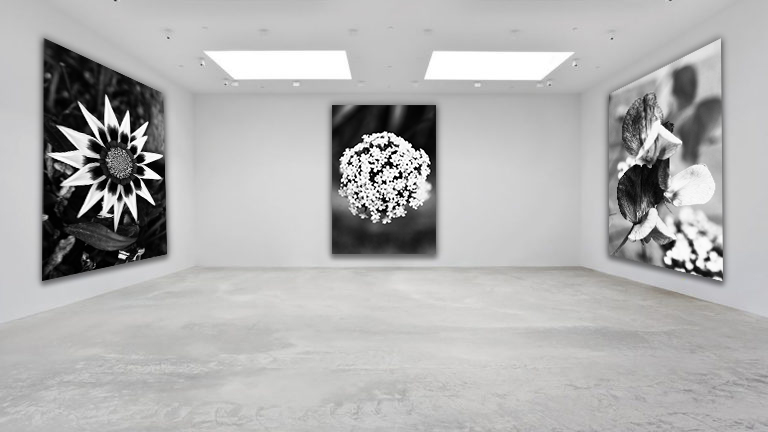
I believe these images work well as a set due to the use of the monochromatic filter that gives the set a sense of uniformity when visualized together. All these images focus on the abstraction of nature through texture, shape and echo. Because of the reoccurring theme of nature, this also means the photos work well. They also have a similar dark, dull tone which adds to the sense of unity of the photographs.

Selecting And Finalising Abstract Unit

Selected Images – Water & Reflections

Selected Images – Nature & Aperture

Selected Images – Saul Leiter & Shutter Speed

Gallery Presentation

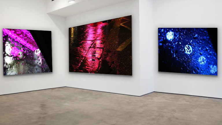
I have chosen this set of 3 images because I believe they link to each other well and hold many photographic techniques. For example, these images have a rough rigid texture due to their uneven surfaces. The repetition of water in the photos produces a 3D-like effect and show rhythm & movement. Additionally, each image has a bold dominant colour. The raindrop photograph on the left has a dominant magenta colour which creates an eye catching effect next to the dark black shadows that diagonally fall beside it. The central image has a warmer pink dominant tone which stretches from the top to the bottom of the photo. This bold colour is reflected on to the street puddle, creating a river-like effect and a main focal point for the observer. The far right image has a dominant blue colour, which creates a cooler temperature in the image. Furthermore, each image has a diagonal composition which captures the bright artificial light in an abstract way. The high contrast between highlights and shadows in these photos draw focus towards the center of the images. I think this series of vibrant and textured images form a striking display, sure to capture people’s attention.
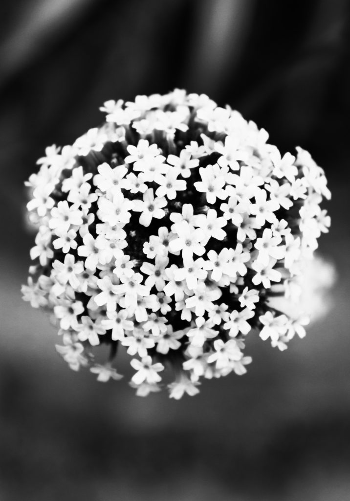
Secondly, I have chosen these 3 nature-based images as I like the similarities and techniques they hold. In each image I have captured a singular flower using a low aperture setting to let it have complete focus. I really like the way these images show a shallow depth of field because of their harshly blurred backgrounds. Additionally, I have edited this set of images with a black and white filter as they reflect the work of Albert Renger-Patzsch. Furthermore, I enjoy the way each image links to one another in terms of composition. The main floral subject of my images falls directly in the centre of the frame, creating a clear focal point for the observer. Also, the main subjects in the images all have a similar circular shape which adds to the organic natural mood of the photos. I have also arranged these images in a dark to light gradient pattern, with the far left image holding the most shadows and the far right holding more highlights. The high contrast in these images really mirrors Patzsch’s work and creates a dramatic series of compelling photos.

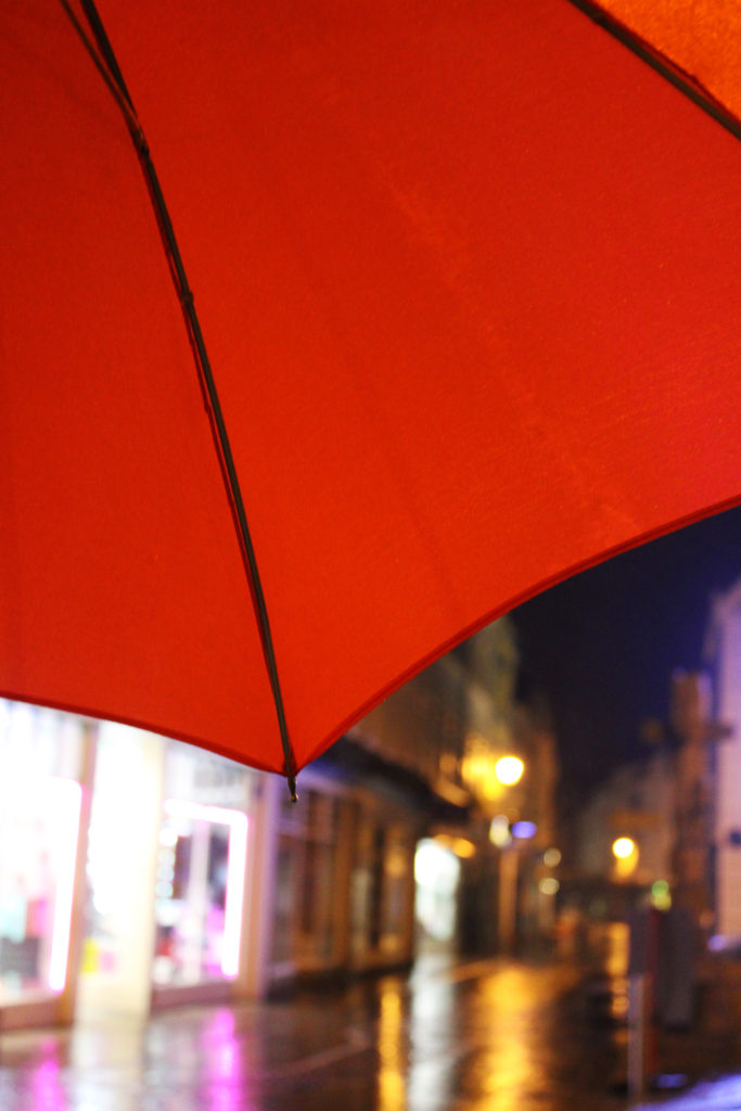
Finally, I have chosen this set of 4 images to present in a gallery format because of their link to Saul Leiter’s ‘Red Umbrella’ work. One thing I enjoy about these photographs is the repeated motif subject which can be spotted in all images. I think this adds a sense of atmosphere and story to this series as it is like we travel with the umbrella, visiting new locations and scenes. Another thing I really like about this series of images is the clear focal points they hold. The striking colour of the red umbrella draws the observer’s attention while still allowing them to take in the whole mood of the image. Moreover, these images work well together because of their warm temperature and range of hot colours, which creates a cosy atmosphere. In addition, these images hold lots of experimentation with shutter speed and aperture which reflect Leiter’s abstract way of capturing photographs. I really like how this series of images has turned out in this gallery setting as I believe their bright saturated colours and abstract subjects create an eye-catching display.