Tag Archives: editing and experimentation

Personal Investigation – Photoshoot 3/4 Josef Sudek

Initial aims for shoot:

My initial aims for this Josef Sudek inspired photoshoot were to combine the technique I discovered while on my ‘Photoshoot 2 – Pictorialism’ , creating a dream-like bur, with Sudek’s iconic display of flowers in clear vases being captured on window sills. I wanted to combine these ideas to create a whimsical depiction of nature, however showing how it can adapt to its surroundings – as if these flowers are symbols of hope. I planned on capturing my shoot using the windows inside my home, however I found it difficult to replicate Sudek’s compositions due to my windows not having such a large space underneath for the flowers to sit. Therefore, I had the plan to use my grandparents home to capture my images, a place still close to my heart that held meanings in location as well as subject. I aimed to conduct my shoot during the afternoon as I wanted there to be enough light to illuminate the subject, but not too much so that it became a silhouette. I planned on using the downstairs bedroom window which looks out onto the garden as I knew there were netting curtains that I could experiment with across the windows, I wanted to see whether this background still allowed for the observer to ‘look through’ the image. I had the idea to use an array of either singular flowers or bunches of flowers in the vase, I wanted to use a selection of types of flowers, and also a set of flowers that were more wilted to compare the effects and atmospheres they created.

Initial Shoot Experiments
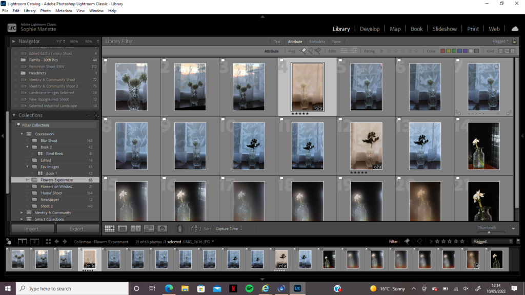
This first shoot was conducted at my grandparents house, using their curtains to create a set of images with an abstract background. I wanted to mirror Sudek’s use of the rain which lined his windows/background but to experiment with a different pattern to see whether this created a similar mood. The lighting of the room was very cold on my shoot day, the sun was behind clouds which actually made it easier to capture the flowers without risk of them becoming silhouettes, however this also meant the warm pink tones that I had captured in my Photoshoot 1 and Photoshoot 2 were not replicated. I knew that I would have to heavily edit the tones and hues of these photographs in order to mirror my fantasy/dream-like theme, nevertheless I captured several images with strong compositions that I knew could be of use when creating my final selection.

Second Shoot Experiments
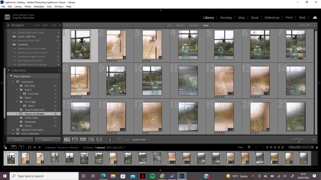
I decided there was a need to do a sub-shoot using the same theme and ideas, however this time using a different location where I could better reflect Sudek’s work. I discussed my idea of shooting in front of a panelled window with my friends and was lucky enough to be able to use one of their bedroom windows to conduct my shoot, it was a subtle reflection of Sudek’s location and gave me the opportunity to experiment with compositions lined up with the window panels. I began my shoot without steaming up my camera lens for a few images so when editing I could experiment with how I could manipulate the image to seem blurred in a Pictorialism style, without manually doing it on the day. I then used my technique of creating a fog over the lens with my breath to take the rest of the images, nevertheless there was still a blue hue that washed over my photos. I also wanted to replicate Sudek’s capturing of rain in the background of his images, however on the day of this photoshoot there was no rain forecast, so I came up with the idea of pouring a glass of water over the outside of the glass to look like raindrops rolling down the window. This idea was very successful and allowed me to experiment with aperture to focus on either the flower or the raindrops – I wanted to create a set of images that were delicate and soft, breaking up the fantasy world from previous shoots with hints of reality breaking down.

Juxtaposition Shoot Experiment
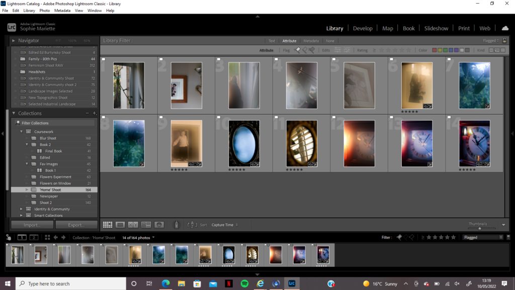
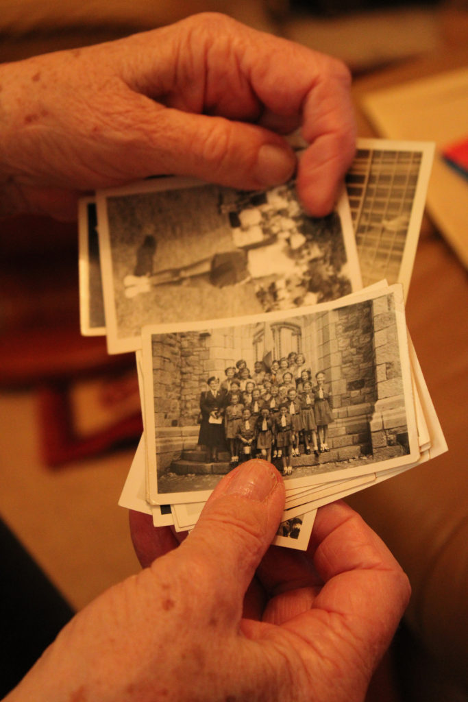
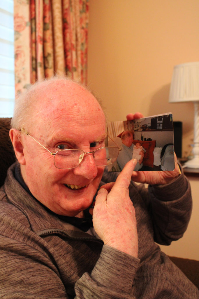
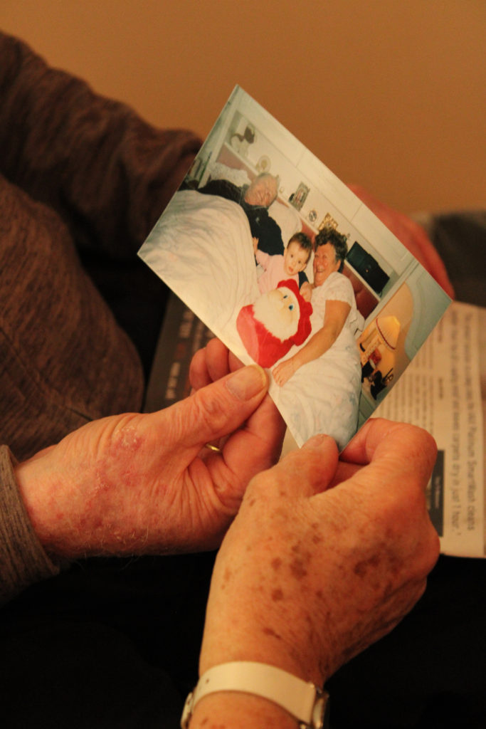
After going through my images from each photoshoot, I realized there were not enough nightmare style images to disrupt my photobook design, I wanted to have a book full of juxtapositions and disjointed hues of blue and peach that contrasted each other, conveying a sense of anxiety creeping in. Therefore, I decided on conducting a 4th photoshoot based on the idea of ‘nightmares’, bringing in the idea of Alice in Wonderland by photographing mirrors and clocks that could be placed next to images of foggy streams to link to the theme of escapism. I undertook this photoshoot around my home, capturing old photographs of my younger self/of family members using the blurry method, as well as capturing sharp images of them to contrast which looked better next to my other shoots. I wanted to focus some images on the idea of reflections, using a small mirror in my bedroom to act as symbol for clearing the mind, starting by capturing it fogged up and then capturing it from the same position once the mist disappeared. I used this photoshoot as an opportunity for experimentation, I knew that I would only choose a small selection of images to be presented in my final collection, however I still wanted to see how many ways I would portray the idea of ‘a nightmare’.

Editing
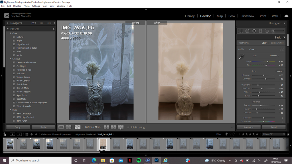
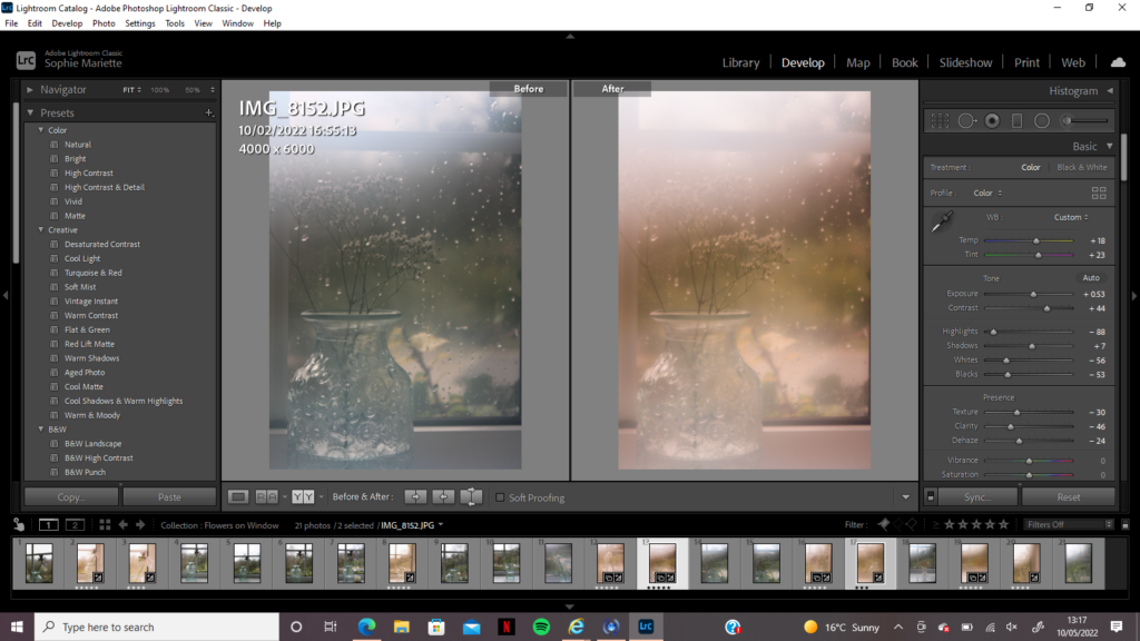
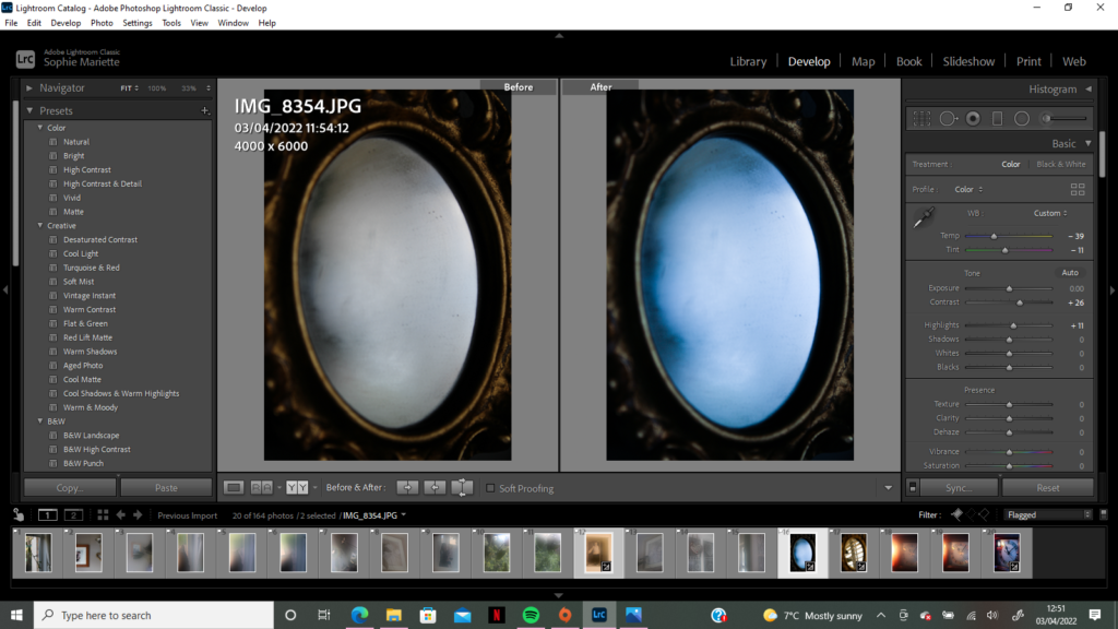
For the first flower experimental shoot I knew there would need to be a lot of manipulation in Lightroom to make the images fit my whimsical theme. I used this as an opportunity to use the different features of Lightroom that I had previously not used as much, such as turning down the clarity of the image and dehazing it to create an over-exposed style. I then saw how turning up the temperature and tint of the image would give it the same peach/pink filter that washed over my other shoots, creating this fantasy display similar to an old blurred photograph. After exploring how turning up or down the contrast/exposure/highlights of the image affected its atmosphere, I found the perfect balance of editing which created my final image. For the second flower shoot, there was still a blue hue that washed over the images due to the artificial indoor lighting being cold, therefore during the editing process I had to, again, turn up the temperature and tint of my images to fit my theme. Even though I had steamed up my lens for most of this shoot, I still used the dehaze and clarity feature to create more of a dreamlike blur over the photos, I believe this successfully replicated Sudek’s work while also bringing in my own personal fantasy style. The nightmare shoot images were mostly cold and lacked in vibrancy, however when editing the two images of my mirror I wanted to experiment with how increasing the blue hue created a mystical and dark atmosphere. All of my images have a fantasy theme, may it be soft positive dreams of childhood or mysterious dark memories rooted in anxiety – this shoot let me edit in an abstract style to separate my subjects from reality. I increased the contrast of this shoot to create sharp edges underneath the blur as there was a lot of shadows and darker tones that I could draw focus to – the circular composition of my mirror image is inviting and unsettling, which were the main ideas I wanted to convey during this shoot.

Final Sudek Inspired Images

Final Juxtaposition Images

Comparison to Sudek:

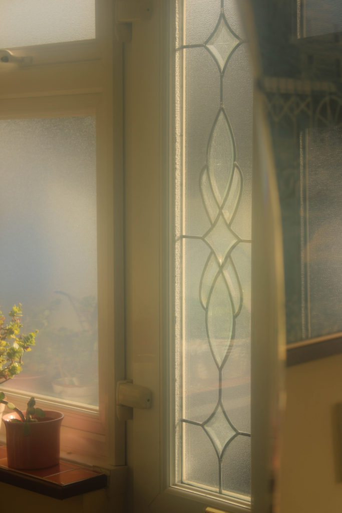
Sudek’s images are dark, they have a sense of mystery to them, and a sense of loss. Nevertheless, when I look at Sudek’s work, though there is loss, there is also hope – flowers are symbolic of life, it is as if Sudek (even in his confinement to his studio) is telling his observer there is still life wroth living – possibly he is trying to convince himself of this fact also. Comparing my work to Sudek’s, there is a clear link in subject and location – I have tried to replicate his surroundings as best I could with the weather circumstances etc – yet there is a contrast in atmosphere. My images are soft focused and bright, there is a content and calming mood within them as if the over-exposed highlights are beams of sunlight bringing joy and hope. Contrastingly, Sudek’s images are cold and dark – even without saturation it is clear that there is a gloomy atmosphere surrounding his subjects – hinting towards his own isolation. I wanted to create this difference to convey a sense of optimism, even though Sudek may be documenting a difficult time in his life there is still faith in nature and finding a way to adapt – this faith and hope is what I wanted to draw the most focus to in my images, they still give an impression of isolation, however this loneliness is surrounded by warmth and brightness as if its optimism for the future. Additionally, Sudek’s use of soft focus is replicated in my work, yet I have taken it to the extreme using my Pictorialism inspired technique – there is an impression of reality breaking down in both mine and Sudek’s work, with abstract shapes in the background creating an eerie atmosphere. Overall, I am really happy with how my Josef Sudek inspired photoshoot turned out, I have been able to experiment with different editing techniques and compositions, having to explore different ways of conveying a theme of anxiety, escapism and safety.

Personal Investigation – Photoshoot Two Pictorialism

Initial aims for shoot:

I wanted to create a set of images that combined the work of Robert Darch and Josef Sudek, mirroring techniques and themes used in Pictorialism photography. I plan on using the main location of Reg’s Garden, a community garden that I used to visit as a child with my grandparents, capturing areas where I would escape into imaginary worlds. I also plan on using my grandparents home for several images, using locations such as the kitchen, hallway and spare bedroom. In these rooms I hope to capture a sense of memory, past and nostalgia by photographing mirrors and doorways, windows that look into the past and provide a view to the future. The theme of safety is one I want to focus on in this shoot, the Pictorialist style will hopefully create a mystical yet welcoming atmosphere, using a soft blurred focus to distort any harsh textures or shadows in each image. I plan on conducting this photoshoot during the mid-afternoon, I want to take full advantage of the bright weather to create exaggerated highlights in my images. Experimenting with the Pictorialism technique is something I really want to explore in this shoot, I plan to bring Vaseline with me on the day to smear over the camera lens, however I would like to try using different materials to create the staple blurred filter over my images. This shoot will serve as an exploration of childhood imagination, physically capturing the Wonderland-like world I escaped to, whether I was happy, sad, confused or anxious – I want to display the dream-like state of ‘playing make believe’.

Editing:

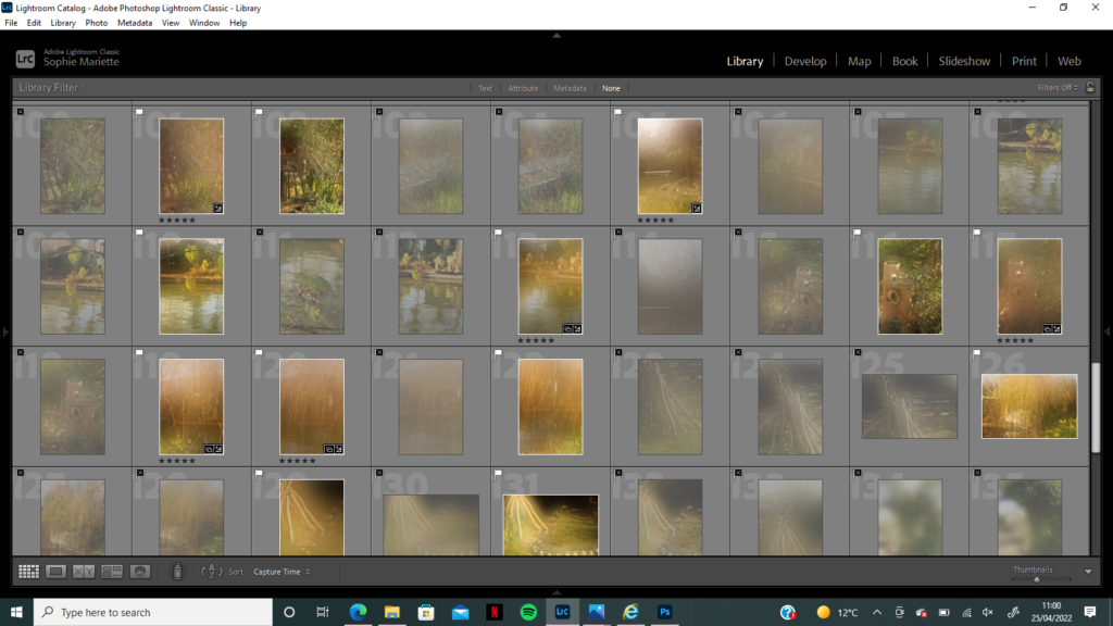
I began editing in Adobe Lightroom, going through each image and flagging it if it portrayed the right atmosphere and theme I wanted to put across. Aesthetics was a feature that had importance in this shoot, I wanted my images to have a whimsical fantasy style that gave the impression of an almost ‘too perfect’ world. I looked for warm tones and orange hues when flagging my images, I found they were more successful when resembling colours of late evening sunsets as it created a cosy and welcoming atmosphere. After flagging my favourite images, I went through them again rating them from 1 -5 and focused on finding the meaning behind each image, when I took this image what did I have in mind? Does that message/idea come across successfully? Additionally, I wanted several images to hold a sort-of ‘escape route’ within them, may it be a door or a window, a clearing in the trees or a bridge to walk across – anything that could lead to this mystical world. Negative space that I captured in my images sometimes served as this ‘escape’, when sorting through and choosing which would be my final images to edit it was clear that keeping this fanciful narrative helped create my desired effect. Below is my selection of 5 star images, I considered colour, composition, meaning and light to create this selection and give the impression of an idyllic world full of imagination.

How I replicated Pictorialism:

I had planned on using Vaseline smeared over the camera lens to mimic that of Pictorialism, nevertheless when I began setting up for this shoot I though of a different idea and technique to create this imagery style. I wanted to create a gradual blur, some images slightly misty and foggy and others completely distorted, to compare how much I wanted to change the atmosphere of my surroundings in each image. Using Vaseline, although effective, was not the most practical material to create this gradual effect, as I would need to keep removing and reapplying the gel to the lens when I wanted less or more blur. Therefore, I thought of using my breath to steam up the lens, as the effect would ware off after a few seconds and I could take multiple shots of the same location as it gradually loses its blur. This allowed me to experiment with how much the lens should be steamed up when photographing to create enough blur to be distorted and dream-like, however not so much that the subject cannot be recognised as a bench or statue. As this project has such a personal connection to me, it was as if I was breathing life into these images to create this other-worldly effect – experimenting with how an image can be manipulated without editing it harshly in Photoshop or Lightroom was something I really wanted to explore. This Pictorialism imagery gives the impression of memories, foggy and blurred but still remembered as happy and content – there is a calmness to this shoot that when mixed with the oil-painting-style imagery portrays an imaginary world where anxiety disappears and childhood can live on.

Experimentation:

The images above and below were both taken in my grandparents home, it was the secondary location to Reg’s garden, holding memories of childhood and happiness. However, during the time of this shoot the lighting and weather was dull and cloudy, blue undertones and shadows made the images seem desolate and forgotten – which was no the atmosphere I wanted to create. When photographing I though of changing the ISO and white balance to create a warmer tone, however I was undecided as to whether the images would make it into my final selection, so did not make the changes. This gave me opportunity while editing to manipulate the highlights, temperature and tint of these photos in order for their colour pallet to match the rest of the blurred images. Instead of keeping the cold blues and putting these images with the ‘nightmare-style’ shoot, it made no sense to take a photo of a happy, loving place and change its whole meaning – therefore slightly warming the temperature and tones helped create my desired mood of welcoming. My grandparents home has always been a place where I have felt safe, as a child I would create stories in every room and escape from the outside world, using props such as cutting boards for boats or shields and curtains to keep the ‘monsters outside’ – all of these memories are now foggy yet still so clear, I wanted to use a Pictorialist style to show this.

Final Edited Images

Overall I am very pleased with how the final edits of this shoot turned out, using breath to manipulate the camera lens and capture a distorted scene allowed me to experiment with how a Pictorialist style can represent a fantasy world. Themes of serenity, perfection, calmness and persuasion were all ideas I wanted to keep in mind during the shoot. Using the style of Robert Darch by capturing nature in all of its beauty, and of Josef Sudek by taking his use of misty blurred surroundings, altogether created this display of fantasy. Using pink and orange tones that replicated a sunset throughout created this warm welcoming atmosphere, which will be disrupted by the harsh ‘nightmare’ shoot images which will break up my photobook. I am using Darch’s technique of progressing narrative through colours and tones, in The Vale of Despond by Dan Cox he describes this in Darch’s work; “A change in the palette of the images, another influence from the cinematic, signals this move, with cooler blues and yellows fading into greys, as the space becomes increasingly hostile.” I plan on creating a third photoshoot delving more into the world of Josef Sudek, being influenced by his study of flowers on a window sill and linking it to themes of adapting to my surroundings and to change. I want to progress these ideas further by experimenting more with the Pictorialism blur and using it to capture scenes in Sudek’s style.

filming editing

Setting/ Editing

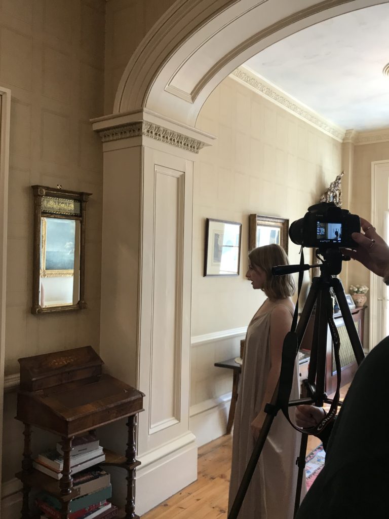
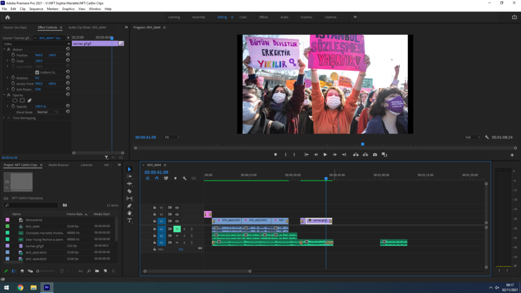
The location was at the house of a relative of mine, We liked this house because it’s regal and touch of femininity. This film was fun to make because it’s concept and also each scene was a perfect image with several hidden symbols. We choose ‘Womankind’ as our title reference to mankind but also because of the stereotype that woman need to be kind and gentle. We took several shoot and we picked out three of them. The videos were about ten seconds each and created a smooth transitions, the goal was to create a continuous shoot and also to create our model’s story about the fight that women did during decades. The first clip is in black and white in reference to the time period (50’s) and to Cindy Sherman. Our model is in the kitchen cooking. She looks around if her husband left, puts down the bowl and picks up her suffragette before she leaves. For the second scene, We can find colour but they are not very bright reference to Clare Rae. In these scene, the model walks into the scene, get’s ready and picks up her woman’s rights poster determined to protest for her rights. The last video clip with our model is the representation of a better future, our model is entering she seems happy and confident, she looks at the mirror and then smile at the camera when she leaves we can hear the speech saying how gentle and kind you are with yourself and then we see the images of strong women stories fighting, protesting, working, trying to have a better a life. After we pick out music for our NFT video. Unfortunately we could only use royalty free for the track due to rights issues. Our first idea was to put a different song for each decade but we thought it wasn’t enough meaningful. We wanted the song to make us emotional and that’s when we found  Luminance by Scott Buckley. The song is sweet and dramatic it was perfect. We added for an extra touch three feminist speeches recordings that was well associated to every shoot. The first audio recording we used is taken from Christabel Pankhurst 1908 speech protesting the proper for votes for women. After we used a speech from 70’s  on the Women’s rights motion and the third one is a speech recorded in 2019 the most recent of Britta Badour’s “Dear Young Woman”

Identity and Community – Photo Walks

With this series of images I attempt to tell a story about an area of St Helier with historical or contemporary links with migrant communities.

My work will focus on three main elements to capture the historical context of the theme of identity and community in St Helier:

A sense of place – for example; location, site, environment, residential area, communal park, architecture and details, Interior of church, community centre, house or home.

Character of community – for example; street scene, decisive moment, staging or performing for the camera.

People and portraiture – For example, a resident outside his/her house/apartment block, shop/ business owner, street portrait/ passer-by.

I focused on three contrasting areas of St Helier:

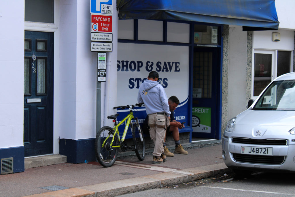
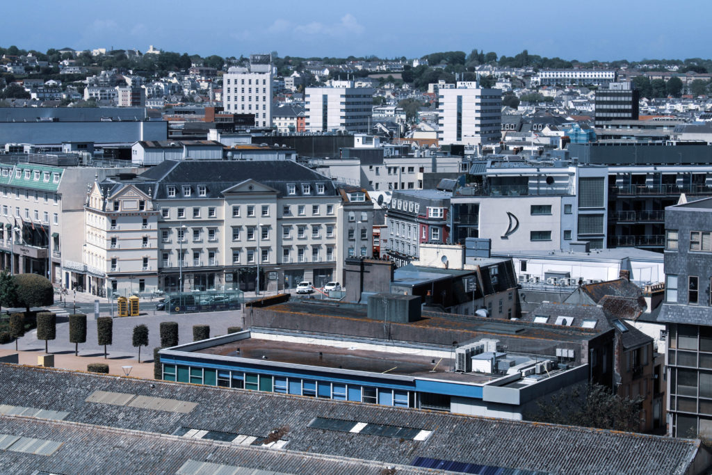
Route 1: Merchant quarter – This area of town was once where the core community of merchants were located. It was once located right on the waters edge in the 1800s but now boarders the marina – this gives merchants easy access to their ships and therefore gives insight into why this area is dubbed the merchant quarter. I enjoyed photographing the character of community in this area as people fused with their environment and seemed to interact with it well.

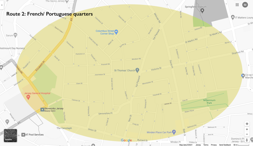
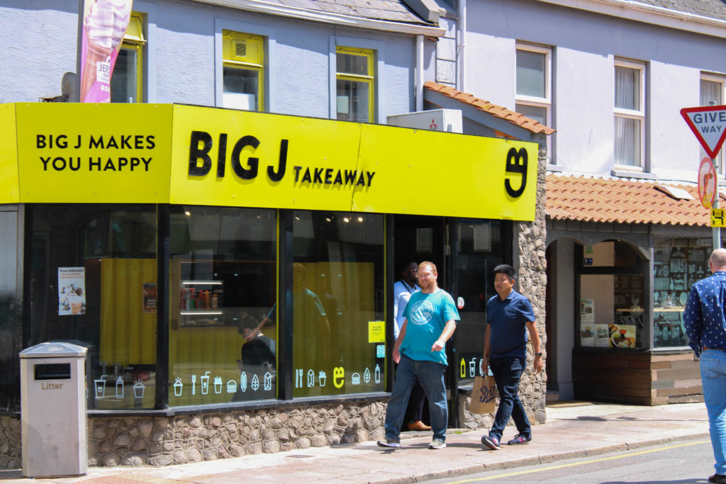
Route 2: French/ Portuguese quarters – This area of town is where most of the European migrant such as the large number of French and Portuguese people that began settling. This area features a diverse range of neighbourly people who form a lively community. This is why I found this area was most interesting to shoot in terms of people and portraiture.
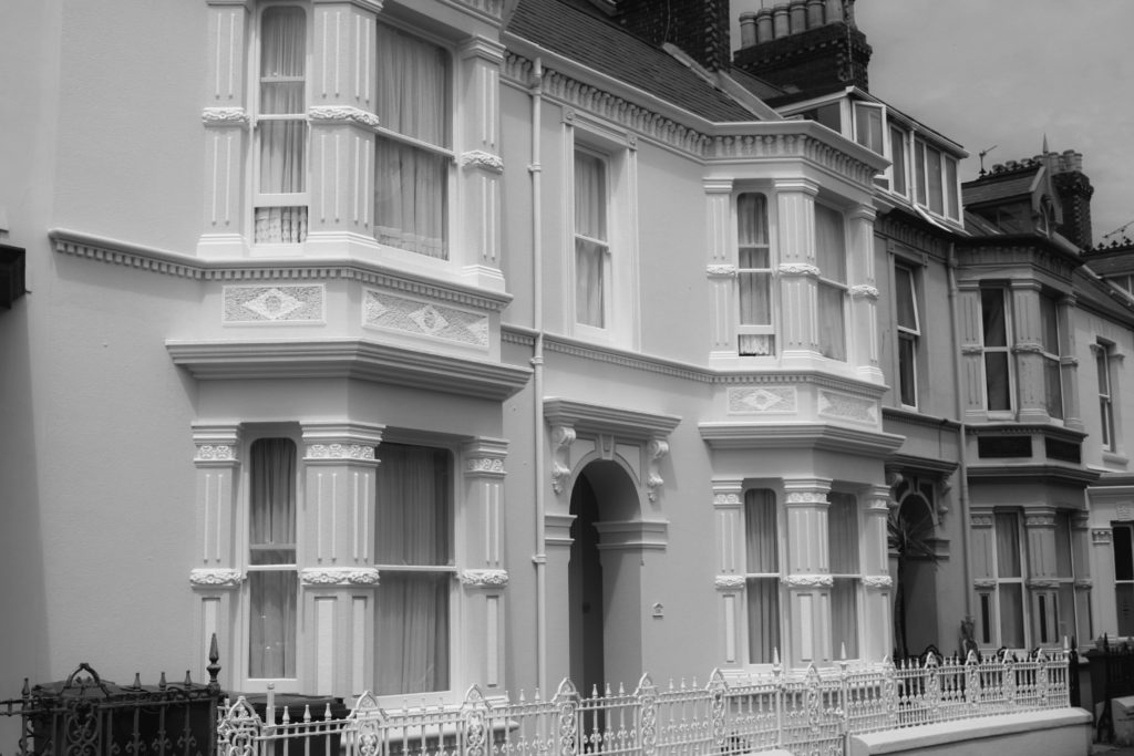
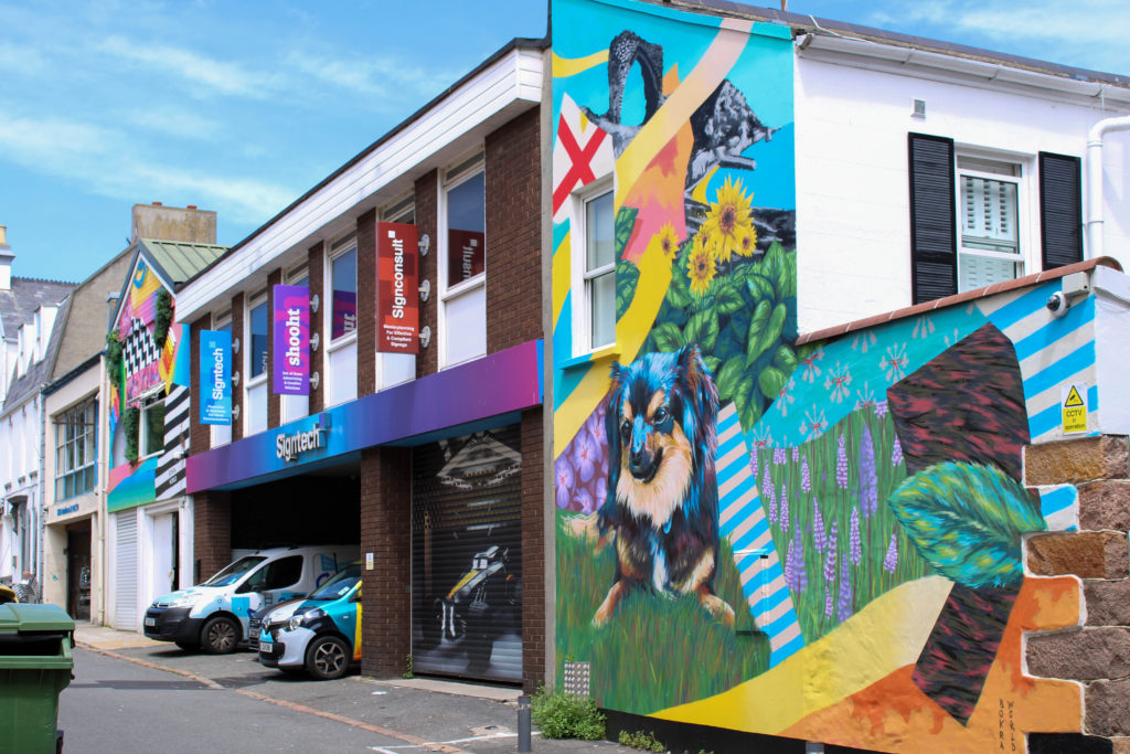
Route 3: British expats/ wealthy residents (Rouge Boullion) – The United Kingdom is Jersey’s closest international partner. Deep social, cultural, economic and constitutional links between us have been built up and maintained over hundreds of years. This area is where most of the wealthy residents and British expats began to settle. The rich architecture in this area is what I found most interesting to shoot. The wealthy British would bring their builders over from the UK to build the magnificent houses. Shooting a sense of place in this area was what I focused on.

Mood Boards

Sense of Place

Character of Community

People and Portraiture

Contact Sheets

Shoot 1 – a sense of place

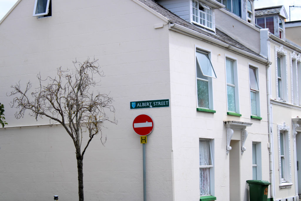
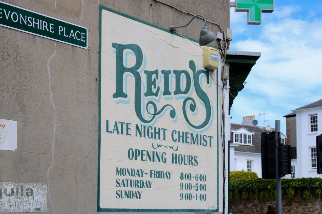
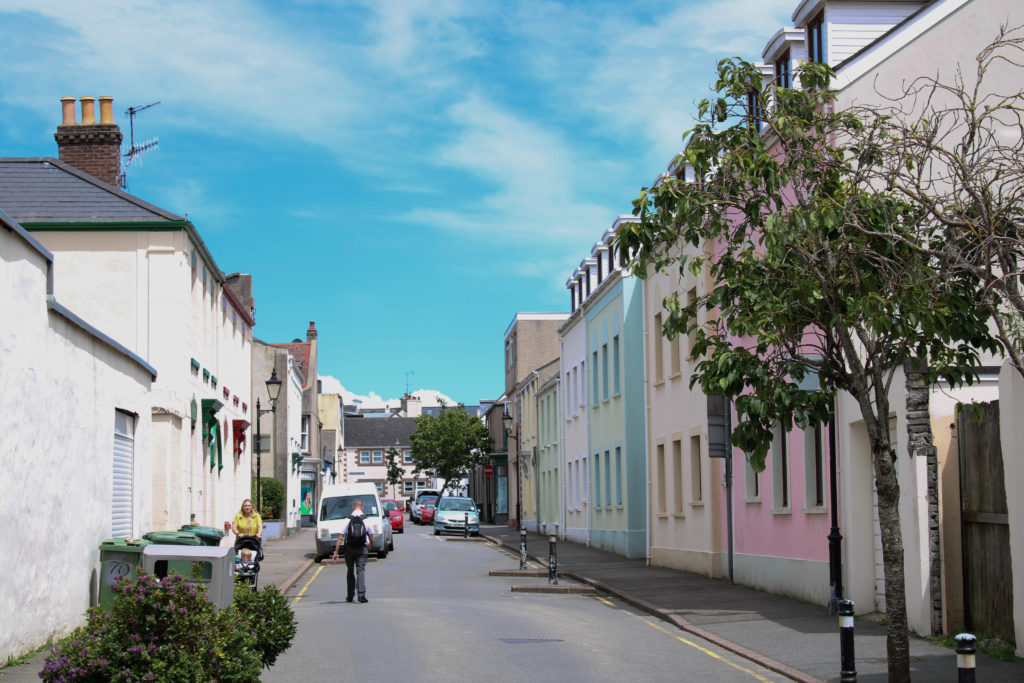
During this shoot I focused on capturing St Helier’s buildings and homes in a manner that encapsulated the social and historical contexts of Jersey. I did this by shooting different styles of buildings – Portuguese, British, houses, shops, offices. I also shot structures which had different ages; I shot newer office blocks and also old houses that had been around since St Helier’s birth.
During my editing I focused on aesthetic composition; I therefore made sure to frame everything in a symmetrical or artistic manner.

I also focused on dramatizing the buildings using deep colour schemes and contrast.

Final Images:

The image above presents a pleasing visual aesthetic as the images share a consistency. They are consistent with framing and composition with the two doors and stairs framed identically. This image tells a story of community and their connection through identical housing, but also shining focus on unique identity shown by the different colour choices of the doors. These images are also effective at referencing a sense of place A few other images that achieve this message in one composition are shown below.

The below images share warm tones and a ‘lens flare’ in the top of the composition that give the images a sense of prosperity that suggests the buildings have been stood happily looking down on the community for a long time.

Shoot 2 – Sense of Character

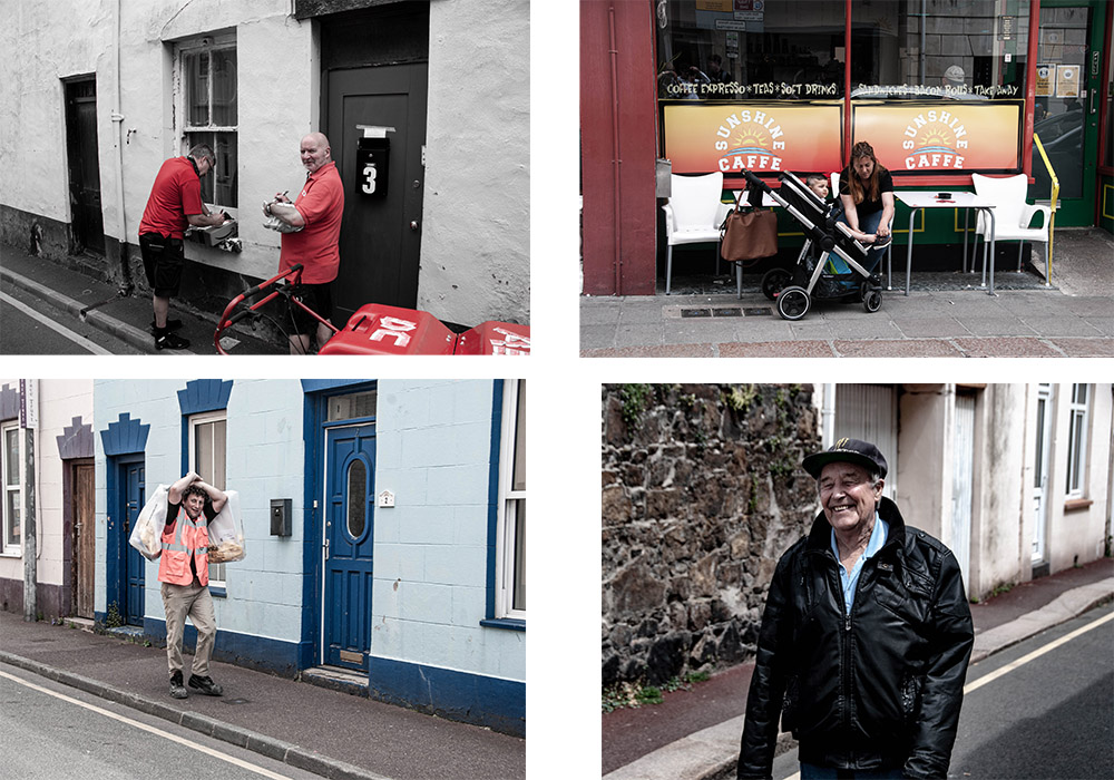
For this shoot I shot people of St Helier interacting with their environment and each other. This produced a wide range of emphatic images expressing emotion and telling a story about the area they are in and about what type of people they are.

I also shot images where there was a lack of people in the shot in a physical sense. I instead shot urban landscapes where there was a setting created by people and shaped by the community but lacked the physical presence of people. For example this image of a food stall tells a story about the community and their everyday lives without anyone actually being present in the image.

The following images are of scenes composing of characters of the community. I like the way they are composed in a way were they blend in with their environment, and all look to be living the hustle and bustle of St Helier, just like their migrant fisherman, merchant ancestors.

Shoot 3 – People and Portraiture

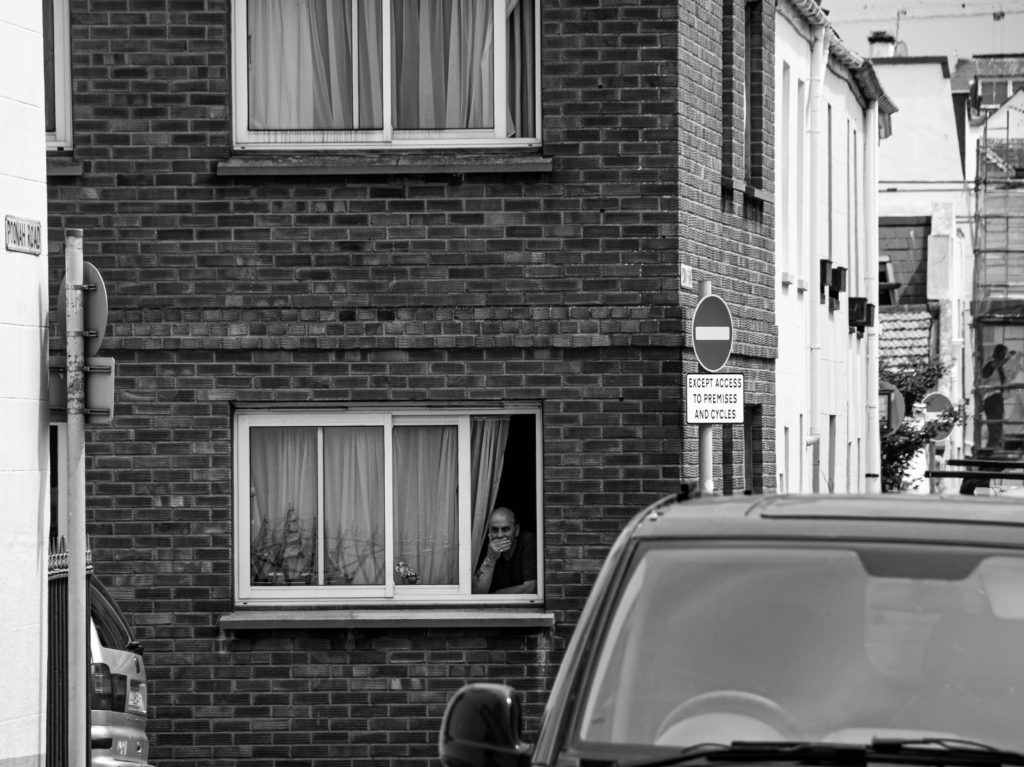
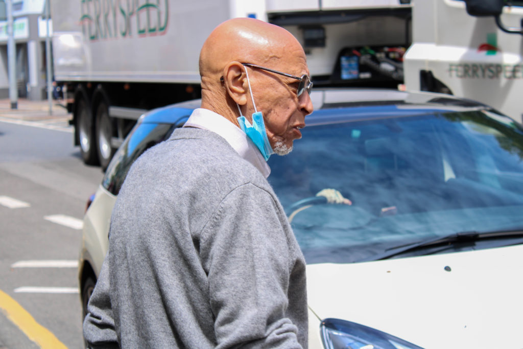
For this shoot I focused on capturing the emotion of the people I shot. I also focused on shooting people who were busy going about their day in a variety of different ways, weather that be playing guitar on the pavement or taking a smoke break; the images tell a story of identity.

Identity and Community – A Sense Of Place

The Photoshoot

On Monday 28th June, as a photography department, we had a day of learning and information at The Societe Jersiaise Photo Archives. During the day we went out into different areas of St Helier focussing on separate communities who came from different immigrant backgrounds, such as the Merchant Quarter, the French/Portuguese Quarters and the British Quarter. My aim for this photoshoot around town was to capture a sense of place, photographing different buildings, shops, businesses, architecture, streets as well as capturing some environmental shots of people working/living in or just travelling through these areas. The group I carried out this photoshoot with focused on walking through the French/Portuguese Quarters, I was able to plan while walking about the kind of people/places and types of buildings I wanted to take images of. My plan was to photograph the comparison between old and new St Helier buildings, showing how the sense of place changed over time, as new communities entered and old ones left. Additionally, I planned on capturing street photography inspired portraits of these communities to show a range of ethnicities residing on the island – I found it important while taking these images to be respectful around certain areas where people were not comfortable having their photo taken. Altogether, I really enjoyed this photoshoot around different migrant communities, showing a sense of place changing over time and people in a natural and not staged environment.

Editing – Contact Sheets

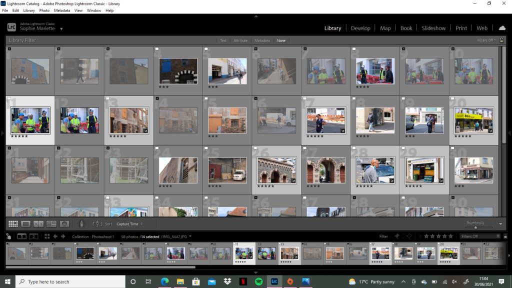
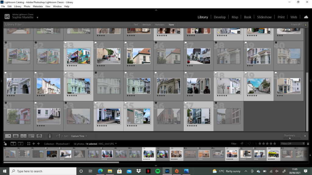
For the editing process of this photoshoot, I took a different approach, in class this week we learnt how to use different filters such as ‘flagging’ and ‘star rating’ using Adobe Lightroom to filter out specific images I liked or disliked to perform a quicker and easier edit. During the photoshoot I took around 100 images in St Helier, before importing them to Lightroom I did an initial sort through and delete of any images I knew that I did not like/did not tell a story or were just not right in lighting/angles – this left me with around 60 images which I imported to edit. Once my images were in Lightroom I went into ‘Develop’ mode to start filtering my preferred images. I started by trying the ‘Flagging’ filter, using controls ‘P’ for a white flag (preferred image) and ‘X’ for a grey flag (disliked image) and holding down ‘shift’ – this really helped speed up my selection and let me clearly see which photographs were my favourite. Next, I used the ‘Star Rating’ feature to filter each image from 1-5, one star as the worst and five stars as the best, which again really assisted me in seeing which images worked better than the others.

Editing – Over Exposed

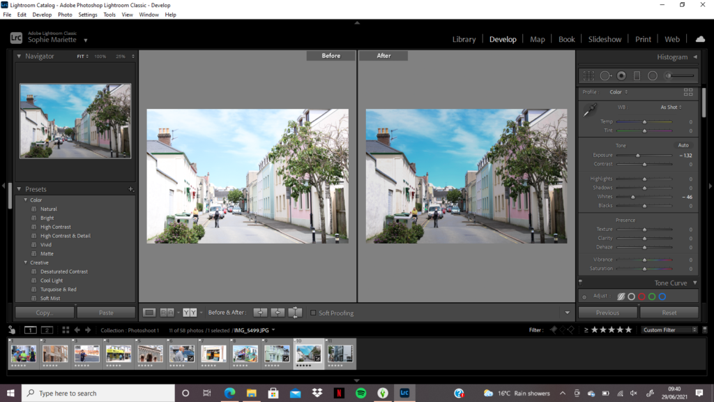
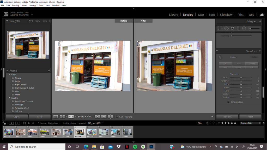
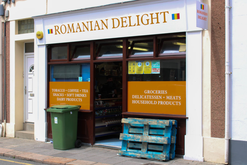
While I was editing my images, I discovered a few came out very over-exposed during the time where I was experimenting with my camera’s shutter speed. On Lightroom I went into develop mode to see whether I could edit these images to correct their exposure – under the ‘tone’ section I lowered the highlights, exposure and blacks. Furthermore, on the image where I have photographed the ‘Romanian Delight’ shop, under the ‘transform’ section I discovered how to straighten my image to create more symmetry and level lines throughout by changing it to ‘auto’. I wanted to edit these images in this way to represent and really show the bright colours of the communities we visited, heightening the vibrancy of the coloured houses and shops to demonstrate their character and beauty in the more secluded areas of town.

Editing – Black and White

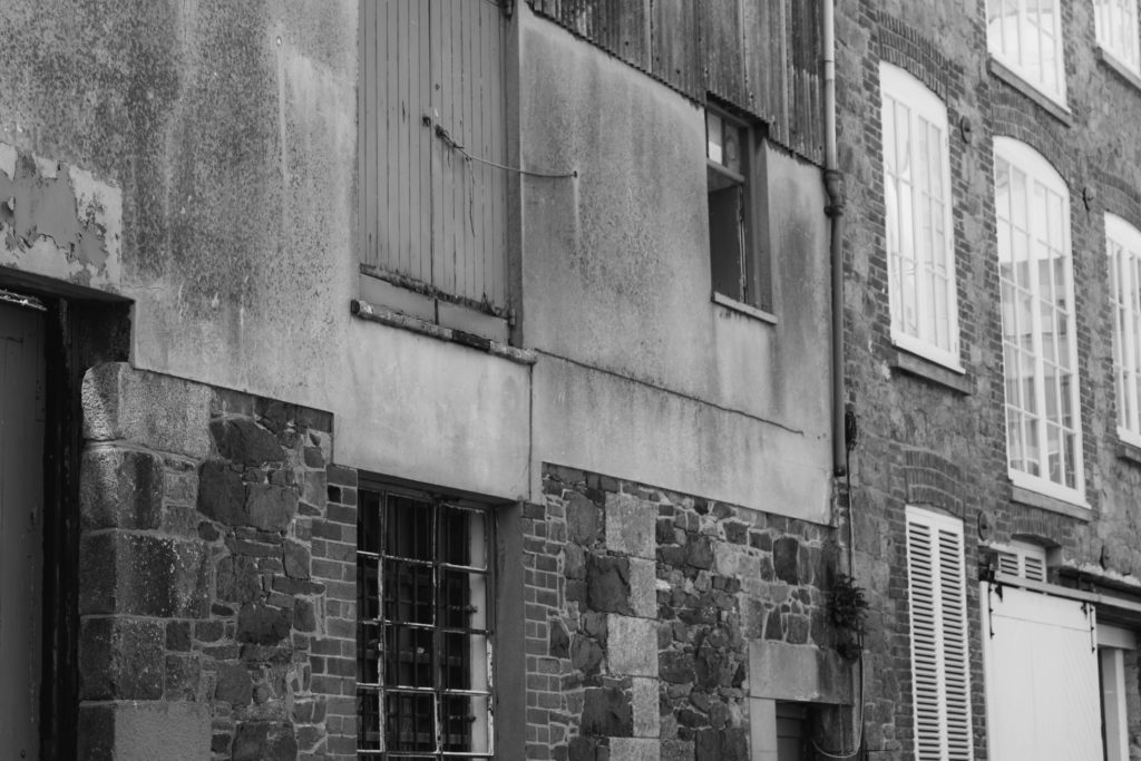
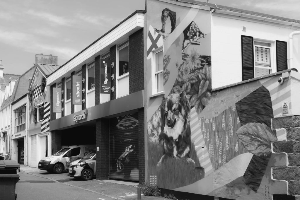
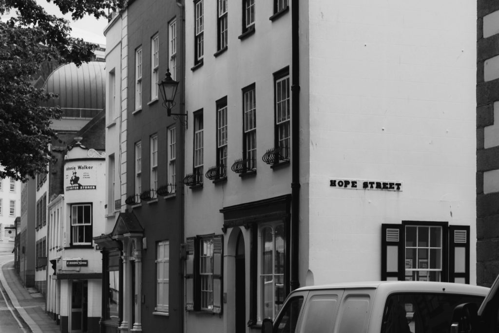
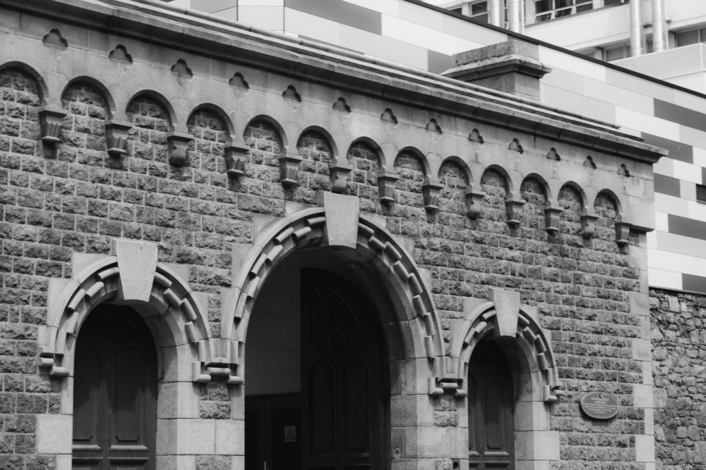
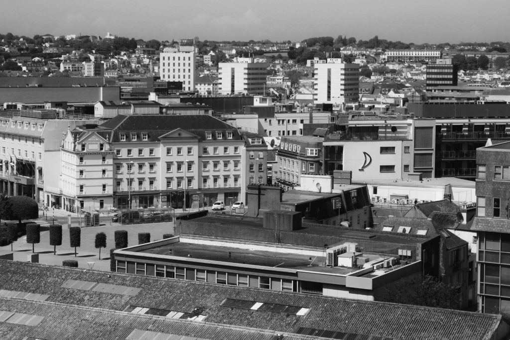
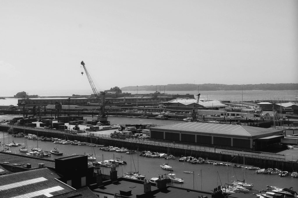
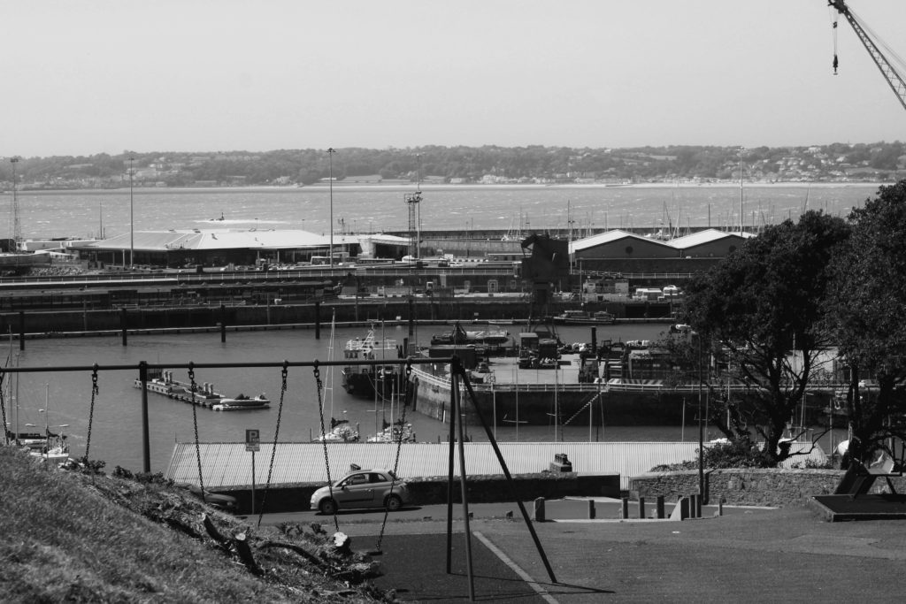
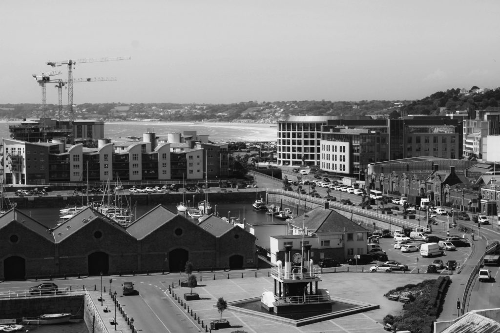
During my editing process of this St Helier photoshoot, I decided to experiment with editing some of my images with a black and white filter. I wanted to edit in this way to see how darker and lighter tones would affect the mood and atmosphere of an image. I produced this edit in Adobe Lightroom, highlighting each of my five star flagged images and selecting the ‘soft black and white’ filter. After seeing what each image looked like black and white, I was able to select my favourite monochrome photos that worked best in terms of contrast and tone. Additionally, I chose these six images due to their link to my theme of this shoot, showing the change of a sense of place in St Helier through it’s architecture. Each image forms a pair with the one next to it, the left hand image represents an older sense of St Helier and the right image shows the more modern/re-built buildings around town. Each pair is a sort of mini sequence showing the progression of architecture, I love the way the ‘older building’ images have darker tones and harsher shadows which symbolizes the possible atmosphere of St Helier’s past around these secluded areas. Contrastingly, the ‘modern buildings’ hold lighter tones with more white and negative space, creating a clean and crisp atmosphere. The natural lighting produces a softer texture, which is interrupted by the repetition of details on each building such as the windows, brick work and doorways.

Final Edited Images

As well as producing black and white edits of certain images from this photoshoot, I have also decided to experiment with how different colours can tell a story within an image. I edited these final photos on Adobe Lightroom, after filtering out my favourites with flagging and star rating, exploring the different features of the app and correcting any mistakes made while photographing outdoors. For example, as shown before in this post, I made the mistake of over-exposing two interesting images, however was able to amend this by turning down highlights, blacks and exposure. Additionally, I wanted to portray the realness and natural atmosphere of these photographic locations, hence why I conducted minimal editing so not to tamper too much with the ‘sense of place’. I wanted vibrancy, however not so overly enhanced that the images looked artificial – I heightened the contrast and highlights of several images to achieve this bright and lively atmosphere. I wanted to edit my images in this way to juxtapose the otherwise empty streets I was capturing, while some images show life and movement, most are static without people to provide character. This was the main reason I wanted to show a sense of place with the area’s architecture, through repetition, space and shape, connoting the idea of a built up landscape of small business and homes which may not seem much to some, but to those living there is their world.

Anthropocene – Editing And Experimentation

Edward Burtynsky Photoshoot

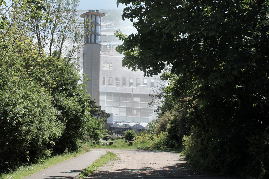
During my editing process for this photoshoot I decided to demonstrate how cold and senseless our world is becoming as a result of mass industrialization – I heightened the whiteness of each image using Adobe Lightroom to reflect Burtynsky’s dystopian and modernized landscapes, symbolizing how human impact may fulfil modern aesthetics, however it also destroys natural habitats. When editing I found it important to keep the cold tones and blue hue across the images in order to suggest how the industrialization of natural landscapes is cold-blooded and eradicates the feeling and warm atmosphere that is produced by unrefined and rural areas of civilization. In Lightroom I turned down the temperature of these images and slightly decreased the vibrancy to further the idea of an unconcerned damaged world. In addition, I wanted to refrain from cropping any of my Edward Burtynsky inspired images as I believe the plain clear skyline in each of the photograph’s backgrounds gives the impression of there being a clear solution to the global problems in this day and age, allowing nature to thrive without destroying it for commercial/industrial purposes – linking with the Anthropocene idea that humans are the single most defining force on the planet as a result of mass industrialization.

Black & White Experimentation

I chose to edit these specific same four photographs in black and white to experiment further with how colour can effect the atmosphere of an image. I edited the photos in Adobe Lightroom by turning down the saturation and vibrancy fully, heightening the contrast slightly to create darker tones. This wide range of light and shade in my images creates a more sombre atmosphere for the observer, the monochrome filter adds drama and creates a vintage feel linking to black and white photographs from the past. I believe this editing choice gives the impression and idea that Jersey’s landscapes hold so many memories for those that have lived here their whole lives, grandparents may have once had a home, or went to school here when the landscape was not industrialized – the black and white nostalgic atmosphere created juxtaposes with that which has been captured; a modern land with age-old memories. Furthermore, I believe that editing these images greyscale has emphasized the sheer amount of repetition within them, for example as the contrast is heightened it draws the observers attention to the darkest areas of the images. As these more shaded areas fall on the windows and doors photographed, it creates a grainier texture due to the high amount of times these subjects are echoed throughout. I think that editing these images with a black and white filter has added a dramatic yet nostalgic effect, juxtaposing with how these Jersey landscapes have been modernized over time. However, the monochrome effect does not provide as much of a cold atmosphere and doesn’t show the observer how man-kind is apathetic towards nature, I believe the cold temperature/coloured editing displays how society views their creations as inventive without seeing the danger behind how mass industrialization effects our planet – when deciding final compositions I will need to consider which editing choice works best.

Andrew Moore Photoshoot

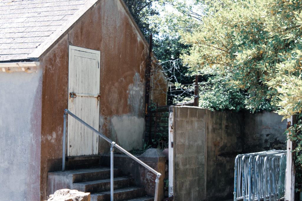
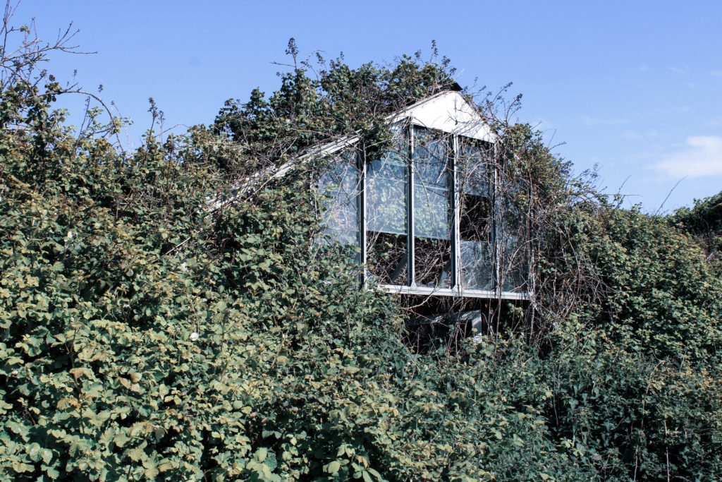
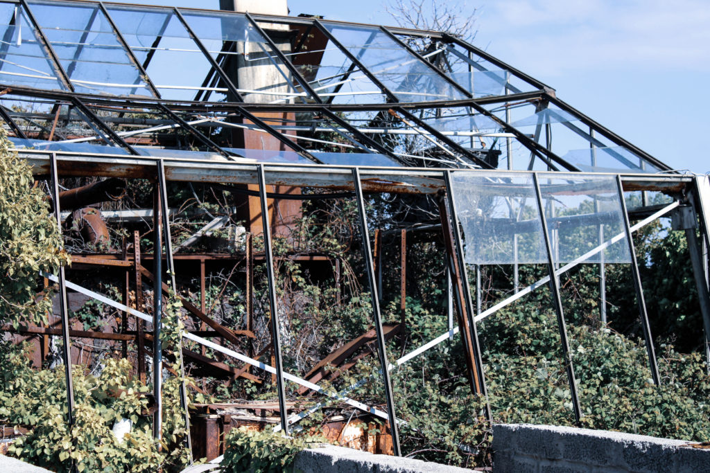
I chose to edit these three images from my Andrew Moore inspired photoshoot to demonstrate how human impact on the natural environment makes its beauty deteriorate, even with nature trying to fight back. During my editing process I made the decision to turn down the saturation and vibrancy of these images in order to reflect the dismal atmosphere that is present in these locations, the muted colours mirror how man-kind’s creations try to silence nature by destroying it. Additionally, I decreased the temperature of the original blue hue that fell across the image’s skylines as I believe they added too much of a bright happy atmosphere which is not what I wanted to portray. I also slightly decreased the exposure to produce a more gloomy and abandoned mood around these photographs to symbolize how these neglected landscapes had been left to ruin. I believe that making the choice to carry out more harsh editing on these images links to the idea of Anthropocene strongly, connoting the idea that man-kind’s ‘editing’ of landscapes is wrecking the unrefined blessing of nature – I plan on setting out my final images in a sequence which shows the growing industrialization of our world, which with this editing choice will be furthered seeing the absence of colour increase as man-kind’s effects take their toll.

Multi-Exposure Experimentation

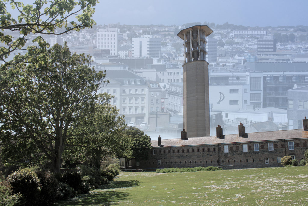
I decided to experiment by creating two multi-exposure images on Adobe Photoshop by merging four different photographs, two from my Andrew Moore inspired shoot and two from my Edward Burtynsky shoot. In Photoshop, I lowered the opacity of the two Burtynsky inspired images and placed them over the other’s skyline. My idea when creating these multi-exposures was to reflect how the future of our planet may look if mass industrialization continues. In the background, the faint St Helier skyline I have edited on really effects the texture of the images as the repetition of buildings and windows creates a more cluttered and artificial feeling. As the modernized setting continues on and disappears into the background it connotes the idea that Anthropocene will proceed into our world’s future, as a wider depth of field is formed. In terms of shape in these images, the geometric patterns from the modern buildings juxtapose greatly with the organic shapes of the trees captured in the foreground. This gives the impression that mass industrialization will not only destroy the natural landscapes of our planet, but also the way society views themselves; the blocky/structural architecture symbolizes how man-kind are becoming robotic homogeneous beings that have no care for the environment around them. The composition of these images also links to Anthropocene ideas, for example the second multi-exposure edit uses the rule of thirds to show the stages of industrialization without needing a sequence of lined up images. The foreground demonstrates nature untouched by man, the mid-ground hints at man’s slight interference with the environment and the background clearly shows mass industrialization. While this technique has its pros, there are also cons surrounding how the ‘stop urbanization’ message could be understood and possibly lost in translation due to the cramped texture and dull vibrancy throughout, as I wanted to reflect the beauty of nature compared to the banal devastation formed by industrial landscapes.

Identity and Place – Editing and Experimentation

Julian Germain Inspired Photoshoot

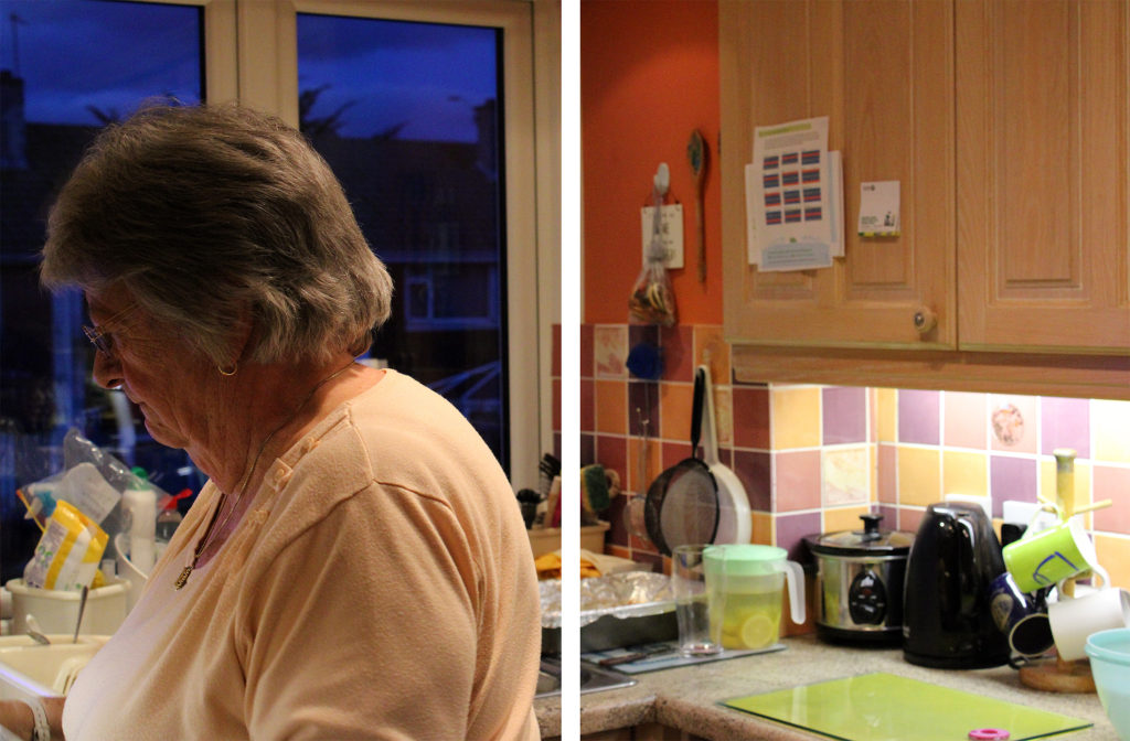
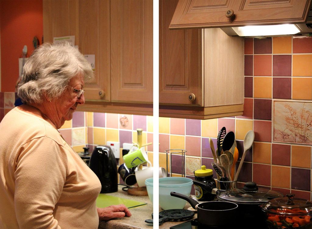
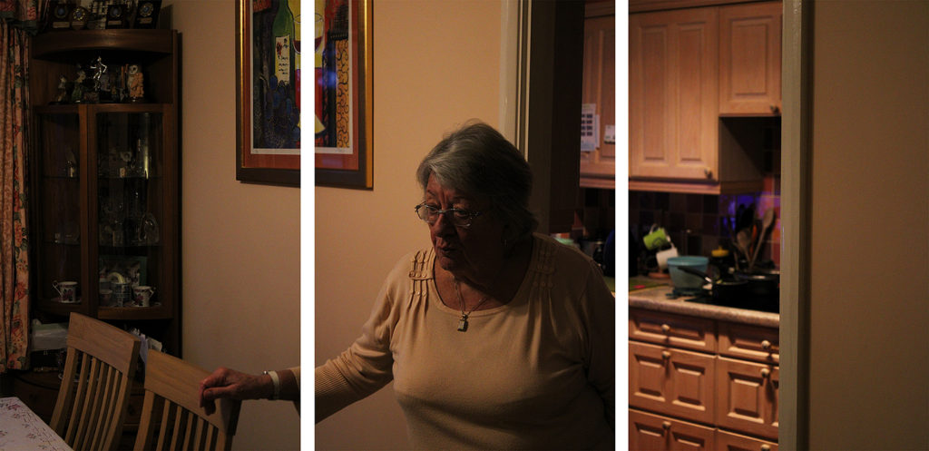
During my editing process of these 3 sequences I decided to keep it quite minimalistic, only heightening or lowering the saturation and brightness so that each group fit together better. Similar to the work of Julian Germain, I wanted to focus on creating a warm, happy environment within each group of images. When editing, I found it important to keep saturation of bright colours high, in order to reflect the joyful energy that overwhelms you when entering my grandparents home. I really enjoy how each sequence has a strong contrast between highlight and shadow, I think this range of tones creates quite an impactful image that quickly catches the observer’s eye while also helping them to understand the influence family has on identity- as if the light overweighs the shadow and makes it clear how important family relationships are.

Experimenting With Multi Exposure

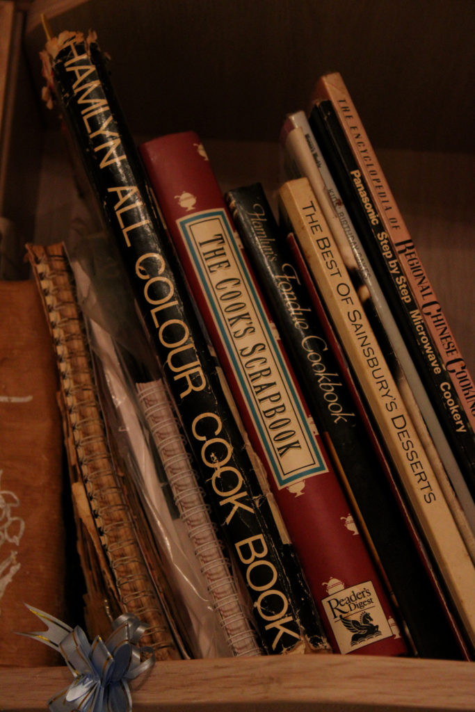
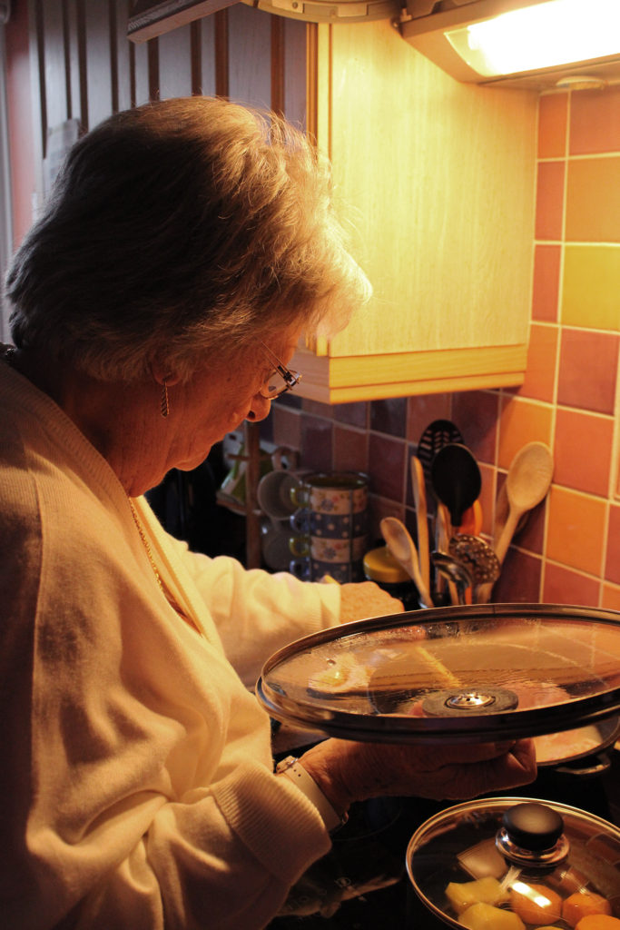
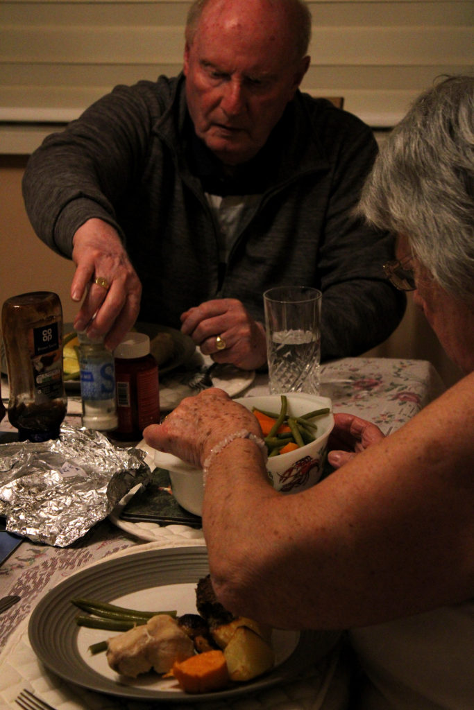
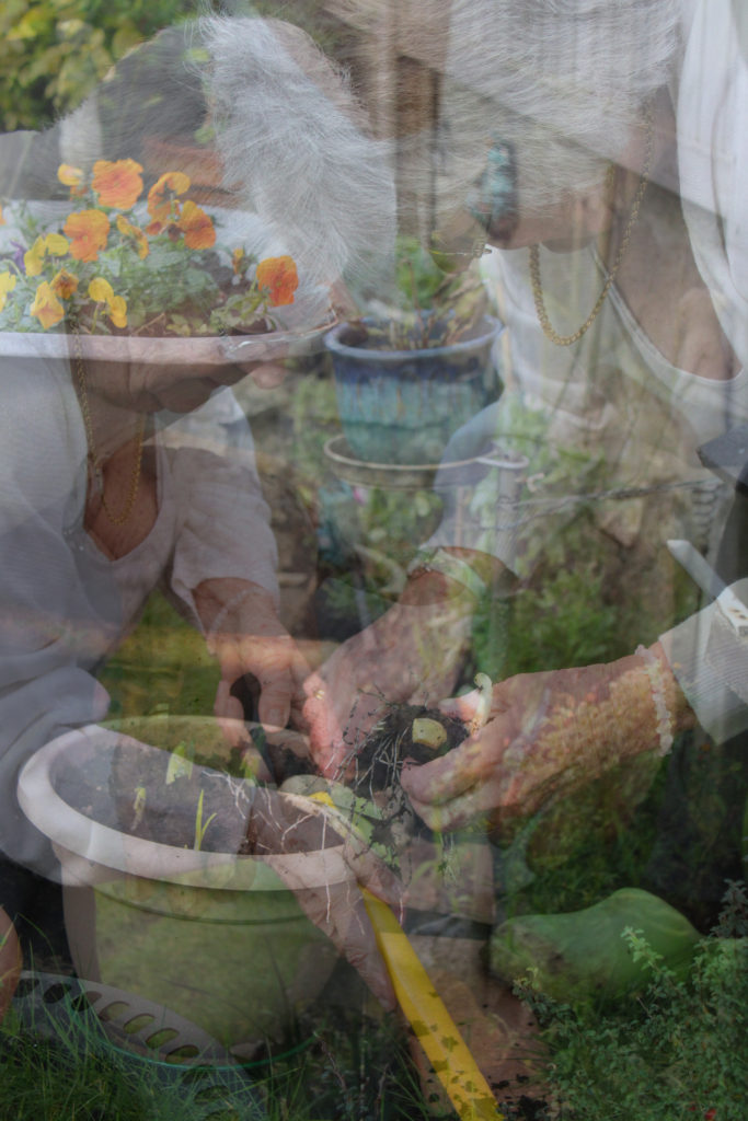
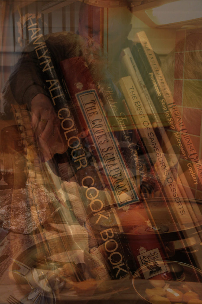
I decided to experiment with creating two multi-exposure images to see whether telling the story was as easy with each image overlapping each other, to them being next to each other. I produced these two images on Photoshop by copying each layer and then pasting them over one another, lessening the opacity each time. I really like how multi-exposure images look and how they can tell a story through repetition- the work of visual artists such as Man Ray are very inspirational to me when creating these types of pieces. I believe that someone’s identity can be very much influenced not only by their surroundings, but what they choose to do in them. When creating these experiments it was clear to me that my grandparents identify immensely with the hobbies they do, I think these multi-exposure pieces really emphasise the importance of these activities to them and show the overwhelming joy the receive from doing what they love. Additionally, the images overlapping each other symbolises the many layers of meaning these scenes hold, like they are echoes of the past that my grandparents remember each time they start the cycle of activities again. Furthermore, I really like how in the second image the focus is on the cookery books yet the other 2 images are layered on top of them. I decided to make this editing choice because of my grandmother’s freedom in the kitchen- she owns so many recipe books yet never ends up sticking to the recipes inside them. This multi-exposure technique symbolises the overcoming love my grandmother has for cooking and how she would prefer to make up her own exciting meals rather than following what someone else tells her to do in a book. These two images hold many interesting ideas and connotations, however I believe the multi-exposure editing actually makes it quite difficult to really see what each images is, and the quality of the images themselves. I think when evaluating my ideas for my final pieces, these images wouldn’t flow as nicely when telling my grandparents story as the prior sequences would.

David Hilliard Inspired Photoshoot

When editing these three images from my David Hilliard inspired photoshoot I decided to, again do minimal editing, but also experiment with how vibrancy and colour can effect the mood or atmosphere of an image. These three images hold many vibrant colours, with the repetition of orange in the kitchen walls providing the clear dominant colour throughout. To keep this vibrancy, I slightly heightened the saturation of each image to really emphasise the bright atmosphere inside my grandparents home- which has impacted my family’s identity for the better through times of sorrow and loss. In addition, I wanted to make sure each element of this special room, such as mugs and kitchen utensils in the background, were easily recognisable. This was because my grandparents are not the biggest fans of change, nearly everything in their kitchen has been their since I was a toddler; the memories they all hold of us baking together when I was little are very special to me. In order to keep these things noticeable, I used the ‘sharpen’ tool on Photoshop for better clarity in each photograph.

Experimenting With Black and White

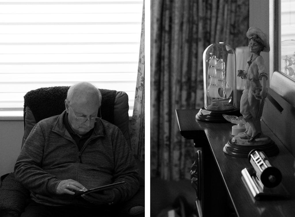
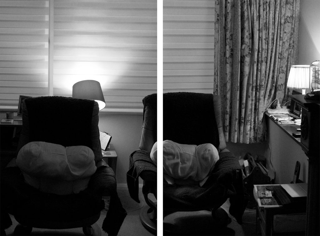
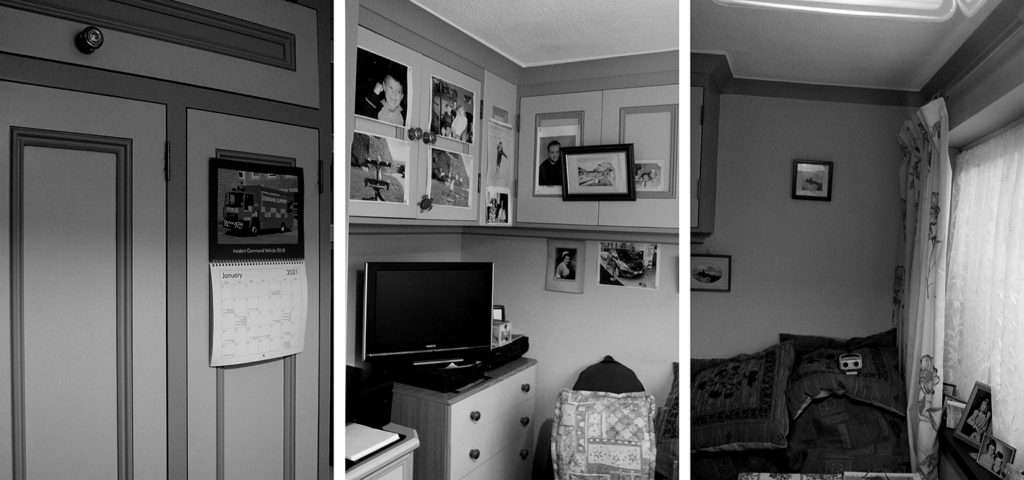
I chose to edit these specific three arrangements in black and white to experiment further with how colour can effect the atmosphere of an image- however in these images I believe the lack of colour actually influences the message and meaning of the photos. The unsaturated filter mirrors the photographs that were taken when my grandparents were children themselves, the black and white image is nostalgic to them and holds many happy memories. In fact, many of the images on the walls of my grandparents home were taken before colour cameras, so this editing links strongly to their childhood and their home itself. I love how the black and white filter emphasises the strong dark and light tones in these photos, it allows the observer to see a range of shadows that fall across each image. Furthermore, this editing clearly shows that the top two images have quite unbalanced tones, leaning more towards the shadow than highlight, whereas the bottom sequence is balanced between light and dark. Moreover, I chose these particular three images because of their link to my family’s identity, they hold many fond memories from past gatherings and childhood. The image exhibiting my grandparent’s chairs is very special to me, the area is a place in their home they will nearly always be and I love how the black and white editing allows the image to link with their past. Additionally, I chose to edit the bottom image due to its sentimentality towards my whole family’s life, with pictures on each wall depicting former achievements and the room’s joyful memories of family BBQs where we would set out drinks tables along with mountains of food. I think this unsaturated editing has added lots of links to the past to these images, however it has also taken away the warm happy atmosphere- it is possible the black and white filter has added a more gloomy mood to the photos so when choosing final images I will need to consider which option is best.