Tag Archives: Editing

Community NFT – Editing Video in Premier Pro

Setting The Scene – Location;
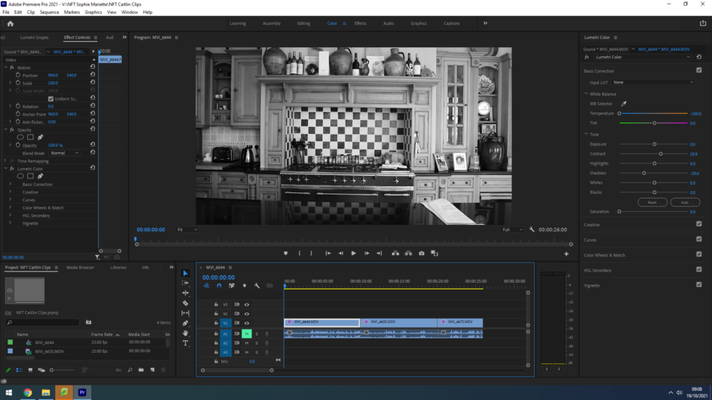
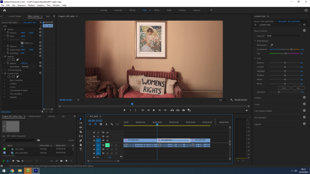
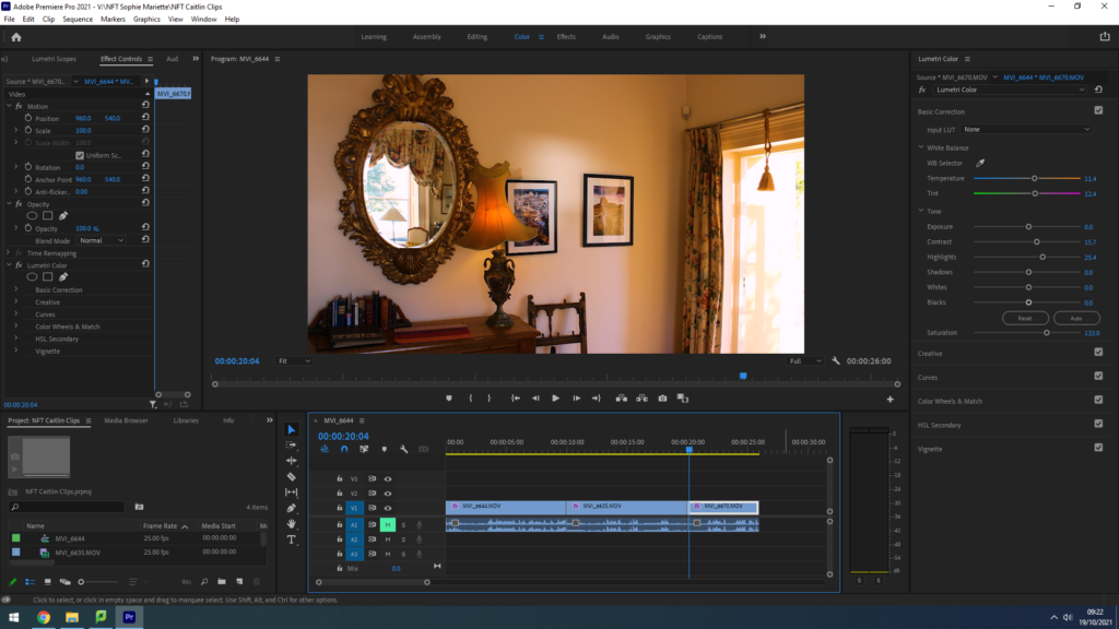
While on location filming our NFT video, using our plans from the storyboard we created, my group chose three rooms in the house that rightly portrayed our three different eras. The first room shows a rustic, un-modernised kitchen with antique original tiles and cabinets to represent our early 1900’s housewife’s home. The lighting in this room was perfect for filming, with large windows spanning from the ceiling to the floor right in front of where we planned to set up the camera, providing perfect natural light to set the scene and highlight our model’s face. To fit with our idea of showing different decades, we edited this clip with a black and white filter to replicate old silent films. We also really loved the range of geometric shapes in this location as it hinted towards the idea of order and tidiness, stereotypical ‘housewife qualities’ that broke down as our video went on. Our next room we chose was a living area with two red patterned sofas relating to those of the 60’s and 70’s, we loved the minimalistic background of this shot as the blank orange walls provided lots of negative space to draw the observer’s attention towards our models actions. We felt a need to increase the vibrancy of each clip as our film went on, therefore we edited with lower saturation and warmer tones that were more reminiscent of old film camera photographs. However, the one part of this location that could steal the observer’s gaze, for all the right reasons, was the watercolour painting of a woman sat in a field of flowers. We really loved having this painting in the centre of our shot as it conveyed the feminine stereotypes we were highlighting in this whole project, relating back to our embroidery inspiration of ‘The Bugs and the Lovers’ and keeping that motif of flowers flowing throughout our piece. Our final location for representing the modern day woman, confident and assured of herself, was anther living/office area that held a grand mirror that had regal tones of wealth and luxury. As described in our storyboard, we wanted to feature a mirror for our model to admire herself in before leaving frame, and we thought this one was perfect. The golden warm tones from the artificial lighting also helped provide links to happiness and comfort in our final shot.

Audio Editing;
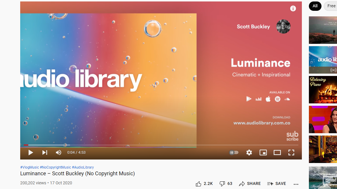
We wanted to create a piece of inspiring audio with links to moments in history that defined waves of the feminist movement to play underneath our film, of course due to copy right we had to find a piece of royalty free music. I researched the free music website Audio Library and found composer Scott Buckley – his instrumental song ‘Luminance’ worked perfectly for our film, with elements of drama, suspense but an overall a calm atmosphere to be juxtaposed with historical audio clips, this piece of music worked well. We also had the idea to find clips from certain women’s rights activists throughout history to layer over the top of this instrumental track. I searched on YouTube to find feminism interviews, our first is taken from Christabel Pankhurst’s 1908 speech recording, protesting for the women’s right to vote, she states ‘the ministers suffragettes, who form the women’s social and political union, are engaged in the attempt to win the parliamentary vote for the women of this century’. Our second historical audio recording is from a NBC news report in the 1970’s on the Women’s rights movement, this woman states ‘we now have ten million women backing this particular measure before congress, that’s ten million women who are united through their organisation.’ Our final audio recording is representing the modern woman of empowerment and self love, it is from Britta Badour’s 2019 poem entitled ‘Dear Young Woman’ where she reads ‘whatever you’re going through as a woman, you have the choice to make for yourself for how gentle and kind you are with yourself’. In Adobe PremierPro, I layered this audio clips over each other to create a piece of sound that told a story throughout our films movement.
Montage Images;
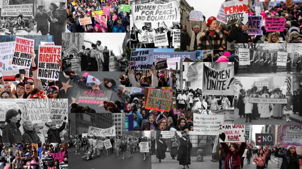
During our video editing process we experimented with how creating a montage for the end of our film would impact the overall message. We wanted to find images from several different decades, highlighting the suffragettes/suffragists as well as present day women fighting for equality and the rights to their own bodies. Each member of our group researched some of the most prominent protests/marches for equality in history, collating a set of images that we wanted to include in our montage. Using a mix of black and white/colour images was something we really wanted to feature. After choosing each photograph we wanted in our montage, we used Adobe Photoshop to create a GIF of our images using the instructions below;

How to make a GIF in Photoshop
1. Create layer for each image
2. Window > timeline
3. Select > Create Frame Animation
4. Drop Menu > Make frames from Layers
5. Timeline > select Forever
6. File > Export > Save for Web Legacy > reduce image size to 720 x 720 pixels

By using a GIF format to create our montage it gave us the ability to speed up the duration of each image, producing a fast paced series of photos that sat in time with the music underscoring our film. We wanted this montage to go at the end of our film to really finalize our message that these issues of inequality are still going on to this day.

Our Title;
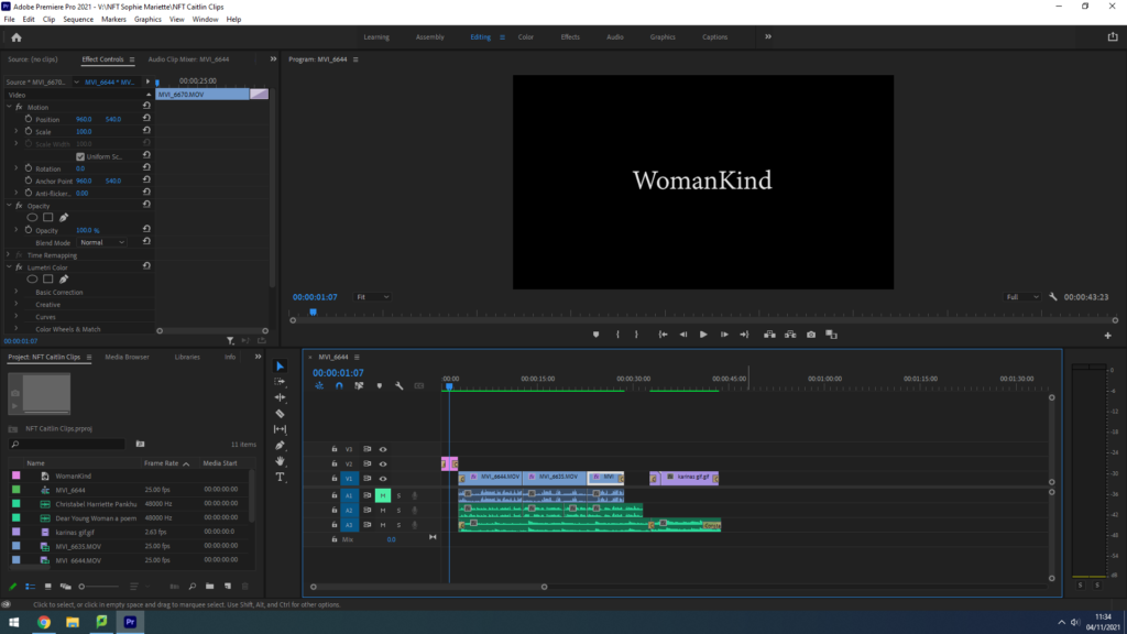
As a group we discussed developing a title that summarised our views and message altogether. We came up with the idea of ‘WomenKind’ – a play on words for ‘mankind’, a word that is meant to refer to the whole human race however only refers to the male gender in the process, switching to ‘Woman’ to create a statement on collective women empowerment. We are not suggesting in this pun, or in this entire project, that women are better than men – that idea has been mentioned nowhere – we are simply drawing attention to the fact that for centuries women and men alike have fought for female empowerment and gender equality, we are giving our thanks and telling their stories. Additionally, we decided to capitalise the ‘K’ in kind to hint at the irony surrounding the stereotype of women being weak and submissive, showing kindness to all. This is clearly juxtaposed with our film celebrating the strong powerful women who still continue to fight for equality, our title highlights and challenges the parodic representation of women throughout history.

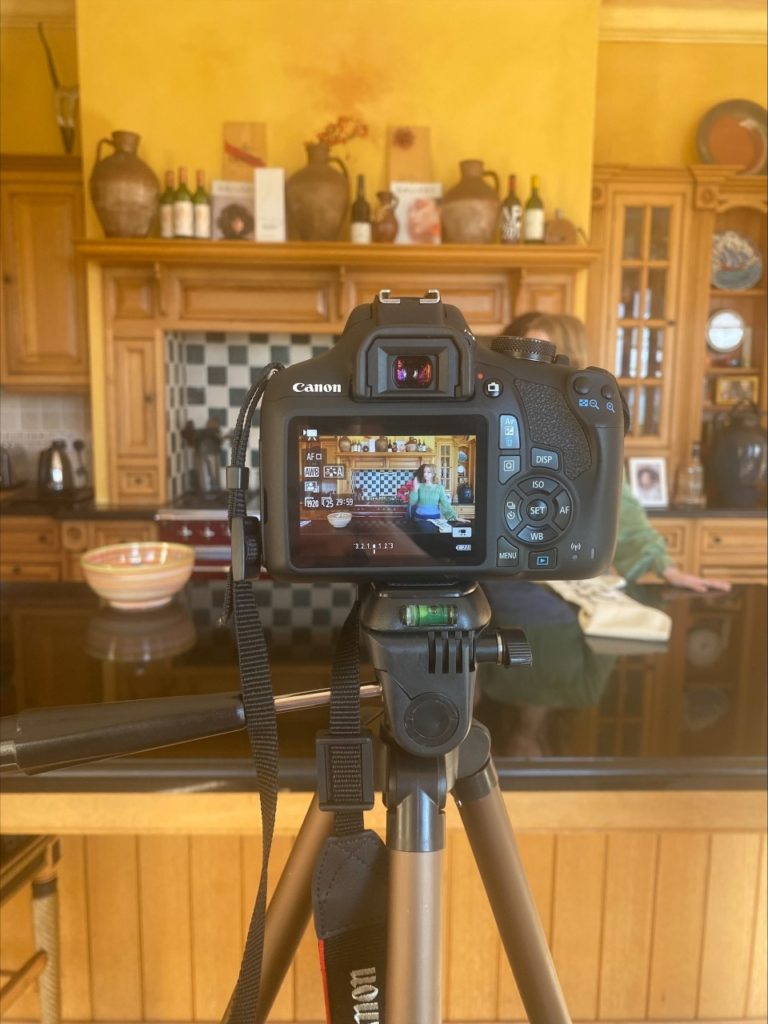
Behind the Scenes;

NFT Community – Recording

Principal Shoot Plan

Before we planned teh shoot we established initial ‘job roles’ for the project:

  • Matthew
    • Camera man
    • Animator
  • Reuben
    • Actor
    • Secondary editor
  • Ollie
    • Director
    • Manager
  • Myself
    • Main Character
    • Chief Editor

We will shoot our video using a DSLR paired with a drone. Referring back to the story board, the DSLR will shoot close up shots and eyelevel perspective shots, while the drone will take the birds-eye-view shots.

Image preview

We will shoot during the day time, during overcast weather to remove any harsh lighting and add drama to our footage. We found an open field area with a cliff which is were we will film as we plan for the main character to appear as he is isolated when shooting birds-eye-view shots. The cliff also adds to the drama and the cliff will add more sublime romanticism to our footage. We want our narrative to be obvious and we are using characters who will act out this narrative effectively. In terms of props we will be using a VR headset which we have crafted ourselves using accessible materials.

Behind the scenes:

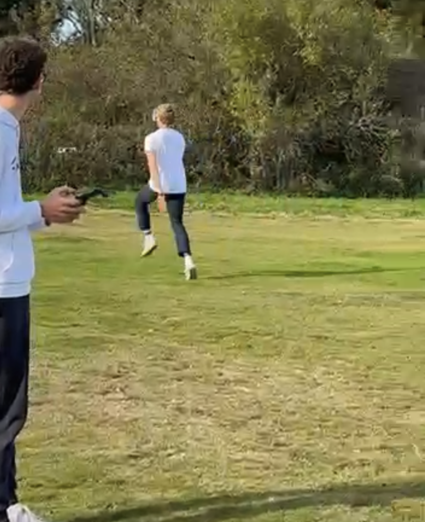
Matthew controlling the drone while I ran towards it
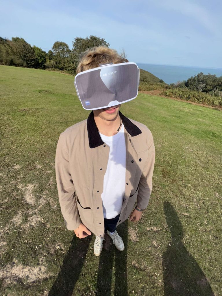
Me showing off the central handmade prop

Am I satisfied that I have enough images/ material? – Yes I am satisfied we have shot an abundance of imagery.
What are you going to do differently on next shoot? – Do not rush the takes as much and refer to the storyboard more directly.
How are you going to develop your ideas? – Add animation and editing to piece the narrative together and further add visual effect to the piece to relay a more emotive campaign.

Film Inspirations:

Editing:

Video

I began by laying delegating the task of finding a backing track for the video. We found a royalty-free electronic song with a fast paced beat which would complement the narrative and visuals well. I then laid the soundtrack in a new sequence in Adobe Premiere pro. Thereafter, I began introducing clips into the sequence and cutting them to the beat. Once satisfied with how the clips where positioned and the overall sequence, I moved onto the next element of post-production, colour grading and Effects. I added a grade on all of the clips using adjustment layers. I went for a high saturation and high contrast grade to dramatize the action in the video. I then added video-game style overlays such as the one below.

For the split screen concept I first had to motion track my face to stabilise the clip more so that my facial features lined up with the animation characters features. The animation was designed by Matthew. You can see his editing process for this HERE

This involved an intricate frame-by-frame masking process.

I added speed ramps to add a sense of hyperreality and the idea that time is controllable in the metaverse more. Finally I added sound FX to add a more immersive feeling.

Image

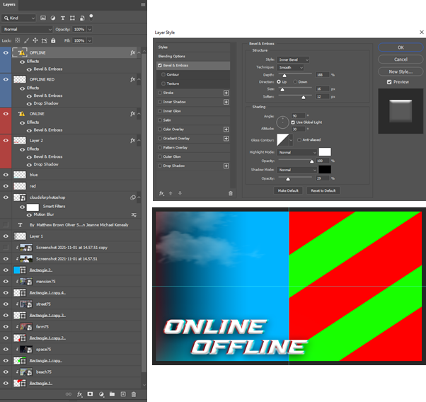
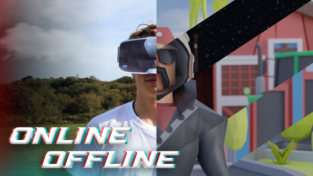
Matthew made the the digital image in photoshop. He used a screen grab from one of the videos of me wearing the VR, and the 5 animated scenes all at the same timeframe so the character lines up.

He then added some glitched text effect by using 2 layers behind each text. To make it better he added some blending mode features, such as, emboss and bevel, etc.

He used shapes and clipping layers to add all the images into to ensure all the shapes are even.

This is the final image which represents the whole NFT film. It shows the most important scene, which is the split scene that includes the animation as the NFT exhibition is called 2lives (online and offline), it shows the real world and the virtual meta verse.

Recording And Editing

We used our storyboard to organise our shoots, to know where/what/when we were going to shoot.

We decided that Michael was going to be Model 1, which would mostly be in the start of the video, and Reuben was Model 2, who was only in the last half of the video. Matt (me) was recording everything, and Ollie was the director and manager.

We had to make a VR headset using a printed off image of a VR headset and then we taped it to some sunglasses.

Shooting

First, we went to a open green area, which we filmed most of our scenes at.

We started off with the main walking headshot video, then we recorded the drone shots of Michael wearing the VR. After I recorded the scene where Michael and Reuben meet in real life and the last scene where they are talking on a bench.

After, we went to record the scene where Reuben takes off the VR headset at a gaming setup.

We couldn’t record a drone shot of a house, as you can’t fly within 50m of houses/property.

Editing

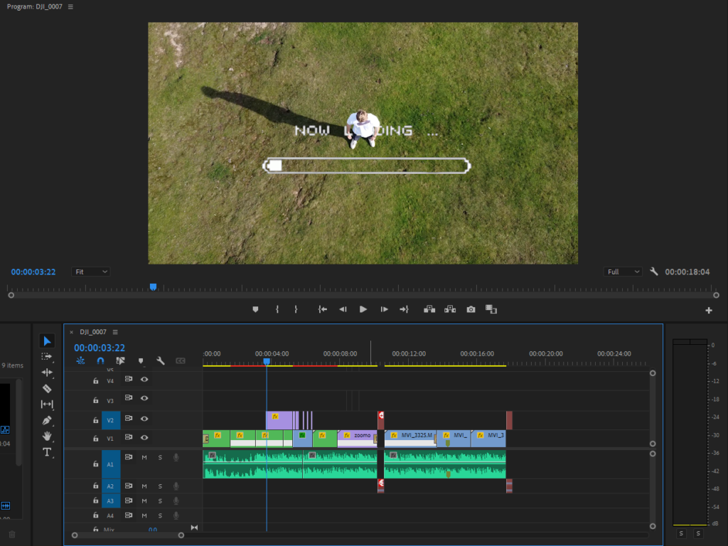
Once we had all the recordings Michael and Reuben started to edit the video on Adobe Premier Pro. They used special effects, such as the loading… visual effect, and static sound effect, etc. They also time-mapped some clips to match the beat of the music.

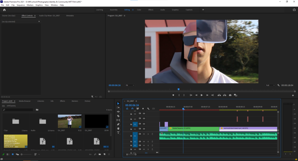
This shows the half and half effect, with the timeline on the bottom half of the screen.

This is one of the special visual effects, which is used at the start of the video. Also, the timeline is zoomed out, so you can see all of the film on the timeline, and all its layers.

This is how the time-remapping was done, as seen on the left. He used key frame to change the speed of the clip at different time intervals.

Design and Layout

Mood Board

What is a Zine?

A zine is a small-circulation self-published work of original or appropriated texts and images, usually reproduced via a copy machine. Zines are the product of either a single person or of a very small group, and are popularly photocopied into physical prints for circulation.

Zine - Wikipedia

Why Photographers Should Create Zines

Digital marketing isn’t always the most effective method of marketing your photography. That’s why photographers have been creating zines for years.

James Moreton is a photographer who is experienced in the art of zine making.

James Moreton

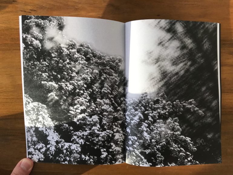
He is an artist who enjoys the tactile approach to photography. “I believe the photographic book is the best medium for photography. The ability to create impact by pairing, juxtaposing and sorting pictures into a flow in order to tell a story or instil an emotion in the viewer is unsurpassed by any other photographic medium” This is why zine making is an important element of a narrative project, therefore, I will incorporate it in mine.

More of James’ work here.

Craig Atkinson: Café Royal Books

Craig Atkinson is the founder of weekly publications, focussing on post-war documentary photography linked to Britain and Ireland called Café Royal Books.

This is an example of valuable photographic works being collected into the tactile and aesthetically sequential format of a zine. “The publications are bought as gifts, as nostalgic reminders. They’re used as reference for film makers, producers, screen writers and costumes designers. Universities collect the books to allow students access to the large collected history of this genre of photography, which hasn’t existed to this extent, in print, before Café Royal Books.” This shows the importance of having a tactile form of work to inspire and reference, which zines seem to capture very well.

Atkinsons zines have an aesthetic formality and consistency which I want to replicate in my zine in some form.

This video by an independent artist encapsulates the zine making process

I want my design to look like a romantisized interpretation of the buildings and communities in St Helier, I want the viewer to feel like they are walking through the town and meeting the people in my compositions when they flip through the zine.

My Format, size and orientation will be as follows:

width: 148mm
height: 210
pages: 16
orientation: portrait
columns:2
column gutter: 5mm
margins: top, bottom, inside, outside: 10mm
bleed: top, bottom, inside, outside: 3mm

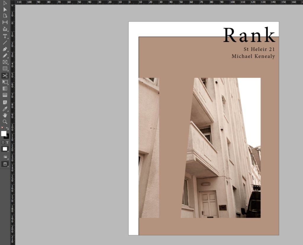
The Title for my project is ‘Rank’. This plays on the difference in class the migrants withhold, it also plays on the common feature of most towns – a taxi rank, finally it plays on the slang word for something that is disgusting – this disgust refers to the vast difference in class. I also want to caption each image with a vague subtitle allowing the viewer to think about the images in different ways.

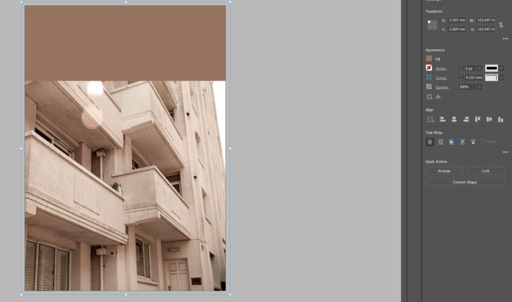
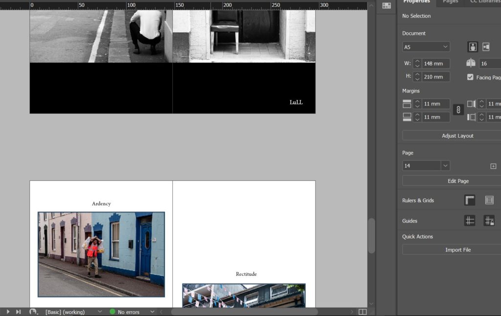
I began by setting up my page colour to be a grey shade. I made sure I added this colour all the way to the bleed line to make sure it printed in full grey without a border. I made my page colour grey to add additional dark colour to the urbanism in my images.

During experimenting, I decided that to enhance my narrative sequence I would rather have a different page colour for each page to enhance and compliment the aesthetic of each image individually. Following on from this I decided that every two parallel pages will have correlation and therefore share the same themes including page colour.

I then decided I want a more abstract look to my front cover as I wanted my zine to entice the viewer and have a more experimental theme. I did this by using the scissors tool to displace images and create different proportions and borders.

I then started adding a theme to each spread. As you can see below I introduced visual elements from my images into the rest of the spread to further develop the narrative and aesthetic of the zine.

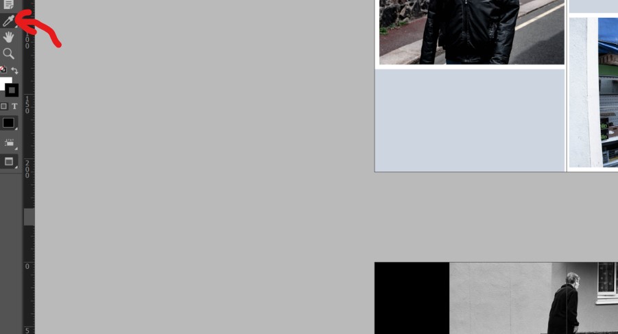
I did this by using the eyedropper tool to select a colour from the image to use as the page colour of the spread.

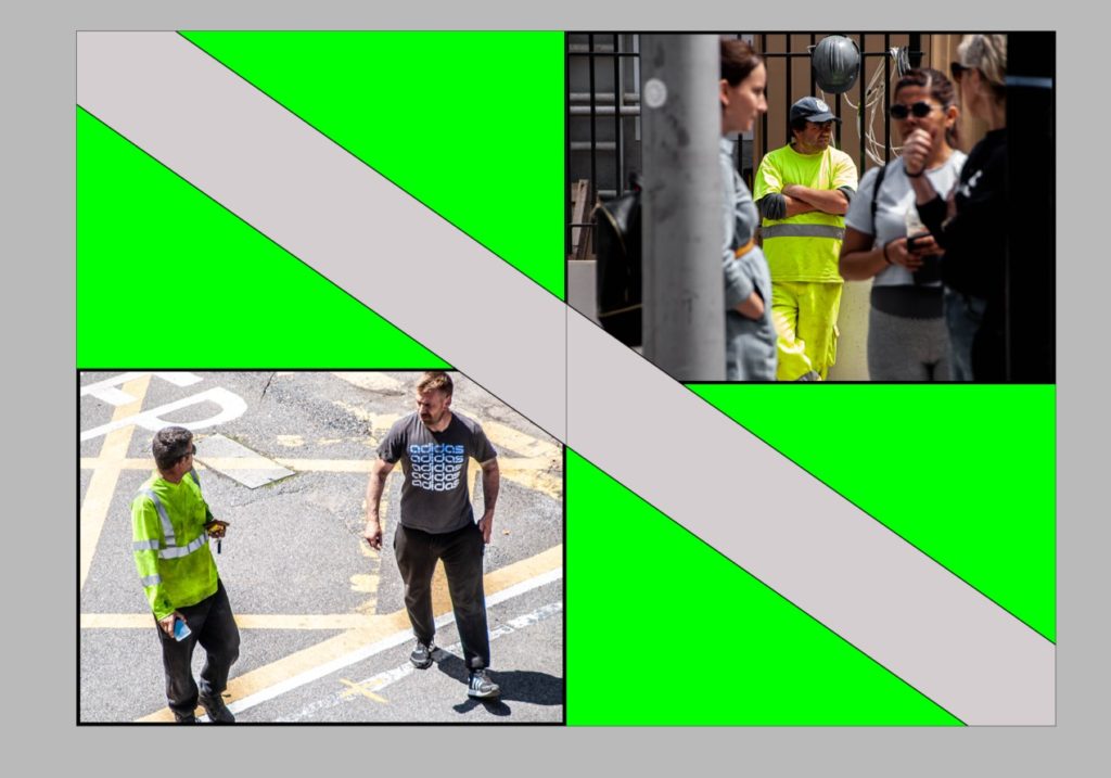
I also decided to experiment with how the page splits my images over the spread by applying some images over two pages like the image below.

I then designed a back page that correlated with the front page by using the same colours and themes.

I then scrolled through my zine adding vague image captions to further the narrative and encourage more thought about the purpose of the project.

Final Evaluation

Throughout the project I was able to endeavour into a pit of knowledge with two territories. The first being the historical and cultural contexts of Jersey and learning more about the rich cultural history the island holds. This led to understanding more about migrant communities which was the predominant theme I was exploring. The second territory of knowledge I gained was that of myself awareness. I was able to learn more about my position in Jersey’s community and my similarities and differences to others in my communities. This identity discovery waws fuelled by experiencing new people and cultures while exploring this topic and learning about the history of the place I call home. I also gained insight into an entirely different scope of art, this being the history of architecture in St Helier. I gained knowledge from an experienced historian and architect from a walk examining the wealth of historic buildings and attractive townscapes that characterise Jersey’s capital. He walked through the history of specific areas through archival records. I was also able to explore the beautifully restored Victorian House and enter the drama of a Victorian family in crisis which developed my insight into the history of how Jersey’s economy and infrastructure came to be.

I was additionally able to apply and channel my knowledge of zine making into a tangible project. I learnt about new software – Adobe InDesign and its useful qualities in terms of creating professional print works. I learnt about other significant zine publishers in Jersey – ED.EM. and others like Café Royal Books and apply them to my project. I was able to turn an idea into a tangible and aesthetically planned narrative which matched my intentions of this project sufficiently.

Identity And Community – Shoot 1

After our tour of the museum we were able to explore the beautifully restored Victorian House and enter the drama of a Victorian family in crisis. Thereafter, we were taken on a tour on the streets near the museum by a passionate historical architecture expert Stuart Fell.

https://jerseyeveningpost.com/news/2021/03/25/our-aim-should-be-to-make-the-place-beautiful-again/

I documented the tours keeping migration and communities in mind and shot it in a fashion that focused on

– a sense of place
– character of community
– people, portraiture

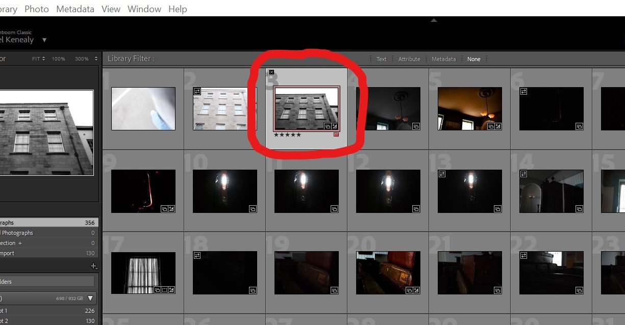
I began my editing process by using the software Adobe Lightroom Classic to start identifying my most powerful and useful images. I did this by working in the Library window and implementing LR’s features that help organise and rank photos. I gave a series of images a ‘flag’ which indicates if I picked them or not. I then gave each image a star rating which narrows down how much I like the image even more and therefore makes the displaying and selecting of my images an easier process. Finally I colour coded images that I believed would work well presented together

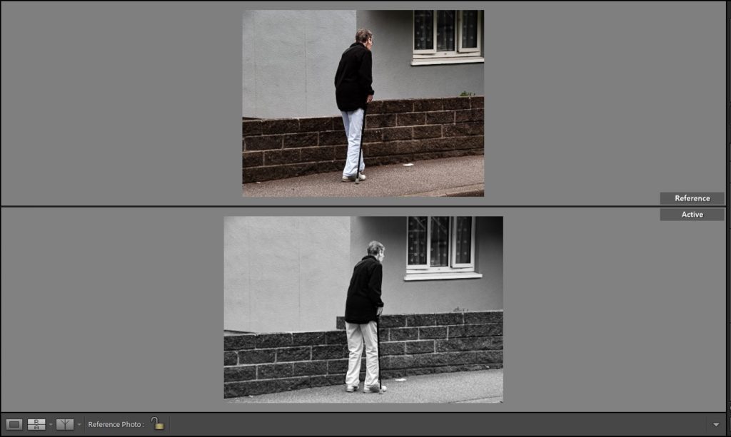
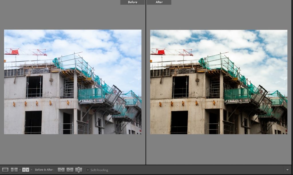
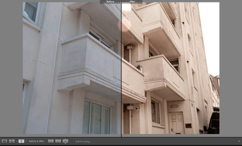
I then used the compare views feature to make comparisons between the same photo edited in deferent ways and to reflect on the before and after of my images to experiment how they could be tweaked differently and what works well to emphasise the emotion in my photographs.

The above is an example of this feature being used where I compare two different images edited in two different fashions. The feature makes it easy to see which image works better at one quick glance.

The above is an example of a before and after comparison where the image is split in half and an easy examination into what editing took place can be made.

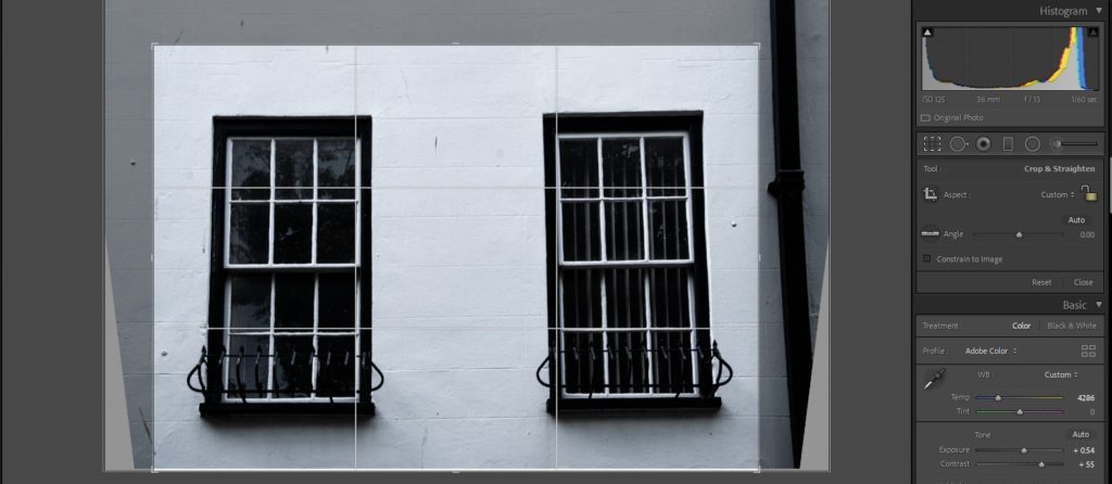
When editing my images the first element of the image I pay attention to before I start tweaking anything else is composition. I adjust the image using the crop overlay tool to frame and compose the image artistically.

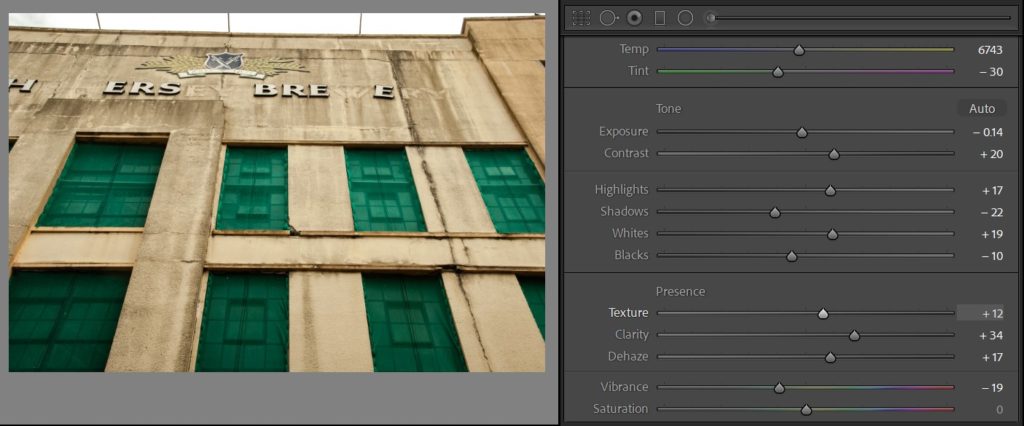
After this I experiment with the colour elements of the image

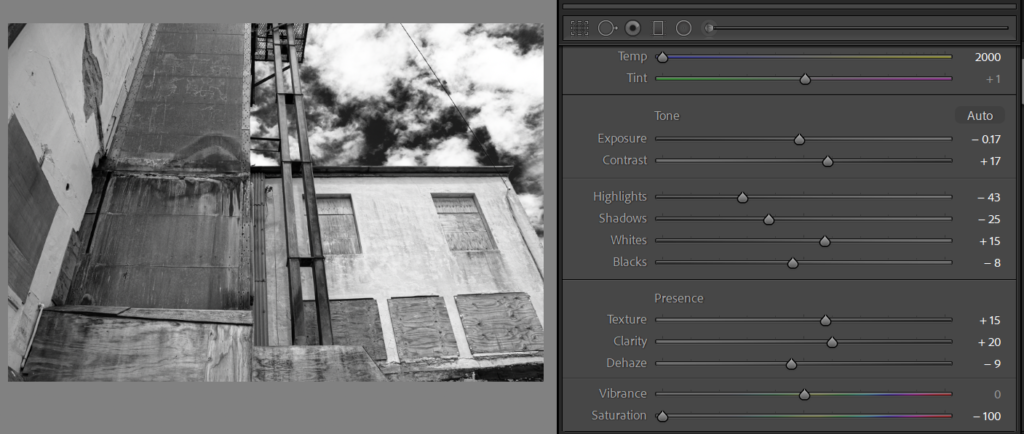
I do the same but, experiment with a completely desaturated monochrome version of an image.

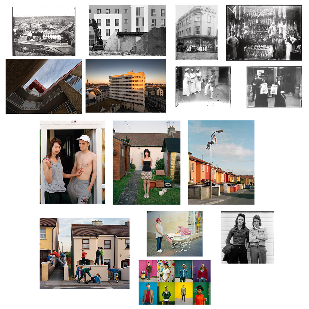
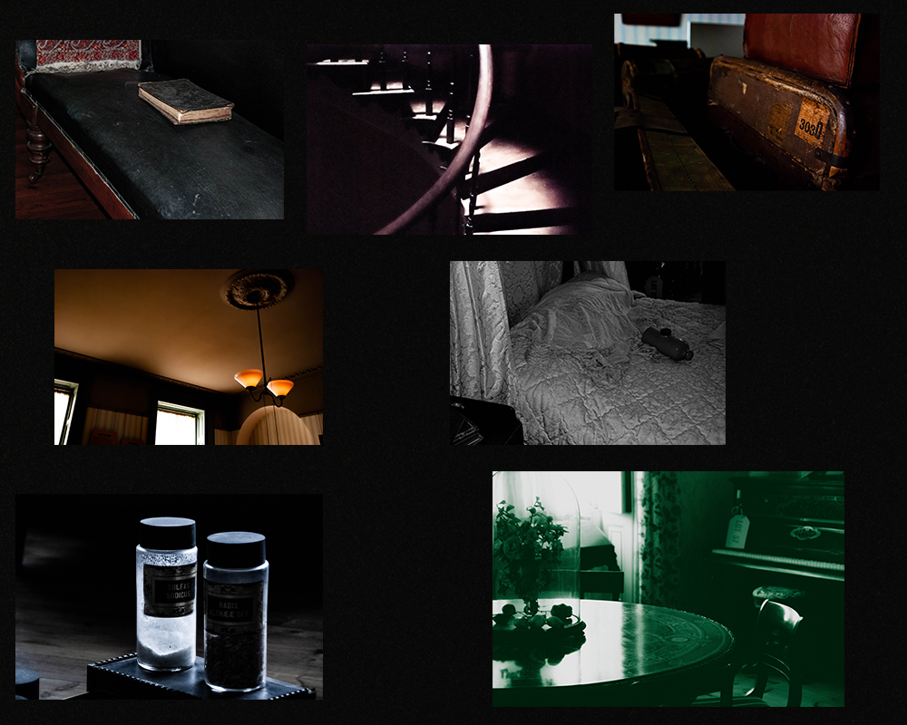
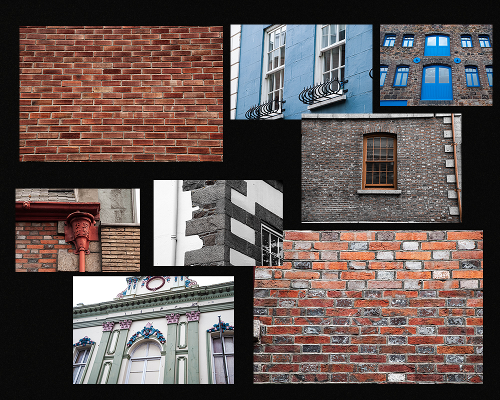
Below are the final edits of the museum and architecture walk grouped into two collages.