
For my finalised images I got inspiration off Alfred Stieglitz in taking pictures of clouds for my image selection in my images being abstract pieces. I chose to get inspiration of Alfred Stieglitz for my final abstract pieces because when I looked at his pictures they caught my attention due to his pictures of clouds looking very abstract in the way the clouds are come across in the pictures for example, some of his pieces don’t even look like clouds although they are due to the contrast of black and white which manipulates the picture into not looking like clouds also, the patterns and repetition of the clouds look very odd making them interesting to look at as you can almost use your imagination in making the picture come across as something else and not clouds.
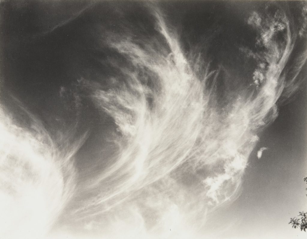
As you can see from this image of Alfred Stieglitz you can use your imagination to manipulate the picture to come across as something else, with this specific image I think of the clouds looking like fluff that comes out of a puffer jacket or a pillow purely using my imagination on what I think the cloud appears to be.
Finalised Pieces
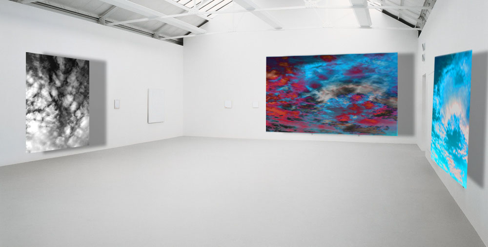
These are my finalised pieces that I have chosen because I thought they looked best in comparison to my other abstract pictures.
The process I went through in making the first one in black and white on the left was by editing the picture by going onto the levels in order to change where the shadows should have been darker in order for the contrast between the black and white to bounce of each other and then I changed the image to being black and white. Moreover, I would say this picture is the closest to Alfred Stieglitz purely because the picture is in black and white with the shadows are heightened just like his pictures.
As for the picture on the far right, the process of editing that I went through in order to get the image to what it looks like was that I went onto the hue and saturation and changed the picture in having the colours of the picture being a bright blue. Also, I cropped out the image, so it was just the clouds in the picture however, this makes it very abstract as the image doesn’t appear to be a cloud and the bright colours in the picture eliminates the natural lighting or natural shadows meaning it would be difficult at first knowing what the picture is.
Finally, the picture in the middle was made through the editing stage of getting the picture on the left on top of the picture on the right merging it into one. Once that was complete, I went onto the black and white image that I put on top of the blue one and I put the opacity down which enables you to see the bottom layer of the image. After that, I changed the colour of the image in order to make the clouds be highlighted in red to make both images contrast from the colours of red and blue.
Overall the middle picture is my favourite out of the three because of the way it doesn’t look anything like a cloud but maybe a weather report. Moreover, I feel like I have taken Alfred Stieglitz’s style of photography and evolve it in the way that it’s not in black and white which goes to show we are photographers in different time periods and this makes my photograph probably catch the eye of a younger person due to how bright the colours are in the image which makes it stand out from the rest.