Tag Archives: Contact-sheets

Identity and Community – Photo Walks

With this series of images I attempt to tell a story about an area of St Helier with historical or contemporary links with migrant communities.

My work will focus on three main elements to capture the historical context of the theme of identity and community in St Helier:

A sense of place – for example; location, site, environment, residential area, communal park, architecture and details, Interior of church, community centre, house or home.

Character of community – for example; street scene, decisive moment, staging or performing for the camera.

People and portraiture – For example, a resident outside his/her house/apartment block, shop/ business owner, street portrait/ passer-by.

I focused on three contrasting areas of St Helier:

Route 1: Merchant quarter – This area of town was once where the core community of merchants were located. It was once located right on the waters edge in the 1800s but now boarders the marina – this gives merchants easy access to their ships and therefore gives insight into why this area is dubbed the merchant quarter. I enjoyed photographing the character of community in this area as people fused with their environment and seemed to interact with it well.

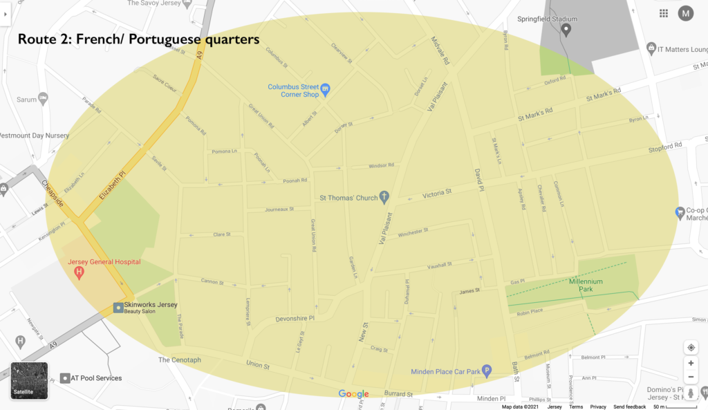
Route 2: French/ Portuguese quarters – This area of town is where most of the European migrant such as the large number of French and Portuguese people that began settling. This area features a diverse range of neighbourly people who form a lively community. This is why I found this area was most interesting to shoot in terms of people and portraiture.
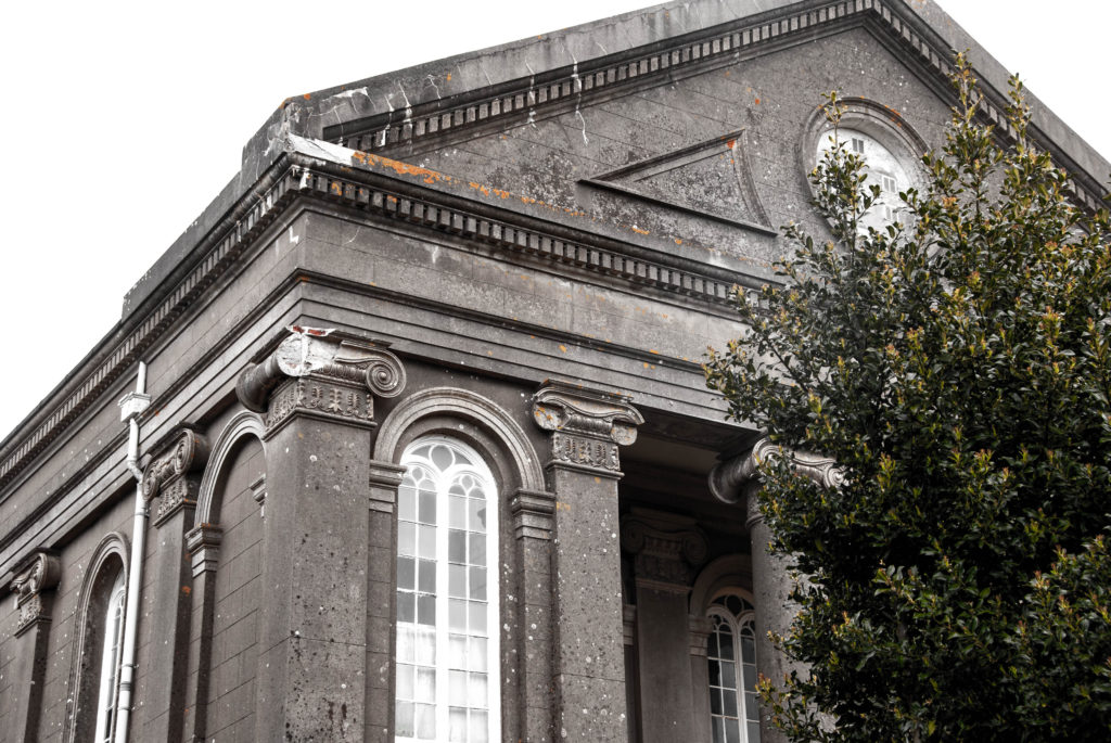
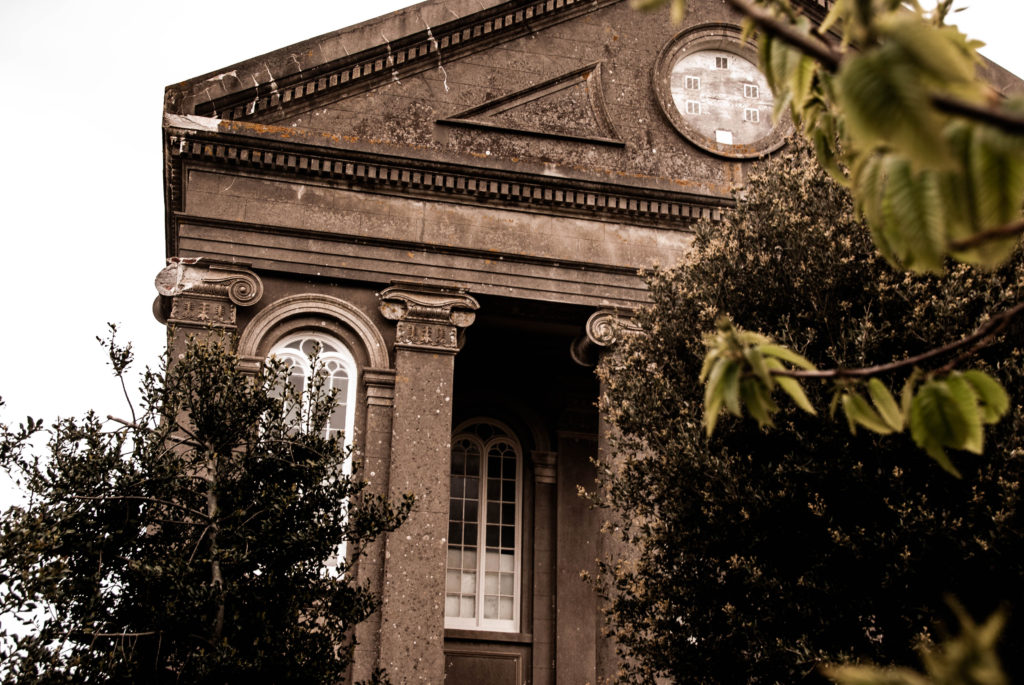
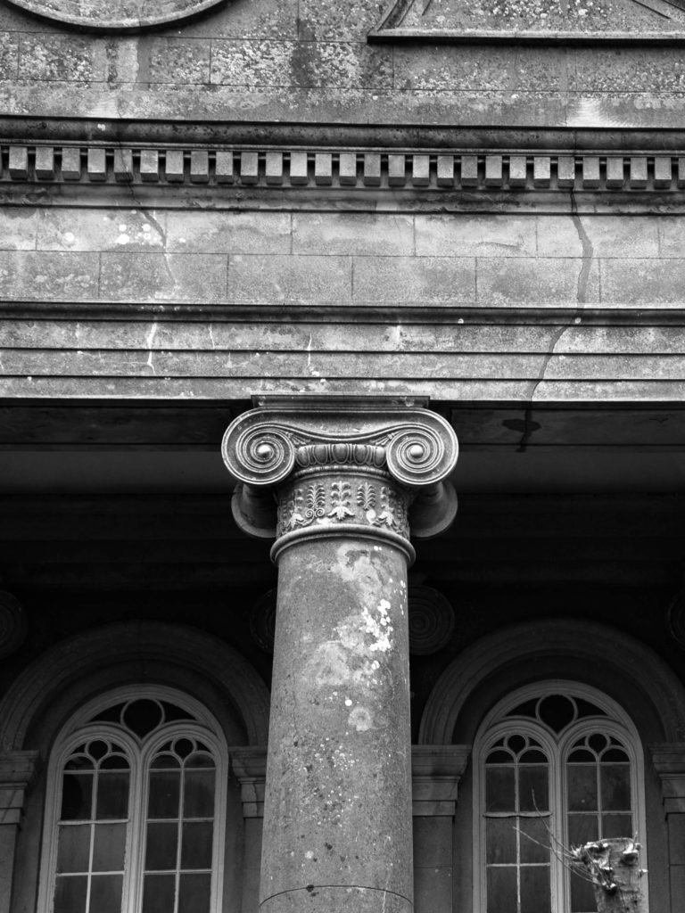
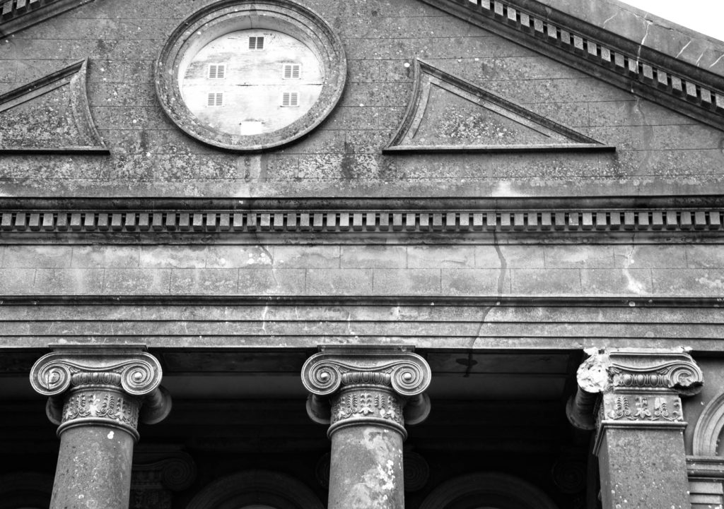
Route 3: British expats/ wealthy residents (Rouge Boullion) – The United Kingdom is Jersey’s closest international partner. Deep social, cultural, economic and constitutional links between us have been built up and maintained over hundreds of years. This area is where most of the wealthy residents and British expats began to settle. The rich architecture in this area is what I found most interesting to shoot. The wealthy British would bring their builders over from the UK to build the magnificent houses. Shooting a sense of place in this area was what I focused on.

Mood Boards

Sense of Place

Character of Community

People and Portraiture

Contact Sheets

Shoot 1 – a sense of place

During this shoot I focused on capturing St Helier’s buildings and homes in a manner that encapsulated the social and historical contexts of Jersey. I did this by shooting different styles of buildings – Portuguese, British, houses, shops, offices. I also shot structures which had different ages; I shot newer office blocks and also old houses that had been around since St Helier’s birth.

During my editing I focused on aesthetic composition; I therefore made sure to frame everything in a symmetrical or artistic manner.

I also focused on dramatizing the buildings using deep colour schemes and contrast.

Final Images:

The image above presents a pleasing visual aesthetic as the images share a consistency. They are consistent with framing and composition with the two doors and stairs framed identically. This image tells a story of community and their connection through identical housing, but also shining focus on unique identity shown by the different colour choices of the doors. These images are also effective at referencing a sense of place A few other images that achieve this message in one composition are shown below.

The below images share warm tones and a ‘lens flare’ in the top of the composition that give the images a sense of prosperity that suggests the buildings have been stood happily looking down on the community for a long time.

Shoot 2 – Sense of Character

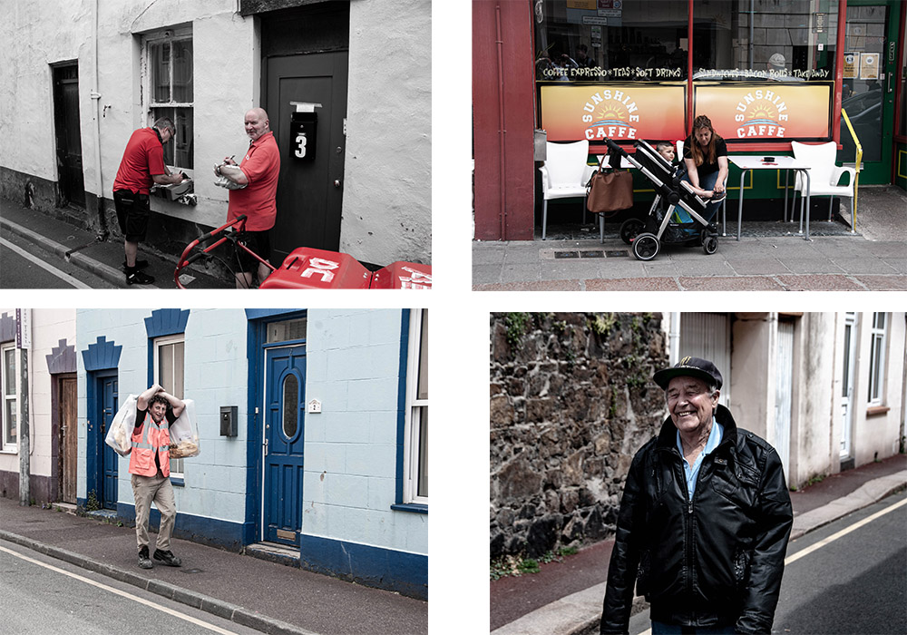
For this shoot I shot people of St Helier interacting with their environment and each other. This produced a wide range of emphatic images expressing emotion and telling a story about the area they are in and about what type of people they are.

I also shot images where there was a lack of people in the shot in a physical sense. I instead shot urban landscapes where there was a setting created by people and shaped by the community but lacked the physical presence of people. For example this image of a food stall tells a story about the community and their everyday lives without anyone actually being present in the image.

The following images are of scenes composing of characters of the community. I like the way they are composed in a way were they blend in with their environment, and all look to be living the hustle and bustle of St Helier, just like their migrant fisherman, merchant ancestors.

Shoot 3 – People and Portraiture

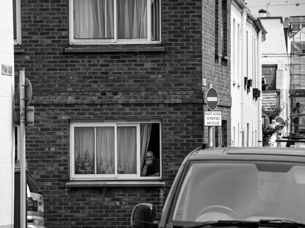
For this shoot I focused on capturing the emotion of the people I shot. I also focused on shooting people who were busy going about their day in a variety of different ways, weather that be playing guitar on the pavement or taking a smoke break; the images tell a story of identity.

contact sheets

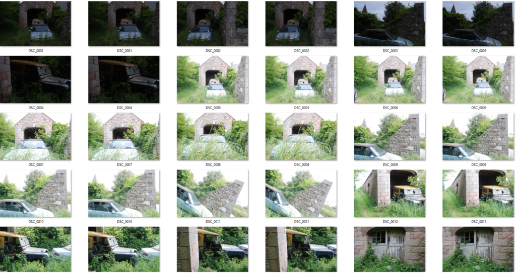
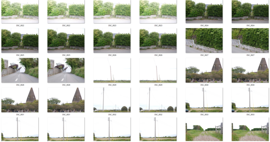
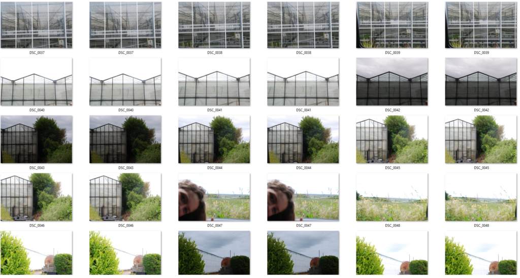
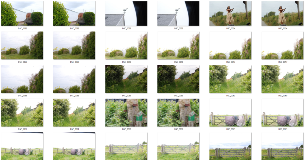
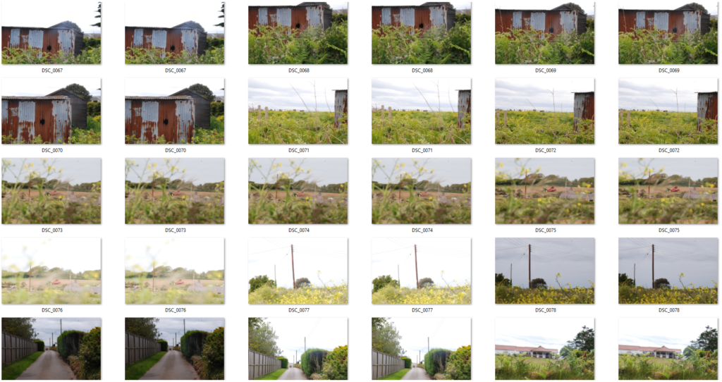
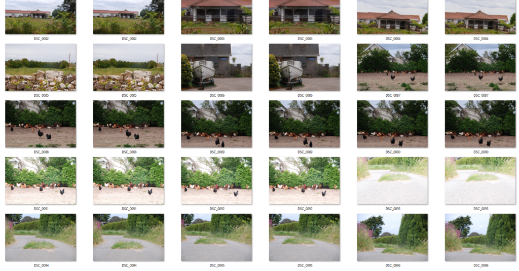
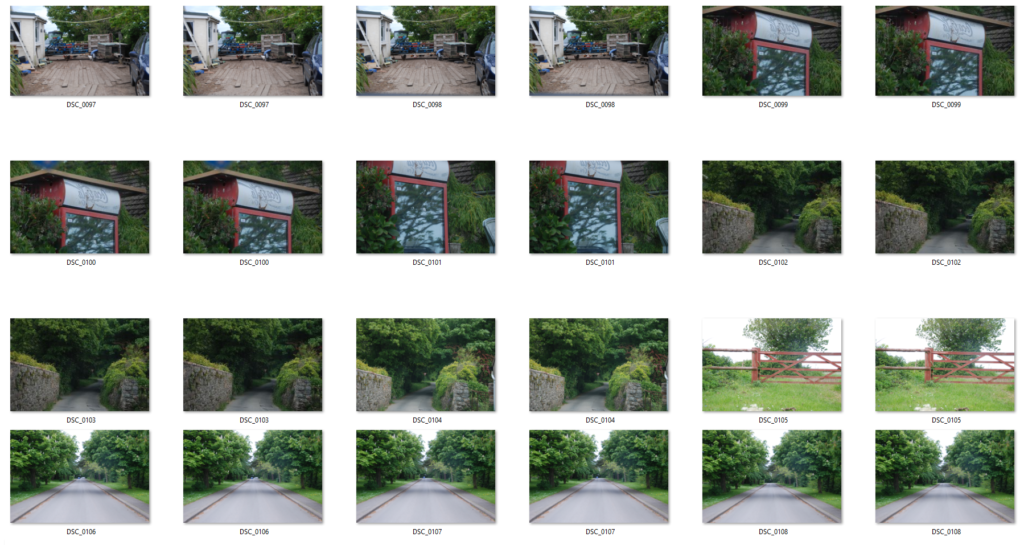
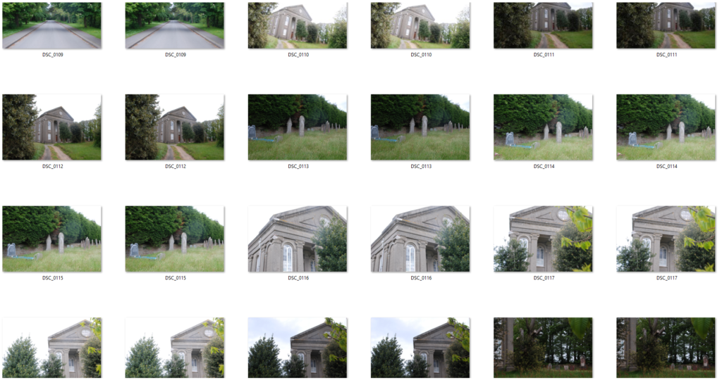
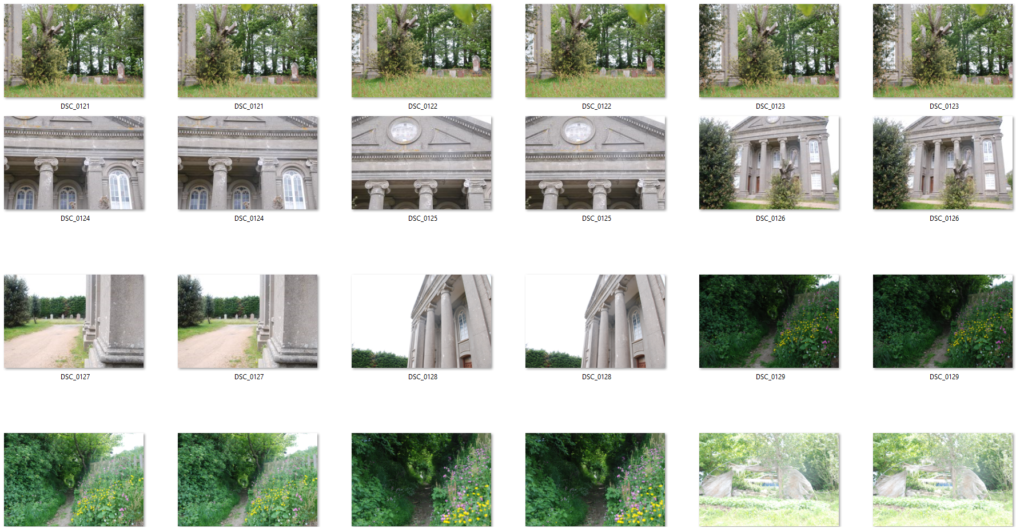
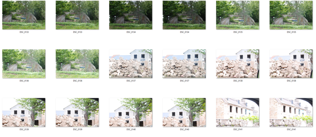
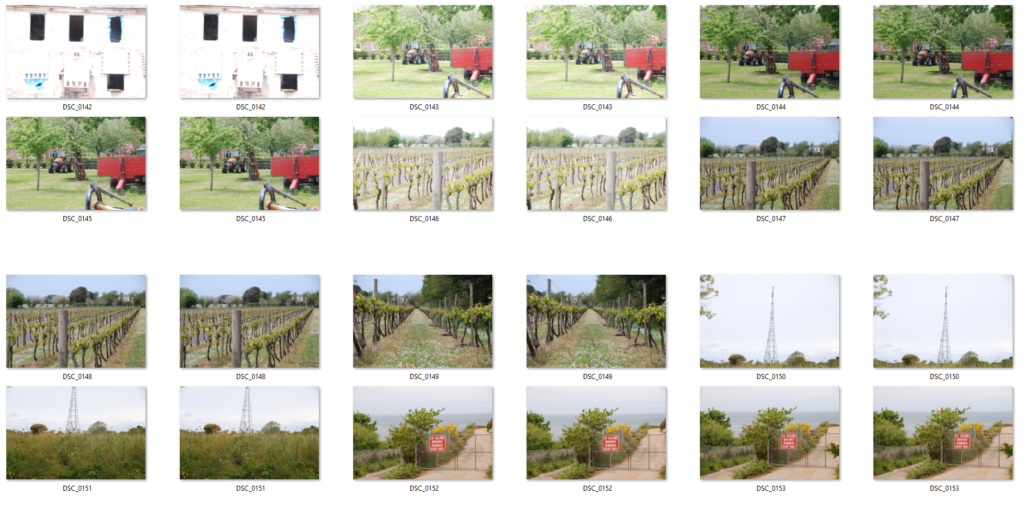
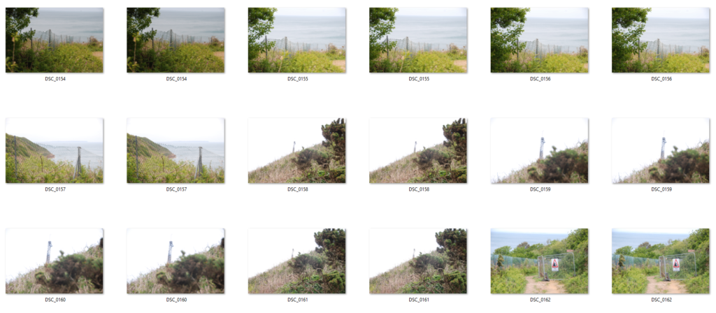
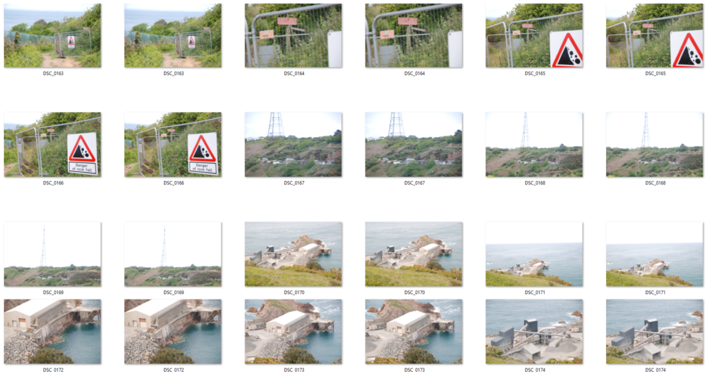
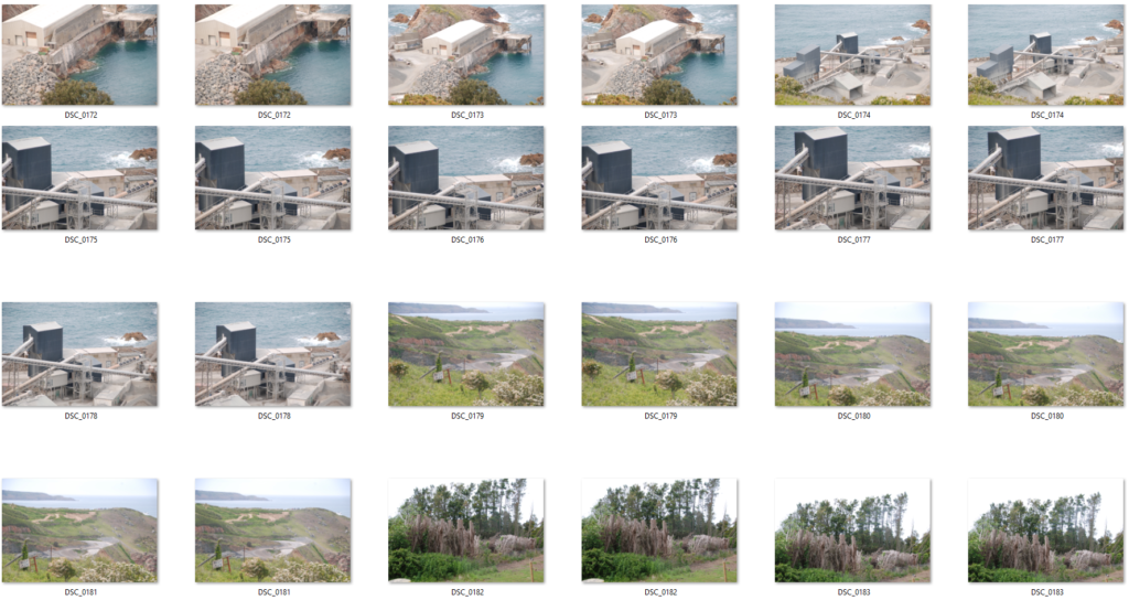
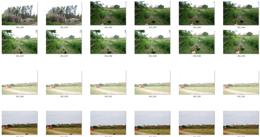
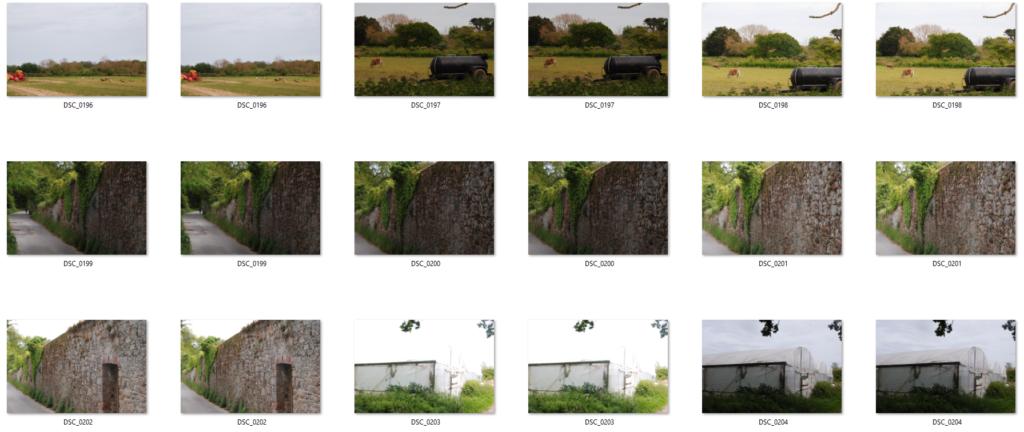
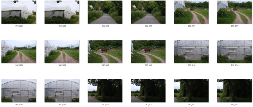
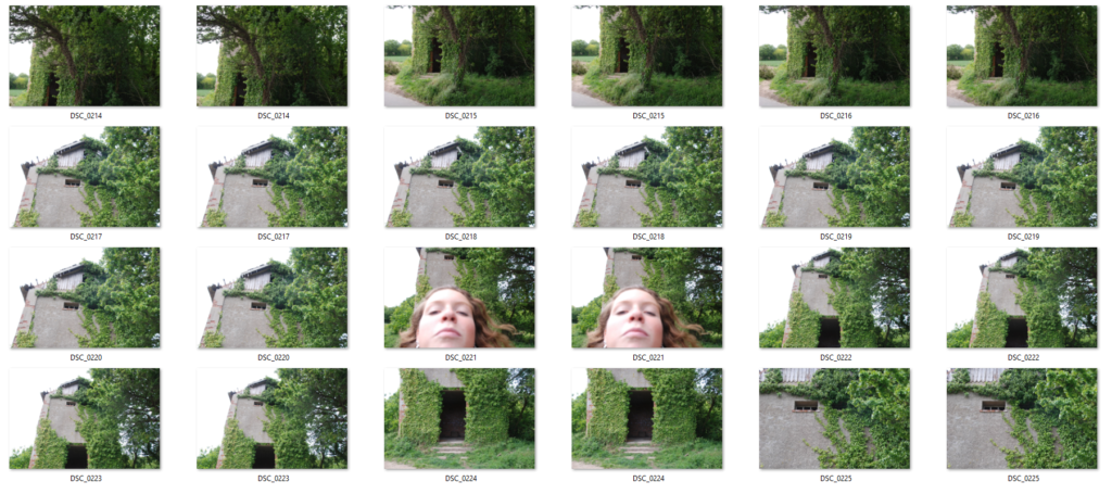
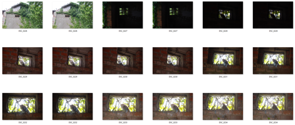
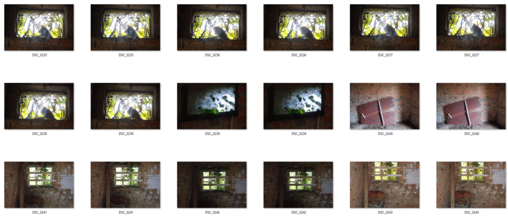
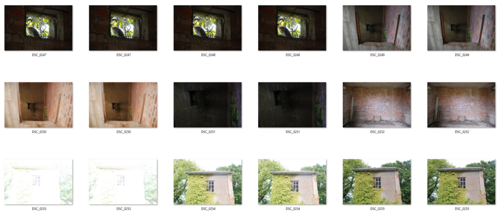
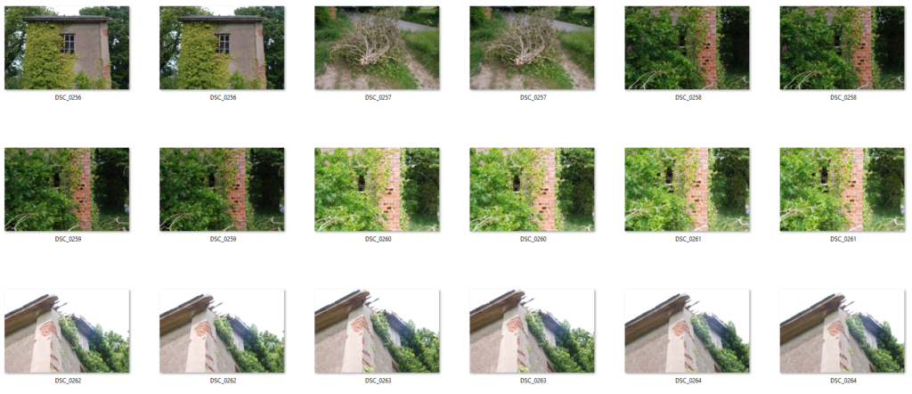
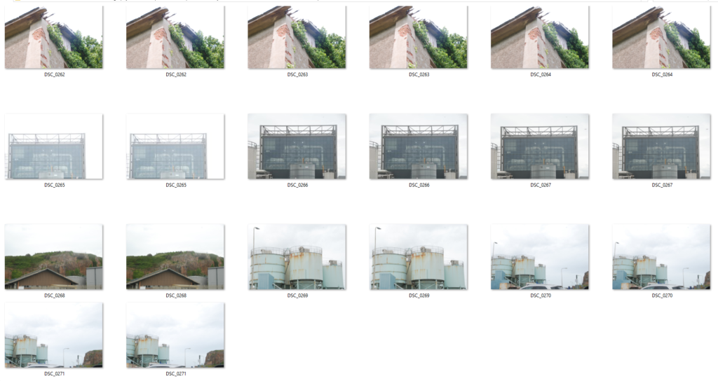
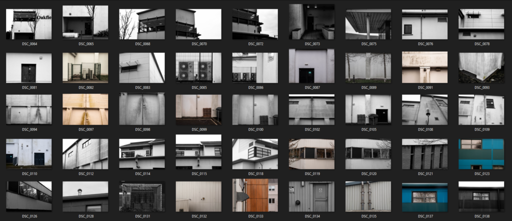
Contact sheets display a series of thumbnails from a photoshoot, these were mainly used when film photography was more popular. they are an easy way to visualise all photos at once and allows you to select your more interesting photos simply.

Thomas Lang:

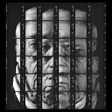
“Gesalt” – Thomas Lang (2018)

Thomas Lang is a portrait photographer who was born in Paris, France. His set of photographs from his series “Gesalt” was produced in 2018 as a form of displaying his portrait photography in an abstract form. He fractures the face of his model into a mosaic-like puzzle. Here, he uses contact sheets as a way of displaying a whole photograph in sections.

My example of a contact sheet:

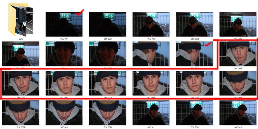
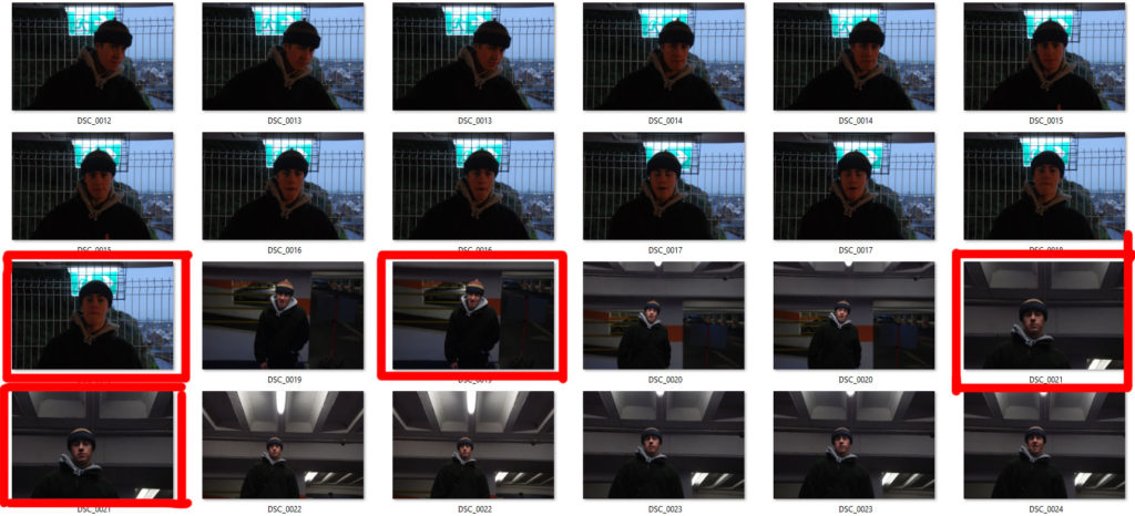
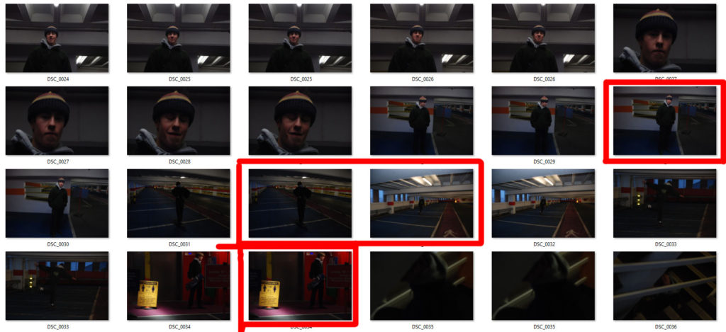
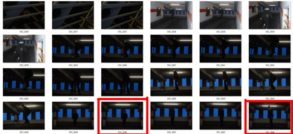
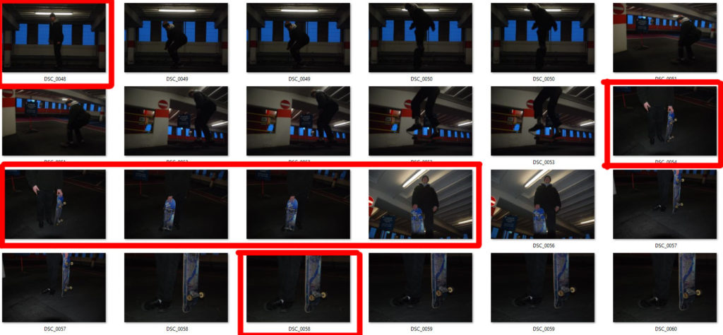
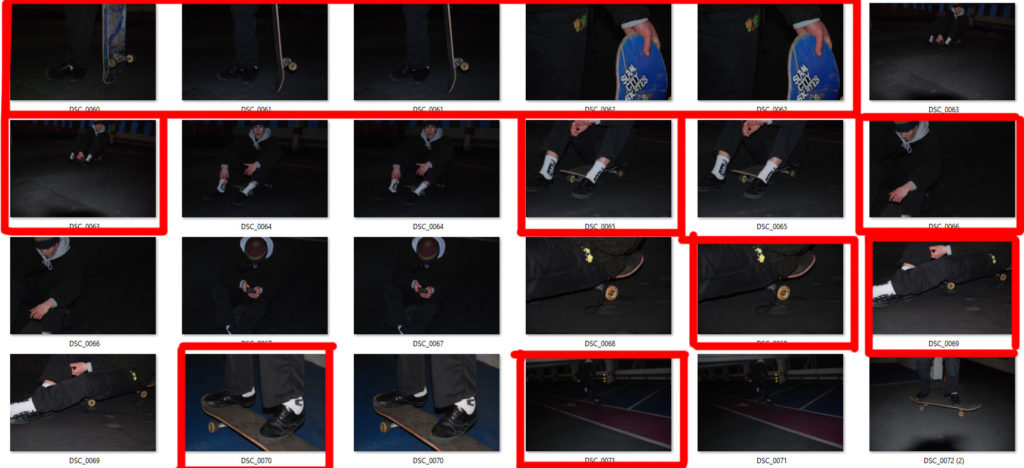
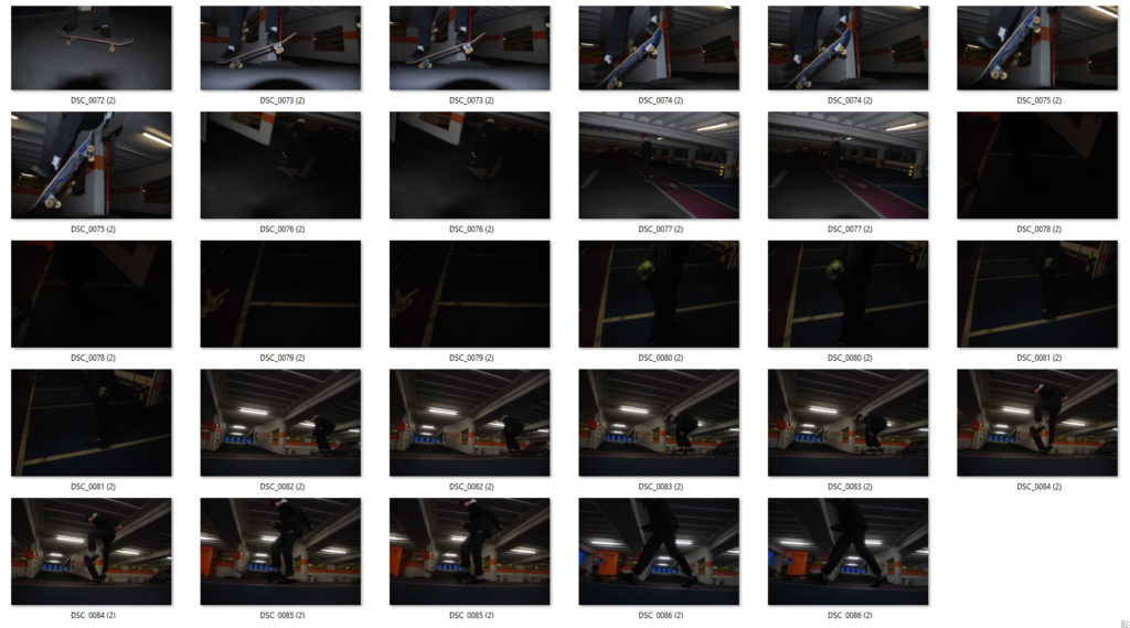
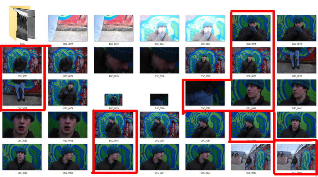
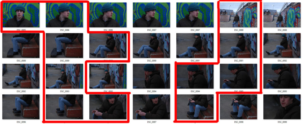
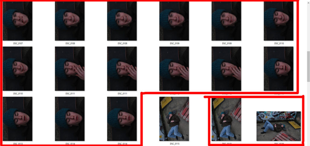
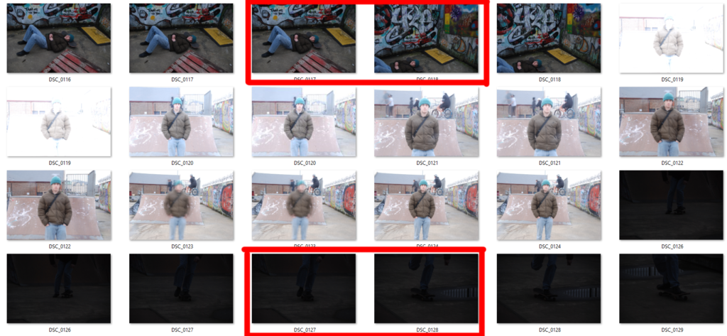
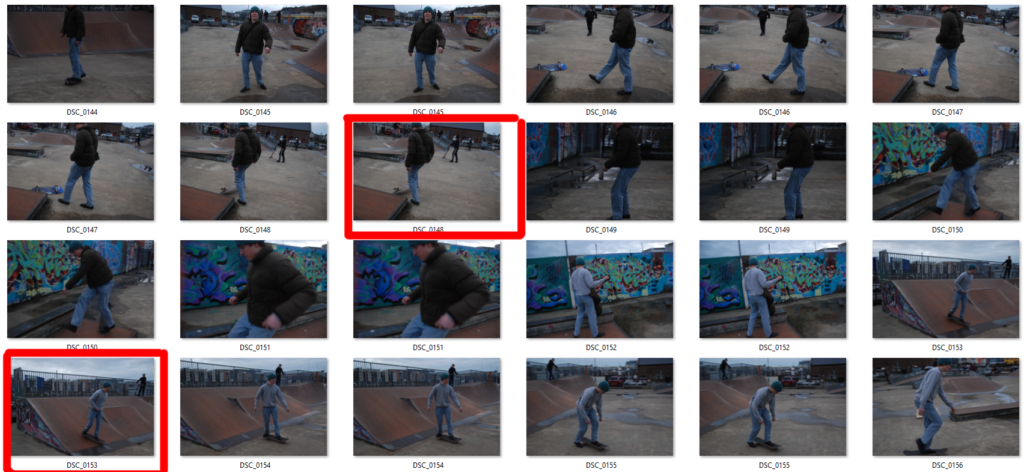
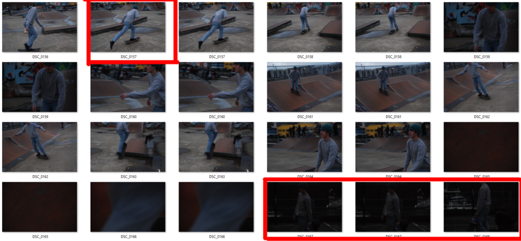
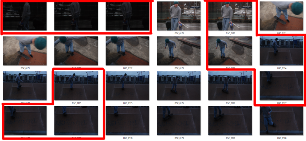
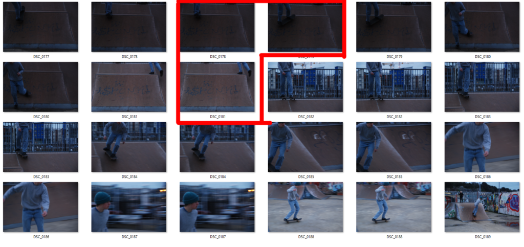
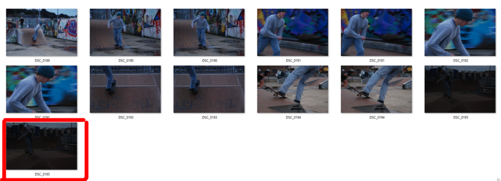
This is an example of a contact sheet from my project of creating a response to “The Formal Elements”. Here I have used the shape tool in photoshop to highlight my most successful and least successful images from the photoshoot.

This way of using contact sheets easily allows me to view a multitude of photos at once and pick out the photos that instantly grab my attention over others. I can them highlight them for future reference to show why I liked them, and why I thought they were more successful.

The World Is Beautiful

Albert Renger-Patzsch

Albert Renger-Patszch (1897-1966) was a German photographer associated with The New Objectivity. In the early 1920’s he worked as a press photographer for the Chicago Tribune before becoming a freelancer. Patzsch published his first book entitled The Choir Stalls Of Cappenberg in 1925, and has his first museum exhibition in 1927.
In 1928, Patzsch published his second, best known, book The World Is Beautiful- which is a collection of one hundred of his photographs in which natural forms, industrial subjects and mass-produced objects are presented with the clarity of scientific illustrations. These types of subjects are what Patzsch thrived to photograph.

The New Objectivity was a movement in German art that arose during the 1920s as a reaction against expressionism. Patzsch’s work fits with this movement because he believed that the value of photography was in its ability to reproduce the texture of reality, and to represent the essence of an object. He wrote that the secret of a good photograph is it’s realism, he wanted people to ‘leave art to the artists’ and ‘endeavour to create photographs which will last because of their photographic qualities.’ Artists such as Max Beckmann, Christian Schad and Otto Dix were also part of The New Objectivity movement.

Patzsch Photo Gallery

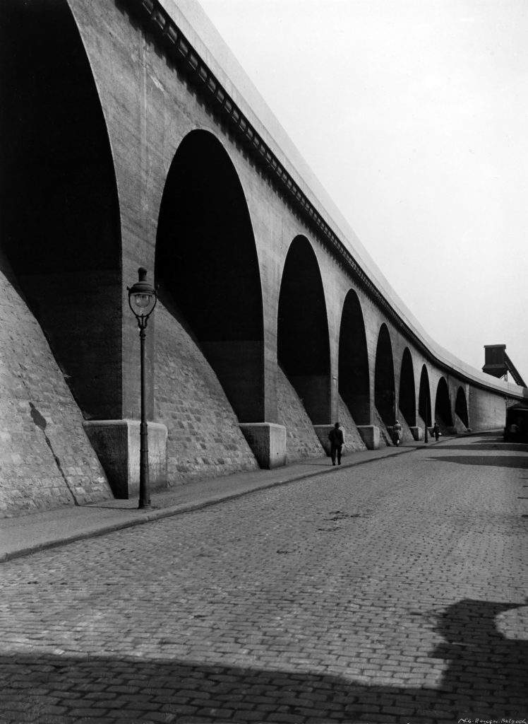
Patzsch’s photographs are monochrome, using very harsh dark and light tones, with high contrast and low exposure. He uses lots of repetition in his images with industrial buildings and nature, showing elements of the world in their natural forms. Patzsch also takes his photos from many abstract positions, some extremely close to the subject, some from below, he uses a wide range of camera angles and zoom. Many of his photos have a rough spiked texture due to the business of his images and the detailed subjects in them.

Patzsch Photo Comparison

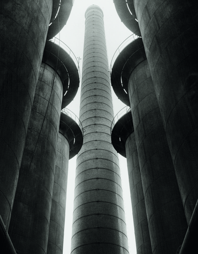
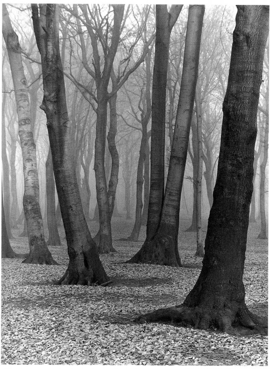
These two images are from Albert Renger-Patzsch’s collection ‘The World Is Beautiful.’ In the first image we can see a gloomy forest filled with tall trees, a representation of nature. However in the second image the subjects are imposing industrial towers, clearly man-made. Also, both images are edited with a monochrome, unsaturated filter- a staple of Patzsch’s photography. One similarity we can see in these images is the repetition of cylindrical objects. In the first image, the trees in the forest are unique with twisted branches and of different shapes and sizes. Contrastingly, the towers in the second image are repeated, however in a uniformed manor with identical structures and shapes. Additionally, the towers look almost like tree trunks themselves, linking to The New Objectivity and the idea that nature is being ruined and replaced by man-made industrial buildings and objects. Moreover, the subjects in both images are not fully in shot, as the frame cuts off the tops of the trees and towers, which connotes the idea that man cannot fully see the damage they have done to the world, they are oblivious.

Nevertheless, there are also many differences between these two Patzsch images. For example, the photos are taken from very opposite camera angles, the first from an eye-level medium shot and the second from a low angle medium shot. The first image’s angle shows nature surrounded by more and more nature, suggesting the power of the environment is fundamentally superior to mankind. However, the angle of the second image paints the industrial towers as intimidating, looking down on everything below them, implying man is always watching. Furthermore, we can see a significant difference in the depth of field in the images. The first clearly has more depth, as we can see trees going far back disappearing into the mist. The second has certainly got depth, however the focal point of the middle tower draws the observers attention, so not much else can be seen in the background. Additionally, the images have contrasting lighting, with the first having much more muted highlights and the second having very bright over-exposed highlights in the background. Patzsch could have purposefully done this to symbolise how nature is being forgotten and ‘muted’ in our minds, whereas industrial buildings and man-made factories thrive while destroying our environment.

My Response – Contact Sheets

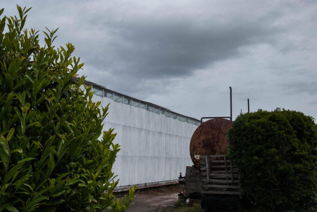
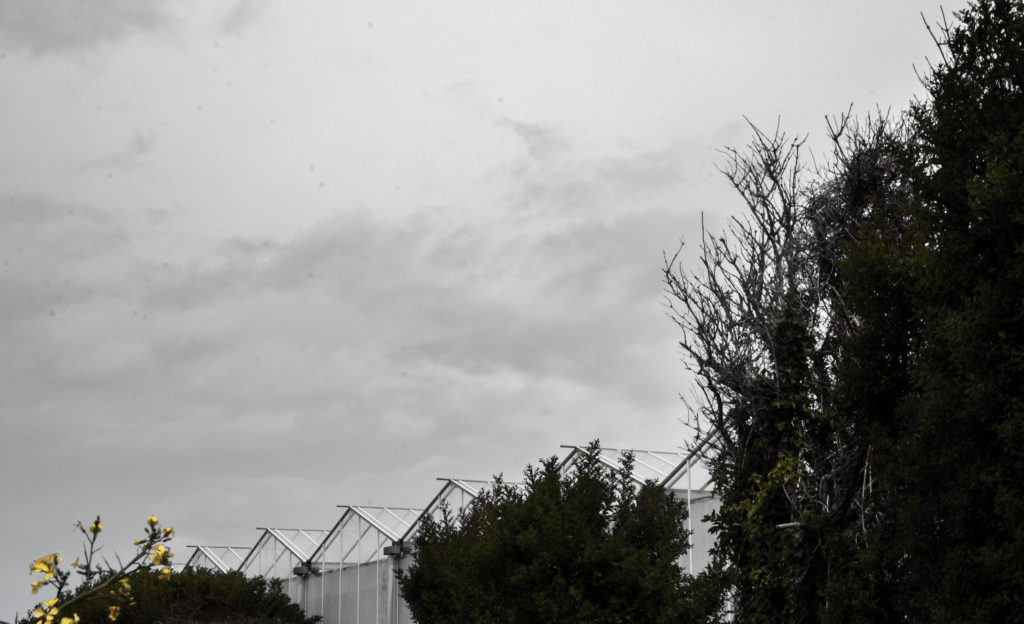
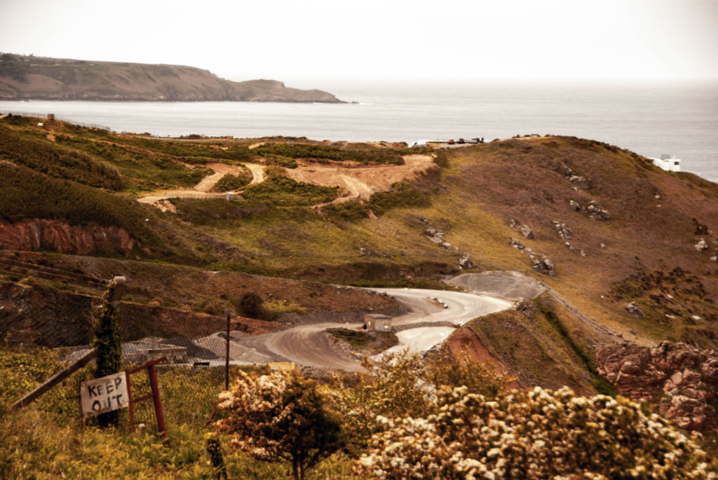
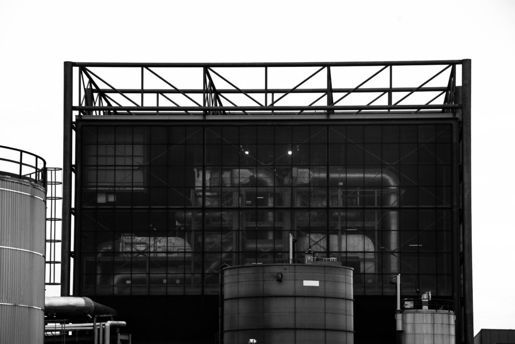
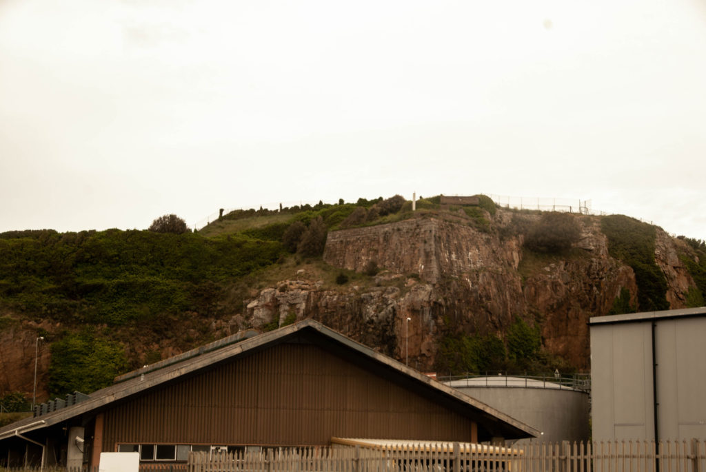
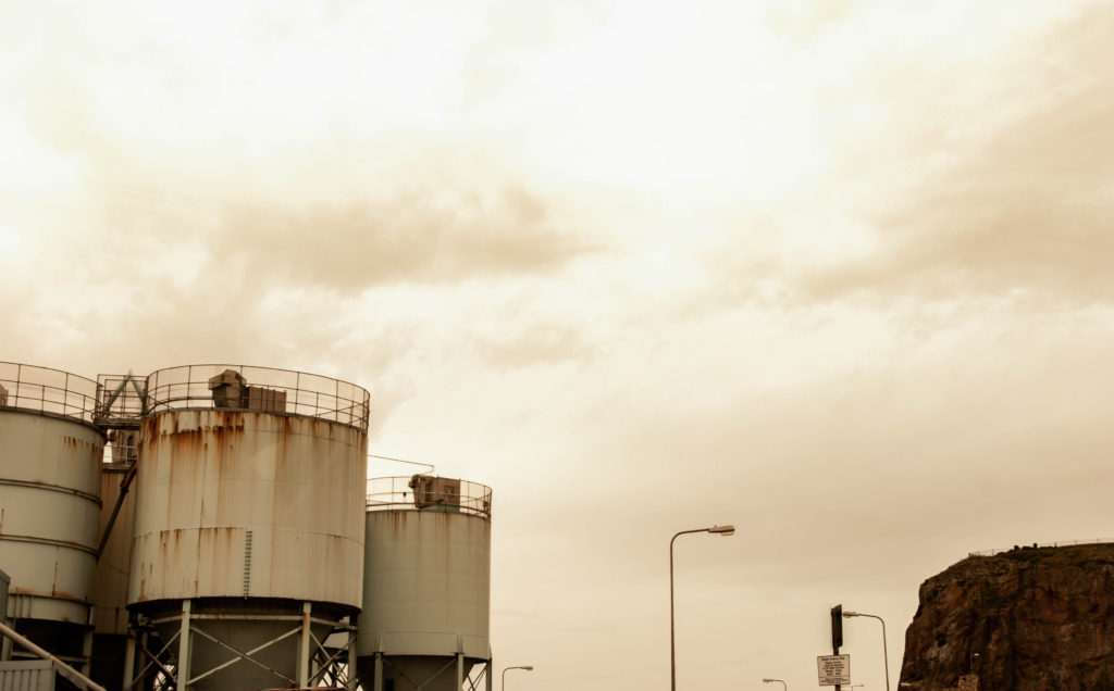
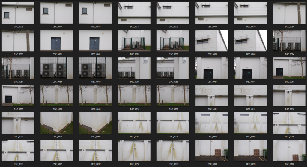
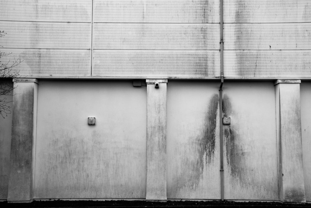
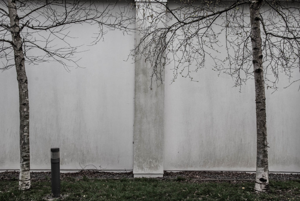
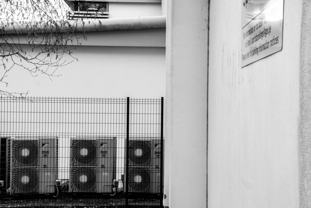
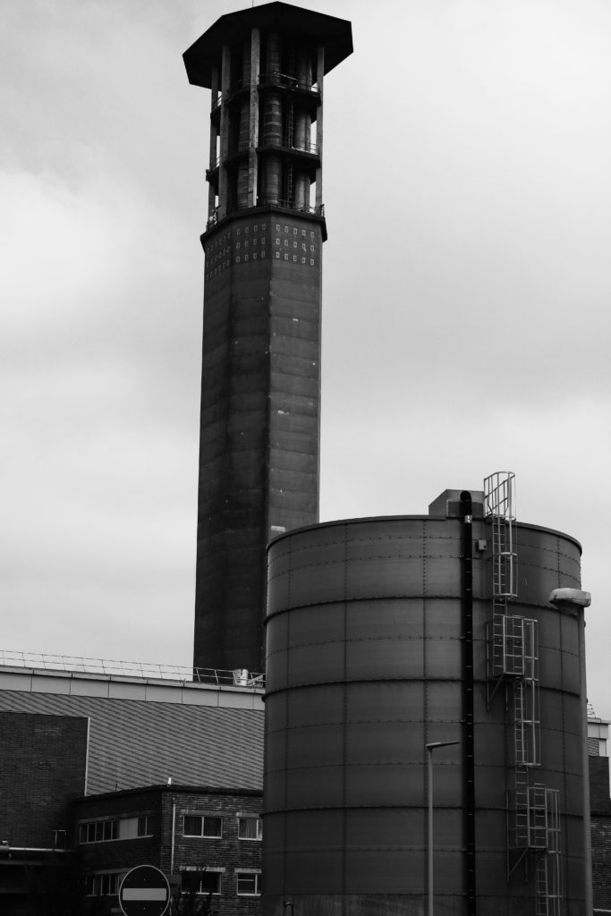
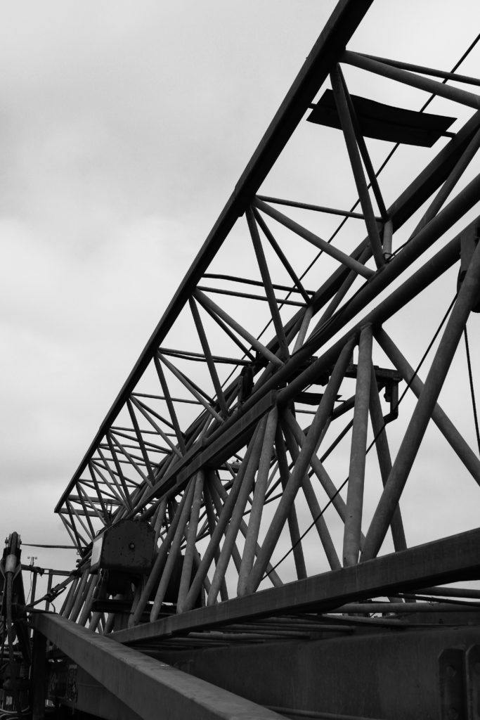
In this first shoot, I photographed industrial buildings around the island that I believed best linked to Patzsch’s work. I focused on capturing man-made buildings and objects, looking at the range of tone and texture created by metal and stone. I also looked for repetition of buildings, windows and fences to add more rhythm to my images as Patzsch does.

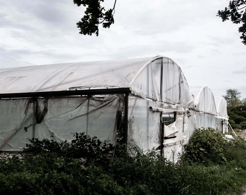
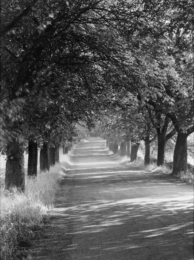
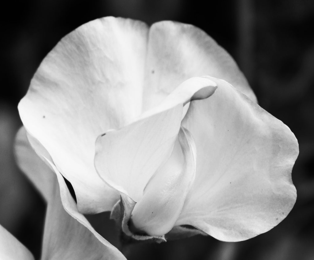
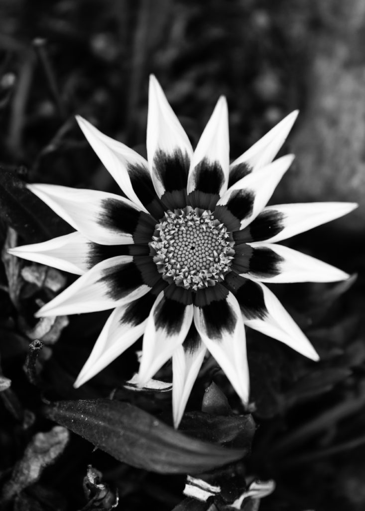
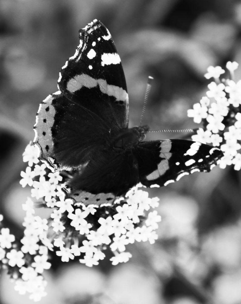
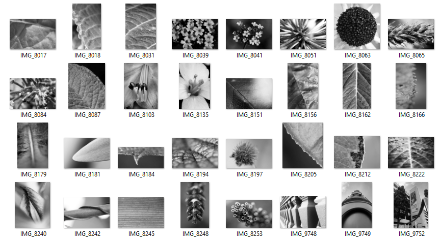
In my second shoot, I captured elements of nature to link to Patzsch’s photography of the environment. I focused on photographing abstract flowers with rough and soft textures, tall trees with twisted branches and insects that symbolise the beauty of nature.

Final Edited Photos

Final Images

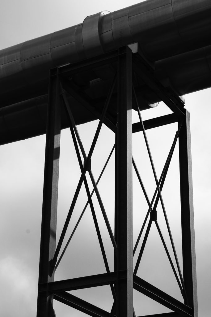
I have chosen these three images as my final evaluation because I believe the nature photos compliment each other well, while contrasting strongly with the industrial. Firstly, I love the high contrast of all these images and the sharp central focal point they all hold. I like the way both of the flower images have a circular shape, I believe the rounded perimeter’s of the subjects help to draw the observer’s attention and focus to the centre of the image. I also believe this contrasts with the second image as it contains more straight lines and geometrical shapes- clearly man made. Next, I really enjoy the repetition of the petals and flowers in image 1 and 3, I think it links well to Patzsch’s work on The New Objectivity. Additionally, I think the natural photos compliment the industrial as both have harsh dark tones and bright highlights. However, in the background of the first and last image, there are dark tones and shadows which enhance the white highlights of the flowers, painting them as clean and pure. Yet, in the industrial image, the bright highlights are in the background creating a dark silhouette of the structure. I chose to photograph this building in such a way to reflect Patzsch’s intimidating industrial images and to contrast with the purity of the environment. The camera angle of this image is also from below the subject which alludes to the idea of man looking down on society.
Contact Sheets

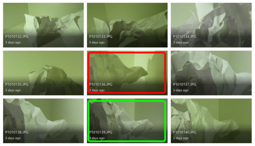
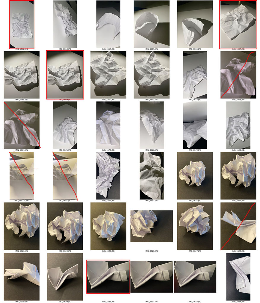
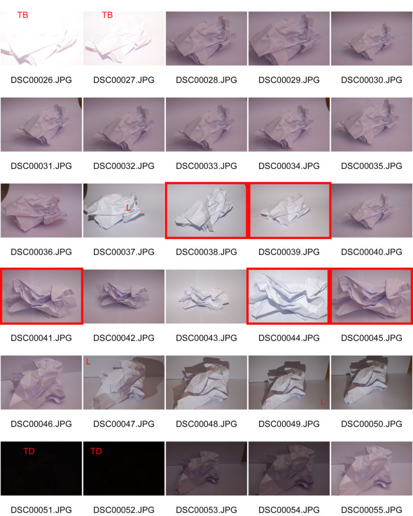
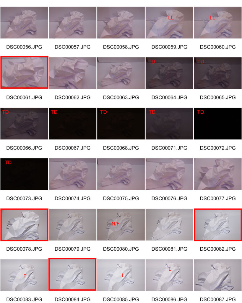
A contact sheet is a piece of photographic paper on to which several or all of the negatives on a film have been contact-printed. It could also be used for photographers to analyse which pictures they think are best from a photo shoot in order to select from moreover, it could be used to show off a to a person what the outcome of a shoot ones and which pictures are most presentable.
As shown from my photo shoot, I have highlighted with a red square around a picture which ones are most suitable and better presented from the photo shoot of the elements of paper. Also, the pictures in which i have crossed out are the ones that aren’t presentable enough due to either lighting, focus and the angle.

Contact Sheets

Contact sheets date back to when you took images on film. Now they aren’t used a digital cameras have a SD card in them.

A contact sheet is all the developed negative images laid out onto photographic paper. They aren’t full size, instead they are used to give the photographer an idea on how the images look.

Contact sheets are helpful as they allow the photographer to see all the images, select the best quality images and then develop the images they want without wasting resources.

William Klein

William Klein is a photographer who was born on April 19th 1928. He was born in New York, however during WW2 he was stationed in Germany and later France, where he would later settle after being discharged in 1945.

He sometimes used his contact sheets to tell a story. However he mainly used them like others, to decide which images he wanted to use.
William Klein

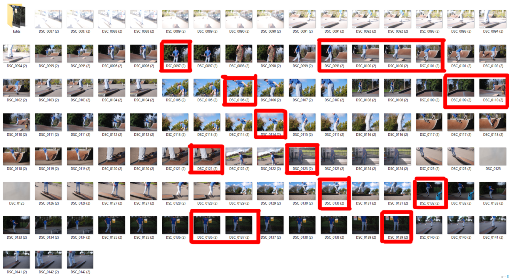
My Own contact sheet

Contact Sheet

What are contact sheets?
– Contact sheets are a tool that dates back to the days of shooting on film, showing the whole roll of film on one sheet of photographic paper, to help the photographer select which images to print.
– They are now outdated as most photographers use digital camera.

Why are they important?
– You can quickly scan a series of images to find the good photos or the ones chosen to be enlarged. instead of wasting materials one bad ones

Contact sheet

What are contact sheets?

Contact sheets are a way for photographers to show proof of their work to clients. They consist of a sheet showing individual photographs with name or numbers of the image. They do this so it is easier to identify which photographs the client wants to produce.


Why are they important?

  • They help the photographer analyse and select the best photographs from his shootings and why.
  • Help the client select which images they want to be produced and edited.
  • Help the photographer reach a wider audience by showing their work to potential clients.