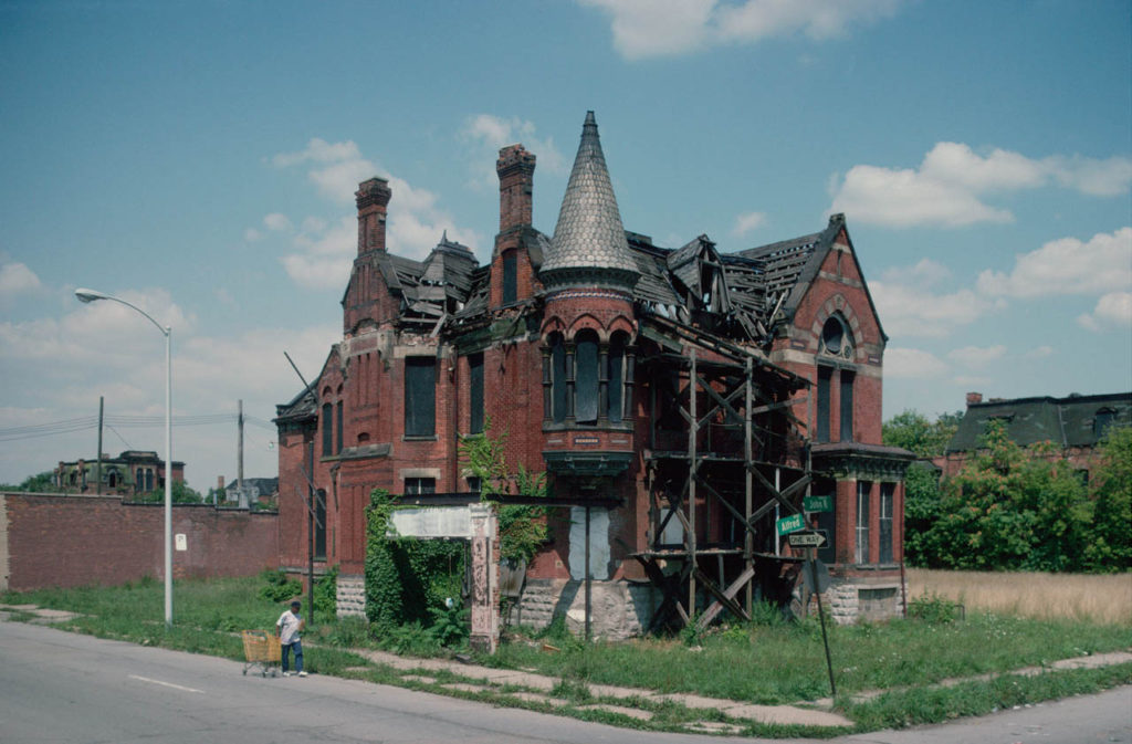
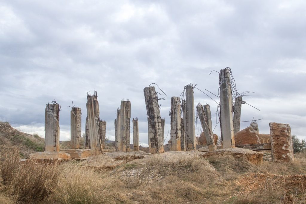
Both images feature a reaction to the Anthropocene. They do this by capturing the essence of mans reckless footprint on the natural environment and man’s greed and carelessness of having to constantly industrialise and destroy the natural environment and then move on swiftly without care. This is seen in these images where the focal point is placed on the derelict structures by framing them in the centre of the composition in a symmetrical fashion.
Both images have similar structural features, they both contain many vertical leading lines created by the structures and the neutral perspective at which they are shot. Both images also contain a deep depth of field with the structures in the foreground and the clouds and various other elements stretching far into the background.
These images differ in their colour schemes as Camilo’s image features a more saturated look with a wider tonal range which creates a deep contrast in the image. The image also contains a wider range of colours whereas George’s image contains a monotone, warmer colour scheme with shallow range of colours. Georges image is also flatter in terms of contrast, it has a narrower tonal range.
“Engulfed” from “Plastic Currents” series – Naomi White (2012)
In terms of similarities, Naomi White and Darian Mederos’ work both focus on the use of plastic in order to create a sense of mystery and abstraction. In both these images in particular the tones of both images are rather muted and subdued. The work by White and Mederos provide the theme of Anthropocene as they use man made, polluting materials to create their work by showing them in an artistic light.
On the other hand, the work by both artists are different in the sense that Darian Mederos’ work focuses more on portrait-based work when compared to Naomi White’s abstract-focused work. Also, Mederos’ work is a painting whereas White’s work is an edited photograph. The tones in White’s image are much warmer in comparison to Mederos’ work that provides a lot of cooler tones.
Despite both works having differences that contradict each other, I think they represent Anthropocene in a similar way, as they create ambiguity through the use of artificial materials.
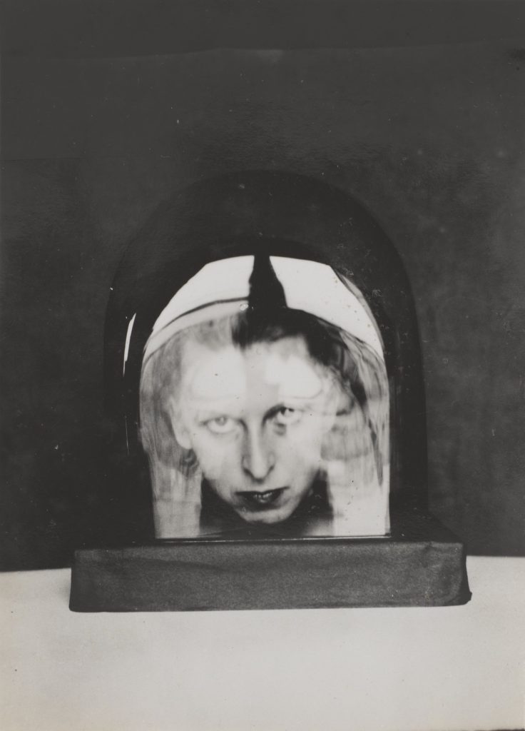
The two images above form Claude Cahun and Carole Benitah both explore identity. This is because in the pictures Their appears to be a lack of identity due to the simplicity of both pictures. In Claude’s picture you can only see her head in some sort of object that appears to be made of either plastic or glass as there are reflections coming off this making it difficult to fully see Claude’s face. Moreover, you can only see her head in the picture as well which gives this a lack of identity as you can’t really see much of the person in the picture.
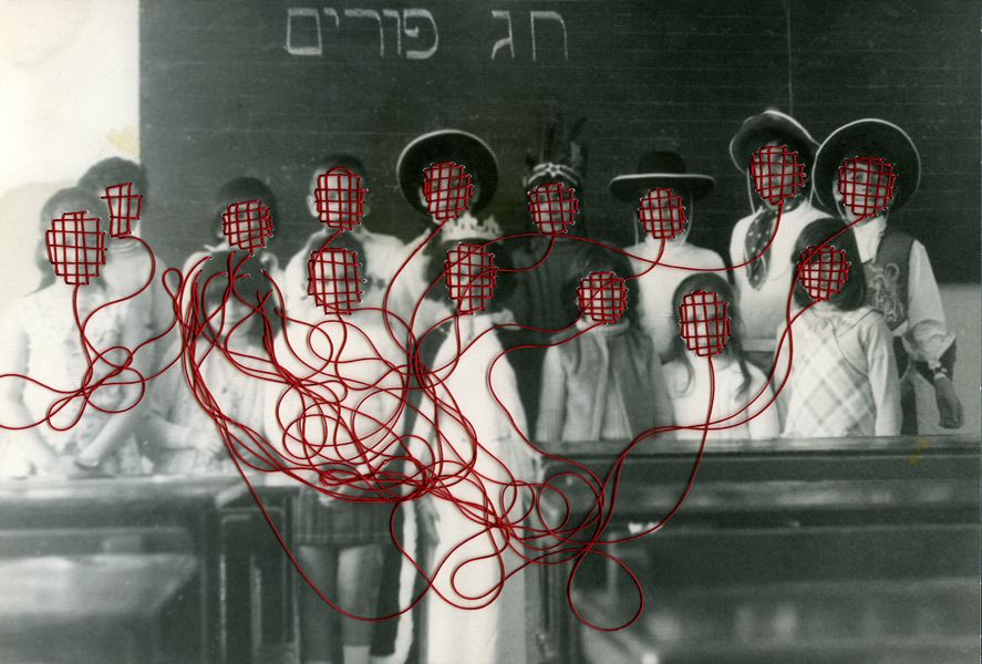
As for Carole’s picture, the faces in the picture are covered in what appears to be red stitching on every face with the strings coming off them tangled up. This shows a lack of identity just like Claude’s picture even though they aren’t to similar because due to the faces being covered up you don’t really have a see for what the emotions on the people’s faces are meaning you couldn’t really imagine what their expressing if they are. Either happy or miserable.
Looking at both of the images, the pictures look similar in the format of how they were taken. They both appear to have a fairly fast shutter speed of 1/125 as there isn’t much movement that is blurred in the images. Another comparison in hoe the pictures where taken, they both appear to of have an aperture of f16 in both pictures as the background and the main appeal of the pictures are both clear visually. As for the ISO, it appears to have a low sensitivity of 200 because you can see some sort of speckles in the pictures but I think this is due to the when the pictures where taken as cameras weren’t as good as they are now.