

My work is similar to the work of Darian Mederos in the sense that bubble wrap is used to create a sense of enigma, as the face is not fully revealed or has a slight blur. Cooler tones with muted colours can also be seen within both images as well as the use of slightly harsher shadows and highlights. There is also a sense of depth of field in both photos as particular sections of the image are in focus. For example in Mederos’ work, the bubble wrap is in focus which blurs out the entire face, whereas in my work the holes in the bubble wrap allows for areas of the face to be in focus.
However there is also prominent differences between the photographs, such as my photo being a close up images rather than a full portrait. Furthermore, the bubble wrap in my work has been ripped, so sections of the face can be seen in focus, in contrast to Mederos’ work in which the whole face is blurred. An obvious difference between my work and the artists work is that Darian Mederos’ work is a painting, however I am using his work for inspiration rather than to recreate exactly.
Overall, I believe I successfully created my own work with the influnce of Darian Mederos as my inspiration for the theme of Anthropocene. I thought Mederos’ work represents Anthropocene in a unique and subtle way although it can carry a deeper meaning.
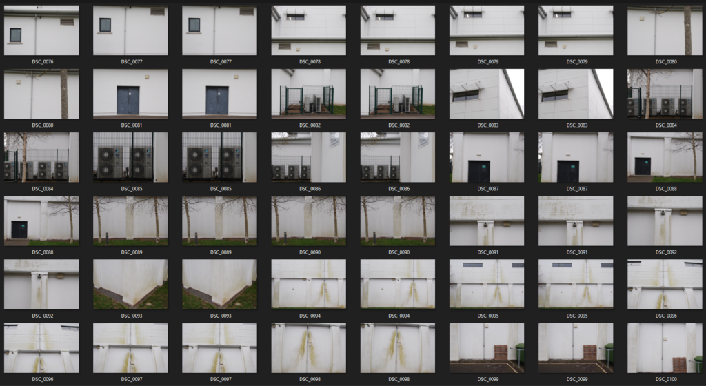
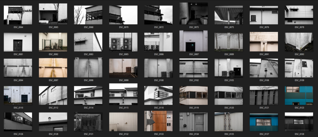
Contact Sheets


Final Edits






Artist Comparison


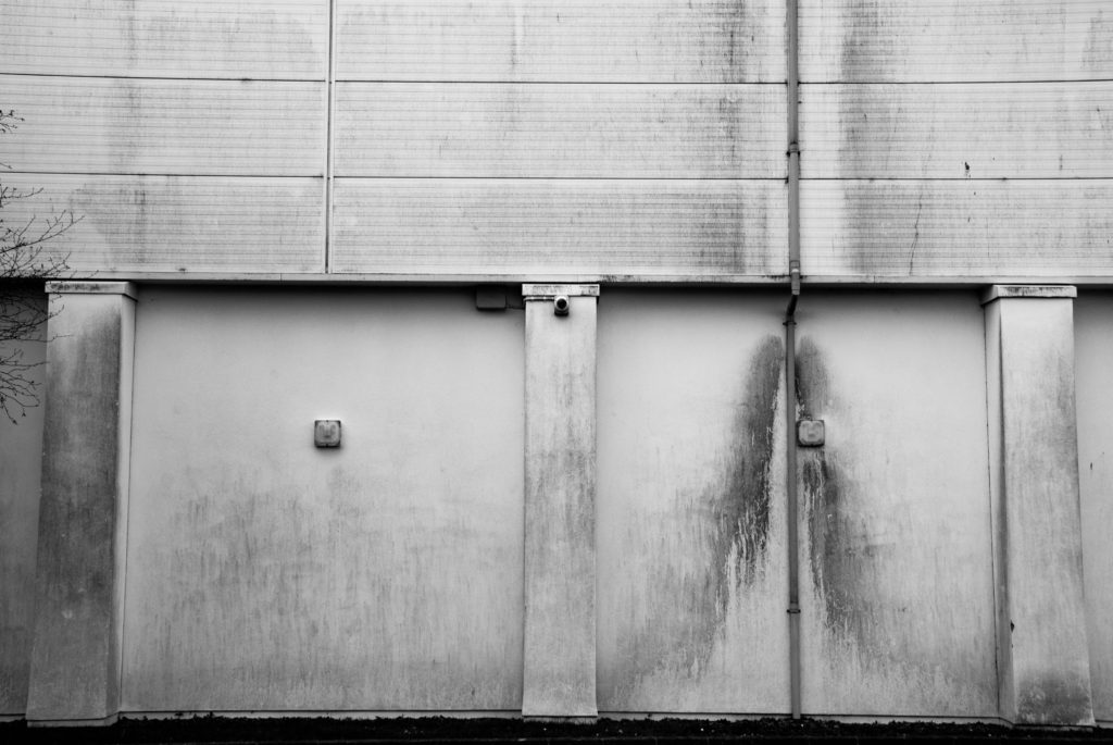
The above image – CORONA DEL MAR, was taken by Lewis Baltz in 1973. The below is my image taken at Oakfield Sports center.


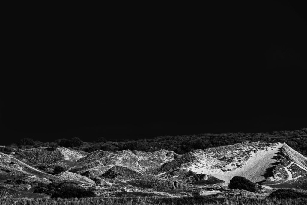
Above are two rural landscape images. The image on the left was shot by American photographer Ansell Adams and the right by myself.
Both images feature a low key, greyscale profile. The use of an ND filter and specific film allowed Adams to create an image with dominant dark tones whilst still allowing for the counteractive sharp highlights to come through in the image. I recreated this by shooting with a large aperture to include as much data in the image as possible and then altering the saturation and temperature of the image in post production. These methods allow for both images to feature a highly romanticized landscape. For example the dramatic moon in the center of a dark, almost fully black sky tucked behind a whisping blanket of clouds which are being pierced by a gathering of sharp snowy mountains is a typical depiction of an exaggerated, sublime landscape.
Both images feature a large tonal range from the dark sky’s and foliage to the white mountains and sand dunes.
Both images have similar form with the empty sky taking up two thirds of the image with the bottom of the image being filled.
They both contain a strong leading line horizontally through the image


Conceptually, both these images represent the idea of death and moving on. The images both feature dark, mournful tones. Adams image features a graveyard symbolizing death and my image contains a sublime landscape which was once flourishing but is now more baron symbolizing life and death. The images both feature bold horizons which alludes to the idea of “new horizons” and moving on from death.
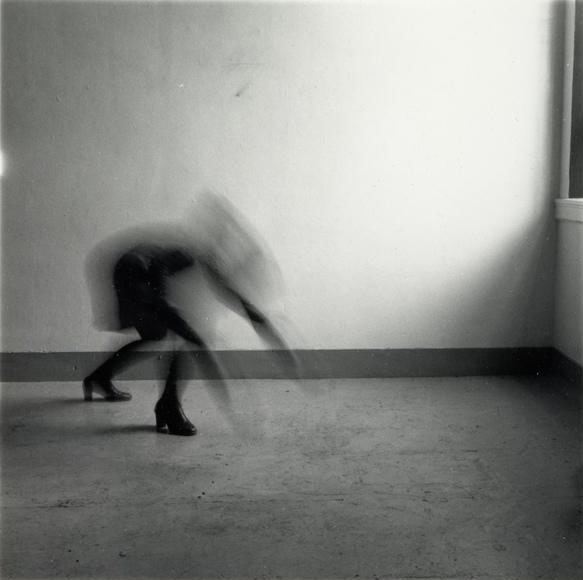
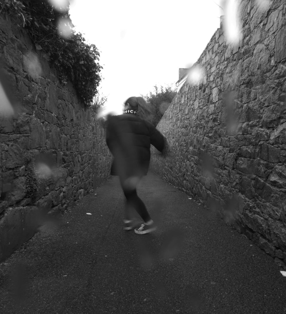
I believe my work is similar to the work of Francesca Woodman but they also have their differences. They are similar in the sense that they both use the method of long exposure to capture the movement of the model in the photo in an almost ghost-like way. They both also have a monochromatic theme, which adds to the ominous atmosphere, as well as the dark coloured clothing which features in my work and the work of woodman.
However, they are different in the sense that the natural lighting used by woodman is slightly softer than the one in my photo. The setting of Francesca Woodman’s photograph is also filled with empty, negative space whereas my image contains a lot of filled, positive space. The overall composition of Woodman’s images are a lot more simple than my own, as she takes her photographs in an empty room which I did not have access to within the time limit of the project.

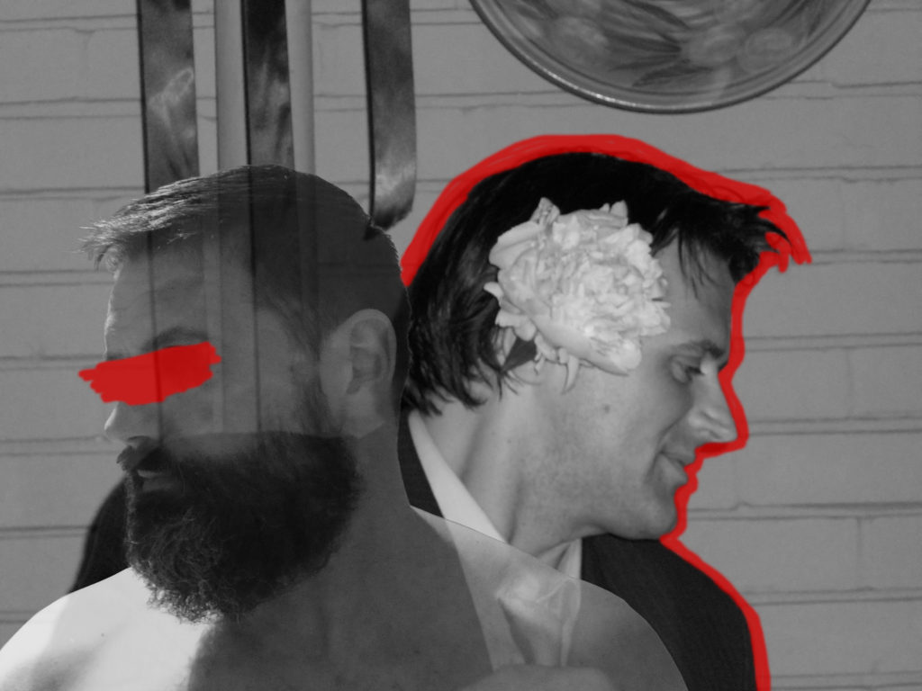
My recreation of Carolle Benitah’s work has both similarities and differences to Benitah’s images, for example they are similar in the sense that the images are brought to life with thin lines of colour, which juxtaposes against the monochrome background. I chose to add colour through the paintbrush tool on photoshop, whereas Benitah uses the traditional method of embroidery.
I used old family photos in my final photographs, which Benitah also uses in her work. I chose to combine my own photography into my work so I took simple portrait headshots of my mum, dad, and myself.
The main difference between my work and the work of Carolle Benitah is that I digitally edited my photographs, and Benitah edits her images physically.
If I was to do this project again I would have attempted Benitah’s method of embroidery to add colour to my photographs, as I feel like digitally editing colour onto the images removes a sense of rawness from the images, and I think the contrast in textures and patterns would have created more interest to the viewer.


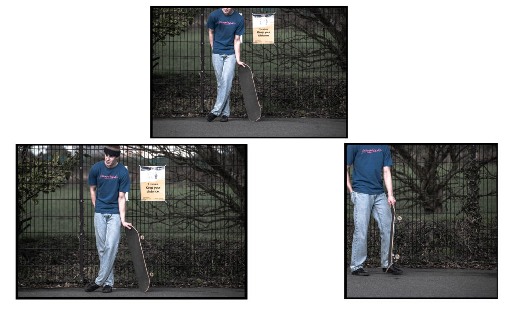

The above are my final displays I decided on.
I grouped some similar images into diptychs and triptychs according to colour scheme, physical similarities. I also used similar bordering and presentation methods that J Grant Brittain uses.
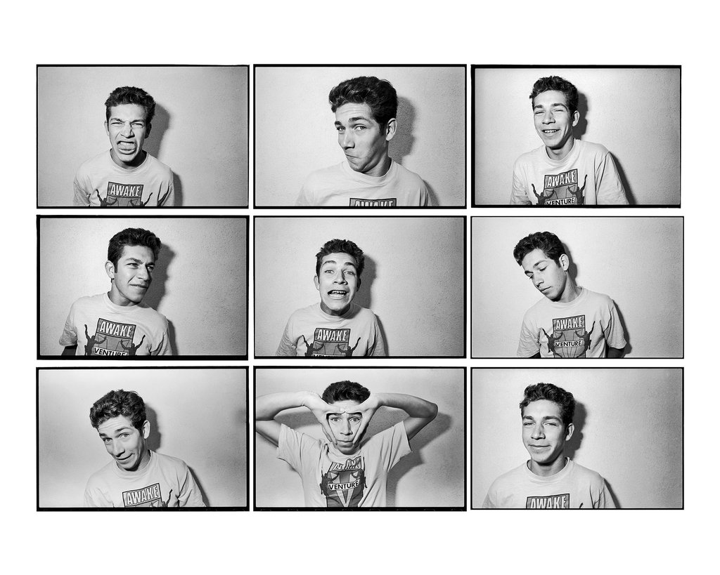
The following is an image comparison between one of my pieces and one of J Grant Brittain’s pieces.


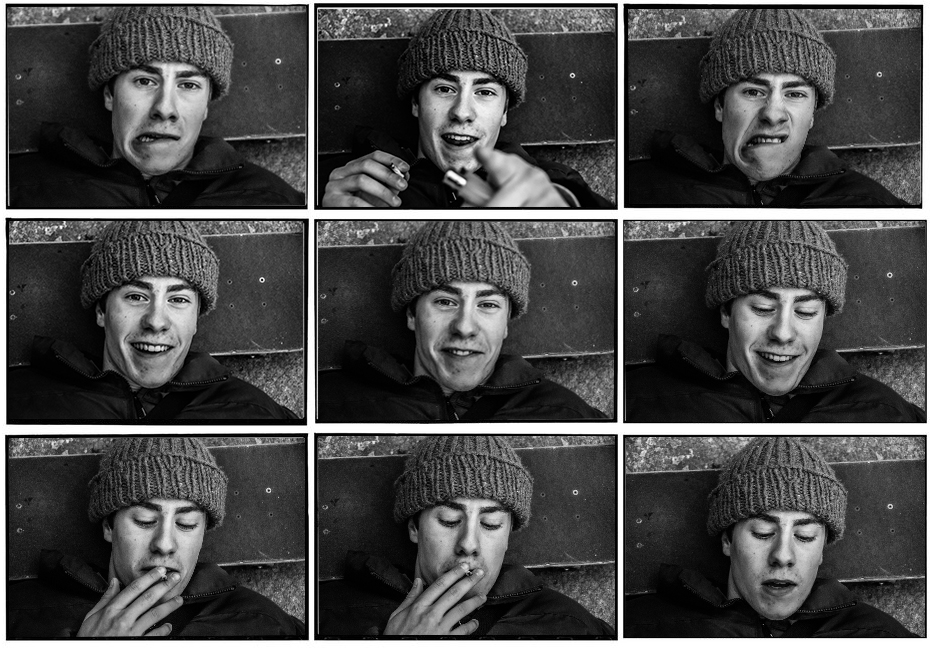
The above images both focus on the identity of the subject by portraying their personality through capturing their facial expressions. Both images are desaturated and have high contrast to accentuate shadows around the face and therefore accentuating the facial features of the subjects. Both images are collaged into sets of 9 coinciding images. Both images feature a mixture of compositions where the subject interacts with the lens and some where the subject ignores the camera.
Grants image is shot with fluorescent lighting in a professional environment whereas my composition is shot with natural lighting in a less professional environment. This also creates difference in the texture of the images, mine has a rougher texture whereas Grants image has a smoother texture to it.

For the above composition I shot the skateboarder in front of an urban graffiti background in a skatepark, I focused on showcasing his culture and style like J Grant Brittain. The gaze and side angle shot creates a sense of confidence, control and passion the skateboarder portrays to his environment.
I shot the image in black and white and used high contrast and clarity to accentuate the features of the subject for example the area around his eye feature high contrast and clarity which captures that emotion in his eyes. The high clarity and contrast also gives the image a sharp and rough texture.
I used a wide aperture to obtain a sharp focus on the subjects face and separate him from the background and create a slight bokeh effect. I used the grid on my camera to frame my subjects head in the centre of the shot.
In conclusion I believe I captured the identity through his cultural passion for skateboarding well with stylistic, J Grant Brittain type images and presented them in an artistic way.
J Grant Brittain is a 65 year old photographer who has shot the skateboarding scene for over 3 decades.
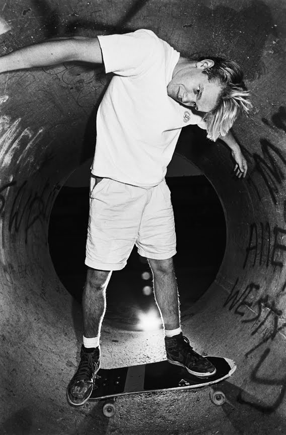
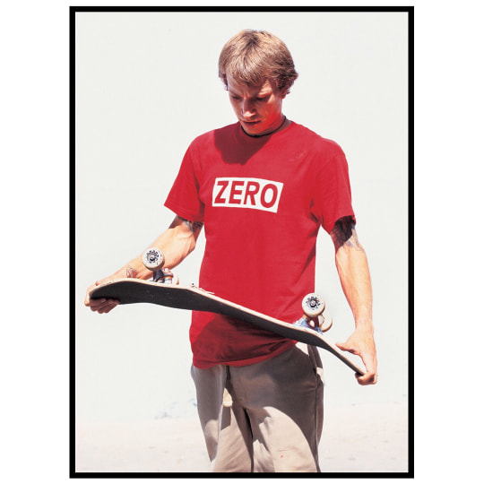
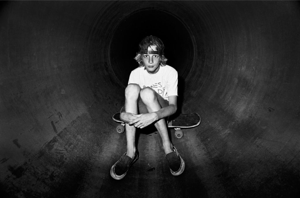
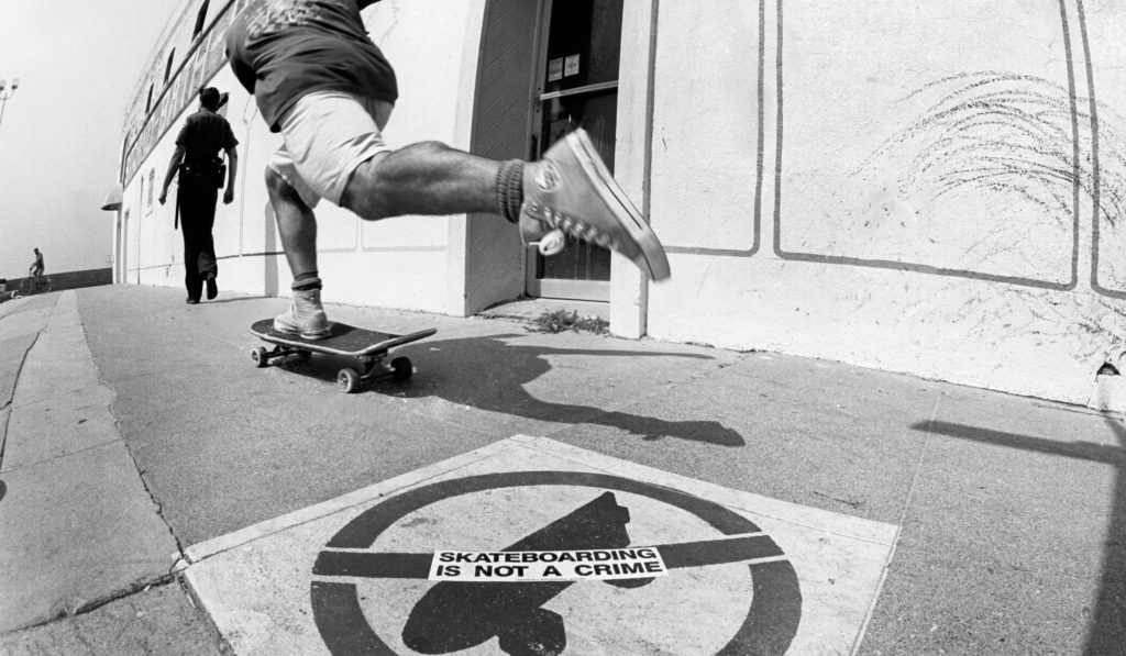
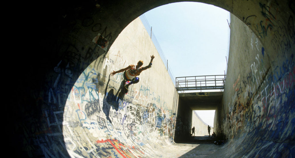
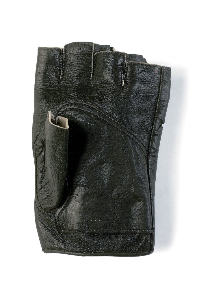

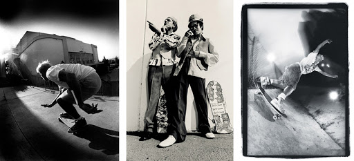
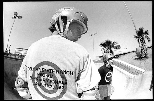
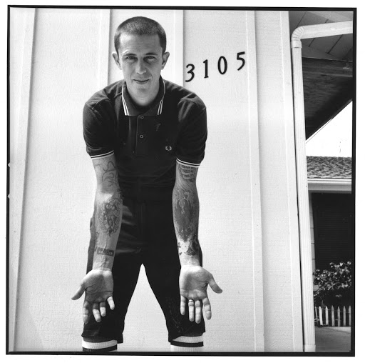
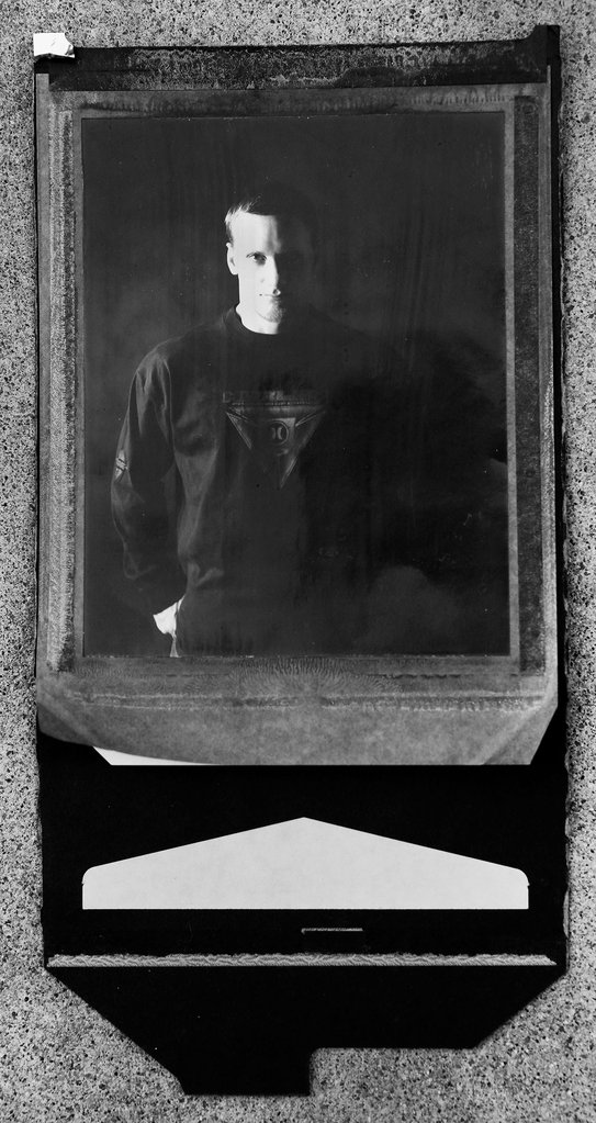
The reason I have chosen to reference his work when completing my project on identity is because he has grown with the culture of skateboarding and he understands how to capture its essence very well. I am also fond of the way he doesn’t limit his work to the conventional action-shot fashion. He broadens his work into a deeper sense to capture the identity of the skaters and their emotions towards the culture of skateboarding. For example the following image captures the identity of the person as it exhibits the subjects emotion and tells a story about the person.

In the above image Grant uses high contrast to deepen the shadows around the subjects face to relay more emotion and definition. This is a way he included themes of identity in his work. The subjects identity is also explored by giving the image context and showcasing the subjects interests and culture he does this by composing the image with the subject holding a broken skateboard. Grant also does a good job of isolating the subject by photographing him with an contrasting background which gives the image a pleasing visual form.
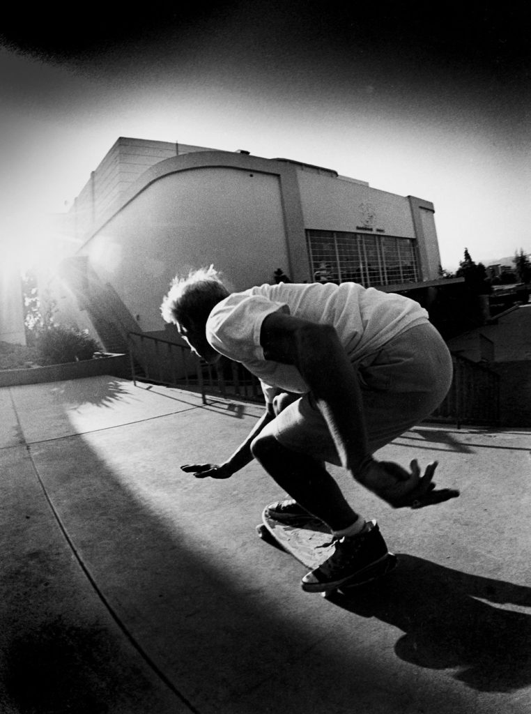
Additionally, when Grant shoots the action shots he doesn’t just focus on showcasing the manoeuvre of the skateboarder but rather their style and environment which many skaters will tell you is far more admirable and important than the tricks you are doing. A skateboarders style and creativity is a what makes up their identity. This creative identity formation is a huge part of the culture of skateboarding and this is one thing that 3 decades of Grants work has made clear.
J Grant Brittain; Claude Cahun Comparison
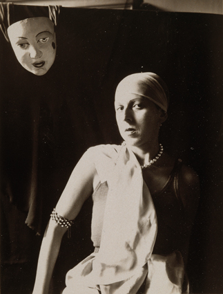

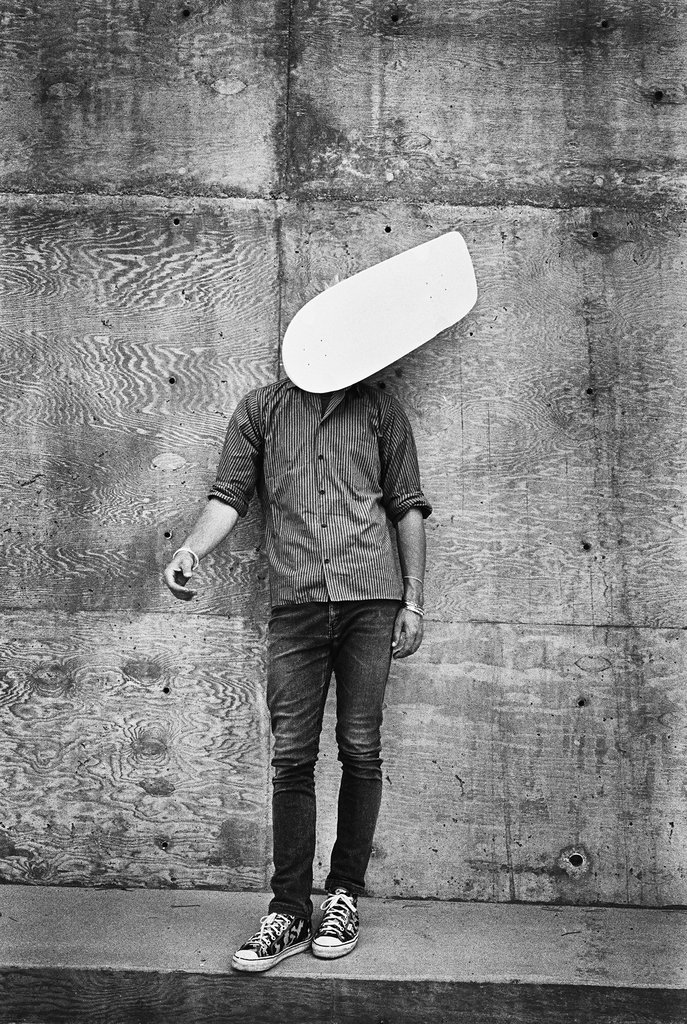
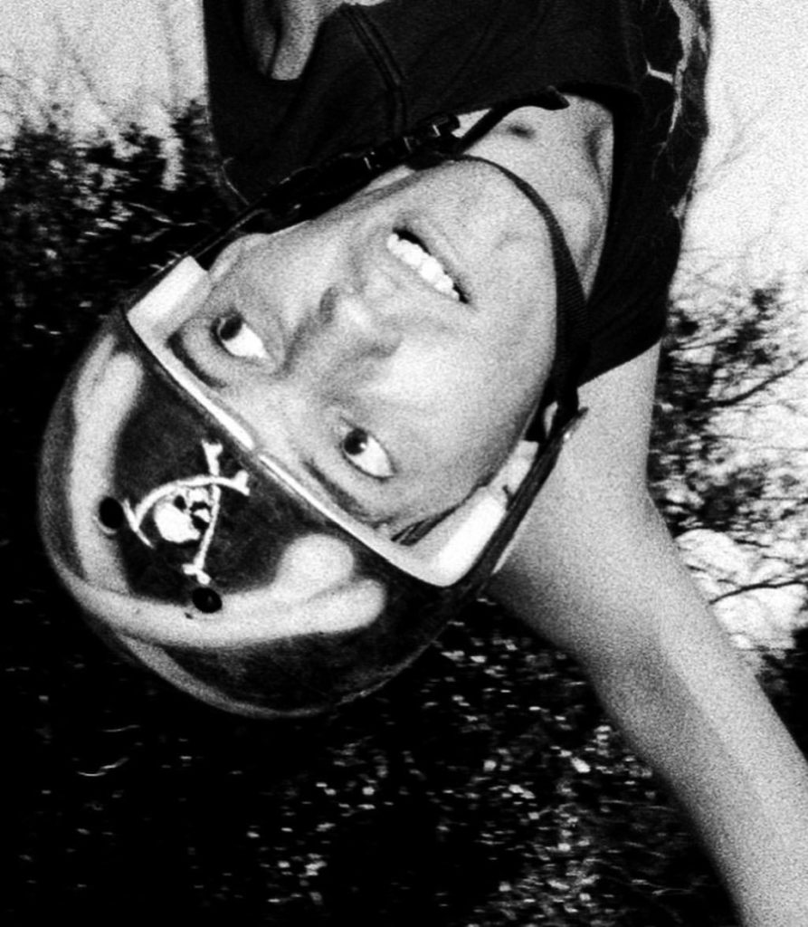
These two images by Claude Cahun and J Grant Brittain both suggest the exploration of Identity. Both images focus on a person and their facial expression and emotion. The compositions both tell a story that we can see behind the eyes of the subjects. The subjects are both photographed with their style being flaunted, the self portrait of Claude her upper body is positions in a confident, striking manner and her chic jewellery and clothing is also seen, the skater in the other composition has a chaotic yet focused style to him with his his creativity shown through his customised helmet which is a visual centre-piece of the composition.
The way the two artists question the theme of identity differs. Claude explores the idea of questioning her identity and her troubles with identity. This can be seen in the above composition with the placement of the mask in the top left corner suggesting notions of multiple identities and is masking her true identity. However on the contrary Grant explores a subject who has found his true identity through the passion of his creative field (skateboarding). Instead of challenging identity he is celebrating the concept through capturing the subject in the moment of passion and expression.
The images both share low saturation and high contrast. This highlights the subject facial features in the two images by accentuating difference in the highlights and darks in the face of the subject.
The images have different textures the self portrait of Claude has a quick shutter speed and appropriate ISO to create a smooth professional portrait texture. This is compared to Grants image which has a slower shutter speed, higher ISO and clarity to show more motion and noise in the image to create a rougher texture.


Carolle Benitah and Claude Cahun share both differences and similarities in their works. The theme of identity is an iconic similarity between the two pieces of work, however these artists display them in different ways. Claude Cahun focuses on the idea of self-expression in terms of identity, whereas Carolle Benitah displays how her identity has been formed through childhood and the cultural tradition of embroidery.
Both pieces also have a vintage aesthetic to them, with the use of the monochrome tones and the grainy appearance of the images. Claude Cahun’s self-portrait was taken in 1920, and as the use of colour photography was not widely accessible, all of Cahun’s photos lack colour. On the other hand, although the original images used by Carolle Benitah are also monochromatic, she adds colour physically through sewing and embroidery.
In terms of the actual photography used, Claude Cahun often uses herself as the model in her images, meanwhile Carolle Benitah uses old family photos which display her relations as well as herself. Carolle Benitah’s work could be argued as whether or not they are photography or art as Benitah did not physically take the images herself. The depth of field in both images are difficult to determine as the background consists of empty, negative space.
Another difference between the two images is that Carolle Benitah’s images are often heavily edited, whether it is digitally or physically. This contrasts to Cahun’s work as there is a sense of rawness to them, as digital editing was impossible and there is no evidence of Cahun physically editing her images after printing. However there is an obvious, large time gap between the images being produced, so Carolle Benitah had the accessibility to digitally edit her photographs.
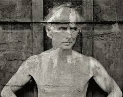
Frederick Sommer, born in 1905, was an Italian-born photographer raised in Brazil. He was considered a master photographer, as he started his love for art in photography in 1931. He originally explored his creative trait through watercolour ink and paper but later discovered his passion for photography in 1938, when he acquired an 8×10 Century Universal Camera. Sommer was a self-taught photographer who experimented with wild concepts for his creative work, he worked with materials as extreme as coyote bones and chicken parts. Frederick Sommer often mixed the two concepts of landscape, portrait and abstraction in his work, for example his portrait of Max Ernst, in my opinion, contains all three elements. Sommer’s landscape work of the vast desert he lived in is considered to be his most extravagant and impressive images, he referred these images as “constellations”. Frederick Sommer later died in 1999, in the desert in Arizona where he lived due to medical issues.

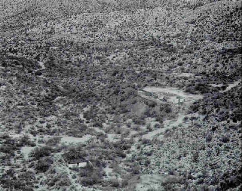
light: The natural sunlight of the image allows areas, such as the walking path, to be highlighted amongst the masses of trees and plants. As the sunlight is coming from above, harsh shadows are cast under them which contrasts against the blinding path.
Lines: There is a pandemonium of unorganised lanes scattered across the image in a chaotic manner, therefore they do not lead to a specific focal point.
Repetition: The only form of repetition in this image is the constant cluster of trees running through the photo, however there is no definite pattern.
Shape: The shapes in this photograph are organic and unorganised, giving the image a chaotic appearance.
Space: There is a wide depth of field to this image as the majority of the photo is in focus, there is also no negative space in the photograph as the whole image is busy in all areas.
Texture: The photo appears to have rough texture, as the trees and plants create a harsh, bumpy composition, however this is contrasted against the smoother and less harsh texture of the path running through the image.
Value/Tone: There is a varied tone from dark to light in this photograph as the darkness is concentrated around the middle third, however there are also scattered tones of darkness amongst the light, therefore I believe the tones are balanced.
Colour: The lack of colour in the image enhances the light and dark tones in their natural form.
Composition: As the photo is a natural landscape, the composition is very unorganised and organic. The rule of thirds could possibly be seen in the middle third, with dark areas concentrated here, but there is no recognisable geometric shapes in the image in order to understand the composition.
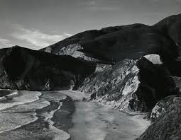
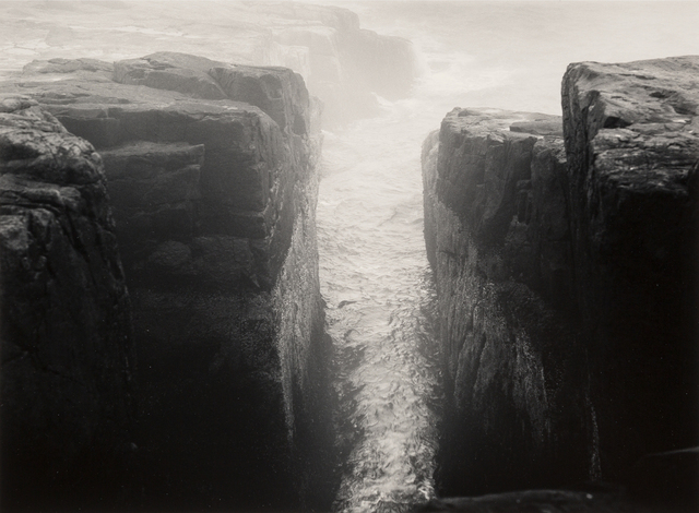
Minor White, an American photographer, theoretician, critic and educator, was born in Minnesota in 1908. His interest in photography began in 1937, as he combined his passion for philosophical theories with taking photos. He was influenced by how people would view photos differently on a personal level, which then began his photography career in black and white and colour landscapes. White created thousands of photos focusing on all areas of landscape, portrait and abstraction before he died in 1976, he also taught photography in many schools across America in his lifetime. His images create a string sense of juxtaposition in the sense of light and dark.

The natural lighting in this photograph is reflected onto the water to create and intense highlight running through the middle third of the image. It also allows harsh shadows to be cast either side of the highlighted water to create a juxtaposition of light and dark.
The leading lines of the two cliffs direct the viewers eyes to the middle third of the photo, this creates the focal point of the glistening water, the harsh lighting also accentuates this. There is also a repetition of jagged lines in the image that appear in the cracks of the cliffs.
There is a repetition of line used in this image, but in a more organic sense. The natural cracks in the rocks are present throughout the image, aswell as the curved lines within the curves of the waves.
The shapes in this photograph are organic and curved, however there is a sense of sharpness in the jagged rocks and cracks within the rocks.
There is a strong depth of field in this image, as the foreground of the cliffs are significantly clearer compared to the background, which is concealed by fog. The darkness of the cliffs create a negative space which acts of a kind of border to the natural chaos of the waves.
The image portrays a rough texture as the sharpness of the rocks is contradicted against the curved waves. The surface of the rocks is uneven and organic, which adds to the coarseness of the photograph.
There is a range of tones from dark to light in this photograph, as the highlights and shadows juxtapose each other. The darkest area of the image is the rocks towards the left and right third, which act as a border to the lightest areas of the image, that being the waves in the middle third of the photograph.
The monochromatic format of the photograph allows the viewer to focus on the highlights and shadows of the image,as well as the shape formation, rather than the colours.
The image has a balanced appearance as the dark and light tones are evenly distributed throughout the image. For example, the dark tones are concentrated around the edges of the image, which then surround the lighter tones concentrated in the middle third.
Frederick Sommer and Minor White share similarities in there landscape work, especially the use of the monochromatic format towards their images, as they focus on tone and shape rather then colour. They also capture the chaotic composition of nature in it’s purest form, as well as the juxtaposition between light and dark.
Alternatively, White’s image here specifically focuses on depth of field and blurring out the background in order to create a focal point, whereas Sommer captures the landscape as a whole and rejects the use of a singular focal point. The juxtaposition between light and dark is much harsher in the work of White compared to Sommer, which suggests that White’s image became over exposed possible from using a wider aperture.