Tag Archives: claude cahun

NFT Community – Experimenting & Developing

Bayeux Tapestry

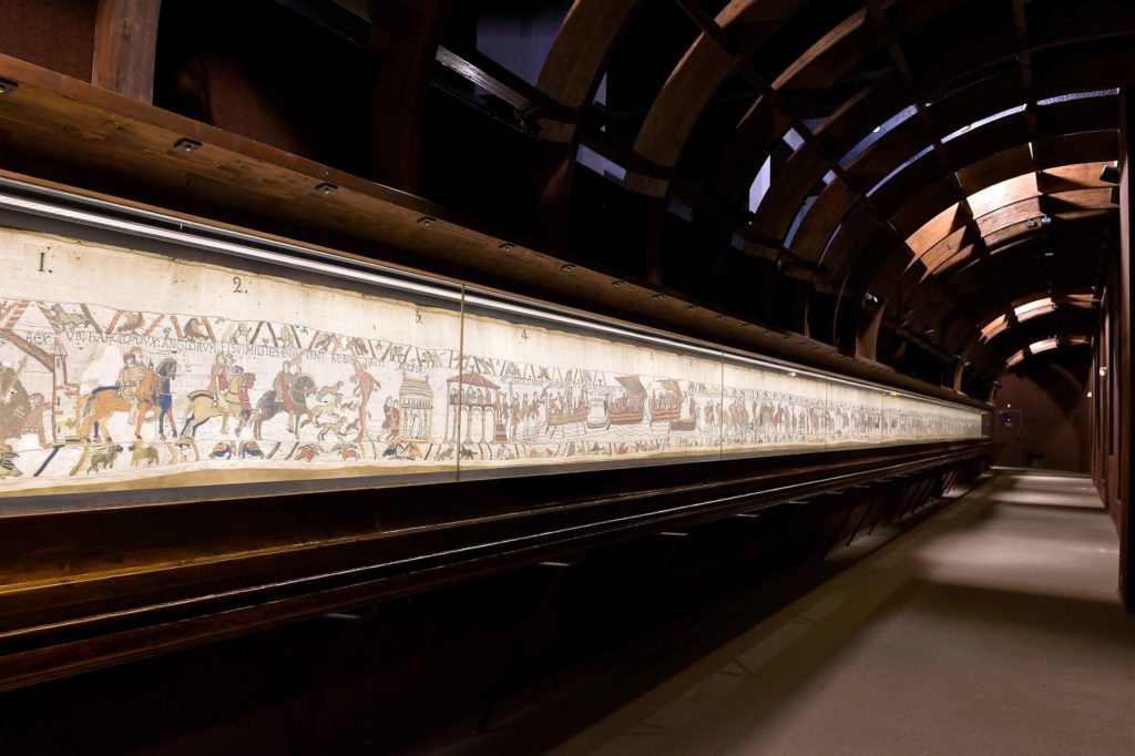
The Bayeux Tapestry is an embroidered cloth nearly 70 metres long and 50 centimetres tall that depicts the events leading up to the Norman conquest of England concerning William, Duke of Normandy, and Harold, Earl of Wessex, later King of England, and culminating in the Battle of Hastings.

It was commissioned to celebrate the ‘William the Conqueror’s’ conquest of England. It begins with the events that led up to it – the death of Edward the confessor the King of England, and the succession of a new king; Harold. It runs through each scene of the Normans invasion and ends in the killing of King Harold.

Death of King Harold showing an arrow in his eye, Bayeux Tapestry, Bayeux, Normandy, France, Europe

The Bayeux tapestry is one of the supreme achievements of the Norman Romanesque. Romanesque art is the art of Europe from approximately 1000 AD to the rise of the Gothic style in the 12th century.

https://www.britannica.com/art/Romanesque-art

The Channel Islands became part of the Anglo-Norman realm when William the Conqueror defeated King Harold and won the English crown at the Battle of Hastings in 1066. Jerseymen, or at least close relatives, serving under their Normandy lords, were said to be present at this historical battle. Just who was and was not at Hastings has been the subject of argument for centuries, but Onfroi, Mauger and Roger de Carteret, the sons of Godefroi de Carteret, are believed to have fought in the battle. It is likely that Onfroi’s son Renaud was the first de Carteret to become established in Jersey, and was thus the founder of the dynasty which ruled Jersey for such long periods over the centuries.

The tapestry is actually not a “true” tapestry in which the design is woven into the cloth in tapestry weave; it is technically an embroidery. It was embroidered on tabby-woven linen in crewel. It uses two main types of stiches: backstitching for the lettering and outlines and coaching for filling in the figures. Nine linen panels were sewn together to make the full 70m piece.

At least two panels of the tapestry are missing, perhaps even another 6.4 m . This missing area may have included William’s coronation.

Bayeux Tapestry - Medieval Histories

The tapestry is now exhibited at the Musée de la Tapisserie de Bayeux in Bayeux, Normandy, France. https://www.bayeuxmuseum.com/en/the-bayeux-tapestry/

Lisa Reihana

Lisa Reihana is a New Zealand artist of Maori descent.

 is a moving image interpretation of the French scenic wallpaper Les Sauvages de la Mer Pacifique.

In Neoclassical France, entrepreneur Joseph Dufour used the latest printing innovations to produce Les Sauvages de la Mer Pacifique (1804), a sophisticated twenty panel scenic wallpaper. Mirroring a widespread fascination with the Pacific voyages undertaken by Captain Cook, de Bougainville and de la Perouse, the wallpaper’s exotic themes referenced popular illustrations of that time. Two hundred years later, Maori artist Lisa Reihana employs twenty-first century digital technologies to animate Les Sauvages de la Mer Pacifique. Enlivened with the sights and sounds of dance and cultural ceremonies, a vast video panorama is populated by a myriad of people drawn from across New Zealand and the Pacific. 
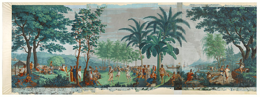
Les Sauvages de la Mer Pacifique (The native peoples of the Pacific Ocean), 1804-5, Mâcon, by Mr Jean-Gabriel Charvet, Mr Joseph Dufour. Purchased 2015 with Charles Disney Art Trust funds. Te Papa (2015-0048-1) – Drops 1 – 10

Separated by two centuries, both the wallpaper and video are set against an utopian Tahitian landscape. While Dufour’s work models Enlightenment beliefs and ideas of harmony amongst mankind, Reihana’s reading of the past is darker and more nuanced. The artist foregrounds the complexities of cultural identity and colonisation by including scenes of encounter between Europeans and Polynesians. 

in Pursuit of Venus is a major video project that has been in development for several years. It reflects the wallpapers utopian ideals, is eight minutes long and presented on two-screens. in Pursuit of Venus has been exhibited in historic homes, art galleries and museums – repurposing each presentation offers new insights and unique presentation opportunities. 

This epic piece of living, moving, animated wallpaper eventually led to her representing New Zealand at last year’s Venice Biennale, where it was described as the best exhibit by critics including those from the Spectator and the Sunday Times.

Read article HERE in the Guardian and watch Lisa discuss the making of her film.

Embroidery

I learnt a lot from my experience with embroidery. Initially some inspiration based stimulus, to gain inspiration into a more tangible world of art, was given to us. I studied the work of El Anatsui who is a Ghanaian sculptor who’s work focuses on reusing materials in an in orthodox way to give it new meaning. Such as this piece below where he uses bottle caps to create a piece that looks flexible and embodies themes of consumption, transformation and the environment.

El Anatsui, Bleeding Takari II, aluminum bottle caps and copper wire,... |  Download Scientific Diagram

We then learnt about the different types of stiches we could attempt to use in our work.

How difficult is embroidery? | Paraffle Embroidery

I made use of the back and the satin stich the most. The back stitch is a good method to create a continuous line. It involves, as the name suggests, stitching cloth in a line and then stitching back onto that line to make it more continuous. Satin stitching is an effective way of filling/colouring in a section of your work and it involves a consistent long portion of string being stitched parallel to fill in a space. Below is an example of where I used these methods in the same piece of tapestry.

My embroidery experience involved a lot of experimenting and compiling of many different elements.

Because there was free reign of creativity I almost allowed my hand to guide the string where I wanted it to go to create visual elements that popped into my head. I decided to create a piece with a central focus with other elements and materials sewed to it.
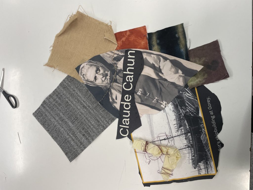
My focal image was that of influential figure in the occupation and art scene of Jersey, Claude Cahun. I additionally decided to use various stitching methods to create an intriguing design around her face to mask her eyes representing the oppression she faced during the occupation.
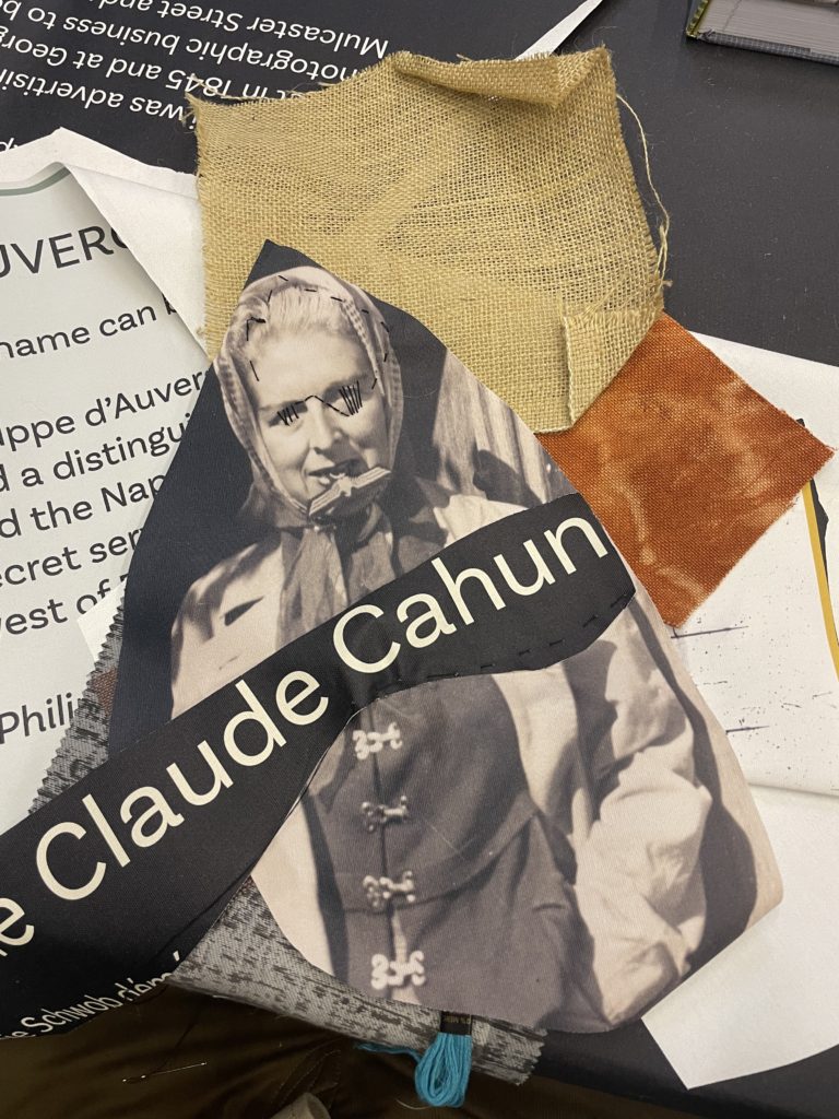
To further showcase my workflow around my embroidery I created a GIF by taking continuous photos of my piece every few minutes. I created it in photoshop by following these steps:

1. Create layer for each image
2. Window > timeline
3. Select > Create Frame Animation
4. Drop Menu > Make frames from Layers
5. Timeline > select Forever
6. File > Export > Save for Web Legacy > reduce image size to 720 x 720 pixels

I believe making this gif inspired thoughts of how tangible art can be infused with digital art. I believe using inspiration from the work of Lisa Reihana this GIF can be developed into a more in depth digital movie with the addition of a narrative. The GIF could be improved by taking images more frequently to create a smoother animation and keeping the embroidery in the same location of the table – not move it around as much.

identity and place case study

CLAUDE CAHUN

Claude Cahun (1894 – 1954) was a French surrealist photographer, sculptor and writer. Born Lucy Renee Mathilde Schwob, they adopted the pseudonym Cahun in 1917, and are best known for their self-portraits, in which they assumed a variety of different and eclectic personas. Cahun’s work challenged the traditional concepts of gender roles, and in their autobiography they state: ‘Masculine? Feminine? It depends on the situation. Neuter is the only gender that always suits me.‘ It is likely Cahun would have identified as non-binary today.

In 1937, they settled in Jersey with their partner Suzanne Malherbe (pseudonym Marcel Moore). Following the German occupation of the island in 1940, both Cahun and Moore became active as resistance workers and propagandists, working extensively to produce anti-German fliers, which they would place discreetly in soldiers’ pockets or in cigarette packages. Their resistance efforts were not only political, but also artistic; using their creative abilities to undermine and manipulate the authority they hated. In many ways, Cahun’s life was marked by a sense of role reversal, and like many early queer pioneers, their public identity became a commentary upon the public’s opinions of sexuality, gender, beauty, and logic. Their adoption of a gender neutral name and their androgynous self-portraits display a revolutionary way of thinking and creating, experimenting with the audience’s understanding of photography as a documentation of reality.

CINDY SHERMAN

Cindy Sherman (1954 – ) is an American artist whose work consists primarily of photographic self-portraits, depicting herself in many different contexts and as various imagined characters. In 1972, Sherman enrolled in the visual arts department at Buffalo State College, where she began painting. During this time, she began to explore the ideas which became a hallmark of her work: She dressed herself as different characters, cobbled together from thrift-store clothing. Sherman works in series, typically photographing herself in a range of costumes. To create her photographs, Sherman shoots alone in her studio, assuming multiple roles as author, director, make-up artist, hairstylist, wardrobe mistress, and model. She explained to The New York Times in 1990, “I feel I’m anonymous in my work. When I look at the pictures, I never see myself; they aren’t self-portraits. Sometimes I disappear.” She describes her process as intuitive, and that she responds to elements of a setting such as light, mood, location, and costume, and will continue to change external elements until she finds what she wants.

Sherman’s work is often linked to feminism, since her photos call attention to the objectification of women in the media. Sherman’s 1981 series Centerfolds contains pseudo-voyeuristic images of young women. Her 2008 series Society Pictures addresses the obsession with female youth and beauty in American society. Her most recent series, the 2016 Imitation of Life, explores the glamour that can be found within mature women. By using stylized, vintage costumes and heavy makeup, Sherman is rendered as a subject that looks almost artificial, aside from her conspicuously-placed, aged hands, which point to the reality behind the illusion. Sherman has identified an uncertainty toward the Untitled series’ relationship with the male gaze.

IMAGE COMPARISON

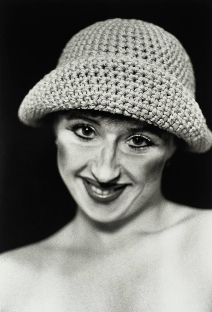
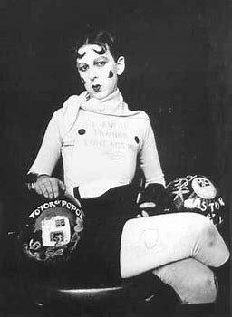
Despite the fact that these two photographs were taken almost 50 years apart, the message behind each of them is strikingly similar; that identity can be whatever you want it to be. Both photographers explore what it means to be perceived and judged by others, and, perhaps more harshly, by yourself. They have stripped themselves of all things, both physical and emotional, in order to transform themselves into re-invented and more developed versions of their previous selves, with both of them taking on the roles of various different personas and characters. For the brief moments during which they are in front of the camera, they are able to let go of what they and society thinks they ‘should’ be, and express themselves through their art form. Both images have been shot in plain black and white tones, with Sherman adding the effect in order to accurately portray her character’s time of relevance. They have also both been shot against a black backdrop, which means we can assume that they were captured in a studio of some kind. The black backdrop also allows the viewer to see Cahun and Sherman clearly, with nothing in the background of the images becoming a distraction to the eye. Additionally, it strips the photograph of any depth, making both images appear flat and two dimensional. Furthermore, the two subjects have very pale complexions, which contrasts heavily to the dark background. As these pictures were captured in a studio, it is highly likely that artificial lighting was used to illuminate the subjects, and we can see that by the way the light is spread evenly over Sherman, we can assume that 3 point lighting was used. Another similarity is that both Cahun and Sherman have used makeup to exaggerate their features as a way to emphasise their respective characters. For example, we can see that Cahun has drawn on her bottom eyelashes in order to make her eyes appear larger and more doe-like, and Sherman has applied a heavy amount of contour to her cheekbones. This can be linked to the theme of identity as makeup is often used by people to create an entirely new face, or alter the one they had before.

Claude cahun comparrison

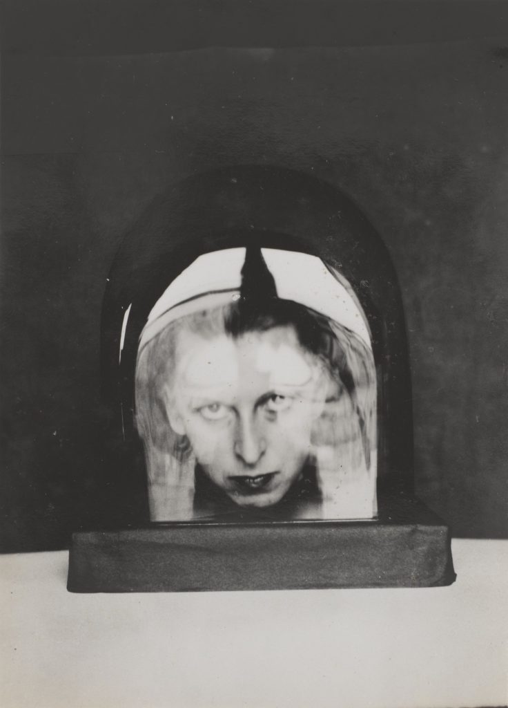
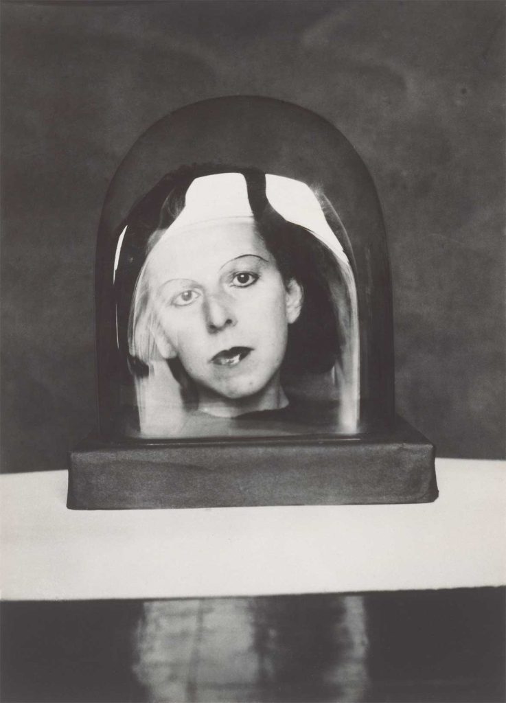
The two images above form Claude Cahun and Carole Benitah both explore identity. This is because in the pictures Their appears to be a lack of identity due to the simplicity of both pictures. In Claude’s picture you can only see her head in some sort of object that appears to be made of either plastic or glass as there are reflections coming off this making it difficult to fully see Claude’s face. Moreover, you can only see her head in the picture as well which gives this a lack of identity as you can’t really see much of the person in the picture.

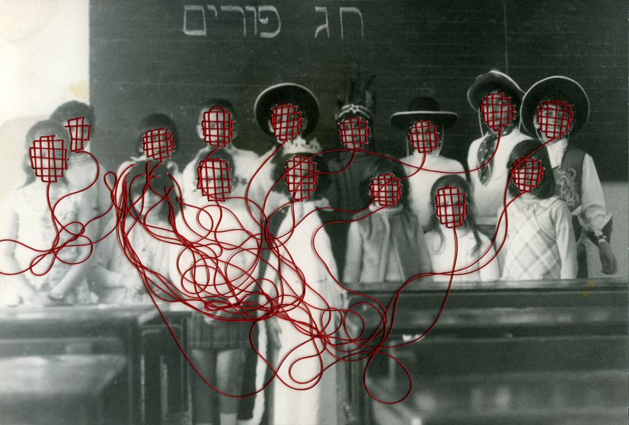
As for Carole’s picture, the faces in the picture are covered in what appears to be red stitching on every face with the strings coming off them tangled up. This shows a lack of identity just like Claude’s picture even though they aren’t to similar because due to the faces being covered up you don’t really have a see for what the emotions on the people’s faces are meaning you couldn’t really imagine what their expressing if they are. Either happy or miserable.

Looking at both of the images, the pictures look similar in the format of how they were taken. They both appear to have a fairly fast shutter speed of 1/125 as there isn’t much movement that is blurred in the images. Another comparison in hoe the pictures where taken, they both appear to of have an aperture of f16 in both pictures as the background and the main appeal of the pictures are both clear visually. As for the ISO, it appears to have a low sensitivity of 200 because you can see some sort of speckles in the pictures but I think this is due to the when the pictures where taken as cameras weren’t as good as they are now.

Claude Cahun cASE STUDY

Claude Cahun was a Born-on October 25th in 1894 and was born in Nantes into a Jewish family who was a lesbian transgender which was expressed later on in her life with the photography that she worked with. 
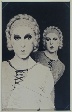
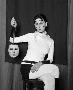
Cahuns work was involved around writing, photography and theatre. Claude was mostly remembered for her highly staged self-portraits and tableaux that incorporated the visual aesthetics of Surrealism. During the 1920s Claude produced a large number of self-portraits in various guises such as aviator, dandy doll, body builder, vampire and angel. Most of Claude’s portraits include the artist looking directly at the viewer with her head shaved, most of the time revealing her shoulders, and a blurring of gender indicators and behaviours which goes to undermine the patriarchal gaze.

In 1937 Cahun and Moore settled in Jersey. Which was in the time period of the fall of France and the German occupation of Jersey and other Channel Islands, they became active as resistance workers and propagandists.  Against the war, Cahun and Moore produced a lot of anti-German fliers. The couple would then attend many German military events. In Jersey, strategically placing their pamphlets in soldiers’ pockets, on their chairs, and in cigarette boxes for soldiers to find. Cahun and Moore’s resistance efforts weren’t only political but also artistic actions, using their creative talents to manipulate and undermine the German authority. This was done in many ways with Claude dressing up as a transgender taking photos in which would show the mix that she could go between like dressing up as a pretty doll with weights besides her.

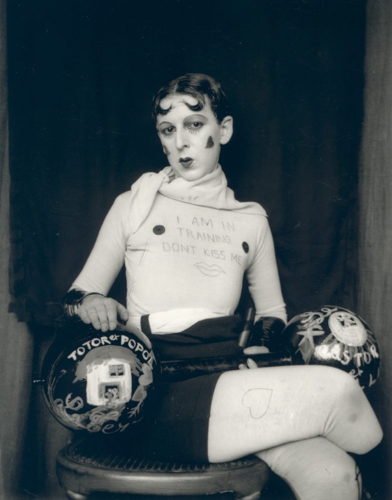
A seen in the picture above, it’s quite apparent in stating that you can see the picture was most likely taken in the 1940’s as the picture is in black and white due to the technology in cameras wasn’t as good as it is now. However, this works quite well as the contrast between black and white stands out great with the writing that is written on her top also, the love hearts that are drawn onto Claude’s face. It appears that there was some sort of stand possibly used to keep the camera in position in taking this picture of Claude. The tones in this picture are light bas you can see that everything in the picture is visible, even the background also, you can see that there are light reflections coming off the weights meaning there was some source of light used to make the picture overall stand out. Finally, in this picture Claude is dressed up as a pretty doll with weighs alongside her, this goes to show how she was trying to portray that society shouldn’t judge you for wanting to be free as she seems to be confused in picking between being male or female which could be caused due to society being so judgmental.

Identity and Place -Claude Cahun/Edward Honaker case study

Claude was a French lesbian photographer born in 1894. She moved to Jersey in 1937 and became active as propagandists and resistance workers during the second world war when the Nazis took over the Channel Islands.

She was sentenced to death in 1945 however it was never carried out due to the Liberation of the Channel Islands from Nazi power. Cahun used photography to express herself and her political views.

Image Analysis

Claude Cahun

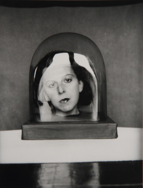
The lighting in this image is very dark with areas of very bright light that could be coming from a window and reflecting on the glass of the subject in the image, which then reflects on the black surface underneath . The darkness of the image allows the viewer to focus on the image of the woman in the dome and the actual dome itself. The brightness on the glass allows the woman to look three dimensional and could allow the viewer to sense the mood of the image.

The fact that the image is in black and white allows the viewer to focus on the contrasts in the image. The image in the dome has mainly dark colours which allows the viewer to see them as a happy person however the black background of the image emphasises the fact that her past was quite dark and she was treated poorly in the prison she was sent to in 1944.

The glass dome could highlight the fact that you are only a tiny fraction of the population of the world; you must live your life the way you want, and the way you believe is correct.

The texture of the image is smooth until the dome which allows the viewer to focus straight onto the centre of the image and on Cahun herself.

Edward Honaker

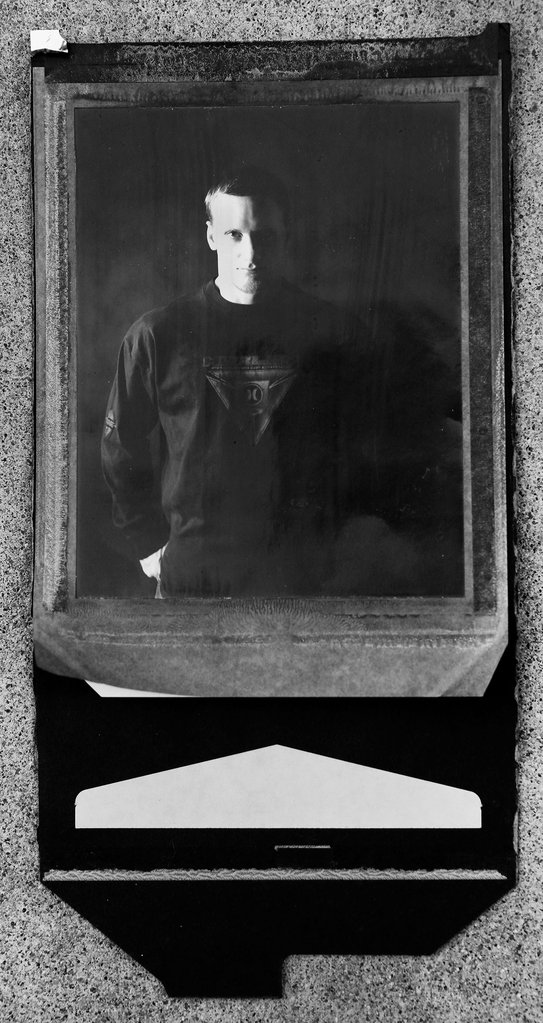
Edward Honaker is a photographer now in his mid-twenties . When he was younger, he used photography to express himself while he was suffering badly from depression.

His images highlight some of the lowest feelings he has had, with the reoccurring theme of feeling like the odd one out and feeling like he didn’t belong in this society/world.

I chose Honaker to inspire me for my work because music is the way i choose to escape reality and the world just like he used photography to take his mind off the depressive thoughts in his head.

Image Analysis

Edward Honaker

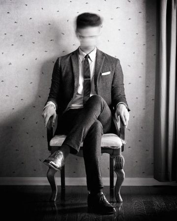
This image allows the viewer to understand that Honaker’s brain is never still. His body may seem calm and relaxed however his mind is constantly working, or in his case his brain keeps haunting him. The image also expresses the fact that he doesn’t feel like he belongs. He’s sat in an empty room wearing a suit, this could represent the social anxiety he has or even the fact that he feels all alone in the world with no one there to support him.

Honaker used a slow shutter speed and moved his head to create a blurred effect; this allows the viewer to further understand Honaker’s thoughts and feelings. The dark tones throughout the whole image further represents the fact that Honaker struggles to see the light in the world. It could also represent the fact that he believes the people around him see him as a sad and angry person.

The image is in black and white which allows the viewer to notice how Honaker, in this stage of his mental health, is unable to see any light/colour in his life.

The wallpaper behind the man could represent the fact that there is no moment of silence for him. He feels like he is permanently getting judged.

There is a lot of different textures in the image which allows the viewer to try and understand what the main focus of the image is.

Comparison of images:

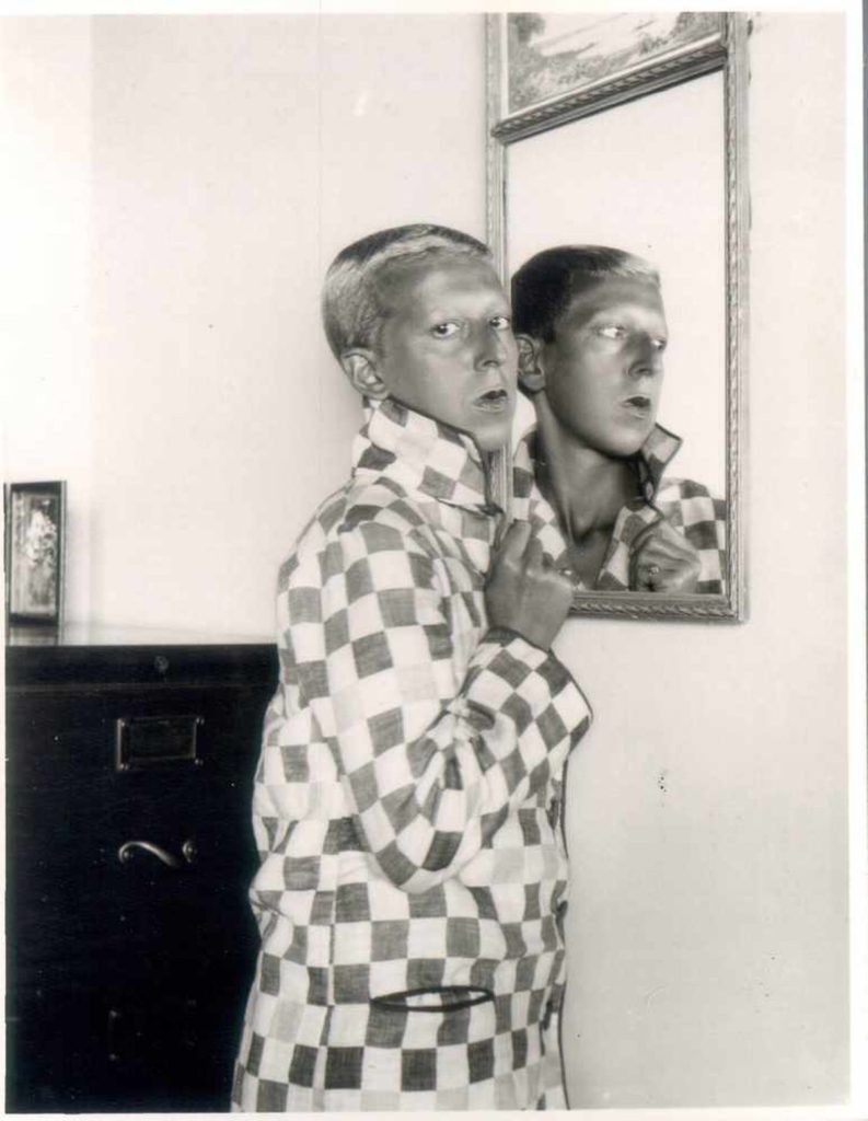
Both of these images are self portraits. Cahun’s is showing the viewer who she is with confidence and showing that she is proud of who she is and doesn’t care what your opinion of her is. Honaker’s however, is the opposite. The image represents the fact that he no longer knows who he is and therefore can no longer recognise himself in the mirror. Both these images send a strong message to the viewer however, the messages contradict each other.

Although both images are in black and white, Honaker’s is clearly a lot darker than Cahun’s. Honaker’s has a shadow covering the mirror representing the depression that has taken over his mind and body. He is unable to look at anything without the dark thoughts taking over his brain.

Cahun’s image is very light with the only dark object being a cabinet behind him. This could represent the fact that Cahun has put all the negative thoughts to the back of her mind and is focusing on the good things in her life and the excitement of what the future holds.

Honaker has blurred out his face which allows the viewer to understand that this disease has created a new person and rather than being able to find the happiness and beauty in his life, the disease has made him isolate from the world and only focus on the negatives. This links to the shadow, representing the depression, creeping over him and slowly removing the happiness from his life.

In Cahun’s image, the reflection is looking back. This could represent the fact that Cahun is looking into the past, now proud of how far she has come in the years of injustice and pain.

Both photographers use a mirror as the main focus of the image which showing that the reflection in that mirror isn’t always the same as what is shown on the surface.

J Grant Brittain

J Grant Brittain is a 65 year old photographer who has shot the skateboarding scene for over 3 decades.

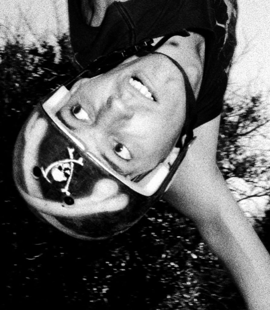
The reason I have chosen to reference his work when completing my project on identity is because he has grown with the culture of skateboarding and he understands how to capture its essence very well. I am also fond of the way he doesn’t limit his work to the conventional action-shot fashion. He broadens his work into a deeper sense to capture the identity of the skaters and their emotions towards the culture of skateboarding. For example the following image captures the identity of the person as it exhibits the subjects emotion and tells a story about the person.

J Grant Brittain

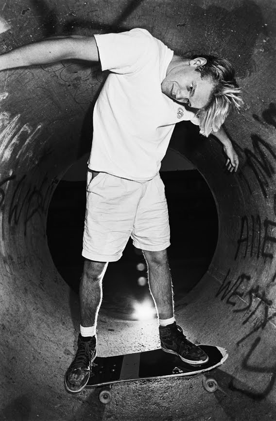
In the above image Grant uses high contrast to deepen the shadows around the subjects face to relay more emotion and definition. This is a way he included themes of identity in his work. The subjects identity is also explored by giving the image context and showcasing the subjects interests and culture he does this by composing the image with the subject holding a broken skateboard. Grant also does a good job of isolating the subject by photographing him with an contrasting background which gives the image a pleasing visual form.

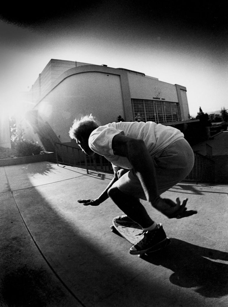
Additionally, when Grant shoots the action shots he doesn’t just focus on showcasing the manoeuvre of the skateboarder but rather their style and environment which many skaters will tell you is far more admirable and important than the tricks you are doing. A skateboarders style and creativity is a what makes up their identity. This creative identity formation is a huge part of the culture of skateboarding and this is one thing that 3 decades of Grants work has made clear.

J Grant Brittain; Claude Cahun Comparison

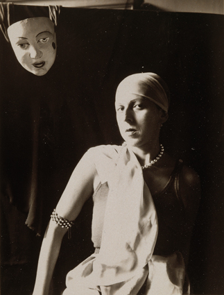
These two images by Claude Cahun and J Grant Brittain both suggest the exploration of Identity. Both images focus on a person and their facial expression and emotion. The compositions both tell a story that we can see behind the eyes of the subjects. The subjects are both photographed with their style being flaunted, the self portrait of Claude her upper body is positions in a confident, striking manner and her chic jewellery and clothing is also seen, the skater in the other composition has a chaotic yet focused style to him with his his creativity shown through his customised helmet which is a visual centre-piece of the composition.

The way the two artists question the theme of identity differs. Claude explores the idea of questioning her identity and her troubles with identity. This can be seen in the above composition with the placement of the mask in the top left corner suggesting notions of multiple identities and is masking her true identity. However on the contrary Grant explores a subject who has found his true identity through the passion of his creative field (skateboarding). Instead of challenging identity he is celebrating the concept through capturing the subject in the moment of passion and expression.

The images both share low saturation and high contrast. This highlights the subject facial features in the two images by accentuating difference in the highlights and darks in the face of the subject.

The images have different textures the self portrait of Claude has a quick shutter speed and appropriate ISO to create a smooth professional portrait texture. This is compared to Grants image which has a slower shutter speed, higher ISO and clarity to show more motion and noise in the image to create a rougher texture.

Claude Cahun

During the 5 year occupation of Jersey by the Germans during the second World War, amongst many terrible things that happened, many antagonists where deported to camps or imprisoned. 75 years ago the island was liberated by allied forces. The last antagonist prisoners to walk free days before the liberation were the Les mesdames who are regarded as local heroes for contributing to the liberation of Jersey.

Lucy Schwob better known by their pseudonym, Claude Cahun was the better known half of the Les mesdames, which was the name that Jersey islanders gave her and her step-sister/lover Suzanne Malherbe (known by her pseudonym Marcel Moore).

Claude came to Jersey from Paris with Marcel in 1937. The couple sought Jersey out for two reasons; because of the jubilant memories of childhood holidays to the neighbouring island, and it was a familiar place to escape the abhorrent fascism and antisemitism that was terrorizing Europe in the ’30s as Claud was Jewish on her fathers side. 

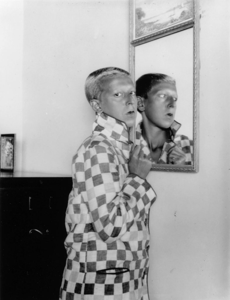
Cahun was a French surrealist photographer, writer, and sculptor. A consistent element present in her work is her unconventional exploration and representation of the concept of Identity. Claud explored her identity in a way where she challenged preconceived notions of sexuality and gender of the time. Claude presented this in her works where she would photograph self portraits where stereotypical gender characteristics where aggravated, for example the following piece where she can be seen composing her appearance as a masculine “circus strongman” while still conveying typical feminine appearance stereotypes such as the bold lipstick:

Claud Cahun

Cahun believed that gender was exchangeable. Assuming different identities was her strong suit.

Claude Cahun

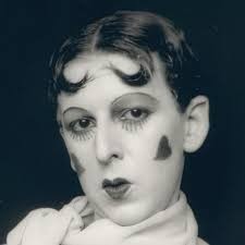
In the above image Claude represents the idea of multiple coexisting personalities by photographing a self portrait by creating a double exposure which is done by shooting an image on film and then shooting another with the subject repositioned on the same segment of film. She has used harsher fluorescent lighting in this image which has created a over-exposed, porcelain looking facial composure whilst accentuating the shadows around her jaw eyes, this could’ve been a way of exploring her identity by ridiculing the identity she was portraying by exaggerating the stereotypical feminine beauty aesthetic of the time being the over-powdered face and eccentric makeup. She also creates greater depth and form in the composition by separating the subject from the background by using a dark negative background and high contrast which opposes the light foreground giving the image an unconventional portraiture look.

Claude Cahun: Jersey’s queer, anti-Nazi freedom fighter

http://www.jeudepaume.org/index.php?page=article&idArt=1480

Identity and Place – Claude Cahun/Julian Germain Case Study

Claude Cahun

Claude Cahun (1894-1954) was a French surrealist photographer known for her highly staged self-portraits exploring gender and identity. Cahun experimented with photographing herself in clothing that was not conventionally feminine or masculine, she was born ‘Lucy Renee Mathilde Schwob’ and in 1919 chose the pseudonym Claude Cahun as it was more sexually ambiguous. In 1937 Cahun settled in Jersey, disguised as a non-Jew, and during WW2, being passionately against war, produced anti-German fliers and placed them in soldier’s pockets secretly. It is clear that Cahun’s beliefs undermined the authority and society at the time as she went out of her way to disrupt ‘normality’ in her images. Additionally, Cahun’s androgynous appearance reflects her views on how identity and gender are just ideas formed by society, not set rules everyone needs to follow. Many of Cahun’s works can be found in The Museum of Modern Art in New York, the Museum of Fine Arts in Boston and the San Francisco Museum of Modern Art, along with many others.

Julian Germain

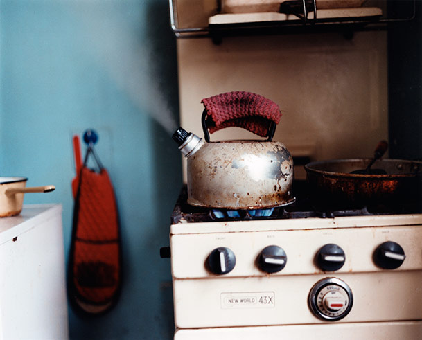
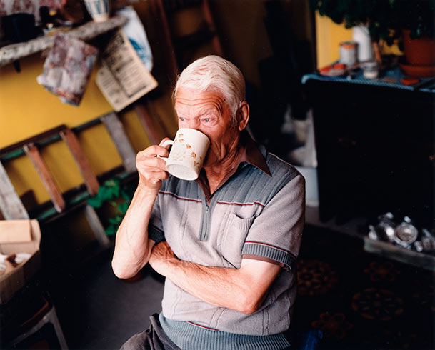
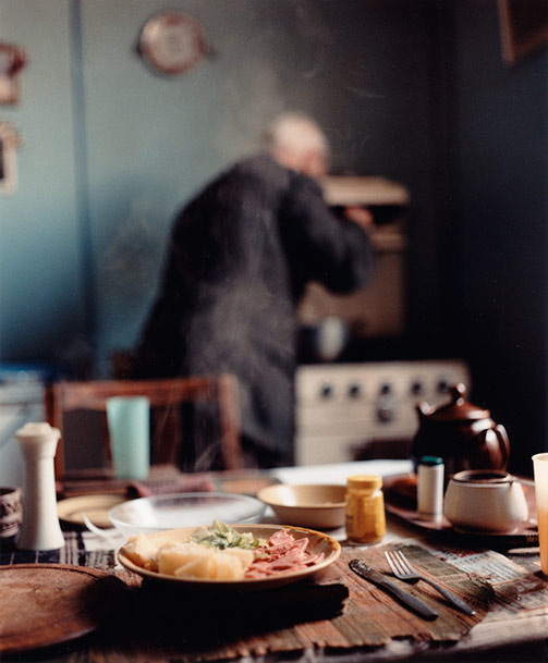
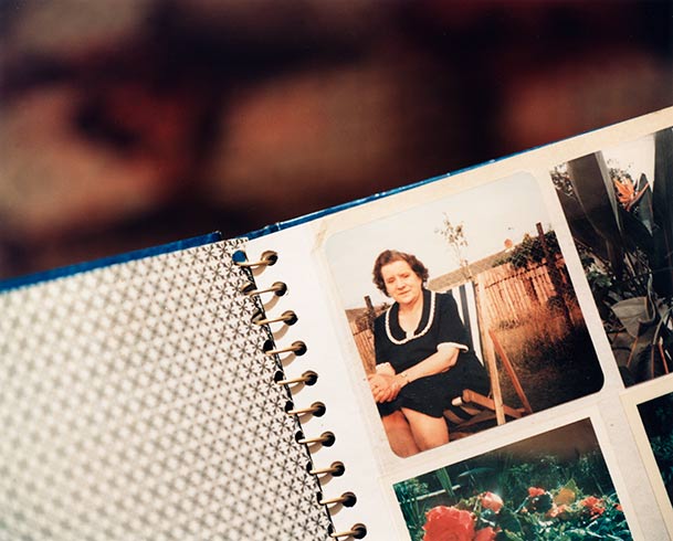
Julian Germain is a British photographer who studied photography at The Royal College of Art in London. Germain’s project ‘for every minute you are angry you lose 60 seconds of happiness’ is a series of photographs made over 8 years of the quiet, contemplative existence of Charles Snelling, an elderly man living alone in a small house in Portsmouth, shown alongside pages from Snelling’s own photo albums. Germain met Snelling in 1992, he describes how his subject lived in a very unique house full of colours like orange and yellow- it was unlike anything he’d seen before. I really love this particular project of Germain’s because of it’s beautiful message depicting how the most important things in life cost nothing at all, he wanted to show people with a profound understanding of who they are and what they stand for, something that cuts across all cultures. I believe this holds a strong link to ‘identity’ as Germain captures the individuality of his subject in an environment important to him. This project really stood out to me when deciding on initial ideas because of it’s close link to family also, I hope to take images of a similar standard in my study.

Image Comparison

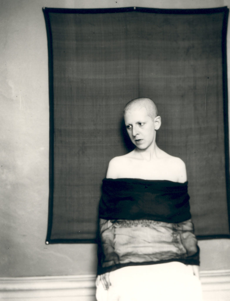
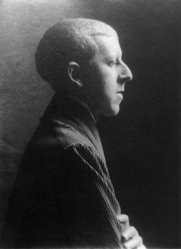
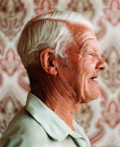
Although Cahun and Germain’s style of photography does not focus on the same concept of identity, these 2 images hold many visual and technical similarities. For example, the composition of each image is extremely similar as both subject’s are looking away from the camera with their bodies angled side-on to the lens. In Germain’s image, this may symbolise his subject’s bright view on the world, as if he is looking out of a window and seeing it’s beauty, furthered by his smiling facial expression. However, in Cahun’s image this composition creates a more closed-off atmosphere, suggesting Cahun has a more negative view on the world and on society. In addition, both images seem to have similar lighting coming from the right of the photo, which creates the main highlights on the front of the subject’s face. This lighting also produces similar shadows in the images, falling behind the subject’s neck and across the left side of their face. Nevertheless, it is clear that Cahun has used a more harsh artificial lighting and that Germain has made use of natural sunlight through a window to capture these images. This sharp lighting in Cahun’s image initiates a more intense dramatic atmosphere whereas Germain’s creates a soft cheerful mood. Another difference between these images are the photographer’s choice of background. Cahun is positioned in front of a dark blank background, possibly symbolising their views on how society’s minds are blank to new ideas and beliefs revolving gender and identity. Contrastingly, Germain’s subject is stood in front of a highly patterned background. The repetition in the wallpaper could suggest the subject has a large family, with the repeated shapes representing family members like a family tree. Furthermore, both of the image’s subjects have similar facial features. Cahun portrays themself with conventionally masculine attributes, such as short hair, in order to disrupt gender norms and go against what society expects. Germain’s masculine subject has a very similar hairline to Cahun, showing that certain facial features or hairstyles are not reserved for a certain gender.

Identity and Place – Claude Cahun AND Carolle Benitah comparison

Gillian Wearing and Claude Cahun: Behind the mask, another mask - Who was Claude  Cahun?
“Self – portrait (shaved head, material draped across body) – Claude Cahun (1920)
CAROLLE BENITAH - Artists - Sous Les Etoiles Gallery | Photography
“à la plage (at the beach)” – Carolle Benitah (2009)

Carolle Benitah and Claude Cahun share both differences and similarities in their works. The theme of identity is an iconic similarity between the two pieces of work, however these artists display them in different ways. Claude Cahun focuses on the idea of self-expression in terms of identity, whereas Carolle Benitah displays how her identity has been formed through childhood and the cultural tradition of embroidery.

Both pieces also have a vintage aesthetic to them, with the use of the monochrome tones and the grainy appearance of the images. Claude Cahun’s self-portrait was taken in 1920, and as the use of colour photography was not widely accessible, all of Cahun’s photos lack colour. On the other hand, although the original images used by Carolle Benitah are also monochromatic, she adds colour physically through sewing and embroidery.

In terms of the actual photography used, Claude Cahun often uses herself as the model in her images, meanwhile Carolle Benitah uses old family photos which display her relations as well as herself. Carolle Benitah’s work could be argued as whether or not they are photography or art as Benitah did not physically take the images herself. The depth of field in both images are difficult to determine as the background consists of empty, negative space.

Another difference between the two images is that Carolle Benitah’s images are often heavily edited, whether it is digitally or physically. This contrasts to Cahun’s work as there is a sense of rawness to them, as digital editing was impossible and there is no evidence of Cahun physically editing her images after printing. However there is an obvious, large time gap between the images being produced, so Carolle Benitah had the accessibility to digitally edit her photographs.

Claude Cahun

Who is Claude Cahun?

Claude Cahun is a woman who has reinvented herself through photography by posing for the lens with a keen sense of staging: dressed as a woman or a man, shaved or wicking, masked or disguised. The most radical pieces, such as his self-portraits made in 1928 or the sets such as “I’m in Training”, foreshadow contemporary performance. Each is a variation on the question of identity and gender, the body and its metamorphosis, individualism and the sense of exception

Analysis

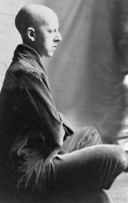
Claude Cahun (Lucy Schwob),  Untitled 1921–22


This definitely shows gender identity. We can see the great Claude cahun in full action. In this photo she has chosen to represent herself bald. Even her eyebrows are not showing. She is dressed in what appears to be a fairly masculine costume. The costume is black, quite large and a bit large for her. She has a white shirt underneath that matches her handkerchief . Her position is in my opinion mixed . We can see that her fist is tight as before a fight. And on her right side she puts her hand on her hip which gives a rather relaxed mood. Her face expresses a little questioning.
Although she dresses in a fairly masculine way you can see in her face that her upper lip has lipstick. What could represent femininity. This image is in black and white which creates a good contrast and a dramatic mood.

Comparison

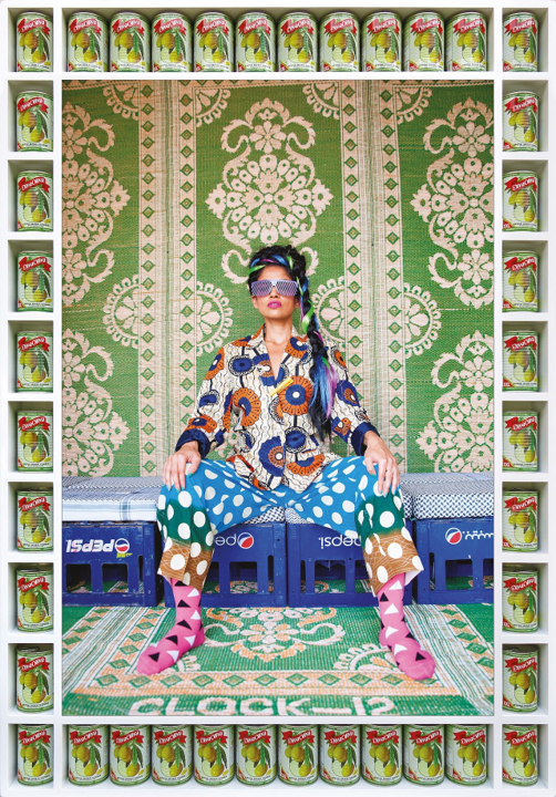
These photographers have a completely different style. The only similarity is that the models are placed in the middle but they don’t even have position. In the background of the photo of Hassan Hajjaj we can see patterns and colours while that of Claude cahun you can not really den something. The photo of Claude cahun is black and white which creates contrast while that of Hassan Hajjaj is in colour to make resort the beautiful Moroccan motifs.