Online Link: Here is an online link to my final photobook – ‘Escaping Wonderland’.
Book Specification:
Narrative: What is your story?
Describe in:
3 words
Escaping, Comfort, Reality.
A sentence
In a ‘Wonderland’ reality where everything is dreamlike and calm, often reality hits and anxiety creeps through again.
A paragraph
Within my photobook I want to convey themes of comfort, security and warmth – an ethereal display of locations where I feel at ease within nature and/or areas at home. My narrative will tell the story of my imagination, a dreamlike collection of images in a Pictorialist style that get disrupted by waves of anxiety being represented by darker colder images. My narrative will consist of juxtapositions, comparing the feeling of unease to instant comfort – the photobook will be a journey through ‘Wonderland’ (representing a world where anxiety is calmed but reality isn’t quite real, certain comforts may feel a little too perfect). With landscape images being broken up by still-lives of flowers and objects, it is as if this perfect world of calm and tranquillity is breaking down to reality; escapism can only be a comfort for so long before reality hits.
Design: Consider the following
How you want your book to look and feel?
- Paper and ink – Premium Lustre
- Format, size and orientation – Standard Portraits
- Binding and cover – Hardcover Image Wrap
- Title – Escaping Wonderland
- Design and layout – Clean & Rustic
- Editing and sequencing – Use of Juxtapositions, Contrasting Colours
- Images and text – Use of Alice in Wonderland quotes & Own Writing
‘Evaluation’
Front Cover:
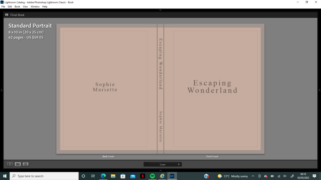
I wanted to create a title that summarised the key themes within my photobook; escapism, anxiety and imagination. Alice in Wonderland was always a film I loved watching, the fantasy world of giant flowers and talking rabbits was one I would find myself wanting to escape into when the world seemed scary or stressful, hence my title ‘Escaping Wonderland’ – bringing together ideas of running away to a world that is almost-too-perfect, at times unnerving. The whole concept of escaping is usually chaotic, similar to the events and inhabitants of Wonderland – therefore I wanted to juxtapose this fanciful expectation with a very simple and plain front and back cover. I had the idea to use the same soft pink colour, that was a motif throughout the images in my book, to be the block background colour. When deciding where to place my title, I wanted it to be visible, but not too imposing and bold so it kept the same soft theme. I decided to write in dark grey and use the font Times New Roman for my title as I believe it looks clean, but also quite whimsical as the letters flick at the ends.
Page Layouts:
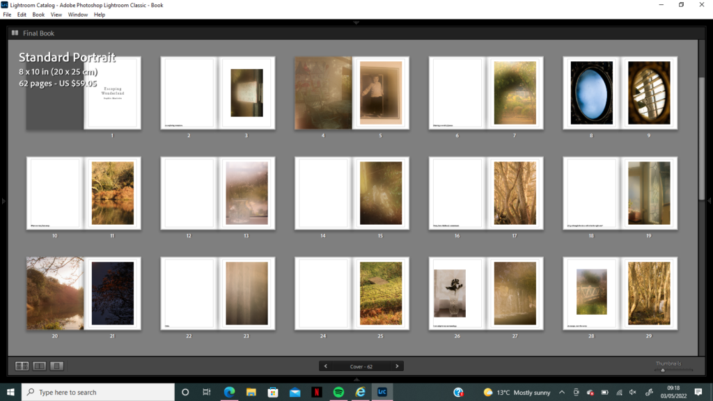
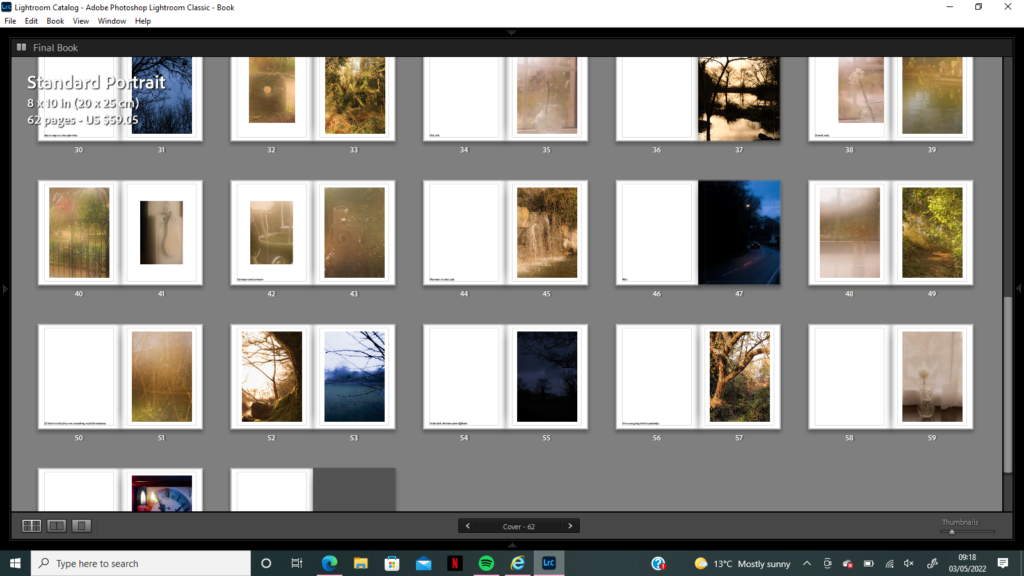
I wanted to follow quite a classic photobook layout when I first started creating my book, placing one image on the right hand side of a double spread and leaving the left side blank. I liked how this created quite a clean and neat look, it helped with creating a calm atmosphere that I could disrupt easily with a ‘nightmare-style’ image or juxtaposition spread. Firstly, I planned on creating a display of my images that was free, without a set sequence or narrative, just a demonstration of locations where I feel safe and have positive childhood memories – I wanted the darker blue images to break up this soft display by being placed randomly on pages throughout the book. Nevertheless, after experimenting with how I could sequence my images to create a narrative, and having the idea to bring text into my book also, I found a natural storyline of exploration that I could have beginning at ‘childhood’. I knew I wanted my book to begin with an image I captured at Reg’s Garden, the public garden space I would visit with my grandparents full of fairy tales and nature, which showed a sign saying ‘please enter visitors welcome’ which I coupled with the phrase ‘a comforting invitation’ on the left hand side. I wanted the inclusion of text to be natural, but also haunting, as if the book was sometimes warning the reader of anxiety creeping in on the next page with sentences such as ‘the water is clear, safe…wait’. The next display of images in my book hints towards child-like imagination, as if I were entering this magical world through a doorway – the images after this one are all inside this fantasy world without anxiety. The layout of juxtapositions range from cold vs warm to natural vs unnatural to reality vs fantasy – I wanted these reminders of the ‘real world’ to pop up during the photobook, it was important for me to show truth in how I have dealt with anxiety, and how sometimes running off into a world of my own (my it be by overthinking or escapism) is not always the best option. I wanted to create a contrast in colours between blue and peach through the book, with phrases next to them such as ‘but it creeps in time after time’ hinting towards anxious thoughts etc. Altogether, my photobook has an ambiguous layout, there is a narrative to follow, but the reader doesn’t have to follow it if they don’t want to – there is always another story within that they may connect with more, maybe the Sudek-inspired images are more sad than optimistic for them for example, it is for the reader to decide what to take from the book.
Strongest Double Spreads:
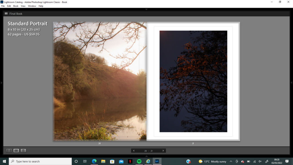
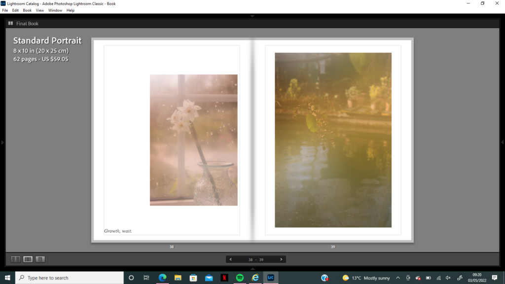
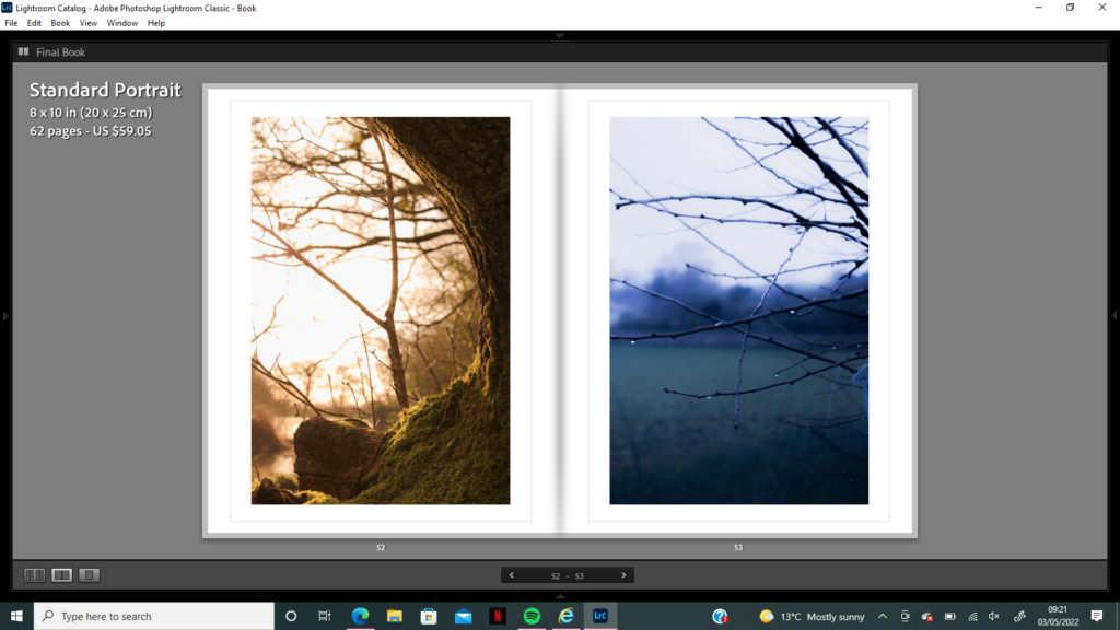
Throughout my photobook I wanted to create both strong and subtle juxtapositions, may it be through colour contrast, atmosphere or subject – I wanted the images to oppose each other. One of my favourite examples of juxtapositions in my book is the first double page spread below, showing two images with branches creeping into the frame – one light, and one dark. There is a clear contrast in colour with these images, but also in atmosphere; the left image holds lots of highlights and bright horizons giving it a welcoming and positive mood, however the right side image holds darker connotations with its deep blue hue and silhouette-like shadows. Additionally, this juxtaposition gives the impression of ‘anxiety creeping in’, as the branches in both images are twisted and reflect ideologies around horror films/nightmares. There is a subtle overlapping of theme which I also love between these images, the hint of orange that covers the right image’s branches could be seen as a reflection of reality in this darker world – I want the images to seem like different versions of each other at different times, one optimistic and one nightmarish. Furthermore, I wanted to create a spread in the book which represented how much I’d grown in confidence over the years, trying to stop letting anxiety get to me so much. The second spread I have included is how I conveyed that idea, using two of my dream-like images of flowers next to each other, one in its natural environment and one adapting to a new space. The soft focus and pastel colours of the images creates a warm and cosy environment, however sometimes growth is not easy, which is a reminder I wanted to give. With my idea of using text throughout the book, I decided to use the phrase ‘Growth, wait’ to go along side this spread and convey the idea of ‘fear of change’ – sometimes growing too much too quickly is overwhelming, which is what I wanted to show. My final juxtaposition holds similar connotations to the first, of nightmares creeping in when anxiety seems to have disappeared. I really liked the similarity of composition between these images, there seems to be a circular space in the middle of both almost as if it leads to another world, or another escape route. The composition of these images also reflects the idea of this scene being the same, but happening in another reality of either calmness or terror, I wanted to create a contrast that was still recognisable and questioned the idea of ‘fantasy vs reality’. I am extremely happy with the outcome of this photobook, the links to my childhood and memories allowed me to explore how I could represent them through manipulation, or just capturing them as I see them in truth.
My use of Quotes:
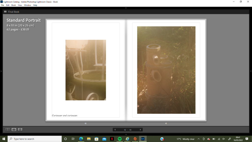
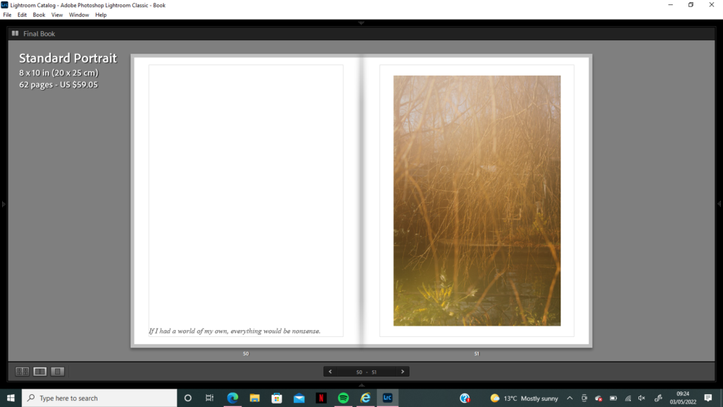
I wanted to highlight the idea of ‘Alice in Wonderland’ throughout my book, while some images where clear reflections of Wonderland themes (such as distorted clocks and mirrors) I still wanted to use text to further these themes. I researched quotes from Alice in Wonderland and wrote down ones I thought could relate to certain images/locations I had captured. For example, the first spread below shows two strange objects which could be mistaken for different things if not looked at closely, this spread reminded me of the quote ‘Curiouser and Curiouser’ as the observer may question what these images are actually capturing. Also, the soft focus and dim light makes the images seem mysterious and unrealistic, there is curiosity in their meaning. The second use of Alice in Wonderland quotes falls next to a singular image that I captured of the branches over the pond at Reg’s Garden. I really enjoy how this image is so ambiguous, it is abstract in its composition and use of aperture to focus behind the front branches which I wanted to seem mystical and creepy. This blur also allows the observer to look beyond the main subject of the branches to see the water and landscape behind, I really liked how strange this composition was and how much of an abstract texture it created. Next to this image I wanted to use the quote ‘if I had a world of my own, everything would be nonsense’ as it reminded me of the weirdness that had been captured, the blurred focus and disjointed composition reflected this phrase entirely.
