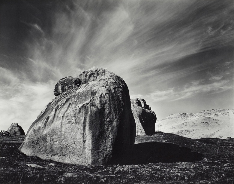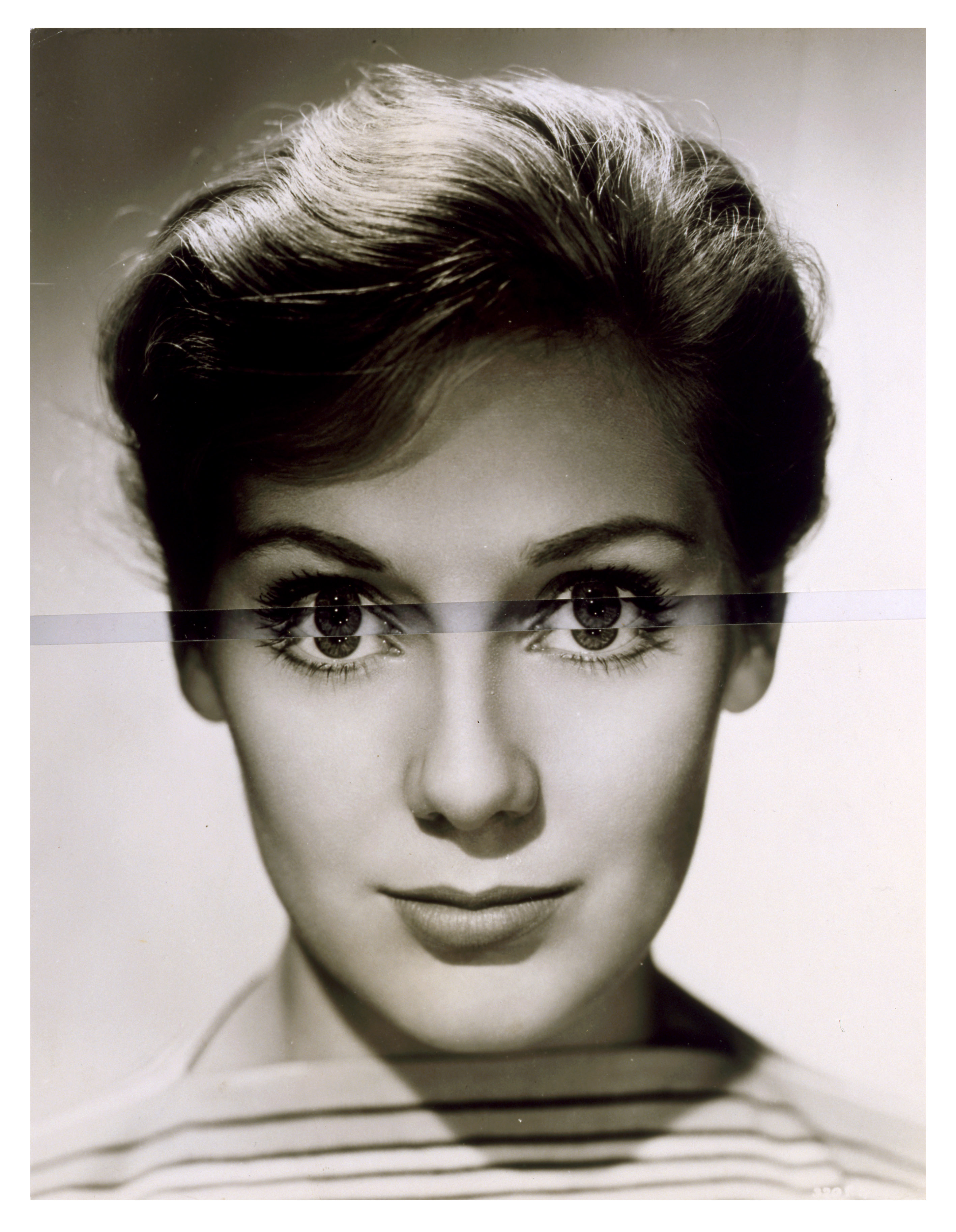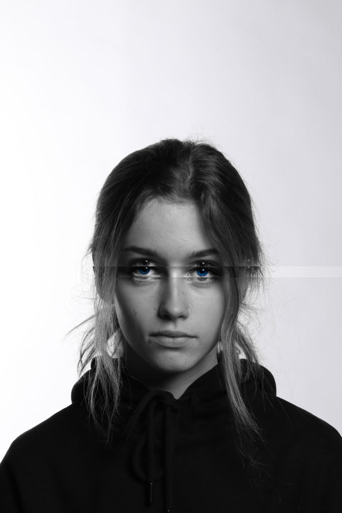
Tag Archives: Artist reference

Identity and Community – Artist Inspirations

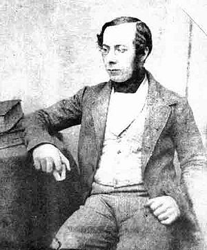
William Collie

William Collie was a Jersey photographer from the 19th century. He was introduced to me at the societe jersiaise photo archive.

https://societe-jersiaise.org/photographic-archive

William Collie was probably the first photographer to use the calotype process in Jersey. This is a technique, were a sheet of paper coated with silver chloride was exposed to light in a camera obscura; those areas hit by light became dark in tone, yielding a negative image.
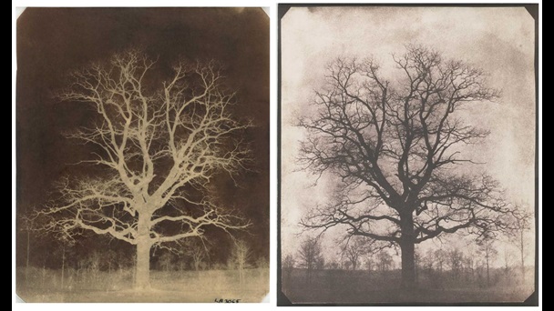
An oak tree in winter – William Henry Fox – 1842

The first pioneer of calotypes was a photographer called Willam Henry Fox.

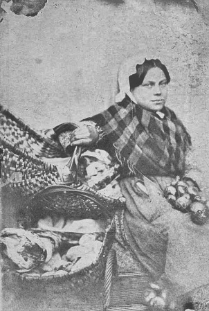
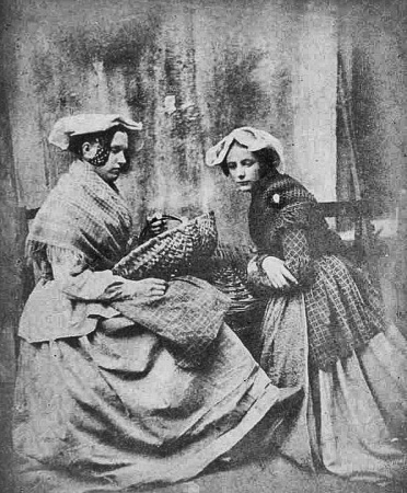
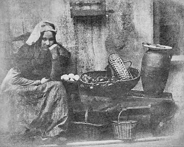
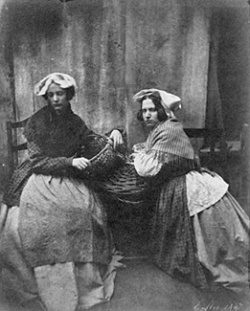
Some of Colliers previously unpublished photographs featured alongside those of Fox in an exhibition at the Musée Dorsay in Paris in 2008. This exhibition boasted some of the first photographs taken on paper in Britain from 1840 to 1860. Below is one of those photographs. It was taken in 1847. It is of Jersey Market women.

This photograph leads onto the next interesting element to note about Williams work. Williams work capturing these portrait style images was one of the earliest signs of tableau photography recorded. Tableau photography is an intentional form of photographing characters whom are arranged for picturesque or dramatic effect and appear absorbed and completely unaware of the existence of the photographer/viewer.

Marin Toft – from Tableaux Vivants

William shot a series of photographs, some of the oldest in Jersey, of Jersey market women. They were tableau photographs were the women were dressed up to look like market women.

I believe this was a huge step into the progress of photography, specifically photography as an artform. Photography during Colliers era was mainly focused on documentative intentions, photos were mainly used to record events, document, log and report. William was part of the early photographers who brought an essence of art and creativity to photography and these early tableau’s support this notion.

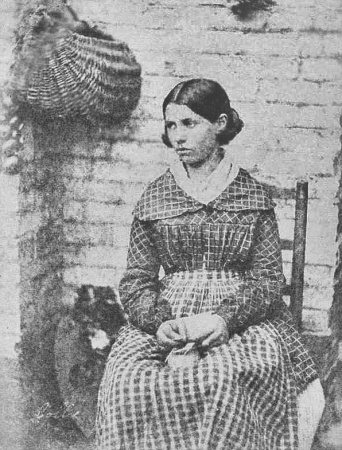
The above photograph is part of Williams ‘Market Women’ collection. The image is of a professionally composed tableau portrait where a young lady is dressed as a Jersey market woman. She is wearing what would be working class clothing of the time. The mise en scene of the image tells the story of a market environment with the hanging basket and what seems to be produce on the ground. The subject has been directed to look away from the lens. This enforces a notion that the subject is absorbed and used to create a dramatic effect; this almost gives the character a sense of elegance but also sovereignty . This sense of emotion the lady is portraying could give us an understanding of the historical context of the image as in the 19th century Jersey saw massive changes in society. A large influx of immigrants from England made Jersey a more connected island than ever before, and brought with it cultural changes and the desire for political reform. During this period, the States reformed to become more representative of the population and the Jersey culture became more anglicised and less religious. The island also grew economically and the built-up areas of the island expanded, especially St Helier, with the development of public transport on the island. This lady could have been represented as a part of this powerful time in St Helier as she is portrayed as a market woman, aiding in the growth of the town. The image has an artistic contrast created by the calotype method of photography that Collier was renowned for. The negative light give a wide tonal range from dark tones in the subjects hair to a pure white tone just an inch down on her collar. This contrast also gives the background a grainy texture as the shadows on the bricks are accentuated.

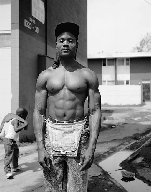
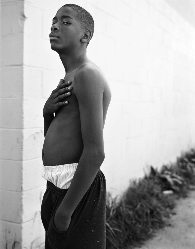
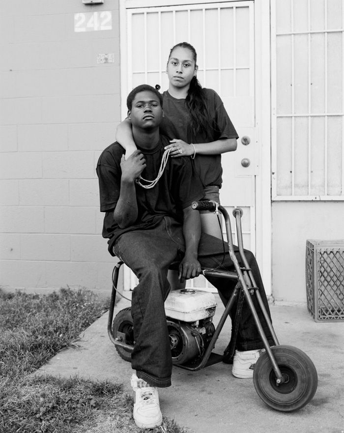
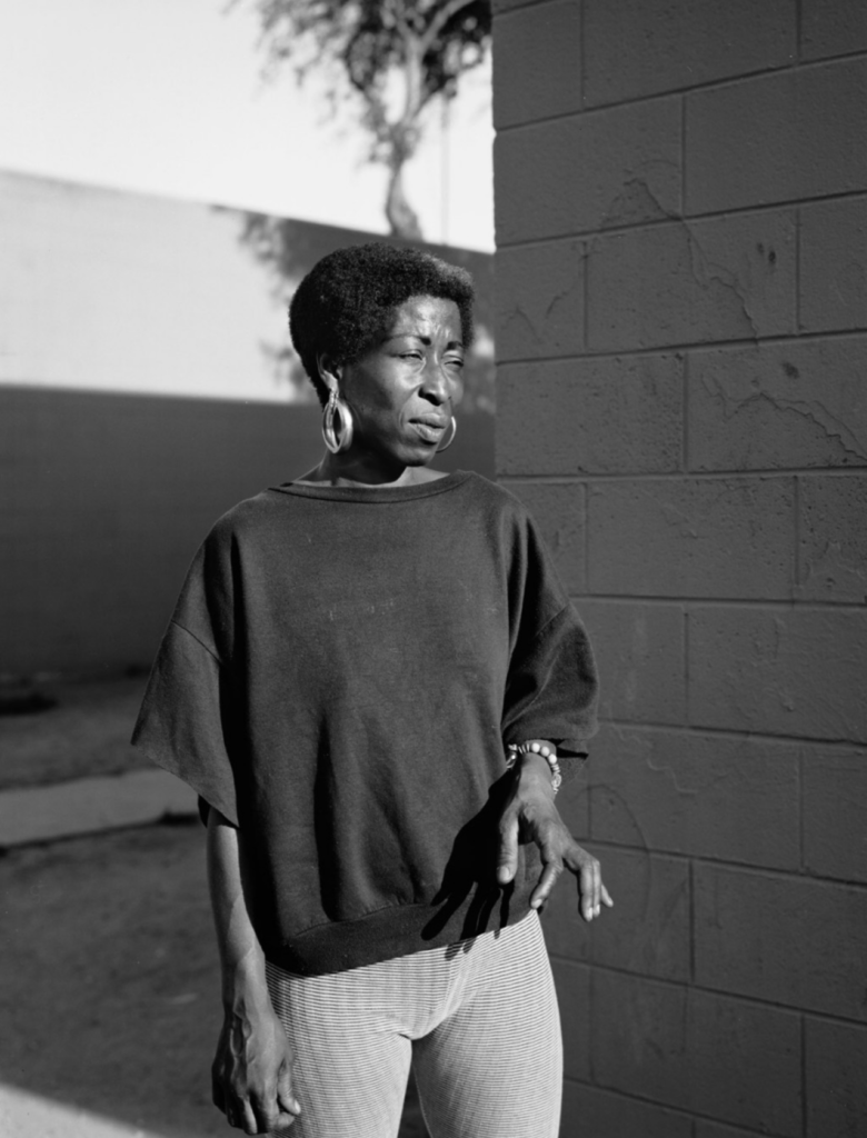
Dana Lixenberg
Dana Lixenberg is a Dutch photographer and filmmaker. She lives and works in New York and Amsterdam. Lixenberg pursues long-term projects on individuals and communities on the margins of society.
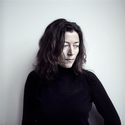
(self portrait)

Her work strips down her subjects to their fundamental characteristics. Her photographs allow the viewer to interoperate every element of the characters identity and essence.

Dana uses a large format field camera which are completely mechanical sheet film photography cameras. The process is highly meticulous, none the less Dana sacrifices convenience for high quality negatives. I believe that Danas use of these cameras is also a way of making the photography process a more meaningful tangible affair. This sentimental process is also probably a method of connecting with the subject she is shooting more, as her passion is contagious and will leak into the subject she shoots.

It makes the process what Dana calls a ‘slow dance’ with her subjects.

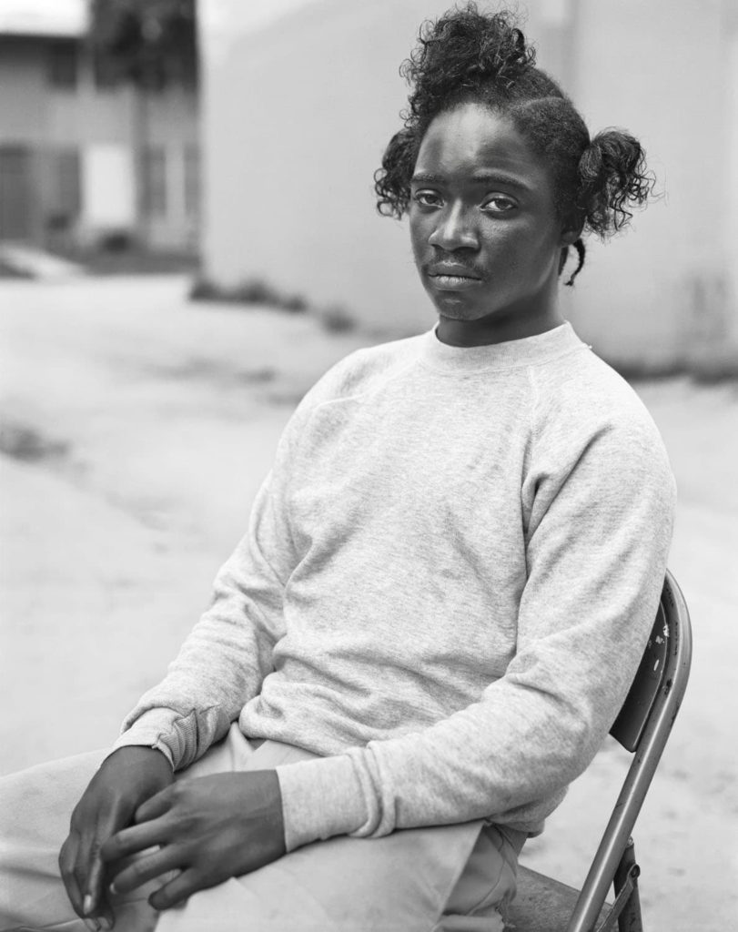
Dana pursues long-term projects with a primary focus on marginalized communities. One of these projects being Imperial Courts 1993 -2015.  It is Lixenberg’s most extensive body of work to date. The project took inspiration directly after the 1992 Rodney King riots. Spanning 22 years, the project tracks the shifting configuration of an underserved community in Watts, Los Angeles. In contrast to the often one dimensional, sensationalized media coverage of this neighborhood, Lixenberg employs a more unobtrusive and community driven photographic approach. Like her other projects, Imperial Courts consists of a series of photographs and a publication. Exploring other media for the first time, Lixenberg also included audio recordings and created a three-channel video installation. The project was awarded the Deutsche Börse Photography Foundation Prize in 2017 and continues to be exhibited internationally.

http://www.imperialcourtsproject.com/

She manages to give us such an in depth look into the residents of this neighbourhood with just street portraiture.

The above is a comparison between William Collie’s image on the left with Dana Lixenberg’s image on the right. Both these photographers are highly evolutionary with the art of photography and telling a story; they both strived to get the most out of their subject. William is pioneering new photographic technology and new styles of shooting portraiture in an artistic way. Dana is evolutionary in the opposite way. She did not try and implement the newest technologies but rather stepped away from the mainstream digital boom of photography she was born into and used older equipment to make her photography a connecting process with her subjects.

Both images are negatives and feature a black and white colour scheme. I believe this allows the viewer to focus on the structure of the image and creates a clear contrast which builds the foundation of the image and shines focus on the features of the character being shot. Both images are composed in a similar way with their subject sat down in a similar way with similar body language. The way their body’s are at a tilt and their hands are together allows both photographers to capture the subjects sense of innocence. The main difference with how the subjects have been composed is that Dana’s is engaging with the camera by looking directly into it; whilst Williams’ subject is pretending the camera isn’t there. Danas portrait makes the viewer feel as if they are engaging with the subject in a personal way whilst William’s is more tableau, making the viewer feel like they are ‘standing on the side-lines’ watching a natural scene take place.

Dana uses a very narrow aperture lens. This gives her image a shallow depth of field and a lot of bokeh. This isolates the subject and creates a neat visual aesthetic with not too many elements clashing. On the other hand William has everything in focus in his portrait. This intentionally allows the viewer to interoperate what environment the woman is in, thus giving her the identity of a market woman.

historical Artists : Victor Hugo

Victor Hugo

Who was Victor Hugo?

Victor Hugo was born February 26, 1802 in Besançon and died May 22, 1885 in Paris. He was a French poet and playwrighter , he marked the history of the nineteenth century, and is still recognized thanks to his literary works, and also by his political speeches. He wrote works very well known as Les Châtiments (1853), Les Contemplations (1856) and Les Misérables in 1862.

To Jersey from France

Because of his political opinion, Victor Hugo could not stay in France during the reign of Napoleon III, and had to refuge in a discreet place. He moved to Jersey in 1852 and he stayed until 1855. Thanks to his refuge he was able to publish his political pamphlet against Napoleon III Napoléon le Petit and Histoire d’un crime. During his period of leaving in jersey he also composed and published some of his best work like Les Misérables, Les Châtiments 1853; Les Contemplations 1856 and La Légende des siècles 1859. Very quickly Victor Hugo becomes very interested in photography. He wants to use it as a political tool to show his image in France. So it becomes a family affair. His sons Charles and, François-Victor, organize a photographic workshop . The Jersey workshop was a unique adventure. It was both a look at the landscape that sometimes inspired Victor Hugo’s drawings and a testimony to an outlaw in exile. The Jersey Workshop was a photographic studio in the greenhouse at Marine Terrace. Victor Hugo’s project was to create a book on the Channel Islands illustrated with images. But the book was never finished, he still produced an intense production of salted paper prints.
The purpose of the workshop was to preserve the memory of the exiles, the portraits which were taken were placed in many albums which were sometimes adorned with paintings or collages by Charles Hugo.

Anthropocene – Camilo Jose Vergara

Camilo Jose Vergara is a Chilean Photographer based in New York City.

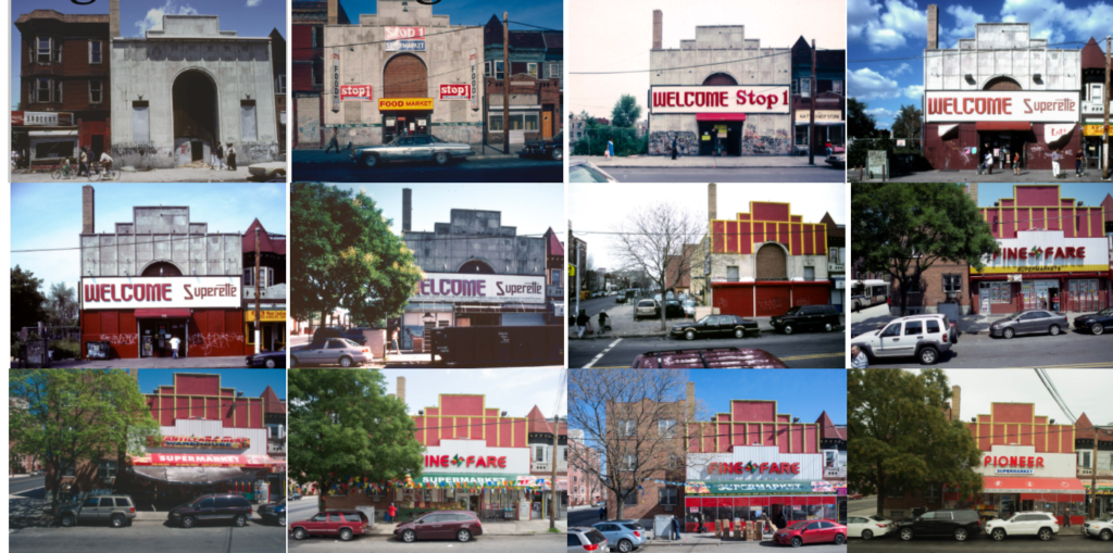
He trained as a sociologist with a specialty in urbanism and this is exactly what his photography emulates. He focuses on ‘rephotography’ in series with urbanisation and the Anthropocene. This means he shot the same buildings over a span of time to document change. This is a method of documenting urbanisation and how man is constantly tweaking the environment around them.

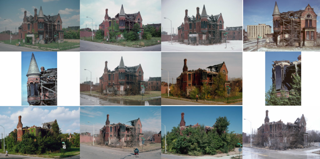
I am most interested in his work where he captures the essence of nature fighting back against urbanisation. He shoots these abandoned, derelict buildings in the fashion of rephotography to document an argument between nature and man. This can be seen through the houses slowly degrading and the earth and plants growing around them. This captures the power of nature and its ambition to flourish juxtaposing to mans greediness and carelessness of leaving ruins to rot in, what was, a beautiful natural climate. Below is an image of the Ransom Gillis House where Camilo has captured this argument and the power of nature.

I believe the way Camilo captures these buildings is an impactful way of looking a Anthropocene. It captures humanities carelessness and the determination of nature in an impactful manner by giving it an aesthetic. The aesthetic being the series of photos where the perspective is exactly them same but there is noticeable change in the environment in every photo. This forces the thought to be made about how quickly our environment changes.

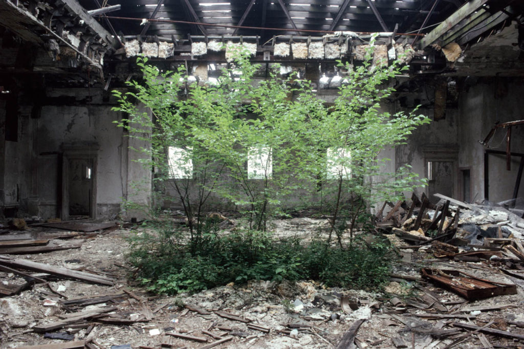
The above image is of the former Camden Library which became abandoned. There are trees growing in the former reading room of the library. Camilo framed these trees in the centre of the image with the library collapsing around them. This creates a stadium around the trees which creates tension and supports the idea of natures determination to grown through humans destruction.

Camilo used natural lighting which is coming through as streaks through the destroyed ceiling. This creates a holy like spotlight on the trees which could imply the idea of the glimpse of hope that nature holds.

The image contains high saturation on the foreground which makes the trees pop with colour but a low saturation and high contrast on the background which creates a gloomy look on the destroyed building, enforcing the juxtaposition between nature and man.
Anthropocene – George Marazakis

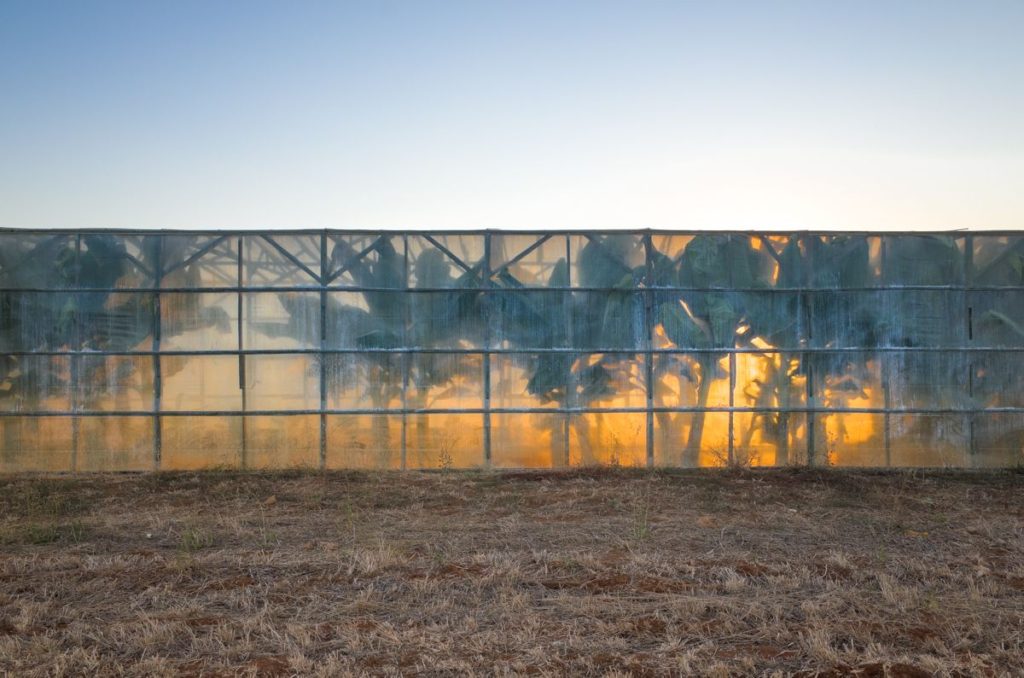
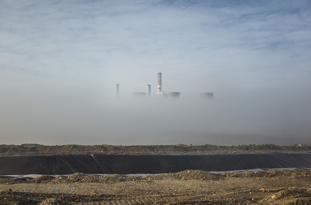
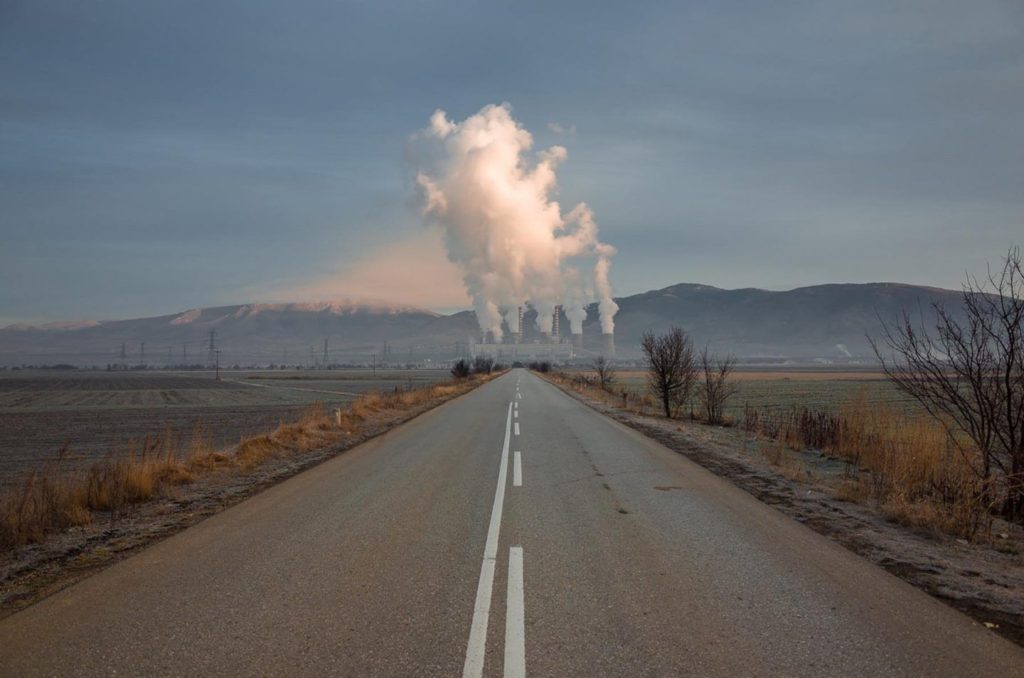
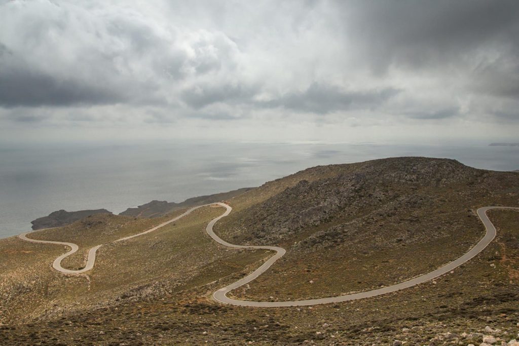
George Marazakis is a Greek photographer who has made a significant contribution to the visual enlightenment related to the Anthropocene with his photographic series, “A Cure for Anthropocene”

His work encapsulates the degradation of the environment in a subtle manner rather than a brash, “in your face” approach. His method does not concentrate on shooting the obvious, mainstream aesthetic themes such as animals entangled in plastics and inept images of geological agony that the media force feed society as a way of sort of ‘guilt-tripping’. Instead George shoots natural landscapes where subtle gestures of man’s ramifications can be seen. He seems to weave the elements of industrialism and climate change into his the landscapes rather than making them the vocal point. I feel this is a far superior way of creating awareness to the issue. It focuses on giving a neutral aesthetic to the Anthropocene. This forces the comparison process of making contrasts between the peaceful natural utopia and the traumatic dystopia that humans are inflicting on the planet. This forces audiences to use their cognition which leads to them caring about the issue more.

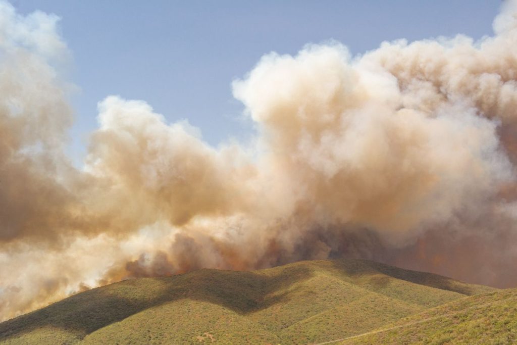
Another distinct element to his photography is the warm, hazy, monotone hue his images have. It almost implies the idea of the earth heating up and global warming. It also creates a slight sense of panic almost like a fire has started and orangey smoke is pouring out of his images. It develops an apocalyptic aesthetic for Anthropocene.

This subtle approach of integrating slight man made interruptions into his landscapes came about as George began to think of the Anthropocene as a disease. “While I was photographing the landscapes affected by human interactions in the middle of natural spaces, the topography started looking like a body to me – like something with the early stages of psoriasis on its skin,” he explains. “If humans are a product of nature, then we can say that we are a disease attacking our own organism, just like an immune system can attack its own body – like autoimmune diseases.” His work takes this idea of disease and spins it around to create a sense of hope by reinforcing the idea that diseases can be cured, this is imbedded in the name of his project ‘A CURE for Anthropocene’

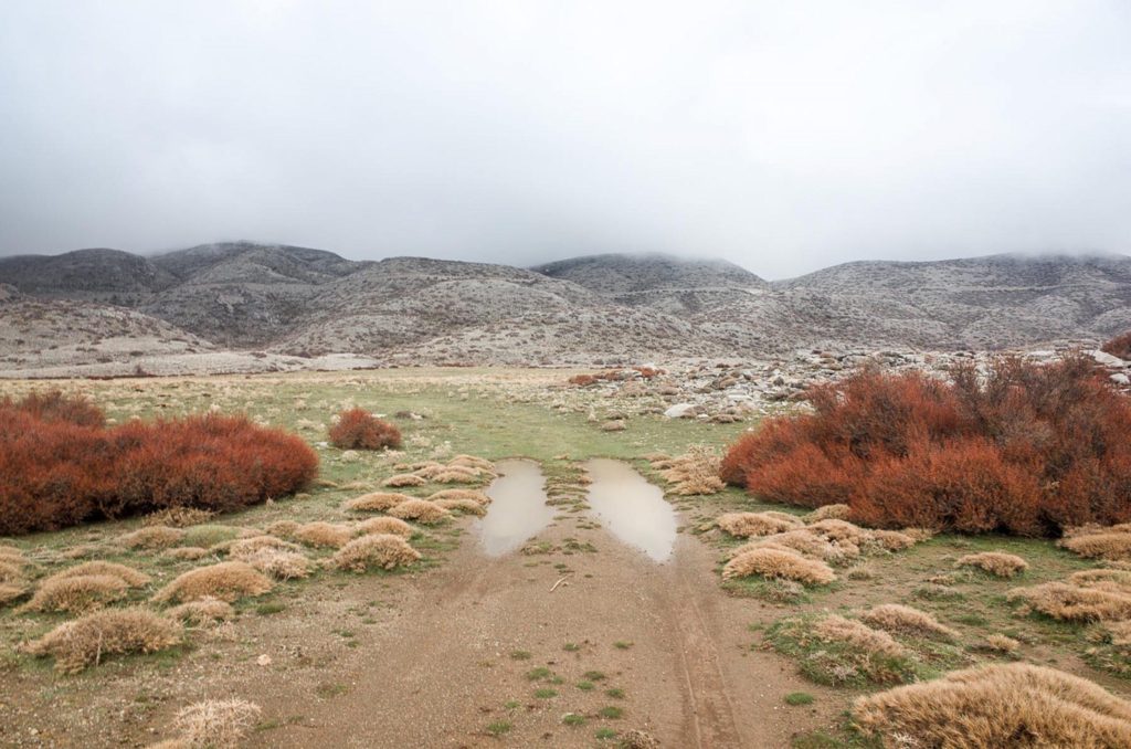
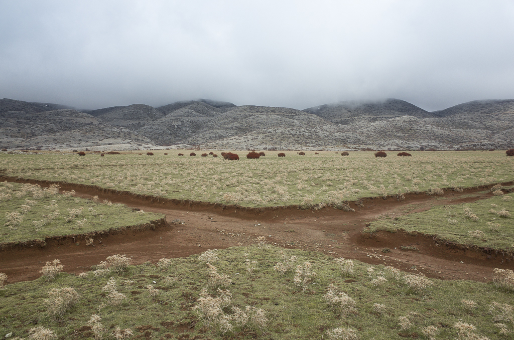
The above image features a natural landscape with a juxtaposition of a subtle hint to mans presence in the foreground with the carved out paths almost like scars on the earth.

George uses natural lighting and he creates a narrow image in terms of colour and contrast in the foreground while romanticising the background with higher contrast and tonal depth. This creates an almost boring foreground which insinuates the mundane and banal nature of man’s degradation on the earth while contrasting this with the dramatic powerful nature of the sublime in the background.

The image is also framed very symmetrically with the paths in the foreground forming an ‘X’ which creates a satisfying aesthetic.

Lewis Baltz

Lewis Baltz was an American Photographer Born 1945 who had an important role in the New Topographics movement of the 70s.

He was one of the first photographers to challenge the dominant methods of landscape photography at the time. He confronted the ideas of the “zero club” photographers at the time and along with 9 other photographers pioneered the New Topographics movement which turned photography’s perspective towards shooting urban man made features.

Lewis was trained to use photography as an art medium, to intersect with other aesthetic social questions rather than a practical form of diarizing and documentation.

Baltz grew up in one of the most rapidly urbanizing placing in the world – Southern California in the post war period. He watched the changes taking place he described it as a new world being born however not a very pleasant one.

It was a new homogenized American environment that was marching across the land and being exported. He noticed that no one wanted to confront this. This realization was the initiation of his interest in shooting the urban and igniting the New Topographic.

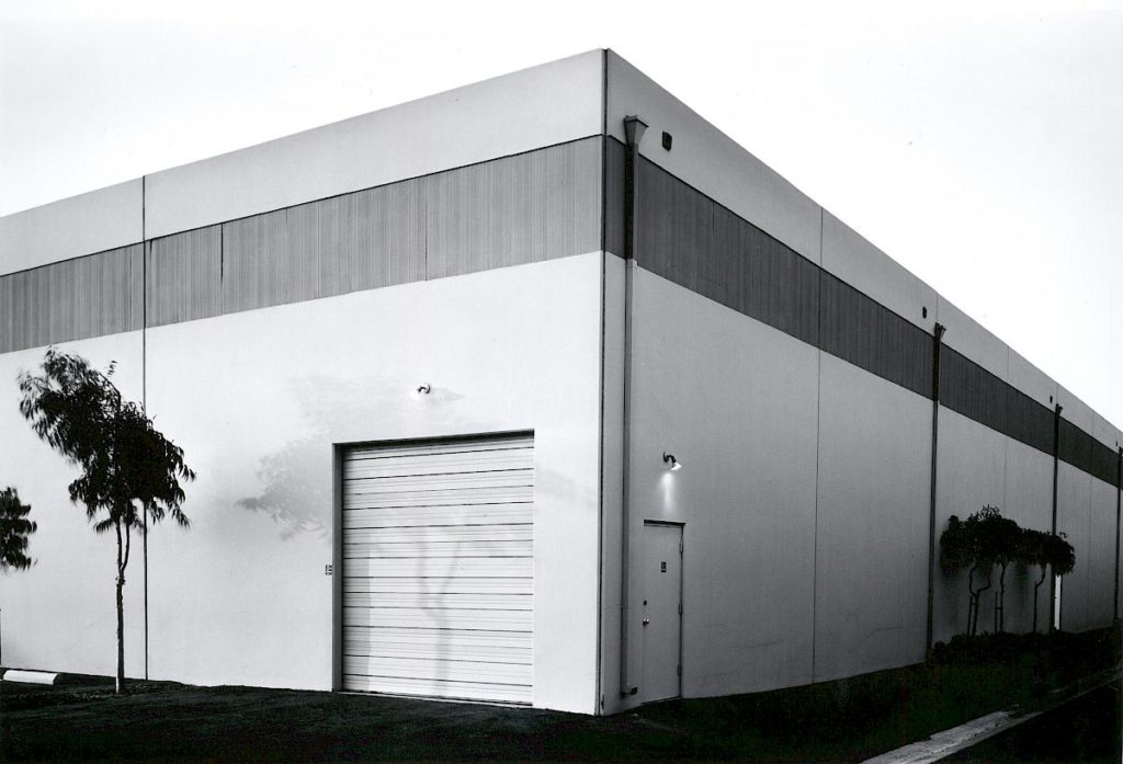
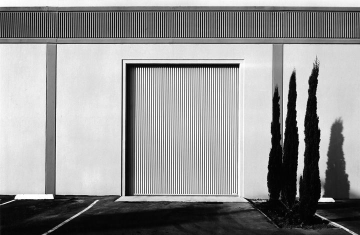
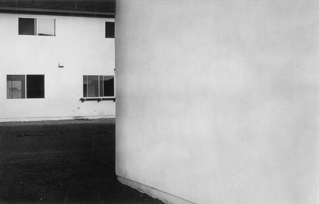
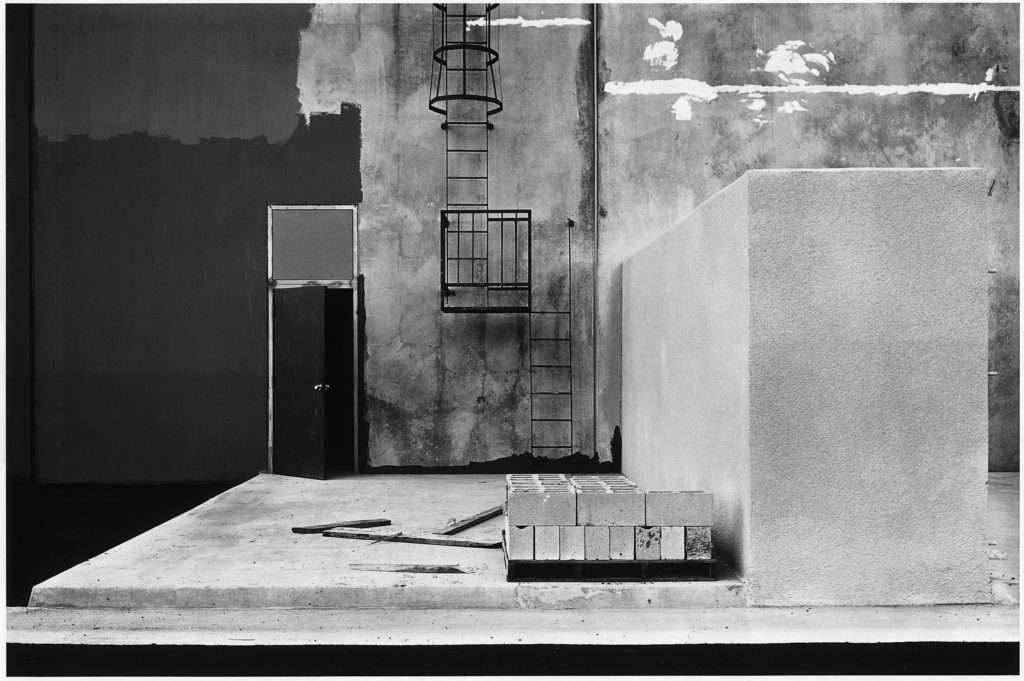
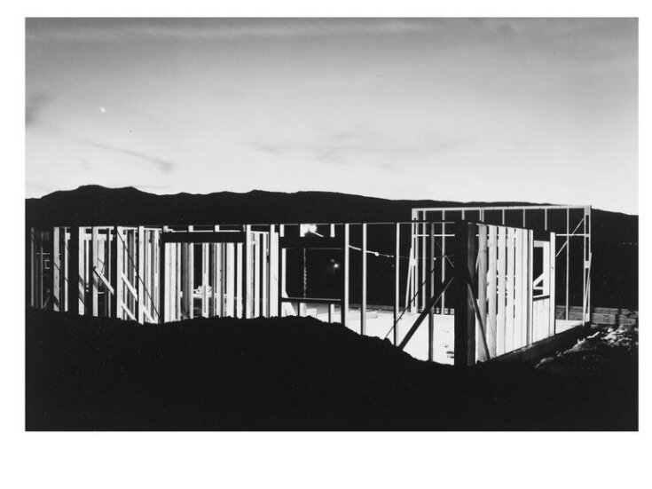
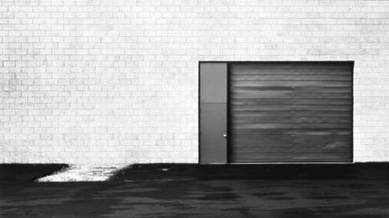
The above image was taken in 1974 and it is called “The New Industrial Parks” and it is part of a monographic series along side “The Tract Houses”, “Maryland”, “Nevada” and “Park City” wherein Baltz addresses cultural and philosophical questions about industrial zones and an artistic documentation of the boom in the urban landscape.

This piece relates well to Lewis’ motive to focusing on the familiar and creating an aesthetic out of the mundane. He does this by shooting a mundane building but making use of a deadpan viewpoint to create a somewhat symmetrical image with many leading lines. These leading lines create a grid like triad which splits the image vertically to comply with the rule of thirds.

The image has a shallow depth of field which gives it a 2D shape which can be an allusion to the lack of humanity which comes from urbanization.

The three slender trees on the right of the image are positioned strategically in line with the rule of thirds grid Lewis created and they add a sort of contrasting tension to the composition as they look like they are being overpowered by the colossal building behind them which consumes the whole frame. This could have been an attempt at pointing to the idea of mans impact on natural landscapes and how they are being overpowered.

The low saturation and more greyscale colours in the images convey the gloomy emotions of the industrialisation. The image also has a very wide tonal range.

Ansel Adams

Ansel Adams is an American photographer born in 1902 and is widely regarded as one of the most influential figures in landscape photography.

His work aims to convey the scale and the power of natural scenes. He does this in a unique way by romanticizing these landscapes. This means he enhances the landscapes past what the eye can see.

He was also a pioneer for a tonal system called the Ansel Adams Zone System – his photographs would convey a very large tonal range from true blacks to true whites in the exact same image.

Ansel Adams: The Formative Years - precise-moment.com

He was part of a new wave of photographers in the early 20th century who divorced themselves from pictorialism and he became an advocate for “pure photography”. This is a style of photography which focuses on sharp focus high clarity and great tonal ranges.

He is known for his stunning landscapes of American national parks specifically the mountains he captures.

The above image is of the Snake River in the Grand Tetons in 1942.

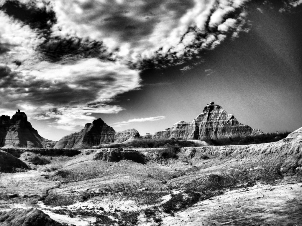
The first discernable feature of this image distinctive to Ansell Adam’s work is the impeccable contrast and tonal range where he has captured every tonal level from the pure black in the foliage in the bottom left and some of the mountains to the pure whites in the river, the snow and the clouds. Ansell probably used a lot of burning when exposing this image to get these pure whites. Knowing Ansel’s past and his emphasis on the pure photography movement we can relate this to the above image with the emphasis on a high clarity crisp image with high contrast. This detail adds a sharp texture to the image which can be seen to emphasize the sharp summits of the mountains in the background.

The image also has a great depth of field. There are many components layering the image from foreground to background. The distant mountains contrast with the near foliage. The winding river adds perspective of depth with its ripples which create a sense of detail being prominent in the foreground, these details and the rivers size slowly diminish as it meanders and winds like a snake through the middle of the image.

The summit of the mountain is framed in the center of the image which creates a sort of aesthetic pyramid form to the image.

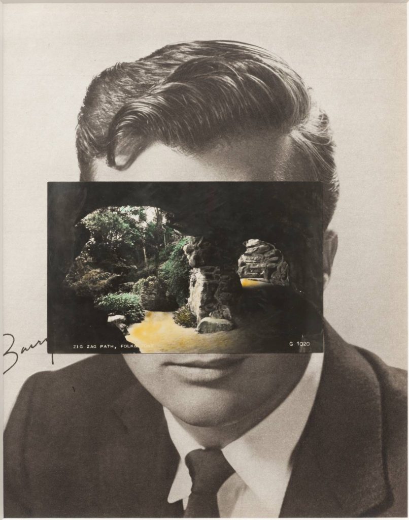
Photo-Montage – John Stezaker

Stezaker is a British photographer born in 1949.

He is fascinated by the “lure”of images.

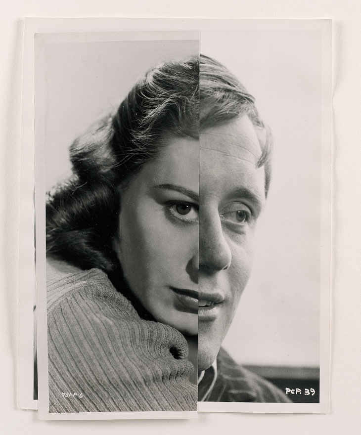
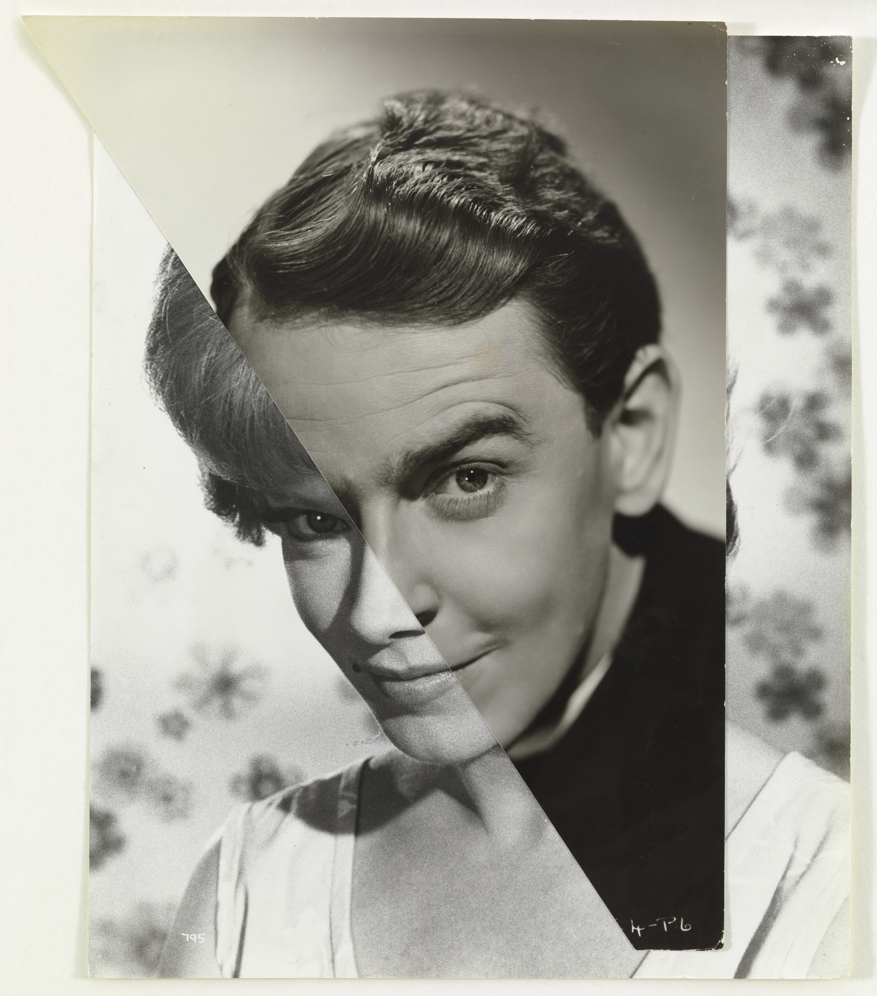
Stezakers’ works focus on photo montage to give old images a new meaning and add a creative surrealistic tinge to his photography.

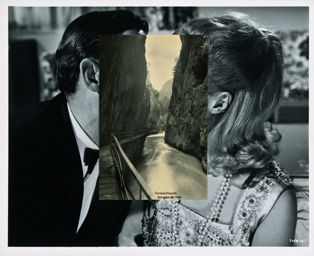
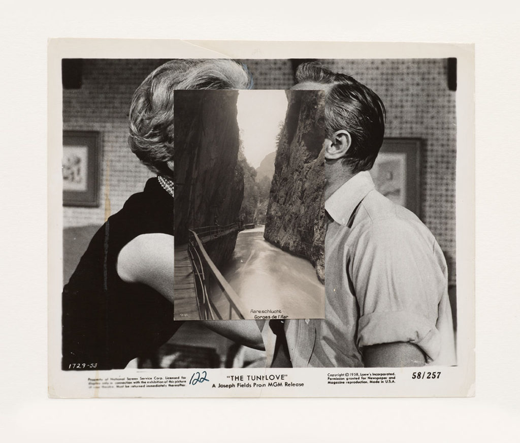
He focuses on the similarities of structural and compositional elements of an image and stitches them together in a seamless yet surreal fashion. For example in the below image he uses the structure of the cliff faces and relates them to the structure of the subjects faces in the background.

This image has quite a flat, monochromatic style which almost gives it a warm balance, soft texture and comfortable feel. The montaging of the cliff faces is visually appealing as it is framed in the centre of the image. The two layers to the image each have their own depth which creates this double up of depth in the image and the eye has a lot of elements to look at which would give it a chaotic composition however because of the montaging the additional layer fits seamlessly within the background which cancels out this chaos and rather satisfies the composition.

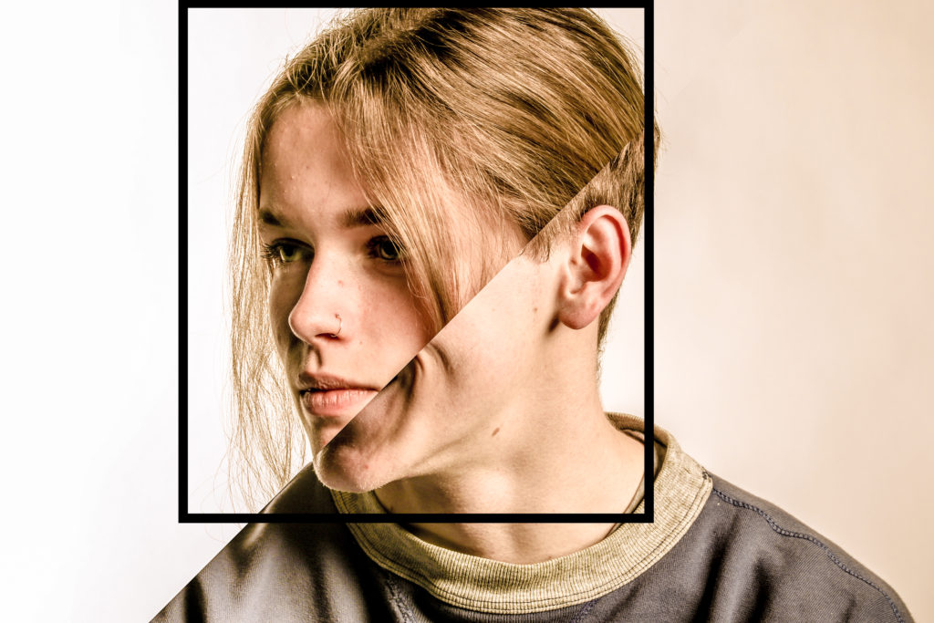
My response to Stezakers’ work:

John Stezaker. Marriage XV. 2006 | MoMA
John Stezaker
Michael Kenealy
John Stezaker - Whitechapel Gallery
John Stezaker
Michael Kenealy

Claude Cahun

During the 5 year occupation of Jersey by the Germans during the second World War, amongst many terrible things that happened, many antagonists where deported to camps or imprisoned. 75 years ago the island was liberated by allied forces. The last antagonist prisoners to walk free days before the liberation were the Les mesdames who are regarded as local heroes for contributing to the liberation of Jersey.

Lucy Schwob better known by their pseudonym, Claude Cahun was the better known half of the Les mesdames, which was the name that Jersey islanders gave her and her step-sister/lover Suzanne Malherbe (known by her pseudonym Marcel Moore).

Claude came to Jersey from Paris with Marcel in 1937. The couple sought Jersey out for two reasons; because of the jubilant memories of childhood holidays to the neighbouring island, and it was a familiar place to escape the abhorrent fascism and antisemitism that was terrorizing Europe in the ’30s as Claud was Jewish on her fathers side. 

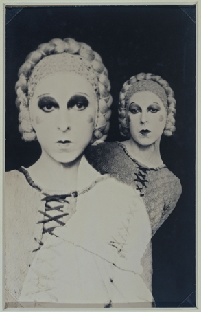
Cahun was a French surrealist photographer, writer, and sculptor. A consistent element present in her work is her unconventional exploration and representation of the concept of Identity. Claud explored her identity in a way where she challenged preconceived notions of sexuality and gender of the time. Claude presented this in her works where she would photograph self portraits where stereotypical gender characteristics where aggravated, for example the following piece where she can be seen composing her appearance as a masculine “circus strongman” while still conveying typical feminine appearance stereotypes such as the bold lipstick:

Claud Cahun

Cahun believed that gender was exchangeable. Assuming different identities was her strong suit.

Claude Cahun

In the above image Claude represents the idea of multiple coexisting personalities by photographing a self portrait by creating a double exposure which is done by shooting an image on film and then shooting another with the subject repositioned on the same segment of film. She has used harsher fluorescent lighting in this image which has created a over-exposed, porcelain looking facial composure whilst accentuating the shadows around her jaw eyes, this could’ve been a way of exploring her identity by ridiculing the identity she was portraying by exaggerating the stereotypical feminine beauty aesthetic of the time being the over-powdered face and eccentric makeup. She also creates greater depth and form in the composition by separating the subject from the background by using a dark negative background and high contrast which opposes the light foreground giving the image an unconventional portraiture look.

Claude Cahun: Jersey’s queer, anti-Nazi freedom fighter

http://www.jeudepaume.org/index.php?page=article&idArt=1480

Identity and Place – Francesca Woodman Study

Francesca Woodman

Francesca Woodman: House #3, Providence, Rhode Island, 1976.jpg
“House #3, Providence, Rhode Island” – Francesca Woodman (1976)

Francesca Woodman, Born in New York in 1958, was an American photographer famous for her monochrome photography of both herself and other female models. The main common feature in Woodman’s work is her use of movement captured by long exposure, creating a ghostly affect. Her videography has been featured in exhibitions around the world, like the Helsinki City Art Museum in Finland, the Tate Modern in London and the Cisneros Fontanals Art Foundation in Miami. Woodman continued her inspirational work that brought mental health issues to life until she died at the age of 22 in 1981.

Examples of Francesca Woodman’s work

https://www.tate.org.uk/art/artists/francesca-woodman-10512/finding-francesca

“Space 2, Providence, Rhode Island” – Francesca Woodman (1976)
“Untitled, Providence, Rhode Island” – Francesca Woodman (from Polka Dots Series – 1976)
“Polka Dots, Providence, Rhode Island” – Francesca Woodman (1976)

Analysis of Francesca Woodman’s work

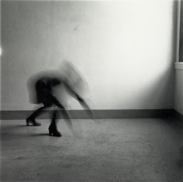
“Space 2, Providence, Rhode Island” – Francesca Woodman (1976)

This image, titled “Space 2, Providence, Rhode Island” depicts Woodman’s underlying sense of human fragility. This depiction of mental health struggle is exaggerated to prove that although through first glance a person may look okay, however their mental illness consumes their entire existence in many cases.

The moody and ominous lighting is provided by natural sunlight shining through the window in a downwards direction. Although the shadows casted are harsh and dark, the edges on the shadows are blurred and hazy, proving the lighting to be slightly soft. The darkest areas of the photograph can be seen in the shadows and the ghostly figure, these areas are juxtaposed against the brighter areas such as the light casted onto the walls through the window.

The straight, thick lining along the floor could be said to be seen as a leading line as it directs the viewers eyes to the mysterious figure towards the middle-left of the image from either side of the photograph.

Although there is no representation of repetition in this image, there is a strong sense of echo, displayed by the delayed movement of the model. This is due to the use of long-exposure by which the camera lens is open for a longer period of time in order to capture the late movement within the picture. The method of long exposure provides an eerie tone to the photograph.

There is a combination of both organic and geometric shapes within this image. Straight-edged shapes can be seen in the lining of the floor and the triangular-shaped shadow in the bottom-right hand corner of the photograph. On the other hand, organic and curved shapes can be seen in the indistinct figure just off the centre of the image, as her back is curved.

It is difficult to work out the depth of field within this photograph as the majority of the background is empty, negative space. This means that there is little comparison in focus between the foreground and background. However I believe there is a narrow depth of field as the edges of the image are slightly blurred.

There is little representation of texture shown in this image as that is not the main focus of Francesca Woodman’s work, although if I had to comment on texture I would say it is smooth as there is no rough or jagged edges seen in the image.

There is a range of tones from dark to light in this image which creates an uneasy atmosphere for the viewer. the darkest tones can be seen in the shadows and in the model crouching in the left thirds of the image. The lighter tones can be seen in around the window, as the natural sunlight beams in and highlights a small section of the photograph. This image tends towards darkness as the majority of the image is in darkness.

There is no colour in this image because of Francesca Woodman’s common theme of greyscale aesthetic within her series of images. The lack of colour brings to light a visual representation of how many people view mental illness as seeing life ‘without colour’. I believe that if this image was taken in colour it would take away the sense of mystery and doomy ambience of the photograph.

The composition of the image is very simple, as the background is very empty and there is a singular focal point in the photograph. I would say this image is unbalanced as the camera is set at a leaning angle rather than central and the focal point is not dead-centre in the photo. There is no influence of geometric-shaped positioning which makes the image harder to comprehend and understand and the rule of thirds is not used either.

Francesca Woodman inspired photoshoot moodboard