Tag Archives: Anthropocene

Anthropocene – Final Images

Final Image Display

Sequence One

Sequence Two

Sequence Three

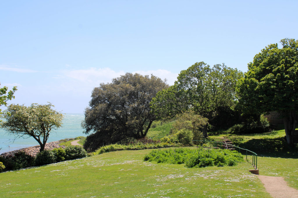
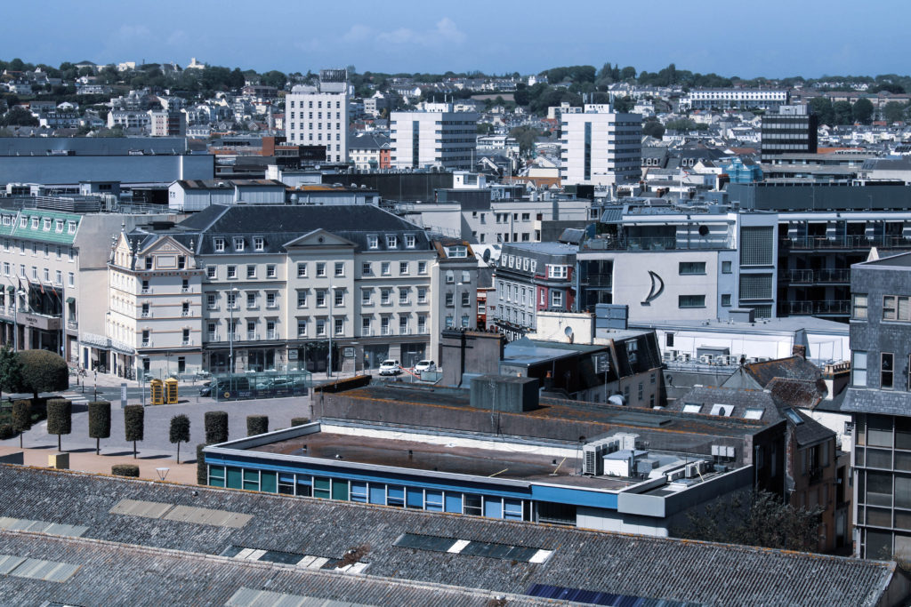
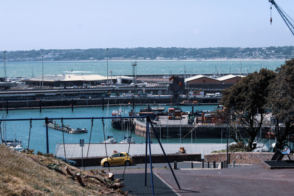
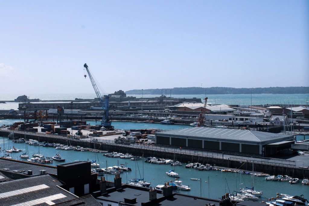
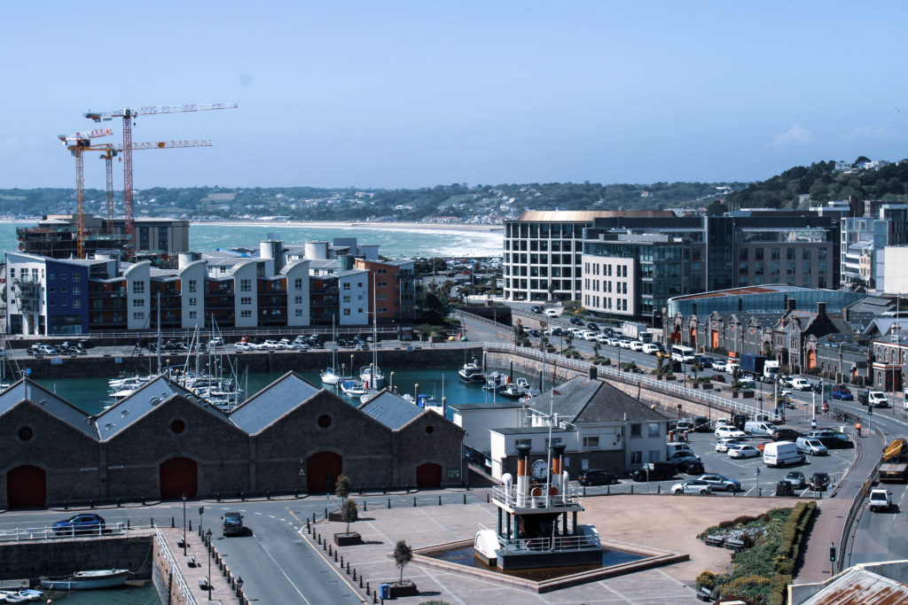
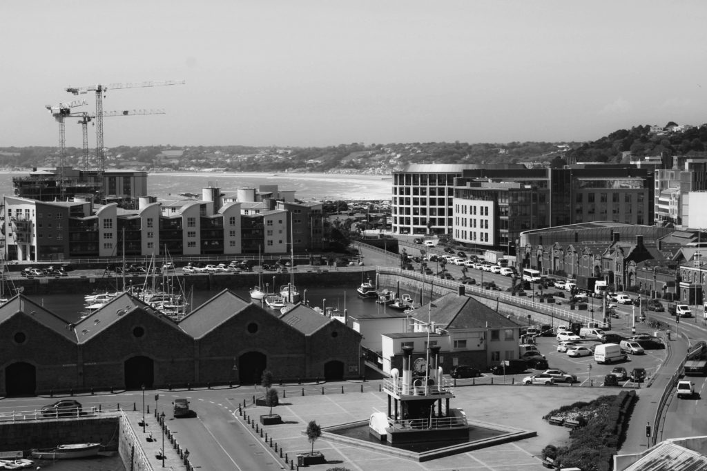
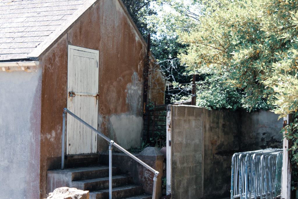
I have chosen these final images due to their strong link with Anthropocene and their ability to symbolize the growing industrialization of our world. My initial idea was to create a sequence of three images, each showing a different stage of urbanization in a sort-of storyboard style. Each image demonstrates how increasingly unnatural our world is becoming by revealing more of man’s impact on the surroundings. After carrying out photoshoots inspired by Edward Burtynsky and Andrew Moore I made the decision to edit each image with a harsher blue tint each time, so the final Burtynsky inspired image at the end of the sequence was of a cooler temperature, reflecting the landscapes emotionless atmosphere. Furthermore, the increased editing of each image symbolizes how manufactured and artificial the planet is turning out to be from society’s disregard of nature, with each image growing colder and more unnatural. The composition and leading lines in each image draw the observer’s attention along the sequence in a cyclical pattern, as if the story goes on over and over again, just like man-kind is frequently building modern structures and industrial sites which all aid in harming the atmosphere around us. Contextually, several photographs from my Burtynsky shoot (which have been chosen for my final display) document reclaimed land in Jersey. It is a fact that reclaimed land is highly susceptible to soil liquefaction, which can amplify the amount of damage that occurs to buildings and infrastructure – I decided to capture these landscapes to further my point on humans being the main source of global devastation, we are interfering with nature and creating danger for all, even destroying the industrial structures we have built in the process- ironic.

Edward Burtynsky Comparison

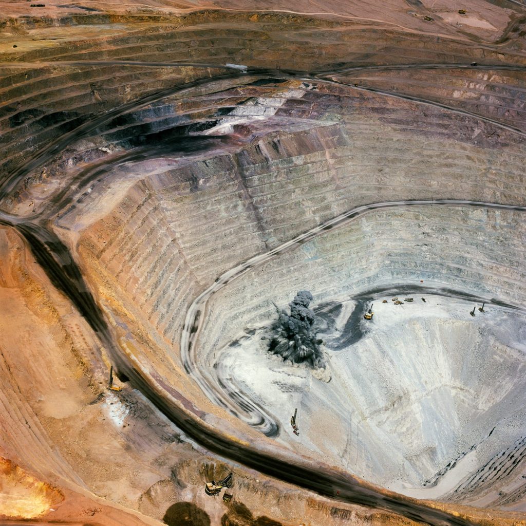
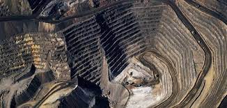
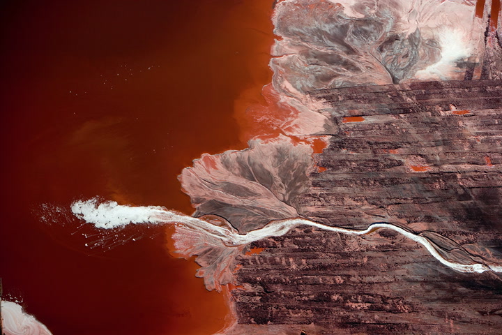
I have decided to compare this Edward Burtynsky image to one of my final pieces because of their similarities in composition and their use of the formal elements. Firstly, a clear similarity between them is the capturing of repetition throughout the landscapes, Burtynsky has photographed an area with circular structures reflected in uniform rows. I believe he was attempting to mirror how unvarying our planets architecture, and even societies themselves, are. Repetition is plainly captured in my image in the form of rectangular shapes from buildings, windows and structures – showing the increased artificial landscapes through geometric echoes. I wanted to reflect Burtynsky’s repetitive technique, however slightly differently to demonstrate the way different communities deal with Anthropocene, seeing whether they fight against it or let it take over. Also, the basic and elemental nature of these shapes shows how trivial these modernized areas in the world are. Additionally, another similarity between these photographs is their straight horizon lines which act as an indication for their wide depth of field. The leading line in Burtynsky’s image slowly reveals a disappearing background as the horizon becomes misty and unclear, this could possibly symbolize how man-kind is forgetting, or not choosing to see, their destruction and wrecking of the natural world – as if industrialization is all that can be seen going into the future. In my image there is also a clear straight leading line across the horizon, however in the background there is a hint of hope within the capturing of a natural environment where trees poke through the urbanized surroundings. The comparison between these two uses of leading lines demonstrates how there is still hope for our landscapes future, however if we don’t act now, that hope will disappear. A key difference between these images is the cameras point of view, while there is the similarity of them both being captured from above, Burtynsky’s birds-eye-view shows a greater span of land. Furthermore, due to my editing choice to connote a more derelict and cold atmosphere through turning down my image’s temperature, the colour palette in Burtynsky’s photo is slightly more muted then mine – nevertheless both still produce a sense of sadness, connoting the robotic and artificial mood of the setting.

Andrew Moore Comparison

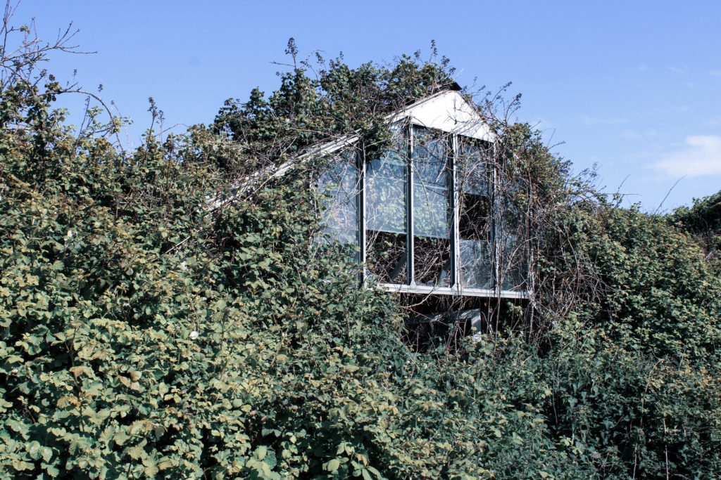
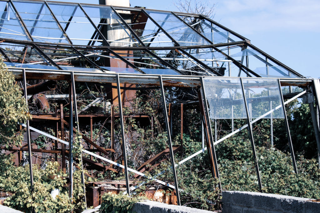
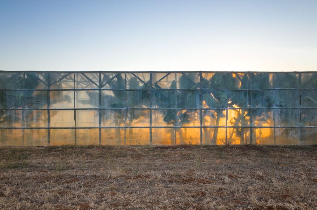
I chose to compare this image by Andrew Moore to one of my final photographs due to their similarities in texture, composition and differences in colour/temperature. Firstly, one similarity between these images is their busy, rough texture which is created by the repeated leaves and brambles entwined around the greenhouses. In both images this texture connotes ideas of discomfort and restriction, symbolizing how nature is being forced into a corner to try and survive from man-kind’s destruction. Additionally, Moore’s image has a similar composition to my own as both are captured at an eye-level point of view with the main subject taking up the span of the entire frame. The scarceness of negative space in these photographs demonstrates how desperate nature is to withstand industrialization and retaliate against man-kind’s interference. Moreover, this creates a short depth of field as little can be seen beyond the overgrown structures, connoting how little time is left for nature to overcome this destruction. Furthermore, another similarity is the image’s use of shape, both mine and Moore’s photos capture triangular structures which are being consumed by the natural shapes of nature. The juxtaposition between these geometric and organic shapes reveals to the observer how the effects of human interference with the planets natural landscapes is causing nature to use force against what we have created, connoting the theme of man Vs nature. Nevertheless, there are also several differences between my image and Andrew Moore’s, for example they both hold different temperatures. Moore’s photograph has more warm tones of orange and yellow allowing us to guess the time of year is autumn and that the image has been taken later on in the day. The warmth of Moore’s photo could possibly symbolize global warming, showing the danger in industrialization, however the saturation of the tones also demonstrates how nature still finds a way to be beautiful even after all the carnage it’s been through. Contrastingly, my image holds much colder tones to represent the cold-heartedness of society – I wanted to symbolize how man-kind has made these landscapes feel, their atmosphere changed by the impendence of humans.

Review And Reflection

My aims and intentions for this Anthropocene inspired project were to demonstrate how man made structure were increasingly impacting our natural environment. I planned on capturing landscapes around Jersey in three different stages; the first highlighting the beautiful natural areas in fields and woodlands, the second showing areas of Jersey where nature can still be seen however man’s impact is taking effect and the third exhibiting the cluttered industrial landscapes of our island. While working on this project I discovered the relevance of camera point of view in images, I found it important to capture my photographs from specific locations and angles to represent the message of impending industrialization that I wanted to portray. One of the biggest obstacles I overcame during this project was my lack of confidence in my editing process, I found it difficult to portray my idea uniquely through editing and became stuck for ideas. However, I quickly overcame this obstacle by brainstorming and experimenting on Lightroom to discover how temperature effected the atmosphere of my images, I really love how the increase in coldness over each image symbolizes the heartlessness of the destruction of nature and the urbanization of landscapes. I would say my greatest strength during this project was my ability to create a storyline through a sequence of images, I believe I successfully connoted the growing industrialization of our world and used my time wisely to experiment and analyse my final images in comparison to the photographers I took inspiration from.

Anthropocene – Editing And Experimentation

Edward Burtynsky Photoshoot

During my editing process for this photoshoot I decided to demonstrate how cold and senseless our world is becoming as a result of mass industrialization – I heightened the whiteness of each image using Adobe Lightroom to reflect Burtynsky’s dystopian and modernized landscapes, symbolizing how human impact may fulfil modern aesthetics, however it also destroys natural habitats. When editing I found it important to keep the cold tones and blue hue across the images in order to suggest how the industrialization of natural landscapes is cold-blooded and eradicates the feeling and warm atmosphere that is produced by unrefined and rural areas of civilization. In Lightroom I turned down the temperature of these images and slightly decreased the vibrancy to further the idea of an unconcerned damaged world. In addition, I wanted to refrain from cropping any of my Edward Burtynsky inspired images as I believe the plain clear skyline in each of the photograph’s backgrounds gives the impression of there being a clear solution to the global problems in this day and age, allowing nature to thrive without destroying it for commercial/industrial purposes – linking with the Anthropocene idea that humans are the single most defining force on the planet as a result of mass industrialization.

Black & White Experimentation

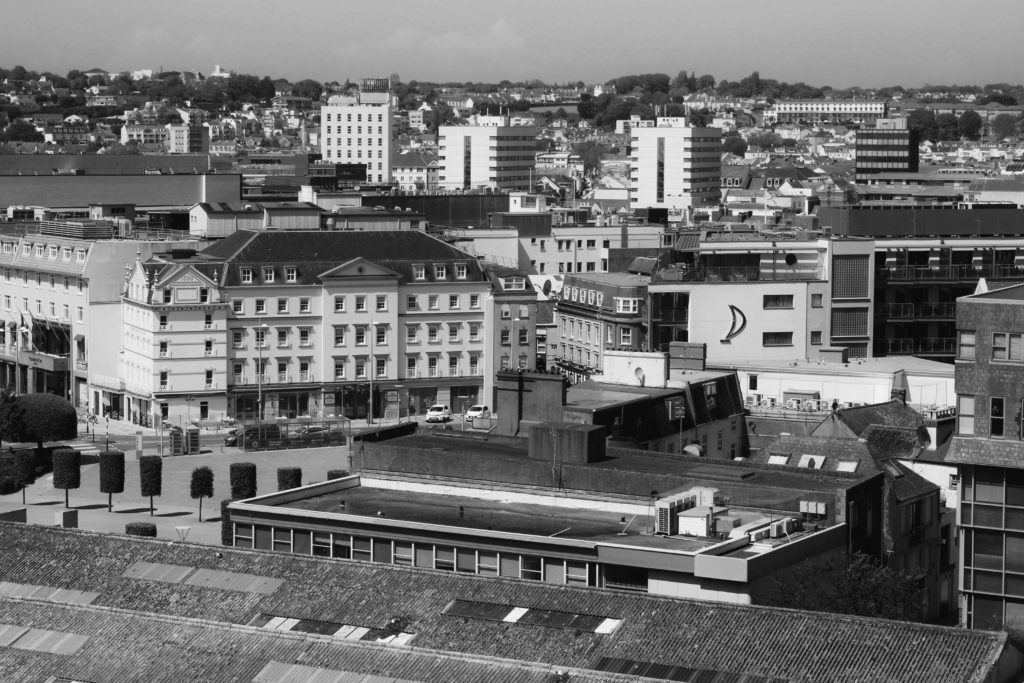
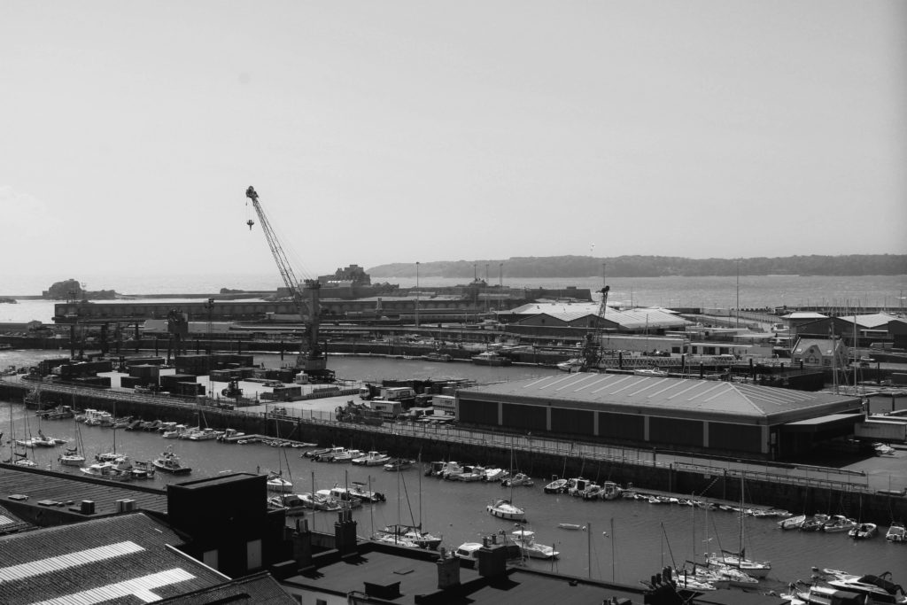
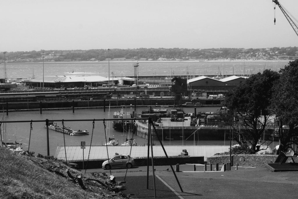
I chose to edit these specific same four photographs in black and white to experiment further with how colour can effect the atmosphere of an image. I edited the photos in Adobe Lightroom by turning down the saturation and vibrancy fully, heightening the contrast slightly to create darker tones. This wide range of light and shade in my images creates a more sombre atmosphere for the observer, the monochrome filter adds drama and creates a vintage feel linking to black and white photographs from the past. I believe this editing choice gives the impression and idea that Jersey’s landscapes hold so many memories for those that have lived here their whole lives, grandparents may have once had a home, or went to school here when the landscape was not industrialized – the black and white nostalgic atmosphere created juxtaposes with that which has been captured; a modern land with age-old memories. Furthermore, I believe that editing these images greyscale has emphasized the sheer amount of repetition within them, for example as the contrast is heightened it draws the observers attention to the darkest areas of the images. As these more shaded areas fall on the windows and doors photographed, it creates a grainier texture due to the high amount of times these subjects are echoed throughout. I think that editing these images with a black and white filter has added a dramatic yet nostalgic effect, juxtaposing with how these Jersey landscapes have been modernized over time. However, the monochrome effect does not provide as much of a cold atmosphere and doesn’t show the observer how man-kind is apathetic towards nature, I believe the cold temperature/coloured editing displays how society views their creations as inventive without seeing the danger behind how mass industrialization effects our planet – when deciding final compositions I will need to consider which editing choice works best.

Andrew Moore Photoshoot

I chose to edit these three images from my Andrew Moore inspired photoshoot to demonstrate how human impact on the natural environment makes its beauty deteriorate, even with nature trying to fight back. During my editing process I made the decision to turn down the saturation and vibrancy of these images in order to reflect the dismal atmosphere that is present in these locations, the muted colours mirror how man-kind’s creations try to silence nature by destroying it. Additionally, I decreased the temperature of the original blue hue that fell across the image’s skylines as I believe they added too much of a bright happy atmosphere which is not what I wanted to portray. I also slightly decreased the exposure to produce a more gloomy and abandoned mood around these photographs to symbolize how these neglected landscapes had been left to ruin. I believe that making the choice to carry out more harsh editing on these images links to the idea of Anthropocene strongly, connoting the idea that man-kind’s ‘editing’ of landscapes is wrecking the unrefined blessing of nature – I plan on setting out my final images in a sequence which shows the growing industrialization of our world, which with this editing choice will be furthered seeing the absence of colour increase as man-kind’s effects take their toll.

Multi-Exposure Experimentation

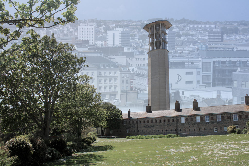
I decided to experiment by creating two multi-exposure images on Adobe Photoshop by merging four different photographs, two from my Andrew Moore inspired shoot and two from my Edward Burtynsky shoot. In Photoshop, I lowered the opacity of the two Burtynsky inspired images and placed them over the other’s skyline. My idea when creating these multi-exposures was to reflect how the future of our planet may look if mass industrialization continues. In the background, the faint St Helier skyline I have edited on really effects the texture of the images as the repetition of buildings and windows creates a more cluttered and artificial feeling. As the modernized setting continues on and disappears into the background it connotes the idea that Anthropocene will proceed into our world’s future, as a wider depth of field is formed. In terms of shape in these images, the geometric patterns from the modern buildings juxtapose greatly with the organic shapes of the trees captured in the foreground. This gives the impression that mass industrialization will not only destroy the natural landscapes of our planet, but also the way society views themselves; the blocky/structural architecture symbolizes how man-kind are becoming robotic homogeneous beings that have no care for the environment around them. The composition of these images also links to Anthropocene ideas, for example the second multi-exposure edit uses the rule of thirds to show the stages of industrialization without needing a sequence of lined up images. The foreground demonstrates nature untouched by man, the mid-ground hints at man’s slight interference with the environment and the background clearly shows mass industrialization. While this technique has its pros, there are also cons surrounding how the ‘stop urbanization’ message could be understood and possibly lost in translation due to the cramped texture and dull vibrancy throughout, as I wanted to reflect the beauty of nature compared to the banal devastation formed by industrial landscapes.
Anthropocene Artist Comparison

Camilo Jose Vergara
George Marazakis

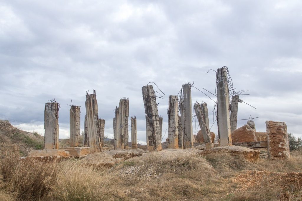
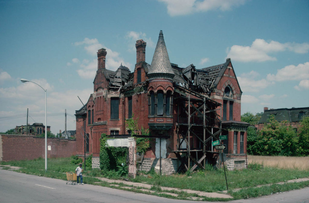
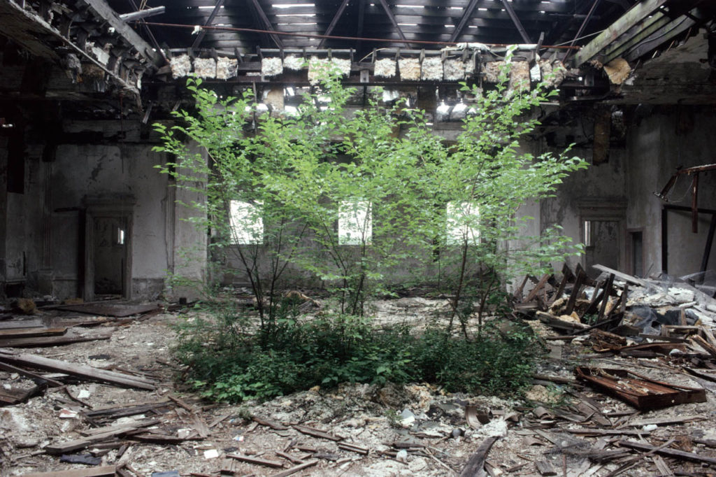
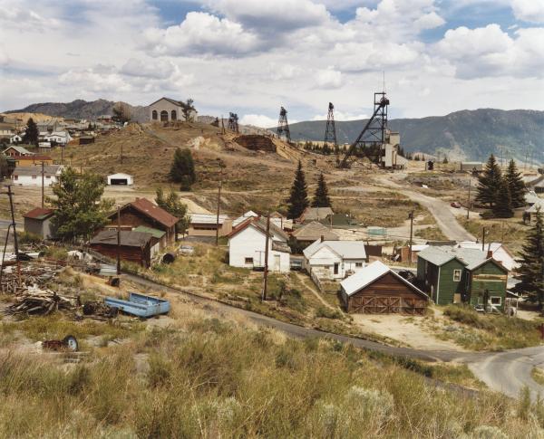
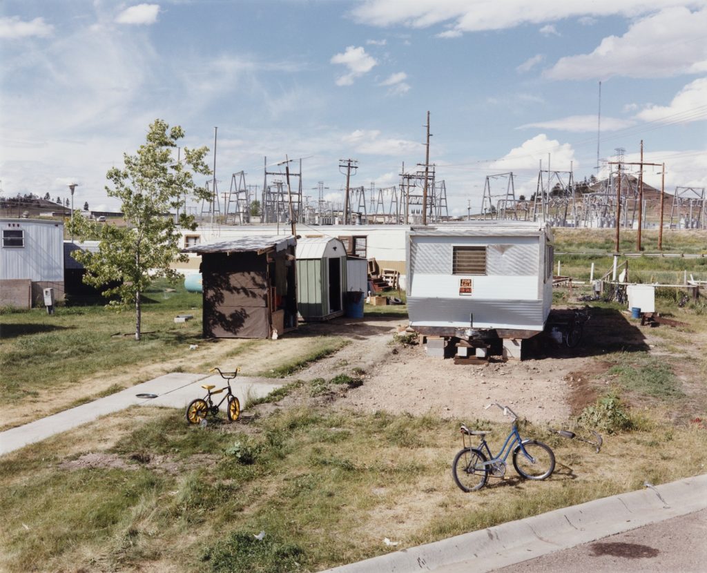
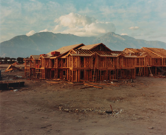
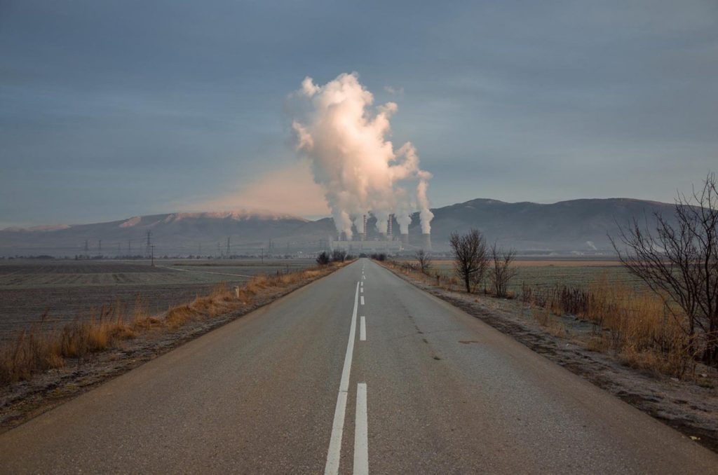
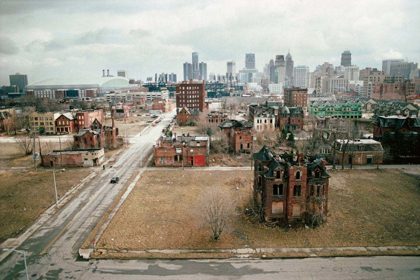
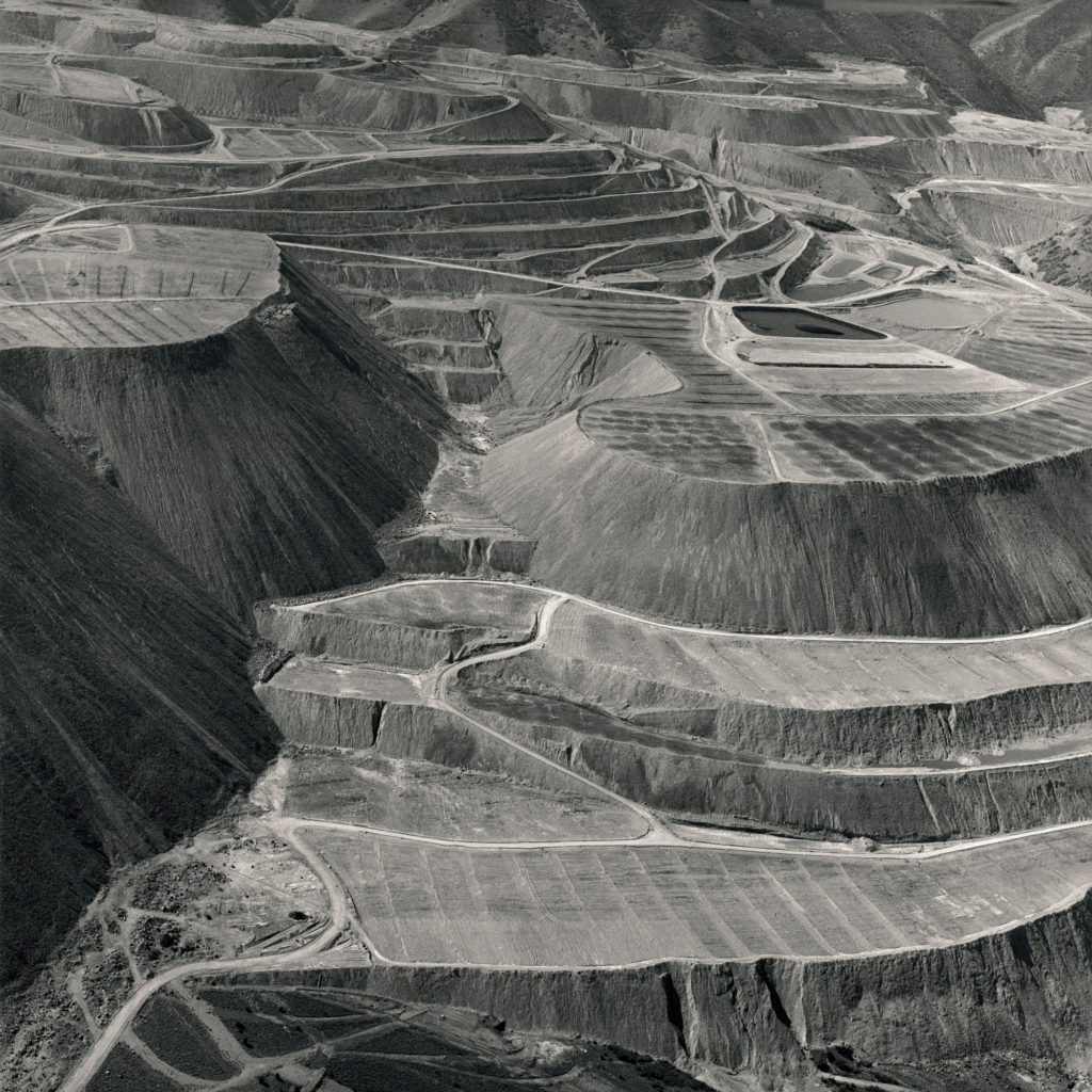
Both images feature a reaction to the Anthropocene. They do this by capturing the essence of mans reckless footprint on the natural environment and man’s greed and carelessness of having to constantly industrialise and destroy the natural environment and then move on swiftly without care. This is seen in these images where the focal point is placed on the derelict structures by framing them in the centre of the composition in a symmetrical fashion.

Both images have similar structural features, they both contain many vertical leading lines created by the structures and the neutral perspective at which they are shot. Both images also contain a deep depth of field with the structures in the foreground and the clouds and various other elements stretching far into the background.

These images differ in their colour schemes as Camilo’s image features a more saturated look with a wider tonal range which creates a deep contrast in the image. The image also contains a wider range of colours whereas George’s image contains a monotone, warmer colour scheme with shallow range of colours. Georges image is also flatter in terms of contrast, it has a narrower tonal range.

Anthroposcene Ideas

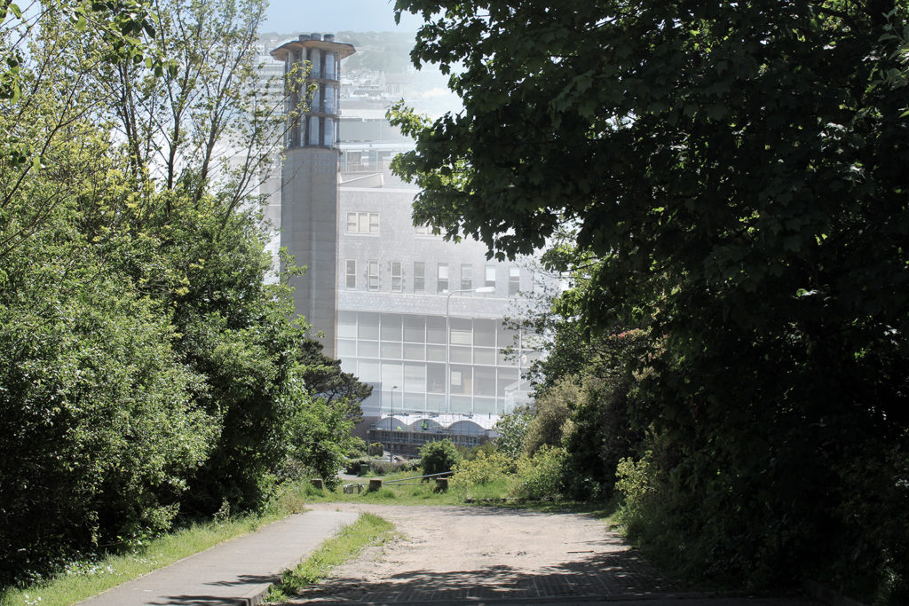
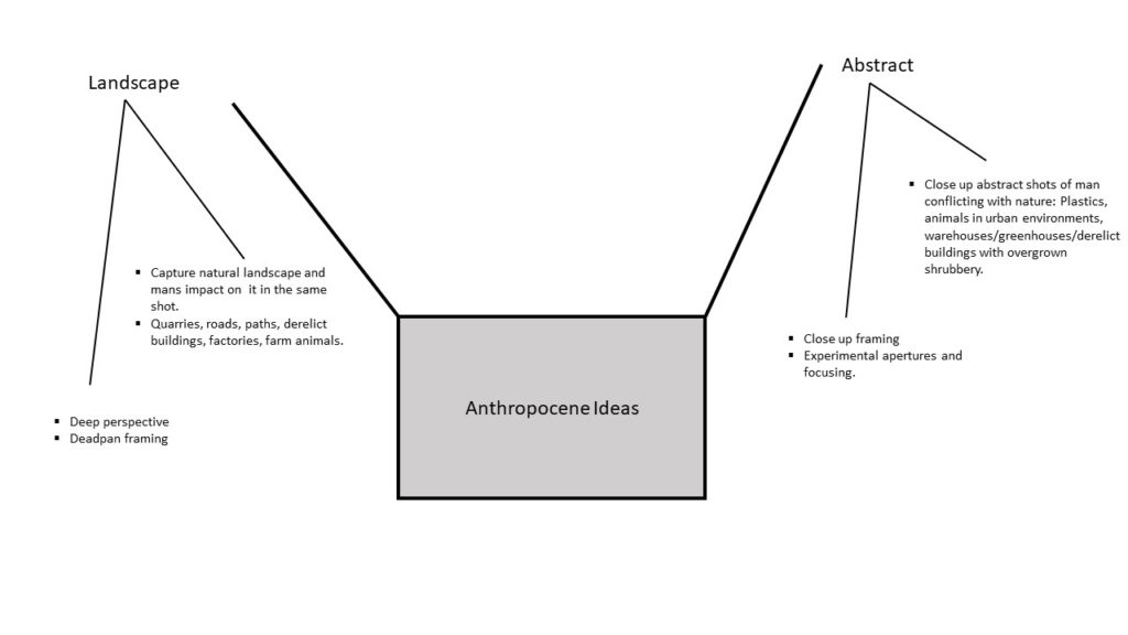
I have chosen to explore the concept of Anthropocene through the genre of landscape photography. I plan to react to ideas of nature being transformed through industry and venture into ideas of altered landscapes through my images. I will do this by shooting landscapes in a wider and vast perspective, of which supplies a view of the full picture. This allows a juxtaposition to be made between the natural environment and what man has interrupted it with.

I also plan to express the conflict between urbanisation and the environment by shooting derelict buildings and portraying nature fighting back against man. I plan to incorporate some abstract methods of photographing these buildings, with a more zoomed in perspective.

Below is some inspiration for my Anthropocene project:

anthropocene

Meaning

The meaning of anthropocene is a geological point of view in which humans have started to impact the earth’s ecosystems or even climate change that has occurred within the past years. Therefore, this word fits perfectly into photography as photographers take pictures which can be documented to show the change’s in the ecosystem on the earth in order to show the rest of the world the downfall in the ecosystems and climates changes on our planet.

Ideas (mood-board/ images)

Anthropocene
Landscapes places that have construction undergoing or getting pictures of cranes on site.forests that appears to be damaged which could be done by being abstract. Places in which there are industrial buildings that cause damage to the environment through pollution.
Portraits Someone wearing a bin as a outfit or plastics in general. Using plastics as accessories on the model. After a simple portrait being taken of a model, I could edit some landscapes onto them.

Altered LandscapesPicture of king street with the pavements being sand once edited.Picture of some flats then editing them onto a sand dune. Taking a picture of a forest changing the bright colours into colours that represent negative emotion.
Case Study

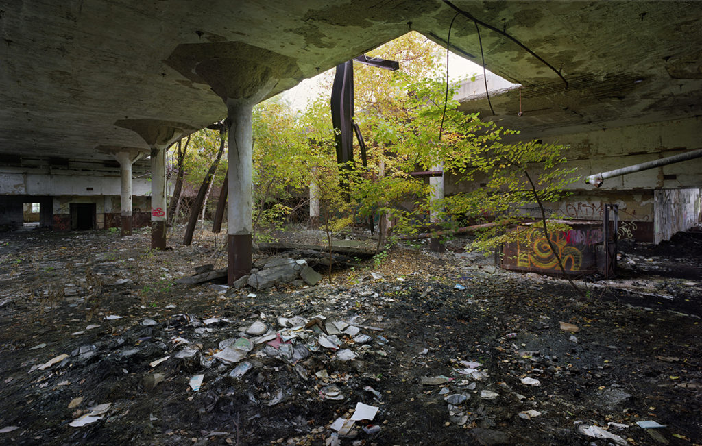
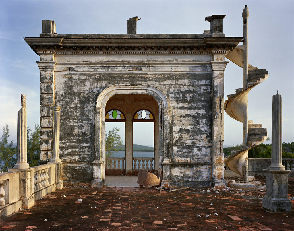
The two photographers that I feel explore anthropocene through the genre of photography that I will be choosing is Camilo Jose Vergara and Yves Marchand & Romain Meffre. Down below will be images of the photographers mentioned.

Camilo Jose Vergara Case Study

Camilo Jose Vergara was born in 1944 Santiago, Chile who was a New York based writer, photographer and documentarian.Vergara has been compared to Jacob Rills for his photographic documentation of American slums and decaying urban environments. Vergara applied the technique of rephotographing in a series of American cities, taking pictures of the same neighbourhoods from the exact same point at regular intervals over many years in order to show changes of the neighbourhoods over time. He was a sociologist with a speciality of urbanism, Vergara used this to his advantage to show the public eye the social decay happening across the world.

As you can see from the images above that Vergara has taken, there are a series of neighbourhoods that have decayed over time. This goes to show that he was a great sociologist in urbanism as you can see from the landscapes that the images of the buildings he had taken, decayed over time in the fact that they have been broken down or even abandoned. The pictures display urbanism as in the images there are buildings displayed that either got done up and look more modern, or the building has either been taken down or abandoned. These images that Vergara has taken above fit in perfectly with the topic of ANTHROPOCENE as the images displayed show how “humans have started to impact the worlds ecosystem” due to there being wasted land or space that is taking over the environment for no reason as the buildings appear to have no use to them. Moreover, this shows how humans are damaging the environment as these buildings could very well have better use to them as possible places to make it green again in order to have habitats for animals so that they can be safe and have some better environmental living than some abandoned houses and streets.

Yves Marchand & Romain Meffre Case Study


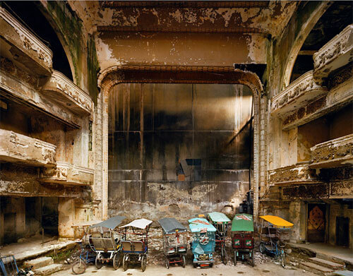
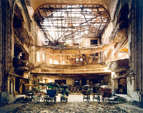
Marchand (b.1981) and Meffre (b.1987) live and work in Paris. Initially pursuing photography individually, they met online in 2002 and started working together with the beginning of their Detroit project in 2005. Steidl published The Ruins of Detroit in 2010. A second printing is planned for later this year. They are currently completing their Gunkanjima book, also to be published by Steidl, and they continue to work on a project documenting American theater’s that have either fallen into decay or been transformed entirely. Their work has been exhibited extensively throughout Europe and has been featured in the New York Times, The Guardian, The British Journal of Photography, Time Magazine, amongst others.

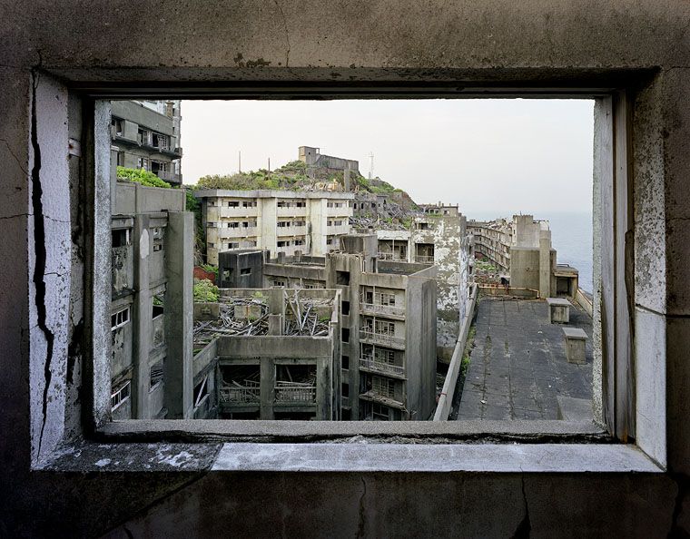
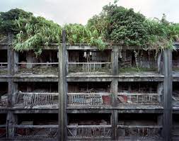
As you can see from the images displayed above from Yves and Romain took images of abandoned places which are being overgrown by the nature surrounding it. As you can see they where great in taking landscape images of abandoned places as everything in the picture is visible with use of what appears to be of natural daylight, in order to show every detail of nature taking over in these landscape images. Therefore, these images fit in perfectly with the theme of Anthropocene as you can see that humans have harmed the environment by having these wasteful abandoned buildings, occupying areas of nature like forests or fields, being overgrown by the nature around it due to these buildings being left unattended in the middle of nature having moss or vines overgrown. Therefore, this could be an impactful message to the world as people can see the damage caused to the world with wasteful buildings occupying these forests or fields as the nature growing back in these buildings is trying to take back what use to be there before the buildings where built.

Comparison

Both photographers mentioned above show the term of anthropocene as the images they have taken come across this subject showing similarities. For example, the picture that they took appear to be portrait/ landscape due to the images being of abandoned buildings that are slowly decaying throughout the years. Moreover, you can see the similarities in which the photographers had taken their pictures with the use of natural daylight and the setting’s of ISO 50, f16 and the shutter speed set at 1/500.

In terms of context behind the images they both display similarities of abandoned buildings that have no use to them as they all appear to be damaged leaving rubble behind and even just occupying areas in which could be turned to beautiful parks with trees in them or even just have the buildings knocked down in general not disturbing the environment. Moreover, both photographers present anthropocene because the images display the disturbance of the environment through humans due to the images showing abandoned buildings that are man made. This could have questions being raised to society on wether we are a lazy society or wether we don’t care about our environment in general as we just leave these buildings that are abandoned to slowly decease throughout its existence as these buildings slowly decay whilst people who walk past don’t having any feelings towards these buildings just wasting space when they could just be demolished and have use for these spaces for either society or just leave the areas alone for nature to take over and grow over these areas not causing any more harm to the environment as it already is.

Photo Shoot

Edited Images

The editing done to these images was that for the black and white ones I converted the images to black and white on photoshop and then changed around either how dark or bright a certain colour of that image was to make shadows pop out more and to create a more contrast between light and dark.

As for the coloured images, this was achieved by changing the hue and saturation on these images to make the colour I selected either really pop out or have some other colours be dimmed as they don’t have to be in the image, as shown in my images I went for the theme of red on all of my coloured images.

Compare & Contrast

The photographers work that I will be comparing and contrasting is Camilo Jose Vergara.

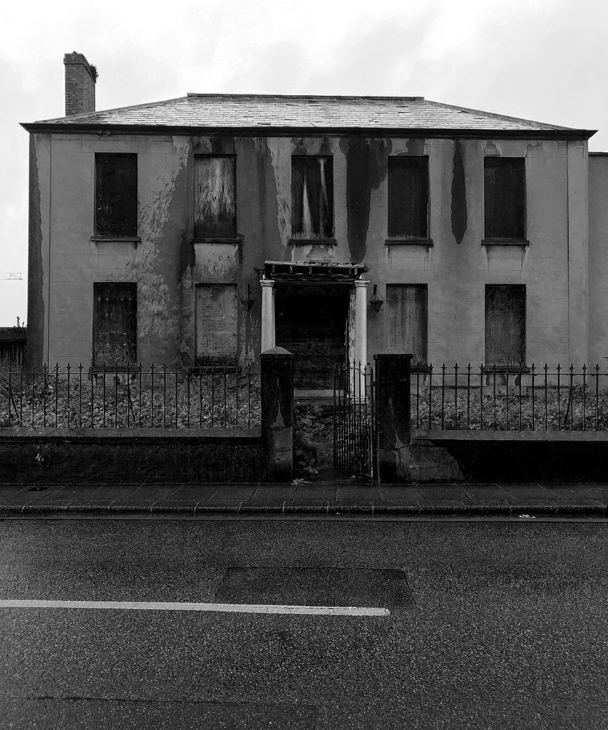
Differences – The differences between my photograph and Camilo’s are that mine is in black and white and his is shown natural as in he didn’t edit his image for colour. Another difference is that his images shows off more contrast between bright and dark with the shadowing in his image, whereas mine hasn’t got any shadowing as the building was flat not having any 3 dimensional structure to it to make it have exaggerated shadows. Finally, a key difference is that he appears to have people in his images where as in my image I don’t have people in it. Therefore, this could go to show that the building in my image is fully abandoned and left out to rot going to show how people in society don’t care about the waste of space being preserved by abandoned buildings in the world. Whereas, in Camilo’s image he has people roaming which goes to show the building in his image is in use, not wasting space however, there appears to be graffiti on the buildings and they seem to be dirty which goes to show how the people in society are very lazy and don’t have a car for the environment as they seem to paint over it and not keep the general streets clean.

Similarities – The similarities between my photograph and Camilo’s are that we both appeared to use natural lighting as our sources of light to capture the images we taken. Also, we have both appeared to take on a dead pan pictures of the buildings that we decided to take images of across the street form the buildings. The final similarity between the images are that both buildings appear to be dirty or damaged due to the lack of care that has been given to them, due to society in the 21st century appearing to be lazy or unconcerned for the community in general as this can lead to people loosing house’s as they just deteriorate leading to it being un-manageable for people to be living in these conditions, which can lead to people overpopulating to somewhere cheaper which what appears to be the cause of Camilo’s picture where as for mine the people have already moved out and now the building has been left wasting space.

Final Image’s

The way in which i would present my images would be by having my picture up on a wall for people to be able to walk around and feel them. Moreover, I could consider on putting materials from the images like leaves or rubble so that people who are looking at the pictures could potentially touch them to get an idea of what the image feels like as well.

Evaluation

Therefore having read the history of Eugene in the reasoning as to why he done photography, this gave me the objective of showing the people who look at my images how buildings can be left derelict for no one to care of which could have better use to them. Moreover, I believe that the economy has a big impact on buildings being derelict due to the fact that as the economy goes up in any place the prices go up and cost of living especially in Jersey where it is very expensive in terms of housing, which could cause people to move away from these homes making them derelict leading to the abandoned buildings being forgotten making them relics of the past.

Overall, I believe that I was successful in presenting my objective with my images through to the audience/ people who would see my images in an art gallery, this is because I have images of abandoned buildings that have been around for a long time including the old Jersey Brewery which could be considered as a relic of the past as it is an old building that was of great use to Jersey. However, if I was to do this project again I would change the way in which I would display my images by getting images of old buildings that are now abandoned, then I would split the images in half and put them together in order to show the drastic changes in the buildings over time.

anthropocene – final imageS

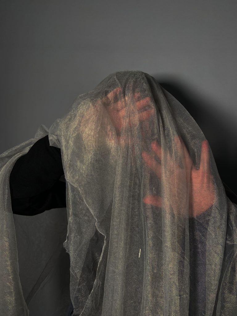
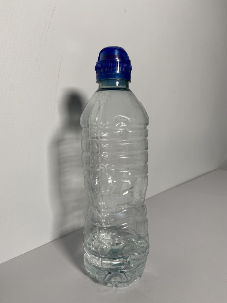
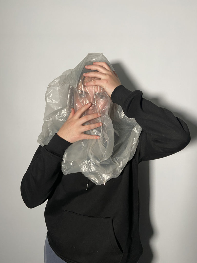
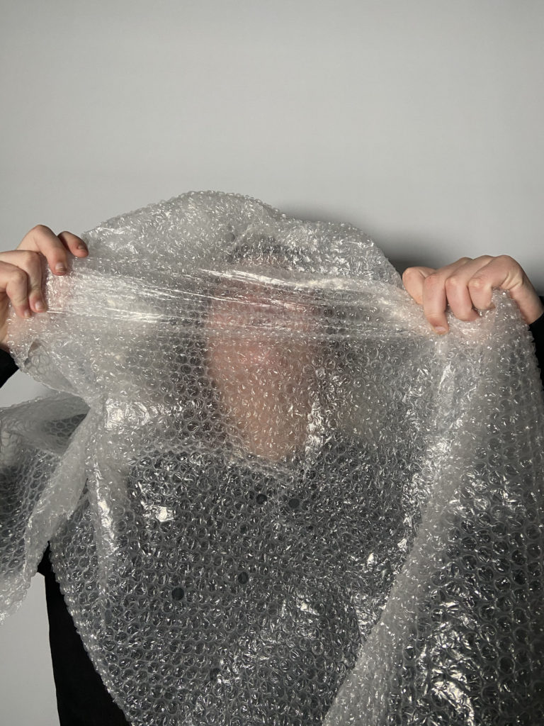
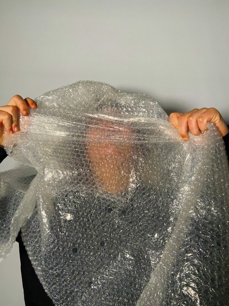
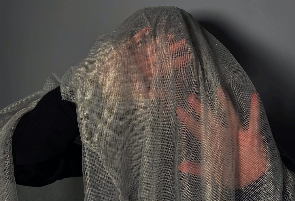
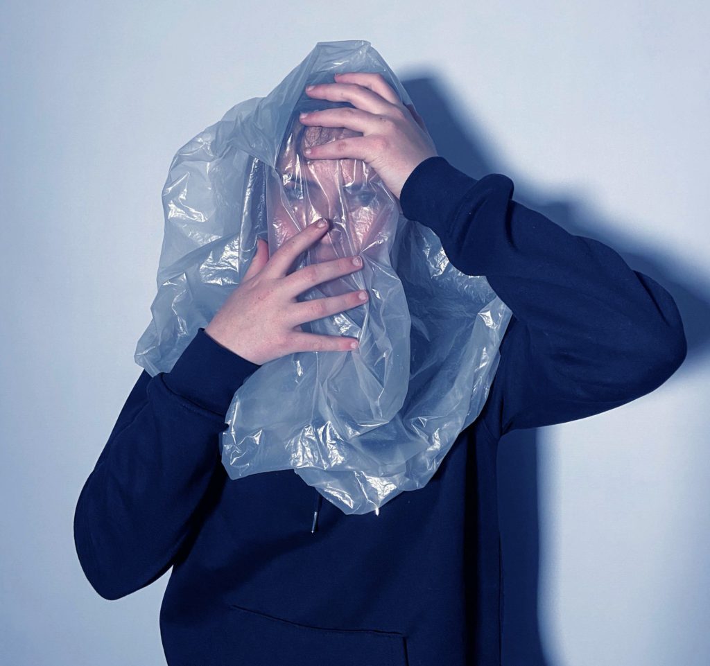
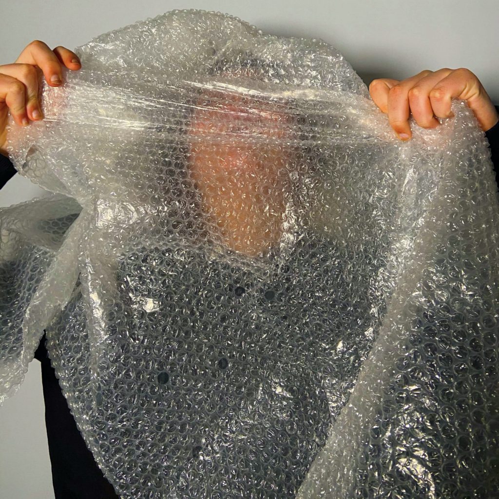
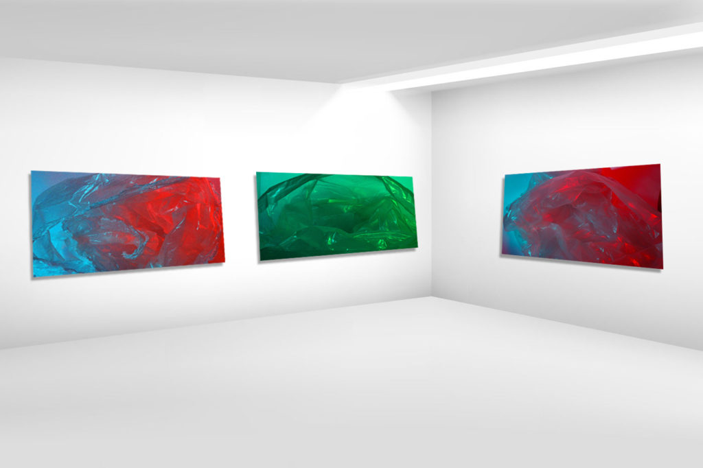
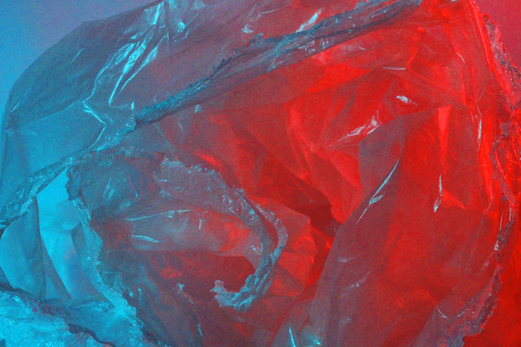
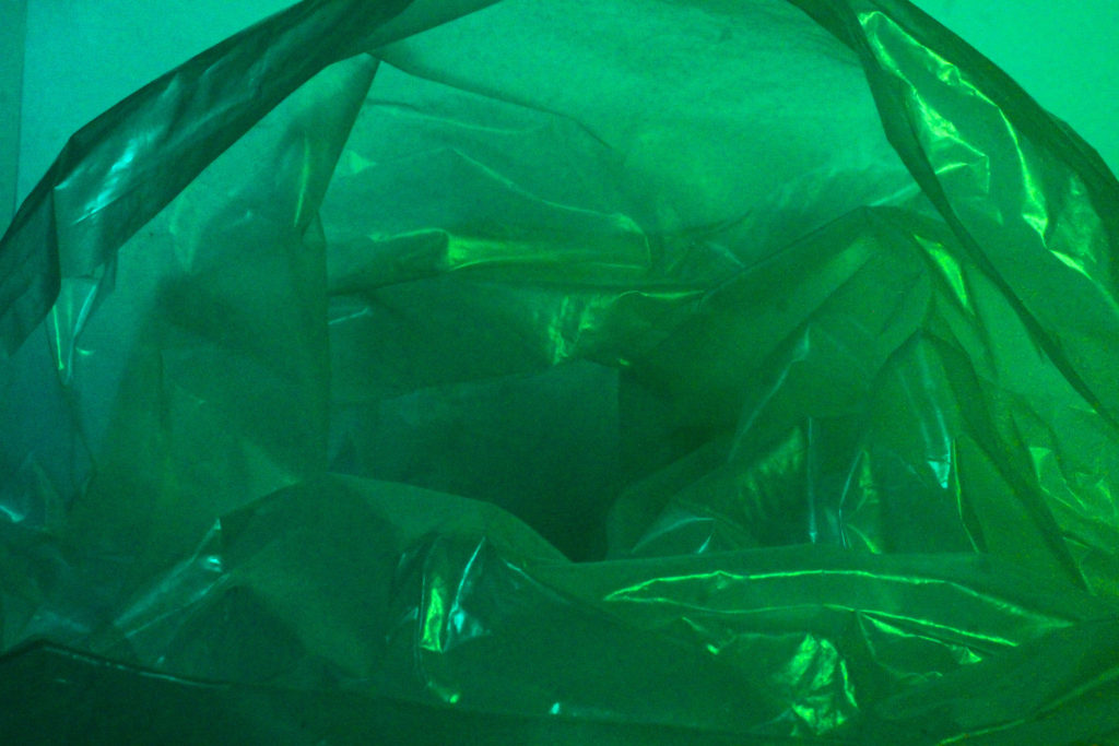
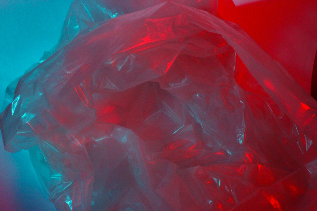
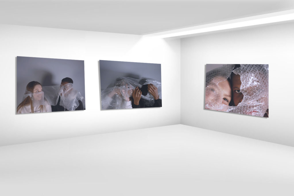
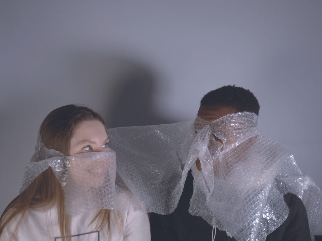
I have chosen these three final images as I believe they best represent the stimulus of Anthropocene, and reflect the type of photographs I had drawn inspiration from and was aiming to recreate. I have chosen all of my final images from my first photoshoot inspired by Jeremy Carrol and Darian Mederos, as I think that they are my best work and the best representation of my abilities and competency. Additionally, I wasn’t very happy with the images I produced in my second photoshoot, which was inspired by Naomi White and Barry Rosenthal. After I had completed each of my photoshoots, I decided to edit my images using Photoshop and experimented with different tools, such as the hue/saturation, brightness/contrast, and vibrance. I explored various different results and altered them until I was happy with the outcomes above.

FINAL EVALUATION

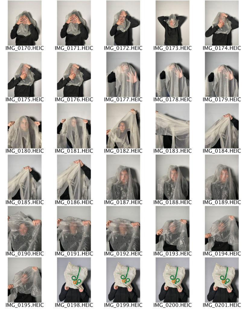
One of my aims for this project was to take photographs which I believed captured the essence of Anthropocene and present them in a way which was impactful and thought-provoking. I chose Jeremy Carrol as my main inspiration as his images are extremely poignant and shocking, which was the type of reaction I wanted to give my audience when the viewed my photographs. I think that one of my strengths during this project was my ability to think on my feet in terms of creativity when I became stuck for ideas. For example, as I went to conduct my first photoshoot, I only had small pieces of plastic which were not big enough to go over my subject’s head. I was forced to use whatever I could find as well as my own pieces, and the images turned out better than I had anticipated. I think that one of my weaknesses during this project was my editing skills on Photoshop. I think that I struggled with this aspect of my process because I had never used the programme before starting this course, and I don’t think that I am that confident yet in my ability to use some of the certain tools, for example, cutting and pasting. Overall, I think I produced some good images which related well to the stimulus of Anthropocene, and I believe I showed some competency when using Photoshop. One of my targets for next time will be to ensure that all of my photoshoots are up to the same standard, and that I am happy with all of the images I am producing.

anthropocene photoshoot 2

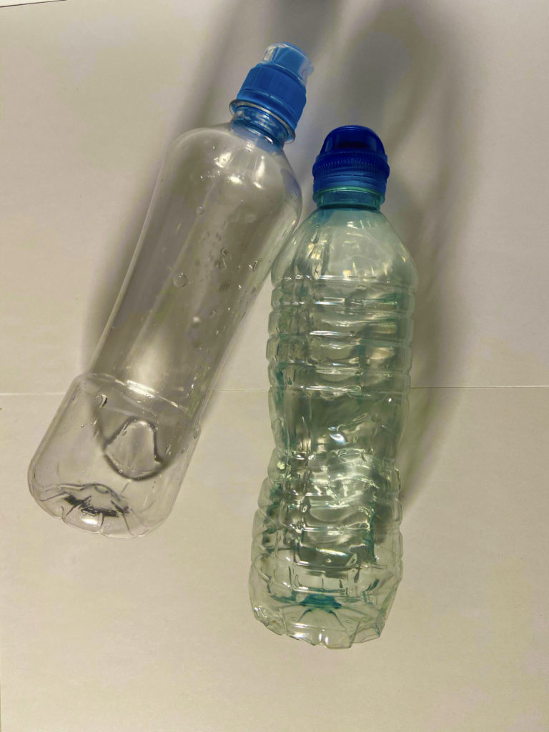
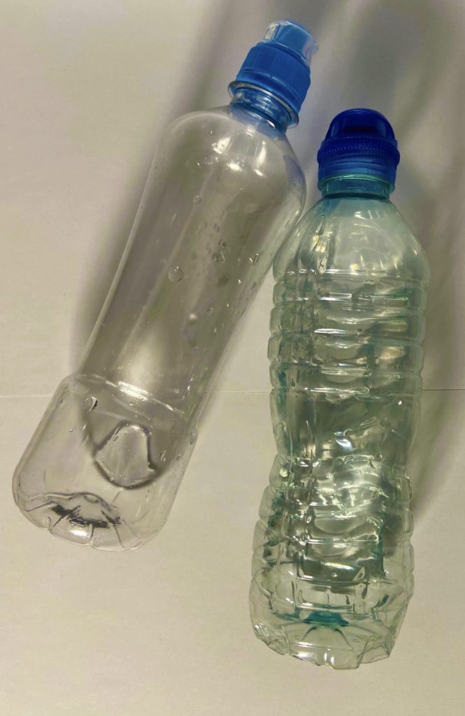
For my second photoshoot under the stimulus of Anthropocene, I have taken inspiration from Naomi White and Barry Rosenthal. I chose these two artists because their work is very stirring, as it addresses the vast amount of plastic objects in the oceans, such as plastic bottles, children’s toys, hair combs, and flip flops.

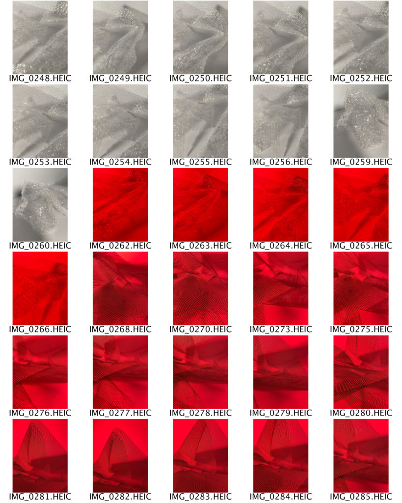
CONTACT SHEETS

SELECTED IMAGES

EDITING AND EXPERIMENTATION – COLOUR

EDITING AND EXPERIMENTATION – CROPPING

FINAL IMAGES

Final images

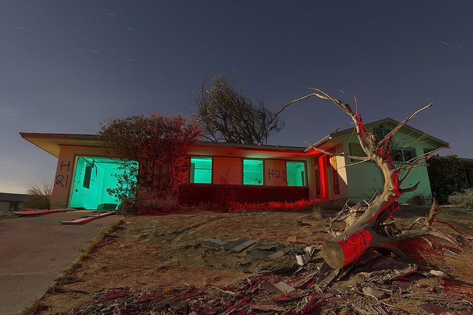
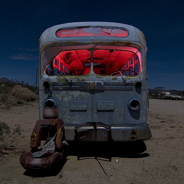
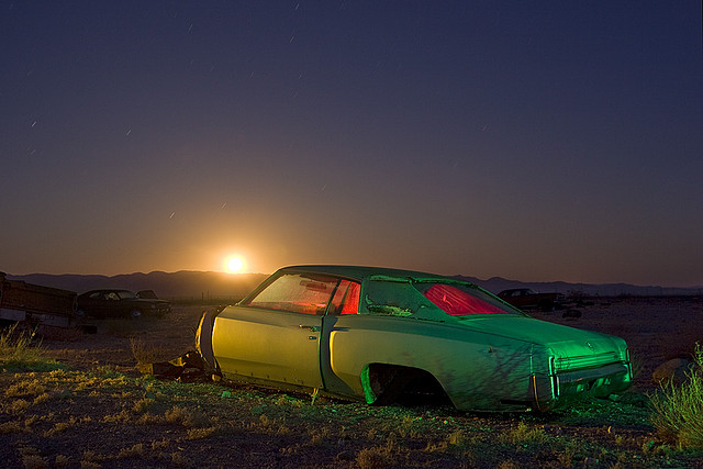
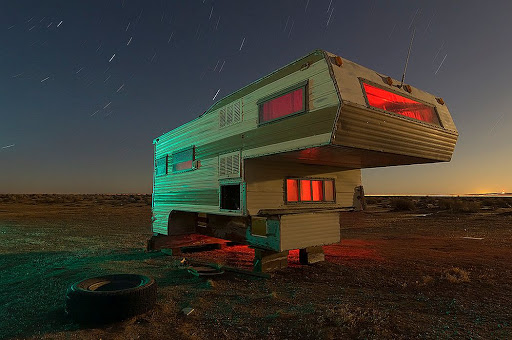
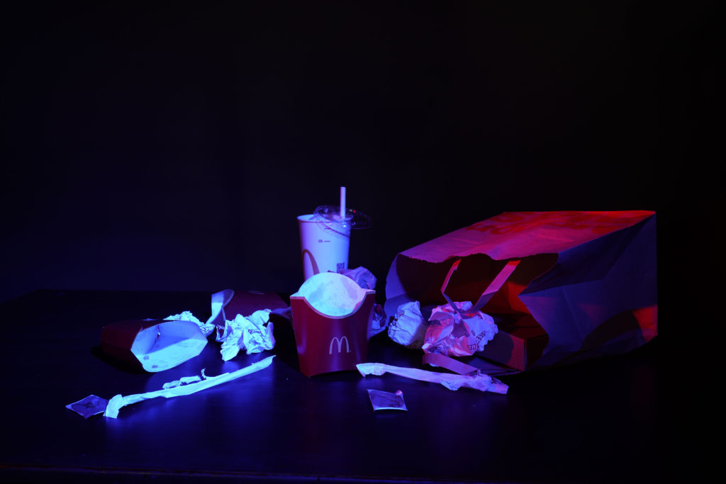
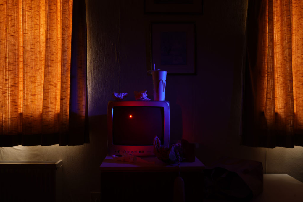
To recreate Troy Paiva’s style I used two continuous lights and added a grid and coloured gels to them. The grid allowed me to narrow the light so that it only lights specific part of the objects I wanted. The colours gels allowed me to add contrasting warm and cool colours just like Troy Paiva does. The camera was set to a very slow shutter speed of between 30 seconds and 8 seconds of exposure time. Since we where shooting in the dark this permitted some ambient light to get sucked in to the exposure. As I moved from the location to location, I had to change the shutter speed to adapt to the ambient environment and in some shots I decided to use flash light rather than continuous light. This helped to isolate the subjects. Off course the camera was always on a tripod. This is very important for slow exposures.

photo that I chose:

The three first pictures are from the same shoot ”Domestic waste”. Each of those three pictures presents different waste. The image I especially like is the first one the ”McDonalds rubbish” because it makes you question how something that is loved by young, old people can be very bad for the environment and pollutes our planet. Those packaging can be found everywhere like on street floors or the beach … But what if we took the packaging of our favourite fast food and turned it into an inspiration from a 17th century painting. Is like what Mat Collishaw or Krista van der Niet does. Let’s convert our waste into art!

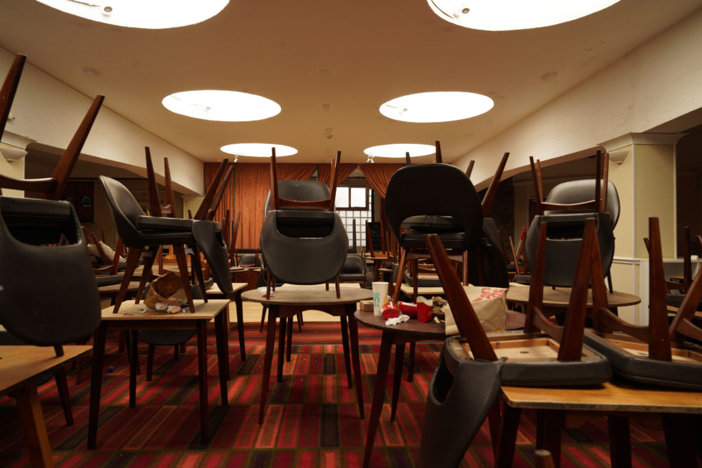
The second picture I especially like is the third one since
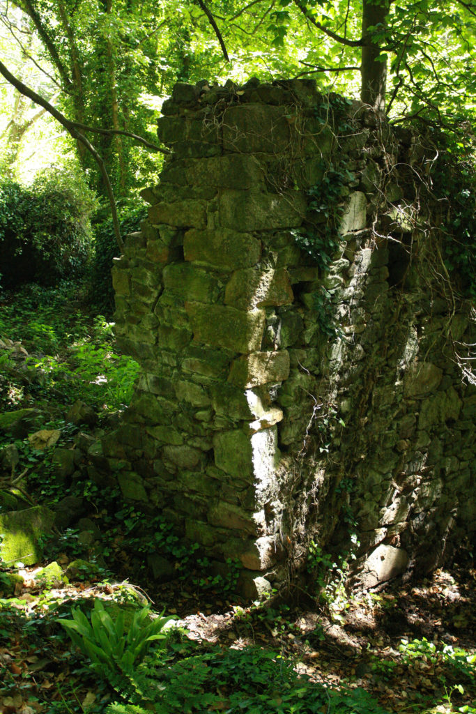
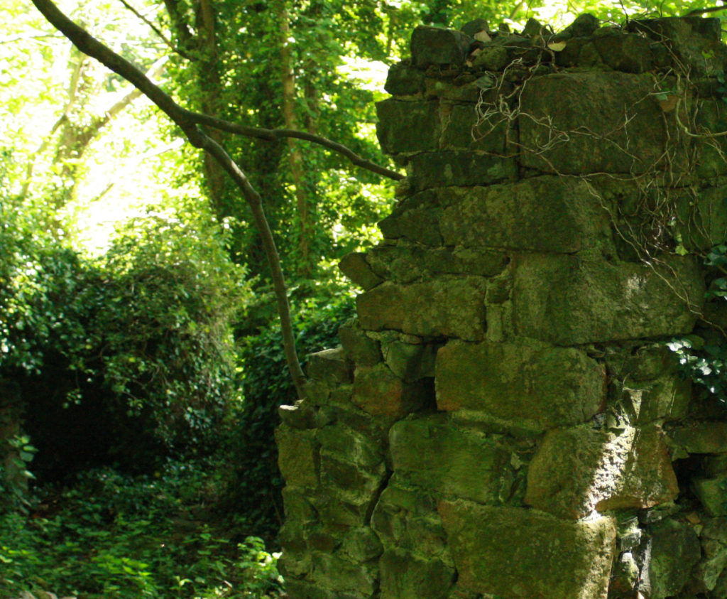
we can see a place that use to be used, now completely abandoned. The colours and patterns of the floors let us guess from what period the hotel was. We can see the unused chairs left on the tables, rubbish everywhere the carpet is dirty… and all this makes me think about what this room was for before, why is it no longer used. The only thing left now are the memories. The last two photos are from my second shoot ”Ingrained in nature”. This shoot had a different meaning for me since I wanted to represent the fight that nature must wage against an anthropogenic element, in the end nature tries to adapt to it and grows up despite everything. The building is hidden in nature,
and its colours are the same as the forest: brown, green, yellow, blue

Review and Reflection

I like the finals results of my photos I think I managed to interpret what I wanted to show. In the first controlled conditions I did, I was a bit disappointed because I didn’t focus on little details because I was not well organized in terms of time. But in this controlled conditions I got better organized and I managed to put the details I wanted like well place the objects, change them, transform them and I also explored more in my idea than the last time. Another thing I had to improve in my last controlled conditions was lighting and sincerely I think it’s something that I handled well in this theme.

anthropocene photoshoot 1

For my first photoshoot under the stimulus of Anthropocene, I have taken inspiration from Jeremy Carroll and Darian Mederos. I have chosen these two photographers as my influences as I believe that their own images are very thought provoking, and stimulate a very particular mood and feeling. In this photoshoot, I aimed to take the main principles of each artist’s images and use them to create captivating and interesting photographs.

CONTACT SHEETS

SELECTED IMAGES

EDITING AND EXPERIMENTATION – COLOUR

EDITING AND EXPERIMENTATION – CROPPING