final outcomes


This shoot consisted of four different frames to produce four final edited images. Here is the contact sheet from the shoot:


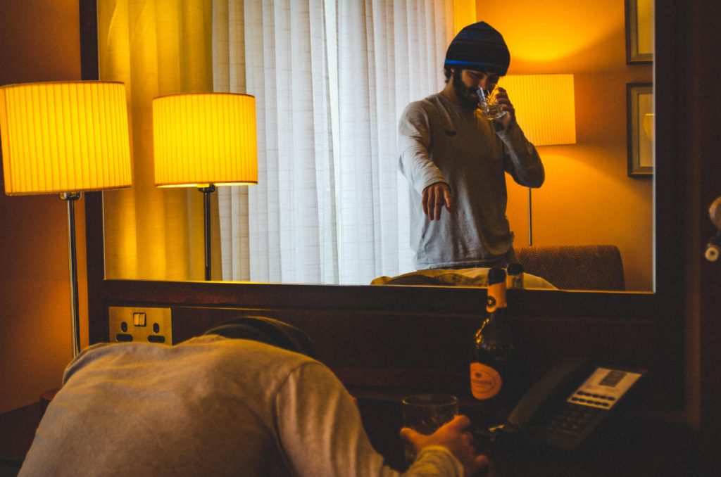
In the style of Paul M Smith, I edited these images similarly to the other tableaux photo shoots I have done so far, creating a washed, grainy film look to the final image.
Similarly to the previous shoots, I took multiple photographs of the same frame with the same subject in multiple different positions in the shot. I used the same process and stages of editing as before too:


I repeated this process for another three sets of images from the shoot to produce these final images:



I wanted to select a group of images that I used in my portfolio, which I made in my own time, so that I could print and mount some of the images.
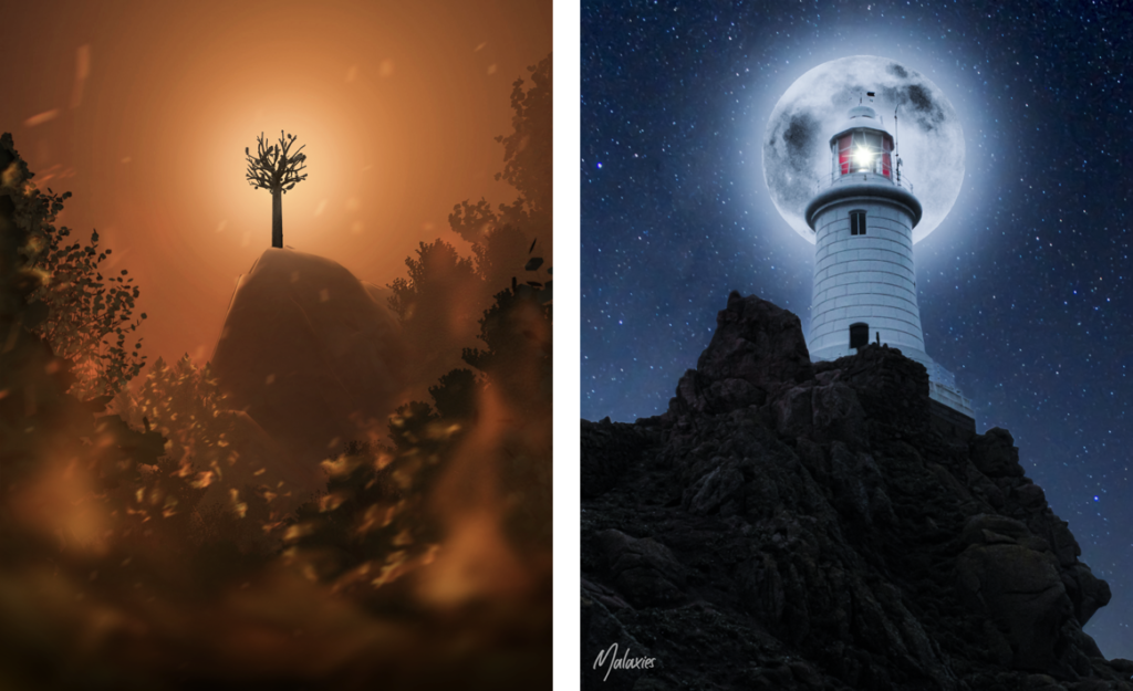
Firstly, I would like to print these 2 examples of my graphic design skills. For the image on the left I used Blender (3D modelling software) and Photoshop, it was the image that I entered into the Eco Active Competition about climate change. For the right image, I made it in Photoshop and is a strong example of photo manipulation using 3 images.
Firstly, I would like to print these 2 examples of my graphic design skills. For the image on the left I used Blender (3D modelling software) and Photoshop, it was the image that I entered into the Eco Active Competition about climate change. For the right image, I made it in Photoshop and is a strong example of photo manipulation using 3 images.
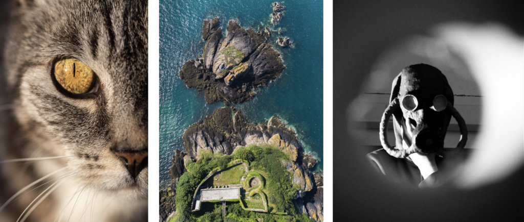
Secondly, I would like to print these 2 images from my Portfolio, as they are my favourite images from it.
The image of the cat I shot during ‘golden hour’ which gave the eye, the central focal point, a vivid golden effect that emphasises the detail of the cat’s iris. I used a macro lens to get really close to the subject. This created more attention to the eye positioned in the centre of the image, and created a slight soften blur to the nose, whiskers, and the mouth. However it still maintains the detail of the hair and the pattern of the cat.
For the aerial image, I used my drone, a DJI Mavic Mini 2, to fly above L’Etacquerel Fort, one of the many Heritage sites in Jersey. The photo was taken from the cliff path, at a height of 120 metres. I boosted the greens and blues to get a more natural look to the environment. I feel this image works well as the curved lines in the architecture contrast the jagged cliff rocks, showing the footprint of the fort really well.
Finally, the mask mask photo, I wanted to create an old, World War 2 atmosphere. In order to do this I took the shot through a cardboard tube with a ripped end, which created a frame around the subject which gives the appearance that the subject is inside a room and you are on the outside of the door looking in through a peephole.
My online Portfolio on Behance: https://www.behance.net/MatthewBrownPhotos
Personation (Virtual Gallery)
To showcase my images I will make a virtual gallery in Photoshop, so that it looks like my images have been displayed in an actual gallery.
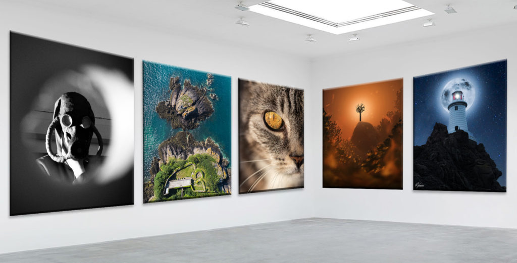
I used CTRL-T to warp the image so that the top and bottom edges of the photo are parallel to the the floor and ceiling. After all the images matched the perspective of the gallery I used blending options to make the images look real and 3D, such as, bevel and emboss and, drop shadow.

Overall, I think that these extra images help display my photographic and post production abilities and therefore the main reason which I wanted to include them in the next print job.
NFT Project Image
I also wanted to include the poster image from the NFT project, which looks like this:
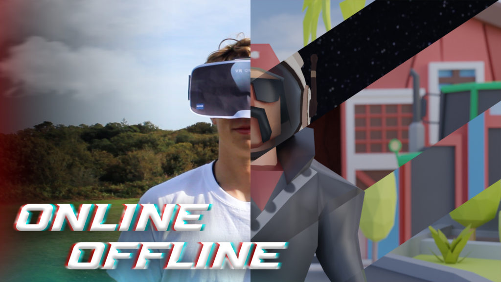
I used the same technique to make a gallery in Photoshop, by using bevel and emboss and drop shadow.
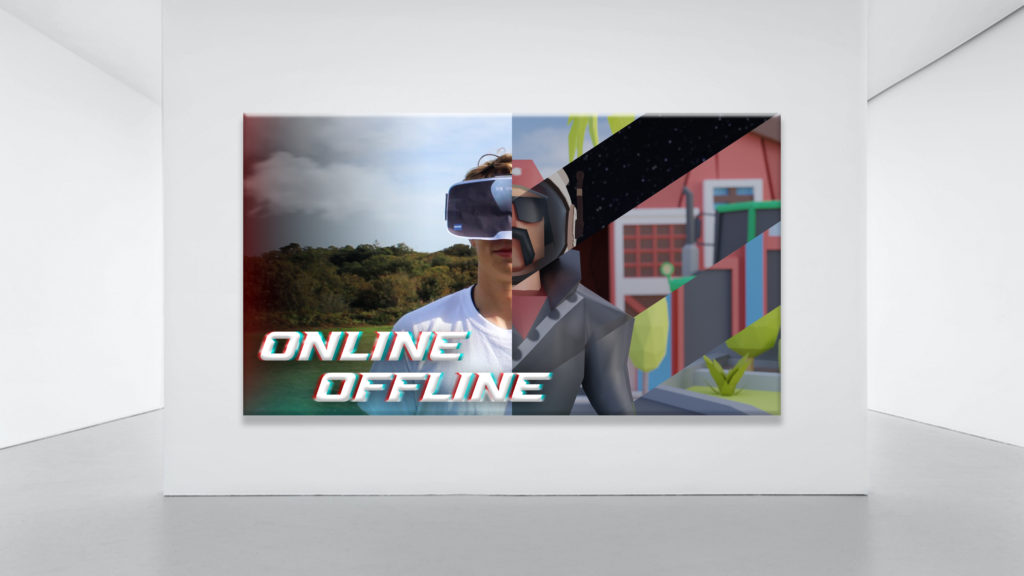
It will be printed A3 unless the quality is bad as its 2560 × 1440 pixels. If it can’t be printed A3 then A4 is ok.
To decide the images that I wanted to print and mount, I used my photo book and picked my favourite images. I would also decide an additional 5 images from my Portfolio that I would print.


In total there are 7 images in the book that I would like printed. I chose them as they stand out and demonstrate great camera skills. I feel that they represent the photo book very well as they are the best ones from it, however they don’t take the value away from the book as it have created contrast and juxtaposed some of the images by paring them with objects and other different images.
Presentation (Virtual Gallery)
To showcase my images I will make a virtual gallery in Photoshop, so that it looks like my images have been displayed in an actual gallery.
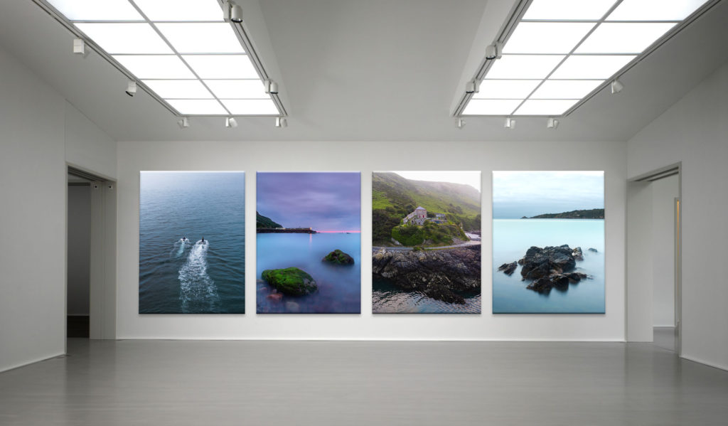
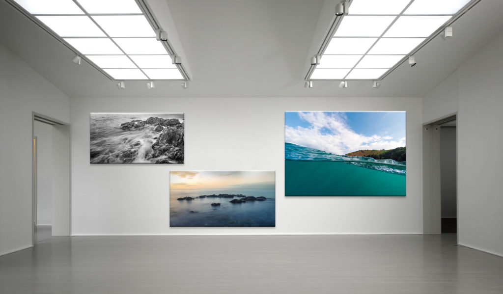
After postponing the images where I wanted them, I used blending options to make the images look real and 3D, such as, bevel and emboss and, drop shadow.

Overall, I am happy with my selection of images to print as they are my strongest images from my most recent project.
Printing
These are the images that I decided to print A4:

These are the images that I’m printing A3:

Here are my final edited photographic responses for Paul M Smith (the editing process is in later blog posts)


How do archives function as repositories of knowledge?
Archives are fundamental to humans’ culture as a connection to past, present and future. As philosopher George Santayana said, “Those who cannot remember the past are condemned to repeat it!” They are repositories of knowledge historic documents and photographs which are stored in archives are, themselves, knowledge.
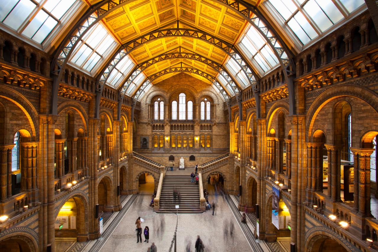
In the modern day, pretty much everyone has an archive available to them in the form of a phone. These phones have made photography incredibly accessible for the ordinary person. By doing this, photographs have become less permanent and significant in contrast to photos from 100 years ago when barely any were taken, and they were treated as irreplaceable and treasured by those who kept them. In the digital age photos are just not seen as important, and often are not kept very long, deleted soon after being taken. In an era of cancel culture, social media has become an archive filled with images and messages that could, with a little digging, make or break a person’s career. The Société Jersiaise, founded in 1873 is a learned society with a focus on archaeology, providing efforts to preserve the islands heritage and identity. Their archives contain over 125,000 photographic images ranging as far back as the beginning of modern photographic history in the 1840s. In recent years, the group has led the excavation of early human and mammoth remains at la Cotte de st brelade which has allowed a greater understanding of the islands geographical past as well as its previous proximity to France 250,000 years ago. This archive is beneficial to the islands cultural heritage as the archive holds many jèrriais language documents, a language that is quickly becoming extinct. It could be argued that the elitist nature of membership only clubs such as The Société Jersiaise inhibit the sharing of knowledge and disregard the working class as the cost of membership to the club for an ordinary applicant is an annual fee of £60 which many everyday people cannot afford. In comparison the British government in a move to increase education made virtually all museum entry free, relying on donations and merchandise sales but mainly their government funding to stay active. This instance illustrates the detriment of privatisation of educative resources.
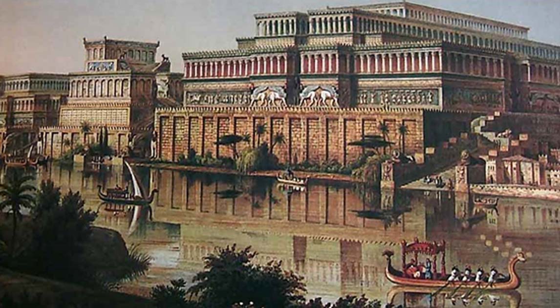
The oldest physical archive in human history is the Library of Ashurbanipal which was built in the 7th century BC and contains over 30,000 clay tablets, which includes the Epic of Gilgamesh, a historically significant poem from ancient Mesopotamia which is regarded as the earliest surviving notable literature and later influenced Homer’s own epics. Both the library and poem help to educate contemporary society, as The Epic of Gilgamesh is though to prove the great flood recorded in the book of Genesis. The oldest artefact discovered are the Lomekwi stone tools from Kenya which are 3.3 million years old and teach us the culture and lifestyle of our early ancestors.
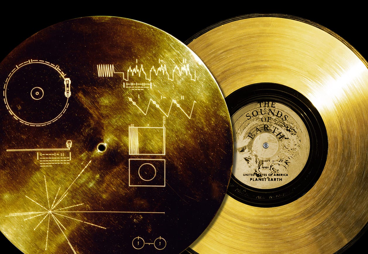
Time capsules have been a means for depositing knowledge to share with the future for hundreds of years, being some of the most basic and rudimentary archives, available to all sorts of people. In 1977 Voyager 1 was sent on a never-ending mission to outer space with an phonographic record dubbed the ‘Golden Record’ which was inscription with diagrams to help extra-terrestrial lifeforms decipher it. The record contains a range of images, music, sounds and greetings to educate space farers about the humble human. Another example of time capsules and their use as archives is the Crypt of Civilisation which was built between 1937-40. The Crypt contains seeds, a typewriter and children’s toys as well as a toy gollywog among other objects to act as a microcosm for the 20th century. The brains behind the project were university founder Thornwell Jacobs who was inspired by the excavation of ancient Egyptian tombs and wanted to create a similar experience for future generations to help them understand society in the 1900s. The crypt is impenetrable and is set to open in the year 8113 A.D, 6000 years after it was built. It could be argued that ventures like this are pointless and that the funds dedicated to them would be better off helping people, especially in America where healthcare is a privilege and not a right however projects such as the ones mentions throughout this essay are vital to the ontogeny of the human race. Through the documentation of the past we learn from mistakes and successes which allow us to advance as a society.
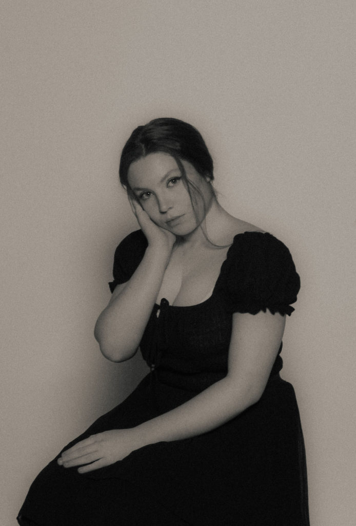
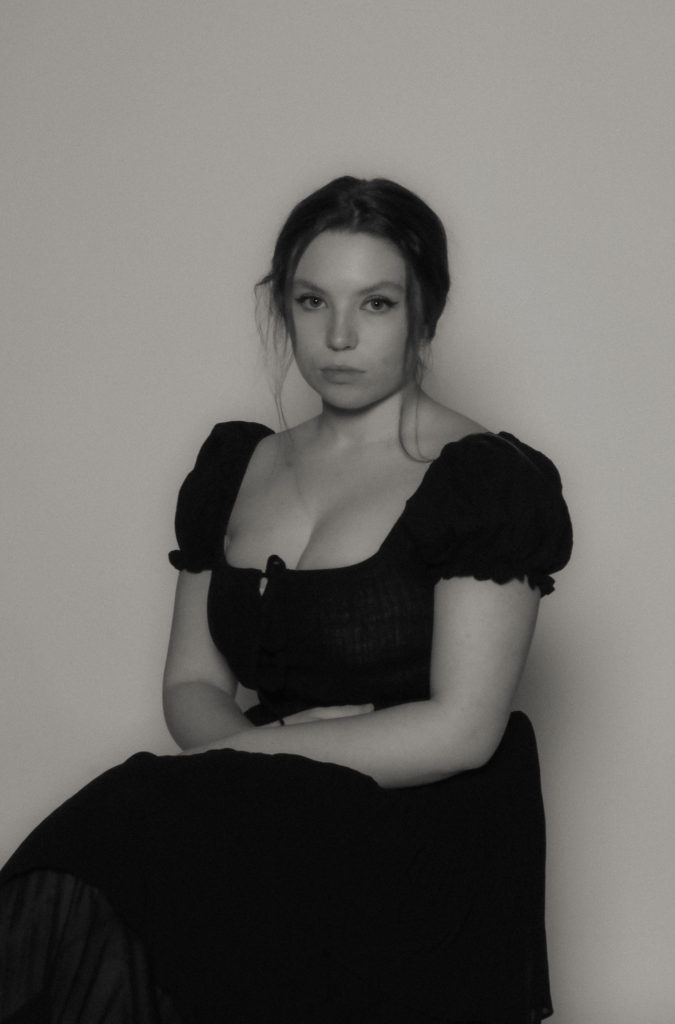
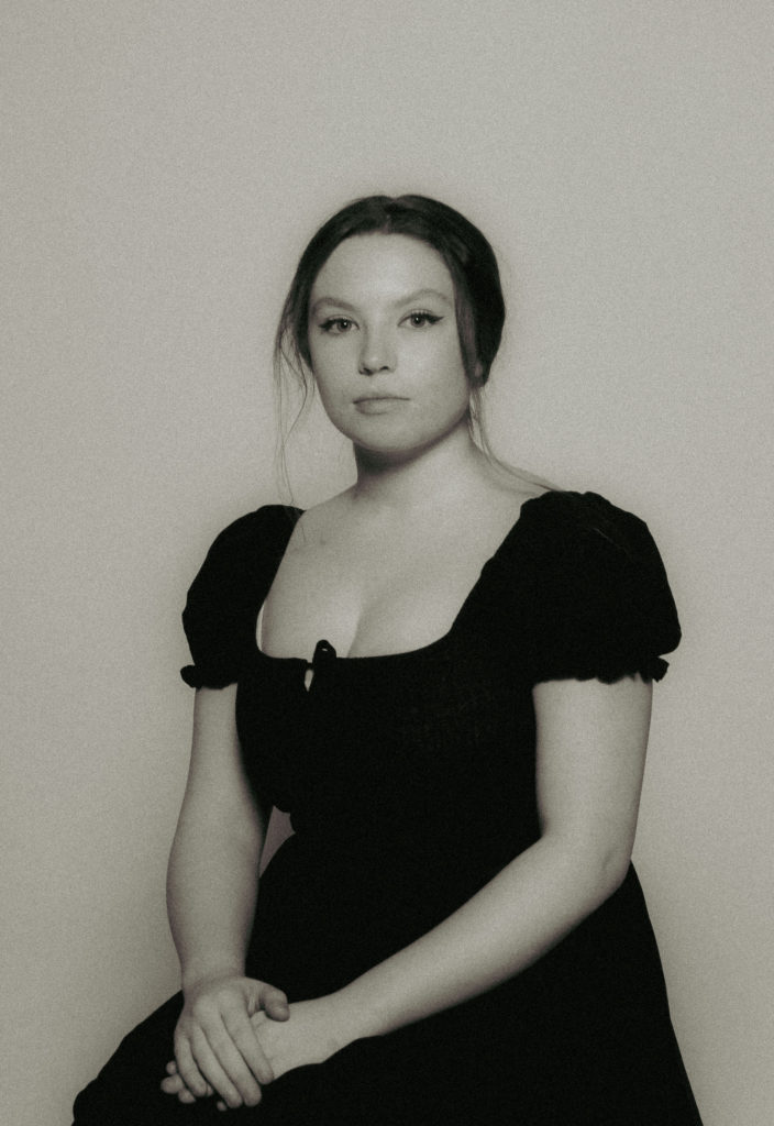

I took some of my final images from another shoot and put them into a virtual gallery layout. I chose images that have similar tones so they work together.
I started by placing the images into the virtual gallery as seen below.

I then placed the images accordingly and angled them so that they look like they are actually in the gallery. I then applied blending options such as bevel and emboss and drop shadow to make them have depth and look 3d. I applied the same amount of these blending options to each image so they look the same.
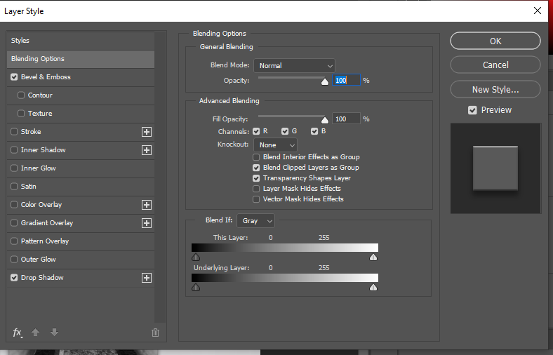
Below is my final gallery layout with the images placed with a 3d depth look to them. I like the way it turned out and I think it shows what the images will look like in real life and also if the images would work with each other.

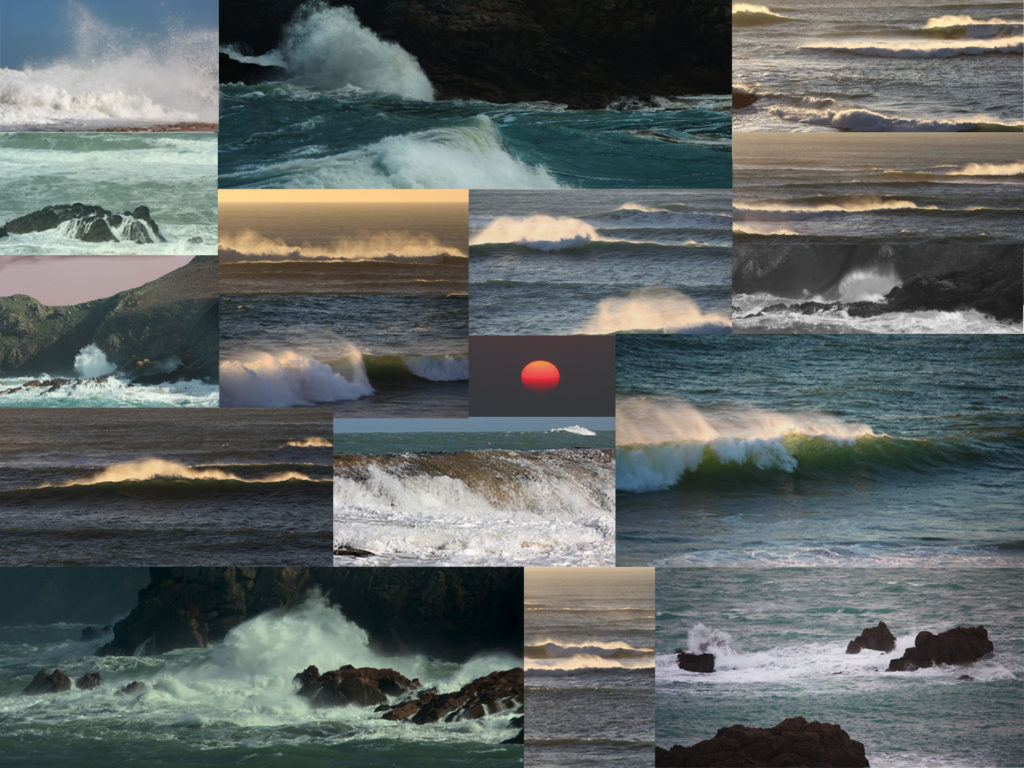
For this project i have decided to create a photobook relating to Jersey Identity involving seascapes. Firstly i will be designing my photobook in Adobe Lightroom. I will be aiming to include roughly 50-80 images of Jerseys coastal areas, bays, and out to oceans horizons etc. My photoshoots will be based around the west coast of Jersey during the hours of dusk and dawn and occasionally midday depending on the light source.
During the rainy days of march, i took a quick photoshoot midday in a range of areas down st ouens bay. Firstly i will use these images to create a draft photobook to inspire my ideas when completing my final shoots. I opened these image in lightroom and took a few of the best ones to make up a book…

With the tided being out when the photoshoot took place, I will be needing to revisit the same areas with the tide being in to capture more detailed images of seascapes. I then selected the best images I wanted to edit in “develop” and put them in a separate folder to use when finishing of the final book.
here is a final look at how the final layout of my photobook will look like…


I started my editing process by importing my photos into Lightroom.
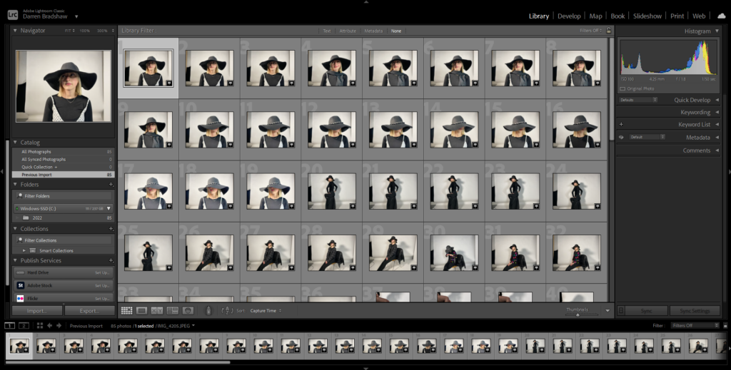
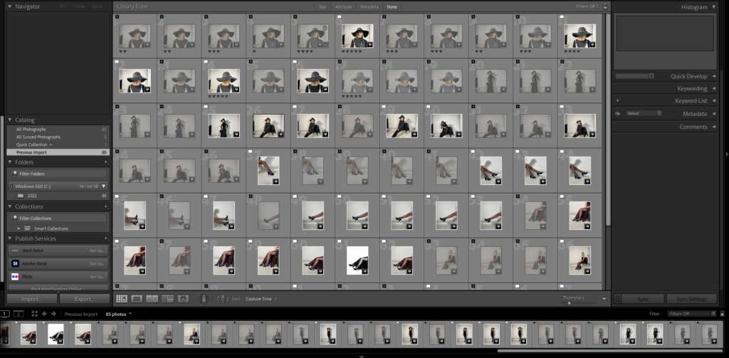
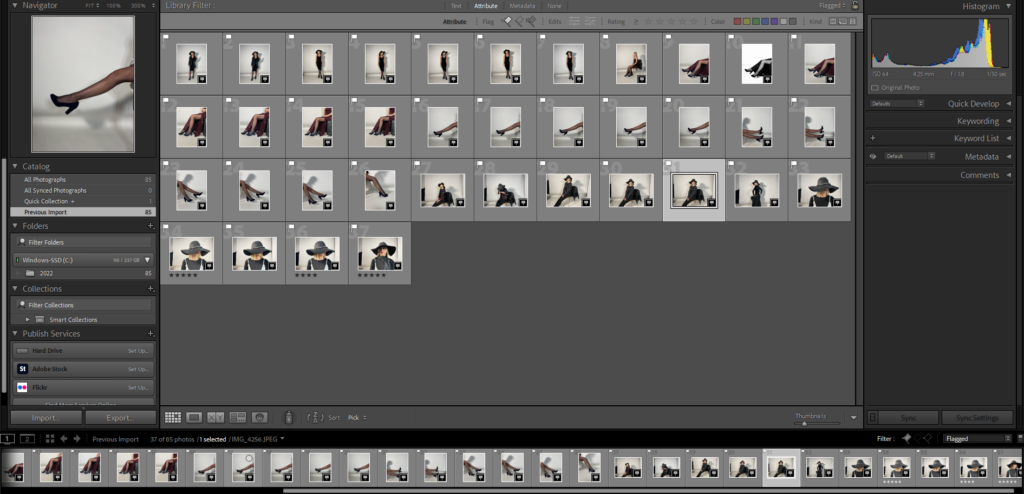
Once imported, I went through my images and flagged the ones I wanted to use in my photobook.
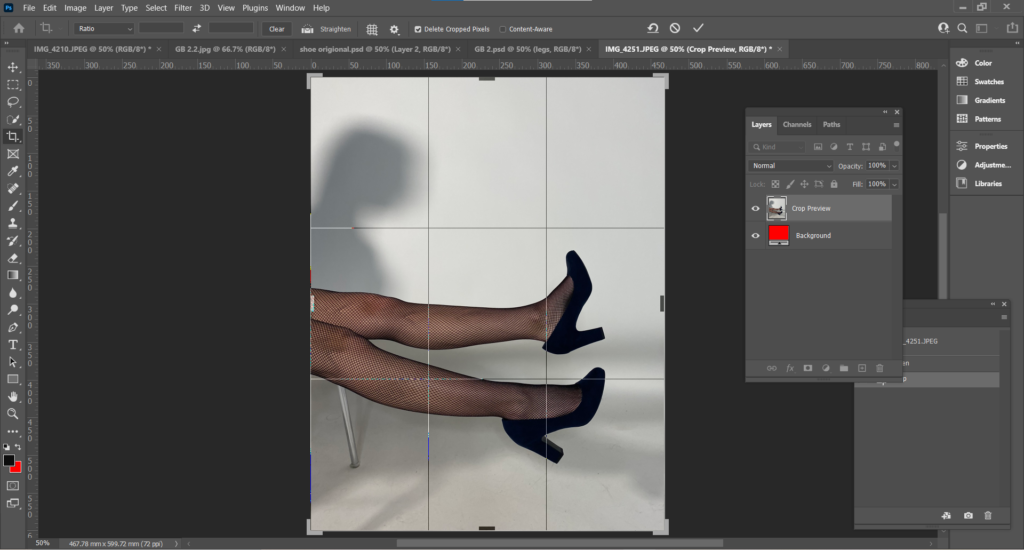
For my first image, I opened it up in Photoshop and cropped and adjusted it to how I wanted. My aim was to change the colour of the shoe to match Bourdin’s images. To do this, I used the Pen Tool and carefully cut out around the shoe.
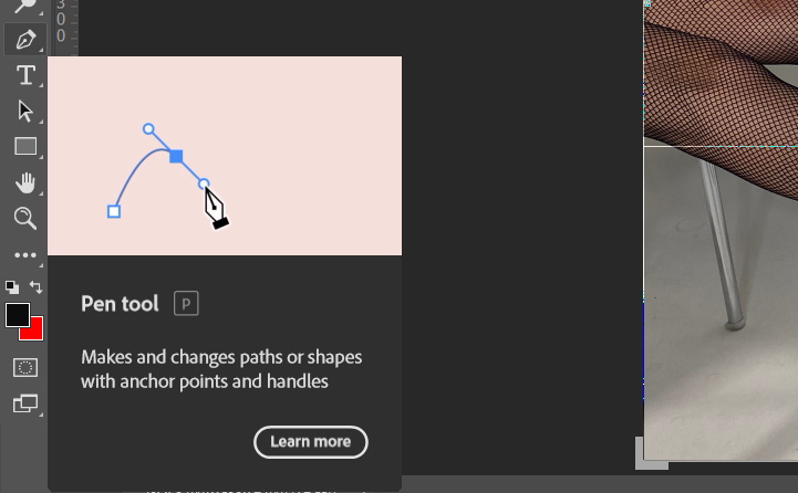
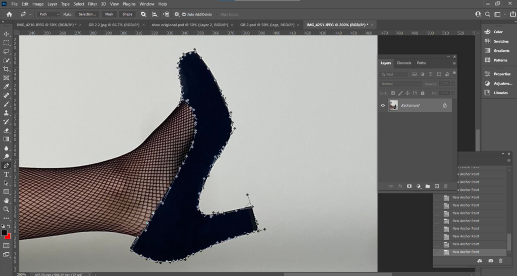
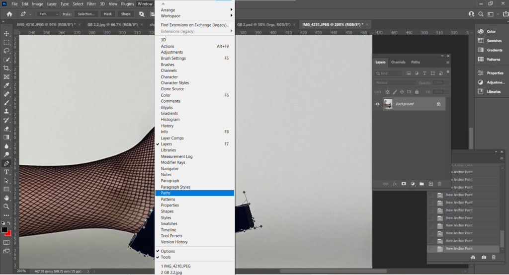
After I outlined the shoe with the Pen Tool, I went up to the menu, under Window and selected Paths.
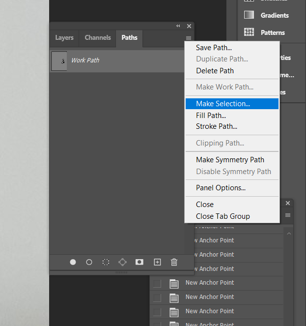
Within Paths, I selected Make Selection under the 3 small lines, this converts an outline drawn by the Pen Tool, to a dotted outline.
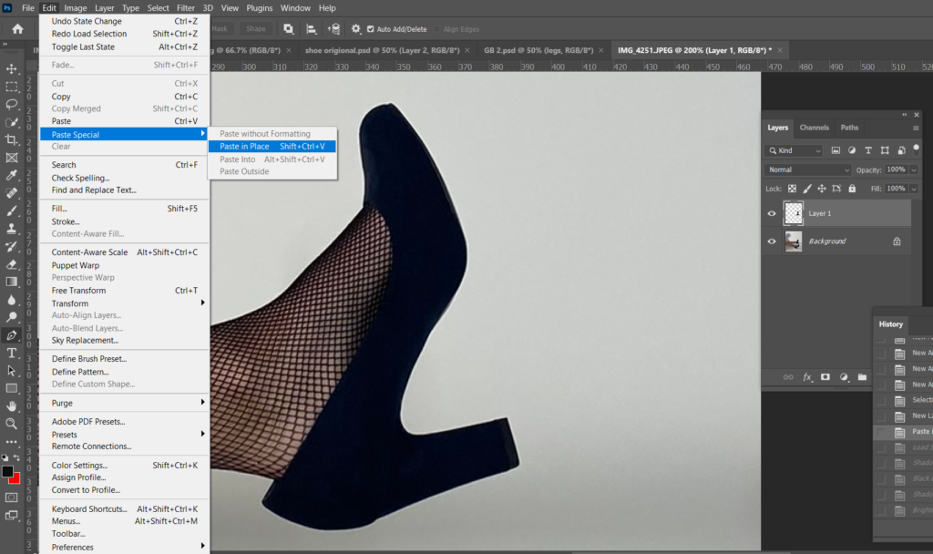
After this, I then selected Edit, Paste Special, Paste in Place onto a new layer so when I changed the colour of the shoe, the background is not effected.
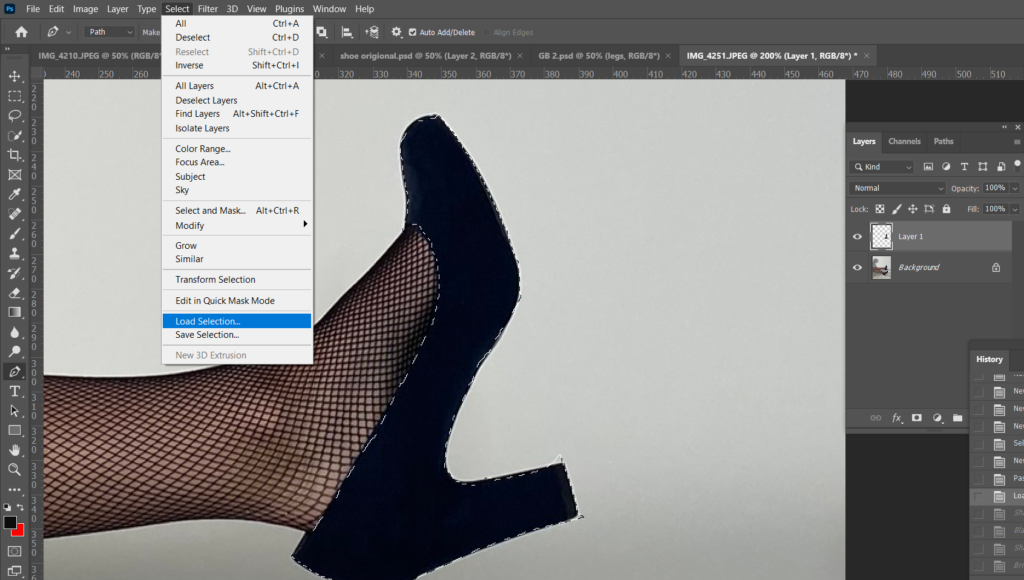
I then selected Load Selection to select the area I want to edit individually.
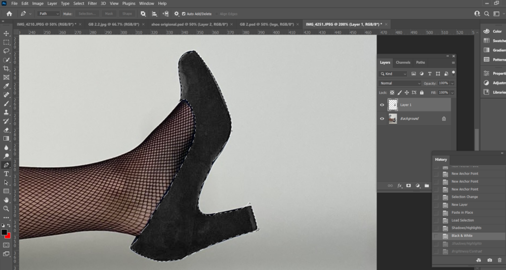
Before changing the colour of the shoe, I adjusted the Brightness, Shadows and Highlights to make the shoe lighter so the colour will turn out more pigmented.
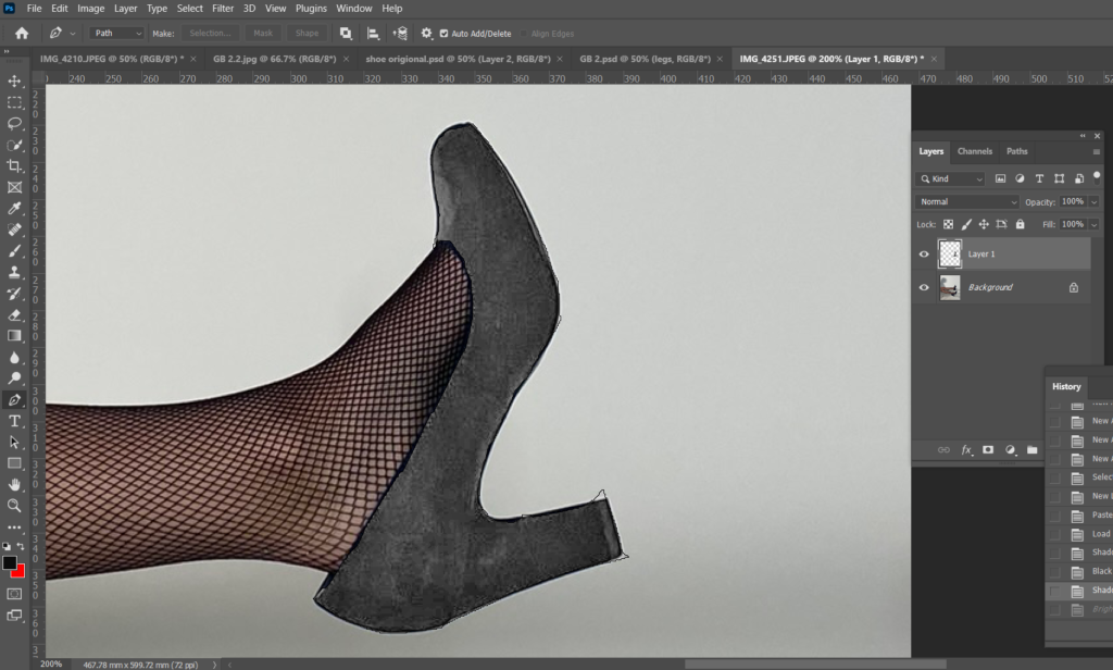
To change the colour I adjusted the Colour Balance.
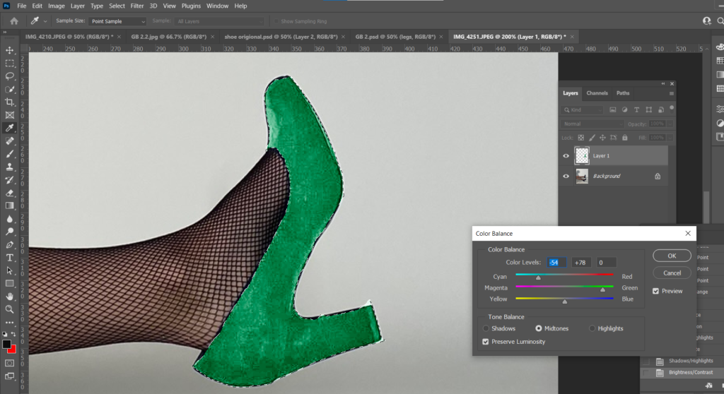
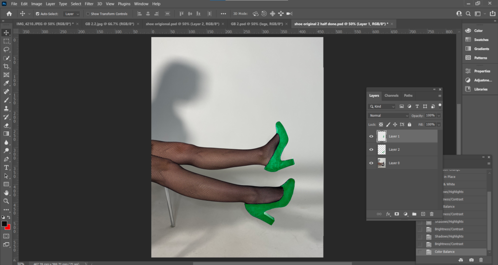
I used the same process for the legs.
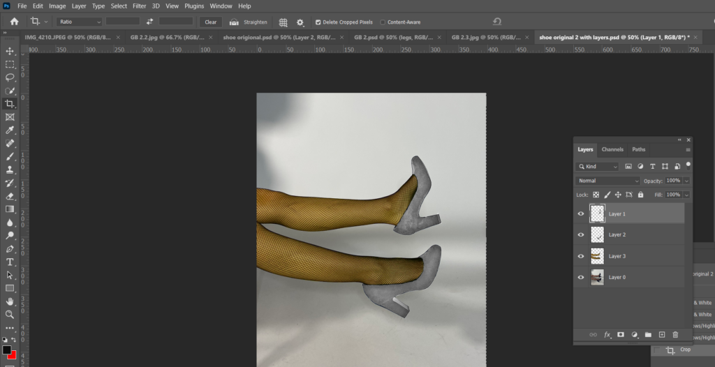
I saved my first edit as a PSD so it saves with all the layers so I can go back and change the colour without having to cut out the shoes again.
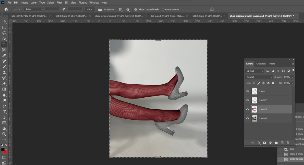
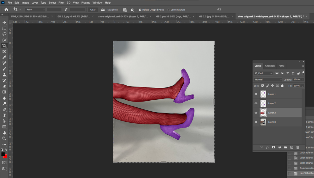
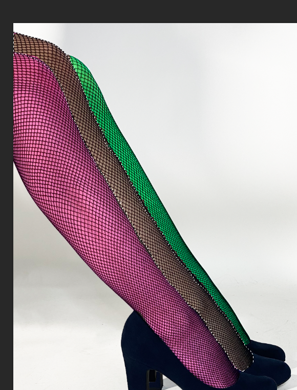
This next edit I needed 3 legs instead of 2 to match my edit to one of Bourdin’s photographs. To start, I used the Quick Selection Tool to select the leg and I cut and pasted it onto a new layer.
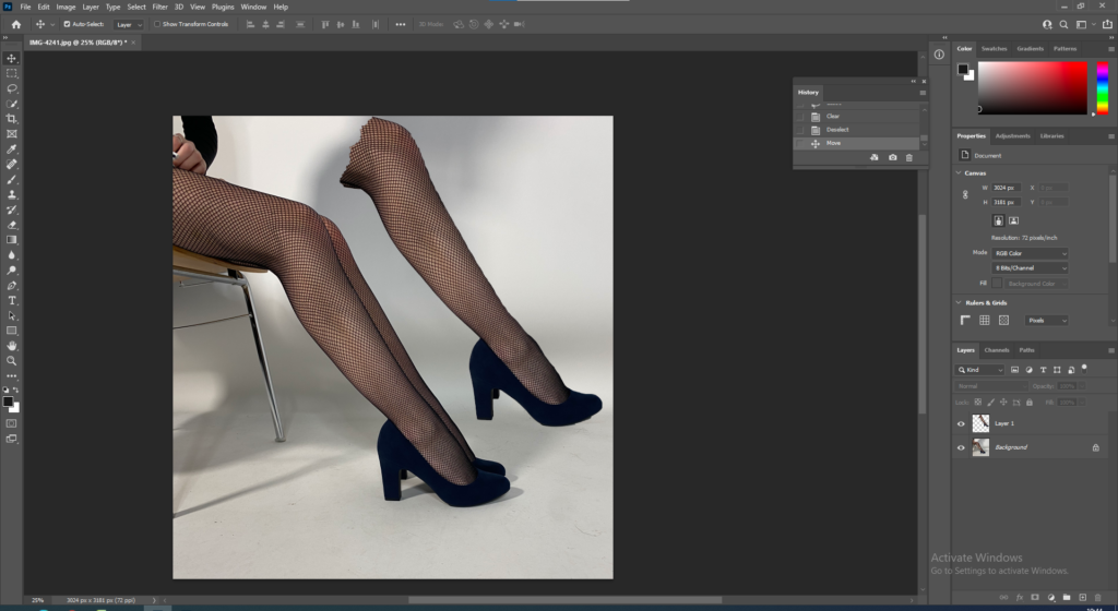
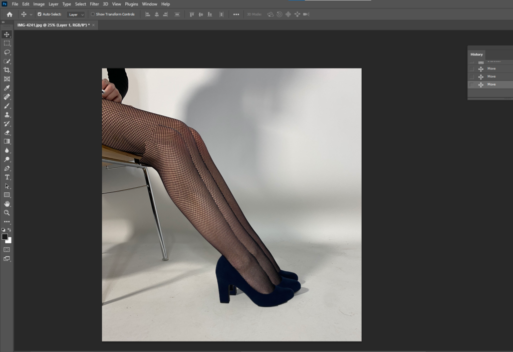
I then positioned it to where I wanted it to be.
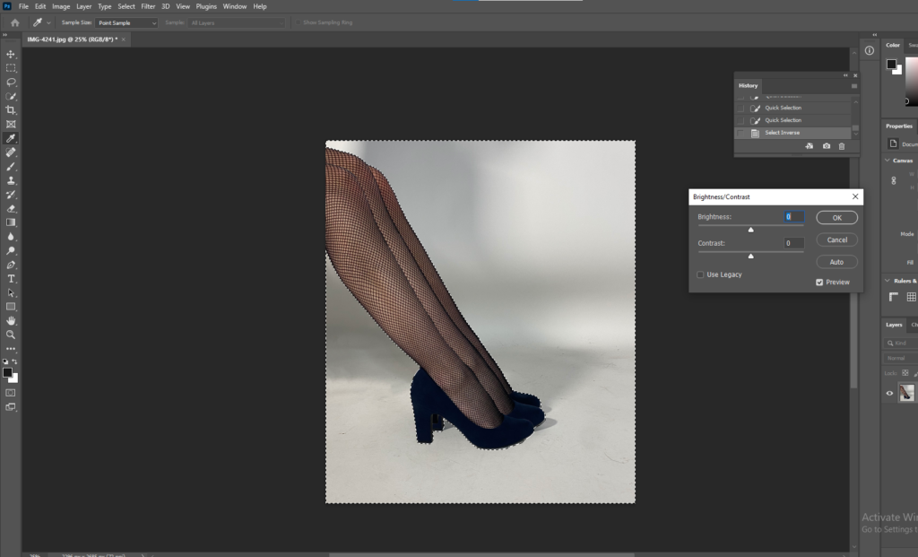
I used the Quick Selection Tool to select the background, then adjusted the brightness to make it brighter, but only the background.
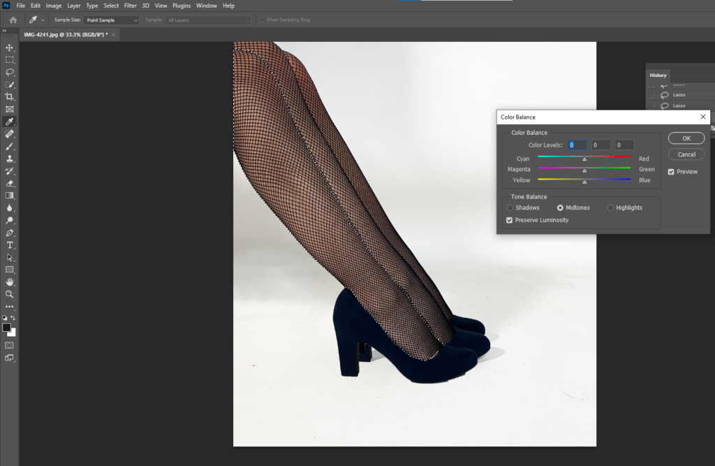
Then again I used the Quick Selection Tool to select the leg I wanted to change the colour of. Went up to Image, Adjustments, Colour Balance and changed the colours of all 3 legs.
Finally I used either the Spot Healing Tool or the Clone Stamp to clean up around the shoes.
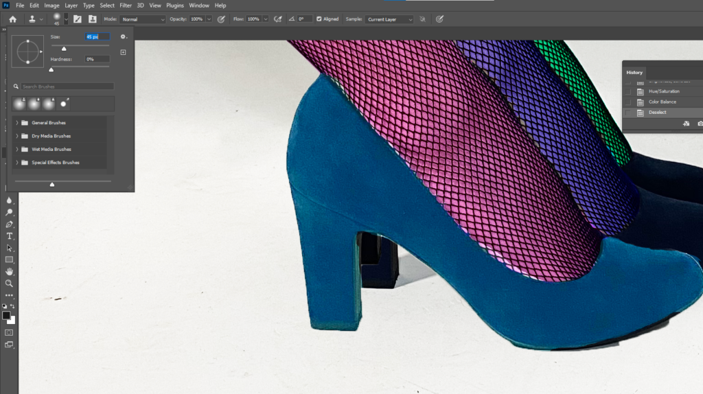


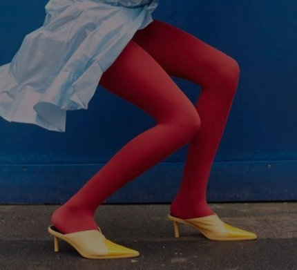
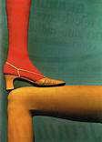
Bourdin explored with a lot of vibrant colours in his work for Charles Jourdan. Jourdan and Bourdin produced a large amount of work on shoe advertisements, I liked the range of bright colours throughout these images and decided to take inspiration and produce a version of my own. Both mine and Bourdin’s images have solid blocks of basic colour instead of pastel or deeper colours for example. The images are eye-catching and don’t require too much thought. They are very positive images but don’t have much narrative, however the 3- legged images to create a sense of curiosity.




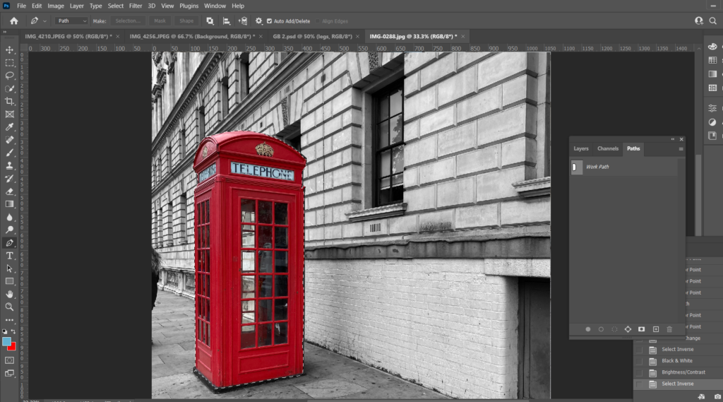
First I opened up my background image and used the Pen Tool to cut out the telephone box, once the box was cut out I went up to the menu and pressed Select, Inverse so everything but the telephone box was selected and changed the background to black and white and adjusted the brightness and contrast.
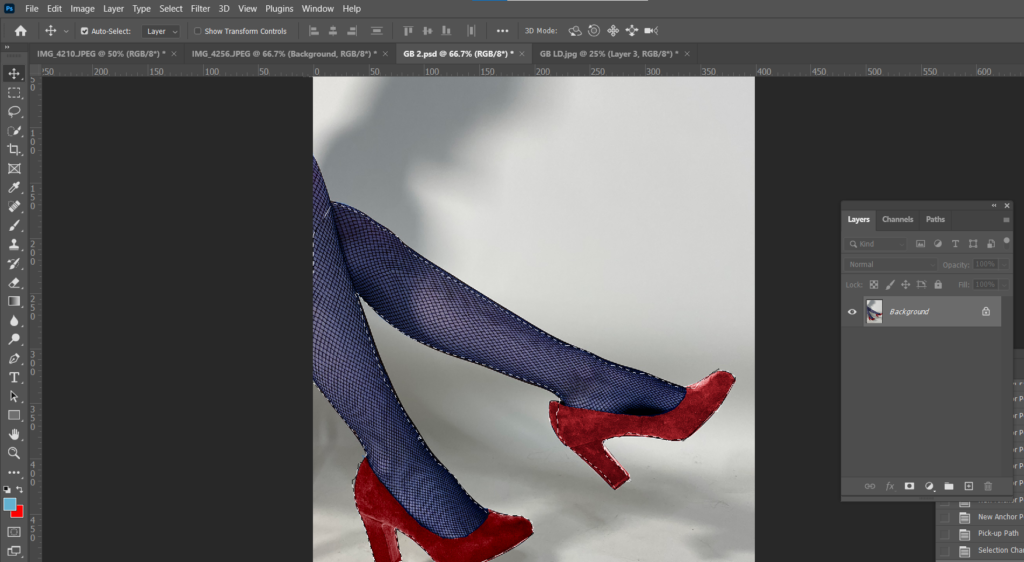
I opened up an image I had previously edited and used the Pen Tool to cut out the legs and cut and pasted it onto my background and adjusted them into the position I wanted by using either Edit, Transform, Scale or Edit, Transform, Rotate.
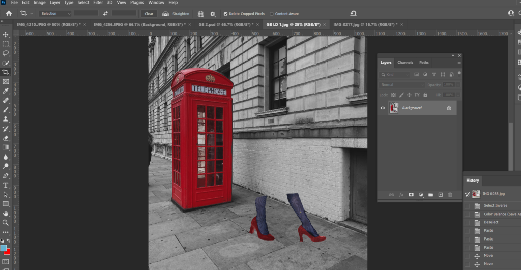
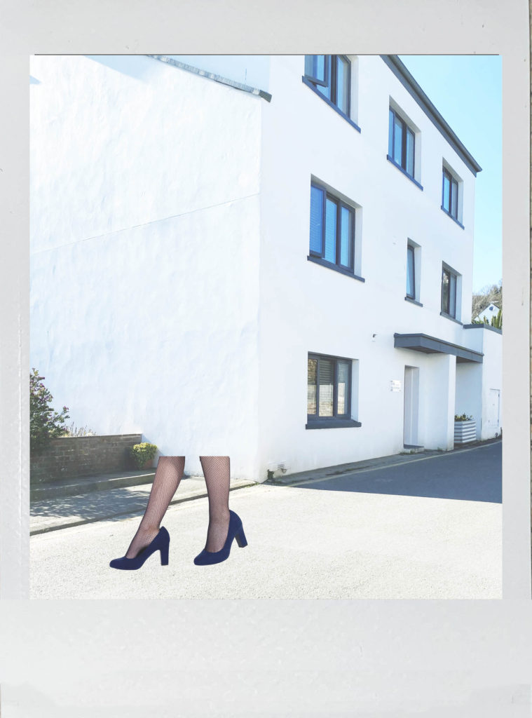
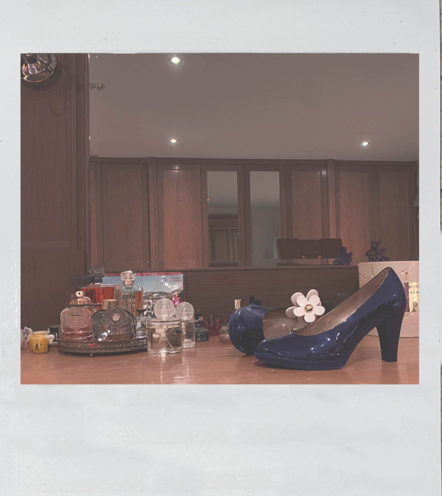
I then opened an image I had taken of a polaroid picture I had at home, I used the Rectangular Marquee Tool to cut out the image within the polaroid, cut and pasted my edited image onto my background, put my edited image on the bottom later and on top placed the polaroid frame.
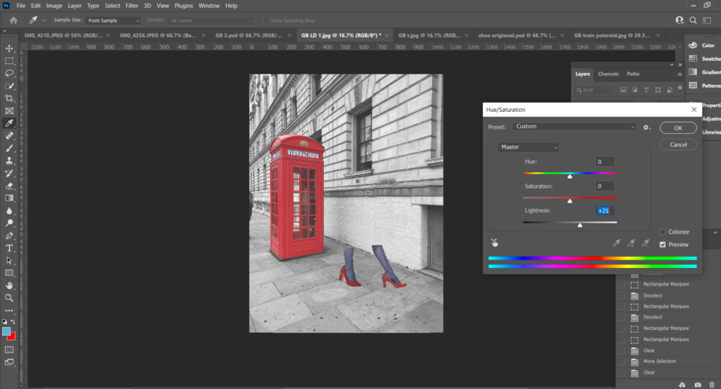
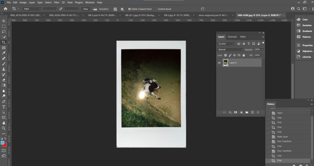
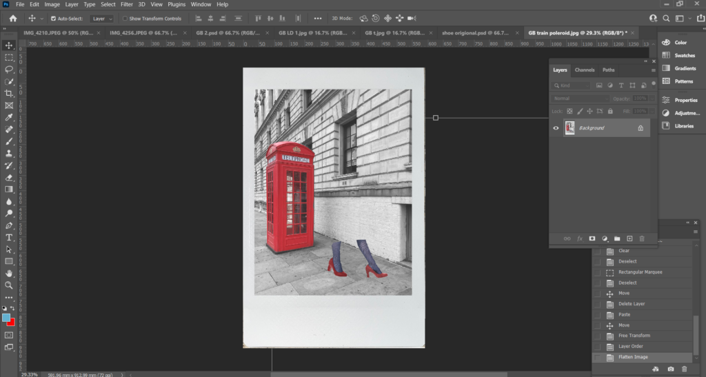
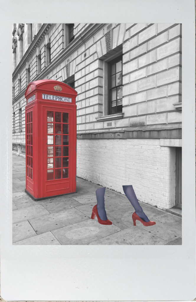
I then repeated this process again for a second image.
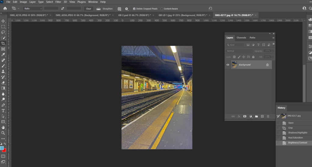
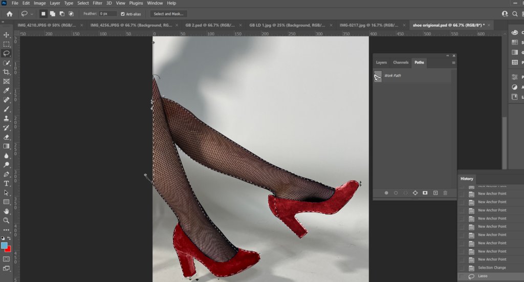
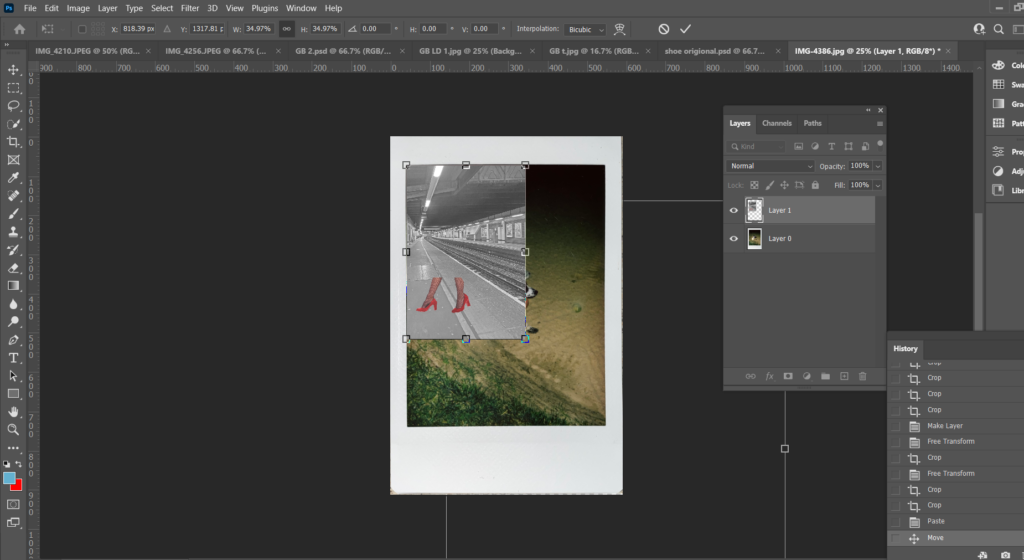
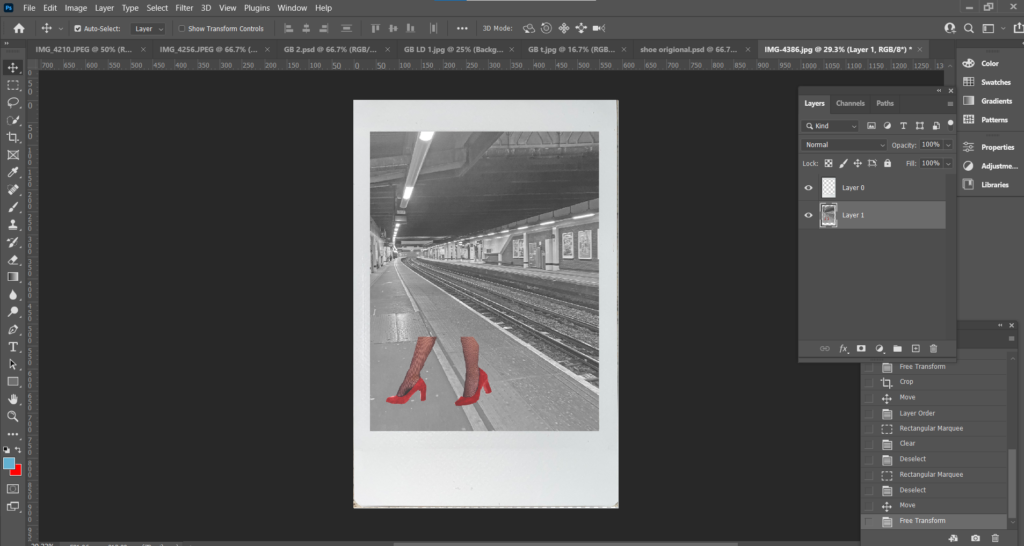
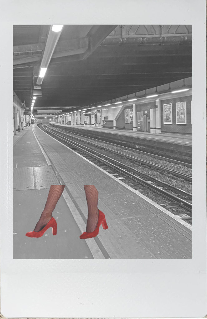
What I like most about my polaroid images is the worn/ old fashioned effect they have. The photographs are edited to match Bourdin’s images which are faded with a slight coloured tint on top. I think polaroid photos are more gripping than just an ordinary photograph, they have more texture and character about them.
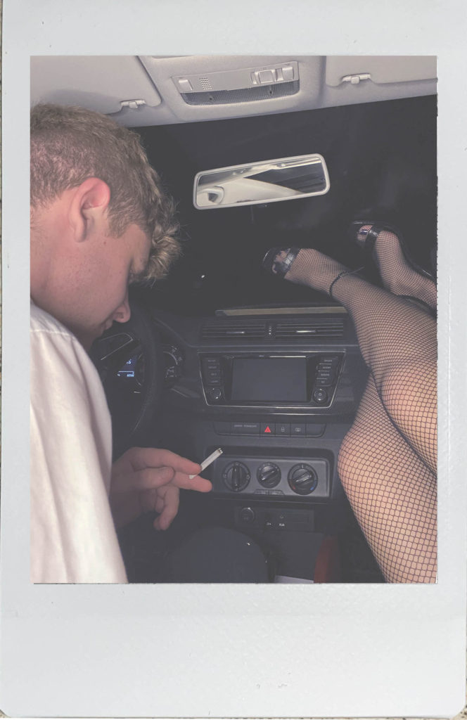
One of my final images had things in the background that I didn’t want in my image, to remove the canvases on the wall I used both the Spot Healing Tool and the Clone Stamp.
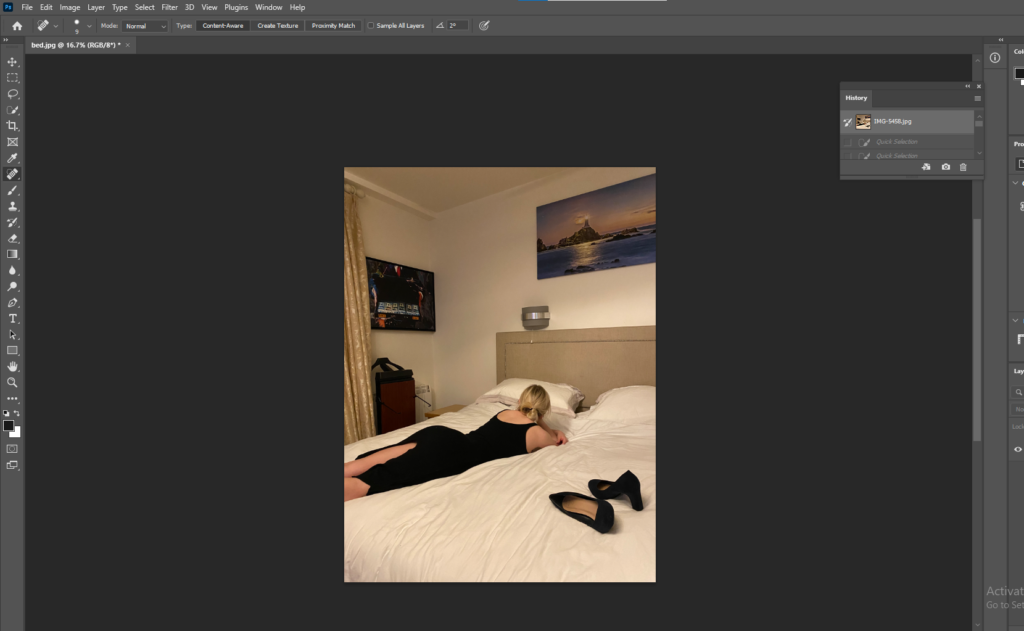
After the canvases had been removed I used the Quick Selection Tool, selected the background and adjusted the brightness to make it brighter.
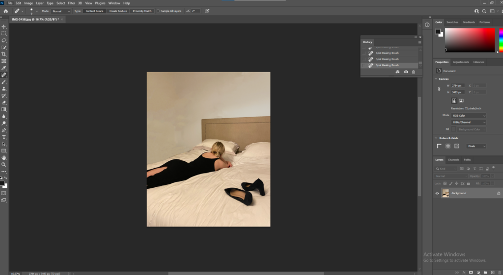


What I love most about black and white photographs is there is no colour to distract you from the structure and depth of the image. Black and white images are a good way of capturing dark shadows and bright highlights. These images have the greatest sense of narrative compared to the others in my photobook, however these images can be interpreted in several ways and have a strong sense of curiosity, for example, the worn dress and heels on the bed, make you wonder where the woman had been that night and did the night end good or badly. The idea that the shoes and dress are both black could be telling us that the night ended badly as black is seen as a fearful, negative shade. The black and white also create deep emotion, the woman on the bed in the first image for example, lays there looking lost, however you can’t see her face so your mind will make up a story about how she may be feeling.
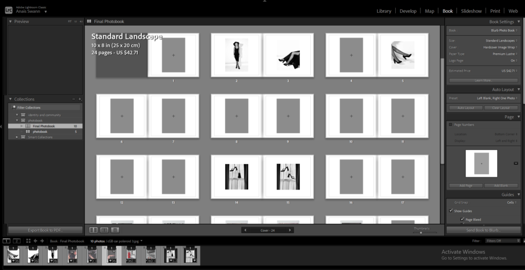
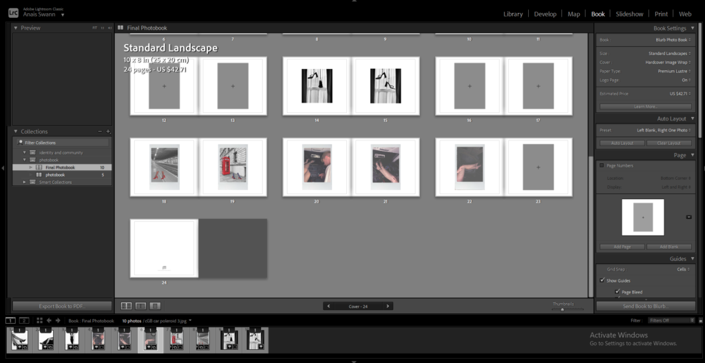
First I imported my edits into Lightroom.
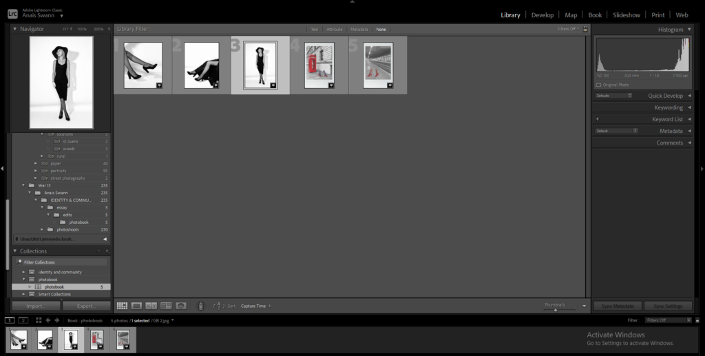
Selected book
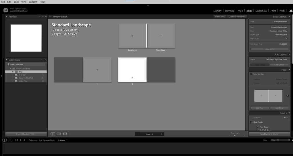
Began adjusting where I wanted my images
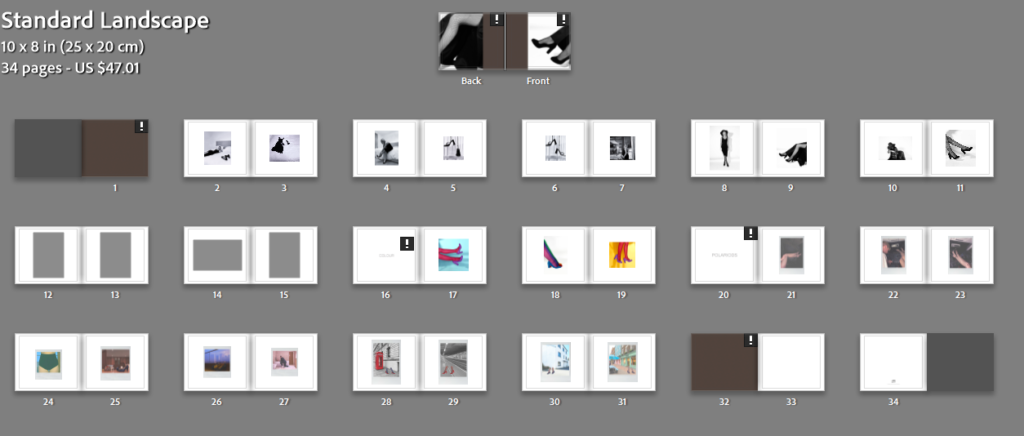
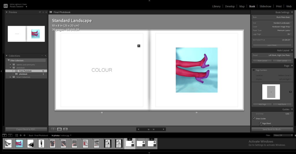
My titles in my photobook are inspired, again, by Charlotte Cotton’s book on Guy Bourdin.
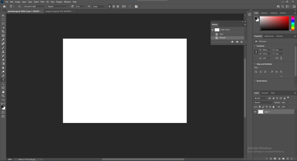
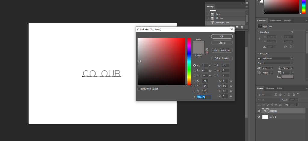
I started by opening a blank white document and selecting the Horizontal Type Tool and deciding on a font and adjusting the colour to a dark beige to match the one used in Cotton’s book.
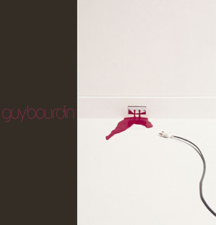
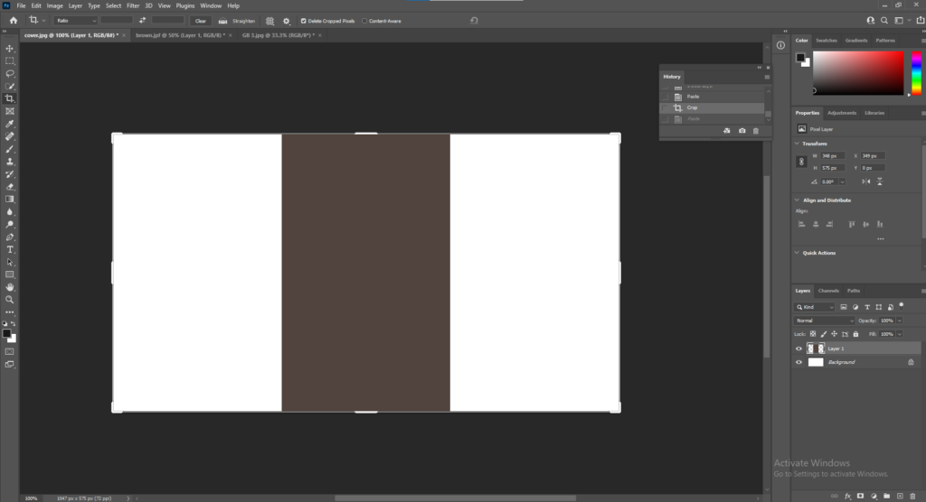
Cotton’s cover is one image that folds from the front cover around to the back. To start my front and back cover, I opened up a document in photoshop then layered the same brown colour I used for the first and last page in my book and placed it in the middle so it will fold from front to back.
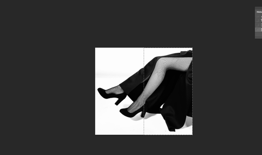
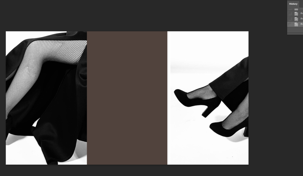
Next I opened the image I wanted to use for my cover and cut out half the image and pasted it onto one side of the brown strip. I then Select, Inverse, Delete so the other half of the image was cut exactly, and pasted it onto the other side of the brown strip.
To add the text onto my front and back covers I used the Horizontal Type Tool.
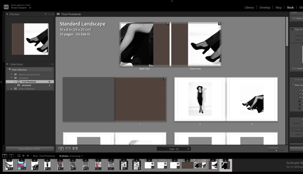
All in Good Taste
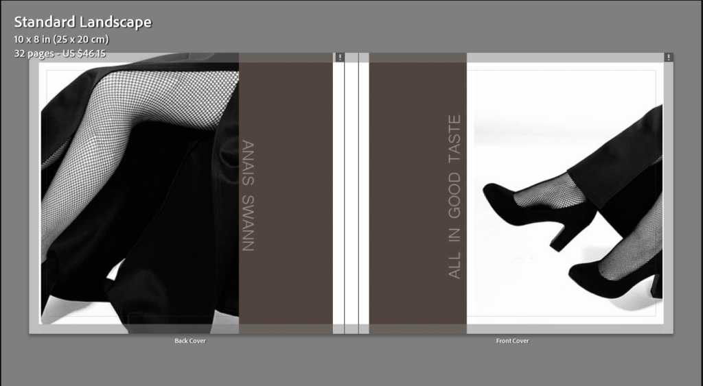
When the book is closed, the image will be folded around both pages.
For the first and last page in my book, it will be a solid brown colour like Cotton did.
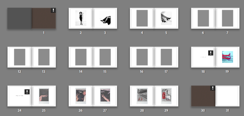




This blog post below includes an artist reference on Guy Bourdin and his impact on the fashion industry and social identities.
Altogether I am happy with the outcome of my personal study. I found the photographers I researched in relation to my study interesting which helped when writing my essay. Guy Bourdin, French artist and fashion photographer, influenced most of my work on the fashion industry and social identities. I found his work gripping and fun which inspired me when it came to taking my own photographs. The layout of my photobook is inspired my Charlotte Cotton’s book on Guy Bourdin, including the layout of the cover and inside pages. What I liked the most about Cotton’s layout is the simplicity of it, I like how the background is a pale white so there is no distraction from the photographs. I found the polaroid images fun to take and edit, as they aren’t an ordinary photo, they have a faded, old-fashioned look about them. Overall, I liked this project the most, mainly because of the freedom to do it on whatever you liked.