NFT – Research and Analysis

WHAT IS AN NFT?

A non-fungible token (NFT) is a unit of data stored on the decentralized public Ethereum (ETH) blockchain, that certifies ownership of a digital asset, which is unique and therefore is not interchangeable.

NFTs can be used to represent items such as photos, videos, audio, and other types of digital files.

The artist creates a piece of digital art, then mints it on the blockchain and lists it on a website for a fee, then users can buy the NFT for an exchange of ETH, sometime the NFT is sold with an utility which can be a real life print out or other items as well as the NFT.

HOW I WOULD DESCRIBE AN NFT?

Lets say you buy the Mona Lisa (NFT) with your money (Ethereum, ETH), now you own it, but when you go to collect it from the museum (blockchain, where all the NFT’s are on) the museum staff stop you and instead, they give you a recipe saying you own it. Basically, the recipe is a certificate of ownership.

DIGITAL ART

Digital art is the new way forward in the modern world. Anyone can create it at home on a computer using software such as, Photoshop, C4D, Adobe Animate, Blender, etc. Essentially, digital art is starting the replace physical art, as there is a lot of new ways to experiment with new ideas.

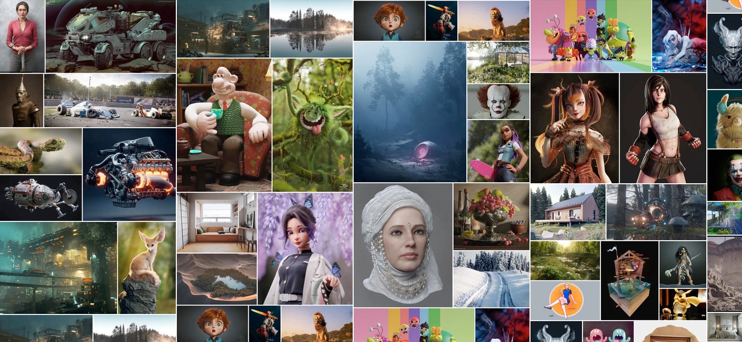
Here are some examples of digital art:

Year in Review: Best of Blender Artists, 2019 - BlenderNation

EVALUATION

I think digital art is more powerful than physical art as it is more modern and up to date with new technology, this means that there is more potential with digital art, as there are no limits. However, physical art has elements that digital art cannot possess, such as, emotion in the brush’s strokes and the texture, this is because digital art is mostly displayed on a screen, until holograms get better.

MY OWN NFT

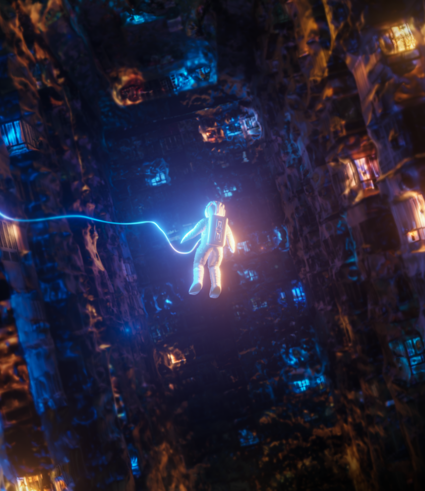
I made some digital art, in a 3D software called Blender then used Photoshop to adjust the colours and other elements. After I minted and listed it on to a NFT market place called Foundation.

This the link to it: LOST
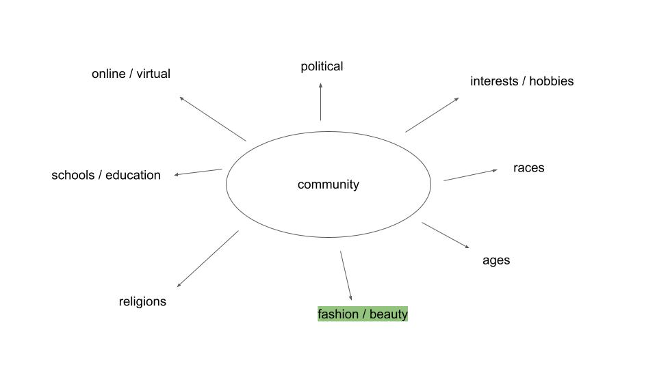
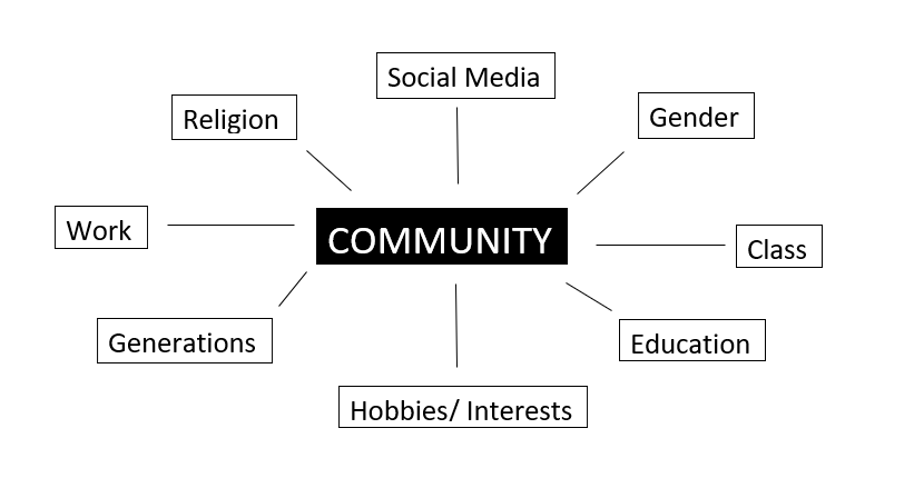
community mindmap & moodboard

A community of the future will celebrate diversity, equality and inclusion and propose a new digital world; a metaverse where everyone is equal regardless of class, race, gender and age. A digital ecosystem that transcends all virtual identities into a utopia for peace, prosperity and progress.

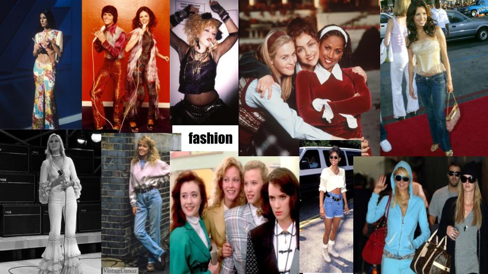
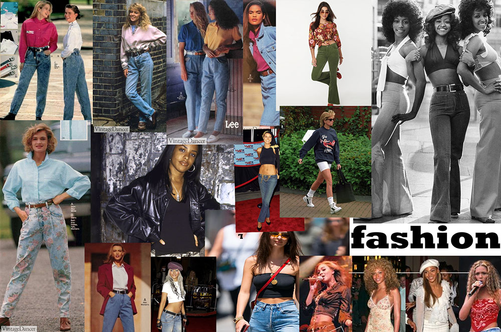
My group decided to focus on the fashion and beauty community, as we think that it has a huge impact on the world, especially on young people. Our aim is to explore the idea of fashion throughout the decades and how it has changed.

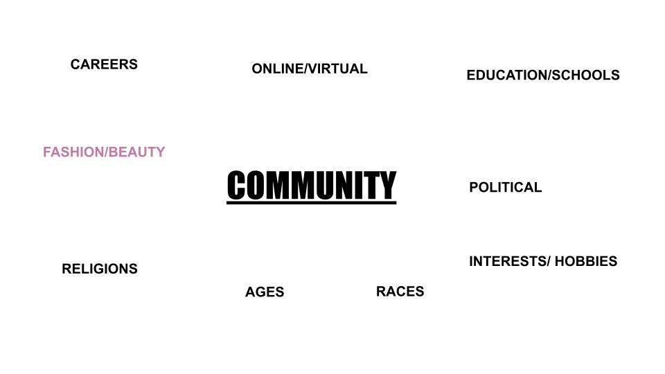
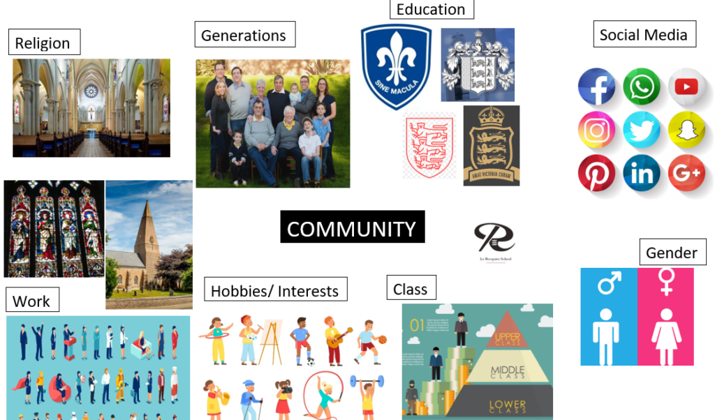
MIND-MAP and mood board

A community of the future will celebrate diversity, equality and inclusion and propose a new digital world; a metaverse where everyone is equal regardless of class, race, gender and age. A digital ecosystem that transcends all virtual identities into a utopia for peace, prosperity and progress.

We chose to do fashion for our group project as we all think the fashion industry is one of the biggest communities and has one of the biggest impacts on our planet AND the media. I then created a mood board for this theme as we want to focus on different decades in the fashion history as our focus and question is how do we think fashion will look like in the future and on the metaverse?

NFT Project – Concept
For this project we are in groups to produce a 30 second animated film and a digital image both linked to the idea of community and what out community will be like in the future.

Idea Board

Out of these different links to community we have chosen to focus on the comparison between online and offline communities. We chose this because of the link of this topic to NFT’s, showing that the world will become more digital as time moves on, leaving an opportunity to express this through our animation and digital image.

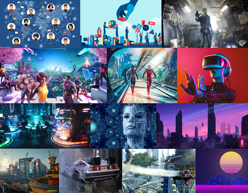
Image Idea Board

Statement of Intent

With the word we have been given as ‘Community’ we split this into different meanings such as; Local community, school community, online/offline community, friendships, sport communities etc. We have also been thinking and learning about NFT’s and the development of the digital world. With this we decided to focus our digital image and animation on the difference between our online and offline community, and what the online community and metaverse will look like in the future compared to the physical world.

CONCEPT: What will the future of Jersey look like as a community in the metaverse?

3 Words

Futuristic, Advanced, Modern

A Sentence

A fully digitalised, advanced cyber space that is extremely different from the physical world.

A Paragraph

A fully digitalised, advanced cyber space that is extremely different from the physical world. I imagine this world to be accessible through virtual reality goggles and it will be as big, if not bigger than the physical world. Enabling users to travel and access anything they want, making things possible that would not be achievable in the physical world. The difference between this metaverse and the real world will be huge, which is why we are focusing on it for our NFT project.

CONTENT: How will you make your film?

Our 30 second video will contrast the two points of view of the metaverse and the physical world. We will use split screen and aerial transitions to display the switching between points of view. For the real world aspect we will mostly use raw camera images and footage, with colour corrections and simple editing. For the metaverse POV we will mainly use fully digital animation to create the different futuristic effects and backgrounds for the different shots.

Embroidery & Animation

Stitching

The two main stitch types which I used was a Back stitch and a Running stitch:

I used various materials and cut pieces of material from a tapestry to create a story and image of my own. I started with a cut out of a persons head from the tapestry:

Image preview

My next step was to cut out a section of cross-hatched material and stitch it onto the subjects eye. The idea behind this was to create a greater sense of mystery about the person’s identity:

Image preview

After this, my next step was to stitch over his mouth and the other eye to again bring a sense of mystery to the buys identity and also add more texture to the overall piece:

Image preview
Image preview

The final addition that I made was to backstitch the whole thing onto another part of the tapestry that I cut out. This was to add more context to the overall piece by putting the subject in a location that the viewer can interpret for themselves:

Image preview

Animation

After completing the final embroidery piece, I transferred all these images and layered them in photoshop. I put the images in chronological order and set the frame rate for the animation. Here is the final product:

Tapestry

After we finished our individual pieces, we put them together to create a deeper meaning and story to be interpreted by the viewer. We stitched the individual pieces to a large material sheet in an order that we agreed on, here is the final product:

Image.jpeg

Identity and community shoots

Shoot 1

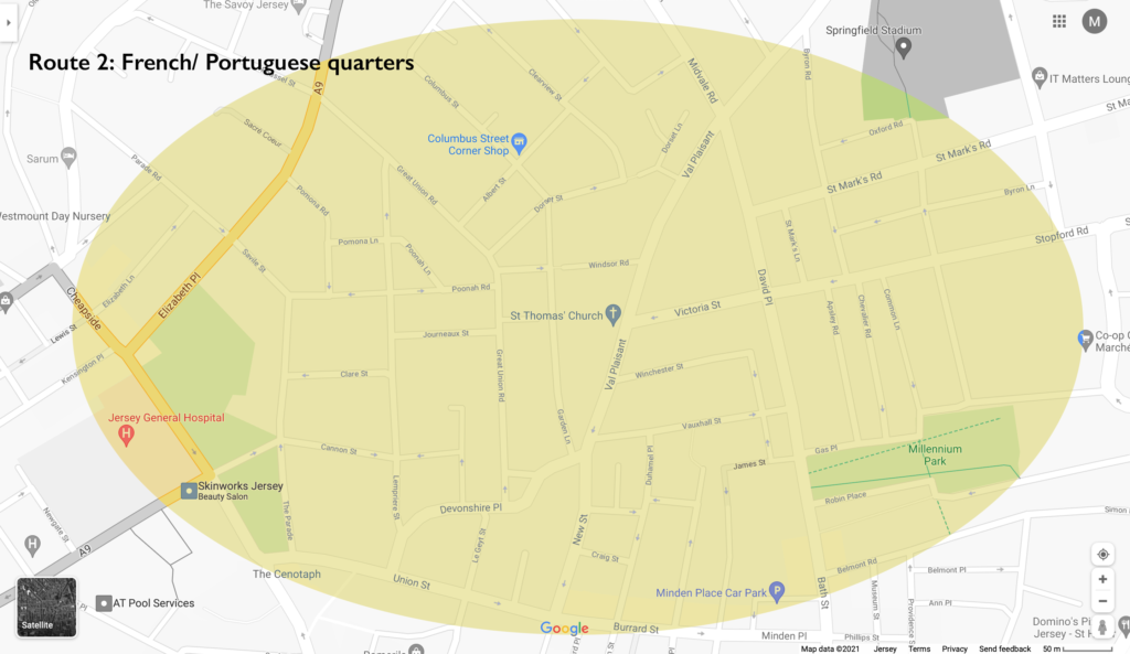
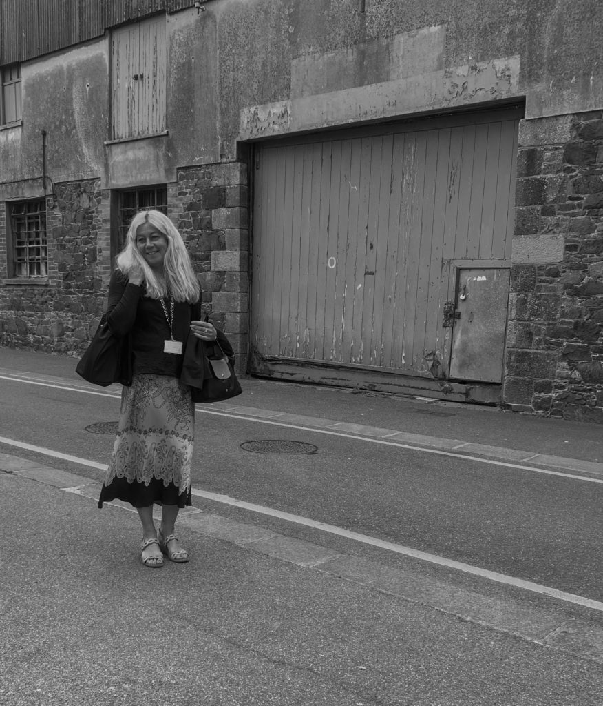
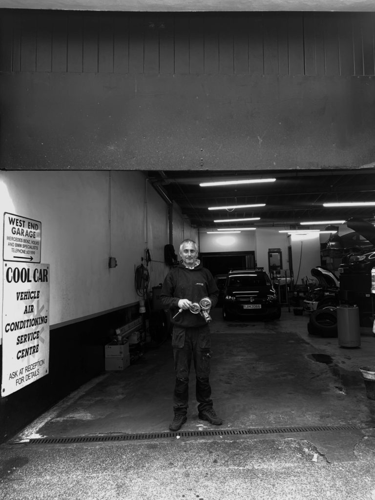
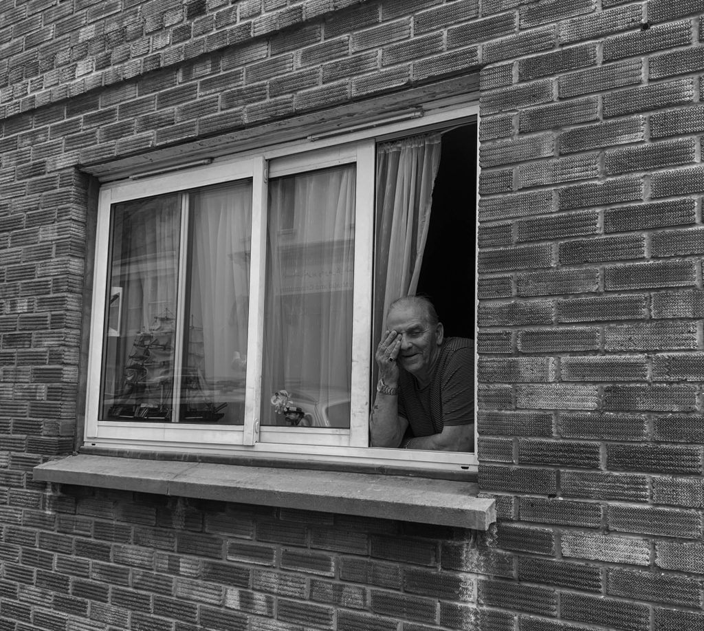
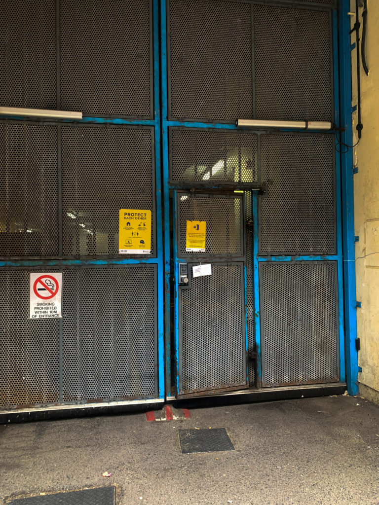
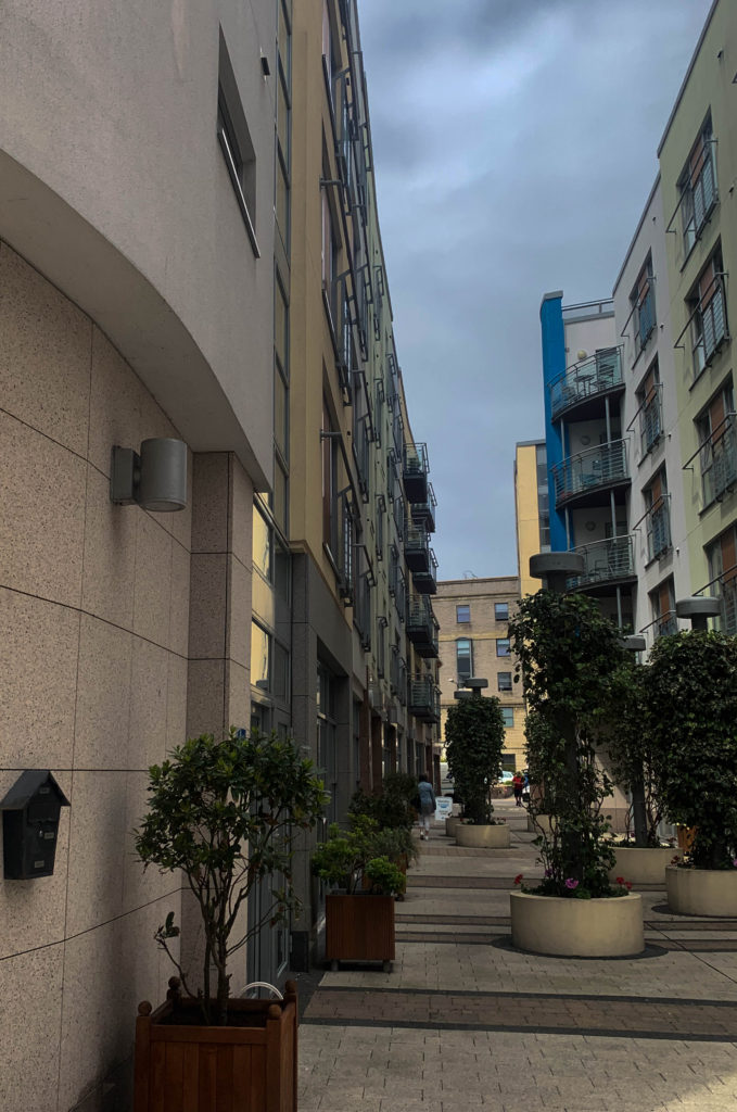
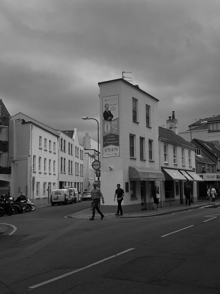
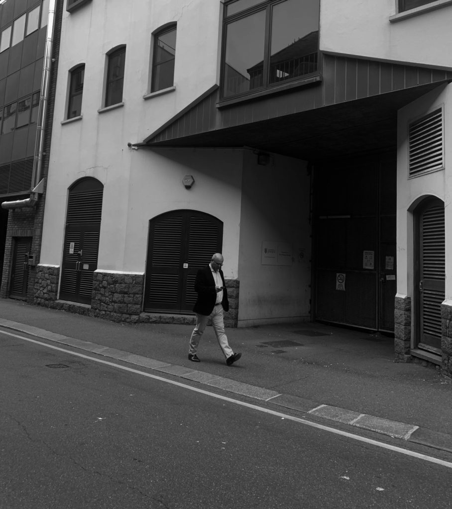
For my first shoot I focused on the French and Portuguese quarters, focusing on capturing raw moments and showing their lifestyle and area through my images. In my shoot I wanted to capture a sense of place, character of community and people/portraiture. In my shoot I took around 200 images.

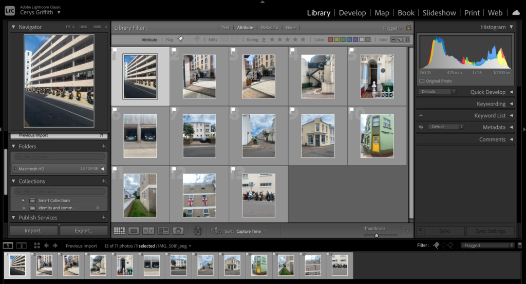
After I did my shoot I then imported my images into light room where I created a Identity and Community folder.
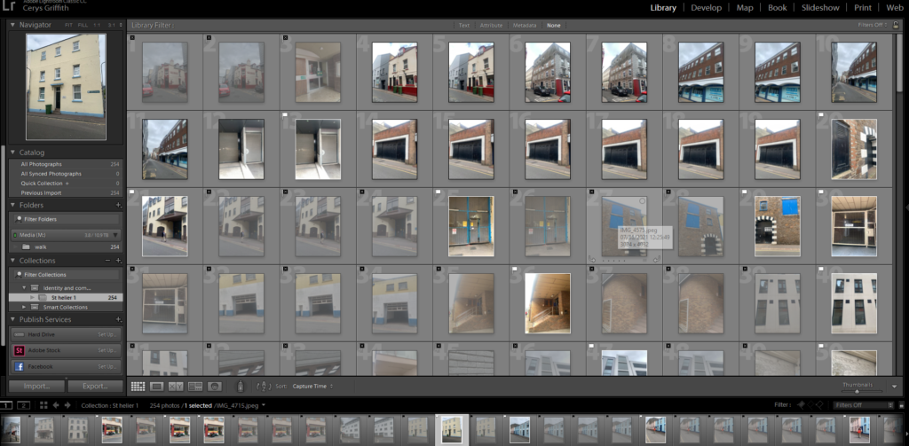
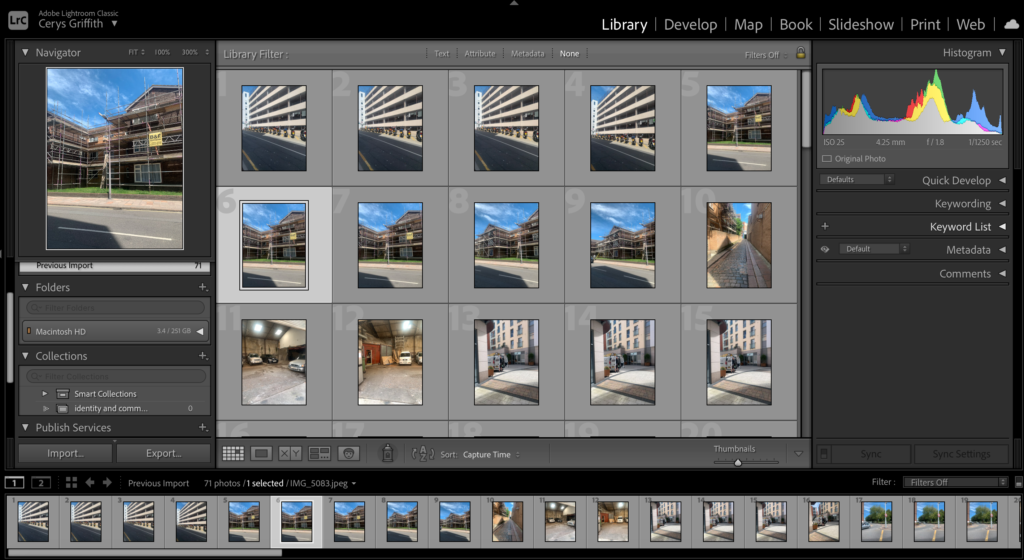
I then went through all my images from my first shoot and flagged the images I want to use by holding shift and using the (p) pick and (x) reject buttons. My aim was to end up with a maximum of half of my images flagged. After flagging my best images, I then rated my images out of 5 so I could focus on my best images.

This image has an empty alt attribute; its file name is image-30-1024x503.png
Here I had flagged (white flag) the images I want to use and edit and the black is images I won’t be using
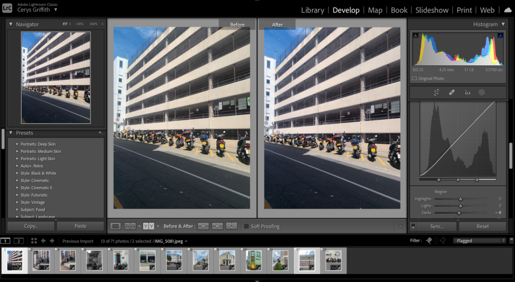
This image has an empty alt attribute; its file name is image-41-1024x517.png
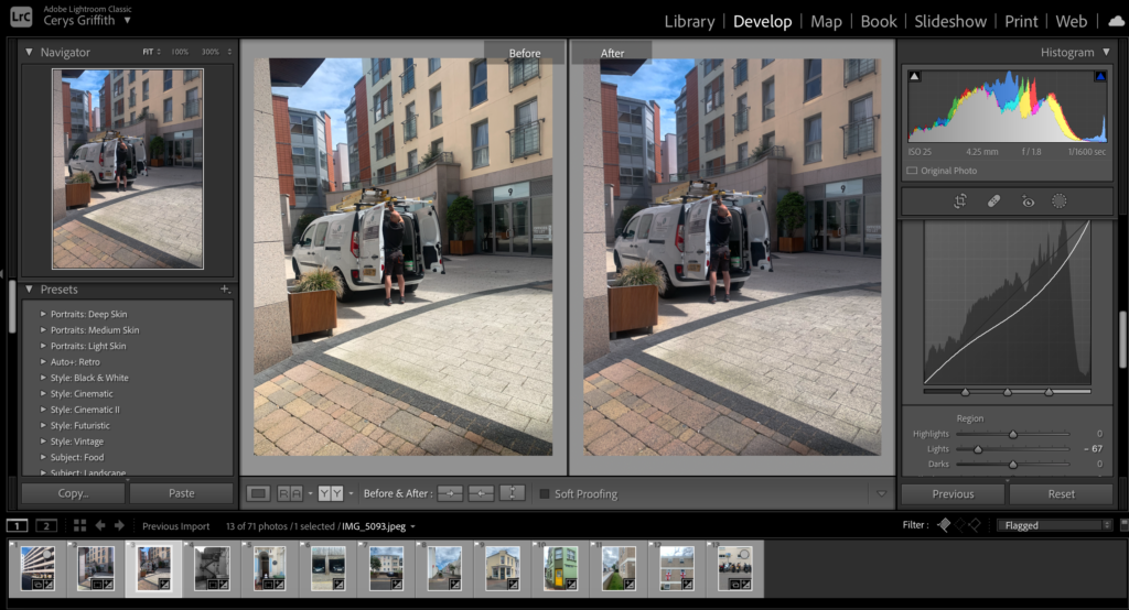
This image has an empty alt attribute; its file name is image-27-1024x519.png

Here are all my selected images from my first shoot.

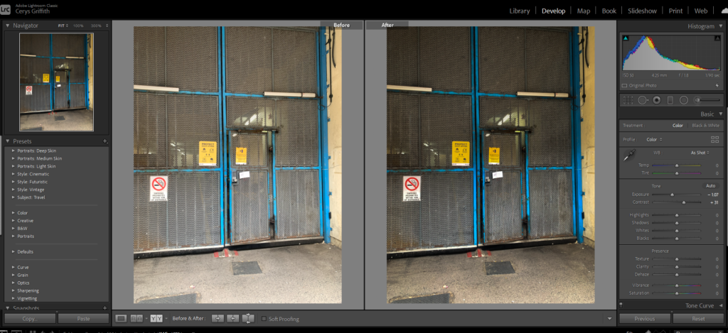
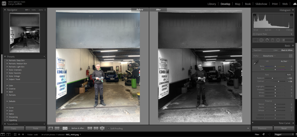
Above is just 2 of my edited images, with their before and after comparison to show how I edited them.

Final images

Analyse:

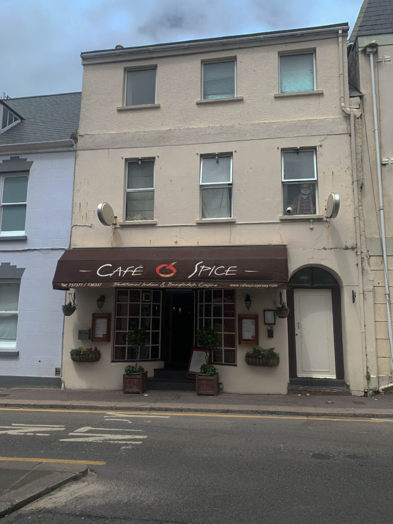
I like the overall outcome of my edited images from my first shoot. I decided to use a mixture of black white and coloured images as I felt not all my images would suit black and white and some of my images had lots of colour in it so I wanted to enhance that. I created my images with the view of representing different cultures within Jersey that aren’t just British. Jersey has a huge range of cultures within the island and I wanted to capture this by visiting different cultural spots.
I decided to include environmental portraits of residents of Jersey as it added a personal and visual aspect to my shoot. I photographed people of different cultures, jobs and occupations. This also represented the different jobs within the island and the lady representing the main occupation in Jersey.

Second shoot

For my second shoot I went around the British expats/wealthy residents.

I then repeated what I did within the first shoot and imported and flagged all my chosen images within lightroom.

I then went through all my flagged images and straightened them up, changed the curve, and changed the tones and exposures on all the images to make them a stronger image.

Final edited images

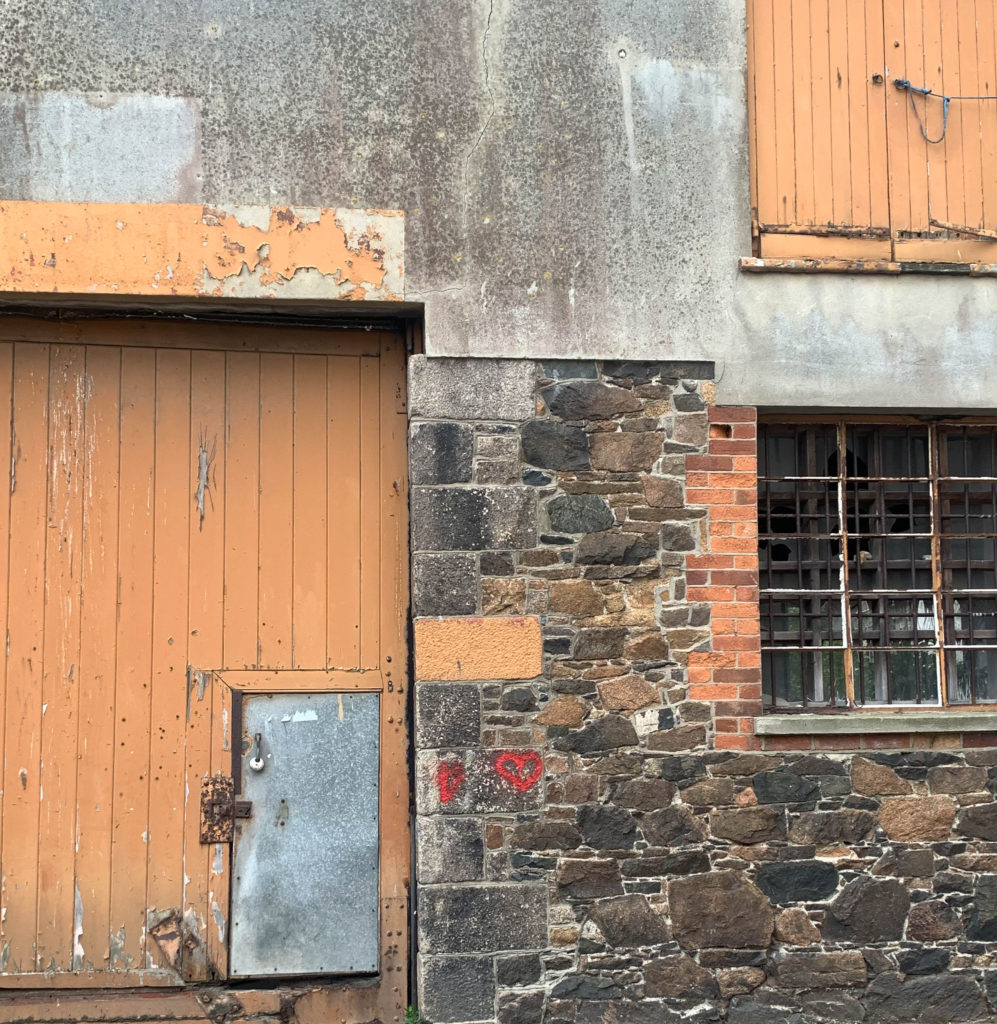
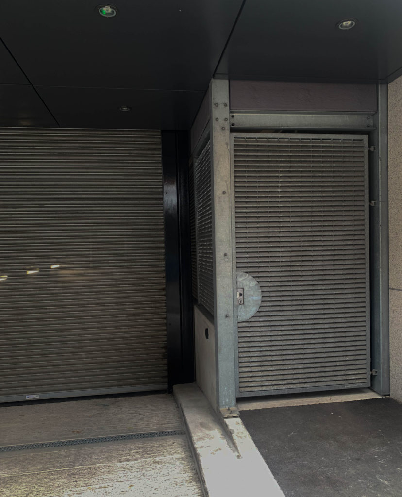
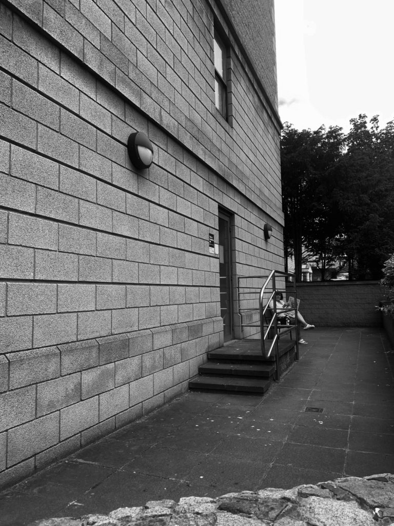
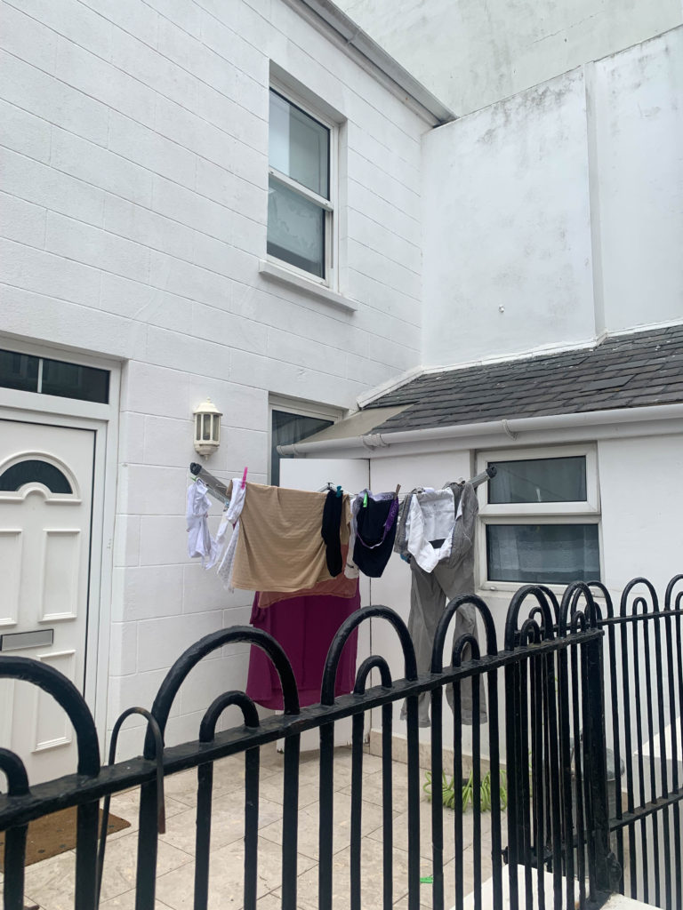
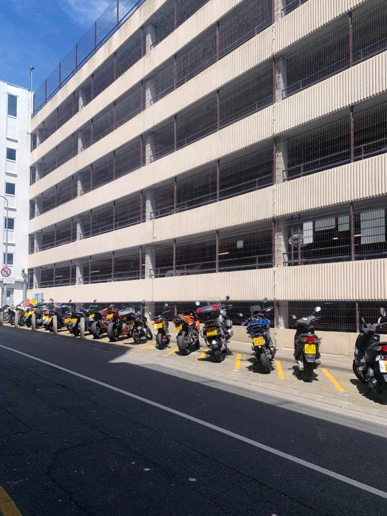
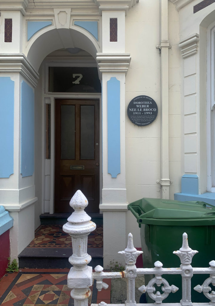
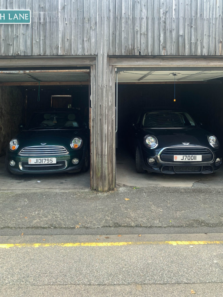
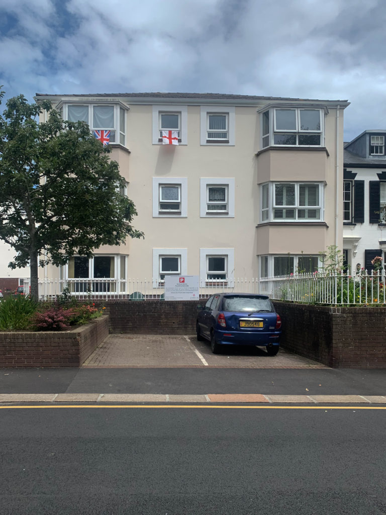
With my second shoot I took a more landscape and environmental shoot focusing on smaller details, like the flags hanging out someones flat window. I focused in on the smaller details of Jersey and the hidden away buildings and objects. I liked looking at different sequences and the colours within this shoot. I wanted to take a different approach to my second shoot to create a different collection of images.

Presentation and evaluation: 16 page photo-zine

The zine

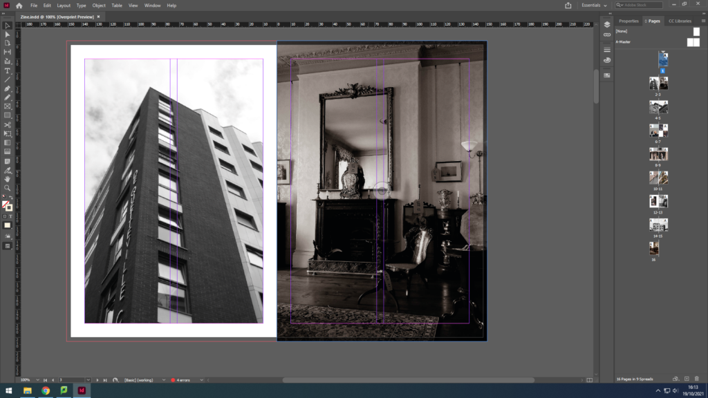
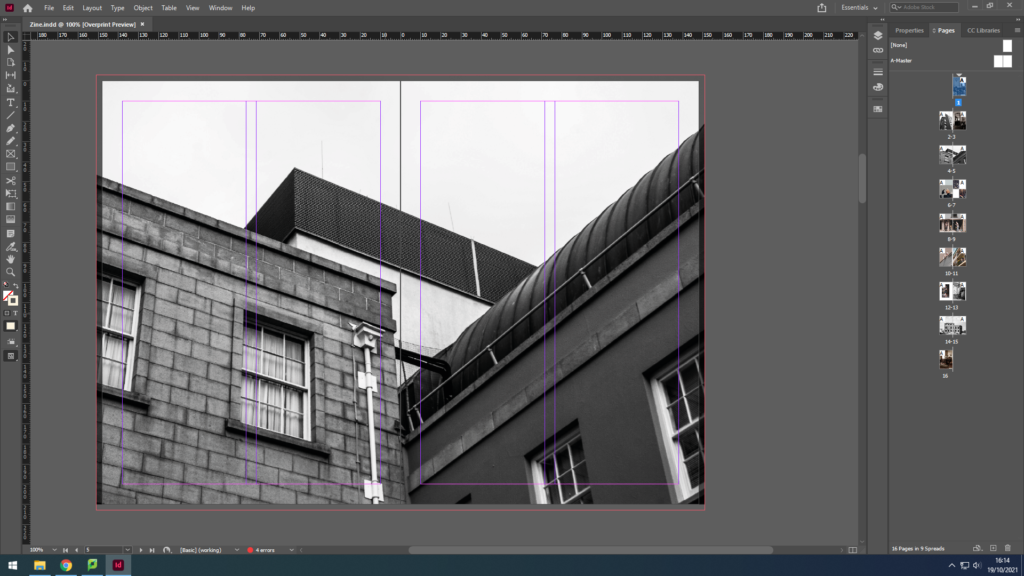
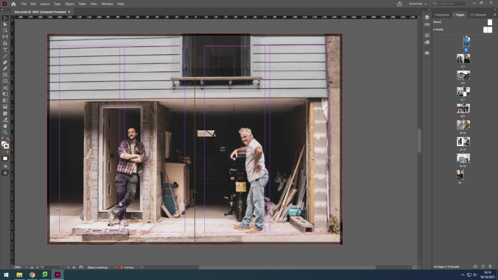
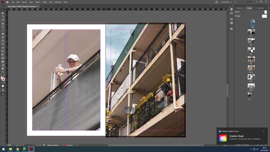
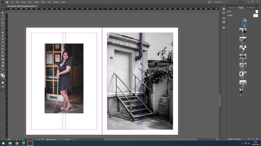
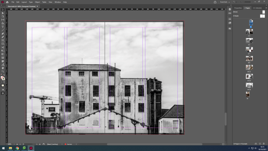
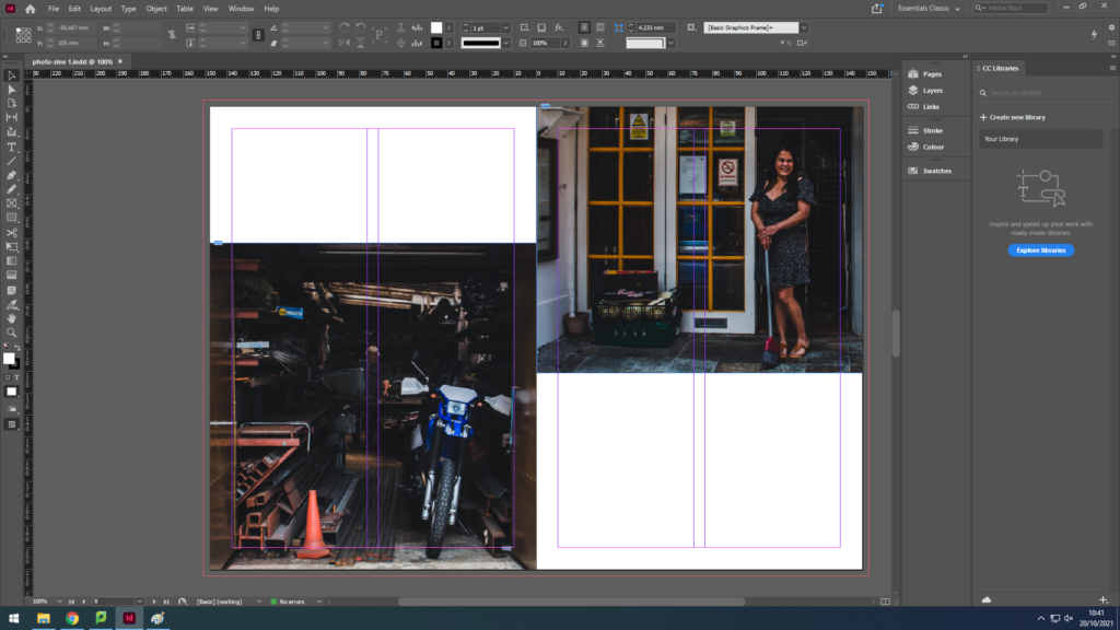
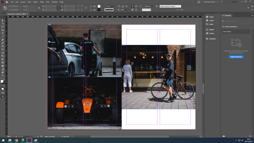
Due to printer issues, I was not able to print my zine successfully, so here is the zine in Adobe Design:

Evaluation

In conclusion, I believe my zine for identity and community powerfully portrays the different uniformity of the Jersey community. For example, I was able to capture the more elderly jersey community; a couple, a man waiting for his beloved, helping each other in love. I also captured the young generation; a young man fixing an automobile. To link the young and the wiser community together I have captured an adult man in his 50s in his garage fixing some items. These 3 examples can clearly show the successfulness of my zine for this project, for, not only does it juxtapose between the old and new generation, but it also makes sure to relate to the ways every individual is unique in their own way, such as, the photograph with the elderly couple gives a sense of unity, dependent on each other whereas the other images show a sense of individualism offering the idea that dependence is old-fashioned, and individualism is the new style.

Although, the zine also manages to illustrate other cultures. For instance, we can see a woman, dressed in black who has Asian heritage; she is standing outside the Gradees restaurant as an attempt to allow the residents to taste different foods from her culture like Half Roast Duckling with Orange sauce, which is a common dish in some lovely parts of Asia.

Therefore, we can understandably observe the prosperous of this zine on Identity and Community.

Animation Workshop

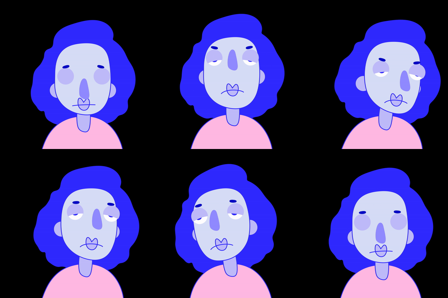
In this workshop we were shown how to animate a simple 2D image in Adobe After Effects. We were given a pre-set image with components to move around. We set keyframes for the different components to move them in co ordination with each other.

Here are the keyframes i used t create the animation:

Below is my final animation from this workshop:

Photo Zine

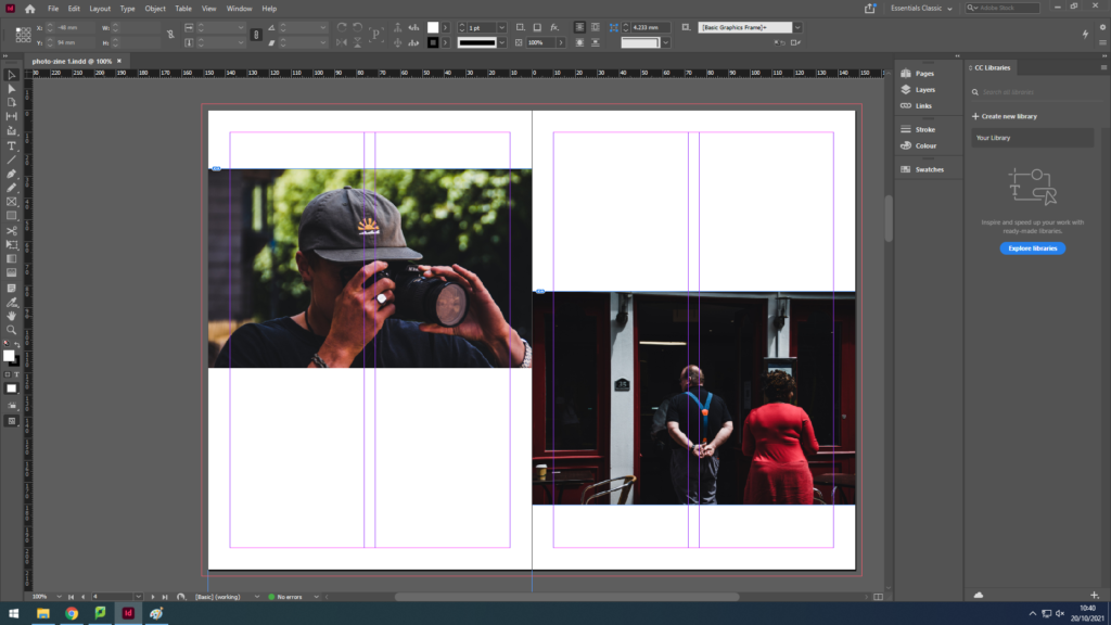
We used Adobe InDesign to create a photo zine of our photography throughout St Helier. We set boarders on the pages to make the images symmetrical and even, and imported out best edited photos from the shoot into the program. I then selected photographs that fit together well to be presented on each page, without over packing the page and cramming photos in. I decided to have some pages with one full image, these images were usually the clearest with high contrast which had a larger impact on the viewer. Other pages had smaller images with up to 2 photos on a page and 4 images on a double page spread. I chose my cover image because of the contrast between the two sides being white with highlights and the other being dark with shadows in the background. I also liked this image because the subjects stayed in the same position that they were in before we walked by to take photos, showing a glimpse into another persons life.

Here are the final pages of the zine screenshotted on Adobe InDesign.