NFT Artist References

Fewocious

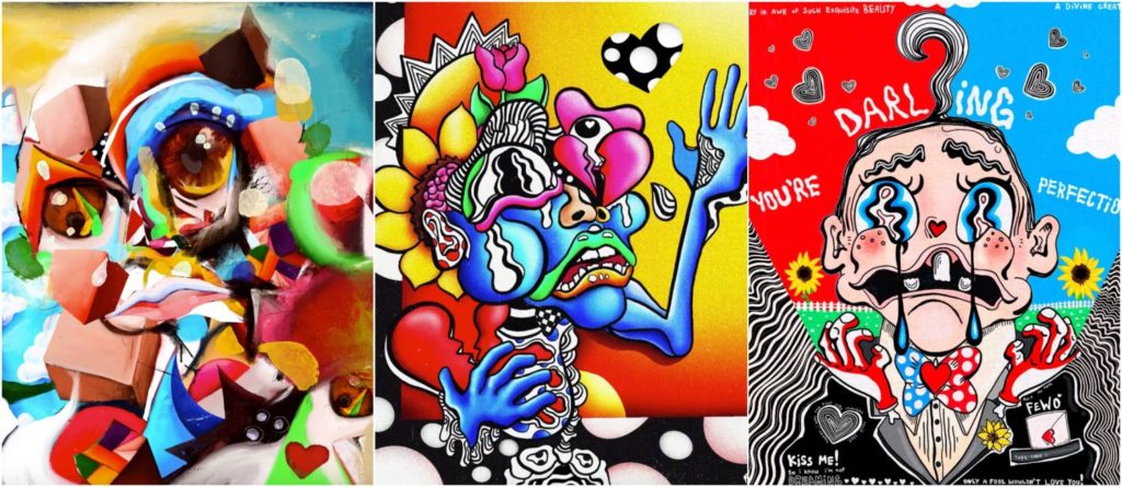
Fewocious, AKA Victor Langlois, is an 18 year old digital artist, born in Las Vegas, USA, now based in Seattle known for his bold and emotive recreations of his memories growing up. Fewocious first began to create pieces of art at the age of 13 as an escape mechanism for his struggles as a transgender youth living in an abusive household. Due to this, Fewocious aims to replicate his emotions from these memories and translate them into his art, with most of them showing a sense of sadness and despair during his difficult times. He also incorporates aspects of his personal journal entries from these time periods to enhance these past representations of himself. Over the span of a year Fewocious has become one of the world’s leading digital artist, whilst also grossing over $17 million from his NFT artworks in under a year. In addition, Fewocious’ work comes to life through his slight use of animation in the NFT pieces, where aspects of the image move around in a GIF like manner. Fewocious claims that he draws his inspiration from various different artist such as surrealist Salvador Dali and Daniel Johnston’s children’s book illustrations.

Analysis
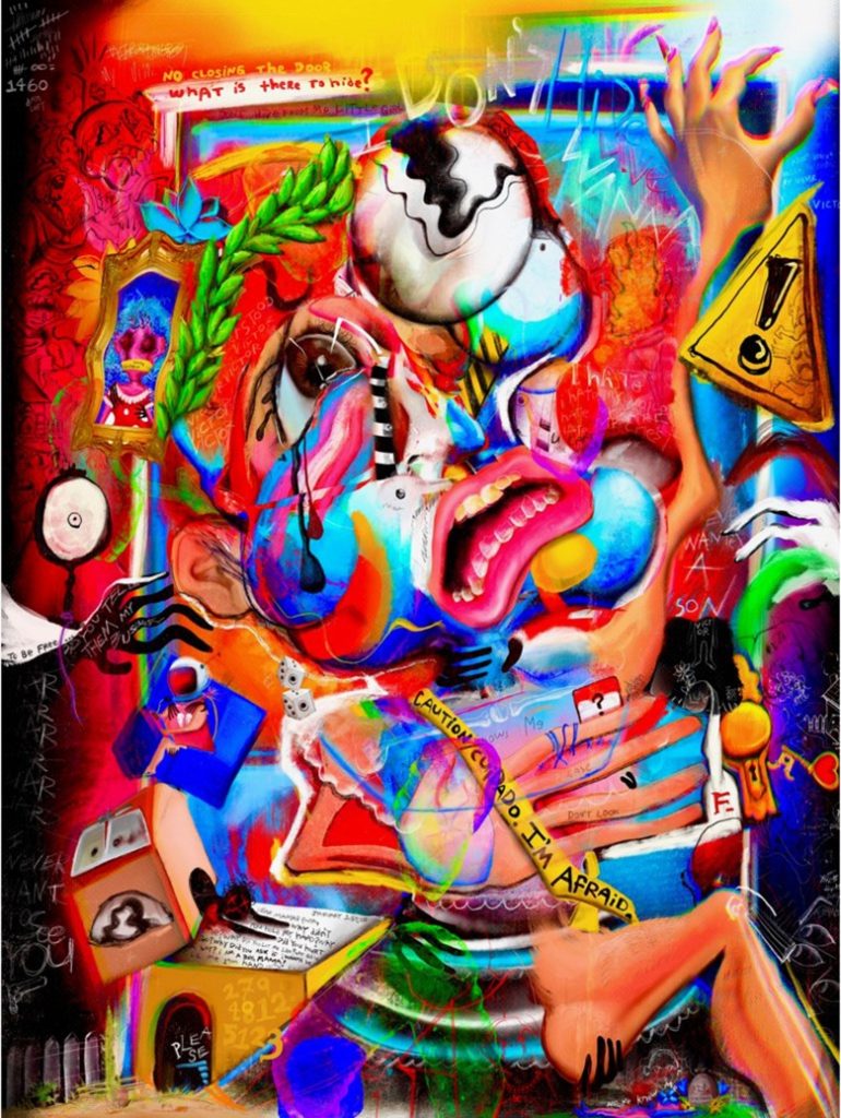
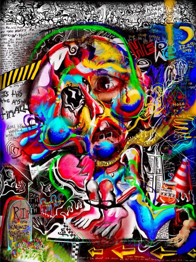
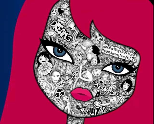
FEWOCiOUS (b. 2003), Year 1, Age 14 — It Hurts To Hide, 2021.

This piece of digital art created by Fewocious displays an abstract depiction of himself at the age of 14, consisting of a collage of different objects, shapes, words and expressions that remind him of this time in his life. Fewocious communicates this through the use of bright and almost luminescent tones in this piece. The focal point of this image appears to be the morphed face in the centre, expressing a sense of fear and fragility through the wobbled lines drawn in the eyes. The leading lines in this piece are created by what looks life a border surrounding the focal point, drawing the viewers eye across the top of the image, then down past the focal point into the far more busy bottom half of the piece, which contains most of the smaller and more hidden messages of the artwork. Fewocious has arranged this piece by leaving some areas of empty space at the top and then incorporating more and more artwork as you move down the image, in turn producing what feels like a bottom heavy piece.

The name of this artwork by Fewocious ‘Year 1, Age 14 — It Hurts To Hide, 2021‘ is referring to the first year of his journey as a trans youth, explaining the pain he had to endure whilst hiding his true identity, for the sake of his family, who refused to accept his need to become his genuine self. Fewocious has stated that “It goes from hiding, to accepting myself, and then realizing that I can just be myself.” about his artwork, with this piece being in the stage of hiding. It can be said that the focal point of the morphed face is looking up as it is searching for someone to help them escape and save them from their suffering. In addition, this morphed reality could be a reference to Fewocious’ sense of confusion in his gender identity accompanied by the rejection of his future self, causing him to feel as if he is caught in-between and unable to latch on to a secure sense of character and identity. Furthermore, the cluttered and bottom heavy aspect of this piece could be a signifier of his weighed down and possibly depressive feelings at this time of despair.

This links artist links with one aspect our group project idea that revolves around the communities of religion and LGBTQ+. This is due to the fact that the creator Fewocious is a part of the LGBTQ+ as he is a trans male. Moreover, we are aiming to display a similar sense of fear of to show your true identity in our work, as Fewocious does, however this will be through the repressive aspects associated with religion around the LGBTQ+ community, rather than a struggle that is more focused on family.

Hackatao

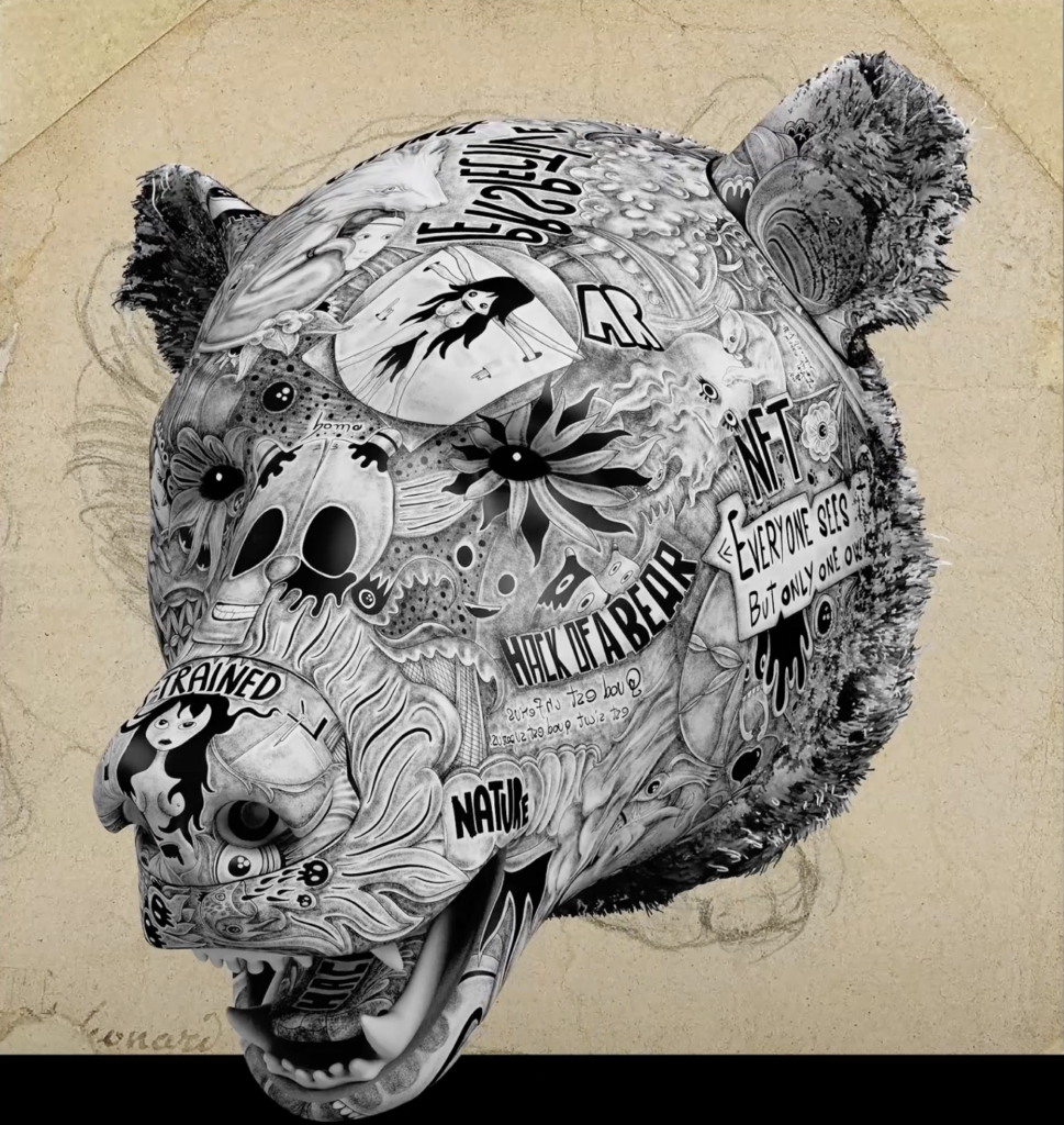
Hackatao, formed in Milan, Italy in 2007, is an artistic duo consisting of Sergio Scalet and Nadia Squarci who are known for their illustrative style artwork that comments of a variety of social issues, such as the environment, politics, humanity, cryptocurrencies and more. In addition, they also include elements of art history within their work. The duo got their artistic alias Hackatao from the combination of the two words ‘hacker’ meaning someone who overcomes challenges with creativity and ingenuity, and ‘tao’ for the principles of the Ying and Yang. Known as pioneers of the NFT world, Hackatao’s work is composed of two styles shown through two dimensional acrylic paint, and the black and white expressions of graphite. Furthermore, the duo are known to take inspiration from artists Takashi Murakami and Andy Warhol in order to create their surrealist pop like pieces. With this style, the duo have went on to collaborate with people such as Blondie, commenting on how the boarders of art and creativity need to be pushed and tested.

Analysis

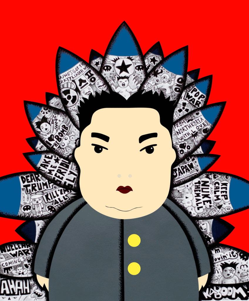
Kim Jong Un – “Dead and Alive” Edition – Hackatao

This image, originally a GIF, created by the duo Hackatao displays a two dimensional caricature style portrayal of North Korean leader Kim Jong-Un, surrounded by missiles in the background of the piece. Here the vibrant, solid red background strongly contrasts against the black and white sketches and texts within the overlapping missiles. The framing of this piece allows for symmetry, due to the depiction of Kim Jong-Un being positioned in the centre. This is further accentuated by the line on the jacket of the caricature, dissecting the image in two symmetrical halves, also being continued by the parting of the hair and finally the point of the central missile. In addition, due to this busy centre of the piece, it leaves a large amount of empty space around the edges of the top half of the image.

This simplistic approach to political commentary by Hackatao could be said to be an attempt to showcase the rising tensions that existed between the USA and North Korea during the Trump administration. In its original animated GIF form this piece by Hackatao displays a skeleton form of the ‘supreme leader’ flashing in and out of the image above. With this it could be argued that Hackatao intended to show what the future could look like for these world leaders, and their countries, if they allowed their egos get the better of them and start a devastating nuclear war. In addition, it can also be said that this nuclear topic is presented in a comical manner, due to the fact that some phrases in the missiles state things such as ‘Keep calm and nuke them all’ and ‘Kaboom’. This may be a reference to the way Hackatao and others may perceive these leaders as infantile and uncapable of leading a country, due to their tendency to have tantrums when they are refused power.

As well as the fact that this artistic duo deal with humanitarian, social and political issues, this style of art links with our NFT group project aim as it incorporates written quotes and texts. This relates to our work as in our still images and our film we are wanting to incorporate protest signs that contend the overlay of the LGBTQ+ and religious communities, in order to display the challenges people who belong to these two groups face in society.

statement of intent

Concept: What will the future of Jersey look like as a community in the metaverse?

3 WORDS: United, Peaceful, Diverse

A SENTENCE: A place where an individual feels respected and comfortable in being who they are.

A PARAGRAPH: Regarding all communities in our mind map, our group decided to focus in on the relationship between the religious community and the LGBTQ+ community as we all know the conflicts those communities have. A metaverse can be described as a potential utopia, so we want to construct a united metaverse between all communities where we all live in harmony.

Content

In our film, we want to show the thoughts and fears of a young man that is conflicted between his religion and sexuality, using scenes of a riot like environment to portray the negative fears and connotations of a happy relationship to show the reward.

contextual study 2

Bayeux tapestry deal agreed by UK and France - CNN Style

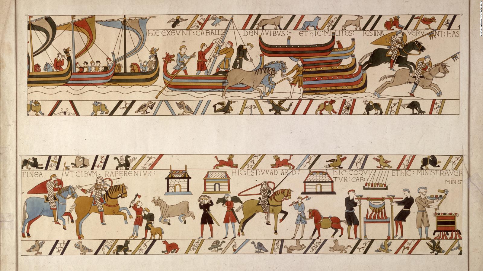
The Bayeux tapestry is an embroidered cloth which is nearly 70 metres (230 ft) long. It depicts the events leading up to the Norman conquest of England. It is presumed to date back to the 11th century, within a few years after the Battle of Hastings. It tells the story from the point of view of the conquering Normans but is now agreed to have been made in England. The cloth consists of some seventy scenes, many with Latin embroidered on linen with coloured woollen yarns. It is likely that it was commissioned by Bishop Odo, William the Conquers half-brother, and made in England – not Bayeux – in the 1070s. In 1729 the hanging was rediscovered by scholars at a time when it was being displayed annually in Bayeux Cathedral. The tapestry is now exhibited at the Musée de la Tapisserie de Bayeux in Bayeux, Normandy, France.

The Bayeux tapestry is embroidered in crewel (wool yarn) on a tabby-woven linen ground 68.38 metres long and 0.5 metres wide (224.3 ft × 1.6 ft) and using two methods of stitching: outline or stem stitch for lettering and the outlines of figures, and couching or laid work for filling in figures. Nine linen panels, between fourteen and three metres in length, were sewn together after each was embroidered and the joins were disguised with later embroidery. Later generations have patched the hanging in numerous places and some of the embroidery (especially in the final scene) has been reworked. The tapestry may well have maintained much of its original appearance – it now compares closely with a careful drawing made in 1730.

https://en.wikipedia.org/wiki/Bayeux_Tapestry#Construction,_design_and_technique

ARTIST REFERENCES – YULIA MAKEYEVA

Yulia Makeyeva

Yulia Makeyeva grew up in Russia and is now based in Jersey, Channel Islands. With a Linguistics degree, an education in Art History, silversmithing and jewellery making background, she turned her full attention to art in 2019. She experiments with different mediums, spanning photography, installations, video, collage, printmaking and traditional domestic crafts. She continually seeks and displays beauty through her work by arranging a contrasting array of materials from the household, industrial to organic matters collected outdoors into abstract forms. She participated in a Textile-based art exhibition in February 2020 in Jersey curated by the RampArts collective. For this exhibition, the curator had chosen works where the artist experimented with drapery, single threads, recycling, and objects covered with fabric.

https://yuliamakeyeva.co.uk/about/

week 4 ~ Storyboard

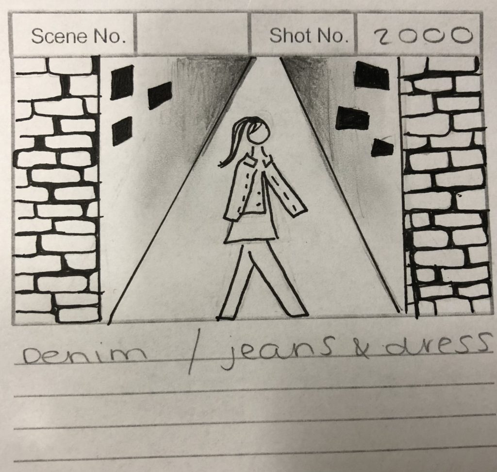
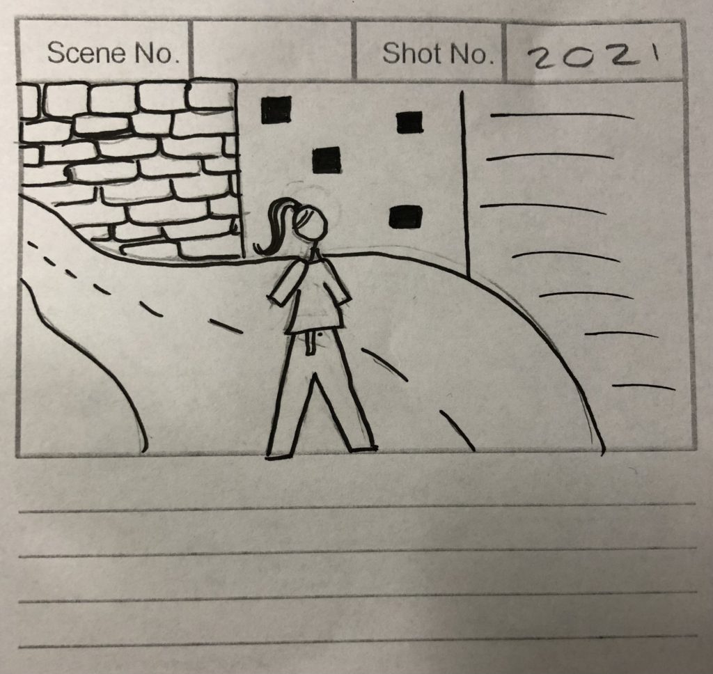
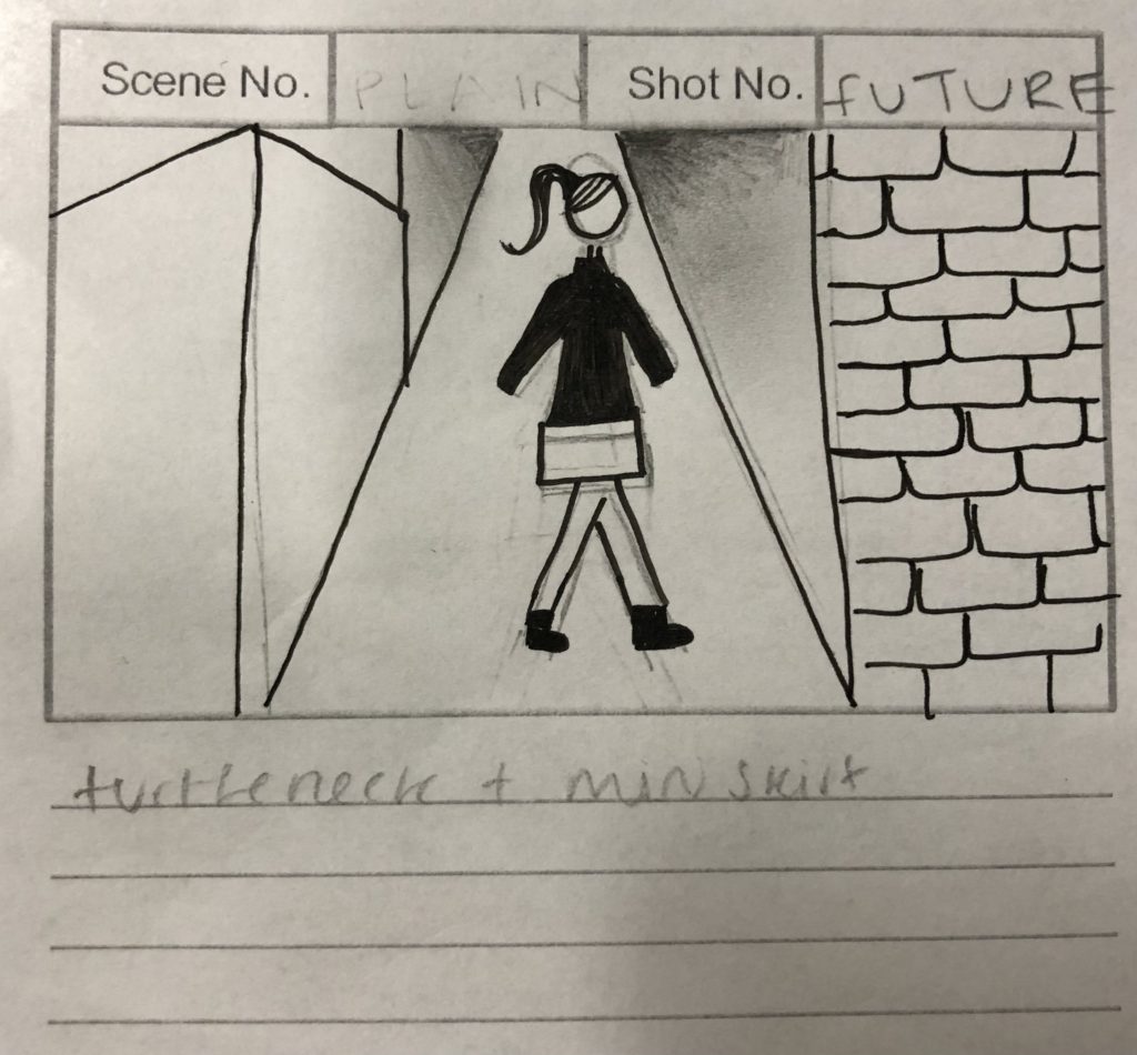
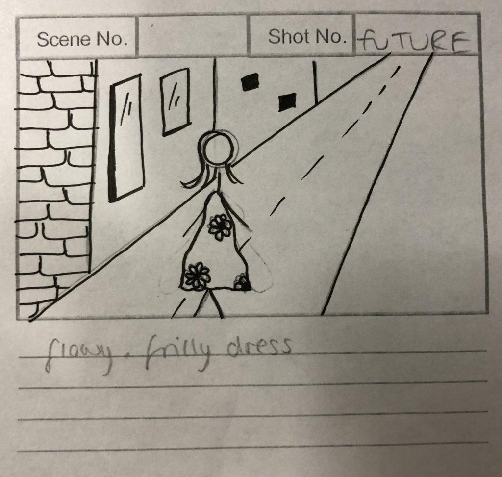
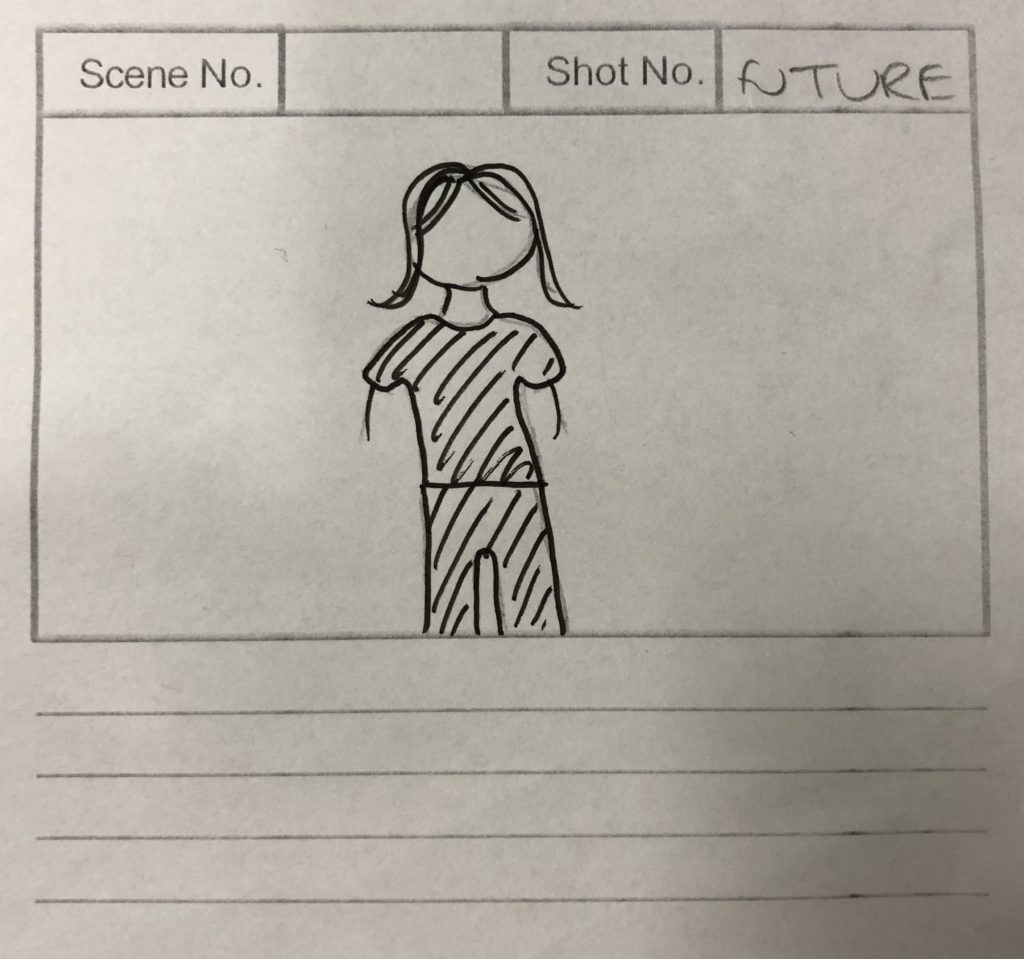
Our storyboard shows that we want a girl walking in front of a street background wearing the clothes of the past and the future to then leave with plain clothes to question what will happen with fashion. We plan to use different backgrounds depending on the year we film in to clearly state that this is a different time point. To add to our story we put in future fashion on what we think will come back and popular again or if there will be something new altogether.

Artists Reference 2: Contemporary artist: textiles & embroidery

The artist in which I have decided to be my main focus is Yulia Makeyeva as I find her work very unique to other artists. Yulia Makeyeva is an emerging multidisciplinary artist and founder of Connect With Art. She grew up in Russia and is now based in Jersey. She is very passionate about engaging the community in art, which relates to our project of nfts and how everyday more people are understanding about what they are globally in the community.
Fleeting: Installation View

I feel that this photograph has several different aspects as her work is an exploration of human memory and the memory of materials. This therefor makes her photograph unique to others as the materials in which she used has sentimental value. Additionally this photo may catch peoples eyes as you can cleary see the main focus which is the embroidery in the centre. However people may find the background distracting for the embroiders although i feel the use of a projector adds to the photograph as a whole.

Other examples of Yulia Makeyeva work:

artist reference- TEXTILES AND EMBROIDERY

Inge Jacobsen

Embroidered Fashion Mags : Inge Jacobsen

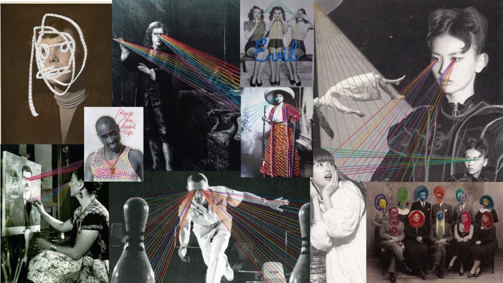
Inge Jacobsen is a highly accomplished Danish/Irish artist. Not only has she exhibited around the world and won countless awards, in 2012 she exhibited alongside legendary YBA Sarah Lucas at the Selling Sex show by SHOWstudio. One of her proudest accomplishments. Jacobsen takes mass produced images, like magazines and adverts and gives them a unique makeover. She stitches, embroiders, cuts and collages to transform her subjects, a process that Jacobsen refers to as ‘hijacking’. Inge Jacobsen’s work is influenced by her Grandmother and Grandmother’s sister who was very good at cross-stitching and would create very intricate pieces.

Inge Jacobsen uses found commercial imagery and thread to put her own spin on classic advertising. Embroidery is used to physically alter the pictures and appropriate their meaning; the artist has named this process ‘hijacking’. Recently Inge has enjoyed working on a commission for American Express, who wanted an original perspective on 3 of their classic cards to use in a social media advertising campaign.

 Inge Jacobsen describes her work as an “intervention.” The photorealistic effect she’s able to achieve with full cross-stitched reproductions (see her version of British Vogue‘s March 2011 Rosie Huntington-Whiteley cover above, side-by-side with the original) is really bold and interesting to look at.

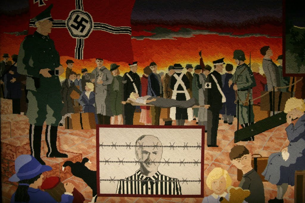
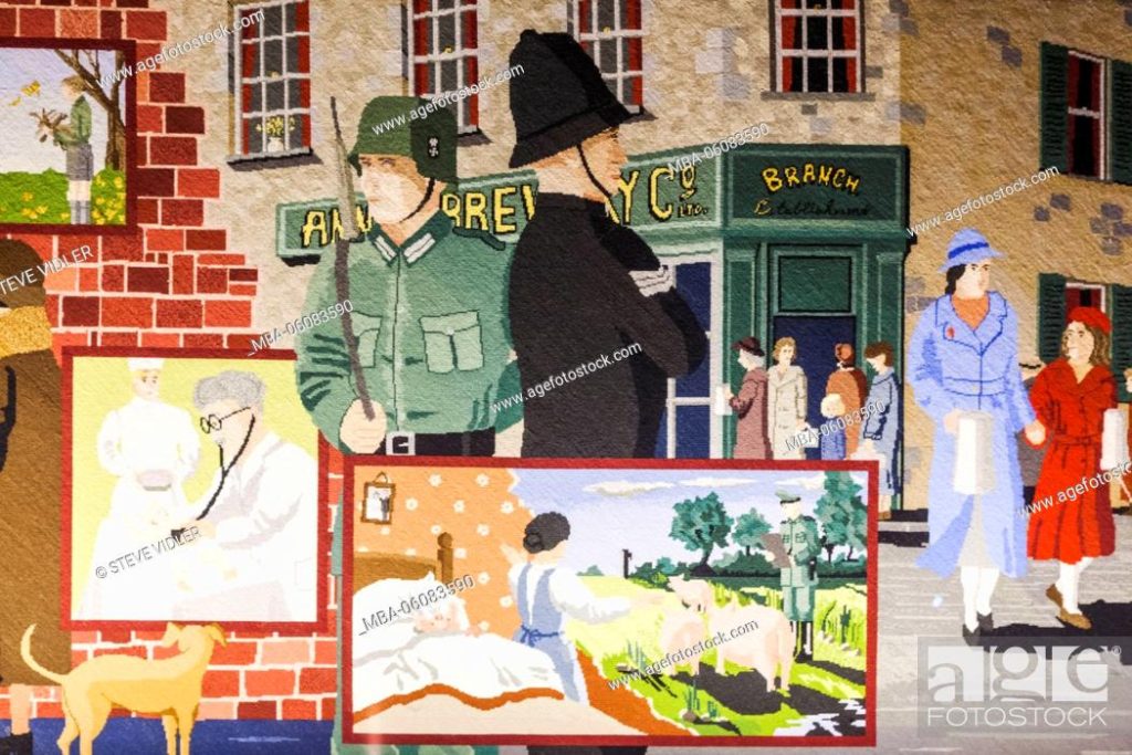
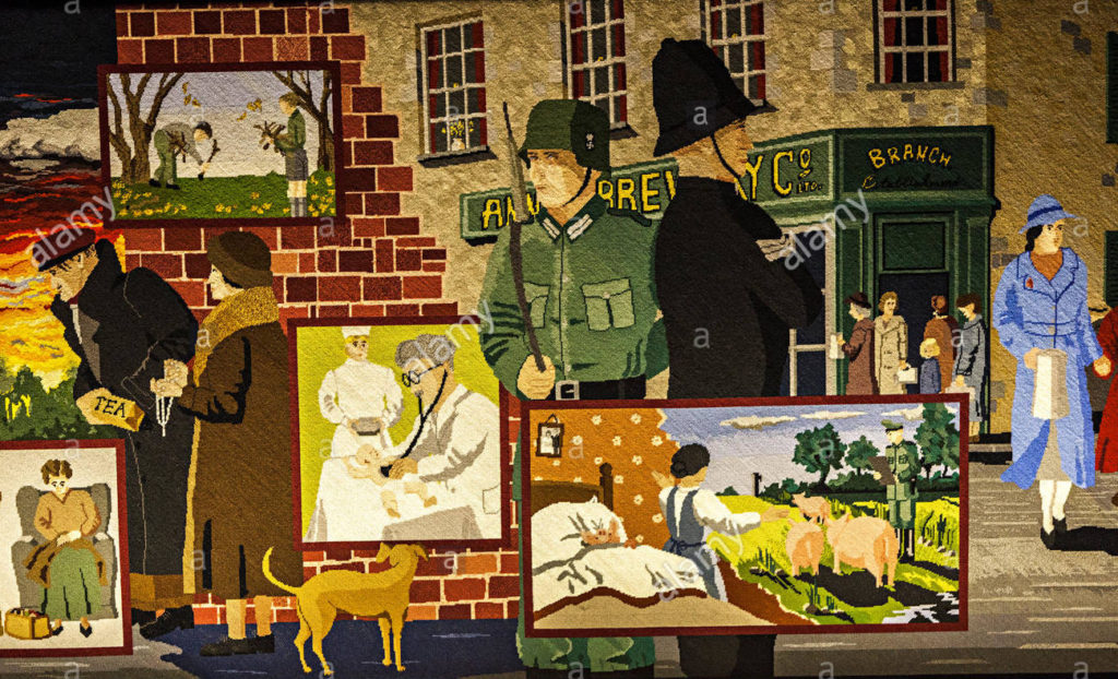
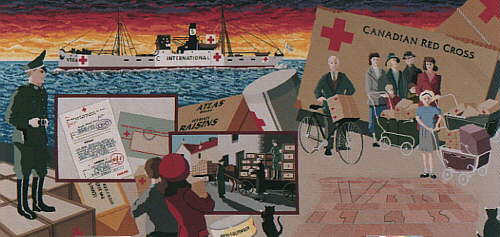
the Occupation Tapestry, Jersey

The Occupation Tapestry was the biggest community art project ever undertaken in Jersey, and made by Islanders for Islanders. It was conceived in order to tell the story of what life was like during the five years of German occupation. 

In 1995, the award-winning Occupation Tapestry was woven by Islanders to celebrate the 50th Anniversary of the liberation from five years of occupation by the German armed forces during the Second World War. It is 13 panels, created from the memories and stories of Islanders who experienced it first-hand. The tapestry is held in the Maritime Museum.

Jersey spirit runs through the Occupation Tapestry. Each of the original 12 panels were created in a different Jersey parish and the 13th panel toured all 12 parishes, each of which depicted a scene of local life during the German Occupation.
The Occupation Tapestry was unveiled by Prince Charles, the Prince of Wales, on 9th May 1995, fifty years after the first English “Tommy” soldiers came ashore to liberate Jersey after the surrender of the German garrison on the same day.

In the museum, each of the tapestry panels has an interactive screen in front of it. By touching the screen, information, including photographs and film, tell you about the tapestry, and also what life was like back then.

Materials used to make this tapestry were 1,418 of 25 gram hanks of Appletons Crewel wool, comprising 275 shades of 52 different colours; 24 metres by 100cm wide, 16 threads to the inch, Single Brown Canvas. Each panel measures 72 inches by 34 inches, there are 626,688 stitches per panel. In all, the twelve panels contain 7,520,256 stitches

Trinity – “Outbreak of War”

Occupation Tapestry Gallery | Jersey Heritage | Visit Jersey

St. John – “By-Passed”

The Occupation Tapestry - Jerripedia

St. Martin – “Red Cross”

Jersey Occupation tapestry 11 - Frank Falla Archive

St. Lawrence – “School and Work”

The Occupation Tapestry, Jersey, Channel Islands - commemorating liberation  from 5 years of Nazi rule - History Alive

animation-Gif

GIF

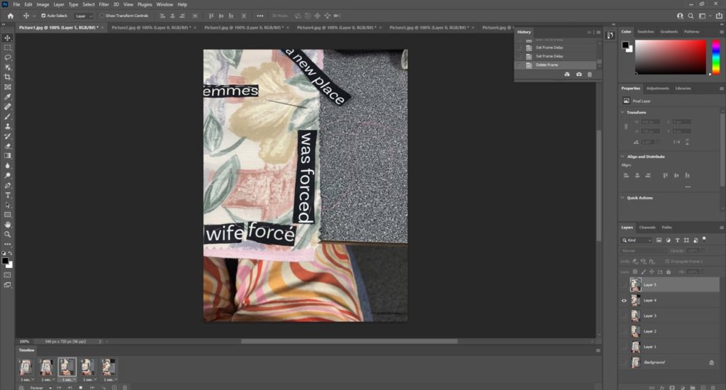
I created my first GIF following these instructions:
1. Create layer for each image
2. Window > timeline
3. Select > Create Frame Animation
4. Drop Menu > Make frames from Layers
5. Timeline > select Forever
6. File > Export > Save for Web Legacy > reduce image size to 720x 720 pixels

Embroidery

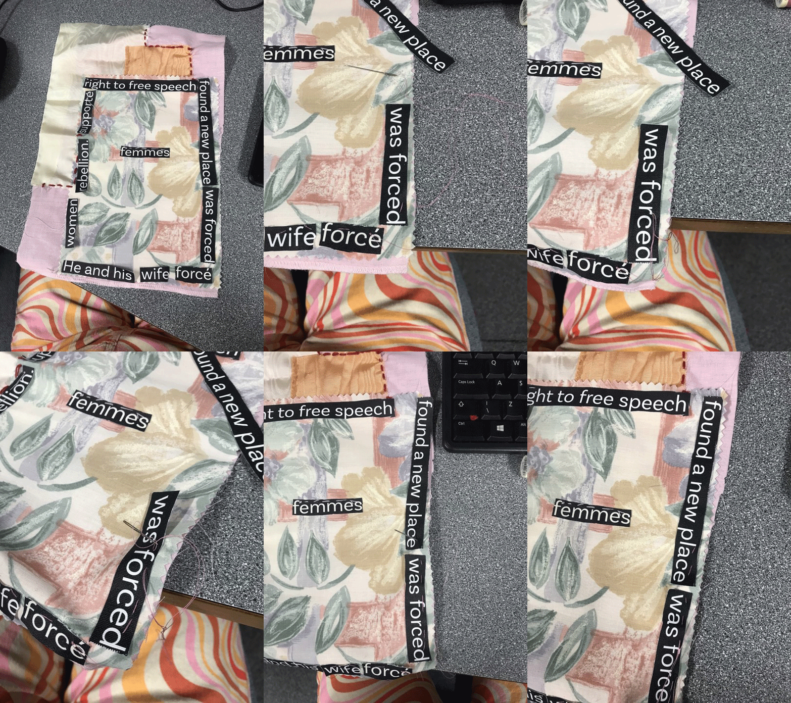
We used embroidery with Yulia Makeyeva and we recorded an image using our iPhone of every step when we creating our embroidery by cutting our figures, shapes, words and re-stitching. Our embroidery had to be related to our groups project which is feminism. I chose carefully my fabric, I chose a fabric with flower pattern to demonstrate that women were compared to flowers because of how “delicate” they were. I also went for a satin white fabric to represent how women had to keep their virginity to be considered as pure, or fit for marriage. And pink for a “for the colour of femininity”. the pieces of frabrics are attached with a red thread that means the blood that women lose once a month. in the middle there is the word Femmes which means women in French.

First intent:

Seconde intent:

After we finished taking several images we re-assembled our images as a GIF on a timeline using Adobe Photoshop. This first intent wasn’t successful since the video wasn’t long enough and didn’t much detail into it. So for the seconded GIF I decide to have a minimum of 10 photos so it could be longer, I ended up putting 14 photos in my GIF and I prefer it than the first one.

contextual study

Bayeux Tapestry

Bayeux Tapestry: Story & Importance Explained, Plus 8 Amazing Facts -  HistoryExtra

The Bayeux Tapestry is an embroidered cloth nearly 70 metres long and 50 centimetres tall that depicts the events leading up to the Norman conquest of England concerning William, Duke of Normandy, and Harold, Earl of Wessex, later King of England, and culminating in the Battle of Hastings. The story begins with a prelude to Harold’s visit to Bosham on his way to Normandy (1064?) and ends with the flight of Harold’s English forces from Hastings (October 1066); originally, the story may have been taken further, but the end of the strip has perished. Along the top and the bottom run decorative borders with figures of animals, scenes from the fables of Aesop and Phaedrus, scenes from husbandry and the chase, and occasionally scenes related to the main pictorial narrative. It has been restored more than once, and in some details the restorations are of doubtful authority. When first referred to (1476), the tapestry was used once a year to decorate the nave of the cathedral in Bayeux, France. There it was “discovered” by the French antiquarian and scholar Bernard de Montfaucon, who published the earliest complete reproduction of it in 1730. Having twice narrowly escaped destruction during the French Revolution, it was exhibited in Paris at Napoleon’s wish in 1803–04 and thereafter was in civil custody at Bayeux, except in 1871 (during the Franco-German War) and from September 1939 to March 1945 (during World War II).

After 950 Years, the Bayeux Tapestry Is Set to Be Displayed in Britain -  The New York Times

The tapestry is of greater interest as a work of art. It is also important evidence for the history of the Norman Conquest, especially for Harold’s relation to William before 1066; its story of events seems straightforward and convincing, despite some obscurities. The decorative borders have value for the study of medieval fables. The tapestry’s contribution to knowledge of everyday life about 1100 is of little importance, except for military equipment and tactics.

NFT Community – Artist Reference

Davy Evans

Davy Evans is an award winning multi-disciplinary artist and designer based in Brighton. With a background in graphic design, Evans fuses practical effects and digital techniques to create ethereal abstract imagery. He often manipulates light and liquid to replicate colour, form, and distortions inspired by natural phenomena. His work is combined into beautiful still, eyewatering creations:

Davy Evans - WuKa

And also animated distortive art visuals:

His works combine real life natural elements such as flowers with hyper realistic and futuristic astrophysical elements into one hypnotic visual. His work makes me use big words like I just did; to describe what is to be seen in Davy’s work is quite a challenge as it is so out of this world. Davys work sets a bar for what is possible for the future of digital art and the world of NFT’s.

https://www.davyevans.co.uk/work

His work inspires th efuture of art, not only for how evolutianary and digitaly advanced it is but also for how he creates it, remembering the basics of the creative process.

“I try to play with new materials and photography techniques whenever I can, allowing for happy accidents to form organically,” he says. “I like the challenge of making something out of nothing; for example, I’ll often try to use everyday household items to create effects.”

I want to include the digital design and colourful abstract elements of Davy’s work into my NFT project.

The above image is from Evans latest series during the UK’s lockdown from the Covid Pandemic. He created this work using the simplicity of flowers, water and glass. The simplicity of the arrangement adds to the absurdity of the artwork. Turning simple elements into such a complex looking, hypnotic piece.

The composition of the piece is chaotic with many elements for the eye to take in. The water droplets forming perfect cell like structure in the foreground combined with the colour they adapt taken from the flower in the background, make for a staggering piece. The image looks like a digital artwork with how supernatural it looks. Colour leaks into every corner of the composition, leaving no pixel monochrome. For how abstract the image is, Davy still manages to include tonal elements, some of the pink/salmon areas of the flower are bright and highlighted, while in the centre of the composition and the frames of the waterdrops, we see shading. I also like the blend of cool and warm temperatures in the same composition.

William Kentridge

William Kentridge contemplates history and creation | The Economist

https://www.tate.org.uk/art/artists/william-kentridge-2680

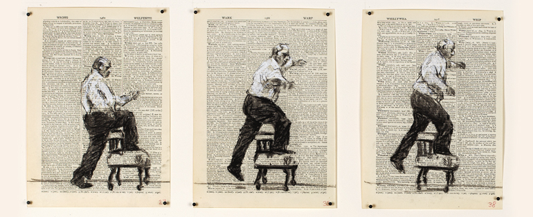
William is an artist from my hometown Johannesburg, South Africa. Unlike the majority of successful white South Africans, he still lives there, and operates out of the heart of ‘Jozi’. He makes drawings which he often turns into animated films. Sometimes there are also performers in front of the animated film and his work integrates into a theatrical piece. He describes this as a ‘drawing in four dimensions’. His process all starts from charcoal drawings. He uses charcoal for a varied number of reasons but mainly its flexibility, room for change and experimentation in the animation process. “You can change charcoal as quickly as you can change your mind”.

Charcoal is easy to erase and it has an abundant granularity to it. Its tonal range is good for photographing. It is also not as meticulous as other art mediums and has a speed and flow that the artist can adopt. William creates his animations frame by frame. This means his process involves making slight adjustments, step by step, and making photographs in between each adjustment. This proves to be a timely method and therefore the speed the charcoal adapts it important.

Williams normal animation setup in his studios include a physical walk from the camera to the canvas where his drawings are made. His frame by frame process involves his walking between the camera and the canvas hundreds of times. He describes this process as a physical but also mental process when new ideas are suggested.

William believes that art needs an initial impulse which has to be enough to get the first drawing done and then in the physical activity of making the drawings, new ideas emerge and new possibilities engaged with until the piece takes shape.

William Kentridge - That which we do not remember | Solo Show | Artfacts

Williams position as an artist is one of self awareness, this is prevalent in every piece from start to finish. Williams art holds political and polemic weight. He describes himself as a child of privilege – he grew up a white middle-class South African who had the first 40 years of his life under the white privileging apartheid regime and the other 20 living in the South African democracy. He is highly aware of his privilege and also the lack of privilege the majority of South Africans experience. His work highlights both his insider and outsider aspects. This is why he choses to stay in South Africa and not flee the madness of it, is envelopes him in his work focusing on the community.

https://theconversation.com/uk/topics/south-african-politics-8463

These two artists have two different takes on digital art. Davy’s work encapsulates a movement of new ideas and forward thinking. This is represented in his very colourful and digitally advanced work. His work is much more futuristic and out of this world. His work is very much a part of the metaphysical and futuristic aesthetic that is emerging in modern times. Williams work, however, uses a much more tactile form of art, and one that is very much a classic method of expression dating back to when cavemen would draw on walls. He uses this dated method and gives it new life by going through a digitisation process and animating it. Unlike Davy, his art reflects on events that have already, or are currently raking place, instead of focusing on movement into the future. His work is a lot less colourful; for the most part William only works black on white.