NFT – Summary and Statement

Summary

Overall, the completed work by our group turned out to be a success. The filming was good especially the drone shots done by Matthew however some of the walking shots were slightly shaky making it difficult for Michael and Reuben to edit together with the animation shots. Matthew mainly focused on animating the sections that were animated. He did this on blender and was successful in creating different settings for the character to walk through. I mainly focused on making a final poster and finding sound effects that were used in the video. Overall, I believe we succeeded in completing what we set out to complete. I would rate it 8/10 for success only because some of the shots are slightly shaky and the video is quite short.

Statement

Title: Online / Offline
The concept behind our NFT video is that two friends each have two separate lives; one offline and online. Our video shows how anything can happen on an online medium but real connection and friendship occurs in real life. As technology develops relationships of all kinds are growing apart. An example of this occurred in the height of the Covid-19 pandemic lockdown. People only experienced contact with family members in the same household and the only way to speak to people outside was via an online medium. This effected the mental health of everyone and looking back on the first lockdown we can see how much we relied on technology to keep connected with family and friends.

Creators: Oliver Shiplee, Matthew Brown, Michael Kenealy and Reuben Jeanne

Statement and Evaluation

Statement

Title: Online / Offline
The concept behind our NFT video is that two friends each have two separate lives; one offline and online. Our video shows how anything can happen on an online medium, but real connection and friendship occurs in real life. As technology develops relationships of all kinds are growing apart. An example of this occurred in the height of the Covid-19 pandemic lockdown. People only experienced contact with family members in the same household and the only way to speak to people outside was via an online medium. This effected the mental health of everyone and looking back on the first lockdown we can see how much we relied on technology to keep connected with family and friends.

Creators: Oliver Shiplee, Matthew Brown, Michael Kenealy and Reuben Jeanne

Evaluation

Overall, I think that the film looks good and covers our original intentions, which was to show how you could know someone in real life, but they can be completely different online. In addition, how the online world brings people together in unusual times, such as Covid-19.
The quality of the video is decent, this is because the clips go together and work well with the animated videos. However, the camera shot videos were a bit shaky, which meant they were harder to edit, for example the half-real life, and half-animated side.

Furthermore, Michael and Reuben did a good job editing the film together, especially to the beat of the music. The special effects really help convey the meaning and direction the video was going towards, which is the online/offline comparison. For example, the loading… effect helps show that Michael is travelling into the Meta verse.

The two things I think worked really well, and made the video ten times more interesting, were the drone shots and the animation. The drone shots really provided a unique cinematic angle, which made the film, feel more professional. The animation is a unique feature, which I think separated our film for others.

Personally, I think that the film could have been a little bit longer, at least 30 seconds. This could have been achieved by making the editing a bit slower, which would have helped the viewer take in the film and what the message was. Instead, we made the editing over the top to make it seem futuristic.

In conclusion, I think that the overall outcome is good and both the film and digital image relate to the original message. The animation art style is mostly in the style of the artist/digital artist that I studied, however there are some differences, as we decided to use a low-poly art style, as it emphasises the digital world more than making it look realistic.

Evaluation

For this NFT project, we started by researching what exactly an NFT is (non-fungible token) and then continued our research by looking at examples of NFT’s and really trying to understand what they are. We then discussed as a group what the question, ‘What will the future of Jersey look like as a community in the Metaverse?’ means and how we will go about creating a 30-second animated video to link to the question. We started by creating mind maps of what a community is and what it means to be a community. We then created mind maps and mood boards on our chosen theme; which we decided to create a film based on fashion. After we made the mood boards we created a statement of intent to decide exactly what we were going to do and how we were going to do it. Within the group, we decided on multiple different ideas which varied from using a projector to project different sorts of patterns onto a model wearing plain and simple clothing to the model wearing clothes that replicate fashion trends over the years. Additionally, we also spoke about how we may be able to use Photoshop or similar software to edit peoples original clothing, which may show that the digital world of fashion can be easily manipulated. Our last idea was to print out original photos which we have taken of our models and either collage or embroider over them to create different designs. We decided that we were going to have our model wearing clothes that best replicate fashion trends over the years. We then did a contextual study on NFT artists that link to our theme of fashion and researched NFT artist Toby Evans who focuses on digital fashion. After that, we did a contextual study on the Bayeux Tapestry as it also links to the embroidery project we are also doing with Yulia, where we each made an individual embroidered piece that links to Jersey. After discussing more as a group how we were going to create the film we created a storyboard. We decided we’re going to start off with a wide shot and then zoom in to a person wearing a 70’s inspired outfit (flares and a crop top), after that there would be an outfit change. Next, there will be another outfit change into an 80’s inspired outfit (mom jeans and a bomber jacket), then there will be a change into a 90’s inspired outfit (black dress). The clips will be shot with the model facing the camera and the clips will cut between outfits as the model walks forward towards the camera. The model will then change into a 2000’s inspired outfit (tracksuit) followed by an outfit inspired by current fashion (baggy jeans and a top). After deciding exactly how we were going to film it we brought in different pieces of clothing that we had at home to try to recreate old fashion trends. Making the outfits look as though they were from the ’70s, ’80s and ’90s was one of the biggest challenges we faced as we only had our own clothes to use. We decided on which clothes best fit each year and then booked out a space in the studio so we could start filming. We started by preparing the studio for filming by setting up all the lights and getting our model in the first outfit. We decided to film on our phones so that the videos would be portrait. We had our model walk towards the camera in the first outfit as we recorded her and then repeated this in all the other outfits. We then chose our favourite clips and started by importing all the videos onto Adobe premier. We then cut each clip at specific times to make it look as though she was walking towards the camera while her outfits changed. We then decided which music to use as a group and uploaded it to the video. After the video was filmed we made a digital image from the video. We decided to edit the images we took on the day of filming in photoshop to make them more interesting. To edit the images I duplicated the image and then used the FX tool on the duplicated layer to turn off the green and blue channels on the layer. I then moved the bottom layer slightly to the left to create a 3D effect. As well as the edited photoshop image we also created a Gif. We used all of our images and copied one image after another to make it look like stop motion and create an illusion that the image is moving. We copied each image over another and created a new animation layer in order to play them one after another and create a frame. This turned out well as it achieved our aim of showing the different changes in fashion through decades by creating a gif and making it look like its one big moving image. Once all of the layers were there we included all the images we wanted to use and created a timeline to create the final gif. We also did an embroidery workshop that links to the question about the community in Jersey. For the workshop, we took all of the individual pieces of embroidery we have done as a group and placed them together on a big piece of fabric. We sat around the table as a group and decided whether or not we liked the positioning of the individual pieces on the larger piece of fabric.  As there weren’t enough individual pieces to fill up the fabric we had to overlap some and leave some spaces in the fabric. Once we decided that we liked the placement we all chose thread colours that we like and started stitching the pieces onto the fabric.

our final video; https://web.microsoftstream.com/video/744704d6-9530-45ed-90ef-886d0c5627f8

our final image;

filmimg and planning

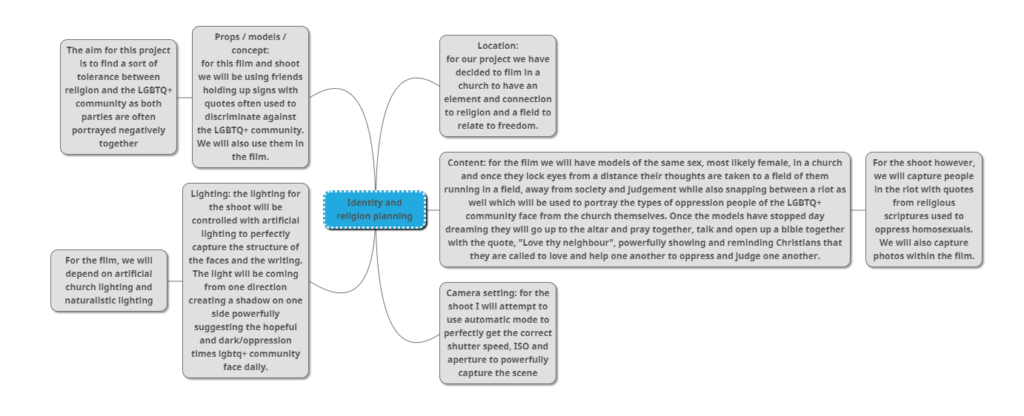
To start our filming process, Tiago constructed a clear and detailed plan for us to refer back to throughout the day. This was extremely beneficial as it helped us stay on focus of what we wanted to achieve and to help us look for little details that can be changed or use to our ability whist at the location to improve efficiency.

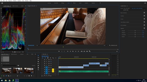
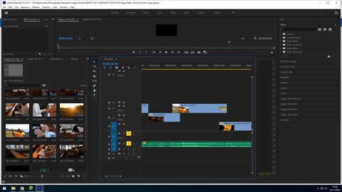
While editing the film, Tiago took screenshots of the process as he went. For our film we obtained a soundtrack that we believed would match the mood of the film. We did this by carefully searching for classical and cinematic music from websites that provided royalty free audios that was appraise for all three atmospheres, the church, dream sequence and riot clips. We came across a piece Sailing Away by Shane Ivers. Tiago first arranged the video clips in the order, showing the storyline, then went on to cutting these clips down and trimming them, in order to present the best part of the footage and cut to the beat. In addition, we obtained a recording of a bible passage, specifically one that quotes “love thy neighbour” to relate to the title of the film.

Here we chose to alternate the scenes of calm and chaos to show the binary oppositions of faith and interpretation that are seen in religion when it comes to the LGBTQ+ community, particularly Christianity. We obtained these clips of riots through searching for royalty free stock footage, as we believed using a real life documented event would be more impactful to the message of prejudice and homophobia that is presented through our film. In addition, we also thought that these clips in particular would work best, as they fit the colour grading in the film, with the fire replicating the sunset in the dream sequence and the warm tone of the church pews.

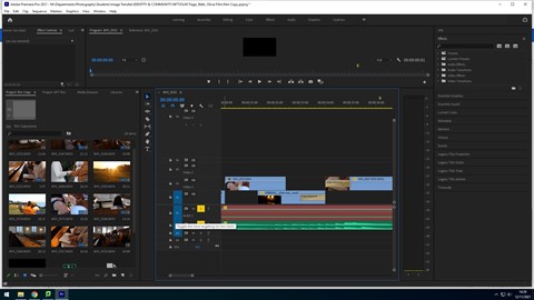
Finally, Tiago added a credit scene at the end of our film, which displays the our names, the film title, the credits for the royalty free music and riot clips, the names of the actors and our school name. This was transitioned into with a crossfade also, as well as the end of the credits. He also faded out the music to give the film a gradual ending, using the constant gain audio effect.

FILM STILL IMAGES

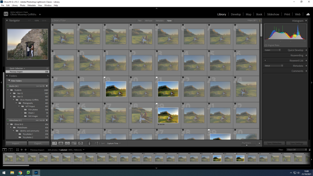
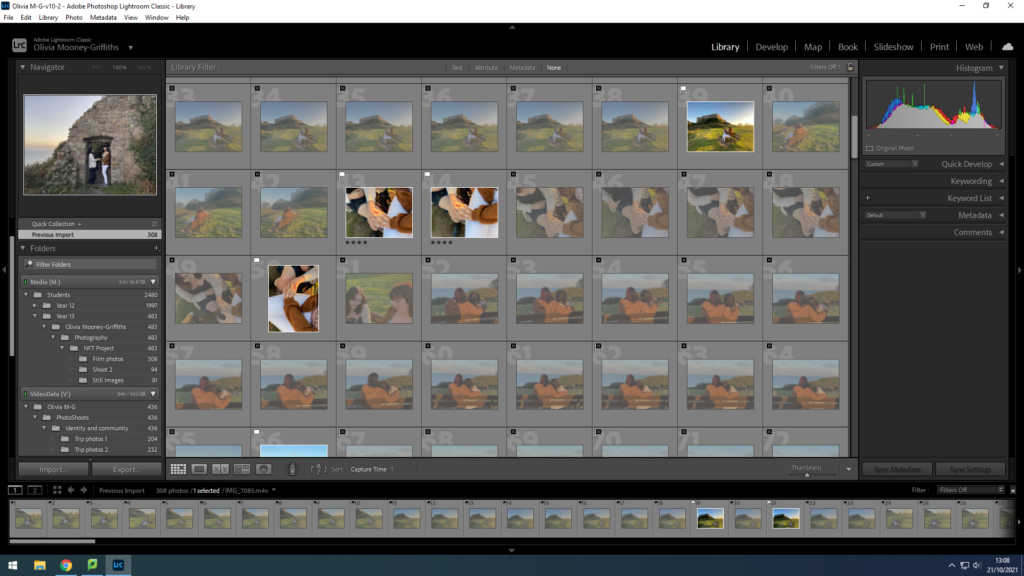
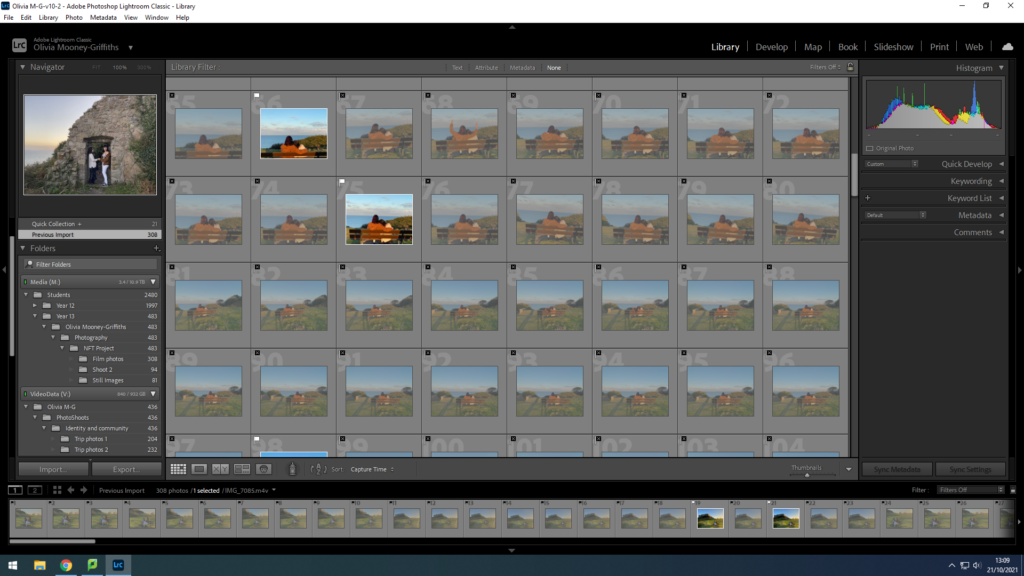
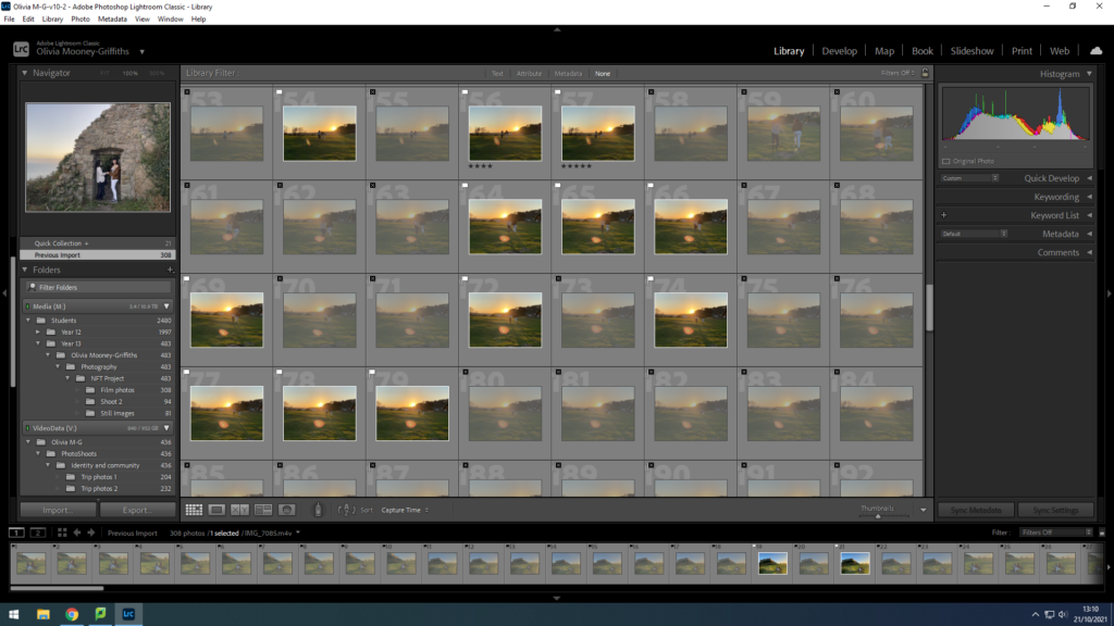
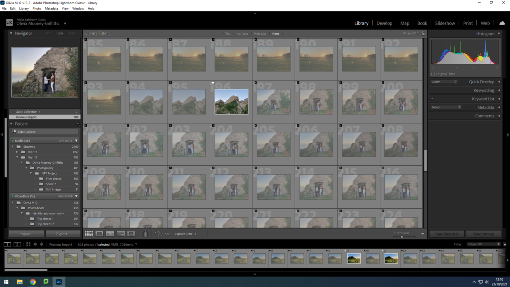
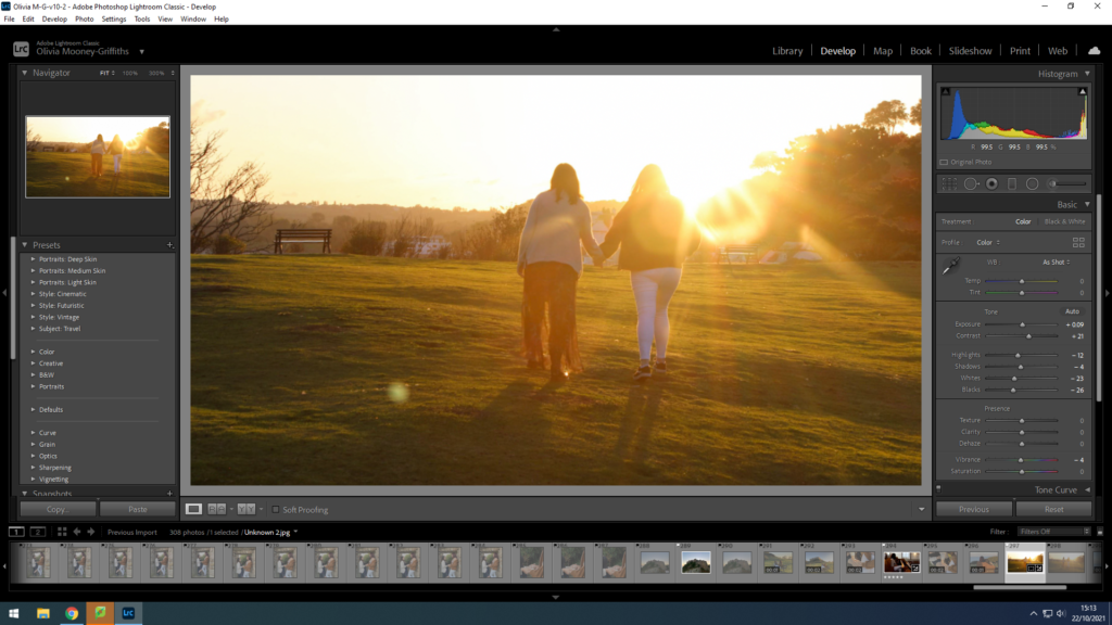
during filming, we took the opportunity to take stills of the scenes as we went along , allowing for more photographs that tell our story of the crossover between the Religious and LGTQ+ communities, as well as our studio images. These photographs include scenes such as the couple in the church and the dream sequence in our film that showcase the couple’s idealistic world for them, in which they are free from restraints and internal conflicts. Within Lightroom, Olivia sorted through which images she thought were best in the sense that they best conveyed our message and were clear and in focus, and that also related back to our original storyboard.

This photo sets the scene of the main character, practicing her religion through reading the bible. This shows a personal relationship with Christian religion for the character and shows that to the audience clearly. When editing, Olivia started off by slightly decreasing the exposure and increasing the contrast, causing a more dramatic setting which will later show a juxtaposition to the lighting of the dream sequence. After this, she then went on to adjust the shadows, highlights, whites and blacks within the image, by increasing the highlights and whites and decreasing the shadows and the blacks, further creating a larger contrast.

This still image displays the scene in which the couple are separated due to fear, still however sharing glances at each other. This conveys how in some instances people belonging to these two communities have to conceal part of their identity in order to be accepted. Olivia edited this photo in the same style as the scene before.

This photograph is a still image of one of our establishing scenes for the dream sequence. This is as the wide shot foregrounds the dream like and scenic setting, due to the castle in the background and vibrant green grass. Here this colour grading contributes to the film by matching the mood to the vibrancy in contrast to the dark slightly duller tones in the church. For the dream sequence Olivia edited the still images by decreasing the exposure due to the large amounts of sunlight already in the photograph. In addition, she also increased the contrast and adjusted the highlights, shadows, whites, blacks and saturation within the image.

This final scene of the dream sequence displays the couple holding hands again, feeling at peace with both sides of their identity, walking through the vibrant, green setting into the sunset. This again reinforces the idea of an ideal world that the characters are longing for themselves. whilst Olivia edited, she kept the essence of the photo bright and vibrant

still images and planning

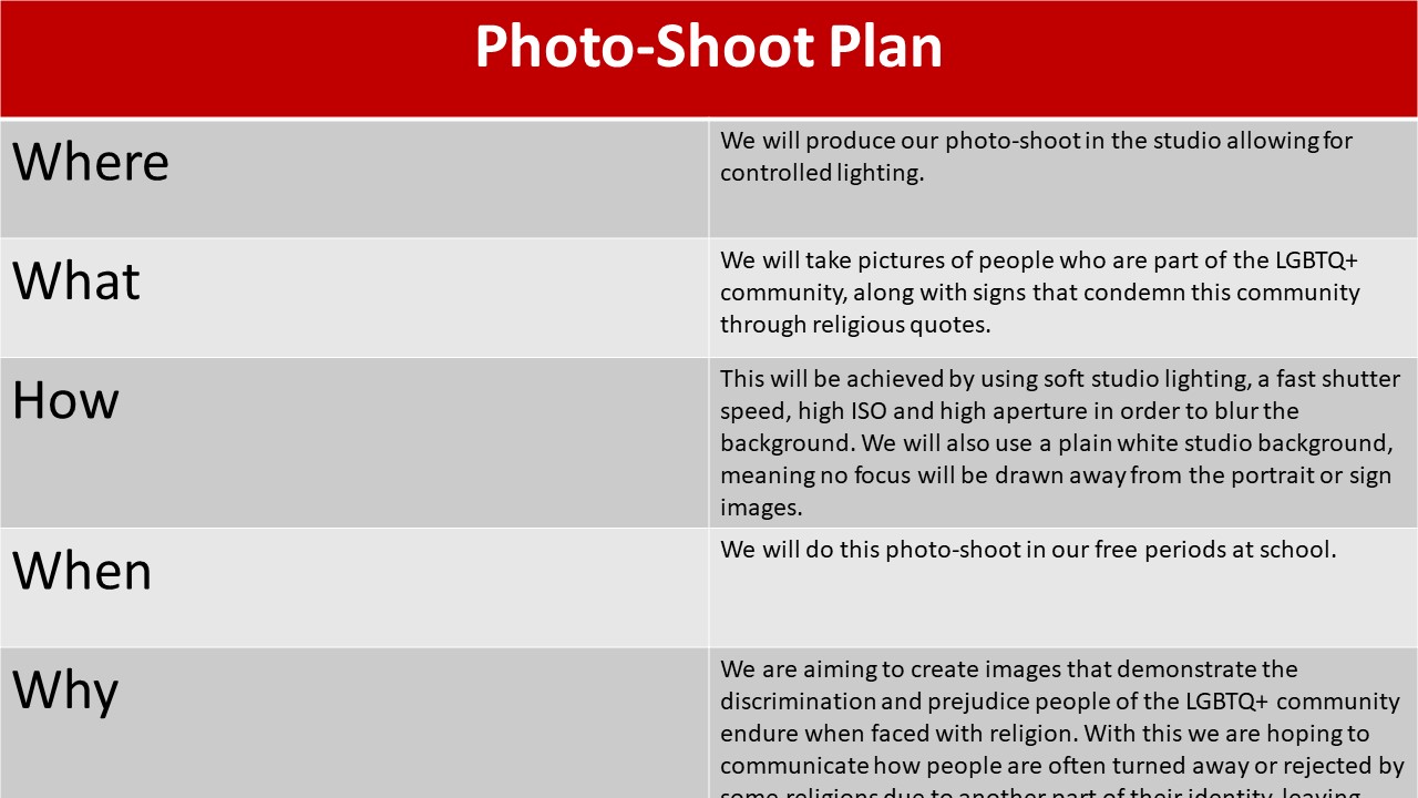
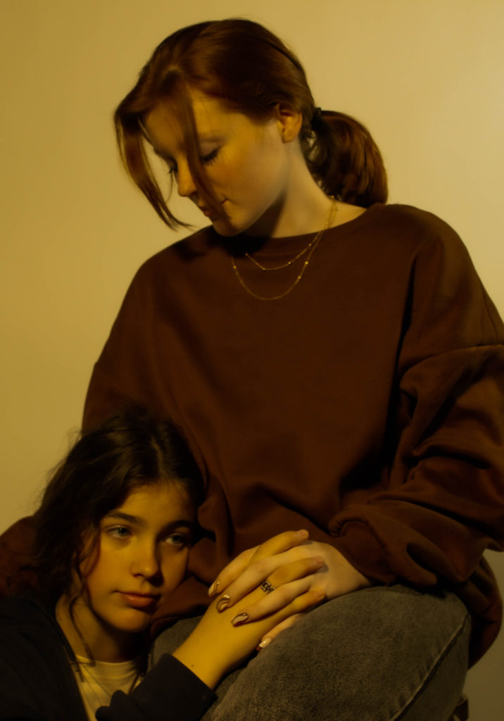
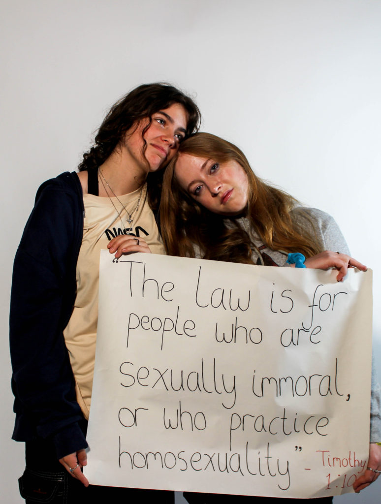
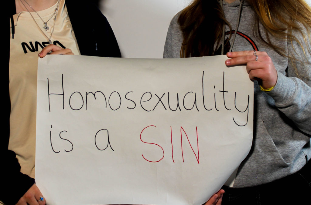
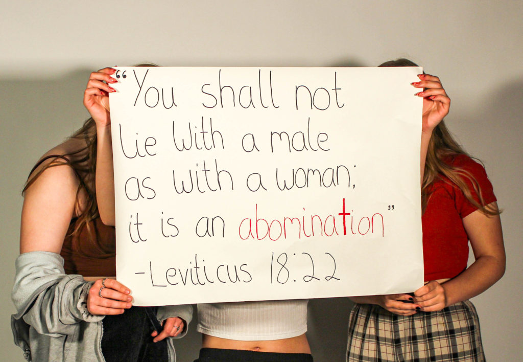
When looking for models, we decided that it may be difficult to find a good handful of young people confident enough in themselves to be photographed for being LGBTQ+. Therefore, for more comfort, we decided to use close friends that may not be apart of the LGBTQ+ community, but still understand the importance of the affects homophobia has on the community.

When taking the photos, Olivia and I took turns to direct and shoot the models. As we both have slightly different ideas and visions, doing the photoshoot together meant we could learn from each other and collect more materials than if only one of us did the shoot.

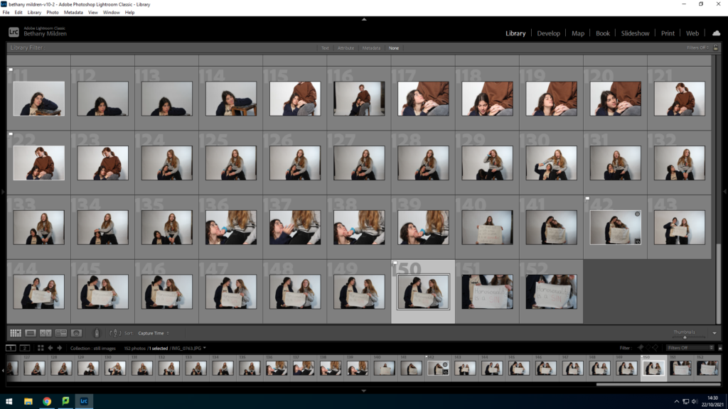
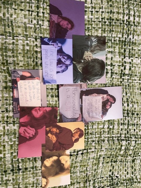
contact sheet

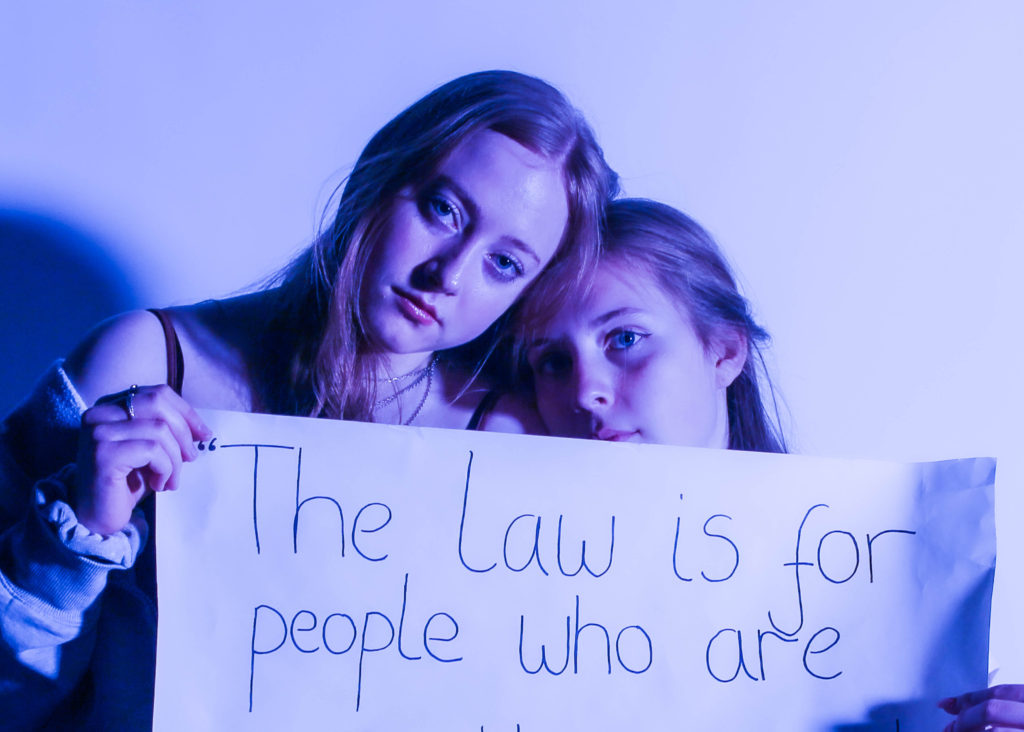
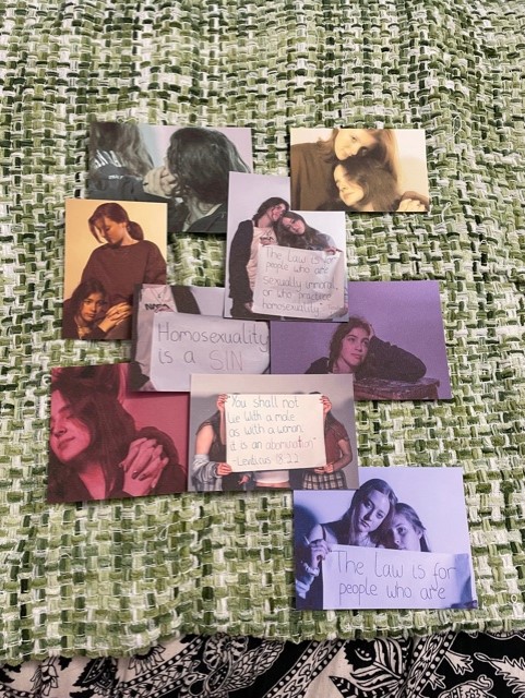
We completed the shoot over two days, using different lighting and different people to widen the variety of photos to choose for our final collection. To start the editing process, I went through the photos and flagged my favourite photos that I felt portrayed the topic well. Using clear photos of the sign, cropping out the models to draw the focus into the issues these phrases can cause. I paired them with photos of the same sex models acting happy and comfortable in their ‘relationships’.

Final photos

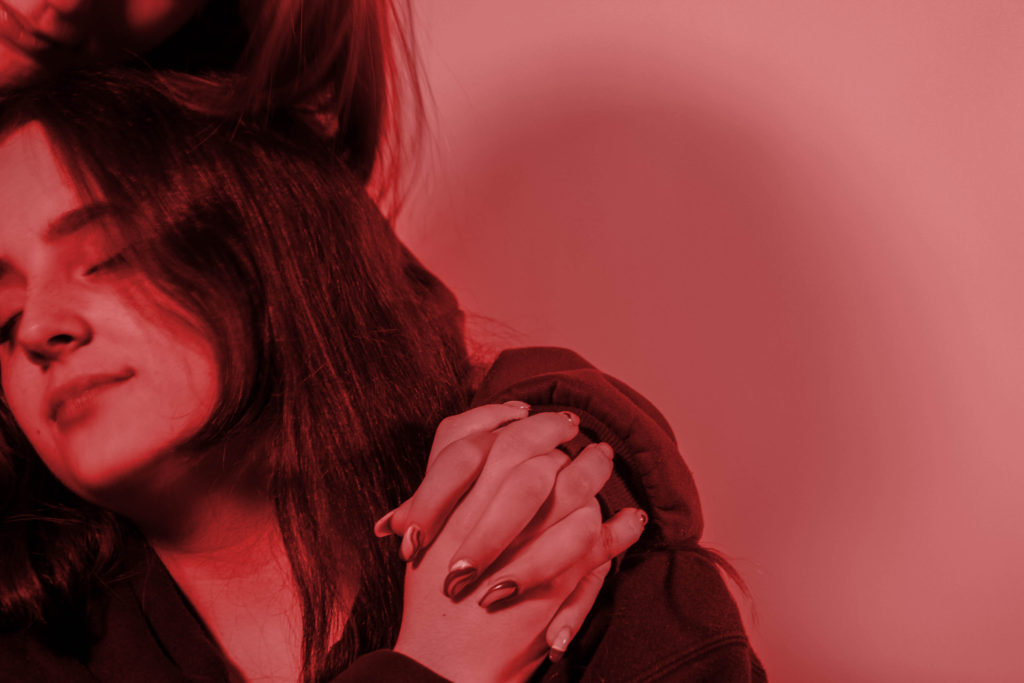
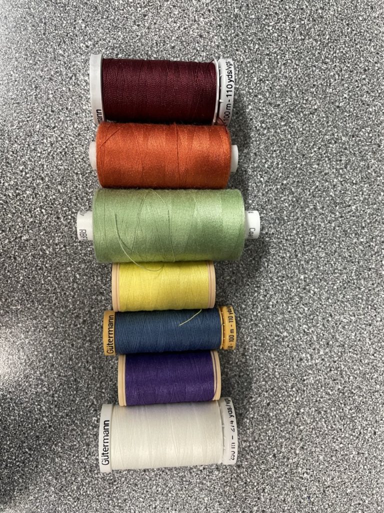
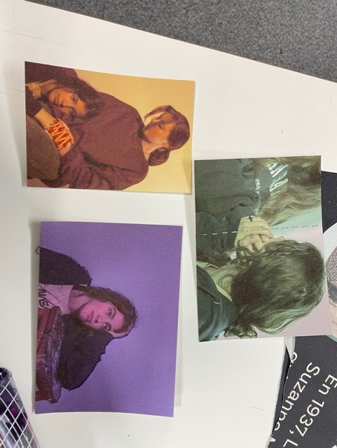
From the photoshoots, I selected 9 of the best photos use use in a physical collage, using techniques learnt from the embroidery workshop. I decided to add a colour overlay over 6 of the images, each of these overlays are also found to be the colours that form the LGBTQ+ pride flag. These will also be integrated with the normal colour images that mainly showcase the passages on the signs that condemn the LGBTQ+ community. By stitching together our images, it also presents a metaphor for the merging and relations of the two identities that a person should be able to share without discrimination. In addition, this assortment of colours and images can also be linked to artwork seen in religious settings, such as stain glass windows seen in many churches.

collage process

To start off the image, i first lay out the photos in different ways and shared them with the group, this was to ensure that the rest of the group were happy with our final image. I chose the same colour thread as the tint of each image, reinforcing the colours that represent the LGBTQ flag as some of the colours faded slightly as a result of the images being printed on a thicker paper, allowing embroidery without tearing. I first, embroided the photos separately, ranging the patterns and density of the thread. I went on to sew the images onto a piece of a2 sized fabric, that acts as the background to the collage. I also glued down some photos and lose edges to de-clutter the piece, making it looked neater. once the piece was together, I then framed it on a window mount to flatten it and keek it stretched.

Recording and Editing: Photo-shoots/ video/ sound

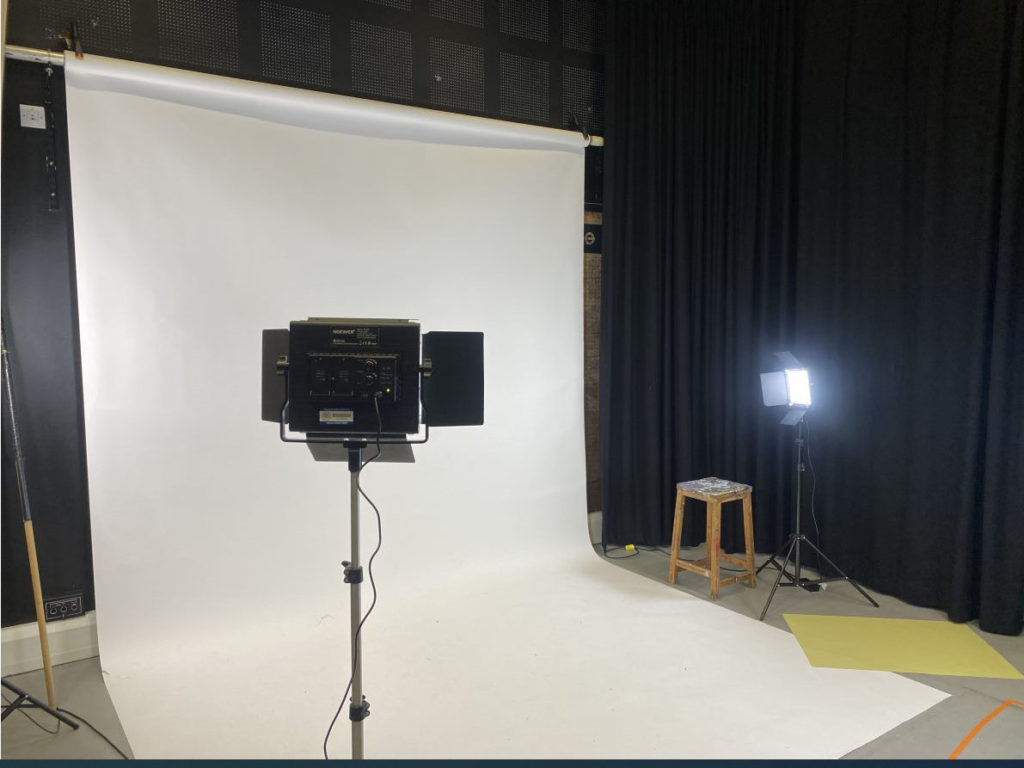
this is the set up we made in order to film our video. We used two bright lights and placed them further away in order to not have any shadows behind the model when she walks.

we then told our model to walk from one point to another across the white backdrop and we placed two small points on the floor in order to make sure she walks across in the same line every video and that she is always in the centre and positioned the same.

we made her change outfits for the different decades and got her to walk across in a straight line so we have all the decades when it comes to editing the final video.

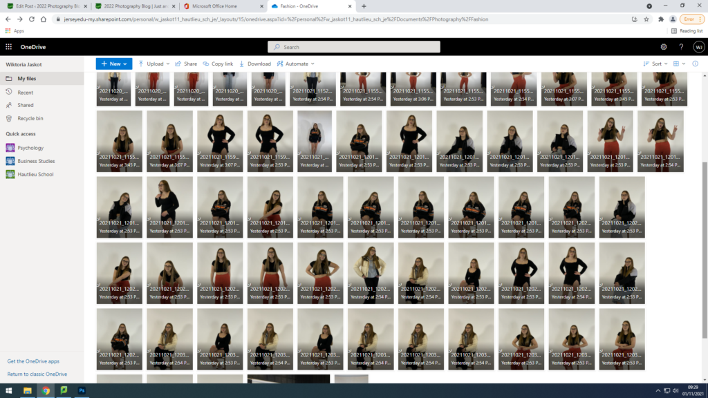
we also decided to take a few photos of the model in the different outfits in order to have a balance of videos , as our main final animation and a few images to be able to make them animated or play them one after another to make it look like they’re in stop motion..

we recorded 5 videos , in a portrait format in order to capture the models whole figure and get the whole walk.

we did five videos in order to record five different outfits throughout the chosen decades.

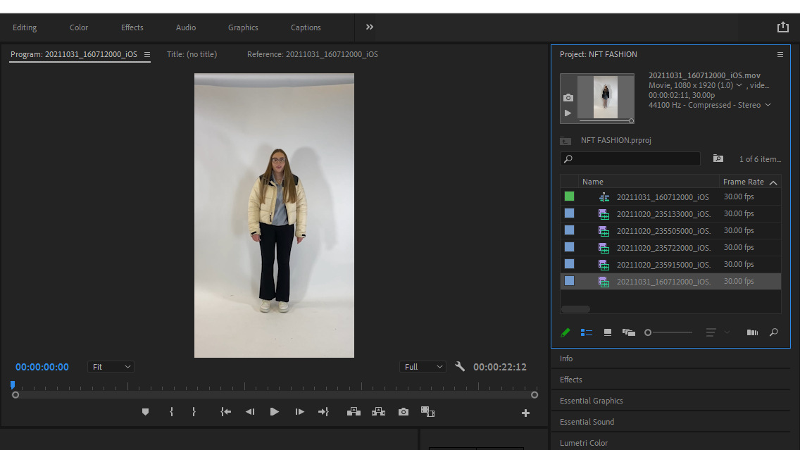
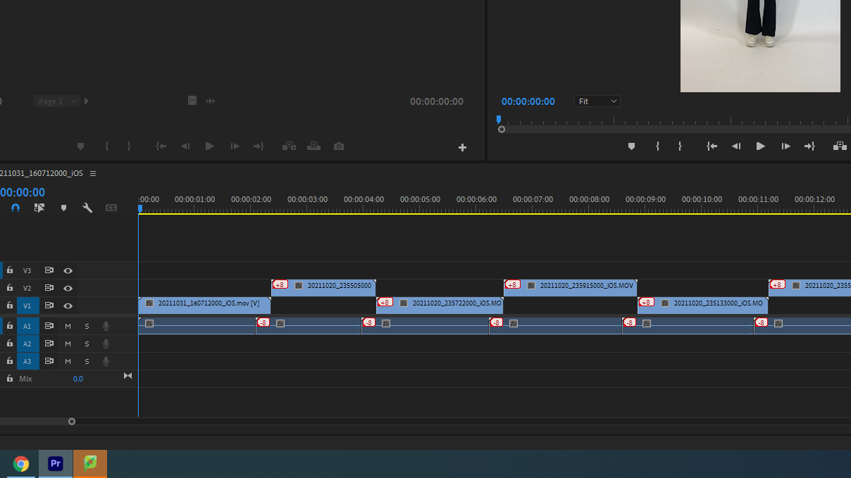
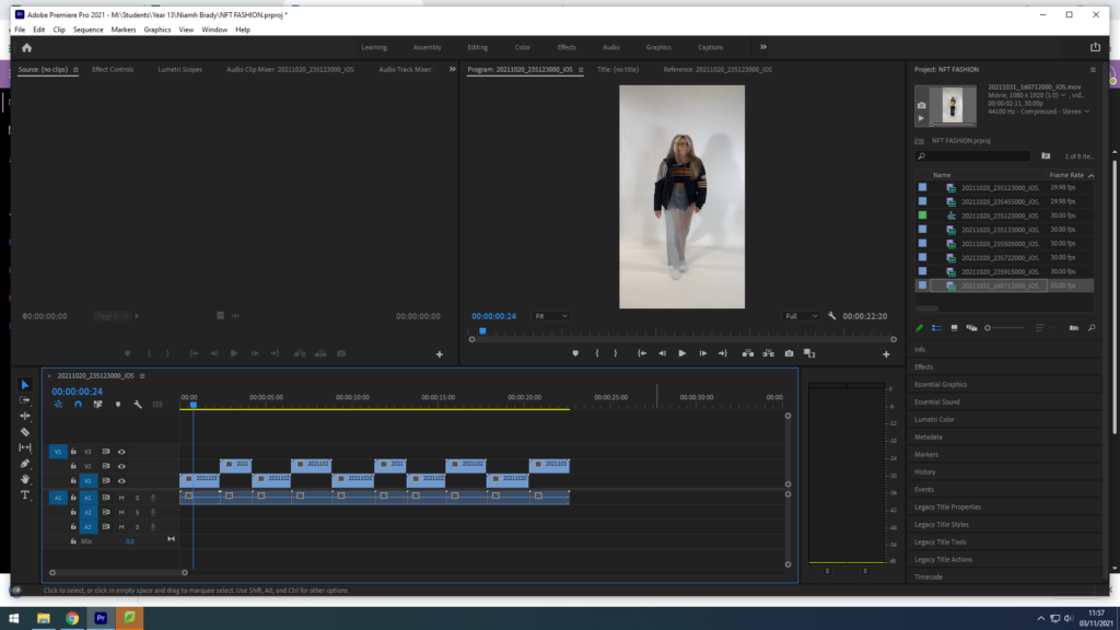
we then uploaded all of our videos and our gif that we edited from all of our images in adobe premiere pro in order to be able to cut down clips and edit them to make our 30 second clip.

we included all of the original videos and played them one after eachother to show the outfits slowly and progessively changing into different decades, we then included our quick and cut up 3 second video that we ended to show the difference in outfits really quickly as this was our main goal. By adding this is made the overall video more interesting as the beginning showed the outfits in detail and you had time to analyse them however by adding and making this cut up version you could see how different they all are when they all change as the model walks in a straight line. Then to finish the final 30 second video , we included the GIF that we created with all the images we took and wanted to include to finish off the video to show the model presenting the different decade outfits.

EDITING THE FINAL VIDEO;

We imported all the videos we took to start creating our video, we had five original walking videos, one edited video of it cutting through different clips rapidly and one GIF.

We then selected the order we wanted them in and we started with the edited video first to have a solid start, and the included all the original clips so that they play one after another, and at the end included the final edited video again and finished with the GIF.

We drag and dropped all the clips in the timeline and made sure they didnt overlap eachother.

We repeated some of the clips are few times in order to reach the time limit and give the viewers are better insight into the outfits.

We placed them all in the correct order and selected the final layout and now had to add sound.

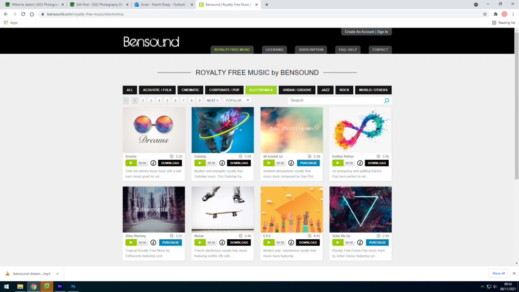
We had to include music that was copyright free , so we took a sound that fit in the best and edited it with our video.

Recording our film

Above is a picture of the studio showing which lights we used in order to shoot our film. We decided to use harsh bright lights to show the full effect of what our model was wearing to portray the fashion through the decades. Additionally we also feel that our photos/film could of been better if we asked the model to stand more forward as it would of highly reduced the shadow in which is seen throughout our film and digital image. The shadow therefore takes away attention from the main focus of our film and increases the non-focus of the background. We wanted to keep our background very minimalistic however due to the shadows this adds more attention to the background of the images than what we wished to achieve.

Recording and editing

We used our storyboard to decide what we were shooting. Michael was out first model who was mainly going to be at the start of the video. Then we decided that Reuben was going to be the second model and be in the mid-final section of the video. We printed off a picture of vr goggles and taped it onto some sunglasses.

Shooting

We shot the video in an open green area and used Matthews drone to get some of the shots. We got a headshot video of Michael walking using the drone. After these shots we gathered some panning shots and some shots following him. Then we recorded Rueben and Michael meeting in real life.

Editing

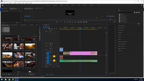
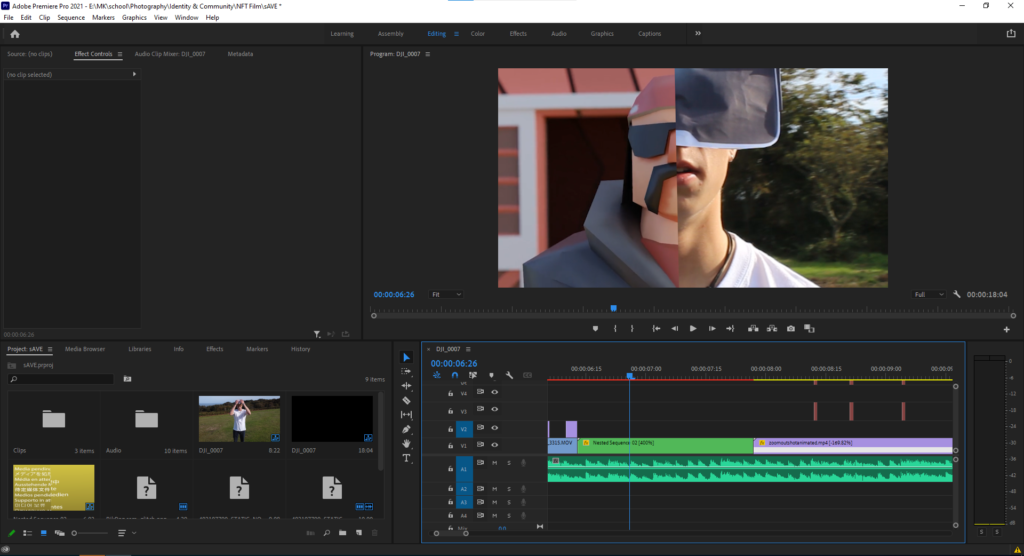
Michael and Reuben also edited the video on Adobe Premier Pro. They added effects such as the loading screen, static sound effect and visual and mapped the video to the beat of the music.

The image above shows the video mapped out on Premier Pro. You can see in the bottom left, the different clips, sound effects and visual effects put together to make the video. Next to the clips is the layout which shows the time at which things change. You can see the sound track beneath the video track and where the video clip changes.